- Follow us:


Friday, September 21st, 2018
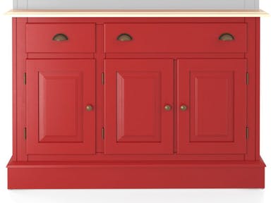
This charming red Canadel Dining Room Buffet will surely give the needed dose of color in your dining room.
Would you want to add colors to your home but aren’t ready to commit to something more permanent? There is no need to paint your whole home if all that your design requires at the moment is a punch of color. Check out these ways that you can add awesome hues to your home –
Cool Is the Way to Go
When you’re using colors in an expansive space, be ready to tone down the brightness if you want to achieve a welcoming effect. Bold colors naturally add energy while the muted hues create a more restful mood.
Define the Focal Point
If you want to create an eye-catching feature in your home, then be ready to use patterns with colors. That one room which successfully combines both will surely stand out. This room can become the focal point of your home.
You can mix patterns and sizes in different rooms as well. Add bright hues for that added drama.
A Color That You Love
When picking a color for the walls and accessories, make sure that you pick that one hue that makes your heart flutter. This is that one hue that you surely can live with for quite some time. Millwork and tiles are quite permanent so never base their colors on mere trends that can pass in just a year or two.
Begin Small
You might feel uncertain when you’re veering away from beiges and grays. Start slow and small. Use colors on your accessories at first. Avoid being shocked when you suddenly splash colors into your home.
A colored area rug is a good start. This can even be changed as the seasons change. And don’t think that you have to keep matching the colors. Don’t be afraid to experiment with hues that do not appear to be related to each other. Break the rules at times but don’t go wild that you will wake up with a huge regret.
Another simple way to begin is to bring in flowers. You will immediately notice the difference when you bring in these colorful beauties.
Fabrics can also help you change the colors while not committing. The slipcover can bring the needed color or the accent pillows can show the difference. If you’re feeling more artistic at the moment, you can also use wall decals, framed textiles, black and white photographs or paintings from budding artists.
Window treatments are just like artworks. You have a bazillion options to choose from plus they provide the needed color and pattern for your space.
‘Talk of adding color and patterns, have you heard of adding ribbons to specific areas in your home? Add them onto your window treatments, lampshades, picture frames, cabinet doors, and just about anywhere that needs an extra dash of color.
Accessorize with a throw, vase, accent pillows or even a bowl of fresh fruits. These extras will give an extra mile in terms of providing shots of color and personality.
Limited Contrast
When you’ve decided to use a bold color, it is crucial that you keep the rest of the palette to a bare minimum. Just go for neutrals as you proceed with your design.
When you want to create fun in a space, don’t be afraid to use the colors on opposite sides of a color wheel.
Color is also that powerful element that you can use to brighten up a stark white space. While white rooms are in these holidays, still, the reality is that you can have more fun if bursts of color can be seen from time to time. That dose of color won’t hurt if you want to set up a clean, modern look.
Tags: adding colors to a home, colors, McCreerys, McCreerys Home Furnishings
Posted in Color Schemes, Interior Design 101, Interior Design Elements | Comments Off on The Hows of Adding Color to a Home
Monday, November 14th, 2016
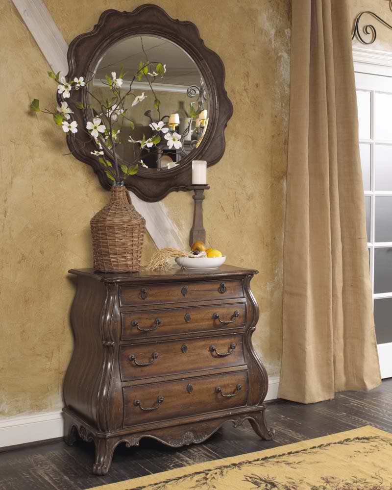
This lovely wooden piece comes from FFDM’s Highlands Collection.’Talk of focal points!
Here’s a great reason to begin decorating for your home now – the end result of your project will enhance the mood in your home. With the right decisions come better sleep inside the bedroom, less stress in the living room and much joy in the kitchen and dining room.
Here are some ways to turn your home into a haven –
Establish an Effective Focal Point
One of the first things that you would notice when you enter anyone’s home is a furniture or architectural part of the home anchoring the rest of the design elements. This is the focal point.
It is your duty to create a focal point for your home. This should be something that is noticeable once you enter your home. It could be a large porcelain vase, an abstract painting, or a memorable souvenir from your travels.
Say No to Debris
What are you still doing staring at that pile of old newspapers on the floor? Pick ‘em up.
Piles of stuff on the hallway or the entryway must go. They all spell chaos and mess inside your home and that’s bad for productivity.
Have a place that is designated for every item. Place the most chic containers right by the door then find bins for incoming and outgoing stuff.
Create Ample Room
Anxiety builds where there’s too much stress or chaos. Reduce the clutter in your home by making space. Cut on all the non-essentials. Let go of unnecessary furnishings, magazines, files, picture frames, etc.
A magical way to create space is to paint one of your chairs or tables and let it blend or disappear into the wall. Painting the walls with a light color will also make the room look a lot more spacious.
Highlight, Don’t Flood with Light
It would be difficult for you and your family to relax during the night if there is a bright overhead lamp right in your living room. This is much like attending a concert wherein you are amped all the time. If you don’t want to be revved up all the time, then use spot lighting just for the areas that need brightness. For all the others, install dimmers that you can activate according to your mood.
Find and install full-spectrum bulbs for a more soothing and natural ambience.
Simplify the Color Scheme
Practice restraint when using colors and patterns. Mixing patterns means you must know how to keep the color schemes within bounds. If you are the type that likes a lot of colors, then be sure to keep patterns to a bare minimum or you’d risk making your home look like the venue for the next Iron Man triathlon.
A relaxing room should be one that’s devoid of too many patterns and colors. Find the most soothing hues then put in just the right amount of furnishings and accessories so that your place becomes more meaningful.
Love Mother Nature
In fact, you should love her so much that you are willing to bring her into your own home. Bringing the outdoors in means having pots of houseplants, some mirrors to reflect the natural light, and the biggest windows to accommodate the beautiful rays of the sun; the view should also include an interesting landscape and awesome trees right outside your home.
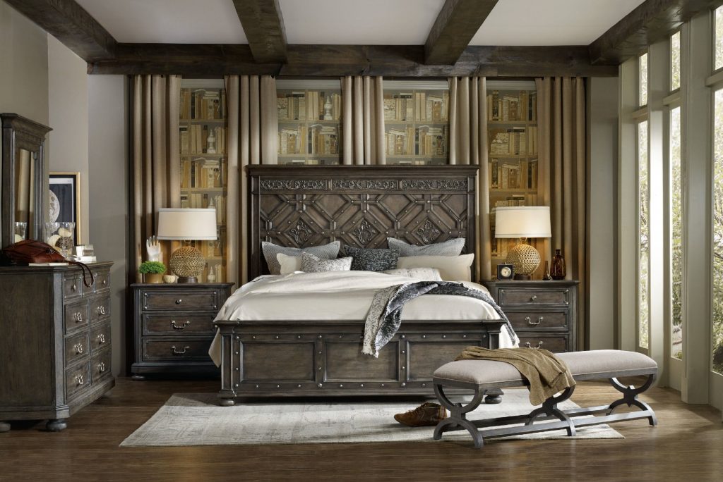
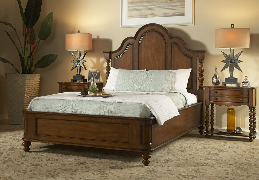
The Hooker Furniture Bedroom Vintage West California King Wood Panel Bed is the perfect focal point to your bedroom.
Turn Off Your Electronics
Put the TV set and the computers in areas where you are not supposed to relax. These are your home office and the entertainment area. Do not let these electronic appliances interfere with a good night’s sleep by putting them inside the bedroom or the living room. In their place, use throw pillows, lamp shades and the most calming colors that you could find.
Tags: adding colors to a home, creating a focal point, declutter, decluttering, determining the focal point, finding the focal point, focal point, houseplant, McCreerys, McCreerys Home Furnishings, nature, nature in interior design, nature-inspired design, nature-inspired home, outdoor view, tips
Posted in Home Maintenance, Interior Design 101 | No Comments »
Thursday, November 10th, 2016
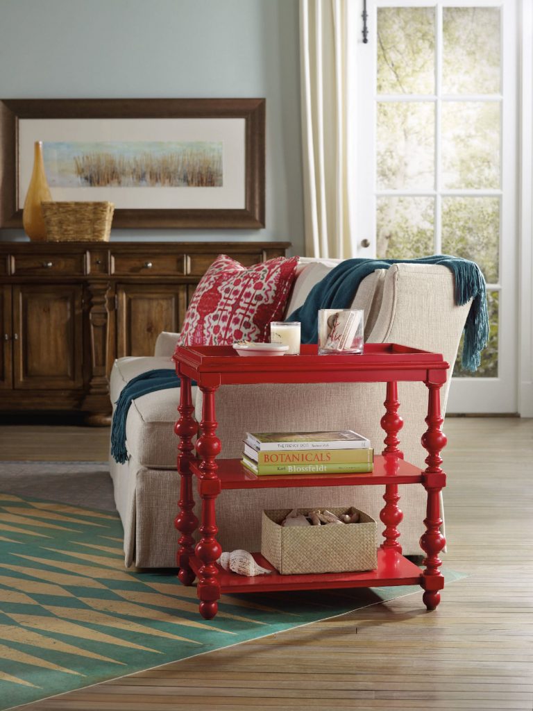
The Hooker Furniture Living Room Sanctuary Chairside Table is as unique and colorful as a side table could get.
When you approach interior design from a homeowner’s point of view, you probably just go about and pick the things that you think are attractive. Also, you tend to make your decisions based on any existing décor or pattern in your home. Color, however is such a powerful tool that you can use to evoke certain emotions. It can also create illusions of space or invoke a dramatic ambience.
Here are tips on how you can effectively use color psychology right in your home –
Bright Colors = Spaciousness
You can create an illusion of space if you use a lot of bright colors in your interior design. Use a lot of eggshells or yellows to make a space seemingly bigger. Don’t immediately go for white, though. Even when it is known to add space, it is not as effective as the tinted hues.
Bright Colors = Happy Educated Crowd
You can appeal to the tastes of the educated few if you learn how to fuse complex colors. For home interiors and exteriors, it has been observed that educated people find two-word colors to be more appealing. Simple colors, on the other hand, appeal to people with lower budgets and those that have lower education levels. When you’re out to pick complex colors, it is best to use names like eggshell white or lime green.
Red = Appetite
You can help build appetite in the dining room or the kitchen by using dashes of red or painting the walls with red paint. A lot of restaurants know this concept which is why they willingly paint their walls with solid red or red patterns.
Use red in the kitchen to up the appetite of people. You can have neutral walls made non-boring when you add red shutters or paint the cabinet doors with any shade of red.
Blended Interior + Exterior = Wow
When you use foyer blends by combining interior and exterior paint, you end up wowing your guests. The entryway or foyer becomes much more exciting if you use this technique.
Deep Tones = Warmth
You can warm up your home by using deep tones during the colder months. Use a lot of yellows, oranges, reds and browns. When you are about to paint your home during the winter because you’re staging it for future selling, remember this advice because it will make the house stand out.
Cool Colors = Fresh and Breezy
If deep tones keep homes warm during the winter, then the opposite, the cooler colors do otherwise. These colors are along the same hues used during fall, especially blue, so use them in abundance during the summer months. Have a white exterior plus a blue trim to achieve a Greek aura which is great if you want a cool-looking home during summer.
Familiar Colors = Fond Memories
If you decide to use familiar colors from your childhood or your not-so-distant past, then you will surely be reminded of wonderful memories. This becomes more special as you put these familiar colors in the kitchen, after all, what could be more pleasant than feeling like you’re back in Grandma’s kitchen?
Reds and yellows are perfect for that playful yet posh look for the kitchen. Don’t use red, though, if you have a high blood pressure. More so, stay away from dark shades of red so that irritability won’t ensue in the house.
Extend the familiar colors into other rooms such as the bathroom. If you love wearing a particular color, then use that same color in your bathroom. Having your fave color on the background will help you look more yearningly at the mirror inside the bathroom. Basically, you will tend to love yourself.
Tags: adding colors to a home, color 101, color basics, color options, color palette, colors, cool colors, McCreerys, McCreerys Home Furnishings, tips, warm colors, warm hues
Posted in Color Schemes, Interior Design 101, Interior Design Elements | No Comments »
Monday, October 3rd, 2016
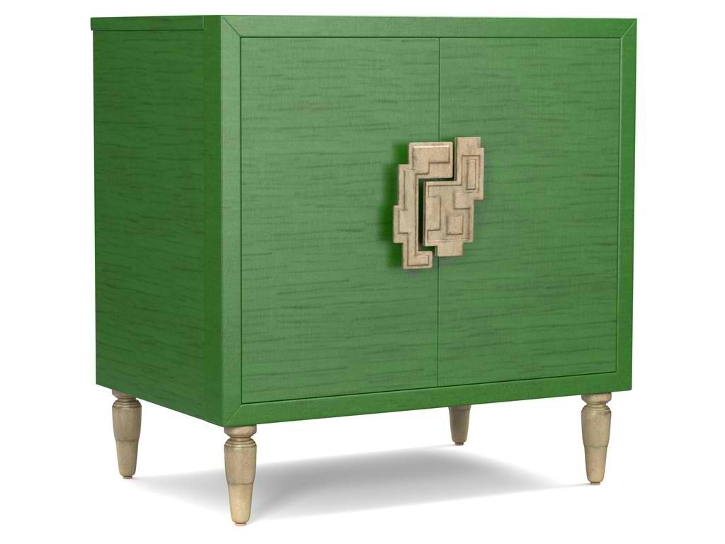
The green hue on this Cynthia Rowley for Hooker Furniture Living Room Sheridan Two-Door Chest 1586-50005-GRN is wonderfully prepped for 2017.
There is no doubt that color is an important element of interior design. It is one of the most influential aspects to human emotions. This is also the fastest way to update a room; what you need to do is just to apply a fresh coat of paint and you’re done. But what do different hues convey and what color forecast best fits the brave new year that is 2017?
Top Hues and Their Meanings
Red. This hue is often associated with determination, leadership and ambition. This can also connote physical desires which is why it is most used in many restaurants.
Pink. This hue represents intimacy, compassion and unconditional love.
Purple. This is the color of creativity and royalty.
Blue. This color represents loyalty, honesty as well as trust.
Orange. This bright hue is linked to optimism and motivation.
Green. This lively color represents vigor and energy. It is often used to create balance and stability.
Yellow. This is a hue that represents enthusiasm, fun, knowledge and hope.
Color Fundamentals
Color is affected by two aspects – the surroundings and the kind of light that shines on it. Try observing any room in your home. You’d soon see that the light is different during different times of the day. Comprehending how light can affect a space during different times of the day will give you the power to choose the correct color scheme that can be used all day through.
This same knowledge will also help you choose the best kind of lighting fixture for that room.
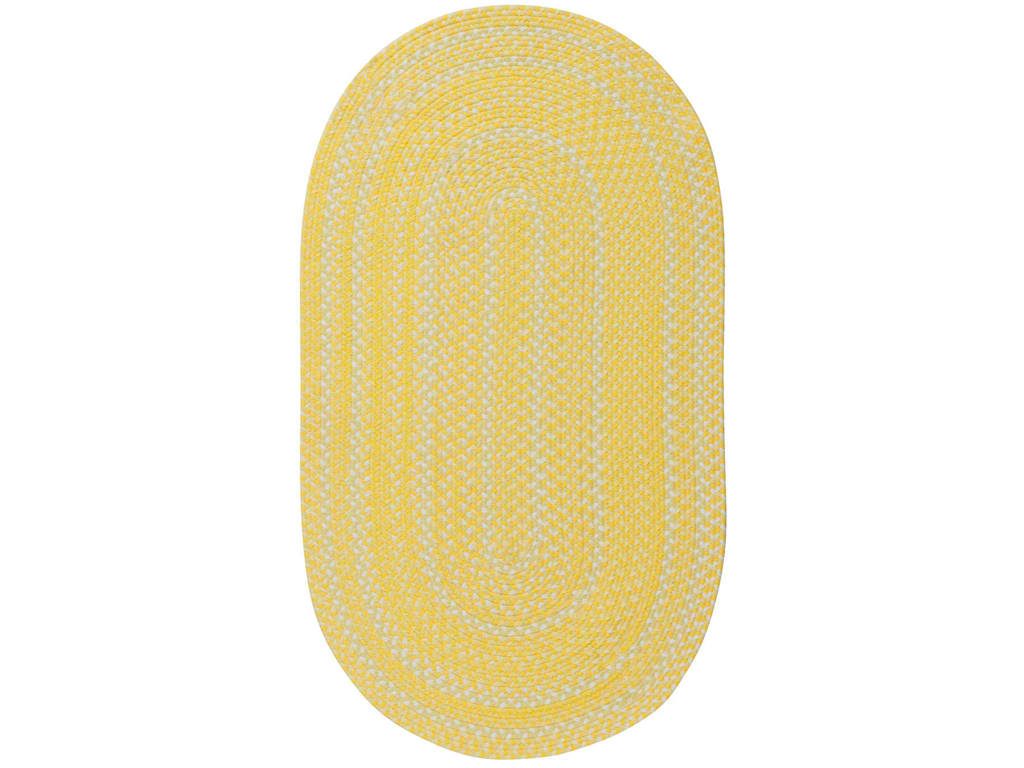
Capel Incorporated Floor Coverings Regatta Rug 0087NS Sunshine
Now, the Forecast
There are many color forecasts that are being done each year but one of the most esteemed are the picks made by Pantone. The upcoming year’s Color of the Year picks are calming, soft and wonderfully romantic. Now don’t worry if those aren’t your exact wish as a color for your home.
Leatrice [Lee] Eseman shared a handful of color palettes that you could choose from. These are all predictably popular colors for the upcoming year that you can use to beautify your home. These colors were also chosen because they address the consumers’ craving for colors that are comfortable yet new. Design trends became inspirations for many of these palettes, so was the film industry (e.g. The Peanuts Movie, Star Wars: The Force Awakens, etc.).
So go ahead and make use of anything silver and metallic or anything bright and colorful (if Charlie Brown inspires you the most). Say yes to orange chiffon, melon as well as dove gray. Grape and lime are also good colors.
Apart from these, there will also be an abundance of florals this upcoming year. Floral hues such as red Dahlia or pink yarrow, plus any shade of green may be acquired tastes but they are beautiful and not-oft used colors.
Gray and red will remain popular in 2017. They will both appear in warmer hues with the backdrop being that of bolder colors. Yellows that look perfect in a harvest setting will also get a lot of attention in the coming year. Yellow with hints of earthiness will look great and would be effectively grounded by classic red or blue.
Any youthful color is also a great choice in 2017. Now don’t be limited to the age-appropriate colors, rather, look for youthful colors with an attitude. So no matter what your age, you can use color palettes that are fluid and can easily morph in the 2017 surroundings.
Find celebratory hues that hail technology and nature. The former will continue to play a vital role in people’s lives. Evolving technology will continue to inspire ambience that is dark or in commanding grays.
Those who love deep plum would also find it a great news that the color forecast for 2017 also includes this hue.
Tags: 2017 color trends, adding colors to a home, blue, bold colors, bold hues, color choices, green, McCreerys, McCreerys Home Furnishings, orange, pink, purple, yellow
Posted in 2017 Trends, Color Schemes, Interior Design 101, Interior Design Elements, Interior Design Themes | No Comments »
Wednesday, September 14th, 2016
FFDM Harbor Springs Collection features these contrasting yet matching hues of natural and whitewashed wood.
Every color is crucial in creating beautiful things in this world. Whether you need colors on your clothes or the interiors of your home, it is the same. While colors are this important, not everyone has the innate skill to point out which color goes with which and which ones would clash. If you cannot trust your eyes to make that judgment for you, then here are some guidelines –
Study the Color Wheel
The basic color wheel should be able to guide you when you make your color choice. You should have seen this colorful pie graph in school but here’s a little something to juggle your memory –
Red, blue and yellow are the three primary colors. Mix red with yellow and what you achieve is orange. Fuse blue and yellow to get the color of nature – green. To get violet, mix red and blue. These are what are known as secondary colors.
Tertiary colors, on the other hand, are the result of the fusion of a primary color and a secondary color. An example is red-violet or and blue-violet.
Every color has tints and shades. The first is a variation of any color when it is mixed with white. Red mixed with white achieves pink which is, in essence, a tint. Shade is a variation of any color when it is mixed with black. Don’t worry too much about shades and tints; what you need to focus on are harmonious color combinations and how to distinguish them.
Color Harmony
The color theory points out that harmonious colors are those that use any two hues that are opposite each other on the wheel. Three colors that are equally spaced on the wheel (or that form a triangle), colors that form a rectangle, are harmonious colors.
These are perfect color schemes or the more proper term is – color harmony. A color scheme should always be harmonious despite the rotation angle.
1586-10458-GRY1 Note-To-Self Writing Desk 1586-75410D-GLD6 Swanson Upholstered Metal Side Chair is featured in a cool, Nordic-themed room.
Warm and Cool Hues
Another separation that you need to be conscious of are warm and cool hues. Every group has its purpose and a spectrum of emotions to convey. Warm colors convey joy, energy and productivity while cool hues convey peace and calmness.
The color wheel can be easily divided if you want to group the warm and cool hues.
Basic Color Schemes
There are fundamental rules to commit to memory if you want to master how to match colors. Don’t worry, they’re quite simple.
Complementary colors are the ones that sit opposite each other on the color wheel (e.g. red and green or blue and orange). These colors have a high contrast so it is best to use them if you want to make a statement. You can use one color as the background and the other as the accent.
You can use shades and tints alternately, for instance, a lighter tint of red can contrast a darker shade of green.
Split complementary hues make use of three colors. This color scheme uses one color plus two adjacent colors. An example is blue, red-orange and yellow-orange. This color scheme is ideal for neophyte interior designers and decorators. This is the scheme to use if you don’t wanna mess up.
Analogous colors are three colors that are next to each other. Yellow, yellow-orange, and orange is an awesome example. This color scheme can be jarring if you mistakenly combine warm and cool colors so be careful.
Triadic colors can also be used in your home. This color scheme is achieved if you use any three colors that sit equally apart. An example of these hues on the color wheel are red, yellow and blue. This is also a high contrast scheme but it is more balanced when compared to complementary colors.
Now that you know the basics, are you ready to experiment on your home’s color schemes?
Tags: adding colors to a home, color 101, color basics, color harmony, color wheel, cool colors, cool hues, harmony, McCreerys, McCreerys Home Furnishings, shades, studying the color wheel, tints, warm colors, warm hues
Posted in Color Schemes, Interior Design 101, Interior Design Elements | No Comments »
Tuesday, July 19th, 2016
FFDM Summer Home Collection: The unifying color in this traditional bedroom is brown in different shades.
Color preferences vary per person, per personality. Some folks like it bright and daring, some feel more secure with neutrals, still others like to experiment. The good news when it comes to using colors is that there is no such thing as a correct palette.
Have you ever gotten inside a home where there is an explosion of colors only to feel that every room seems to be detached from the rest? What’s missing here is what’s referred to by interior designers as cohesion.
The Cohesive Paint Color
A simple way of creating a more cohesive feel is to have color consistency on walls. Connecting spaces, in particular, should have paint color that will harmonize them. This is especially true in an open floor plan.
This does not mean that you should automatically resort to gray, white or beige. You can still use a color that suits your preference so long as the hallways, the foyer and the main connector room are all painted in the same color. The color that you use there will serve as the dominant color in your home.
Plan the Color for Sightlines
People who want variety in their wall colors should pay more attention to sightlines. These are those areas when you are standing inside the living room and you get to look into the other rooms. A clear view of the dining room or the kitchen from there means you have to paint these three rooms with the same paint color. The key here is for all three rooms to work together. Paint them in different colors and what you’d get is a weird look that simply won’t work.
Hooker Furniture Dining Room Sunset Point Rectangle Dining Table with Two 18in Leaves
Pick Color Groups
Just as you are admonished to choose your friends well, this is also the case when it comes to choosing your color gang. Your color scheme must effortlessly flow from one room to the next. To achieve this, make sure that you get colors from the same temperature family.
Some people choose to work with the warm color palette, others the cool color scheme such as the blues, grays, and greens.
Another option is to pick one or two hues then use variations. If blue happens to be the main color, then you could pair it with gray-blue or you can always go with pure blue which shifts to navy blue as you move from one room to the other.
This same concept can be used in using decorative accessories.
As for your wall paint, paint stores can provide you with tint of particular colors. Your chosen main color can be knocked down to about 50%; all the mixer has to do is to add more white each time. You can go lighter or darker with the main color that you choose.
Walls should be painted two to three shades lighter than the ceiling color. This won’t look stark when you decide to use white.
Paint decks are also great inspirations in finding colors that harmonize.
Edgy Colors, Hid
Rooms that are out of sightline are great places to experiment on in terms of wilder colors. Powder rooms, master bedrooms, kids’ rooms, and other rooms that are encased in four walls are places that you could colorfully indulge.
So, have you always wanted to paint a room black? Begin with the bathroom!
Bold Colors, Cute Accessories
Accessorizing is an easy way of introducing dramatic hues. Limit the bold colors on your accessories, this is if you’re still uncomfortable about the whole switch from neutrals to bold colors.
Choose a color that will excite the senses, bright colors are great in highlighting a thing or worth.
Tie the rooms with accent colors that alter from room to room, though continuing with the major color throughout. Blue and green in the living room, for example, will mean using one of these colors inside the dining room. You could do blue and yellow in the next room.
Always keep the colors cohesive so that your theme would make more sense to you.
Tags: adding colors to a home, color 101, color basics, color harmony, harmony, McCreerys, McCreerys Home Furnishings, symmetry
Posted in Interior Design 101, Interior Design Elements | No Comments »
Monday, July 18th, 2016
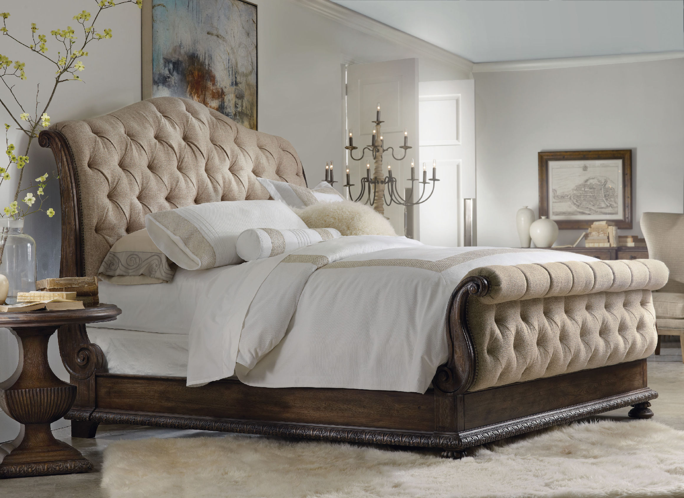
The Hooker Furniture Bedroom Rhapsody King Tufted Bed is nested in a neutral background. Its wooden frame pops from this sea of neutrals.
Muted tones are the go-to colors when you want to be safe with your interior design; yet, at times, you would think what you have created is a masterpiece of muted tones only to end up with a bright, colorful mess.
Neutral tones only become effective in interiors if you know which elements to work with. You need to be subtle, to begin with, and creative enough to make the muted tones more interesting. Know the basics such as which paint color goes with which furniture and what rugs to use on certain areas. After you figure out the major elements, it is also your duty to come up with the pieces that will populate your home such as potted plants, books, artwork, and other things that would bring a personal touch to your place.
Always Within Bounds
The walls are your biggest challenge when it comes to choosing the right color. There is a wide array of shades that come from the same color family so it is wise to choose from within these. Whether you go from ligher to darker or the other way around, picking colors that come from the same color family will give your home a unified look.
Espoused Colors
A basic palette for any room is the tone-on-tone neutrals plus two accent hues. An example is having blue trim paired with an orange-red area rug.
Layer with Love
Homeowners always default to the creation of a purposeful interior. Layering is great for your interiors so long as you use colors in moderation. Again, just to be on the safe side, neutrals can make your life a whole lot easier.
A natural woven area rug will surely work well with in pulling together the rest of the décor. This is a piece that automatically adds texture and softness. In addition to this, pick artworks when you are out to coordinate or complement colors. Art pieces should be in proportion with the room. A few large artworks render a better visual effect than a group of smaller ones. This is – if – you are aiming for the classic look.
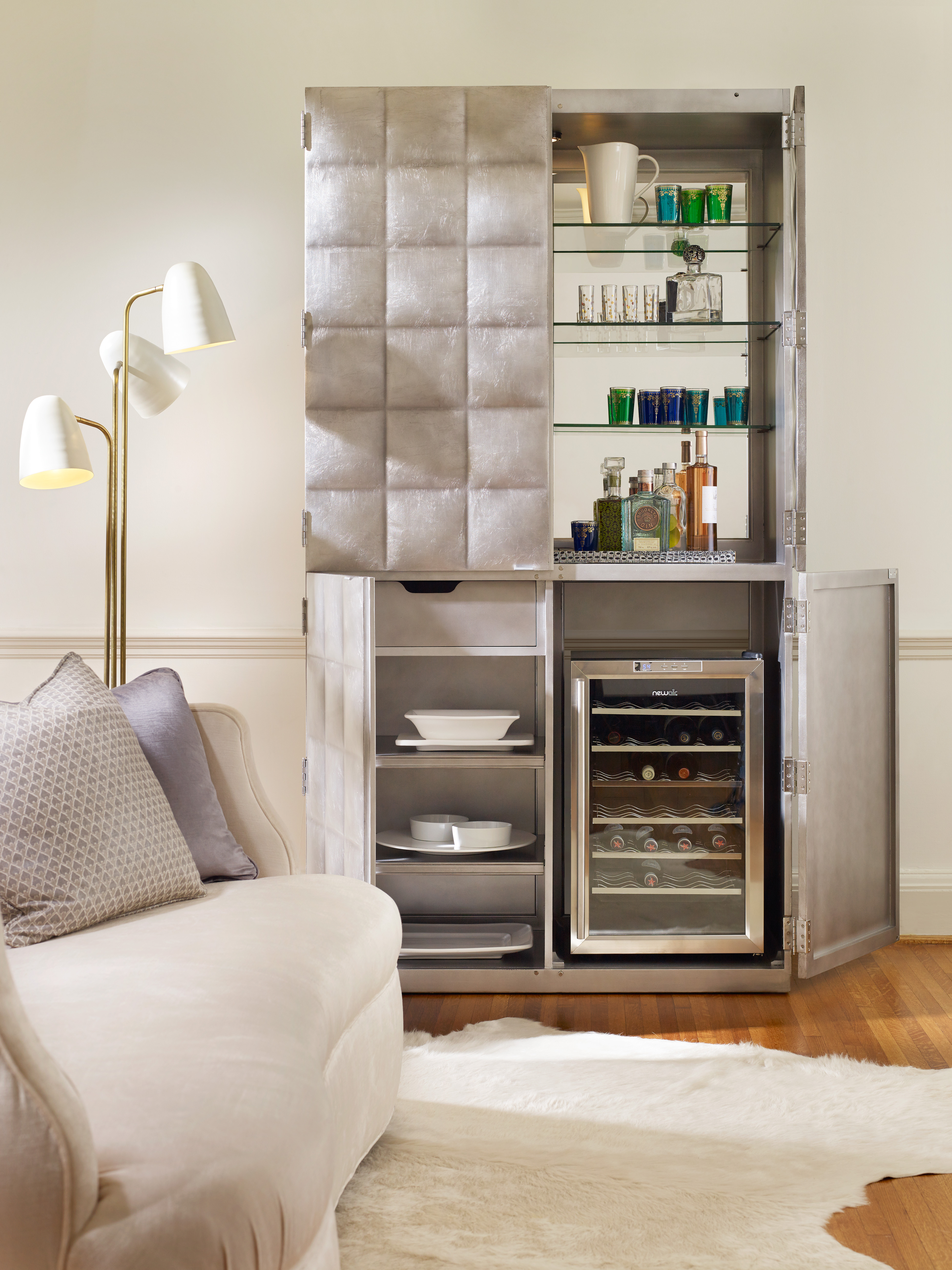
1586-50011-SLV2 Alchemist Bar Cabinet
Balance In All Things
As you work with neutrals in your contemporary kitchen, keep glossy cabinets and pieces with sharp edges grounded by having organic elements brought in. Wooden finishes have the power to amplify the beauty of streamlined looks; so bring softness inside the kitchen by having wooden countertop.
Infuse Lively Colors
Don’t think that life in colors is limited only to the bright hues. You can still use neutral colors but still achieve the beauty of a lively interior. Neutrals provide the usual serenity and cleanliness but there is also no denying that they can enhance the mood in any room.
Raspberry-colored pillows, for instance, that have the same prints as your neutral wallpaper would surely jive.
Don’t Forget the Frivolity
Most of the time, you are so engrossed on how the room would eventually look that you end up missing out on special elements that should be used. Lighten the mood with exciting accessories such as animal print pillows with neutral colors blending well with the rest of the design elements.
If you prefer neutral design with a little edge, then go ahead and combine gray or white walls with some industrical accent pieces. There are many industrial-themed pieces in the market now that will provide a convincing aged look for your home.
Being frivolous is simple if you add some natural elements such as potted plants into your home. Successful neutral design is all about popping the right elements against a muted background. Achieve this and you’re already an expert in your own right.
Tags: adding colors to a home, McCreerys, McCreerys Home Furnishings, neutral design, neutral hues, neutral interior design, neutral interiors, neutrals, tips
Posted in Interior Design 101, Interior Design Themes | No Comments »
Friday, June 10th, 2016
FFDM’s Summer Home Collection: Striking contrasts are seen in different design elements here from the shiny woodworks, to nature’s touch, and some metallic and ceramic elements.
Have you ever tried to define the word contrast? This is an oft used word in the world of interior design. Dictionaries define this term as the combination of unlike elements such as tone, colors, textures, patterns or emotions. This can be further defined as the lightest versus the darkest parts of a photo, painting or any other work of art.
Dullness vs. Contrast
Take a careful look at most black and white photographs; these are often difficult to read since there is no color contrast to begin with. This kind of photograph often appears flat except when taken at an angle where the depth is clearly defined. If there is any contrast in a black and white photo, these are the tonal contrasts.
To further define contrast, this is the comparison of two things with respect to their differences. This can also be similar objects but with dissimilar qualities.
Are you starting to get the concept of contrast now? No?
Examples of Contrast
One example of contrast is when an interior designer would want to highlight the intricate designs of a cream-colored cabinet inside a kitchen. This can be achieved if you use a charcoal wall as backdrop. The cabinets would appear to be the star of the show once you achieve this.
This kind of contrast is what’s known as achromatic. This is the contrast between two opposing shades – black and cream.
Contrasts can also be seen in nature each day. The white sheep grazing on the green, grassy landscapes; an orange buoy in the midst of the blue sea; white snow and some black rocks nestled beneath it; and many such contrasts.
The marriage of fabric and metal in this Miles Talbott Living Room Mesa Chair JR-9440-C is perfect for any living room.
Contrast: A Composition Element
Contrast is a crucial part of composition. You can easily create contrast, more frequently with colors. At times, you can make subtle contrast with texture. Rooms can also play with different forms of shapes which can also represent a kind of contrast.
Geometric pieces like curvy ones can play contrasting roles with edgy pieces.
Above any element, you need to consider the color contrast when you are out to achieve opposition. Contrast makes objects distinguishable.
Here are seven kinds of contrast according to Johannes Itten –
Tags: adding colors to a home, color 101, color basics, contrast, contrast in design, contrast in interior design, McCreerys, McCreerys Home Furnishings, mixing colors
Posted in Color Schemes, Interior Design 101, Interior Design Elements | No Comments »
Friday, May 6th, 2016
FFDM’s Protege collection offers this interesting, multi-colored seating piece.
Having the will to tackle a multi-colored theme project in your home requires a lot of vision. When you are set to do this, begin by looking at walls, ceilings and floors as empty canvasses that need to be filled with exciting colors. A multi-color palette may not be an easy theme to project but you will certainly find joy once you accomplish it.
A multi-color scheme looks best when there is one dominant color that will anchor the rest together. With this in mind, you need to come up with a color palette that you really love to begin with. After choosing the color that tickles your senses, you can then determine the colors that will contrast or complement your chosen anchor color. As soon as you have decided on these, find out which other colors you will add to the existing pool.
Hiring a Professional Colorist
It is advisable that you find a professional colorist if this is your first time to delve into the multi-color scheme. The judgment of such professionals are highly esteemed so all you’ll need to do is to meet up with some of them, decide whose portfolio impresses you the most, then sit down and have a heart-to-heart talk with the winning fellow. Cut through the usual chitchats. Tell the colorist what you want from the onset. Remember that you are still the boss and that the colorist should know how to fuse your ideas with his color expertise.
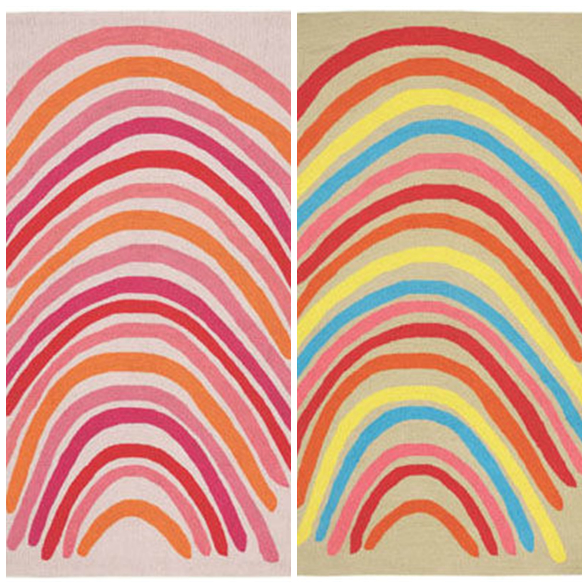
From L-R: Capel Incorporated Floor Coverings Rainbows; Capel Incorporated Floor Coverings Rainbows.
What to Discuss
Before you set that meeting with the colorist, you can begin your color search by cutting some color cards. These samples can be set up against the walls so you’ll have an idea on how they will look. Place one color card after the other and see how they will interact. See how each color looks under natural and artificial lighting.
You can also use a color visualizer. This is often available in paint shops or in paint manufacturers’ websites. This is a special software that will help you experiment with colors without making your walls look like toddler’s playroom.
The development of a multi-color palette can also begin with the purchase of paint samples. There are also swatches that you can use right onto your walls. Using these may take a bit more effort but seeing the results will help you make a more intelligent decision.
Whichever technique you use to create the color plan for your home, always make sure that the dominant color you chose will still be the star of the show. This should be used in no less than 40% of the interior design elements. The secondary color can have 25%, with the rest taking in the rest of the percentage.
Rainbows and Stripes? Why Not?
It is easy to be bold when one uses colors. Varying shades bring about different patterns which, in turn, evoke different emotions.
If you want to go a step further and employ stripes with colors, then you’re in for a real adventure. This combination creates the most exciting visual delights.
Versatility is key to achieving balance even when presented with a lot of activity – imagine using colors and stripes. Adding drama to the room could be the use of bold yet contrasting colors it could be the installation of wide-striped wallpapers as backdrop for multi-colored furniture.
If you want something subtler, then settle for monochromatic stripes instead. These are less distracting.
The way the stripes are presented can also create different illusions. Vertical stripes create height while horizontal ones can make a small room seem wider.
Stripes can also harmonize any busy space. These are simple, parallel lines that can interact with any kind of graphics. Add stripes to some colorful florals and the latter become immediately grounded.
Take time to try different combinations for stripes and your multi-color palette. It’s an awesome way to enliven your home.
Tags: adding colors to a home, bright colors, bright hues, bright paint colors, brightening up rooms, brightening up your home, color consultant, McCreerys, McCreerys Home Furnishings, multi-colored interiors, multi-colored palette, rainbow interior design, rainbow interiors
Posted in Color Schemes, Interior Design 101, Interior Design Elements, Interior Design Themes | No Comments »
Saturday, April 30th, 2016
FFDM Vintage Classics features this wooden piece complete with mirror and other interesting accessories to welcome your guests.
Do you believe that you’ve only got one chance to make a good lasting impression? This means you have to make the entry way as welcoming as possible to all of your guests. The entry way reflects who you are as a person. This should be a place where comfort and happiness fuse as people walk through the first door of your home.
Here are ways to set the tone for the rest of your place –
Layer the Light
A beautiful lantern can make a huge difference in a relatively small place. The entry way can also be the perfect place for a table lamp or a beautiful wall sconce. There are various lighting options for different moods.
Iron sconces can add a unique sense of style in a place where an added glow is much welcome.
A fabulous pendant lighting fixture can also make a huge difference. Actually, it can make or break the look offered by beautiful doors and carvings. This is not a usual fix that homeowners do to their entry ways, however, this is a spot that you need to spend more time and money on.
Vintage lighting will give the area a distinctive appeal. If you have an old home with equally old wiring, make sure that you commission a competent electrician to update the wiring systems for you. After the rewiring project, you can already spruce up the place with a new paint job or by adding interesting accessories and furnishings.
Highlight the Art
In many apartments, entry ways are quite small but this does not automatically mean that you can no longer make a statement. Your home’s entry way can still be chic if you hang the correct kind of artworks.
Install a statement mirror or a geometric rug to warmly welcome guests. Let them feel that they are welcome in your home and that they are about to see a stylish dwelling.
Your statement piece can be one unique piece that is an heirloom. Or it can be a piece of furniture that is newly-bought yet has the features of a would-be heirloom.
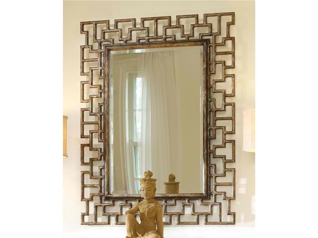
Hooker Furniture Accents Fretwork Mirror spells rustic especially when paired with the wooden Asian sculpture.
Correct Scaling
That grand foyer with a small table is a rather saddening state to be in. A beautiful, spacious entry way must have a fabulously large console table, a huge mirror, and a bench. Sconces should be present not just to welcome guests but more to highlight the beautiful architectural structures and beautiful furniture pieces.
Accents such as bins of flowers, an umbrella stand, and throw pillows will add a dash of personality to a usually regular-looking entry way.
Style Extension
The entry way must show your visitors what they would see inside your home. If you used rustic textures in your entry way, then these must also be seen in other rooms.
Set the tone at the entry way.
A Rug Is a Must
Sometimes, the entry way dimensions can be a tad trickier for rug placement. The floor is a wonderful place to put color, pattern and softness. Since the entry way has high foot traffic, find a rug that can sustain this kind of traffic.
Be Bold, Dazzle ‘Em
Primary colors can offer an awesome entry way to any home. Nautical style can be started with a basket of oars right by the entry way. Geometric rug in bright colors spells playful and unique.
Architecture needs to be respected. You can still show your personality through wall covering. Wallpapering is a classical take on beautifying the walls yet it comes with a modern twist. You might also have an art collection that can be highlighted by the right wallpaper.
Tags: adding colors to a home, area rug, art, artwork on walls, bold, decorating the entry way, decorating with area rugs, designing the entry way, displaying art, displaying artwork, entry way, entry way design, entry way style, geometric, geometric concept, geometric patterns, geometric style, layering, layering lights, McCreery's Furnishings, McCreerys, McCreerys Home Furnishings, textures, tips
Posted in Interior Design 101, Interior Design Elements, Special Rooms In Your Home | No Comments »
Follow us on our social media
© McCreery's Home Furnishings | All Rights Reserved | Privacy Policy