- Follow us:


Tuesday, July 4th, 2017
(The First of a Six-Part Series)
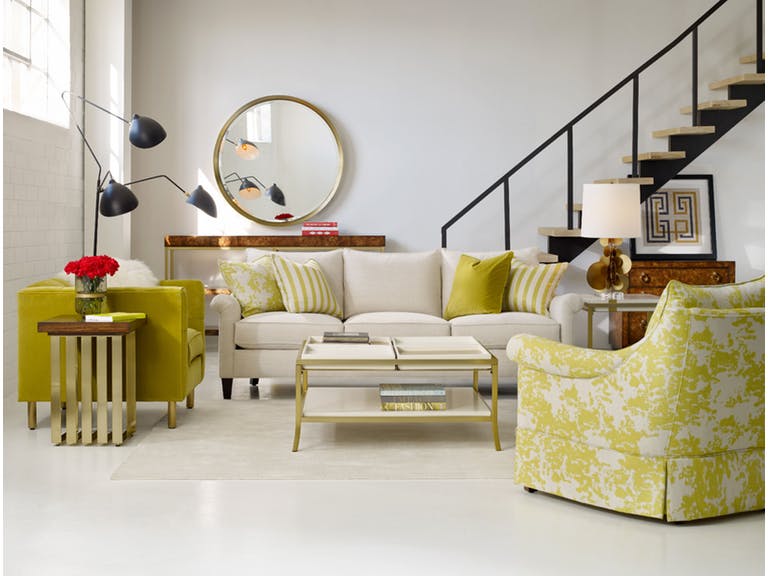
Cynthia Rowley’s Rivington 3-Over-3 Sofa together with the most colorful decorative elements to adorn a living room.
Adding color to your home – or at the very least, conceptualizing how the hues will make your habitat more amazing – is also a way to add more color to your life. Yet there are a lot of questions as to what paint color to use in a home as well as color predicaments like whether to pick gray or blue.
Of course we won’t be able to send you paint swatches just so you know how to begin your color 101 journey. What you can do is to read this series of color and paint basics that will teach you how to shop for the best colors and to effectively use them in your home.
This first of a six-part series will teach you about color fundamentals – this is more like a crash course to reading the color wheel and how to harmonize hues.
Matching and mixing colors is no easy business, though. Don’t get the idea that everyone can do this without any knowledge of color fundamentals, don’t feel, insecure in pairing unique hues, too. It’s all about learning the science and the art behind it all and being comfortable in using it in your own home.
Decorating with Hues
It is crucial to keep the color theory in mind when it comes to color decoration. Before you start thinking if it’s complicated or not, here are the basic principles –
Color theory also creates logical color structure. For instance, you could have a bunch of vegetables and fruits. Color theory would dictate that you would organize these based on their color relation. The oranges would sit next to the lemons while the lemons would be right next to the green apples which sit right next to the blueberries, and so on.
Don’t fret, it is not as complex as it seems to sound. You just have to, primarily, orient yourself to the color wheel. This is a tool, a handy helper of sorts, which will guide you in picking the specific colors – even down to the specific shades – that you want.
The color wheel comprises 12 basic colors which are –
When dealing with paint, remember these terms –
Shade means any pure hue fused with black.
Tone is a hue mixed with gray.
Hue is any pure color with the exception of white or black.
Tint is a color mixed with white.
Here are the fundamental color harmonies that you need to keep in mind –
Analogous hues are three hues that sit side-by-side on your color wheel such as green, yellow green and yellow.
Note that every hue outside of these already come from a mixture of hues to varying degrees.
Use the color wheel and these basic color guides so you don’t go wrong. Also, make it a point to look at Mother Nature for color inspirations. Just imagine a red flower encircled by green and yellow leaves. All these, the color of the leaves, the flowers and grass, all are inspirations for your color palette.
What about you, what are your color inspiration sources? Look around you – the possibilities are actually endless.
Tags: color 101, color basics, color choices, color combination, color fusion, color options, color palette, color schemes, McCreerys, McCreerys Home Furnishings
Posted in Color Schemes, Interior Design 101, Interior Design Elements | Comments Off on Color 101: Using the Color Wheel, Choosing and Matching Hues
Thursday, November 10th, 2016
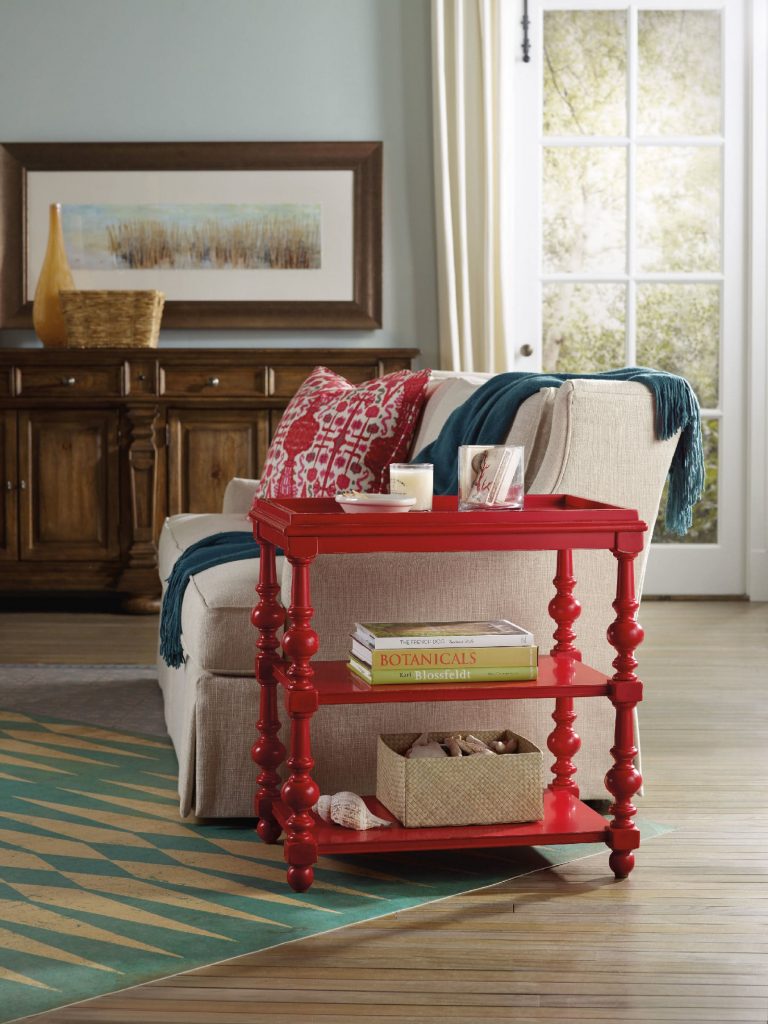
The Hooker Furniture Living Room Sanctuary Chairside Table is as unique and colorful as a side table could get.
When you approach interior design from a homeowner’s point of view, you probably just go about and pick the things that you think are attractive. Also, you tend to make your decisions based on any existing décor or pattern in your home. Color, however is such a powerful tool that you can use to evoke certain emotions. It can also create illusions of space or invoke a dramatic ambience.
Here are tips on how you can effectively use color psychology right in your home –
Bright Colors = Spaciousness
You can create an illusion of space if you use a lot of bright colors in your interior design. Use a lot of eggshells or yellows to make a space seemingly bigger. Don’t immediately go for white, though. Even when it is known to add space, it is not as effective as the tinted hues.
Bright Colors = Happy Educated Crowd
You can appeal to the tastes of the educated few if you learn how to fuse complex colors. For home interiors and exteriors, it has been observed that educated people find two-word colors to be more appealing. Simple colors, on the other hand, appeal to people with lower budgets and those that have lower education levels. When you’re out to pick complex colors, it is best to use names like eggshell white or lime green.
Red = Appetite
You can help build appetite in the dining room or the kitchen by using dashes of red or painting the walls with red paint. A lot of restaurants know this concept which is why they willingly paint their walls with solid red or red patterns.
Use red in the kitchen to up the appetite of people. You can have neutral walls made non-boring when you add red shutters or paint the cabinet doors with any shade of red.
Blended Interior + Exterior = Wow
When you use foyer blends by combining interior and exterior paint, you end up wowing your guests. The entryway or foyer becomes much more exciting if you use this technique.
Deep Tones = Warmth
You can warm up your home by using deep tones during the colder months. Use a lot of yellows, oranges, reds and browns. When you are about to paint your home during the winter because you’re staging it for future selling, remember this advice because it will make the house stand out.
Cool Colors = Fresh and Breezy
If deep tones keep homes warm during the winter, then the opposite, the cooler colors do otherwise. These colors are along the same hues used during fall, especially blue, so use them in abundance during the summer months. Have a white exterior plus a blue trim to achieve a Greek aura which is great if you want a cool-looking home during summer.
Familiar Colors = Fond Memories
If you decide to use familiar colors from your childhood or your not-so-distant past, then you will surely be reminded of wonderful memories. This becomes more special as you put these familiar colors in the kitchen, after all, what could be more pleasant than feeling like you’re back in Grandma’s kitchen?
Reds and yellows are perfect for that playful yet posh look for the kitchen. Don’t use red, though, if you have a high blood pressure. More so, stay away from dark shades of red so that irritability won’t ensue in the house.
Extend the familiar colors into other rooms such as the bathroom. If you love wearing a particular color, then use that same color in your bathroom. Having your fave color on the background will help you look more yearningly at the mirror inside the bathroom. Basically, you will tend to love yourself.
Tags: adding colors to a home, color 101, color basics, color options, color palette, colors, cool colors, McCreerys, McCreerys Home Furnishings, tips, warm colors, warm hues
Posted in Color Schemes, Interior Design 101, Interior Design Elements | No Comments »
Wednesday, September 14th, 2016
FFDM Harbor Springs Collection features these contrasting yet matching hues of natural and whitewashed wood.
Every color is crucial in creating beautiful things in this world. Whether you need colors on your clothes or the interiors of your home, it is the same. While colors are this important, not everyone has the innate skill to point out which color goes with which and which ones would clash. If you cannot trust your eyes to make that judgment for you, then here are some guidelines –
Study the Color Wheel
The basic color wheel should be able to guide you when you make your color choice. You should have seen this colorful pie graph in school but here’s a little something to juggle your memory –
Red, blue and yellow are the three primary colors. Mix red with yellow and what you achieve is orange. Fuse blue and yellow to get the color of nature – green. To get violet, mix red and blue. These are what are known as secondary colors.
Tertiary colors, on the other hand, are the result of the fusion of a primary color and a secondary color. An example is red-violet or and blue-violet.
Every color has tints and shades. The first is a variation of any color when it is mixed with white. Red mixed with white achieves pink which is, in essence, a tint. Shade is a variation of any color when it is mixed with black. Don’t worry too much about shades and tints; what you need to focus on are harmonious color combinations and how to distinguish them.
Color Harmony
The color theory points out that harmonious colors are those that use any two hues that are opposite each other on the wheel. Three colors that are equally spaced on the wheel (or that form a triangle), colors that form a rectangle, are harmonious colors.
These are perfect color schemes or the more proper term is – color harmony. A color scheme should always be harmonious despite the rotation angle.
1586-10458-GRY1 Note-To-Self Writing Desk 1586-75410D-GLD6 Swanson Upholstered Metal Side Chair is featured in a cool, Nordic-themed room.
Warm and Cool Hues
Another separation that you need to be conscious of are warm and cool hues. Every group has its purpose and a spectrum of emotions to convey. Warm colors convey joy, energy and productivity while cool hues convey peace and calmness.
The color wheel can be easily divided if you want to group the warm and cool hues.
Basic Color Schemes
There are fundamental rules to commit to memory if you want to master how to match colors. Don’t worry, they’re quite simple.
Complementary colors are the ones that sit opposite each other on the color wheel (e.g. red and green or blue and orange). These colors have a high contrast so it is best to use them if you want to make a statement. You can use one color as the background and the other as the accent.
You can use shades and tints alternately, for instance, a lighter tint of red can contrast a darker shade of green.
Split complementary hues make use of three colors. This color scheme uses one color plus two adjacent colors. An example is blue, red-orange and yellow-orange. This color scheme is ideal for neophyte interior designers and decorators. This is the scheme to use if you don’t wanna mess up.
Analogous colors are three colors that are next to each other. Yellow, yellow-orange, and orange is an awesome example. This color scheme can be jarring if you mistakenly combine warm and cool colors so be careful.
Triadic colors can also be used in your home. This color scheme is achieved if you use any three colors that sit equally apart. An example of these hues on the color wheel are red, yellow and blue. This is also a high contrast scheme but it is more balanced when compared to complementary colors.
Now that you know the basics, are you ready to experiment on your home’s color schemes?
Tags: adding colors to a home, color 101, color basics, color harmony, color wheel, cool colors, cool hues, harmony, McCreerys, McCreerys Home Furnishings, shades, studying the color wheel, tints, warm colors, warm hues
Posted in Color Schemes, Interior Design 101, Interior Design Elements | No Comments »
Tuesday, July 19th, 2016
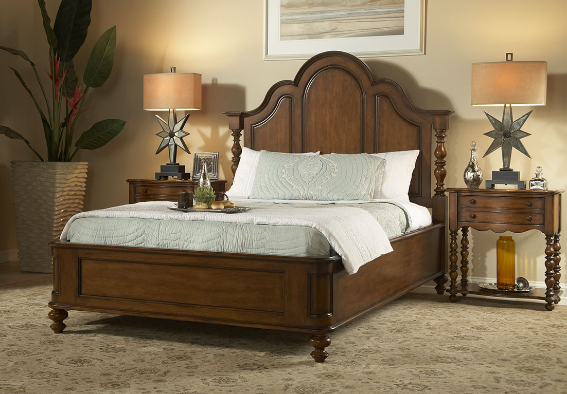
FFDM Summer Home Collection: The unifying color in this traditional bedroom is brown in different shades.
Color preferences vary per person, per personality. Some folks like it bright and daring, some feel more secure with neutrals, still others like to experiment. The good news when it comes to using colors is that there is no such thing as a correct palette.
Have you ever gotten inside a home where there is an explosion of colors only to feel that every room seems to be detached from the rest? What’s missing here is what’s referred to by interior designers as cohesion.
The Cohesive Paint Color
A simple way of creating a more cohesive feel is to have color consistency on walls. Connecting spaces, in particular, should have paint color that will harmonize them. This is especially true in an open floor plan.
This does not mean that you should automatically resort to gray, white or beige. You can still use a color that suits your preference so long as the hallways, the foyer and the main connector room are all painted in the same color. The color that you use there will serve as the dominant color in your home.
Plan the Color for Sightlines
People who want variety in their wall colors should pay more attention to sightlines. These are those areas when you are standing inside the living room and you get to look into the other rooms. A clear view of the dining room or the kitchen from there means you have to paint these three rooms with the same paint color. The key here is for all three rooms to work together. Paint them in different colors and what you’d get is a weird look that simply won’t work.
Hooker Furniture Dining Room Sunset Point Rectangle Dining Table with Two 18in Leaves
Pick Color Groups
Just as you are admonished to choose your friends well, this is also the case when it comes to choosing your color gang. Your color scheme must effortlessly flow from one room to the next. To achieve this, make sure that you get colors from the same temperature family.
Some people choose to work with the warm color palette, others the cool color scheme such as the blues, grays, and greens.
Another option is to pick one or two hues then use variations. If blue happens to be the main color, then you could pair it with gray-blue or you can always go with pure blue which shifts to navy blue as you move from one room to the other.
This same concept can be used in using decorative accessories.
As for your wall paint, paint stores can provide you with tint of particular colors. Your chosen main color can be knocked down to about 50%; all the mixer has to do is to add more white each time. You can go lighter or darker with the main color that you choose.
Walls should be painted two to three shades lighter than the ceiling color. This won’t look stark when you decide to use white.
Paint decks are also great inspirations in finding colors that harmonize.
Edgy Colors, Hid
Rooms that are out of sightline are great places to experiment on in terms of wilder colors. Powder rooms, master bedrooms, kids’ rooms, and other rooms that are encased in four walls are places that you could colorfully indulge.
So, have you always wanted to paint a room black? Begin with the bathroom!
Bold Colors, Cute Accessories
Accessorizing is an easy way of introducing dramatic hues. Limit the bold colors on your accessories, this is if you’re still uncomfortable about the whole switch from neutrals to bold colors.
Choose a color that will excite the senses, bright colors are great in highlighting a thing or worth.
Tie the rooms with accent colors that alter from room to room, though continuing with the major color throughout. Blue and green in the living room, for example, will mean using one of these colors inside the dining room. You could do blue and yellow in the next room.
Always keep the colors cohesive so that your theme would make more sense to you.
Tags: adding colors to a home, color 101, color basics, color harmony, harmony, McCreerys, McCreerys Home Furnishings, symmetry
Posted in Interior Design 101, Interior Design Elements | No Comments »
Friday, June 10th, 2016
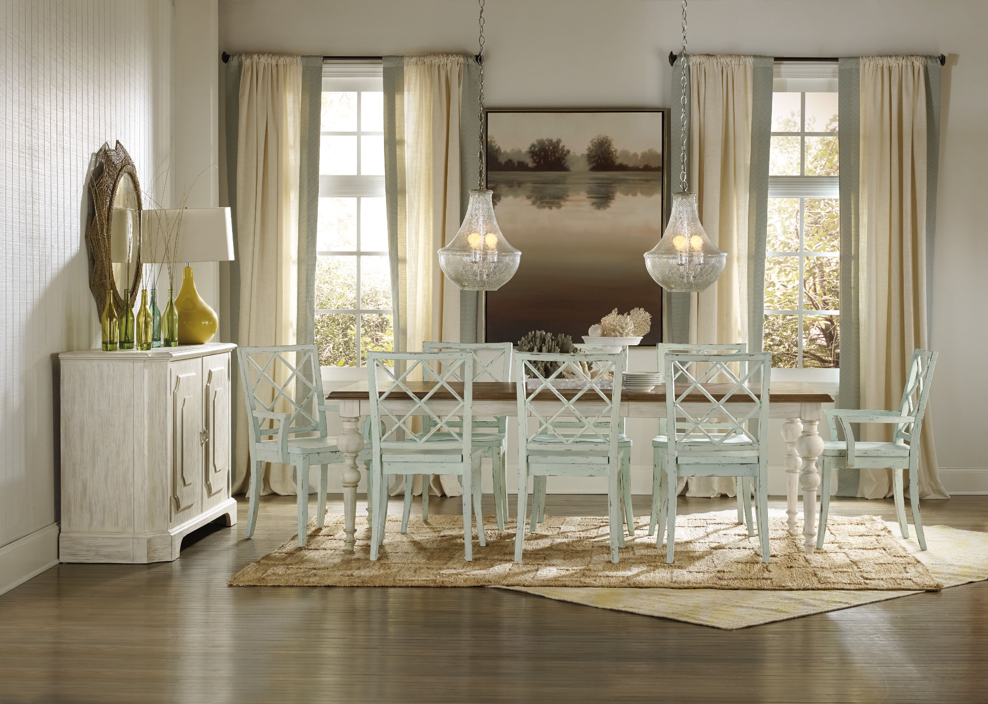
FFDM’s Summer Home Collection: Striking contrasts are seen in different design elements here from the shiny woodworks, to nature’s touch, and some metallic and ceramic elements.
Have you ever tried to define the word contrast? This is an oft used word in the world of interior design. Dictionaries define this term as the combination of unlike elements such as tone, colors, textures, patterns or emotions. This can be further defined as the lightest versus the darkest parts of a photo, painting or any other work of art.
Dullness vs. Contrast
Take a careful look at most black and white photographs; these are often difficult to read since there is no color contrast to begin with. This kind of photograph often appears flat except when taken at an angle where the depth is clearly defined. If there is any contrast in a black and white photo, these are the tonal contrasts.
To further define contrast, this is the comparison of two things with respect to their differences. This can also be similar objects but with dissimilar qualities.
Are you starting to get the concept of contrast now? No?
Examples of Contrast
One example of contrast is when an interior designer would want to highlight the intricate designs of a cream-colored cabinet inside a kitchen. This can be achieved if you use a charcoal wall as backdrop. The cabinets would appear to be the star of the show once you achieve this.
This kind of contrast is what’s known as achromatic. This is the contrast between two opposing shades – black and cream.
Contrasts can also be seen in nature each day. The white sheep grazing on the green, grassy landscapes; an orange buoy in the midst of the blue sea; white snow and some black rocks nestled beneath it; and many such contrasts.
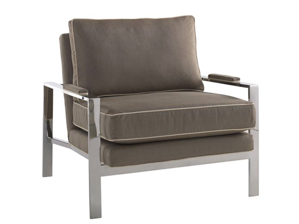
The marriage of fabric and metal in this Miles Talbott Living Room Mesa Chair JR-9440-C is perfect for any living room.
Contrast: A Composition Element
Contrast is a crucial part of composition. You can easily create contrast, more frequently with colors. At times, you can make subtle contrast with texture. Rooms can also play with different forms of shapes which can also represent a kind of contrast.
Geometric pieces like curvy ones can play contrasting roles with edgy pieces.
Above any element, you need to consider the color contrast when you are out to achieve opposition. Contrast makes objects distinguishable.
Here are seven kinds of contrast according to Johannes Itten –
Tags: adding colors to a home, color 101, color basics, contrast, contrast in design, contrast in interior design, McCreerys, McCreerys Home Furnishings, mixing colors
Posted in Color Schemes, Interior Design 101, Interior Design Elements | No Comments »
Follow us on our social media
© McCreery's Home Furnishings | All Rights Reserved | Privacy Policy