- Follow us:


Monday, October 3rd, 2016
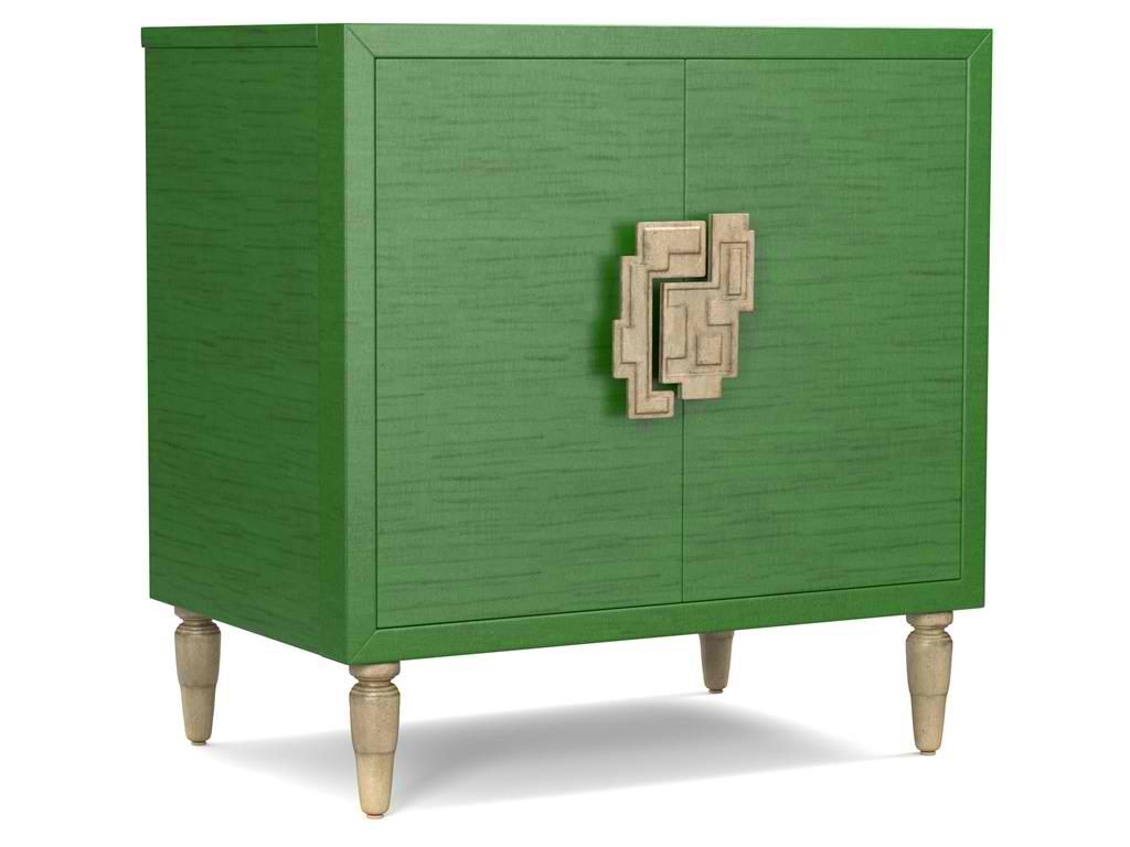
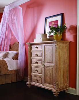
The green hue on this Cynthia Rowley for Hooker Furniture Living Room Sheridan Two-Door Chest 1586-50005-GRN is wonderfully prepped for 2017.
There is no doubt that color is an important element of interior design. It is one of the most influential aspects to human emotions. This is also the fastest way to update a room; what you need to do is just to apply a fresh coat of paint and you’re done. But what do different hues convey and what color forecast best fits the brave new year that is 2017?
Top Hues and Their Meanings
Red. This hue is often associated with determination, leadership and ambition. This can also connote physical desires which is why it is most used in many restaurants.
Pink. This hue represents intimacy, compassion and unconditional love.
Purple. This is the color of creativity and royalty.
Blue. This color represents loyalty, honesty as well as trust.
Orange. This bright hue is linked to optimism and motivation.
Green. This lively color represents vigor and energy. It is often used to create balance and stability.
Yellow. This is a hue that represents enthusiasm, fun, knowledge and hope.
Color Fundamentals
Color is affected by two aspects – the surroundings and the kind of light that shines on it. Try observing any room in your home. You’d soon see that the light is different during different times of the day. Comprehending how light can affect a space during different times of the day will give you the power to choose the correct color scheme that can be used all day through.
This same knowledge will also help you choose the best kind of lighting fixture for that room.
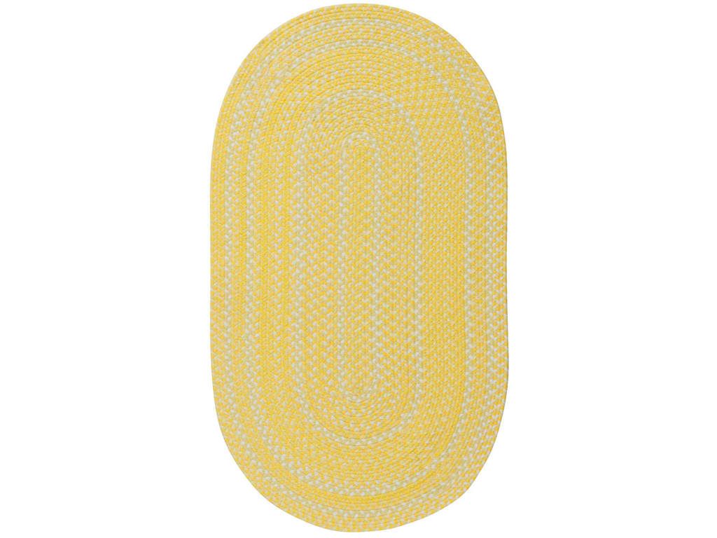
Capel Incorporated Floor Coverings Regatta Rug 0087NS Sunshine
Now, the Forecast
There are many color forecasts that are being done each year but one of the most esteemed are the picks made by Pantone. The upcoming year’s Color of the Year picks are calming, soft and wonderfully romantic. Now don’t worry if those aren’t your exact wish as a color for your home.
Leatrice [Lee] Eseman shared a handful of color palettes that you could choose from. These are all predictably popular colors for the upcoming year that you can use to beautify your home. These colors were also chosen because they address the consumers’ craving for colors that are comfortable yet new. Design trends became inspirations for many of these palettes, so was the film industry (e.g. The Peanuts Movie, Star Wars: The Force Awakens, etc.).
So go ahead and make use of anything silver and metallic or anything bright and colorful (if Charlie Brown inspires you the most). Say yes to orange chiffon, melon as well as dove gray. Grape and lime are also good colors.
Apart from these, there will also be an abundance of florals this upcoming year. Floral hues such as red Dahlia or pink yarrow, plus any shade of green may be acquired tastes but they are beautiful and not-oft used colors.
Gray and red will remain popular in 2017. They will both appear in warmer hues with the backdrop being that of bolder colors. Yellows that look perfect in a harvest setting will also get a lot of attention in the coming year. Yellow with hints of earthiness will look great and would be effectively grounded by classic red or blue.
Any youthful color is also a great choice in 2017. Now don’t be limited to the age-appropriate colors, rather, look for youthful colors with an attitude. So no matter what your age, you can use color palettes that are fluid and can easily morph in the 2017 surroundings.
Find celebratory hues that hail technology and nature. The former will continue to play a vital role in people’s lives. Evolving technology will continue to inspire ambience that is dark or in commanding grays.
Those who love deep plum would also find it a great news that the color forecast for 2017 also includes this hue.
Tags: 2017 color trends, adding colors to a home, blue, bold colors, bold hues, color choices, green, McCreerys, McCreerys Home Furnishings, orange, pink, purple, yellow
Posted in 2017 Trends, Color Schemes, Interior Design 101, Interior Design Elements, Interior Design Themes | No Comments »
Thursday, September 29th, 2016
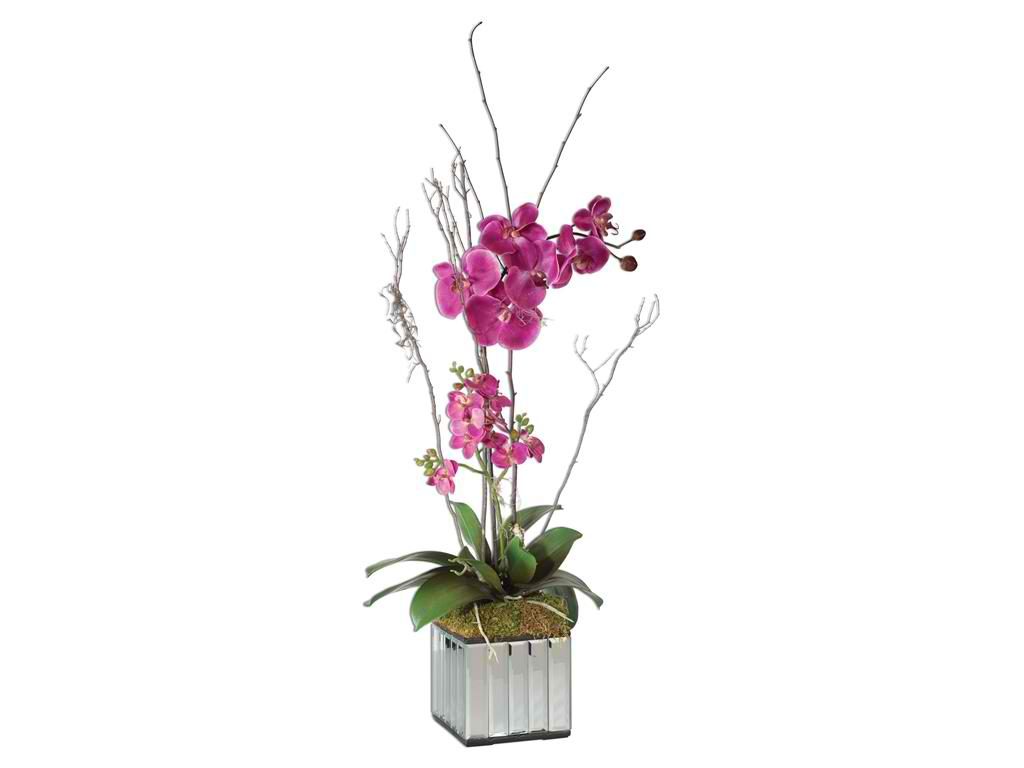
Flowers and the female population will always co-exist so go ahead and add this Accessories Uttermost Fuchsia Kaleama Orchids 60121 in your woman cave.
Men have man caves so why can’t women have the same? A woman also deserves a place to dream, work, be creative and just simply be. This could also be her secret place when the kids are gone. Why can’t it also be a place where she could hold her yoga? Whatever her reason is for setting up a woman cave, every female specie has the right to have her own space.
Personalize the Woman Cave
This is a woman’s place so there’s a need to highlight items that describe who she is and what the space strictly is for. This is also her sanctuary so while it is okay to have DIY projects, it is also equally important to find elements that would make the place descriptive of her. In essence, whatever she chooses for this room must always be personal.
A Woman Cave Is Decluttered
It is important to get organized. This is why the bathroom or the walk-in closet should have usable and spacious cabinets and drawers, even shelves. Have a shoe drawer set up and the closet filled with essentials – only the essentials. Remember that items which are no longer used for months are supposed to be chucked.
Use racks and closet space to up the amount of storage space in the woman cave. Racks and pegboards can be used on the wall to store shoes, hats, jewelry, dresses, magazines or books.
Wallpapered Woman Cave
If the room looks a little drab then you can spruce it up with wallpaper; more so if you’re not ready to make major interior design changes.
Get the paste the wall kind of wallpaper so you get to save time and energy. Wallpaper is not pricey and it can even look amazing as long as you choose the patterns and texture that go well with the woman cave theme. Wallpapering is also a great thing to resort to if you’re sick of the look of the room.
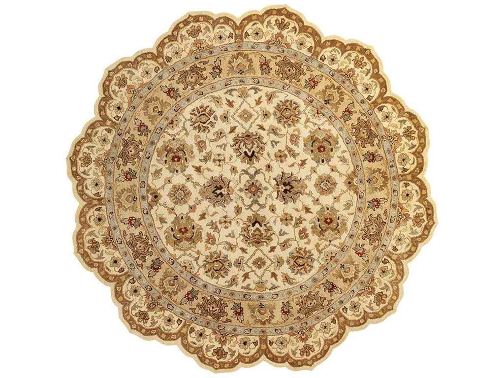
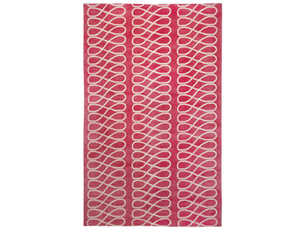
Add a feminine touch to your home office desk by placing this Capel Incorporated Floor Coverings Mumtaz Meshed Rug 3313AS0800600 beneath it.
The Woman Cave Desk
Every woman’s gotta have her own desk. Who wouldn’t want more desk space, right?
Dining tables are great for when you pay and sort out the bills but it shouldn’t be enough for tasks such as e-mailing, surfing the net, checking the social media, etc. Women who love arts and craft also know that the dining table isn’t the right table to use for such projects.
The Woman Cave Spa
If a woman is in need of a place to unwind after a long day at work or a tiresome week, then the woman cave should be a relaxing spot. To achieve this, you can create a spa-like environment where there is a chandelier, chaise lounge, even some faux fur area rug. A nice fireplace would also be awesome in this environment.
If books relax you, then the woman cave can also double as a reading nook. Have a freestanding bookshelf, a desk, and a comfortable chair.
Remember that what could be calming for one woman may not be the same to the next. The possibilities are actually endless. Imagination and creativity are needed to create a place that offers ultimate serenity.
Throw Pillows in the Woman Cave
One of the most versatile accessories that you can use inside the woman cave are throw pillows. These have the capacity to replace chairs or a comfy couch, that is, if you have enough of ‘em. Set up a bean bag chair, some pillows and a blanket – this is your hangout corner.
Not Always Pink and Fluffy
The typical man cave may be filled with manly things but a woman cave should not always follow protocol, meaning, it does not have to be pink and chic all the time. The rule to setting up the perfect woman cave is to bring in anything that makes you happy. It could be frilly, it could be minimalist, it could be anything.
The woman cave defines the woman just as much as the woman defines her woman cave. That’s that.
Tags: declutter, decluttering, decluttering advice, decluttering tips, decorating with wallpaper, McCreerys, McCreerys Home Furnishings, pink, pink design, pink interior design, pink interiors, throw pillow, tips, wallpaper, wallpapering, woman cave
Posted in Interior Design 101, Interior Design Themes, Special Rooms In Your Home | No Comments »
Wednesday, June 8th, 2016
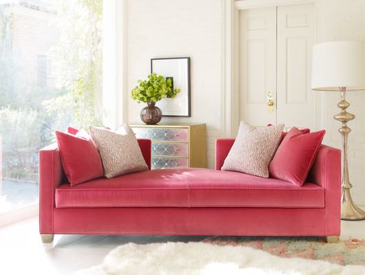
Pink is definitely the star in this room. Featured sofa is Cynthia Rowley’s 6000CR Coco Daybed
The beautiful Audrey Hepburn once stated that she believes in pink. There is a reason why this color excites and has an attitude that is solely its own. First, it is a contradictory hue. The meaning that it evokes depends on what context and culture it is being presented. This can be mainly feminine in many cultures although it can also be bold and frank the next. In Japan, however, pink is a masculine color (yes it is).
Pink Is Love
Just like the color red, well, knowing that pink is a mixture of red and white, it is being linked to love. Red is more passionate while pink is tender and innocent. This color focuses more on intimacy, thoughtfulness and being careful with each other’s feelings.
Pink also represents nurture and familiar love.
Does Pink Excite or Calm the Nerves?
Pink can evoke both these feelings in humans. Again, depending on the level of intensity in which it is presented, pink can be aggressive (just like red) or it can be vulnerable and calm just as in old rose or carnation pink.
What’s the chief color that dominates nurseries for baby girls?
Pink.
Pink is often linked to innocence and childhood sweetness. It can even border naïve at times, if not vulnerable. But there is also a reason why pink is quoted when it comes to optimism – seeing the world through rose-tinted glasses means the person is overly positive.
Various Levels of Pink
The stronger shades of pink such as fuchsia often represent energy and confidence. Which is why we are no longer surprised why brighter shades of pink are often used in manufacturing girls’ toys.
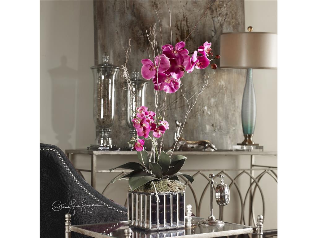
Accessories Uttermost Fuchsia Kaleama Orchids 60121: A touch of pink won’t’ hurt, in fact, it ups the level of elegance in this mainly metallic look.
Is Pink Positive or Negative?
Both.
Pink has many positive associations as it can be a non-threatening color. It represents hope, innocence as well as optimism in the best of times.
The downside to pink is that it can be downright silly especially when it is not used properly. It can also be considered shallow when it won’t anchor or fuse with any other design element inside a room.
‘Time to Use Pink
‘Still have no idea what shade of pink you should use in your home? The color might have excited you in
Roses are a great source of invaluable study when it comes to the relaxing shade of pink. If you take a closer look at this kind of flower, you will notice that it also comes with other bright colors such as yellow and orange. If the flower can get away with this look, then a room or two in your home could also have this color combination.
Other complementary colors are green, black and white.
Why green?
Remember the rose yet again. The pink rose pops out on its fresh green stem and leaves – no look can be sweeter.
As for black and white, these two can take pink and make it more elegant and controlled.
Pink: The Supporting Cast
Your palette does not have to be mainly pink. It can play a supporting role to the main players which are chocolate brown or shades of gray.
A whisper of pink evokes romance when splashed on walls. Call this your dessert palette where pink is as soft as it can possibly go.
Pink: The Hero of the Show
Pink can also be the star of the whole ensemble. This is the case with the more confident shades of pink such as lavender-leaning tints, fuchsia, and deep-pink. Use the bolder pinks as the main color palette or as accents that will surely catch people’s attention.
Tags: McCreerys, McCreerys Home Furnishings, pink, pink color psychology, pink design, pink in interior design
Posted in Color Schemes, Interior Design 101, Interior Design Elements | No Comments »
Wednesday, February 24th, 2016
From FFDM’s Palm Island Collection
The color pink, when mentioned, conjures images of sweet candies or a baby girl’s room. But there are a lot of pink shades to begin with, each one setting different moods. Fuchsia, for instance, energizes anyone who sees it. The softer shades of pink are more restrained, more like a blush, which gives a soothing feeling.
Those people who find safety in the color white should try pink. If they go a step further and try it with gray, then what they have already achieved is a flattering hue, something that always makes people feel good.
Peony, a more intense shade of pink can be used in a space where there isn’t much foot traffic. Deep pink paired with raspberry undertones will look great inside a dining area.
Pink can be paired with many other colors including black, chocolate brown, mint green, silver, metallic gold, even white. Pairing it with a masculine hue such as navy blue will ground the pink shade.
Dusty pinks when mixed with any neutral color can instantly add glamour inside a bedroom. It can also be sophisticated as it is paired with beige or brown. Such color combination will look wonderful in a dining area with raffia walls.
Salmon pink or deep rose is the perfect color to use if you want your pink shade to become a little more dramatic. Pink is sweet and romantic. It is the ultimate girly shade.
Pink works best on small homes where the color can be appreciated without being overwhelming. Pink is also a great choice for the exterior of cute or storybook type homes.
Creating Moods with Pink
Use light posy pink with just a hint of gray. This fusion will spell both innocence and sophistication – two things that are at opposite ends of the spectrum.
If you want to have a feeling of spring indoors, then mix pink with fresh green shades. This will make any room appear more inviting.
Adding energy inside a home office is now easy by painting the walls with vibrant pink. Begonia pink can also bring in higher level of excitement. This is best used in the usually unexciting long hallway.
Pink, a touch of lilac and taupe would be the perfect combination if you want to add sophistication in your home.
More Pink Combinations
Pink offers a huge array of delicious colors. They can be warm or cool depending on your preference and how deep or light the shade is.
Don’t think that the color pink is just for little girls, though. This can be the go-to color that can make accents pop and one that can give you the most beautiful styles.
Pink is now used in abundance on many interior design projects. You can now find pink fabrics, wallpapers, rugs, and artworks. Pink is fresh and it adds pizzazz without any effort.
Block painting one wall can give you an interesting focal wall. Choose from the many shades of pink. Find out also which you prefer, the high gloss finish or the flat type. Adding pink to the former will give you a breathtaking result.
Capel Incorporated Floor Coverings Loop 9′ x 13′ Rug 1929RS09001300525
Pining for More Pink
Black and pink is your designer pair. This is stark and highly dramatic, it is also intelligent as well as crisp. This combination works pretty well when mixed with gray tones or sharp white.
Pink and dark buff is a powerful pair that will balance each other. The latter will tone down the tempers of pink. This is a combination that is more often used in classic or traditional settings. This is especially beautiful when there is an abundance of natural light.
Still Unsure of Pink?
If you still don’t know how to control pink, then just use it as a surprise element in one of your rooms. If you love inviting people over, then use hot pink in your dining room. An extra jolt of pink can liven up any dull space. Mix it with metallic silver or gold and it instantly spells luxury.
Don’t be afraid to use pink anymore. This is the best punctuation that you can use in your space so you should embrace it rather than be fearful of it.
Tags: feminine, feminine design, feminine interiors, feminine style, McCreerys, McCreerys Home Furnishings, pin in interior design, pink, pink color psychology, pink design, pink interiors
Posted in Color Schemes, Interior Design 101, Interior Design Elements, Interior Design Themes | No Comments »
Follow us on our social media
© McCreery's Home Furnishings | All Rights Reserved | Privacy Policy