- Follow us:


Tuesday, August 29th, 2017
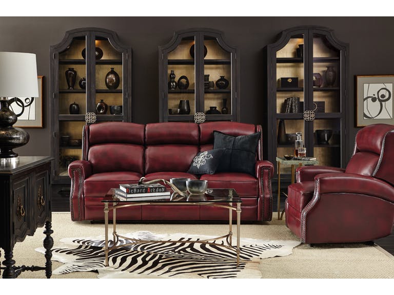
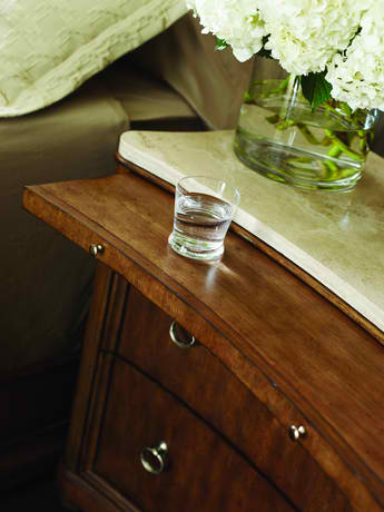
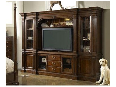
Hooker Furniture Living Room Carlisle Power Motion Sofa with Pwr Headrest: This room evokes power and drama because of the dark walls, dark accents, and the equally dark furniture choices.
Color is a powerful tool that designers and homeowners have been using to beautify homes for many years. Hues are also stimulating, soothing, healing, though they can also excite or even terrify. If you happened to paint the walls in your home then you find out that the color doesn’t jive with the rest of the décor, then you’re up the creek.
To make the right choices with warm colors, there are some simple things that you need to keep in mind –
Differentiate Warm from Cool
The color palette for interior design is divided into the warm and cool colors. The most obvious warm hues include yellows, oranges, and reds. These colors are directly opposite the cool colors comprising blue, greens and grays.
Where these colors meet, these are what you would refer to as a hybrid. Purple and green are hybrid colors and they can both be warm or cool depending on how light or dense the mixture is. Lime green, for instance, contains a lot of yellow so it is considered warm. Kelly green, on the other hand, has more blue so it is considered as a cool color.
Warm Colors Stimulate
How do you think you’d feel inside a bright red room? Exactly.
Red is the color that is often associated with war, energy, strength, danger, desire, passion, determination, and love. It is also known to increase human metabolism as it can also raise blood pressure.
Red is a dynamic color. It represents energy and aggression as it can easily raise anyone’s heart rate. Just place red in the middle of a neutral background and what color would your eyes go to?
Red, of course.
Orange, on the other hand, is the combination of yellow and red. This is often used to draw attention which is why it is used on traffic signs. Businesses make good use of this color because it enhances energy and activity.
Orange is widely used as a uniform color for many sports teams. If you want to motivate your team, then have orange plastered all over the walls. If it’s too bright for you, then at least use some orange accents.
Yellow, in color psychology, means optimism, happiness, and enthusiasm. It is no less than the brightest color on the spectrum. Yellow is upbeat and fun. It is cheerful and it is also the color of hope.
If you’ve noticed, the basic warm colors work best in social rooms. So, if you’re thinking about using warm colors, then it is best to use them in the dining room, the living room, and as well as the kitchen.
Black and White: Warm + Cool
While black and white may not be considered as proper colors, they are widely used in many homes – and successfully so. Black with its warm properties pairs well with white and its cool properties. So, if you paint an entire room white, it will be a stark, cold-feeling room unless you do something to counteract this.
Black is always warm so use it sparingly. It can easily overwhelm so just use a little black and you’d never go wrong.
Warm Color Consistency
Always remember the effect that you would want to achieve in the room. This is the only way that you can define whether you’d use predominantly warm colors or if you need to resort to cool ones. This only means that you must learn to use warm effectively so that they won’t clash with the cool colors.
If you have a warm-colored floor (wooden flooring), then you shouldn’t paint the room green. Do this only if you would want to the room to look off beat.
Tags: McCreerys, McCreerys Home Furnishings, warm colors, warm hues
Posted in Color Schemes, Interior Design 101, Interior Design Elements, Interior Design Themes | Comments Off on Hot, Hot, Hot Colors – _ 4 Guidelines in Using Warm Colors
Tuesday, August 22nd, 2017

The Hickory White Bedroom Upton King Upholstered Bed 585-25 can be easily shared by a couple. It comes in a color that’s perfectly gender-safe.
Interior design is both a form of art and science. It makes use of principles such as balance, contrasts, patterns, textures, and hues. When it comes to colors, there are just too many to choose from. So when you’re planning on changing the color of your walls, you could begin with a dilemma – what colors will I choose, the calming or energizing hues?
The colors orange, red, and yellow are known as the warm colors. They are called as such because they are literally the colors of fire. These colors make walls feel closer than they really are as they seem to come forward.
These energizing hues are used most often on upholstery and accent pieces. If you want a room to appear cozy, then just add a splash of red, orange, or yellow somewhere.
That Warm Room
If you are about to decorate a well-lighted, huge room, then what you need are warm hues. These are the very colors that would add a welcoming vibe.
Begin with warm neutrals on the walls. Use warm gray, taupe, or a warmer, yellow-toned shade of white. Pick any natural-colored sofa to harmonize and add richness to brick walls. If your place happens to have a brick fireplace, then emphasize the redness by using this vibrant color as your anchor.
Place custom throw pillows that blend well with the sofa fabric. Use also an area rug that picks its color from the walls or the brick red beauty of the fireplace. Always make sure that the reds harmonize with the wooden elements especially the hardwood floor.
If you’re feeling more adventurous, then paint the walls crimson. This is the most dramatic statement one could ever make.
The Warm Accents
If your home is not big enough to let in a generous amount of light, then your better choice is to limit the use of warm colors to mere accents. This is the best way that you could go if you want to make a design statement.
Have a lighter neutral on the walls. This could be cool gray or white, while you can cover the sofa with navy blue fabric. As for the chairs, use a hue like medium gray. Have the wall hangings in red, bright orange, yellow, or even the fusion of all these three.
Understanding Opposing Spectrum Colors
Being able to understand the terms that matter when it comes to colors is a huge step towards using them effectively.
Warm colors can make you feel warm, like literally and figuratively. These darker colors are often used inside huge rooms so they can look cozier and homier. Brown and terracotta plus other hues such as these can stimulate. It is this very reason why they are used in rooms that are in need of movement and increased activity.
You might be interested to know whether you really feel cooler or warmer when you use certain colors. Try living in a room painted in jet black during the hottest summer months and you’d know that it’s just the wrong color option at that moment.
The psychological effect of warm colors is even more important than the temperature that they evoke. Just take red, for instance. It is a hue that makes you think of courage, bravery, passion, and all the strong feelings that are similar to these.
Orange is yet another energetic hue. It can stimulate the beholder to feel happier, and more adventurous. It is a wonderful color to use inside business establishments.
Yellow is no less than the brightest color on the visible spectrum. It evokes feelings of optimism and happiness because it represents the sun.
Use these colors to make your home happier and, at the same time, cozier.
Tags: McCreerys, McCreerys Home Furnishings, warm colors, warm hues
Posted in Interior Design 101 | Comments Off on Energizing Hues
Thursday, November 24th, 2016
This American Cherry piece by FFDM offers warm hues that is suitable to your homey, comfortable taste.
There is no doubt that colors are very powerful. They can heal, stimulate, soothe and even be fun. When you are committed to doing a makeover in any room in your home, then it is not simply buying a piece of furniture or adding some lights that will make a huge difference. All these design elements will not amount to anything if the colors chosen by the homeowner are unappealing.
Getting to Know Warm Colors
The palette for interiors is divided into two huge groups – the warm and cool colors. Warm colors are yellows, reds, beige, oranges and some creamy colors. Try looking at the color wheel and you will find the warm colors on one side of this color wheel and the cool ones on the other side.
Hybrid colors are right where the cool and warm colors converge. Purple and green, for instance, are hybrid colors and they can be cool or warm depending on the mixture. Lime green is both yellow and green but it has more yellow which is why it is considered a warm color.
Exciting, Social, Warm Colors
Oranges, yellows, reds as well as off-whites are hot and stimulating. They can soothe the emotions, though, which is why they are generally used in places where people gather – restaurants, many homes, and other commercial spaces.
Warm colors work best in social rooms like the living room, kitchen and the dining room. They are also great in home bars and other areas where robust activities are common.
Warm colors have a tendency to advance, meaning, they drawn in space. A red living room, for example, would feel more intimate because of its passionate look and feel. A cooler color would be chosen if the homeowner or designer decided to make the room look and feel more expansive.
Orange is also an oft-used warm color. It can take some load off the red hues if the latter have been overused. The warm color is also your best friend if you have a large yet sporadically furnished space. Closing up some of the space and making it feel more intimate is as easy as resorting to warm colors.
If you’re still undecided on what paint scheme to use, then take a careful look at the elements in the room that you’re about to design. Wanting the space to draw closer means you have to go for the warmer palette.
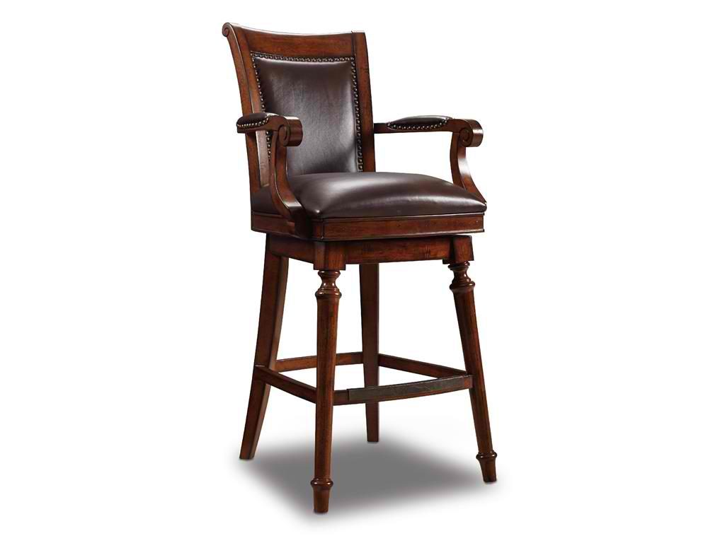
Hooker Furniture Dining Room Merlot Barstool 300-20025 has warm hues for your rustic home bar.
Mixing and Matching – Totally Allowed
You can experiment by mixing and matching some cool and warm colors. You can do this to advance your designs and to make rooms more exciting. Remember that the nearer the colors are to red, the warmer they are.
Consult the color theory regularly to know the framework in describing color behavior. There are some exceptions to the rule, of course, but warm colors almost always advance while cool colors recede.
You’re more than ready to start fusing these exciting colors so let’s go –
Warm White Wall: The use of warm colors does not have to be drastic. You can’t paint an entire house orange. Try painting your white-walled library with some warm palette. Add wooden floors, some gray furniture and exciting bronze accents. There, fusion accomplished.
Next, you could also turn your red kitchen to a cozy one. Soften the cranberry red walls as well as the wooden floors with some green or blue furniture and accessories.
Take a look at the undertones, too. A gray kitchen could be either cool or warm depending on what undertone your paint has. Consider the kitchen accessories and other colored appliances when shopping for a new kitchen color.
Lastly, when thinking of tone, fuse two colors on opposite sides of the wheel to add character – just make sure that you balance the design.
Tags: McCreerys, McCreerys Home Furnishings, warm colors, warm hues
Posted in Color Schemes, Interior Design 101, Interior Design Themes | No Comments »
Thursday, November 10th, 2016
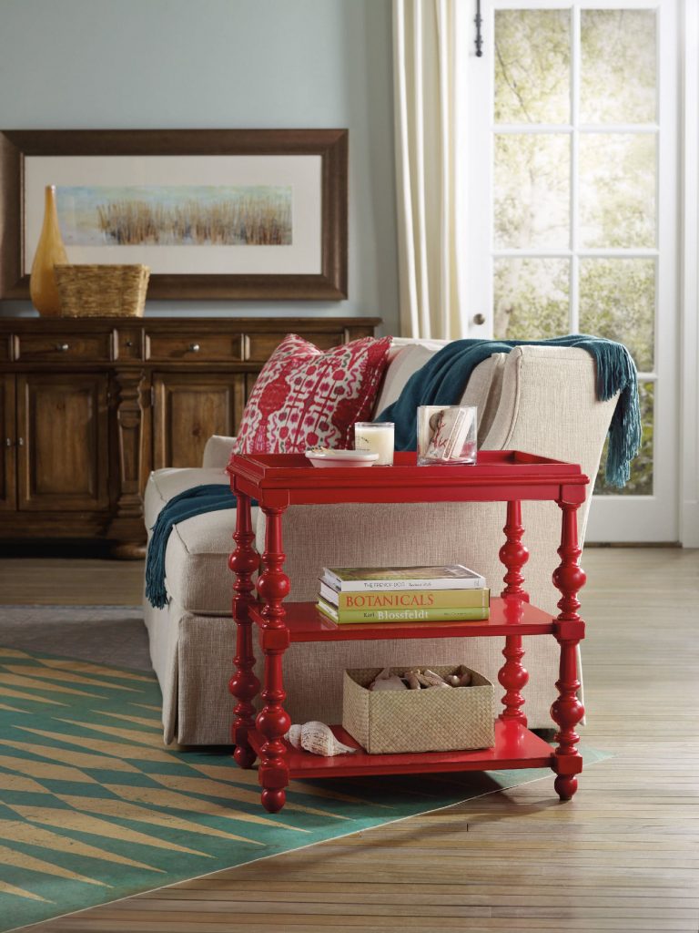
The Hooker Furniture Living Room Sanctuary Chairside Table is as unique and colorful as a side table could get.
When you approach interior design from a homeowner’s point of view, you probably just go about and pick the things that you think are attractive. Also, you tend to make your decisions based on any existing décor or pattern in your home. Color, however is such a powerful tool that you can use to evoke certain emotions. It can also create illusions of space or invoke a dramatic ambience.
Here are tips on how you can effectively use color psychology right in your home –
Bright Colors = Spaciousness
You can create an illusion of space if you use a lot of bright colors in your interior design. Use a lot of eggshells or yellows to make a space seemingly bigger. Don’t immediately go for white, though. Even when it is known to add space, it is not as effective as the tinted hues.
Bright Colors = Happy Educated Crowd
You can appeal to the tastes of the educated few if you learn how to fuse complex colors. For home interiors and exteriors, it has been observed that educated people find two-word colors to be more appealing. Simple colors, on the other hand, appeal to people with lower budgets and those that have lower education levels. When you’re out to pick complex colors, it is best to use names like eggshell white or lime green.
Red = Appetite
You can help build appetite in the dining room or the kitchen by using dashes of red or painting the walls with red paint. A lot of restaurants know this concept which is why they willingly paint their walls with solid red or red patterns.
Use red in the kitchen to up the appetite of people. You can have neutral walls made non-boring when you add red shutters or paint the cabinet doors with any shade of red.
Blended Interior + Exterior = Wow
When you use foyer blends by combining interior and exterior paint, you end up wowing your guests. The entryway or foyer becomes much more exciting if you use this technique.
Deep Tones = Warmth
You can warm up your home by using deep tones during the colder months. Use a lot of yellows, oranges, reds and browns. When you are about to paint your home during the winter because you’re staging it for future selling, remember this advice because it will make the house stand out.
Cool Colors = Fresh and Breezy
If deep tones keep homes warm during the winter, then the opposite, the cooler colors do otherwise. These colors are along the same hues used during fall, especially blue, so use them in abundance during the summer months. Have a white exterior plus a blue trim to achieve a Greek aura which is great if you want a cool-looking home during summer.
Familiar Colors = Fond Memories
If you decide to use familiar colors from your childhood or your not-so-distant past, then you will surely be reminded of wonderful memories. This becomes more special as you put these familiar colors in the kitchen, after all, what could be more pleasant than feeling like you’re back in Grandma’s kitchen?
Reds and yellows are perfect for that playful yet posh look for the kitchen. Don’t use red, though, if you have a high blood pressure. More so, stay away from dark shades of red so that irritability won’t ensue in the house.
Extend the familiar colors into other rooms such as the bathroom. If you love wearing a particular color, then use that same color in your bathroom. Having your fave color on the background will help you look more yearningly at the mirror inside the bathroom. Basically, you will tend to love yourself.
Tags: adding colors to a home, color 101, color basics, color options, color palette, colors, cool colors, McCreerys, McCreerys Home Furnishings, tips, warm colors, warm hues
Posted in Color Schemes, Interior Design 101, Interior Design Elements | No Comments »
Tuesday, October 18th, 2016
FFDM’s Sunset Canyon Collection shows the beautiful color of the fall season in this wood ensemble.
Fall is definitely here. This only means that it’s time to look into pumpkin décor, spice lattes and wonderfully warm meals. So bring out the crockpot and your designing skills (okay maybe not in that order) because it’s time to transition the look of your home.
Your home is the perfect spot to decorate using fall elements. Decorating for this season means you have to embrace warm, beautiful colors, coziness and all that these bring, without forgetting to have fun in the process.
Here are some ways that you can start fall design –
Say Goodbye to Summer Bedding
One of the quickest ways to say hello to fall is to say goodbye to the previous season. Find something warmer for your bed; look for warmer colors and warmer elements. Think of comforters, duvets, colorful pillows and blankets.
Add some rugs, romantic lighting and homey décor.
Don’t worry about making your room too dark. Use window treatments to offset the artwork, furniture and lamps that you bring in. This is also that perfect moment to paint your bedroom with a more subdued coat of paint. You will be spending more time indoors so consider painting your home with the colors that you are most comfortable with.
Beautify the Windows
It’s time to spruce up your windows especially if you want to achieve fall vibes. Use curtain walls, embellishments and drapes. Sheer can be used as an overlay. Hanging curtains crosswise can also add a different level of visual interest.
The market is filled with curtains and other window embellishments. See which ones would suit your fall design. Be mindful of the materials, color and their functions. Find warm hues like ones that mimic nature. Look for fabrics that will make the room feel homier.
Add Candles and Warm Lighting
This is the perfect season to use a lot of candles. These can become decorative elements that have the capacity to make any space look cozier. If you are a DIY enthusiast, then this is the chance to get your family together and create your own string lights and candles.
Candles are also effective mood lights. These can effortlessly improve the ambience in your home. They can also smell nice – which is like hitting two birds with one stone.
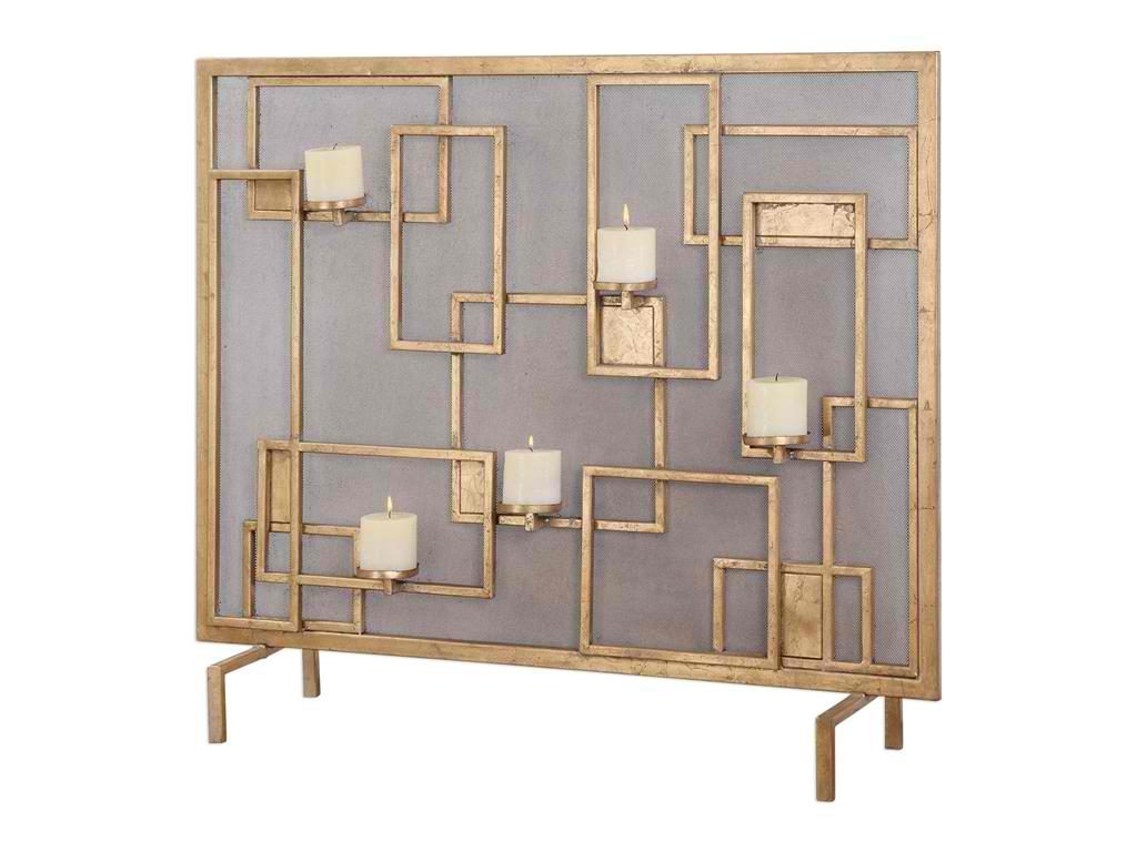
The Uttermost Dining Room Mara Fireplace Screen Candleholder 20179 is the perfect element that would cap your focal point for the living room this spring.
Extra Blankets, Pillows and Throws
Since this is the perfect time to get cozy, it’s time to check out some local shops for pillows, throws and blankets. These are your best decorative elements for this season apart from the pumpkins, wreaths, dried fruits, and other festive crafts.
Sweet-Smelling All Around
What could be more wonderful than to come home in a place that’s sweet-smelling with breads, spices and crockpot meals. Add to the holiday euphoria by putting some essential oils inside the living room, bedroom, bathroom, and just about every room in your home. Lavender is one great option to begin with. It is not just a sweet-smelling scent, it is also antiseptic and has antibacterial properties.
Yes to Area Rugs
An area rug is also an essential décor that can be added to up the level of coziness this season. It does not have to be costly or fancy. Just invest in a few rugs that can add color and comfort where they’re needed.
An area rug can also effectively warm your feet during those extra cold mornings.
Alter the Landscape
This is also the season to cozy up your backyard and patio. It’s time to swap the bright lights and water elements with festive décor and candles. Add some lovely scents, potted plants, beautiful flowers, and shrubberies.
Clay artwork as well as bright pillows may also be used to improve the outdoors during fall.
Tags: candelabra, candelabrum, decorating with candles, designing for fall, fall decor, fall design, fall interior design, fall interiors, fall preparation, holiday lighting, home lighting, McCreerys, McCreerys Home Furnishings, warm colors, warm hues
Posted in Color Schemes, Fall Season, Interior Design 101, Interior Design Themes | No Comments »
Monday, September 26th, 2016
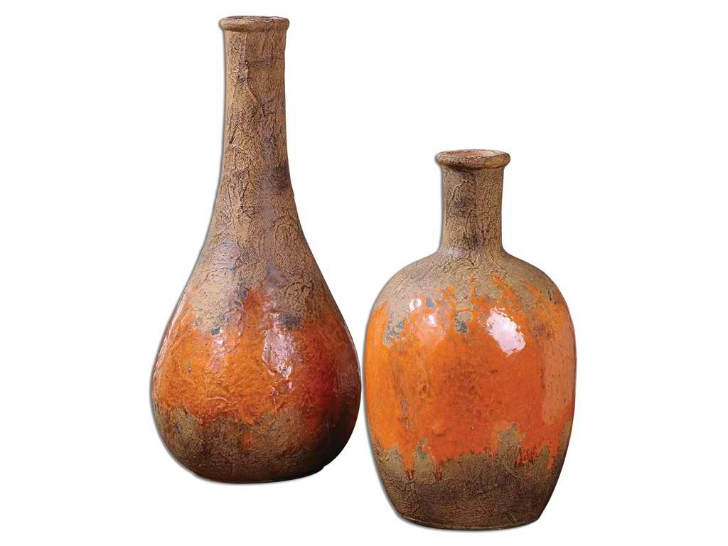
The rustic colors brown and orange are beautifully featured on these Accessories Uttermost Kadam Ceramic Vases S2 19825.
Fall has finally arrived. This is that season when families gather and homes are filled with the aroma of home cooked meals. This is also that time when wood smoke, the tang of fresh apples, and the cool air all come together to bring that wonderful, unexplainable feeling; this season is a reassurance that Christmas is just around the corner.
Fall spells a lot of activities that you could attend with your family. You can go barn dancing, mountain biking with your friends (while enjoying the red, yellow and orange leaves all around), scenic drives through the woods, etc.
The greatest part of this season is the chance for the entire family to decorate the home. Even subtle decorative pieces can make a dull home look suddenly stunning. The right elements could also bring in a sophisticated ambience so make sure that you take advantage of the rich resources that you can find outside – the produce from the farmers’ market, flower shops, even your own backyard.
A Burst of Colors
Fall is all about colors and flowers so bring in those chrysanthemums, marigolds and dahlias. Whether you arrange these beautiful flowers outdoors or in vases indoors, your efforts will surely be rewarded. These flowers don’t just bring elegance into your home but texture as well.
Any arrangement made possible by Mother Nature is the perfect element that you can bring in. Nature, during this season, offers colorful pumpkins and gourds. The former aren’t just great for pie but also as the perfect Jack o’ Lanterns for Halloween. It’s impossible not to love the delicious orange hue these plump pumpkins.
Mix and Match
It’s the time to mix and match different types and sizes, even various colors of wheat stalks and flowers. This is the ideal décor during the entire season. Bring it a step farther by adding pine cones, trees, acorns, citrus fruits and some sprigs. Wreaths should be placed on walls (yes, they can stay there till Christmas) to add visual texture and warmth.
Other things that you can match are colors in various textures. Warm and cozy colors are in such as burnt orange, rust, browns, mustard, plums and grays. Try combining some of these colors to achieve a warm glow that is unique to this season.
Wool and wood are the right materials to harmonize especially during the coldest fall nights. The solid, smooth texture of wool’s fibers plus the sturdiness of wood create just the right combination. Go ahead and update your furnishings by matching wool cushions to your wooden furniture. Use this fusion if you want to be stylish yet safe this season.
Another way to add visual interest in your home is to use accents in interesting motifs. Examples are leaves, woodland creatures and trees. Geometric patterns are at home in this setting, too, and so is tartan.
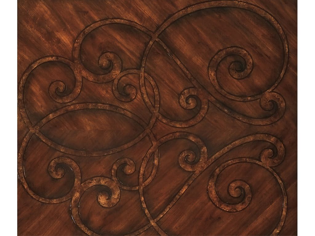
Dark Walnut and Mappa Burl Finish by Hooker Furniture
Lanterns Aglow
Lanterns can offer an enchanting glow during the coldest evenings. They can cast beautiful and inviting light by the porch or right inside your home. Remember that the daylight hours are a lot shorter so you have more time to enjoy the glow of your chosen lanterns.
Adding metals is also another way to add some glow this season. Let copper dominate as this is a must-have metal during fall and winter. Add its reflecting qualities in your home for an instant appeal and visual expansion.
Fall season is definitely upon us all. The leaves are out to change and the days are bound to be shorter. Prepare for chillier mornings while the crisp summer sun slowly fades. You may miss the summer daytime but this season brings with it a different festive mood that’s difficult to ignore so you might as well enjoy it!
Tags: fall, fall color palette, fall decor, fall design, fall interior design, fall interior design elements, fall interiors, fall preparation, McCreerys, McCreerys Home Furnishings, nature, nature-inspired design, nature-inspired home, nature's colors, styling for fall, tips, using nature's colors in interior design, warm colors, warm hues
Posted in Color Schemes, Interior Design 101, Interior Design Themes | No Comments »
Wednesday, September 14th, 2016
FFDM Harbor Springs Collection features these contrasting yet matching hues of natural and whitewashed wood.
Every color is crucial in creating beautiful things in this world. Whether you need colors on your clothes or the interiors of your home, it is the same. While colors are this important, not everyone has the innate skill to point out which color goes with which and which ones would clash. If you cannot trust your eyes to make that judgment for you, then here are some guidelines –
Study the Color Wheel
The basic color wheel should be able to guide you when you make your color choice. You should have seen this colorful pie graph in school but here’s a little something to juggle your memory –
Red, blue and yellow are the three primary colors. Mix red with yellow and what you achieve is orange. Fuse blue and yellow to get the color of nature – green. To get violet, mix red and blue. These are what are known as secondary colors.
Tertiary colors, on the other hand, are the result of the fusion of a primary color and a secondary color. An example is red-violet or and blue-violet.
Every color has tints and shades. The first is a variation of any color when it is mixed with white. Red mixed with white achieves pink which is, in essence, a tint. Shade is a variation of any color when it is mixed with black. Don’t worry too much about shades and tints; what you need to focus on are harmonious color combinations and how to distinguish them.
Color Harmony
The color theory points out that harmonious colors are those that use any two hues that are opposite each other on the wheel. Three colors that are equally spaced on the wheel (or that form a triangle), colors that form a rectangle, are harmonious colors.
These are perfect color schemes or the more proper term is – color harmony. A color scheme should always be harmonious despite the rotation angle.
1586-10458-GRY1 Note-To-Self Writing Desk 1586-75410D-GLD6 Swanson Upholstered Metal Side Chair is featured in a cool, Nordic-themed room.
Warm and Cool Hues
Another separation that you need to be conscious of are warm and cool hues. Every group has its purpose and a spectrum of emotions to convey. Warm colors convey joy, energy and productivity while cool hues convey peace and calmness.
The color wheel can be easily divided if you want to group the warm and cool hues.
Basic Color Schemes
There are fundamental rules to commit to memory if you want to master how to match colors. Don’t worry, they’re quite simple.
Complementary colors are the ones that sit opposite each other on the color wheel (e.g. red and green or blue and orange). These colors have a high contrast so it is best to use them if you want to make a statement. You can use one color as the background and the other as the accent.
You can use shades and tints alternately, for instance, a lighter tint of red can contrast a darker shade of green.
Split complementary hues make use of three colors. This color scheme uses one color plus two adjacent colors. An example is blue, red-orange and yellow-orange. This color scheme is ideal for neophyte interior designers and decorators. This is the scheme to use if you don’t wanna mess up.
Analogous colors are three colors that are next to each other. Yellow, yellow-orange, and orange is an awesome example. This color scheme can be jarring if you mistakenly combine warm and cool colors so be careful.
Triadic colors can also be used in your home. This color scheme is achieved if you use any three colors that sit equally apart. An example of these hues on the color wheel are red, yellow and blue. This is also a high contrast scheme but it is more balanced when compared to complementary colors.
Now that you know the basics, are you ready to experiment on your home’s color schemes?
Tags: adding colors to a home, color 101, color basics, color harmony, color wheel, cool colors, cool hues, harmony, McCreerys, McCreerys Home Furnishings, shades, studying the color wheel, tints, warm colors, warm hues
Posted in Color Schemes, Interior Design 101, Interior Design Elements | No Comments »
Thursday, January 28th, 2016
Biltmore desk from FFDM. It may be traditionally classy but it also comes with modern features to accommodate your gadget needs.
There is reason behind the liking for hardwood furniture among sophisticated homeowners. This kind of furniture can provide a different level of appeal in any home. While both softwood and hardwood materials are great for furniture creation, there are benefits and disadvantages for both.
Hardwoods come from angiosperm trees which produce covered seeds. This is a sturdy material that has been used for centuries in the manufacture of furniture and flooring, too. It is heavier, harder and classic looking when compared to many kinds of softwoods.
One of the best examples of a hardwood is the good, ol’ reliable oak. Oakwood is super solid and has been used in manufacturing heirloom furniture pieces. Oakwood bedroom furniture sets look elegant and will surely leave a lasting impression with anyone.
There are many styles of hardwood furniture that can be found in the market these days. If you want to use a classic, contemporary, traditional, periodic or rustic theme, then this is the material to acquire. All hardwoods are solid and long-lasting.
Biltmore pieces come with durable and beautiful hardwoods that will make your home stand out.
Hardwood Furniture Advantages
It may be tempting at times to just choose furniture made with inferior materials since they are cheaper. But that is all that they are – inferior. You will, eventually, spend more as you buy a replacement for the low quality furniture which you settled for.
So, to save yourself a lot of money and energy, even time, consider buying hardwood furniture in the first place. Hardwood furniture is an investment that can give you a lot of benefits. First on this list is its natural beauty.
Mahogany, oak, mango and acacia are all naturally beautiful. They automatically up the level of warmth and coziness in your home. Genuine pieces of hardwood furniture are not difficult to spot. Just run your hand through the surface of the wood and you would know that you are touching the right thing.
Another benefit that comes with hardwood furniture is its sturdiness. Invest in quality oak or mahogany furniture and this will surely become an antique years from now. Hardwood even improves with age and is even built to outlast the owners. This means that hardwood furniture is the perfect kind of heirloom piece that you can pass on to your posterity.
Fine Furniture Design Salisbury Home Entertainment Left Wall Unit Top 1020-692TL.
Toughness also comes with all the other benefits of hardwood furniture. Of course, you already know that buying cheap flat-pack pieces can be easily damaged by children and pets. Traditional woods can withstand scratches and even bigger problems. They are repairable and can be polished to look new all the time – this you cannot expect with cheap furniture.
The classification of wood as to its hardness or softness comes down to its physical characteristics. While it is generally true that hardwoods are harder than softwoods, there are also exceptions like in the case of yew. This is classified as softwood yet it is relatively hard. Balsa, on the other hand, is a type of wood that is much softer than most softwood.
Hardwood vs. Softwood
Most hardwoods are used in the creation of sturdy desks, cabinets, flooring materials, and decks. Softwood is used in some building components although most are used in paper manufacturing and the creation of medium-density fiberboards.
Hardwood furniture pieces are also easy to clean. To maintain, all you would need is daily dusting and an occasional application of polish or cleaning with mild detergent.
Choosing hardwood furniture that can live for hundreds of years means investing in the toughest and densest materials; you will never be wrong to select hardwood furniture. It won’t just last for years, it is also stunning and classy, one that would elevate the way people see you.
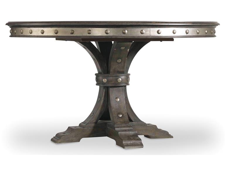
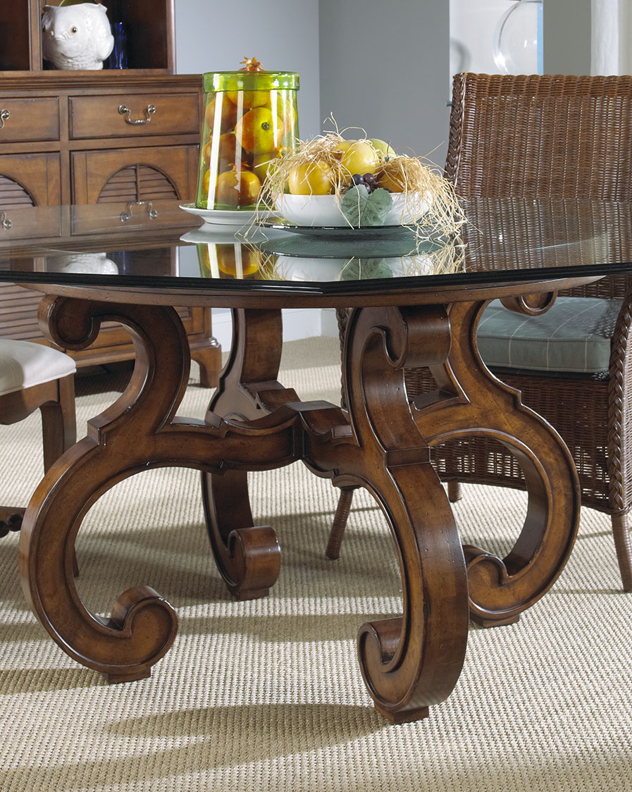
Hooker Furniture Dining Room Vintage West 54in Round Dining Table with 20in leaf is hardwood furniture made with hardwood solids, resin, decorative nails and aluminum. This traditional dark wood comes with a dark charcoal finish, unsurpassed quality, and solid frame. This lovely piece will never contract or expand during extreme weather changes.
Tags: benefits of using wood, benefits of wood furniture, classic, classic design, hardwood, hardwood design, hardwood furniture, hardwood pieces, hardwood species, hardwoods, McCreerys, McCreerys Home Furnishings, oakwood, solid wood furniture, traditional style, traditional theme, walnut hardwood, walnut hardwood type, walnut wood, warm colors, wood elements
Posted in Furniture, Interior Design 101, Interior Design Elements | No Comments »
Monday, January 18th, 2016
This neutral-colored bed from the Bergman Bedroom Collection of Jonathan Louis is perfect with yellow curtains, that yellow chair at the foot of the bed, and yellow-striped bolster, and other yellow accessories.
The color yellow is a wonderful hue. It is intense, it is bright, and it can even evoke the strongest emotions. Yellow is an attention-grabbing color yet it can also become abrasive should you make the mistake of overusing it. This color can appear bright and warm but in the wrong hands, it can also be visually tiresome.
Yellow can cause eye fatigue because of the high amount of light which it can reflect. The use of this color as a wallpaper on computer monitors can cause eye strain, even vision loss for some. Though this is the case, it can also be used (in moderation) to grab people’s attention. This is why yellow is used mostly in most roadside advertisements.
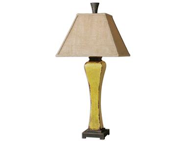
Lamps and Lighting Uttermost Oratino Burnt Yellow Lamp 26476 at McCreerys Home Furnishings. This fascinating lamp comes with a crackled ceramic. You will love the burnt yellow glaze as well as the rust bronze detail.
The Sunny Color
Using yellow in interior design means you are ready to stage warm and happy feelings inside your home.
Color therapy makes use of this color to evoke feelings of happiness in people. In interior design, it creates coziness and feelings of warmth. This is quite a popular color for wall paints.
Splashes of yellow can be used inside your home through golden carpet hues, warm room furniture, and yellow lighting fixtures. Accessories in yellow can also make a rather dull room appear more exciting.
Yellow is a highly recommended color for decorating rooms. This is the color that can brighten up any dark, gloomy room. Painting the walls light yellow, creamy yellow or any yellowish tint on wallpapers is great for small and dark rooms.
Mix decorative items of yellow and colors that match this lovely hue. If you have used yellow as paint or wallpaper, then find a neutral color for your ceiling and floor. This should balance the looks of your interiors while also creating a pleasant atmosphere.
Yellow can be so many things – it can be juicy, subtle, even dimmed. The living room walls can be painted with this juicy shade. If used as a tint, it can be mixed with brown, cream or brick red. Speaking of duos, what could be considered as the marital pair for yellow is the color green. This is a combination that is typically used in kitchens and children’s bedrooms. Bright accessories can be a fusion of two colors: red, coral, blue, orange or turquoise.
If you want to use yellow inside classical interiors, then have it combined with white. This is a great mixture for dining rooms, offices and living rooms. These two colors can make any room look larger, clean and bright. If you used the color combination as a backdrop, then be sure to use moss-colored, terracotta, or burgundy accessories. Wooden oak furniture will also look great inside such interiors.
If, on the other hand, you decide to use yellow and white furniture and accessories, then be sure to have a more exciting ceiling to floor colors such as lilac, green, or shades of blue.
It is also safe to experiment with yellow and chocolate. You will never go wrong with this combination as it offers a warm contrast to the usual sunny feelings that yellow evokes. Mix the same color with red and you will instantly bring life into a room.
Purple is also a great combination for bright yellow. Children’s rooms often come with pastel green with purple accessories. This is never irritating to the eye.
All in all, yellow can be used in different shades and can be easily combined with many different colors. Just learn to put balance these awesome colors by knowing their limits. Just remember this – too much of anything can always annoy.
Yellow lemons – in this case oranges – can add a unique tinge of yellow on your dining table. This wooden masterpiece is from FFDM’s Sunset Collection available at McCreerys Home Furnishings.
Tags: bright colors, bright hues, bright paint colors, brightening up rooms, color combination, color fusion, color psychology, contrast, guidelines, McCreerys, McCreerys Home Furnishings, tint, tips, warm colors, yellow, yellow color palette, yellow in interior design, yellow interior design, yellow interiors
Posted in Color Schemes, Interior Design 101, Interior Design Elements, Interior Design Themes | No Comments »
Thursday, January 14th, 2016
This classic wooden drawer is from FFDM’s American Cherry Collection.
Southwestern design is defined with earth colors and the richest textures. This means that you should use more of orange, yellow, turquoise, and red clay. Clay tile roofs, terracotta and handcrafted stuff are all welcome in a southwestern home.
Upholstery for this design is chiefly woven fabrics, suede, animal hides or leather. Blankets could be made of traditional native clothing. Do not limit the use for these beautiful pieces inside the bedroom because they can also be great wall decor.
Wood furniture is a must and could also feature metal accents or a distressed finish. The accents used in southwestern environments can be anything from painted ceramics to hand-painted tiles. If you can find early pieces dating all the way back to 16th century Mexico, the better.
Tribal Design Elements
You will see a lot of Native American pieces inside a southwestern home. Elements such as latillas, vigas and other artwork are design themes that are commonly used in architecture. This style is quite earthy as well as organic as it captures the heritage of Arizona and New Mexico areas. Natural accents, colors and other elements look and feel a lot like Mexican, Spaniard, and Native American designs; open floor plans, flat roofs and courtyards, even gardens can become a part of your home.
This Hooker Furniture Living Room Covington Bogue Club Chair has the right color to give life to a southwestern habitat.
Southwestern design makes use of subdued earthy tones like tan, cream, brown, terracotta, and white. These colors are great as backdrop for American Indian-inspired textiles and accents. Azure is a famous color for windows and doors. Any color found in nature such as forest green, salmon, sunny yellow and slate blue can fit perfectly in southwestern interiors.
Southwestern furniture should be unpretentious. Say no to anything intricate. Cherry, walnut, pine, and just about any mid-tone wood would do. It should have soft leather or natural textiles as coverings. Make use of huge pillows right on the floor as well as hammocks in your courtyard. These can be alternative seats for your guests. Always remember that the rooms must be spacious or have a natural flow.
As for the walls, they are often made with the same materials as the exteriors. Mostly adobe, interior walls are roughly plastered. Others use smooth stone or stucco. If you want to add warmth and color onto a boring wall, then use hand-painted tiles. They can also be used in covering kitchen backsplash. If not, use the tiles as individual accents.
Murals are also a huge depiction of southwestern culture. Have spiritual stories or rituals painted on murals then have them installed as a statement wall.
You can also try stucco plaster then add builder’s sand to the paint. You may also use special paint effects such as suede, color washing, or faux paint.
Capel Incorporated Floor Coverings Biltmore Select Bidjar Rug 1773RS02000300450 at McCreerys Home Furnishings
Southwestern floors are often honey-colored. Other homeowners prefer terracotta tiles. Adding visual interest on your floors is easy. Just arrange the tiles in patterns and layouts.
Parquet or light wood flooring is widely used. You can color this kind of flooring with cobalt blue or any other earthy color to make it more exciting. Carpets and rugs are valuable pieces but if you do not want these in your home, then be sure to opt for hardwood flooring.
Use brick or stones throughout your home without letting the style suffer. Use lovely rugs with traditional patterns and colors brighten up the room.
Southwestern accents are mostly paintings, candles, wrought-iron stuff, dried flowers, sculptures, pottery (the hand-painted type), and animal skins.
Learn these Southwestern design tips and begin bringing rustic beauty into your lovely home.
Tags: animal print, brick, earthy, guidelines, leather, McCreerys, McCreerys Home Furnishings, Mexican, Mexican interior design, Mexican interiors, Mexican style, Native American, Native American design, natural stone, neutral, neutrals, paint, rustic, rustic decor, rustic design, rustic elements, rustic home, rustic interior design, rustic look, rustic style, rustic theme, southwestern interior design, southwestern interiors, Spanish, stone, textures, tips, tribal, warm colors, wood elements, wood furniture, wooden elements, wrought iron, wrought iron furniture
Posted in Interior Design 101, Interior Design Elements, Interior Design Themes | No Comments »
Follow us on our social media
© McCreery's Home Furnishings | All Rights Reserved | Privacy Policy