- Follow us:


Monday, July 23rd, 2018
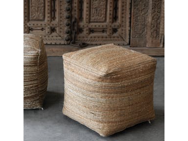
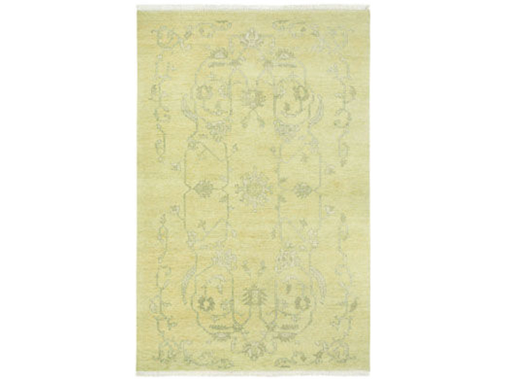
Neutral on neutral: Uttermost Accessories Shiro Ecru Pouf 23959
The simple act of changing the color in a room could transform the overall appearance of that space. It can be as basic as changing the backsplash pattern or painting the walls anew. The colors that you use should be the right one or the correct combination so you end up creating a timeless classic or a contemporary look that is to die for.
Before you hire the best painting contractor, though, you need to decide why certain colors are well-liked while others are simply…bland.
The Renowned Neutrals
If you are a homeowner who is looking for ways to make your home accessories pop or if you’ve made the major decision of selling your home, then it’s high time to decide also on the paint colors that you will use.
Neutrals are the safest way to go as they are guaranteed to liven up any living room or bedroom. Gray is an amazing canvas to any design element. It is also set to make unique features pop. But don’t limit yourself to just gray, white, brown or black, though.
You can also go for neutral orange and green which are always trendy. These are muted hues that are not so bold. They can also be easily paired with tan or gray hues. These plus some neutrals will add to the depth of a space as well as the warmth.
Go Gaga Over These Kitchen Hues
Kitchens usually come with interesting design features. Consider installing a lighter wood color on the kitchen cabinets. This is the most appealing that you could use when you’re pairing with pastel. A brighter hue might easily clash with a bright-colored tile countertop.
Always consider these factors when you are picking the best kitchen paint color.
When you want to play safe and you use neutrals in this area as well, then go for traditional white. Just picture an all-white kitchen which offers a clean and fresh appeal. If this is a bit more difficult to clean, then look for warmer hues such as reds or its more cheerful counterpart which is yellow.
Living Room Hues to Covet
The living room is also a wonderful area to use neutral colors. The most reliable backdrop will always be any neutral color such as beige, tan, white or cream. Mixing gray with beige is what’s now known as greige. This is a hot hue to have inside any living room.
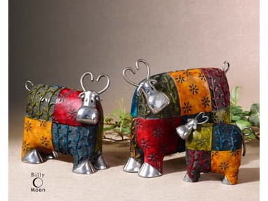
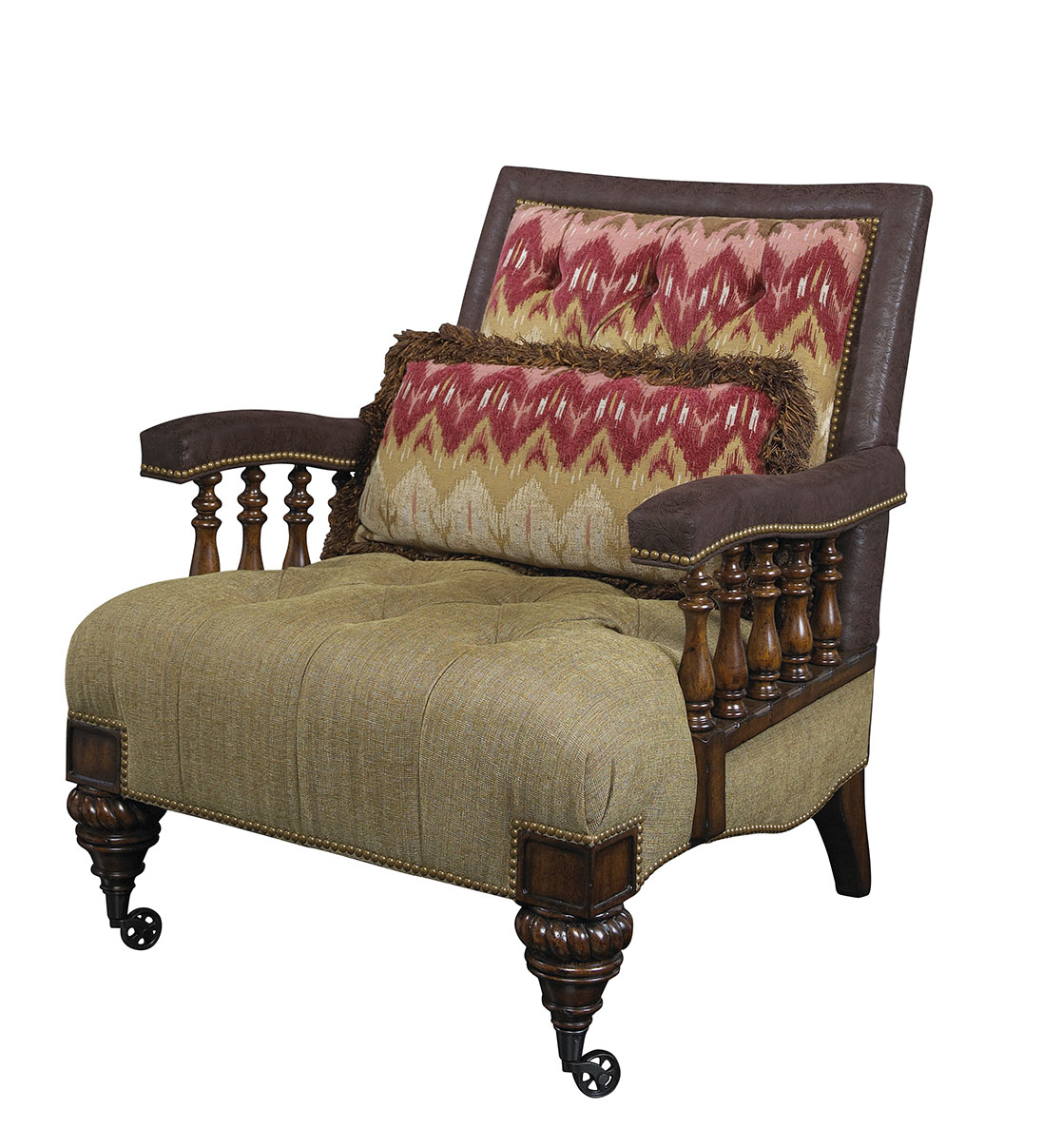
Bold Colors on Neutral: Uttermost Accessories Colorful Cows Metal Figurines
Bedroom Colors to Die For
A bedroom is a place of relaxation so make sure that there are no jolting colors there that would disrupt the quality of your sleep. You can paint the room with deep blue or a light green. Your preference is highly considered when picking the correct color in this part of your home. But you have to remember that creating a spa-like space is more important than the need to satiate your craving for, say, a tangerine color inside the bedroom.
Popular Bathroom Hues
Paint can make a room appear larger or smaller depending on how you would want to use it. If you have a small bathroom, then widen the room by painting it with light colors such as powder blue or pastels. Those who are bold enough to use black or navy blue are confident that they have ample space to paint.
Now the Costs
As soon as you have already decided which color to paint a room with, it’s likely that you would want to begin planning on the budget. The best results require professional help. These experts know how to best apply the paint that you want.
Average interior painting cost is at $1,679.
Tags: bright colors, bright paint colors, color palette, McCreerys, McCreerys Home Furnishings, neutral colors, neutral hues, neutral paint colors, paint colors
Posted in Color Schemes, Interior Design 101, Interior Design Elements, Interior Design Themes | Comments Off on Why Are These Colors So Popular?
Saturday, May 14th, 2016
FFDM Brentwood Collection: The light touch of yellow on the lampshade, artwork, area rug and accent chair makes it a noticeable yet non-glaring element inside this beautiful room.
You either love or hate yellow – what is it? Some may answer that their level of emotion towards this color depends on how vibrant or soft it is. Believe it or not, though, yellow is crucial in interior design.
Color can affect humans physiologically without them noticing it most of the time. This only means that you must never underestimate the power that colors or color combinations have among humans.
A Fair Share of Yellow
You might have seen a good amount of yellow in interior design magazines and sites these days. Stop wondering why yellow seems to be taking the interior design industry by storm.
Yellow is a retrospective color, meaning, your grandma and grandpa did enjoy using this color during their days.
Yellow is often used because of its positive qualities. It is known to evoke happiness, confidence and optimism. Imagine feeling optimistic just because you wake up to a sunny yellow room every day. There is a downside to this color, though. Overusing it (meaning you surround yourself with everything that’s yellow), or using the wrong tone, even pairing it with the wrong hue will render the yellow useless (if not damaging to the overall design).
This means that you should harness just the right shade of yellow. If you don’t know what shade to pick, then find the one that resonates the most with you. See also that this shade of yellow does not create disharmony in your existing interior design theme.
Yellow can range from daffodil, creams, sunflower shades and acid hues.
Choosing or Avoiding Yellow
The rooms where you should use yellow are the hallways, the breakfast nook, and any room that asks for a lot of activities and foot traffic. The hallways, for instance, are often dark and so yellow is the best welcoming color that you can use there.
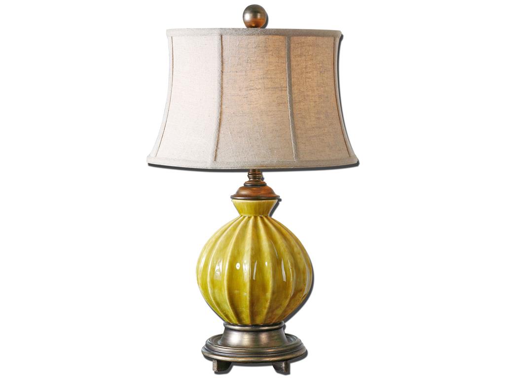
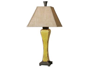
Uttermost Lamps and Lighting Pratella Lamp 27491 features a bright yellow base that will surely captivate the beholder.
Teaming Up with YellowYellow can relate to the emotions just like a person taking an upper. This only means that you shouldn’t use yellow in areas where you should be resting such as the bedroom or the bathroom. The reading room might not be a good area to use this color in. Being exposed to yellow in these places of relaxation will only make the person annoyed or irritable in the long run. Remember that even as you sleep, the psychological properties of yellow are still at work so better be careful in using this activity-inducing hue.
You are seeing a lot of yellow pairings in many interiors at the moment. Different combinations are being used under different circumstances. Depending on yellow’s strengths, gray is often used as the hue to tone down this active color.
Tonal white versions of yellow include ivory, cream and oyster hues. These look lively, fresh and happy and are known to excite the senses. Spring showed much of these beautiful colors so it would be a waste if you would not be able to harness yellow to your home’s advantage.
A complementary color to yellow is any shade of purple. If you think you have doused your home with too much yellow, then freely use purple to counteract the overactive environment that you have created.
For a calmer color scheme, find the analogous colors. Which colors sit right next to yellow on the color wheel?
For yellow, these would be red and orange.
The key to successfully using yellow as a color scheme is to use it together with the hues from the same family. It also pays to identify which colors are primary, secondary and accents.
Yellow has always been a contradictory color. It can be the color of slaves (during the Spanish Inquisition) or it can represent nobility (this is apparent among the Chinese). At the end of the day, it will always represent cheerfulness so use it with caution.
Tags: bright colors, bright hues, bright paint colors, brightening up rooms, brightening up your home, McCreerys, McCreerys Home Furnishings, yellow, yellow color palette, yellow color psychology, yellow interior design, yellow interiors
Posted in Color Schemes, Interior Design 101, Interior Design Elements, Interior Design Themes | No Comments »
Friday, May 6th, 2016
FFDM’s Protege collection offers this interesting, multi-colored seating piece.
Having the will to tackle a multi-colored theme project in your home requires a lot of vision. When you are set to do this, begin by looking at walls, ceilings and floors as empty canvasses that need to be filled with exciting colors. A multi-color palette may not be an easy theme to project but you will certainly find joy once you accomplish it.
A multi-color scheme looks best when there is one dominant color that will anchor the rest together. With this in mind, you need to come up with a color palette that you really love to begin with. After choosing the color that tickles your senses, you can then determine the colors that will contrast or complement your chosen anchor color. As soon as you have decided on these, find out which other colors you will add to the existing pool.
Hiring a Professional Colorist
It is advisable that you find a professional colorist if this is your first time to delve into the multi-color scheme. The judgment of such professionals are highly esteemed so all you’ll need to do is to meet up with some of them, decide whose portfolio impresses you the most, then sit down and have a heart-to-heart talk with the winning fellow. Cut through the usual chitchats. Tell the colorist what you want from the onset. Remember that you are still the boss and that the colorist should know how to fuse your ideas with his color expertise.
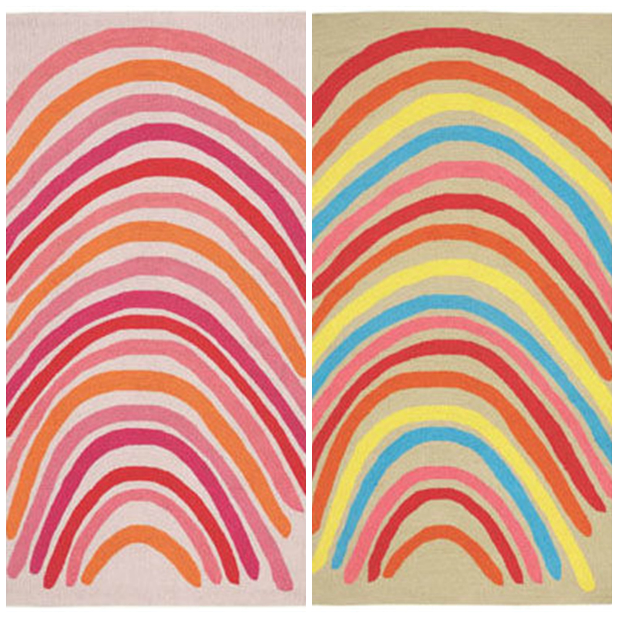
From L-R: Capel Incorporated Floor Coverings Rainbows; Capel Incorporated Floor Coverings Rainbows.
What to Discuss
Before you set that meeting with the colorist, you can begin your color search by cutting some color cards. These samples can be set up against the walls so you’ll have an idea on how they will look. Place one color card after the other and see how they will interact. See how each color looks under natural and artificial lighting.
You can also use a color visualizer. This is often available in paint shops or in paint manufacturers’ websites. This is a special software that will help you experiment with colors without making your walls look like toddler’s playroom.
The development of a multi-color palette can also begin with the purchase of paint samples. There are also swatches that you can use right onto your walls. Using these may take a bit more effort but seeing the results will help you make a more intelligent decision.
Whichever technique you use to create the color plan for your home, always make sure that the dominant color you chose will still be the star of the show. This should be used in no less than 40% of the interior design elements. The secondary color can have 25%, with the rest taking in the rest of the percentage.
Rainbows and Stripes? Why Not?
It is easy to be bold when one uses colors. Varying shades bring about different patterns which, in turn, evoke different emotions.
If you want to go a step further and employ stripes with colors, then you’re in for a real adventure. This combination creates the most exciting visual delights.
Versatility is key to achieving balance even when presented with a lot of activity – imagine using colors and stripes. Adding drama to the room could be the use of bold yet contrasting colors it could be the installation of wide-striped wallpapers as backdrop for multi-colored furniture.
If you want something subtler, then settle for monochromatic stripes instead. These are less distracting.
The way the stripes are presented can also create different illusions. Vertical stripes create height while horizontal ones can make a small room seem wider.
Stripes can also harmonize any busy space. These are simple, parallel lines that can interact with any kind of graphics. Add stripes to some colorful florals and the latter become immediately grounded.
Take time to try different combinations for stripes and your multi-color palette. It’s an awesome way to enliven your home.
Tags: adding colors to a home, bright colors, bright hues, bright paint colors, brightening up rooms, brightening up your home, color consultant, McCreerys, McCreerys Home Furnishings, multi-colored interiors, multi-colored palette, rainbow interior design, rainbow interiors
Posted in Color Schemes, Interior Design 101, Interior Design Elements, Interior Design Themes | No Comments »
Monday, January 18th, 2016
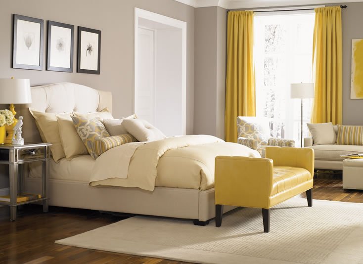
This neutral-colored bed from the Bergman Bedroom Collection of Jonathan Louis is perfect with yellow curtains, that yellow chair at the foot of the bed, and yellow-striped bolster, and other yellow accessories.
The color yellow is a wonderful hue. It is intense, it is bright, and it can even evoke the strongest emotions. Yellow is an attention-grabbing color yet it can also become abrasive should you make the mistake of overusing it. This color can appear bright and warm but in the wrong hands, it can also be visually tiresome.
Yellow can cause eye fatigue because of the high amount of light which it can reflect. The use of this color as a wallpaper on computer monitors can cause eye strain, even vision loss for some. Though this is the case, it can also be used (in moderation) to grab people’s attention. This is why yellow is used mostly in most roadside advertisements.
Lamps and Lighting Uttermost Oratino Burnt Yellow Lamp 26476 at McCreerys Home Furnishings. This fascinating lamp comes with a crackled ceramic. You will love the burnt yellow glaze as well as the rust bronze detail.
The Sunny Color
Using yellow in interior design means you are ready to stage warm and happy feelings inside your home.
Color therapy makes use of this color to evoke feelings of happiness in people. In interior design, it creates coziness and feelings of warmth. This is quite a popular color for wall paints.
Splashes of yellow can be used inside your home through golden carpet hues, warm room furniture, and yellow lighting fixtures. Accessories in yellow can also make a rather dull room appear more exciting.
Yellow is a highly recommended color for decorating rooms. This is the color that can brighten up any dark, gloomy room. Painting the walls light yellow, creamy yellow or any yellowish tint on wallpapers is great for small and dark rooms.
Mix decorative items of yellow and colors that match this lovely hue. If you have used yellow as paint or wallpaper, then find a neutral color for your ceiling and floor. This should balance the looks of your interiors while also creating a pleasant atmosphere.
Yellow can be so many things – it can be juicy, subtle, even dimmed. The living room walls can be painted with this juicy shade. If used as a tint, it can be mixed with brown, cream or brick red. Speaking of duos, what could be considered as the marital pair for yellow is the color green. This is a combination that is typically used in kitchens and children’s bedrooms. Bright accessories can be a fusion of two colors: red, coral, blue, orange or turquoise.
If you want to use yellow inside classical interiors, then have it combined with white. This is a great mixture for dining rooms, offices and living rooms. These two colors can make any room look larger, clean and bright. If you used the color combination as a backdrop, then be sure to use moss-colored, terracotta, or burgundy accessories. Wooden oak furniture will also look great inside such interiors.
If, on the other hand, you decide to use yellow and white furniture and accessories, then be sure to have a more exciting ceiling to floor colors such as lilac, green, or shades of blue.
It is also safe to experiment with yellow and chocolate. You will never go wrong with this combination as it offers a warm contrast to the usual sunny feelings that yellow evokes. Mix the same color with red and you will instantly bring life into a room.
Purple is also a great combination for bright yellow. Children’s rooms often come with pastel green with purple accessories. This is never irritating to the eye.
All in all, yellow can be used in different shades and can be easily combined with many different colors. Just learn to put balance these awesome colors by knowing their limits. Just remember this – too much of anything can always annoy.
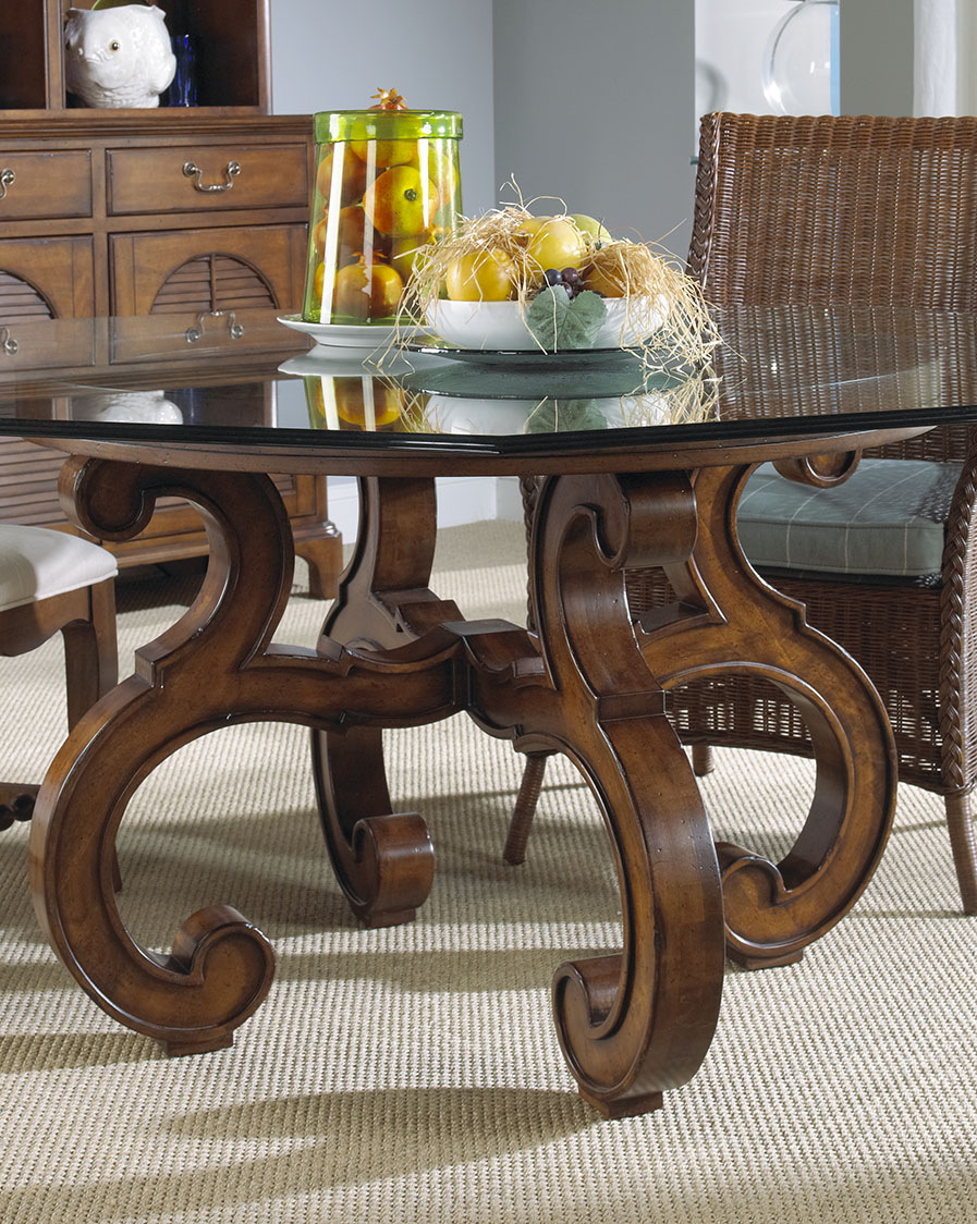
Yellow lemons – in this case oranges – can add a unique tinge of yellow on your dining table. This wooden masterpiece is from FFDM’s Sunset Collection available at McCreerys Home Furnishings.
Tags: bright colors, bright hues, bright paint colors, brightening up rooms, color combination, color fusion, color psychology, contrast, guidelines, McCreerys, McCreerys Home Furnishings, tint, tips, warm colors, yellow, yellow color palette, yellow in interior design, yellow interior design, yellow interiors
Posted in Color Schemes, Interior Design 101, Interior Design Elements, Interior Design Themes | No Comments »
Follow us on our social media
© McCreery's Home Furnishings | All Rights Reserved | Privacy Policy