- Follow us:


Tuesday, July 4th, 2017
(The First of a Six-Part Series)
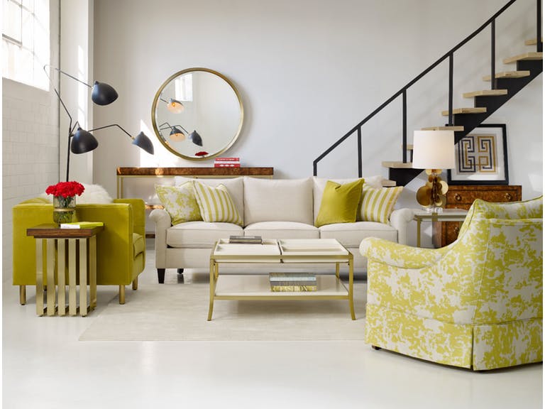
Cynthia Rowley’s Rivington 3-Over-3 Sofa together with the most colorful decorative elements to adorn a living room.
Adding color to your home – or at the very least, conceptualizing how the hues will make your habitat more amazing – is also a way to add more color to your life. Yet there are a lot of questions as to what paint color to use in a home as well as color predicaments like whether to pick gray or blue.
Of course we won’t be able to send you paint swatches just so you know how to begin your color 101 journey. What you can do is to read this series of color and paint basics that will teach you how to shop for the best colors and to effectively use them in your home.
This first of a six-part series will teach you about color fundamentals – this is more like a crash course to reading the color wheel and how to harmonize hues.
Matching and mixing colors is no easy business, though. Don’t get the idea that everyone can do this without any knowledge of color fundamentals, don’t feel, insecure in pairing unique hues, too. It’s all about learning the science and the art behind it all and being comfortable in using it in your own home.
Decorating with Hues
It is crucial to keep the color theory in mind when it comes to color decoration. Before you start thinking if it’s complicated or not, here are the basic principles –
Color theory also creates logical color structure. For instance, you could have a bunch of vegetables and fruits. Color theory would dictate that you would organize these based on their color relation. The oranges would sit next to the lemons while the lemons would be right next to the green apples which sit right next to the blueberries, and so on.
Don’t fret, it is not as complex as it seems to sound. You just have to, primarily, orient yourself to the color wheel. This is a tool, a handy helper of sorts, which will guide you in picking the specific colors – even down to the specific shades – that you want.
The color wheel comprises 12 basic colors which are –
When dealing with paint, remember these terms –
Shade means any pure hue fused with black.
Tone is a hue mixed with gray.
Hue is any pure color with the exception of white or black.
Tint is a color mixed with white.
Here are the fundamental color harmonies that you need to keep in mind –
Analogous hues are three hues that sit side-by-side on your color wheel such as green, yellow green and yellow.
Note that every hue outside of these already come from a mixture of hues to varying degrees.
Use the color wheel and these basic color guides so you don’t go wrong. Also, make it a point to look at Mother Nature for color inspirations. Just imagine a red flower encircled by green and yellow leaves. All these, the color of the leaves, the flowers and grass, all are inspirations for your color palette.
What about you, what are your color inspiration sources? Look around you – the possibilities are actually endless.
Tags: color 101, color basics, color choices, color combination, color fusion, color options, color palette, color schemes, McCreerys, McCreerys Home Furnishings
Posted in Color Schemes, Interior Design 101, Interior Design Elements | Comments Off on Color 101: Using the Color Wheel, Choosing and Matching Hues
Thursday, January 5th, 2017
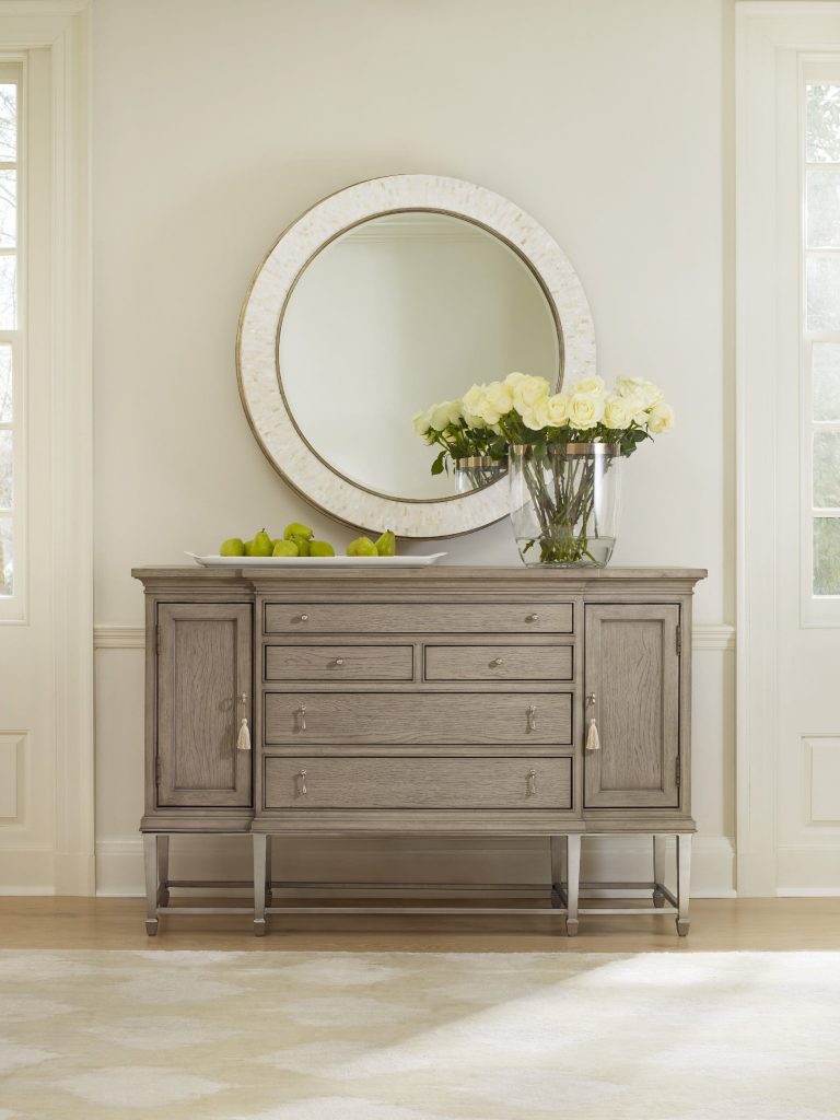
CYNTHIA ROWLEY FOR HOOKER FURNITURE SOIREE SIDEBOARD: Beige proved its worth in this setting.
Selecting paint for interiors can make or break the overall appearance of a home. Also, colors can dramatically influence people’s feelings, moods and, eventually, behaviors. It is because of these reasons that you should research your choices before you even think of altering the colors of your walls.
Professional painters have the skills to paint your home or you can just roll up your sleeves and do the work yourself. Either way, there will come a time when you need to pick the right color for every room.
Here are the 5 hottest wall paint picks for this year –
Hazel
This is a delicious light blue color that’s both attractive and flexible. This is a hue that will look charming when paired with neutral accents, wooden pieces and white trim. Hazel is the right color for a homeowner who is looking to add subtlety into his home.
Shades of White
What could be safer and more popular than white among homeowners? The trick, though, is to find one that’s not too dull or bright. Any shade of white is a classic choice for any home. It is timeless and elegant and it could give your space a more relaxed and comfortable feeling.
If you’re not comfortable about white being the dominant element, then use it to freshen up your ceilings, cabinets and trim. It will also look amazing and more interesting when you pair it with silver or beige accents.
Beige – The Neutral Paint Advocate
Talk of beige, this color is quite huge this year. Use it on your walls and look how gorgeous it would be when painted on the most important rooms inside your home.
Beige is warm and cozy and it will pair well with either light or dark furnishings. There are many exciting shades of beige in the market these days so go ahead and find the one that makes your heart skip.

Accessories Uttermost Indigo Florals Framed Art S2 41558
Go Loud with Indigo
This is a hue that’s perfect for someone who wants to experiment or who simply wants to have fun. This is a gorgeous hue all on its own but it will even look more amazing when paired with any shade of white.
Use indigo paint to update your door or use it to create a unique accent wall. This hue is trendy and vibrant and it offers just the right amount of spunk for your home updates.
If you feel even bolder, paint the entire room with indigo. This color will serve as the foundation in decorating the rest of the rooms. Use indigo on your furniture and accents. Indigo spells liveliness and energy so be sure to use it in rooms where you need a lot of invigorating force.
Gray Is Still Hot
Gray is still a trending color this year in the interior design industry. It is dark and light depending on the tone that you use. Despite its name, gray can also be light or slightly bluish. It can pair well with many other colors – take your pick. This color is especially wonderful if you’re thinking of redesigning your bedroom this year. Gray will give it a more peaceful and serene feel as it is an attractive and delicate hue.
Giving gray an influence of blue will make it more refreshing and even water-like in its appearance. It is surely a color that will not disappoint.
Conclusion
Paint is an effective way to update the look of any home. Choosing from among these five exciting 2017 colors will make your home a sight to behold. Get a new perspective plus a new coat of paint so you would fall in love with your habitat once more.
Tags: color options, McCreerys, McCreerys Home Furnishings, paint options, wall colors
Posted in Color Schemes, Interior Design 101 | Comments Off on 5 Safe Paints for Your Home This 2017
Thursday, November 10th, 2016
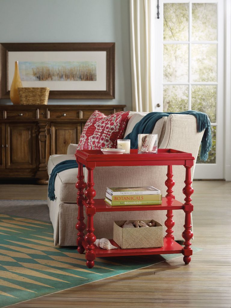
The Hooker Furniture Living Room Sanctuary Chairside Table is as unique and colorful as a side table could get.
When you approach interior design from a homeowner’s point of view, you probably just go about and pick the things that you think are attractive. Also, you tend to make your decisions based on any existing décor or pattern in your home. Color, however is such a powerful tool that you can use to evoke certain emotions. It can also create illusions of space or invoke a dramatic ambience.
Here are tips on how you can effectively use color psychology right in your home –
Bright Colors = Spaciousness
You can create an illusion of space if you use a lot of bright colors in your interior design. Use a lot of eggshells or yellows to make a space seemingly bigger. Don’t immediately go for white, though. Even when it is known to add space, it is not as effective as the tinted hues.
Bright Colors = Happy Educated Crowd
You can appeal to the tastes of the educated few if you learn how to fuse complex colors. For home interiors and exteriors, it has been observed that educated people find two-word colors to be more appealing. Simple colors, on the other hand, appeal to people with lower budgets and those that have lower education levels. When you’re out to pick complex colors, it is best to use names like eggshell white or lime green.
Red = Appetite
You can help build appetite in the dining room or the kitchen by using dashes of red or painting the walls with red paint. A lot of restaurants know this concept which is why they willingly paint their walls with solid red or red patterns.
Use red in the kitchen to up the appetite of people. You can have neutral walls made non-boring when you add red shutters or paint the cabinet doors with any shade of red.
Blended Interior + Exterior = Wow
When you use foyer blends by combining interior and exterior paint, you end up wowing your guests. The entryway or foyer becomes much more exciting if you use this technique.
Deep Tones = Warmth
You can warm up your home by using deep tones during the colder months. Use a lot of yellows, oranges, reds and browns. When you are about to paint your home during the winter because you’re staging it for future selling, remember this advice because it will make the house stand out.
Cool Colors = Fresh and Breezy
If deep tones keep homes warm during the winter, then the opposite, the cooler colors do otherwise. These colors are along the same hues used during fall, especially blue, so use them in abundance during the summer months. Have a white exterior plus a blue trim to achieve a Greek aura which is great if you want a cool-looking home during summer.
Familiar Colors = Fond Memories
If you decide to use familiar colors from your childhood or your not-so-distant past, then you will surely be reminded of wonderful memories. This becomes more special as you put these familiar colors in the kitchen, after all, what could be more pleasant than feeling like you’re back in Grandma’s kitchen?
Reds and yellows are perfect for that playful yet posh look for the kitchen. Don’t use red, though, if you have a high blood pressure. More so, stay away from dark shades of red so that irritability won’t ensue in the house.
Extend the familiar colors into other rooms such as the bathroom. If you love wearing a particular color, then use that same color in your bathroom. Having your fave color on the background will help you look more yearningly at the mirror inside the bathroom. Basically, you will tend to love yourself.
Tags: adding colors to a home, color 101, color basics, color options, color palette, colors, cool colors, McCreerys, McCreerys Home Furnishings, tips, warm colors, warm hues
Posted in Color Schemes, Interior Design 101, Interior Design Elements | No Comments »
Follow us on our social media
© McCreery's Home Furnishings | All Rights Reserved | Privacy Policy