- Follow us:


Wednesday, February 7th, 2018
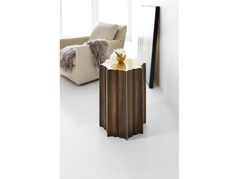
Hooker Furniture Living Room Melange Eden Drink Table is coming very soon!
Color theory is an all-encompassing definition of concepts and designs. There are three categories, though, that can be logically used in fashion or interior design. You have, of course, already heard of the color wheel, the color harmony, and how each color is used according to context.
Color theories are there for a structural comprehension of hues. For instance, if you see a table laden with fabrics, then you can categorize according to color.
How to Use the Color Wheel
Also known as the color circle, this is based on yellow, red, and blue which are the traditional, basic colors. Sir Isaac Newton was the first to develop the circular diagram in 1666. Scientists and artists, since then, have come up with designs and variations based on the said diagram.
The color wheel is a representation of the logical arrangement of hues in their purity. First, take a look at the primary colors. These cannot be formed when you mix other colors. These are self-sustaining hues and are used to create other hues.
The secondary colors, on the other hand, are formed as you mix the primary colors. When you mix red and yellow, you end up with orange. Purple – which is the color of 2018 – can be made by fusing red with blue. Mixing yellow and blue means you will have a green hue soon.
Tertiary colors are red-orange, yellow-orange, red-purple, blue-purple, yellow-green and blue-green. These are made by mixing a primary color with a secondary color, hence, the two-color names.
What Is Color Harmony?
Harmony is the pleasant arrangement of music, color or poetry. When pertaining to visual experiences, this is one that pleases the beholder. It must be able to engage the viewer and create a sense of balance or order.
When was the last time that you saw something that was not in harmony with something else? You would probably define that space as chaotic or boring. Either way, you were not pleased with what you saw so your brain rejected the image.
There are formulas to follow with regard to color harmony. There are color schemes that come from analogous hues. These are colors that sit side-by-side on the color wheel such as yellow-green, yellow, and the exciting yellow-orange.
If you want to use two colors that are seated opposite from each other, then what you want are complementary colors. An example of these is green and red as well as yellow-green and red-purple. The two colors may seem to oppose but they actually provide the needed contrast as well as optimized stability.
If you want to use additive colors, then you would want the primary hues that make up the white light. These are green, red, and blue or RGB. Subtractive primary colors, on the other hand, uses a color-printing process referred to as the CMYK or the use of cyan, magenta, yellow, and black.
Tints are mixtures of any color with white while shades are mixtures of any color with black. Toning is the creation of anything that is grayed down (white and black are both added to a hue). There are three ways to alter the basic color wheel and these are to tint, shade or tone.
The 60-30-10 Rule
The key to being confident in combining colors is to use this simple rule. This concept follows the rule of three which is used in almost everything from marketing to writing and even floral arrangements.
This is not a precise formula, okay, so relax. Don’t go all matchy-matchy, just be careful with cohesion and balance.
The 60 in this rule stands for 60% of the room should be occupied by anchor pieces and walls. The next 30% should be for accent furniture, wood trim, area rugs, and textiles, while the last 10% is for artwork, decorative pieces, and other small items.
Tags: color harmony, color theory, color wheel, McCreerys, McCreerys Home Furnishings
Posted in 2018 Trends, Color Schemes, Interior Design 101, Interior Design Elements | Comments Off on The Relevance of Color Theory in Interior Design
Wednesday, September 14th, 2016
FFDM Harbor Springs Collection features these contrasting yet matching hues of natural and whitewashed wood.
Every color is crucial in creating beautiful things in this world. Whether you need colors on your clothes or the interiors of your home, it is the same. While colors are this important, not everyone has the innate skill to point out which color goes with which and which ones would clash. If you cannot trust your eyes to make that judgment for you, then here are some guidelines –
Study the Color Wheel
The basic color wheel should be able to guide you when you make your color choice. You should have seen this colorful pie graph in school but here’s a little something to juggle your memory –
Red, blue and yellow are the three primary colors. Mix red with yellow and what you achieve is orange. Fuse blue and yellow to get the color of nature – green. To get violet, mix red and blue. These are what are known as secondary colors.
Tertiary colors, on the other hand, are the result of the fusion of a primary color and a secondary color. An example is red-violet or and blue-violet.
Every color has tints and shades. The first is a variation of any color when it is mixed with white. Red mixed with white achieves pink which is, in essence, a tint. Shade is a variation of any color when it is mixed with black. Don’t worry too much about shades and tints; what you need to focus on are harmonious color combinations and how to distinguish them.
Color Harmony
The color theory points out that harmonious colors are those that use any two hues that are opposite each other on the wheel. Three colors that are equally spaced on the wheel (or that form a triangle), colors that form a rectangle, are harmonious colors.
These are perfect color schemes or the more proper term is – color harmony. A color scheme should always be harmonious despite the rotation angle.
1586-10458-GRY1 Note-To-Self Writing Desk 1586-75410D-GLD6 Swanson Upholstered Metal Side Chair is featured in a cool, Nordic-themed room.
Warm and Cool Hues
Another separation that you need to be conscious of are warm and cool hues. Every group has its purpose and a spectrum of emotions to convey. Warm colors convey joy, energy and productivity while cool hues convey peace and calmness.
The color wheel can be easily divided if you want to group the warm and cool hues.
Basic Color Schemes
There are fundamental rules to commit to memory if you want to master how to match colors. Don’t worry, they’re quite simple.
Complementary colors are the ones that sit opposite each other on the color wheel (e.g. red and green or blue and orange). These colors have a high contrast so it is best to use them if you want to make a statement. You can use one color as the background and the other as the accent.
You can use shades and tints alternately, for instance, a lighter tint of red can contrast a darker shade of green.
Split complementary hues make use of three colors. This color scheme uses one color plus two adjacent colors. An example is blue, red-orange and yellow-orange. This color scheme is ideal for neophyte interior designers and decorators. This is the scheme to use if you don’t wanna mess up.
Analogous colors are three colors that are next to each other. Yellow, yellow-orange, and orange is an awesome example. This color scheme can be jarring if you mistakenly combine warm and cool colors so be careful.
Triadic colors can also be used in your home. This color scheme is achieved if you use any three colors that sit equally apart. An example of these hues on the color wheel are red, yellow and blue. This is also a high contrast scheme but it is more balanced when compared to complementary colors.
Now that you know the basics, are you ready to experiment on your home’s color schemes?
Tags: adding colors to a home, color 101, color basics, color harmony, color wheel, cool colors, cool hues, harmony, McCreerys, McCreerys Home Furnishings, shades, studying the color wheel, tints, warm colors, warm hues
Posted in Color Schemes, Interior Design 101, Interior Design Elements | No Comments »
Tuesday, July 19th, 2016
FFDM Summer Home Collection: The unifying color in this traditional bedroom is brown in different shades.
Color preferences vary per person, per personality. Some folks like it bright and daring, some feel more secure with neutrals, still others like to experiment. The good news when it comes to using colors is that there is no such thing as a correct palette.
Have you ever gotten inside a home where there is an explosion of colors only to feel that every room seems to be detached from the rest? What’s missing here is what’s referred to by interior designers as cohesion.
The Cohesive Paint Color
A simple way of creating a more cohesive feel is to have color consistency on walls. Connecting spaces, in particular, should have paint color that will harmonize them. This is especially true in an open floor plan.
This does not mean that you should automatically resort to gray, white or beige. You can still use a color that suits your preference so long as the hallways, the foyer and the main connector room are all painted in the same color. The color that you use there will serve as the dominant color in your home.
Plan the Color for Sightlines
People who want variety in their wall colors should pay more attention to sightlines. These are those areas when you are standing inside the living room and you get to look into the other rooms. A clear view of the dining room or the kitchen from there means you have to paint these three rooms with the same paint color. The key here is for all three rooms to work together. Paint them in different colors and what you’d get is a weird look that simply won’t work.
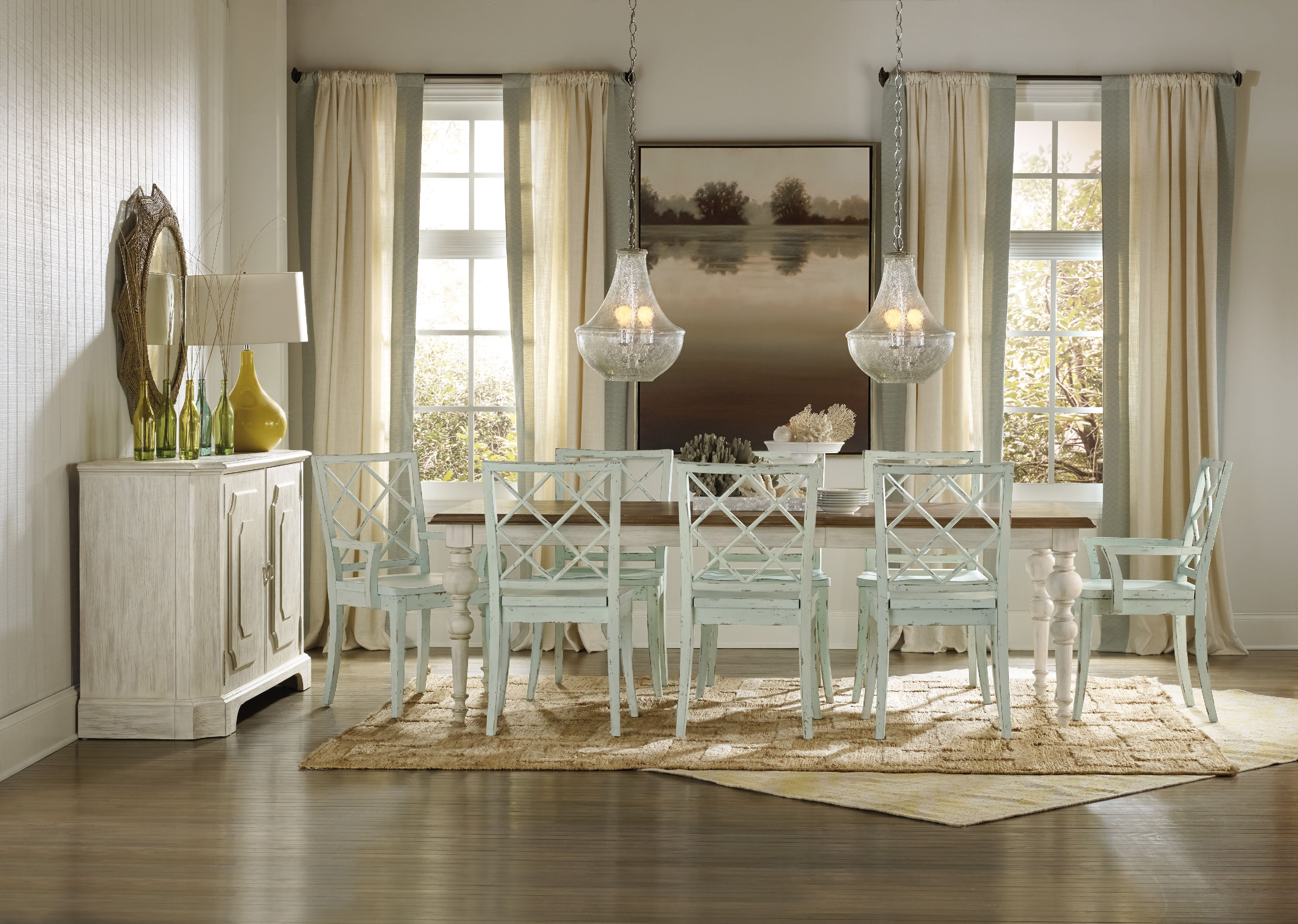
Hooker Furniture Dining Room Sunset Point Rectangle Dining Table with Two 18in Leaves
Pick Color Groups
Just as you are admonished to choose your friends well, this is also the case when it comes to choosing your color gang. Your color scheme must effortlessly flow from one room to the next. To achieve this, make sure that you get colors from the same temperature family.
Some people choose to work with the warm color palette, others the cool color scheme such as the blues, grays, and greens.
Another option is to pick one or two hues then use variations. If blue happens to be the main color, then you could pair it with gray-blue or you can always go with pure blue which shifts to navy blue as you move from one room to the other.
This same concept can be used in using decorative accessories.
As for your wall paint, paint stores can provide you with tint of particular colors. Your chosen main color can be knocked down to about 50%; all the mixer has to do is to add more white each time. You can go lighter or darker with the main color that you choose.
Walls should be painted two to three shades lighter than the ceiling color. This won’t look stark when you decide to use white.
Paint decks are also great inspirations in finding colors that harmonize.
Edgy Colors, Hid
Rooms that are out of sightline are great places to experiment on in terms of wilder colors. Powder rooms, master bedrooms, kids’ rooms, and other rooms that are encased in four walls are places that you could colorfully indulge.
So, have you always wanted to paint a room black? Begin with the bathroom!
Bold Colors, Cute Accessories
Accessorizing is an easy way of introducing dramatic hues. Limit the bold colors on your accessories, this is if you’re still uncomfortable about the whole switch from neutrals to bold colors.
Choose a color that will excite the senses, bright colors are great in highlighting a thing or worth.
Tie the rooms with accent colors that alter from room to room, though continuing with the major color throughout. Blue and green in the living room, for example, will mean using one of these colors inside the dining room. You could do blue and yellow in the next room.
Always keep the colors cohesive so that your theme would make more sense to you.
Tags: adding colors to a home, color 101, color basics, color harmony, harmony, McCreerys, McCreerys Home Furnishings, symmetry
Posted in Interior Design 101, Interior Design Elements | No Comments »
Friday, February 5th, 2016
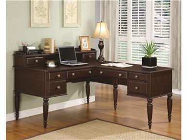
The Flexsteel Home Office Hutch W1201-747 will neatly sit on that cozy corner of your home office, allowing more space to be utilized.
Many people find themselves living in homes with an open floor plan. These days, if you still do not have one but are thinking of jumping on the bandwagon, then you have to consider which walls to tear down or to cut away from. The airy and open feeling of this kind of layout is awesome though it also comes with home design quandaries.
The most common questions that people ask with regard to the open floor layout are these –
These are just some of the many questions that open floor layouts conjure.
Space planning is the step that comes before color, fabric or finish selection. This should be done whether you are designing your first home or when you are remodeling. Planning, when done right, can give you a room that looks and feels much larger.
Well, there is no need to be paralyzed with fear. If you’re not ready to dive into the totality that open space planning offers, then know that you can still section off the space into smaller areas. Make a list of functional spaces that you will set up within the bigger space. If you can, assign a specific square footage for each room.
You also have to consider the foot traffic per area. For example, there should be ample space between the dining area and the kitchen (no less than four feet is ideal) so that diners will be able to walk to and from both areas without hindrance.
With an open floor plan, you will have more space for this lovely wooden piece from the Hyde Park Collection of FFDM.
Space adjacency should also be considered. Rooms that are commonly placed next to each other are the bathroom and the bedroom, the kitchen and the dining room, the living room and the kids’ play area. Of course, this all depends on your lifestyle.
Consider the current and future locations of doors, electrical outlets, windows, and columns. The kitchen should be situated on an area where there’s amply water supply – and so should the bathroom. You will surely minimize costs if you plan the adjacent rooms properly.
An open space layout does not necessarily translate into rooms that are not properly defined. Say no to the temptation of lining up your walls with furniture. Instead, use area rugs to define the conversation clusters in your living area. Doing so will let you add coziness and warmth to your home, making it a lot more inviting.
If you are the entertaining type, you might want to consider buying a chaise or daybed. These come with open sides and can serve as seats for two rooms. An alternative can be that lovely upholstered bench that is both a seat in your dining area or an anchor for a work of art propped against the wall.
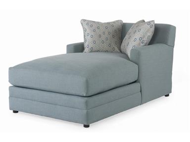
Chaises offer two open sides; this is a piece that you can use in two areas (Century Furniture Living Room Cornerstone Chaise LTD7600-5).
As for the walls, Instead of the usual, you can just invest in some dividers, double-sided bookcases or decorative screens. These simple items will be able to provide the privacy that you need on a daily basis.
Open floor planning is all about color harmony (read about our previous blog on how to do this – http://mccreerys.blogs.eprevue.net/2016/02/04/interior-design-101-fundamental-color-harmonies/). While colors are a major part of your open space layout consideration, it is important to note that all walls do not have to be painted with the same color.
Whatever happens, do not allow yourself to freeze with fear. Open floor plan should bring out your creativity and vivid imagination!
Tags: color harmony, McCreerys, McCreerys Home Furnishings, open floor, open floor layout, open floor plan, space planning, tips
Posted in Interior Design 101, Interior Design Themes | No Comments »
Thursday, February 4th, 2016
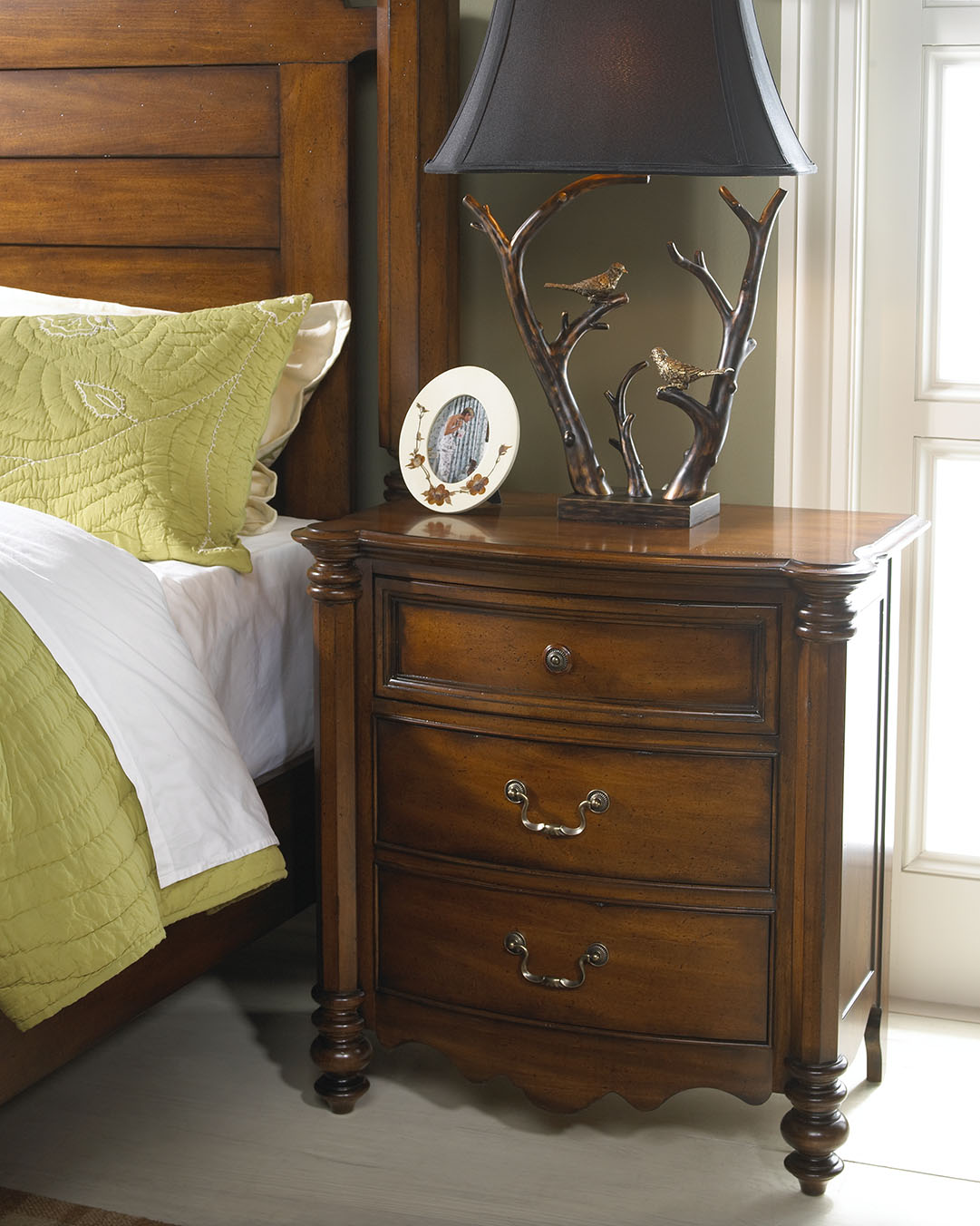
‘Notice the play of colors in this photo? The colors of nature were excellently used inside this cozy bedroom. Wooden pieces come from the Summer Collection of FFDM.
For many interior designers, the color wheel can serve as their guide when mixing and matching stuff. As many would attest, a designer can never go wrong with a color wheel in hand. This nifty tool can help you see the combinations in a glance. From there, you can let your imagination take over and allow color harmonies to naturally take place.
Designers do not just resort to magazines, the Internet or interior design books for guidance. There are also tools such as the color wheel that can help them decide on color schemes, theme, and color combinations.
Harmonizing Hues
There are so many colors and the design possibilities are actually limitless. But before you roll up your sleeves to begin shopping for your home’s needs, you must first learn the basic color harmonies. Mainly, there are three to keep in mind – the primary, secondary and tertiary colors. Each one will be able to help you understand the color wheel better.
The primary colors are also referred to as the anchor hues. These are the pure colors which serve as the foundation of all the other colors that you will ever encounter. The primary colors are red, blue and yellow. Remember that every hue comes from a mixture (in varying degrees) of these basic colors.
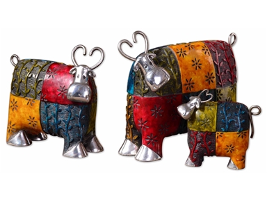
These colorful cows will definitely pop in a stark white background. Made with metal and green, blue, red, and orange finishes, these playful accessories are sure to get your guests’ approval.
Next are the secondary colors. These are a mixture of two primary colors. These include the following –
Just like the primary colors, there are only three colors under the secondary color category.
Lastly, there are tertiary colors. These are those hues result from the mixture of primary plus secondary colors. Examples include –
So now you may be wondering how you would be able to pick the right palette when you have been presented with a lot of inspiring combinations. The initial step is to make a decision on what scheme you really want.
You can just go with a primary color though it is also tempting to pick from the rich hues that are available, after all, there’s the entire spectrum to pick from.
Color harmony can help you make this difficult decision. Harmonizing creates a pleasant ambience, one that is not just visually pleasing but also well-balanced.
Colors can give life, add drama or pique interest. They can also affect the way people interact. For instance, blue elicits productivity so shades of this color are used in many offices all over the world. Red, on the other hand, is used in many restaurants because it is known to create hunger pangs as it also excites the senses. The way people associate with their surroundings rely greatly upon the colors that are found in that environment.
Now it’s time to learn basic color combination techniques. First, there’s monochromatic. This kind of harmony makes use of a single color even when it is mixed with its tints or shades. Tint is a mixture of white plus any color while shades result when a color is mixed with black.
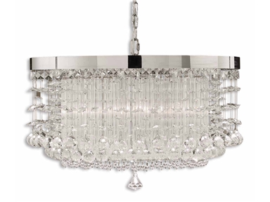
An effective way to achieve color harmony is to install lighting fixtures. This lovely chandelier will surely elicit oohs and aaahs. (Uttermost Lamps and Lighting Fascination, 3 Lt Chandelier 21138).
So if you’ve been wondering if you can work with different shades of yellow, then do so.
Complementary is a kind of harmony that offers a striking contrast between hues. This is especially great when you want a room to stand out. To use, find colors that are opposite each other on the color wheel.
Analogous colors are those that are adjacent to one another on the color wheel. These are often nature colors, therefore, they can match easily.
Triadic scheme makes use of colors that have been evenly spaced on the color wheel. They have been given this name because you can literally draw a triangle to connect these colors.
Split-complementary is great for beginners. The formula to use is –
Tetradic is a scheme that uses four different colors at the same time (two colors plus their complements). What you get is a brazen, multi-colored palette.
Lastly, the square scheme makes use of four colors that are equally spaced from one another. Connect these four and you will be able to form a square. To offset the hues, just remember to use a light-colored, neutral background.
Color harmonies aren’t difficult to achieve. With a little patience and creativity, your home is sure to stand out.
Tags: adding colors to a home, color harmony, color in interior design, colors, harmony, McCreerys, McCreerys Home Furnishings
Posted in Color Schemes, Interior Design 101, Interior Design Elements | Comments Off on Interior Design 101: Fundamental Color Harmonies
Monday, January 11th, 2016
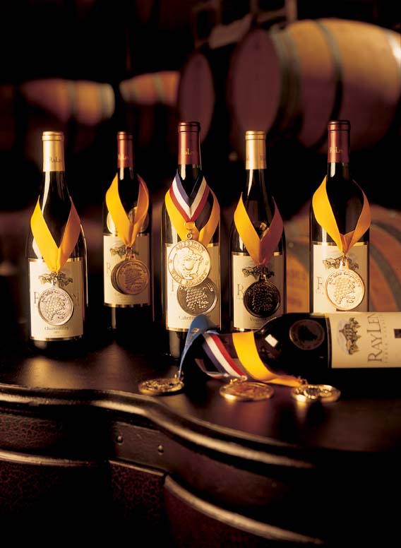
Wine bottles in this photo are from FFDM’s RayLen Vineyards Collection.
Choosing to highlight the rooms in your home with a vineyard or wine theme can add a casual ambience that is often linked to country French or Tuscan style. Wine accents permeate your place with a glamorous yet tranquil atmosphere. Pick hues that are commonly found in nature to harmonize with your wine accents. Use sage green, burgundy, and deep blue for a calming effect. Sunshine yellow and red, on the other hand, can make a room come to life. If you want to add a hacienda feel or mission touch, then use rustic textures.

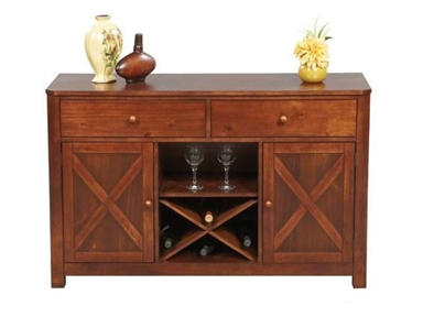
This lovely wine rack is also from FFDM’s RayLen Vineyards Collection
Guidelines for the Innovative Vineyard Theme
First, what is a wine theme without bottles of wine, right? Keep those wine bottles in a wine rack made of wrought-iron. If you can find those with grapevine and grape bunch embellishments then do so. Display this kind of rack inside your Napa Valley design kitchen.
You can also set up a wine bar with different kinds of wines placed on a glass-topped, wrought-iron table. If you don’t want to take the risk on metal, then go safe with the traditional beauty of wooden racks. To add a country feel, wind some grapevines among the wine bottles.
As guests arrive, place fresh grapes with cheese board showcasing a number of cheeses, crackers, crusty bread, and fruits. Place a terracotta ice bucket complete with a vineyard logo and wine glasses and you’d be the talk of the town!
Now don’t think that the wine theme is just great for your kitchen. You can bring this same rustic look to your bedroom by grouping grapevine wreaths on the place where the headboard should have been. Embellish these with sunflowers to achieve the sunniest Tuscan atmosphere. Here, you should opt for faux grapes complete with dried herbs or some yellow starflowers.
Put this same treatment above the couch in your living room. You can pick one oversized wreath or settle with a group of smaller ones.
Of course, just like any design, one of the fundamental guidelines in achieving cohesion or balance is the use of a focal point.
Make a focal point inside the dining room or kitchen by using a wine puller collection showcased on a bead board backsplash. Put this on the side of the kitchen island or right above the counter.
You can reach a higher level for this look by filling up a pottery bowl (preferably brick red or muted yellow) with different fruits. Use purple and green grapes with all the other fruits, of course. Place this fruit bowl in the middle of your vintage farm dining table. None can be more perfect as a rustic centerpiece.
The bathroom can also be given an eclectic flair as you place vineyard-themed towels, bathrobes and a shower curtain. If you cannot have these theme towels made, then you can just combine white towels with towels in red or purple shades. Highlight the walls with wallpaper in the same hue or print.
Winners Only Dining Room 52 Inch Franklin Server DFD470B at McCreerys Home Furnishings
Designing a Wine Cellar
You may not be a wine connoisseur but if you enjoy a glass of wine after dinner, then it won’t hurt to use this unique them when you remodel your home. Here are some ideas before you set out to build or remodel –
Never think that the wine cellar is merely a storage area. This is an important room just as much as the dining or living room. Obviously, wine bottles need to be kept in a quiet, undisturbed, cool and private place. While this is so, you should not decorate the space as if no one is ever going to see it.
Add a wooden wine rack or cabinet, even a wrought-iron bar in the corner. These furniture pieces are not just there to beautify; they can also serve as storage units in your cellar or wine room. Add a framed artwork on the wall to complete the artistic vibe in your wine-themed home.
Tags: color harmony, country, country cottage, country style, country style interiors, eclectic, eclectic design, eclectic interiors, eclecticism, French design, French design elements, French furnishing, French furniture, French interior design, French interiors, French Romantic, harmony, McCreerys, McCreerys Home Furnishings, Napa Valley design, rustic, rustic charm, rustic interiors, rustic look, rustic style, rustic theme, Tuscan design, Tuscan interiors, Tuscan style, vineyard theme, wine bar, wine cellar, wine cellar design, wine theme
Posted in Interior Design 101, Interior Design Themes | No Comments »
Follow us on our social media
© McCreery's Home Furnishings | All Rights Reserved | Privacy Policy