- Follow us:


Friday, September 21st, 2018
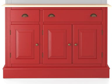
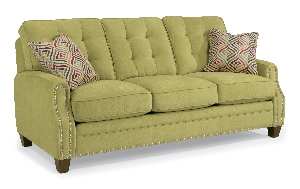
This charming red Canadel Dining Room Buffet will surely give the needed dose of color in your dining room.
Would you want to add colors to your home but aren’t ready to commit to something more permanent? There is no need to paint your whole home if all that your design requires at the moment is a punch of color. Check out these ways that you can add awesome hues to your home –
Cool Is the Way to Go
When you’re using colors in an expansive space, be ready to tone down the brightness if you want to achieve a welcoming effect. Bold colors naturally add energy while the muted hues create a more restful mood.
Define the Focal Point
If you want to create an eye-catching feature in your home, then be ready to use patterns with colors. That one room which successfully combines both will surely stand out. This room can become the focal point of your home.
You can mix patterns and sizes in different rooms as well. Add bright hues for that added drama.
A Color That You Love
When picking a color for the walls and accessories, make sure that you pick that one hue that makes your heart flutter. This is that one hue that you surely can live with for quite some time. Millwork and tiles are quite permanent so never base their colors on mere trends that can pass in just a year or two.
Begin Small
You might feel uncertain when you’re veering away from beiges and grays. Start slow and small. Use colors on your accessories at first. Avoid being shocked when you suddenly splash colors into your home.
A colored area rug is a good start. This can even be changed as the seasons change. And don’t think that you have to keep matching the colors. Don’t be afraid to experiment with hues that do not appear to be related to each other. Break the rules at times but don’t go wild that you will wake up with a huge regret.
Another simple way to begin is to bring in flowers. You will immediately notice the difference when you bring in these colorful beauties.
Fabrics can also help you change the colors while not committing. The slipcover can bring the needed color or the accent pillows can show the difference. If you’re feeling more artistic at the moment, you can also use wall decals, framed textiles, black and white photographs or paintings from budding artists.
Window treatments are just like artworks. You have a bazillion options to choose from plus they provide the needed color and pattern for your space.
‘Talk of adding color and patterns, have you heard of adding ribbons to specific areas in your home? Add them onto your window treatments, lampshades, picture frames, cabinet doors, and just about anywhere that needs an extra dash of color.
Accessorize with a throw, vase, accent pillows or even a bowl of fresh fruits. These extras will give an extra mile in terms of providing shots of color and personality.
Limited Contrast
When you’ve decided to use a bold color, it is crucial that you keep the rest of the palette to a bare minimum. Just go for neutrals as you proceed with your design.
When you want to create fun in a space, don’t be afraid to use the colors on opposite sides of a color wheel.
Color is also that powerful element that you can use to brighten up a stark white space. While white rooms are in these holidays, still, the reality is that you can have more fun if bursts of color can be seen from time to time. That dose of color won’t hurt if you want to set up a clean, modern look.
Tags: adding colors to a home, colors, McCreerys, McCreerys Home Furnishings
Posted in Color Schemes, Interior Design 101, Interior Design Elements | Comments Off on The Hows of Adding Color to a Home
Thursday, November 10th, 2016
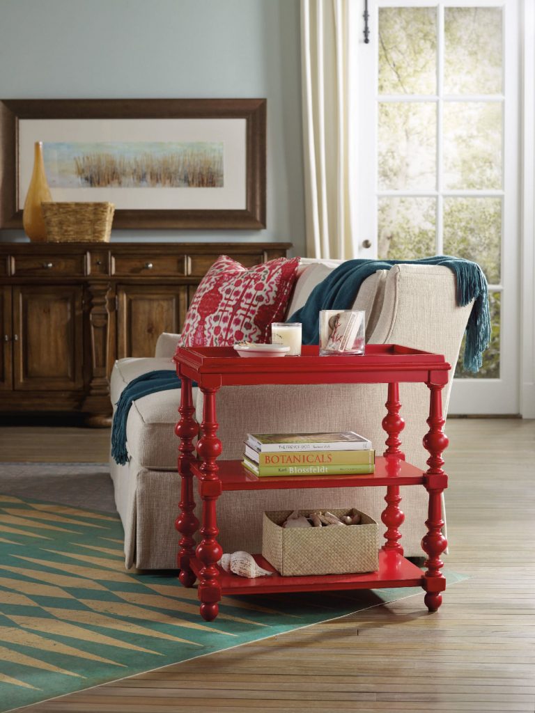
The Hooker Furniture Living Room Sanctuary Chairside Table is as unique and colorful as a side table could get.
When you approach interior design from a homeowner’s point of view, you probably just go about and pick the things that you think are attractive. Also, you tend to make your decisions based on any existing décor or pattern in your home. Color, however is such a powerful tool that you can use to evoke certain emotions. It can also create illusions of space or invoke a dramatic ambience.
Here are tips on how you can effectively use color psychology right in your home –
Bright Colors = Spaciousness
You can create an illusion of space if you use a lot of bright colors in your interior design. Use a lot of eggshells or yellows to make a space seemingly bigger. Don’t immediately go for white, though. Even when it is known to add space, it is not as effective as the tinted hues.
Bright Colors = Happy Educated Crowd
You can appeal to the tastes of the educated few if you learn how to fuse complex colors. For home interiors and exteriors, it has been observed that educated people find two-word colors to be more appealing. Simple colors, on the other hand, appeal to people with lower budgets and those that have lower education levels. When you’re out to pick complex colors, it is best to use names like eggshell white or lime green.
Red = Appetite
You can help build appetite in the dining room or the kitchen by using dashes of red or painting the walls with red paint. A lot of restaurants know this concept which is why they willingly paint their walls with solid red or red patterns.
Use red in the kitchen to up the appetite of people. You can have neutral walls made non-boring when you add red shutters or paint the cabinet doors with any shade of red.
Blended Interior + Exterior = Wow
When you use foyer blends by combining interior and exterior paint, you end up wowing your guests. The entryway or foyer becomes much more exciting if you use this technique.
Deep Tones = Warmth
You can warm up your home by using deep tones during the colder months. Use a lot of yellows, oranges, reds and browns. When you are about to paint your home during the winter because you’re staging it for future selling, remember this advice because it will make the house stand out.
Cool Colors = Fresh and Breezy
If deep tones keep homes warm during the winter, then the opposite, the cooler colors do otherwise. These colors are along the same hues used during fall, especially blue, so use them in abundance during the summer months. Have a white exterior plus a blue trim to achieve a Greek aura which is great if you want a cool-looking home during summer.
Familiar Colors = Fond Memories
If you decide to use familiar colors from your childhood or your not-so-distant past, then you will surely be reminded of wonderful memories. This becomes more special as you put these familiar colors in the kitchen, after all, what could be more pleasant than feeling like you’re back in Grandma’s kitchen?
Reds and yellows are perfect for that playful yet posh look for the kitchen. Don’t use red, though, if you have a high blood pressure. More so, stay away from dark shades of red so that irritability won’t ensue in the house.
Extend the familiar colors into other rooms such as the bathroom. If you love wearing a particular color, then use that same color in your bathroom. Having your fave color on the background will help you look more yearningly at the mirror inside the bathroom. Basically, you will tend to love yourself.
Tags: adding colors to a home, color 101, color basics, color options, color palette, colors, cool colors, McCreerys, McCreerys Home Furnishings, tips, warm colors, warm hues
Posted in Color Schemes, Interior Design 101, Interior Design Elements | No Comments »
Monday, April 18th, 2016
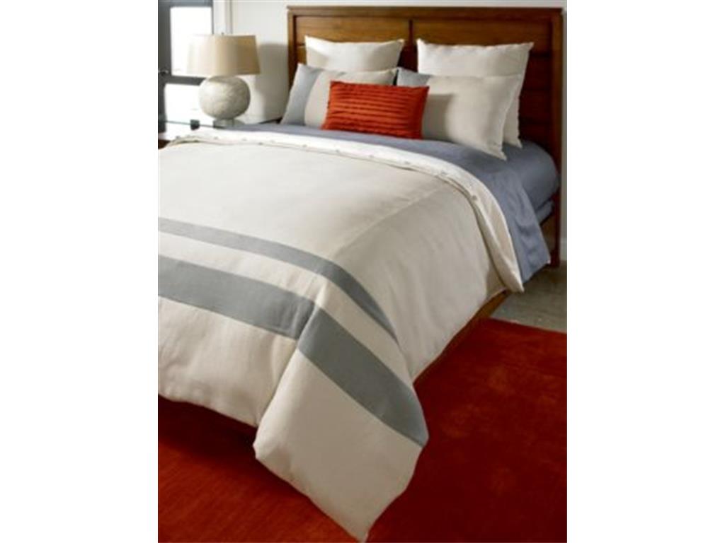
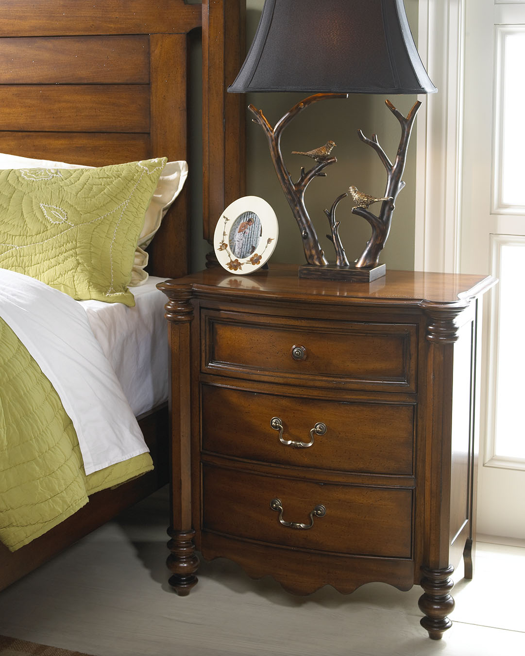
Thomasville Bedroom Slumber Ensemble Set (Super Queen) TV-BD1-40 shows an exciting fusion of bold and neutral colors.
The bedroom, unlike living spaces, can make use of hot hues on walls. Living space walls normally reflect the trendiest artwork and accessories unlike the bedroom where in-the-moment palettes are most in. The 80s bright neon look, for instance, would be an interesting color to splash across the bedroom walls. Pink and dove gray combination, on the other hand, makes for a relaxing room. If you want a more recent color combination, look for them in fashion magazines. What usually appears in clothing stores and on runways are almost always translated to bedding.
For those who have a bit of trouble when it comes to sleep, colors that are serene or restful is the way to go. For those who do not have sleeping issues, then you are the few who can try something bolder. Spending more time inside the bedroom is a lot more fun if the colors are fresh and they match your personality.
Rich Hues
Choose to add color and texture in one go with the grass cloth wall covering. Pick a color (or color combination) that is vibrant so that the rest of the room is left simple. Say, you chose flaming red as the color; then have the bed and the rest of the furniture in a more subdued color. You can, however, carry over the red to your lampshades, pillows, and bedding.
Painting the walls and trim with a bold, bright hue can give the bedroom a cozier, more cocooning effect.
The Hanging Chair
If you have ample room for an extra chair, then you might as well have one that shows a lot of flair. A hanging basket chair will surely catch anyone’s attention.
The One-of-a-Kind Keyhole Arch
If you are jumping into the remodelling bandwagon, then you might as well do something mysterious or unique for this project. Adding a nook or a semi-secret corner can be done in style. Just add a keyhole arch to separate the smaller area. This should still be able to allow the passage of light into the main room.
Use Layering
Try a different sort of style when you are out to change the bedding. Mix and match patterns and colors. Since the bed is the biggest object inside the room, make it a point to think about what you would put there. Any pattern or color that you place there will immediately catch the eye of anyone who visits the bedroom. Use a smaller scale of patterns on the sheet while using a larger scale pattern on your coverlet.
Accent pillows can take the extra large scale prints.
Floral arrangements create an interesting backdrop to an otherwise boring bedroom nook. Featured table is from FFDM’s Biltmore Collection.
Beautify the Windows, Too
Don’t be satisfied with plain blinds for your bedroom. You can afford to be more flamboyant when it comes to your bedroom shade so you might as well choose fun fabrics.
You may begin with the plain, neutral-colored shades then sew on some interesting fabrics. Just be conscious about the layers that you add since these can make the shades opaque. See also that the fabrics won’t make opening and closing the shades a lot more difficult.
Add Some Bedroom Art
It would also be nice if you can commission a wonderful piece of art. You can save up for one artwork or you can create a simple gallery right on your bedroom walls. Most artists work from a single photograph then they develop their theme from there.
You can set up a real headboard, a wallpaper headboard, or you can simply cover a not-so-inspiring part of the wall with curtains.
You see, there is no need to limit your vision with regard to the inspiring
bedroom that you are creating so unleash the artiste in you.
Tags: art, artwork, artwork on walls, bedroom colors, bedroom furniture, colors, displaying artwork, layering, layering in interior design, McCreerys, McCreerys Home Furnishings, patterns
Posted in Bedroom Design, Color Schemes | No Comments »
Thursday, February 4th, 2016
‘Notice the play of colors in this photo? The colors of nature were excellently used inside this cozy bedroom. Wooden pieces come from the Summer Collection of FFDM.
For many interior designers, the color wheel can serve as their guide when mixing and matching stuff. As many would attest, a designer can never go wrong with a color wheel in hand. This nifty tool can help you see the combinations in a glance. From there, you can let your imagination take over and allow color harmonies to naturally take place.
Designers do not just resort to magazines, the Internet or interior design books for guidance. There are also tools such as the color wheel that can help them decide on color schemes, theme, and color combinations.
Harmonizing Hues
There are so many colors and the design possibilities are actually limitless. But before you roll up your sleeves to begin shopping for your home’s needs, you must first learn the basic color harmonies. Mainly, there are three to keep in mind – the primary, secondary and tertiary colors. Each one will be able to help you understand the color wheel better.
The primary colors are also referred to as the anchor hues. These are the pure colors which serve as the foundation of all the other colors that you will ever encounter. The primary colors are red, blue and yellow. Remember that every hue comes from a mixture (in varying degrees) of these basic colors.
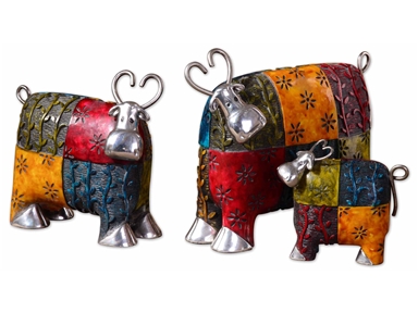
These colorful cows will definitely pop in a stark white background. Made with metal and green, blue, red, and orange finishes, these playful accessories are sure to get your guests’ approval.
Next are the secondary colors. These are a mixture of two primary colors. These include the following –
Just like the primary colors, there are only three colors under the secondary color category.
Lastly, there are tertiary colors. These are those hues result from the mixture of primary plus secondary colors. Examples include –
So now you may be wondering how you would be able to pick the right palette when you have been presented with a lot of inspiring combinations. The initial step is to make a decision on what scheme you really want.
You can just go with a primary color though it is also tempting to pick from the rich hues that are available, after all, there’s the entire spectrum to pick from.
Color harmony can help you make this difficult decision. Harmonizing creates a pleasant ambience, one that is not just visually pleasing but also well-balanced.
Colors can give life, add drama or pique interest. They can also affect the way people interact. For instance, blue elicits productivity so shades of this color are used in many offices all over the world. Red, on the other hand, is used in many restaurants because it is known to create hunger pangs as it also excites the senses. The way people associate with their surroundings rely greatly upon the colors that are found in that environment.
Now it’s time to learn basic color combination techniques. First, there’s monochromatic. This kind of harmony makes use of a single color even when it is mixed with its tints or shades. Tint is a mixture of white plus any color while shades result when a color is mixed with black.
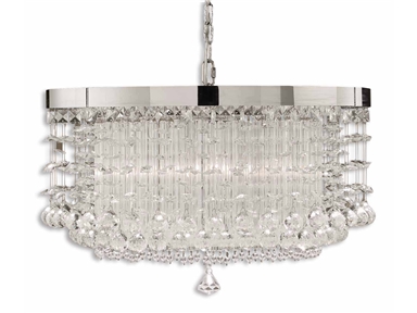
An effective way to achieve color harmony is to install lighting fixtures. This lovely chandelier will surely elicit oohs and aaahs. (Uttermost Lamps and Lighting Fascination, 3 Lt Chandelier 21138).
So if you’ve been wondering if you can work with different shades of yellow, then do so.
Complementary is a kind of harmony that offers a striking contrast between hues. This is especially great when you want a room to stand out. To use, find colors that are opposite each other on the color wheel.
Analogous colors are those that are adjacent to one another on the color wheel. These are often nature colors, therefore, they can match easily.
Triadic scheme makes use of colors that have been evenly spaced on the color wheel. They have been given this name because you can literally draw a triangle to connect these colors.
Split-complementary is great for beginners. The formula to use is –
Tetradic is a scheme that uses four different colors at the same time (two colors plus their complements). What you get is a brazen, multi-colored palette.
Lastly, the square scheme makes use of four colors that are equally spaced from one another. Connect these four and you will be able to form a square. To offset the hues, just remember to use a light-colored, neutral background.
Color harmonies aren’t difficult to achieve. With a little patience and creativity, your home is sure to stand out.
Tags: adding colors to a home, color harmony, color in interior design, colors, harmony, McCreerys, McCreerys Home Furnishings
Posted in Color Schemes, Interior Design 101, Interior Design Elements | Comments Off on Interior Design 101: Fundamental Color Harmonies
Sunday, January 17th, 2016
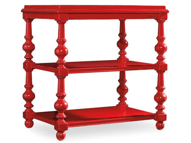
The Hooker Furniture Living Room Sanctuary Chairside Table will catch your guests’ attention if you let it stand against white or any neutral background.
You have probably seen those painting sequences on home TV shopping shows and thought that the people there looked like they were having fun. In reality, painting a home (or even just a portion of it) is far from being glamorous. You can actually exercise your organization skills and patience as you go about with this activity but, in the end, you will feel a level of satisfaction that will make you say – it’s all worth it.
The fundamentals of painting all begin with planning. As what’s always been said, always begin with the end in mind. Try to visualize your space down to the minutest details like what furniture would go with what color, what sort of accessories would blend with your chosen walls, would you use carpets or tiles, and many such details.
After planning and visualizing these things, it’s time to translate your vision into reality. You will surely be surprised to find out that your room or your entire home turned out to be quite like your visualized, ideal space.
Sloan-Sofa-with-Nails-in-Fabric-917-22 is perfect for any colorful interior design theme.
Consider the Available Space
Many interior designers would agree that one of the first considerations that you have to make before you would start an interior design project is space and how much of it you can work with. The space that you’ll be able to work with validates the colors (paint) that you end up using.
Keep in mind that smaller spaces need light colors such as sand, white and cream. These light hues will give the small space an illusion of being more expansive. On the other hand, bigger spaces are like canvases for the homeowner’s imagination. You can use different hues depending on what needs to be expressed. Colors such as dark brown, navy blue, and black can lend a romantic look and feel.
Consider the Ceilings, Floors and Walls
As soon as you know how much space you can get your hands on, you also need to consider other parts of your home such as your floors, walls and ceiling. These are also parts of your huge masterpiece so they also need to be given some serious planning.
Just think of yourself as the liberal artist. Make a shortlist of all the colors that you think would make these parts of your home come to life. Do not go too crazy on the hues so that your residence remains tasteful. As much as you can, limit your color choices to just five hues.
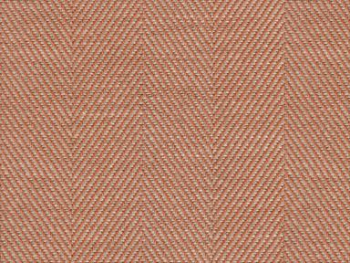
Just as you would the paint, it pays to ask for swatches when looking for the right fabric for your sofas. This orange/rust fabric comes from the Lexington cover collection available at McCreery’s Home Furnishings.
Get Color Samples
It is best to get paint swatches or samples from different paint centers. As soon as you have mixed the shades, wipe the paint swatch on a sheet of paper.
Test your chosen colors by taping the paint test swatches to the wall. See how the colors work for you visually.
At the moment, the top five designer colors are –
Light gray or ash can work as a substitute for the usual shades of white. It can effectively tone down the mood in any space while not neglecting on modernity and being sleek. Charcoal gray, meanwhile, can draw attention easily which is why it can be an effective paint on your focal wall.
White is timeless and it can efficiently frame any interior. Just make sure that you choose white carefully because it can become glaring.
Orange is a warm color that works best with metallic hues such as gold and copper. It is also the perfect color for autumn-inspired interiors.
Green reminds us of nature, freshness and going organic. This hue can make any space feel more fresh and relaxing. It can also blend well with other neutral colors.
Lastly, neutral paints can suit any style. They are easy to maintain and can become the primary color to an exciting accent color which you would later add.
Tags: accent color, adding colors to a home, colors, designer colors, designer paint, floor color, guidelines, home paint, McCreerys, McCreerys Home Furnishings, neutral paint, neutrals, paint, paint colors, painting, tips, wall color, wall paint
Posted in Color Schemes, Interior Design 101, Interior Design Elements, Interior Design Themes | No Comments »
Saturday, January 16th, 2016
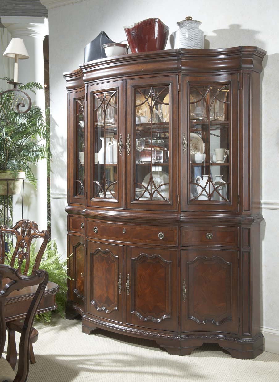
This China cabinet comes from FFDM’s Antebellum Collection. The classic color of wood will make any home be the envy of the neighborhood.
The year 2016 is marked as the Year of the Rat on the Chinese calendar. The specific styles and interior design trends for this year are distinctive because they show a lot of expression. They also come in richness that is sure to transcend to the next year.
Playful Colors Are Back
Among the various inspired changes inside homes this year, cheerful colors are definitely back. There is also this growing emphasis on nature and the environment even in unusual rooms such as kitchens and the bathroom.
Innovations are not limited to these concepts. Accessories also display the richest hues though they are also surprisingly used in a more functional and minimalist space. Hints of metals such as brass and copper are also used in different areas of the home.
This year’s color palette comes in shades of red, pink and peach and designers are more than willing to use these colors to tell the world that they are following the trend. Pink is not just seen in interior design but also in make-up, fashion and office decor.
Accessories also come in shades of deep blue, green oil and navy. These colors convey feelings of coolness and calm inside any premise. For instance, brass or copper surfaces can cleverly blend with moody colors such as purple and black.
Once again, marble, copper and brass are the stars of the 2016 trend. There are various uses for these glamorous materials, their flexible characteristic, and their artistic look.
Another noticeable change inside homes this year is the presence of decorative yet functional objects. There is simply no room for useless stuff. It has become increasingly crucial to own objects that can be used throughout the homeowner’s lifetime, maybe even beyond.
The dynamic lifestyle of modern man also requires clever usage of space, its proper arrangement, and minimalism. The kitchen, for instance, may be completely concealed in order to open more room for entertainment.
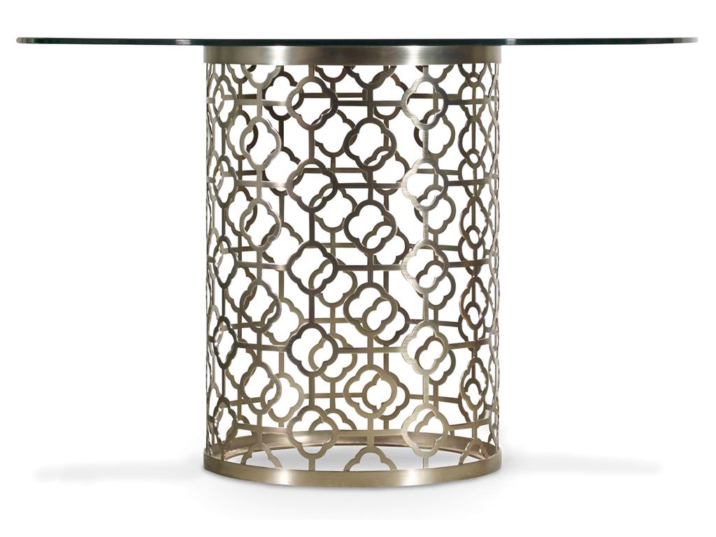
The Hooker Furniture Dining Room Skyline Round Glass Top Dining Table comes with plated metal and glass. Choose from the gold or champagne-colored finish.
These days, the world of interior design is constantly moving towards minimalism because of its simple aesthetics. The reason behind this is simple – modern man is always busy and all he wants is a haven to go home to, a place where he could escape from city life. The use of green walls or optical illusions inside bathrooms and kitchens can add to the level of fascination.
Another huge change inside the home environment is the seemingly spa atmosphere. The bathroom is the leading room that has turned from a functional space to a relaxation area. Chairs and benches, even vanity tables are no longer uncommon inside modern bathrooms.
Have an abundant amount of vegetation inside the bathroom, too. Bring in those green plants that you love. Urban gardens inside living premises are also hip and trendy. Mother Nature is being let into homes because more and more designers and architects are considering the health of their clients. Bringing nature closer to homeowners does not just provide beauty but also a high level of calmness.
To keep the rest of your home fresh and up-to-date with the latest interior design trends, be sure to control the ventilation and humidity. Fresh air is what provides natural plant life. If this is not possible to achieve, then green walls are your next best option. The colors pink and gold are also artistic and easygoing hues that you can experiment with during the year. See how you can have them entwined or used separately in your home’s architecture and interior design.
Tags: brass, colors, copper, decorating with houseplants, decorating with indoor plants, decorating with plants, guidelines, houseplant, houseplant decor, marble, McCreerys, McCreerys Home Furnishings, metals, minimalism, minimalist, modern, nature, nature in interior design, nature-inspired design, nature-inspired home, playful colors, rich hues, tips, trendy colors
Posted in 2016 Trends, Interior Design 101, Interior Design Elements, Interior Design Themes, Interior Design Trends | No Comments »
Follow us on our social media
© McCreery's Home Furnishings | All Rights Reserved | Privacy Policy