- Follow us:


Wednesday, September 27th, 2017
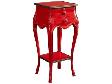
Fine Furniture Design Living Room Accent Table 1160-961: A lovely focal piece
Designers – whether in the world of fashion or interior design – know that colors bring life to creations. They do not only do this, these hues can also affect human emotions. Colors can inevitably influence people’s feelings, even their perceptions.
Colors can make people interested or disinterested; they also have the power to captivate or cause boredom, and they can also motivate. Interestingly, adults perceive colors not only physically but also psychologically.
Colors could also be linked by humans to certain experiences. There are certain colors that remind people of their childhood or hues that they associate with a pleasant or even a traumatic experience. The more pleasant hues are the ones that people tend to gravitate to.
While color choice tends to be subjective, there are certain hues that work a certain way. Relaxation is often brought about by lighter colors while darker ones could either make you feel more active or homey.
Energizing Hues
If you want to be woken up, stimulated, or to feel more energetic, then you should look for bright hues. Of course, you must remember the chief function of the room where you are going to use the colors at.
Color appropriateness is vital to room functions. For instance, if you want a room to sustain stimulating activities (e.g. a family room), then go for heavy and more attractive hues such as green, red, pink and yellow tones.
These colors help promote excitement and even happiness. Ophthalmology theories suggest that red can even stimulate the eye nerves. A psychological factor about the color red is that it can also be attributed to violence and blood. This is why you would feel like you’re in a fight or flight mode when you’re in a red room.
Playful Hues
There are also colors that do not excite as much but would also not induce sleep. These playful hues go beyond the common blue or pink. Don’t just settle for pastels when you are expectant. Go for more playful tints such as seafoam green or robin’s egg blue.
There are also more sophisticated shades of beige that could excite the senses. Consider also how you will effectively use black or white or even a combination of the two.
As for your baby’s nursery or toddler room, know that babies are able to perceive colors from the fourth month onwards. Moreover, they are also able to perceive contrast in colors. This means that they will, somehow, be able to appreciate the colors that you put inside their rooms and how each hue interacts with its neighboring colors.
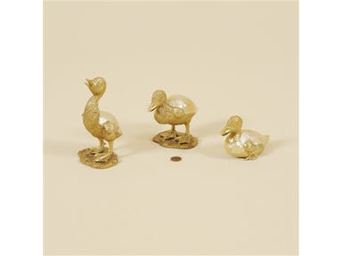
Maitland-Smith Accessories Set Of Three Satina Finished Cast Brass Ducklings, Yellow Mother Of Pearl Inlaid Accents 1054-264
Soothing Hues
Lastly, there are the calming colors. These are those hues that make you relax and think of tranquility and peace. Green is an amazing choice for relaxation. Remember that the color spectrum has two separate ends. The short wavelength is where blue resides while on the other end is red. Right in the middle of this spectrum is the color green.
In between the two extreme sides is where the human eye relaxes the most. So go ahead and choose green in different shades. Choose green for your bedroom, even for the bathroom and the reading areas.
Must-have Paint Tools
For your home’s color makeover, make sure that you have the right set of tools. Here’s a concise list –
Tags: color choices, color psychology, effects of colors, McCreerys, McCreerys Home Furnishings, moody colors, paint colors
Posted in Color Schemes, Interior Design 101, Interior Design Elements | Comments Off on Moody Colors: Energizing, Playful, and Soothing Hues
Tuesday, July 4th, 2017
(The First of a Six-Part Series)
Cynthia Rowley’s Rivington 3-Over-3 Sofa together with the most colorful decorative elements to adorn a living room.
Adding color to your home – or at the very least, conceptualizing how the hues will make your habitat more amazing – is also a way to add more color to your life. Yet there are a lot of questions as to what paint color to use in a home as well as color predicaments like whether to pick gray or blue.
Of course we won’t be able to send you paint swatches just so you know how to begin your color 101 journey. What you can do is to read this series of color and paint basics that will teach you how to shop for the best colors and to effectively use them in your home.
This first of a six-part series will teach you about color fundamentals – this is more like a crash course to reading the color wheel and how to harmonize hues.
Matching and mixing colors is no easy business, though. Don’t get the idea that everyone can do this without any knowledge of color fundamentals, don’t feel, insecure in pairing unique hues, too. It’s all about learning the science and the art behind it all and being comfortable in using it in your own home.
Decorating with Hues
It is crucial to keep the color theory in mind when it comes to color decoration. Before you start thinking if it’s complicated or not, here are the basic principles –
Color theory also creates logical color structure. For instance, you could have a bunch of vegetables and fruits. Color theory would dictate that you would organize these based on their color relation. The oranges would sit next to the lemons while the lemons would be right next to the green apples which sit right next to the blueberries, and so on.
Don’t fret, it is not as complex as it seems to sound. You just have to, primarily, orient yourself to the color wheel. This is a tool, a handy helper of sorts, which will guide you in picking the specific colors – even down to the specific shades – that you want.
The color wheel comprises 12 basic colors which are –
When dealing with paint, remember these terms –
Shade means any pure hue fused with black.
Tone is a hue mixed with gray.
Hue is any pure color with the exception of white or black.
Tint is a color mixed with white.
Here are the fundamental color harmonies that you need to keep in mind –
Analogous hues are three hues that sit side-by-side on your color wheel such as green, yellow green and yellow.
Note that every hue outside of these already come from a mixture of hues to varying degrees.
Use the color wheel and these basic color guides so you don’t go wrong. Also, make it a point to look at Mother Nature for color inspirations. Just imagine a red flower encircled by green and yellow leaves. All these, the color of the leaves, the flowers and grass, all are inspirations for your color palette.
What about you, what are your color inspiration sources? Look around you – the possibilities are actually endless.
Tags: color 101, color basics, color choices, color combination, color fusion, color options, color palette, color schemes, McCreerys, McCreerys Home Furnishings
Posted in Color Schemes, Interior Design 101, Interior Design Elements | Comments Off on Color 101: Using the Color Wheel, Choosing and Matching Hues
Tuesday, October 4th, 2016
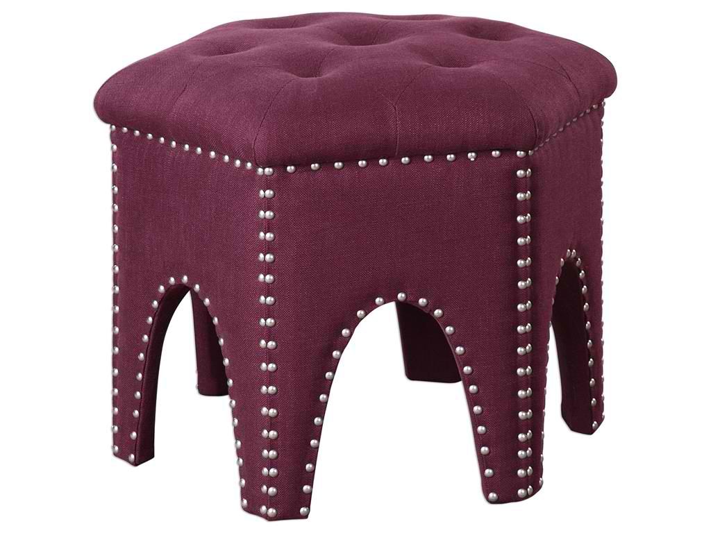
Living Room Uttermost Pippa Purple Small Stool 23286
Purple – just like any other color – can have many different meanings. As a homeowner, it is your privilege to know what colors are, what they’re made of, which colors best team up with which, and what emotions are invoked by each.
Knowing what the color purple can offer is also the duty of interior designers to learn. This is because they are the experts that many clients rely on. Through them, homeowners can make informed and educated choices regarding colors and how they can be used in their dwellings.
If you want to use purple in your kitchen, for instance, you need to find out whether you can use it subtly or more frequently. Look at elements where you could use purple and places where you’ve never used them in the past – wallpapers, fabrics, even accessories.
Purple can mean a lot of things. It could be restful, serene, elegant, spiritual, reverent, and calm. Yet it can also be philosophical, overactive, and creative in the right hue.
Royally Purple
Purple is a regal color this is why it is not commonly used in many homes. There are various forms where you could use this beautiful color. You could add white to come up with a tint that’s unique – lilac, mauve or lavender are all wonderful tints that come from the fusion of white and different hues of purple.
The more subtle or restful versions of this color can be used inside homes especially inside the bathroom and the bedroom. This is a color that promotes calmness (just make sure to use the right tint), even daydreaming.
Purple is also often used with yellow as they are hues that complement each other. These two can create a forceful statement that is both royal and dignified. Purple looks stunning on dining chairs and other pieces that feature fabrics; this is also the perfect accent color especially when used on a triadic scheme. This will blend well with orange and green as it provides a supremacy that may appear striking at first yet beautifully balances the rest of the design elements.
Purple in the Bedroom
Purple is versatile because it is a bright, fun color. It is great for different rooms in your home. You can create a beautiful atmosphere by adding purple, first, in the bedroom. Paint the walls with this beautiful color. It’s bright but also relaxing, use the eggplant shade to make the room more elegant. Use lavender in a pale shade to balance this dark color.
Take a step back and enjoy your work.
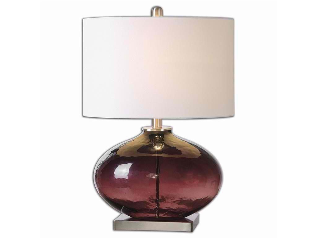
Lamps and Lighting Uttermost Tyrian Purple Glass Table Lamp 26190-1
Purple in the Living Room
The living room could evoke different emotions depending on the theme that you are trying to achieve. A shade of purple can be used as an accent wall. Actually, when you take a closer look at it, you could even mistake it as a color blue.
Use purple chairs, accent pillows and rugs. The living room becomes more exciting as you add this purple stuff. Just don’t make the mistake of using purple on every single wall or you would end up feeling woozy.
Purple Bathroom
When it comes to the bathroom, it’s time to use a tint of purple – lavender. This offers a feminine touch without being too womanly.
Purple is a relaxing hue that can work pretty well on the tub. You could spend hours in a relaxing bath as you redo the purple to a tint of lavender on your bathtub.
Deeper shades of purple could stage an air of royalty and mystery.
Again, you don’t have to paint every wall in your home with purple paint. Just know where to add purple touches and you would create an opulent-looking home with close to zero effort.
Tags: color choices, McCreerys, McCreerys Home Furnishings, purple, purple color scheme, purple design, purple interior design, purple interiors, purple theme, tips, violet
Posted in Color Schemes, Interior Design 101, Interior Design Elements | No Comments »
Monday, October 3rd, 2016
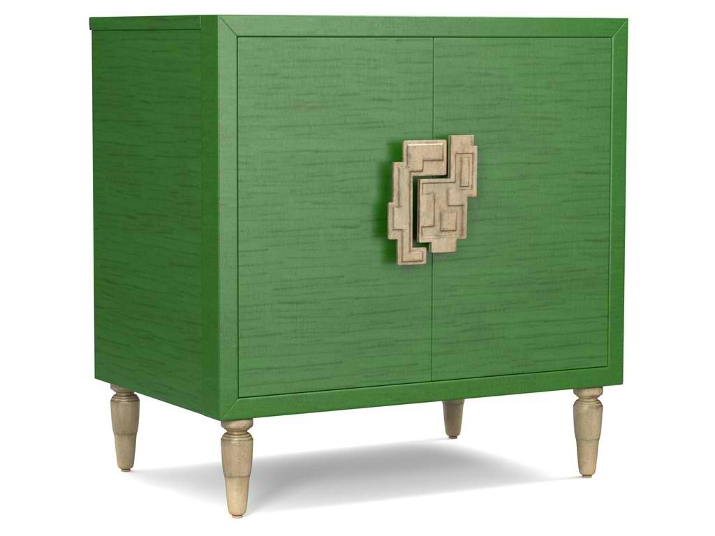
The green hue on this Cynthia Rowley for Hooker Furniture Living Room Sheridan Two-Door Chest 1586-50005-GRN is wonderfully prepped for 2017.
There is no doubt that color is an important element of interior design. It is one of the most influential aspects to human emotions. This is also the fastest way to update a room; what you need to do is just to apply a fresh coat of paint and you’re done. But what do different hues convey and what color forecast best fits the brave new year that is 2017?
Top Hues and Their Meanings
Red. This hue is often associated with determination, leadership and ambition. This can also connote physical desires which is why it is most used in many restaurants.
Pink. This hue represents intimacy, compassion and unconditional love.
Purple. This is the color of creativity and royalty.
Blue. This color represents loyalty, honesty as well as trust.
Orange. This bright hue is linked to optimism and motivation.
Green. This lively color represents vigor and energy. It is often used to create balance and stability.
Yellow. This is a hue that represents enthusiasm, fun, knowledge and hope.
Color Fundamentals
Color is affected by two aspects – the surroundings and the kind of light that shines on it. Try observing any room in your home. You’d soon see that the light is different during different times of the day. Comprehending how light can affect a space during different times of the day will give you the power to choose the correct color scheme that can be used all day through.
This same knowledge will also help you choose the best kind of lighting fixture for that room.
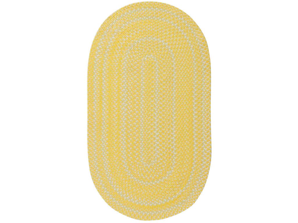
Capel Incorporated Floor Coverings Regatta Rug 0087NS Sunshine
Now, the Forecast
There are many color forecasts that are being done each year but one of the most esteemed are the picks made by Pantone. The upcoming year’s Color of the Year picks are calming, soft and wonderfully romantic. Now don’t worry if those aren’t your exact wish as a color for your home.
Leatrice [Lee] Eseman shared a handful of color palettes that you could choose from. These are all predictably popular colors for the upcoming year that you can use to beautify your home. These colors were also chosen because they address the consumers’ craving for colors that are comfortable yet new. Design trends became inspirations for many of these palettes, so was the film industry (e.g. The Peanuts Movie, Star Wars: The Force Awakens, etc.).
So go ahead and make use of anything silver and metallic or anything bright and colorful (if Charlie Brown inspires you the most). Say yes to orange chiffon, melon as well as dove gray. Grape and lime are also good colors.
Apart from these, there will also be an abundance of florals this upcoming year. Floral hues such as red Dahlia or pink yarrow, plus any shade of green may be acquired tastes but they are beautiful and not-oft used colors.
Gray and red will remain popular in 2017. They will both appear in warmer hues with the backdrop being that of bolder colors. Yellows that look perfect in a harvest setting will also get a lot of attention in the coming year. Yellow with hints of earthiness will look great and would be effectively grounded by classic red or blue.
Any youthful color is also a great choice in 2017. Now don’t be limited to the age-appropriate colors, rather, look for youthful colors with an attitude. So no matter what your age, you can use color palettes that are fluid and can easily morph in the 2017 surroundings.
Find celebratory hues that hail technology and nature. The former will continue to play a vital role in people’s lives. Evolving technology will continue to inspire ambience that is dark or in commanding grays.
Those who love deep plum would also find it a great news that the color forecast for 2017 also includes this hue.
Tags: 2017 color trends, adding colors to a home, blue, bold colors, bold hues, color choices, green, McCreerys, McCreerys Home Furnishings, orange, pink, purple, yellow
Posted in 2017 Trends, Color Schemes, Interior Design 101, Interior Design Elements, Interior Design Themes | No Comments »
Monday, April 11th, 2016
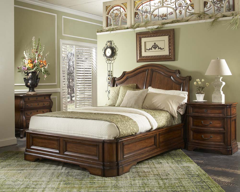
The potted flowering plant plus the curves on some of the accessories softened the linear look of the bed. Featured bedroom set is from FFDM’s Vintage Classics.
The bedroom of a young woman is supposed to be cheerful and fresh. This is a room that should reflect her age, even her character. It would be wrong to make it look like an elderly woman’s dwelling but it shouldn’t look like a little girl’s room, too.
This only means that a balance should be achieved between these ages as adolescence is pretty much a delicate phase.
The young lady’s bedroom should be a place for retreat or relaxation. It should have the right fusion of freshness and femininity. There should also be zero clutter or else, the mood and overall female vibe would be ruined.
Always Begin with the Color
Let’s begin with the room color. What you should choose should be a vibrant color. Now you know why most young women’s bedrooms come with lavender, pink or pastel colors. These have a certain princess-ey or fairy-like feel.
Still, there are young women who prefer a more intense color. You could level from a pink to fuchsia or from lime green to bottle green.
Generally, the safest choice is soft pink. Red, blue, green and purple come in next. These can up the drama a bit. You can also integrate dashes of black or white.
It’s Always Downhill Once the Theme’s Chosen
Stylizing a young woman’s room is always personal which is why having a direction is critical.
With a specific style in mind now, it’s time to make the dream into a reality. Look at the walls, furniture, accessories and window treatments.
Should you aim for a contemporary appeal? Should it be shabby chic? It’s up to the young woman to decide. If you are a parent who is there to support your young one’s decision, then see to it that she’s also making the correct choices.
The theme is often modern but not all young women have this taste. Go through magazines and books on interior design that could give you an idea on what theme to work with.
The bedroom shouldn’t just be colorful, it should also be airy. The bigger the surface area that you need to work on, the smaller the furniture that you need to bring in; there’s also a need to solve the issue on storage through an investment on open shelves, multi-functional drawers, chests, and cabinets.
For the rest of the decor, all these depend on the young woman’s personality. For instance, you could buy – especially for this project – contemporary wall arts, wall accessories, vases, posters, and such.
As for the furnishings, be sure to add pieces that soften the overall appeal of the room. Do not forget about comfort as you invest in a bed and seating. If you elect to have linear pieces, then be sure to have vases filled with fresh flowers brought in.
Consider also the curtains, draperies, and the rest of the beddings. These should fuse correctly through coordination. The wall color must not clash with these fabrics.
See if low lamps, candelabra and aromatherapy oil burners can also be brought in. The candleholders should be made of crystal and not the metallic type as this would make the room look older. An elegant chandelier is an effortless way to make the room feel more ladylike.
These accessories have the power to pull everything together yet take it easy for you could also go overboard just as easily. Too many accessories will result in clutter and a chaotic feel – the very things that you would never expect in a young woman’s boudoir.
Now wasn’t that easy? Setting up a young woman’s bedroom has never been this easy and fun before.
Tags: bedroom colors, bedroom essentials, bedroom for girls, cabinet, candelabra, chest of drawers, color choices, drawers, girls' bedroom, McCreerys, McCreerys Home Furnishings, young girls' bedroom, youth bedroom
Posted in Bedroom Design, Interior Design 101, Interior Design Elements, Interior Design Themes | No Comments »
Wednesday, April 6th, 2016
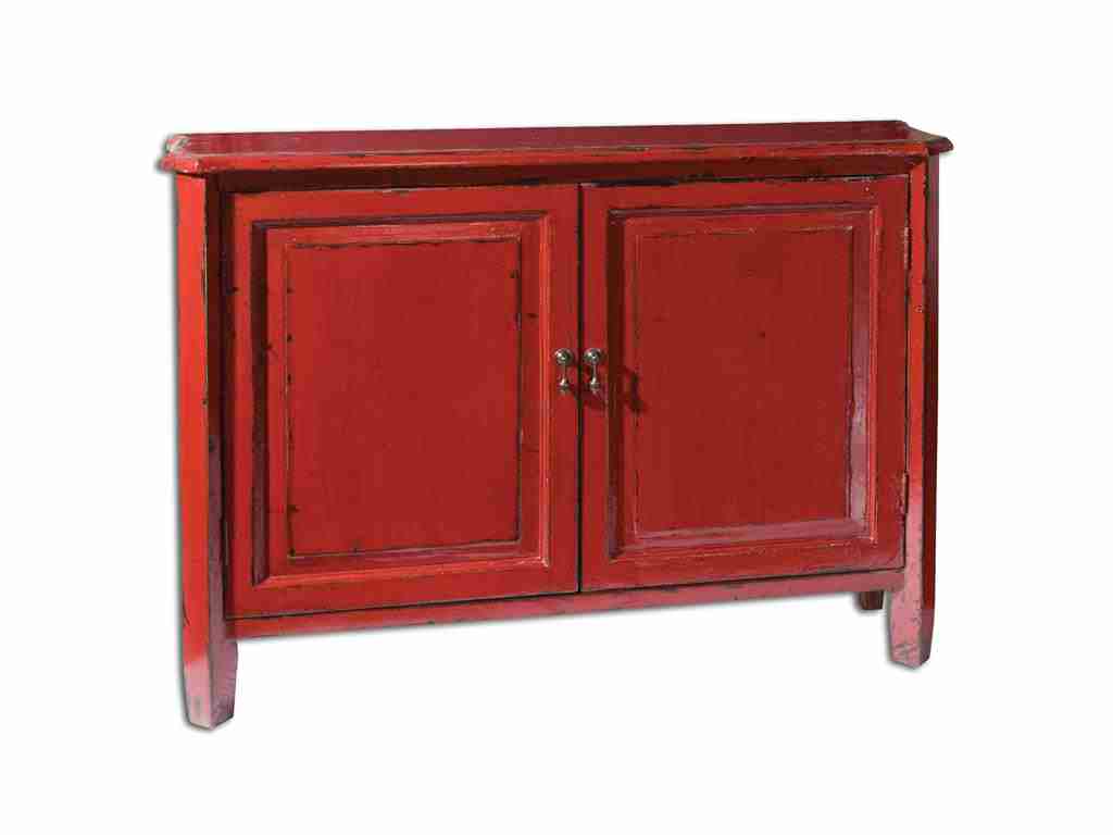
Living Room Uttermost Altair Red Console Cabinet 24404 is vibrant, attractive and one-of-a-kind.
Many designers casually use the terms tint, hue, shade or tone when referring to colors. But do most homeowners actually understand the meaning of each? Or are they just different names for the same term? The painter has to know the difference in each so he will be able to communicate effectively about color mixing and his painting job in general. As a homeowner, perhaps, it is about time to get to know the terms often used when it comes to paint and color schemes.
The term hue is far from being complex. This is a reference to color more specifically the colors found on the color wheel. If you are familiar with the color wheel, then you’d know that there are three primary colors which are red, blue and yellow. The secondary colors are violet, green, and orange. The tertiary colors are those that fill in the gaps between the primary and secondary hues.
Have you noticed how black or white is not considered a color? And have you wondered further where they should be located in the color wheel? You won’t have to worry about these two because you won’t
Canadel Dining Room Arm Chair CHA5040TF has a sienna washed colored fabric.
find them on the color wheel. What you need to study are how shades, tones and tints can be variations of different hues that are found on the color wheel once black or white are mixed with any of them.
Canadel Dining Room Arm Chair CHA5040TF has a sienna washed colored fabric.
Hello New Colors
You probably love colors but very few people are familiar with the most exotic hues used in interior design. There are literally hundreds of colors that you need to become familiar with if you want to be well-versed in color knowledge. For example, there are hundreds of blue shades. Most of the time, there are even histories involved in the creation of a unique color.
Why not be the first one in your group to extensively discuss these new hues?
For the first example, there’s smalt.
Smalt is a deep blue shade that is often used in ceramics. Literally, this is glass that is made when cobalt salts a11re mixed with molten glass. This mixture creates purple undertone that is barely distinguishable. It offers a luminescent quality which is why it is best used on statement walls.
The next new color on our list is byzantium. This is a lively purple shade that is sometimes interchanged with fuchsia. Byzantium is derived from purple while fuchsia comes from pink.
Byzantium looks great with gray, black, yellow or blue.
Cordovan is a rich hue of brown or burgundy. This is often associated with leather, mostly leather sofas. The name came from Cordova city in Spain which is famous for its manufacture of fine leather.
Sienna is one of the more famous colors on this list of unique hues. It is reddish brown and is often used in earthy themes. Its name comes from Siena, Italy and is also used in reference to clay that contains manganese oxide and iron oxide.
Vermilion also comes with a bright red hue. It can also be reddish orange at times. This is a classic shade that is used on many gorgeous lamps and lacquer ware.
‘Ever heard of gamboge? This is that deep mustard yellow color that got its name from the gamboge tree. This tree secretes a mustard yellow sap, hence, the name. Imagine having a pair of sofas in the gamboge hue. It’s sublime.
Pavo is another shade of blue but it is electric blue that is closest to the colors of peacock feathers. This can be best described as the marriage of deep turquoise and royal blue. Try pavo as the color of your sofa throw pillows.
Lastly, there’s aubergine. You have probably heard of this deep brownish purple hue before. This is just like the color of eggplants. Add this to a shade of turquoise or gray and you’ll achieve a unique color mixture that will catch people’s attention.
Tags: adding colors to a home, bold, bold color palette, bold design, bold interiors, bold statement, color choices, color combination, McCreerys, McCreerys Home Furnishings, unique interior design colors
Posted in Color Schemes, Interior Design 101, Interior Design Elements | No Comments »
Saturday, March 26th, 2016
The Thomasville Living Room Margeaux Chair 1185 15 will be sublime in a colorful backdrop.
A client who wants to consult a color consultant is someone who might have already taken multiple trips to a paint store. She must have a collection of paint swatches, she might even have samples already used on the walls yet she still cannot make up her mind regarding what to do. These are the kinds of people who might think that they do not have an inkling about what to do but all that their minds need to do is to visualize and have the confidence to carry out their vision.
Do you need a color professional? Don’t fret because it is not difficult to find one. Just type the keywords – color consultant – online and you should be able to find a list in no time. There are also other professionals who might already be working in your home. Just look at those painters, architects and contractors. They might know a number of color consultants that could meet your color requirements.
The Color Consultant – Who Is He?
Uttermost Accessories Vintage License Plates Clock 06675 is a colorful addition to a neutral room.
Interview several candidates before considering someone. You would want to establish a working relationship with this person so there’s gotta be chemistry. Ask also for their references so that you will know what past projects they have made, especially those that are similar to yours.
Color proficiency also requires the color consultant to provide what you think is a wonderful hue. Getting a sense of what the client actually wants and the duration and scope of the project are the things that they want to grant.
The consultancy could be as short as a single session or the consultant might ask for several meetings. This all depends on the process that is about to be undertaken and the complexity of the painting project.
It is wrong to think that the color consultant will tell you what to do. He may be an expert but he can only give some advice. You still are the client so your preferences are given priority. Hourly rates can range from $85 to $200 USD. To get an average approximation about the color consultancy, the three to four bedroom home can be given an expert advice in about three to four hours. Of course, this time varies depending on how indecisive the client is.

Uttermost Accessories Vintage License Plates Clock 06675 is a colorful addition to a neutral room.
There are also color consultants who charge for a flat fee. This fee already includes the follow-up visits. Initial visits are often just a walk-through the home that is about to be painted. The consultants then envision what kind of color scheme would work during this first visit. It can be difficult for some clients to envision things using mere paint chips. The consultant, therefore, has to be able to offer 50 draw-downs in various neutrals.
The neutrals can be shown in their finishes such as the flooring or the countertop. Here, the client will be able to see which works and what shouldn’t be given much time. After this walk-through, a brainstorming session usually follows. The color swatches are then brought out by the consultant and held up against the walls. The client should have an idea about the decision that she will make by looking through the samples.
Most consultants ask for their client’s most-used or favorite room. To the perennial workaholic, this could be the home office; to the foodie, this is definitely the kitchen or the dining room.
No consultant will force his favorite colors on you. What they want to achieve is a happy customer and they are only able to do this if they personalize the rooms in a client’s home. They would only recommend colors that can endure the test of time and those that will work well when you begin furnishing the rooms.
The color consultant is there to help should you start feeling dizzy around the swirling color suggestions of family and friends. It’s time to rely on his proficiency.
Tags: color choices, color combination, color consultant, color in interior design, McCreerys, McCreerys Home Furnishings
Posted in Color Schemes, The Interior Designer | No Comments »
Thursday, March 10th, 2016
Investing in quality furniture will save you more money than falling for cheap ones that you’ll say goodbye to in just a few weeks or months. Featured furniture pieces are from the Biltmore Collection of FFDM.
The whole process of decorating is often a hit and miss procedure. Don’t fret because there is no need to learn an entire interior design book just to be good at beautifying your home. Here are some highly regrettable disasters in decorating and how you can avoid them –
Saying No to Color Swatches
Who would paint walls without testing the color first?
Apparently, a lot of homeowners.
You shouldn’t automatically paint your walls with the color that you love. Even when you love purple, it just might not work inside your living room. Different colors can look differently on walls than they often do on the paint chips.
Painting mere swatches, primarily, and finding out how they look under various lighting conditions could cause some delays but this will save you bigger frustrations in the future.
Un-Ready for High Maintenance Decor
A lot of homeowners also fall into the tempting feeling of buying marble countertops. They probably were coaxed by their friends or neighbors about the beauty of marble as a material not considering the energies required in maintaining such a beauty. Pretty soon, they end up regretting their previous decision.
If you don’t want to fall into the same trap, consider the improved quartz countertops.
This is also what happens to people who purchase a shag rug, not realizing that it sheds a lot. You should be a vacuum goddess in order to keep up with the shedding of such a rug. If you don’t have time for such chores, then better say no to this plush rug.
Playing – Unsuccessfully – With Colors
Sure, colors can easily up the wow factor inside any home but you have to be careful in using the kind of colors that will really evoke interest. For instance, buying a loud colored sofa means you have to tone down on the rest of the interior design elements. Adding over-the-top prints elsewhere or anything brighter on the walls, ceiling or floor would instantly create chaos.
If you do not want to have one particular furniture or element to dominate the room, then learn to play with neutrals and adding a dash of color here and there.
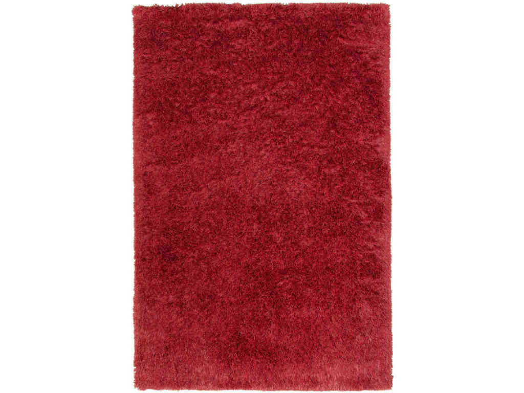
Capel Incorporated Floor Coverings Metro Retro Shag Rug 3250RS03000500550 is a beautiful sight to behold inside your home. Be sure to care for it so that it remains a lovely floor piece.
Rush Decorating
If you think that you can complete your decorating project in just a day, then you’re thinking wrongly. Having a set of furniture in your living room on the very day that you get the key to your new home may be tempting but pretty soon, you’ll realize that it may not be a total match to the architectural structure of your home or the theme that you eventually choose.
Rushing to buy that perfect wallpaper will just burn a hole in your pocket. Take the time to choose the pattern, texture and color for your wallpaper as this will help in gluing the rest of the design elements.
Furniture Mishaps
Another disadvantage in hustle decorating is putting all the things that you own (read cramming!) inside a room. Most of the time, collections and photographs, even artworks crowd the walls. Add the bulky furniture and you’re set to completely fail.
Another downside to rush decorating could be falling for a cheap piece of furniture. Keep in mind that reupholstering can be pretty pricey so it is best to invest in furniture that will last for many, many years. Buying brand new furniture is like buying a new car. You will always have fewer to zero problems with the brand new piece.
Apart from problematic cheap furniture, another probable problem that you would encounter when it comes to buying furniture is to choose ones that do not harmonize with the rest of your design elements. Do understand scale and proportion in order to successfully create a lovely room.
Follow these simple guidelines and you will not commit decorating mistakes the way others before you have done.
Tags: color choices, decor mistakes, decorating mishaps, decorating mistakes, McCreerys, McCreerys Home Furnishings, mistakes in decorating
Posted in Decorative Elements, Interior Design 101, Interior Design Elements | No Comments »
Follow us on our social media
© McCreery's Home Furnishings | All Rights Reserved | Privacy Policy