- Follow us:


Monday, October 3rd, 2016
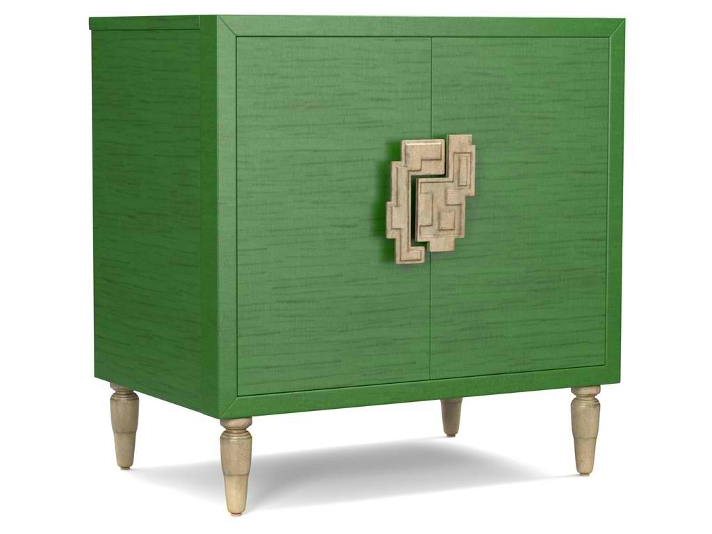
The green hue on this Cynthia Rowley for Hooker Furniture Living Room Sheridan Two-Door Chest 1586-50005-GRN is wonderfully prepped for 2017.
There is no doubt that color is an important element of interior design. It is one of the most influential aspects to human emotions. This is also the fastest way to update a room; what you need to do is just to apply a fresh coat of paint and you’re done. But what do different hues convey and what color forecast best fits the brave new year that is 2017?
Top Hues and Their Meanings
Red. This hue is often associated with determination, leadership and ambition. This can also connote physical desires which is why it is most used in many restaurants.
Pink. This hue represents intimacy, compassion and unconditional love.
Purple. This is the color of creativity and royalty.
Blue. This color represents loyalty, honesty as well as trust.
Orange. This bright hue is linked to optimism and motivation.
Green. This lively color represents vigor and energy. It is often used to create balance and stability.
Yellow. This is a hue that represents enthusiasm, fun, knowledge and hope.
Color Fundamentals
Color is affected by two aspects – the surroundings and the kind of light that shines on it. Try observing any room in your home. You’d soon see that the light is different during different times of the day. Comprehending how light can affect a space during different times of the day will give you the power to choose the correct color scheme that can be used all day through.
This same knowledge will also help you choose the best kind of lighting fixture for that room.
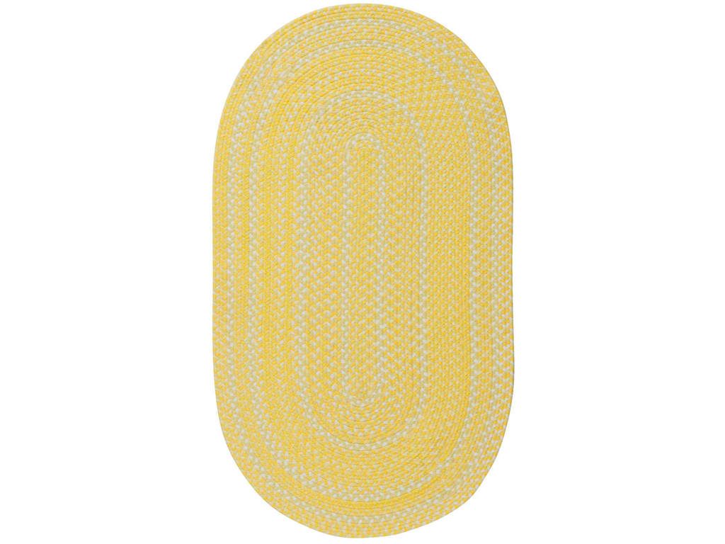
Capel Incorporated Floor Coverings Regatta Rug 0087NS Sunshine
Now, the Forecast
There are many color forecasts that are being done each year but one of the most esteemed are the picks made by Pantone. The upcoming year’s Color of the Year picks are calming, soft and wonderfully romantic. Now don’t worry if those aren’t your exact wish as a color for your home.
Leatrice [Lee] Eseman shared a handful of color palettes that you could choose from. These are all predictably popular colors for the upcoming year that you can use to beautify your home. These colors were also chosen because they address the consumers’ craving for colors that are comfortable yet new. Design trends became inspirations for many of these palettes, so was the film industry (e.g. The Peanuts Movie, Star Wars: The Force Awakens, etc.).
So go ahead and make use of anything silver and metallic or anything bright and colorful (if Charlie Brown inspires you the most). Say yes to orange chiffon, melon as well as dove gray. Grape and lime are also good colors.
Apart from these, there will also be an abundance of florals this upcoming year. Floral hues such as red Dahlia or pink yarrow, plus any shade of green may be acquired tastes but they are beautiful and not-oft used colors.
Gray and red will remain popular in 2017. They will both appear in warmer hues with the backdrop being that of bolder colors. Yellows that look perfect in a harvest setting will also get a lot of attention in the coming year. Yellow with hints of earthiness will look great and would be effectively grounded by classic red or blue.
Any youthful color is also a great choice in 2017. Now don’t be limited to the age-appropriate colors, rather, look for youthful colors with an attitude. So no matter what your age, you can use color palettes that are fluid and can easily morph in the 2017 surroundings.
Find celebratory hues that hail technology and nature. The former will continue to play a vital role in people’s lives. Evolving technology will continue to inspire ambience that is dark or in commanding grays.
Those who love deep plum would also find it a great news that the color forecast for 2017 also includes this hue.
Tags: 2017 color trends, adding colors to a home, blue, bold colors, bold hues, color choices, green, McCreerys, McCreerys Home Furnishings, orange, pink, purple, yellow
Posted in 2017 Trends, Color Schemes, Interior Design 101, Interior Design Elements, Interior Design Themes | No Comments »
Friday, August 5th, 2016
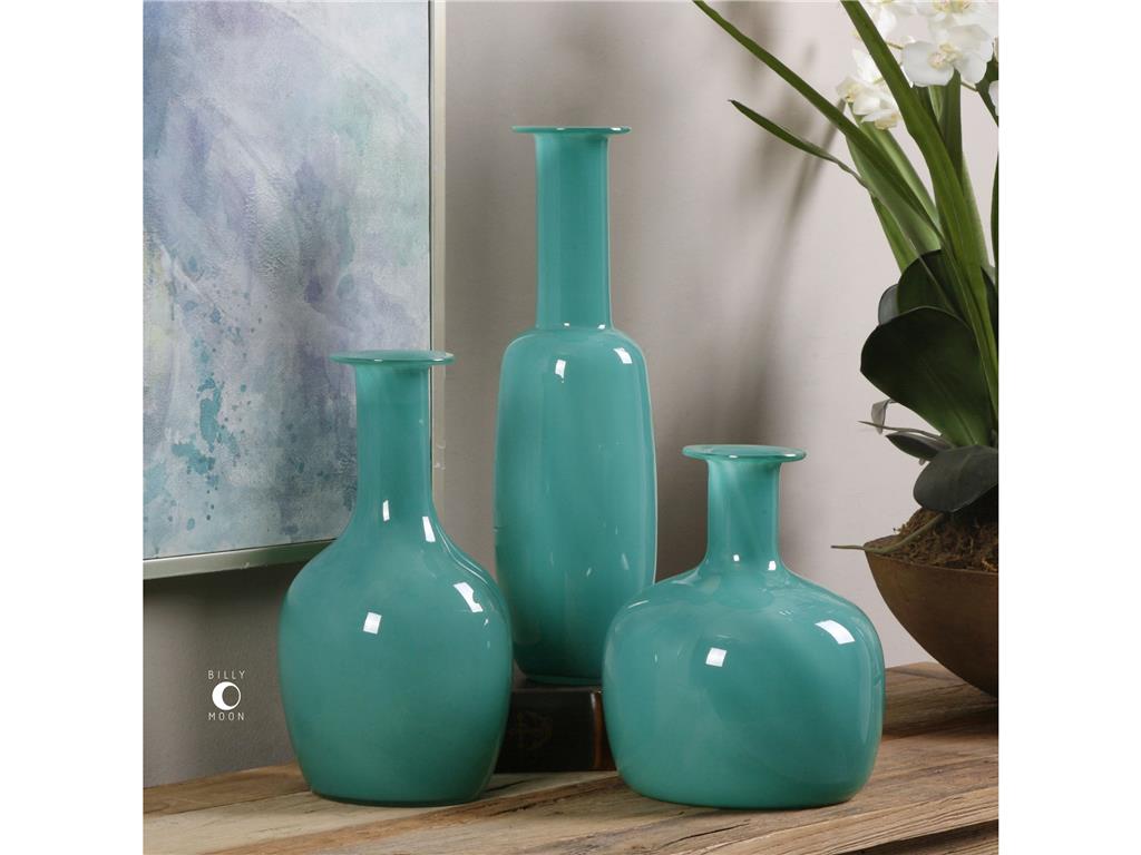
Accessories Uttermost Baram Turquoise Vases, S3 20017
Turquoise is a color named after the gemstone. It brings to mind soothing beach waters and the most relaxing bay breeze. This color is considered soothing and is used in a few mental health facilities because it helps create a serene atmosphere.
There are, however, a few colors that are called turquoise but are not actually turquoise. This is not teal, neither is it light blue, it is not aqua, too. Turquoise, simply put, is a mixture of green and light blue. Tints of this color come with infused yellows in different shades. This color can be anywhere from cool to warm, pale to vibrant.
Pairing Turquoise
Turquoise is a best friend to many colors. It effectively complements citrus tones such as lime. It can also work with its cousin color, blue, as well as in different shades including navy blue. Put the navy blue, turquoise and red altogether and will have achieved a Mexican, Caribbean vibe. Add some Native American motifs and art, consider also if you can set up a Mid-Century modern design.
Go ahead and pair turquoise with warm or bright white and that’s an instant beach look for you. Use mustard or amber and what you would evoke is an Old Mexican vibe. Put turquoise with gold and what you would have achieved is instant glamour.
Fall In Love with Turquoise
You can fall in love with turquoise if you are the type that loves sticking his toe in the water. A jaw-dropping turquoise chandelier is a grand way to use this color in your living room or dining room design. You can use olive-colored walls as an equally breathtaking backdrop for this interesting lighting fixture.
You can also paint that old chest that you’ve been keeping in a distressed color. You can then add accent pillows in, guess what – turquoise! This is both an energizing and soothing way to try turquoise in your home.
That Turquoise Wall
Just like other vibrant colors, turquoise can also be painted on an accent wall. This can add energy as well as light to any neutral-colored room. This is especially wonderful inside the dining room or a kitchen.
Turquoise accent wall paired with natural wood as well as warm whites simply spell happiness. If neutrals don’t fascinate you, then add a little dimension to the room by having turquoise painted right next to dark coral walls.
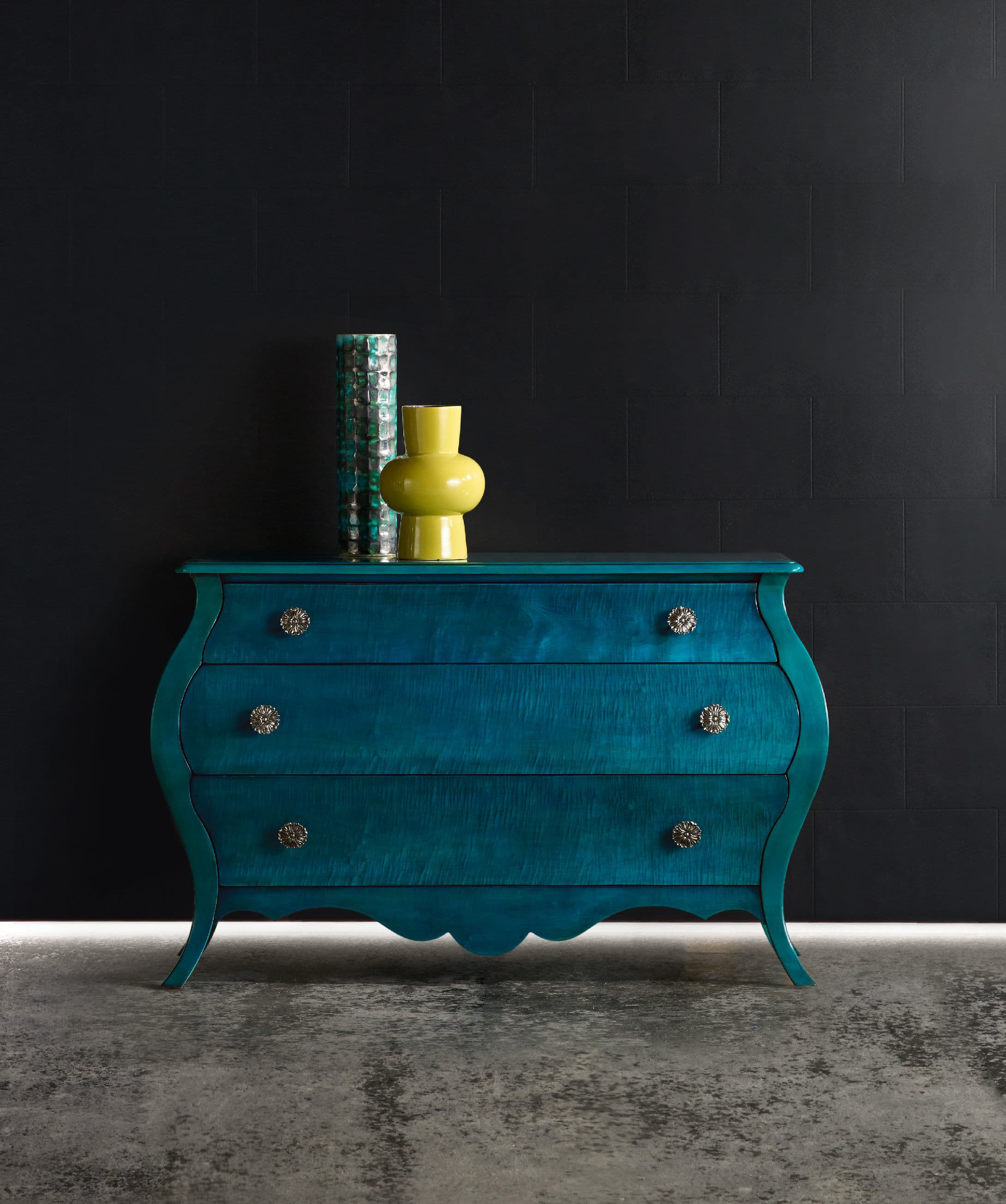
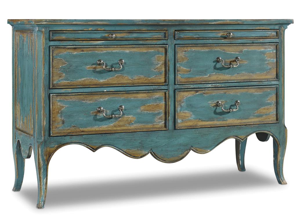
BLOG 7. Hooker Furniture Living Room Melange Nina Bombe Chest – Turquoise
A Turquoise Bathroom
Turquoise can enliven and calm at the same time especially when you use it inside the bathroom. Gold and turquoise will also work wonderfully inside this space more so when you decide to use it on your wallpaper.
Use turquoise and white in this room and you would create a glamorous beach-like bathroom. That style is very Miami.
Personalizing with Turquoise
Popping turquoise in a traditional setting is a unique way to personalize a room. A desk made of natural wood, for instance, could just be another nondescript piece inside a hotel room. A touch of turquoise could make a huge difference.
Lastly, are you interested in creating pale turquoise on your own? Here’s a simple method to do just that –
Tags: blue, blue color scheme, blue design, blue design blue interiors, McCreerys, McCreerys Home Furnishings, turquoise, turquoise color scheme, turquoise interior design, turquoise interiors
Posted in Accents, Color Schemes, Interior Design 101, Interior Design Elements, Interior Design Themes | No Comments »
Monday, July 25th, 2016
Hooker Furniture Living Room Sanctuary Four-Drawer Chest
Sky blue is a color that hints of the seaside; lets you picture springtime; and the bright blue skies. There are many reasons to love this calm color. You can use this in both interior and exterior parts of your home namely the ceilings, kitchens, bedrooms, even that cute picket fence.
All About Blue
Blue is the color of honesty, trust, even loyalty. It is often quiet, sincere and reserved. This isn’t your go-to color if you don’t want to draw attention as it detests confrontation.
Speaking of color psychology, blue is also believed to be a reliable as well as a responsible hue. Sky blue is confident and secure, it is a great color to give direction and order in any work or living space.
Blue seeks out tranquility and peace above any other characteristic. It is a color that promotes mental and physical relaxation, thus, it can reduce stress.
Don’t you just feel a sense of calm if you see a sea of cloud-like blue? It is because it can slow down one’s metabolism. The paler the blue color is the more independent you would feel.
In giving meaning to blue, it can also relate to one-on-one communication. This is especially true when you speak the truth verbally. Blue, in essence, is the public speaker, also the teacher.
Blue is an idealistic color. It enhances self-expression and one’s ability to communicate his wants or needs. This is a color that inspires high ideals.
If you are conservative when it comes to interior design, then blue is the right color for you. It is predictable, non-threatening, and safe. Blue can be determined in pursuing any endeavor that it is after.
Blue is difficult to alter because it is inflexible when faced with a different or new idea. It may analyze, consider, and mull things over but it has its own version of reality.
Blue can also be nostalgic as it tends to live in the past. If all these descriptions reflect your personality then you can go ahead and pick blue as your color scheme.
There are many other reasons why blue would work for you –
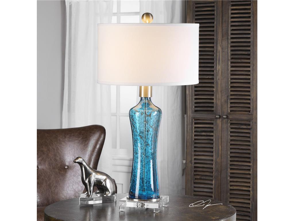
The sky blue of this Uttermost Lamps and Lighting Sekani 27207 blends beautifully with the chocolate brown background.
Blue Is Classic
Sky blue can be worn all year long. It can look great in spring, look fresh when paired with citron and pale green. During summer, sky blue’s vibrant partners are turquoise and white; and in the cooler months, you can warm up this color by adding rich orange, gold and chocolate.
Sky Blue Is A Crowd Favorite
Are you searching for a color that is usable in your home? Sky blue is fun and bright for those who like things to be flamboyant. It is also a subdued color for people who love the classics. This is a hue that is non-gender specific.
Sky Blue Is Enduring
If you are picking the colors for tile work, cabinetry, or a new sofa, then sky blue is a great hue to resort to. It will not look old or tired even after you use it for a season or two.
One other reason why sky blue is enduring is because it can cool down any warm hue. You can pair it with bright colors such as cherry red if you want to achieve a summery look. This color can also remind people of their childhood memories where they go to the beach or look at the clear, blue skies. Remember that nothing can be more beach-like than sky blue.
For a more polished look, sky blue can be paired with sandy or creamy hues. This is the traditional choice for a subdued living room scheme.
Tags: blue, blue color psychology, blue color scheme, blue design, blue interiors, McCreerys, McCreerys Home Furnishings, sky blue color scheme, sky blue design, sky blue interior design, sky blue interiors, tips
Posted in Color Schemes, Interior Design 101, Interior Design Elements | No Comments »
Thursday, July 21st, 2016
The 1140CR Ryder Chair 1586-10446A-BLK3 Skyline Bookcase duo makes blue so enviable.
Living rooms, sunrooms, family rooms, and sitting rooms all have one thing in common – they are all supposed to be relaxing. And no color can promise a heightened state of calmness more than blue. Different companies have come up with different shades of blue from indigo to sky blue.
Blue is also cited, generally, as the favorite color when it comes to achieving serenity, calm, stability, authority or conservatism. Now is it a wonder why blue is the color of policemen’s uniforms? This is also the color that represents honesty, wisdom and loyalty. A few blue tones are also perceived to be cold which can evoke feelings of aloofness or sadness.
What Color Experts Say
But what do these professionals know about blue? What do they, together with psychologists, know about blue and how it should be used in homes?
The ancient Chinese and Egyptians studied and practiced chromo therapy. This means they believe that colors have healing properties. This is also referred to, these days, as colorology or light therapy. This is not practiced in traditional medicine but more of an alternative form of health treatment.
In the book, The Principles of Color Therapy, it has been written that blue ray is no less than one of the greatest antiseptics throughout the world. This is known to soothe pain and illnesses.
Buddhists also recommend blue lapis lazuli in bringing inner peace. Blue has a calming power that is not easy to explain. Particular shades of sky blue are known to be most calming.
Earlier Europeans also believed in the protective power of this color. These people painted their doors, staircases, cupolas and fences with blue to ward off evil.
If you want to have a more relaxing bedroom and bathroom, then be sure to use light blue in those rooms. Just make sure to use some rustic elements with the blue in your bedroom so that the theme won’t come out as too unfeeling.
Blue pops beautifully in this 1586-75200B-BRN-75410F-BRN1-room
Appetite Suppresser
It has also been scientifically proven that blue can suppress the appetite. This may have come from the fact that rotten food tend to have a bluish tinge, hence, seeing blue while eating can actually make your weight loss program a lot more effective.
Blue may be the best choice for people who want to trim down but it’s not the best option for foodies.
Blue Means Productivity
Blue is an oft-used color in offices because researches show that people have a tendency to become more productive inside blue rooms. A study by the University of Colombia in the year 2009 showed that the color blue even ups the test scores of children who were took their IQ tests in blue rooms.
This makes blue the most popular choice for home libraries, study rooms, and home offices.
Feng Shui Goin’ Blue
The Feng Shui principles point at blue as a water element. Since this is so, it should be situated in the east if you want to be healthy and if you want your relationships to remain strong. Placing blues on the southeast part of your home spells abundance and wealth.
If you want to experience all these in your home, then have some water elements in those locations.
Blue-Gray to the Rescue
Dark blue is also a good color inside the bedroom because it evokes serenity and calm. A blue-gray mural is a good way to adding a contemporary flair into your home. This same color can be added to the spa-like bathroom. Use it as a backdrop then add a colorful area rug and a laminate tub.
Cabinetry painted in this color would render it perfect for the farmhouse look. A transitional bedroom would also do well to make use of this color.
Tags: blue, blue color psychology, blue design, blue interiors, color psychology, McCreery's, McCreery's Home Furnishings
Posted in Accents, Interior Design 101, Interior Design Elements | No Comments »
Follow us on our social media
© McCreery's Home Furnishings | All Rights Reserved | Privacy Policy