- Follow us:


Tuesday, July 4th, 2017
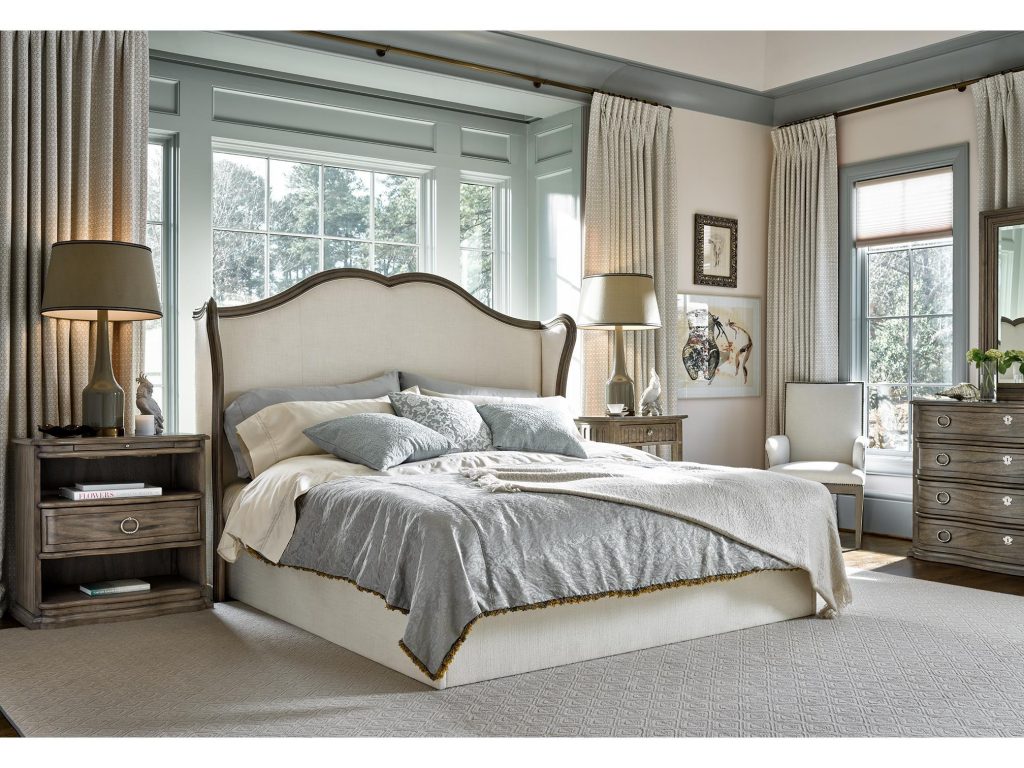
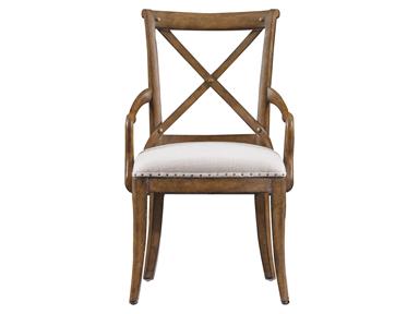
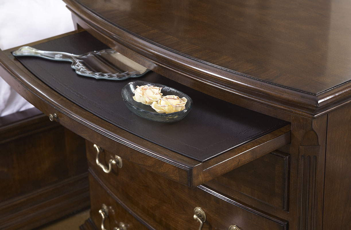
This bedroom still manages to stand out even with an all-neutral background and furnishings. Featured furniture is the Lazarus Queen Headboard piece from FFDM’s Meritage Collection.
(Second in a Six-Part Series)
Pronounced (NOO-trul), neutral colors are not the hues that you would expect to see on your color wheel. Neutrals include light, midtone and the darker shades that are all classified as earthen colors. When talking about the interior design context, neutral actually means minus the color.
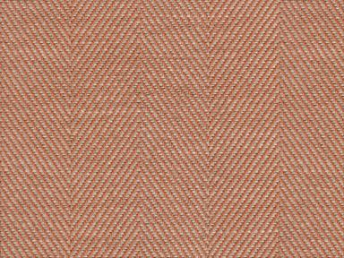
The most famous neutrals include black, ivory, beige, taupe, shades of gray, and white. These colors plus undertones will create variety despite your color palette being neutral.
To illustrate this, picture different shades of beige. There are actually some that have undertones of pink, gold or tan. Even white is not just the stark white that we compare hospital environments to. White can be bluish, ivory, or yellowish.
The Light Neutrals
Beige and white are two favorite light neutrals that are standalone hues. While this is so, they are still versatile enough to be used with other equally subtle colors.
White and beige are not even referred to as real colors but they do give a clean and classic feeling especially when used in the right rooms such as the bedroom, powder room or the dining room.
Light neutrals are there to trick the eye to believe that there is more space when it is actually limited. When you pair furnishings with like shades, you could create a sprawling room illusion without too much effort.
The Midtones
Mid-tones are cocoa, khaki, camel, and sand which all offer a natural ambiance. These hues also provide the best backdrop for colorful or like-colored furnishings.
The use of midtone in interior design is now a popular move among homeowners. These neutrals give comfort and warmth where necessary though they are also versatile to work with tropical, classical, and even modern designs.
In essence, the mid-tone is any indirect lighting that is directed at an object. Just imagine an apple that is receiving an enormous amount of sunlight. The surface that gets hit with the most light is the highlighted area. The shadows are the areas where there is no light. Now imagine the line where these two meet – that’s the perfect midtone.
The Dark Neutrals
The best examples of dark neutrals are black and gray. These are the colors that can effortlessly add drama, sexiness, and a dash of sleek to any living space.
Dark neutrals are sophisticated tones whether you intend to use them as an accent or background. Make a minimalist and stark statement as you contrast the dark colors against a lighter, neutral background (white and beige are absolutely perfect). You can also choose to be bold by pairing black or gray with bright colors such as yellow or red.
The All-Neutral Living Space
If you’re brave enough to do the all-neutral theme, then be sure to layer the varying hues of the color that you choose to use. This will ensure that you achieve a sophisticated ambiance.
Still, be sure to use colors that harmonize with one another. Pick a lighter shade for your walls (take note to always begin with the walls) while you use dark upholstery. You can also use an area rug in hues that blend well with a wood flooring. Just make sure that this shade is darker than your walls so that your furniture will still stand out.
Be sure to tie the room with the right accessories. When you properly use neutrals to your advantage, then you will see that all these stand out – the fireplace surrounded with stone, wood, and bricks’; the exposed beams; the hardwood flooring; and the wooden window frames.
Having a light and large home means you have a lot of options. If your home is small and a little on the dark side, then it would do you good to lighten up your neutral color palette.
Tags: light neutrals, McCreerys, McCreerys Home Furnishings, midtone, midtones, neutrals
Posted in Color Schemes, Interior Design 101, Interior Design Elements, Interior Design Themes | Comments Off on Color 101: Lovin’ the Neutrals
Monday, July 18th, 2016
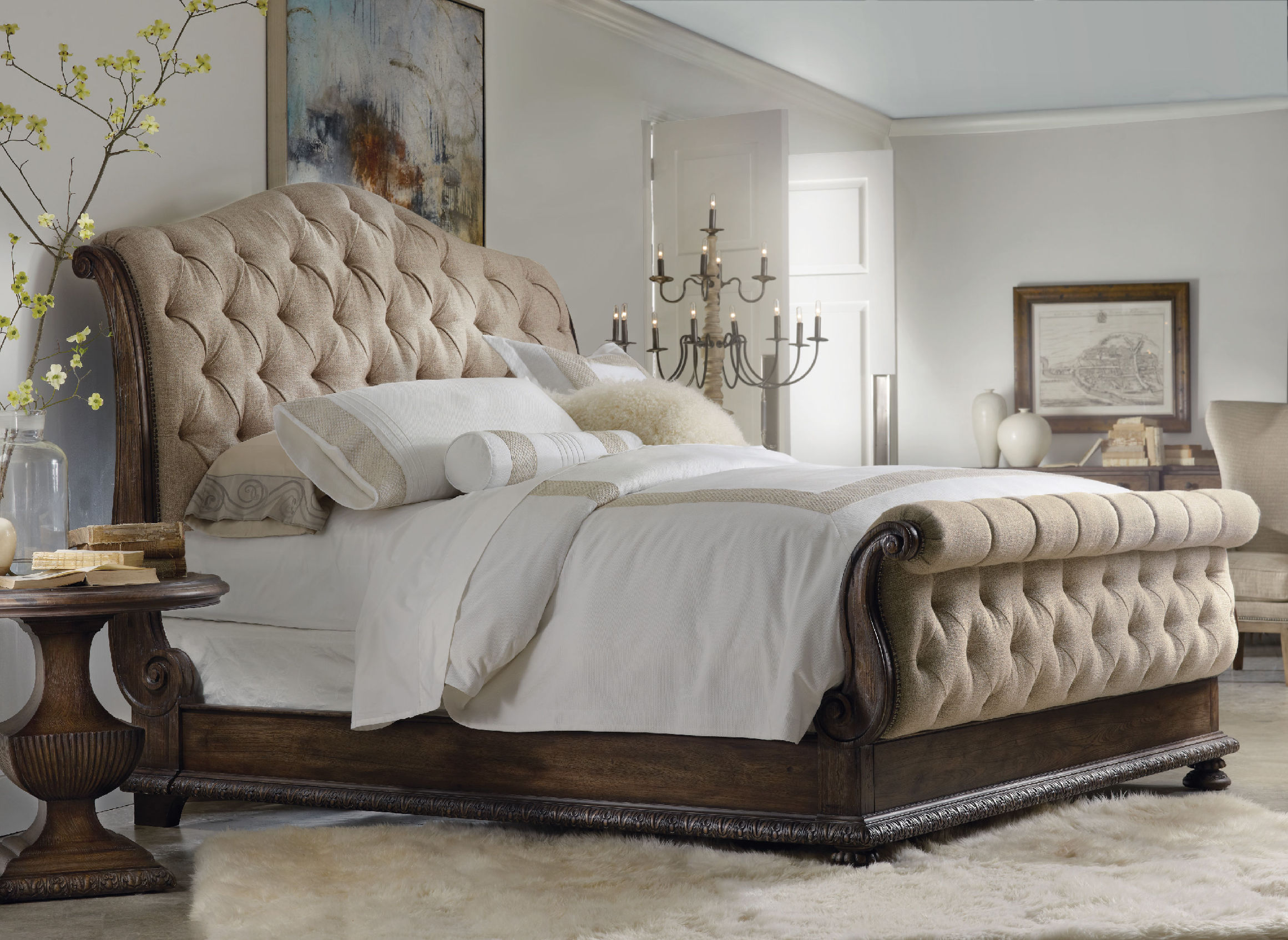
The Hooker Furniture Bedroom Rhapsody King Tufted Bed is nested in a neutral background. Its wooden frame pops from this sea of neutrals.
Muted tones are the go-to colors when you want to be safe with your interior design; yet, at times, you would think what you have created is a masterpiece of muted tones only to end up with a bright, colorful mess.
Neutral tones only become effective in interiors if you know which elements to work with. You need to be subtle, to begin with, and creative enough to make the muted tones more interesting. Know the basics such as which paint color goes with which furniture and what rugs to use on certain areas. After you figure out the major elements, it is also your duty to come up with the pieces that will populate your home such as potted plants, books, artwork, and other things that would bring a personal touch to your place.
Always Within Bounds
The walls are your biggest challenge when it comes to choosing the right color. There is a wide array of shades that come from the same color family so it is wise to choose from within these. Whether you go from ligher to darker or the other way around, picking colors that come from the same color family will give your home a unified look.
Espoused Colors
A basic palette for any room is the tone-on-tone neutrals plus two accent hues. An example is having blue trim paired with an orange-red area rug.
Layer with Love
Homeowners always default to the creation of a purposeful interior. Layering is great for your interiors so long as you use colors in moderation. Again, just to be on the safe side, neutrals can make your life a whole lot easier.
A natural woven area rug will surely work well with in pulling together the rest of the décor. This is a piece that automatically adds texture and softness. In addition to this, pick artworks when you are out to coordinate or complement colors. Art pieces should be in proportion with the room. A few large artworks render a better visual effect than a group of smaller ones. This is – if – you are aiming for the classic look.
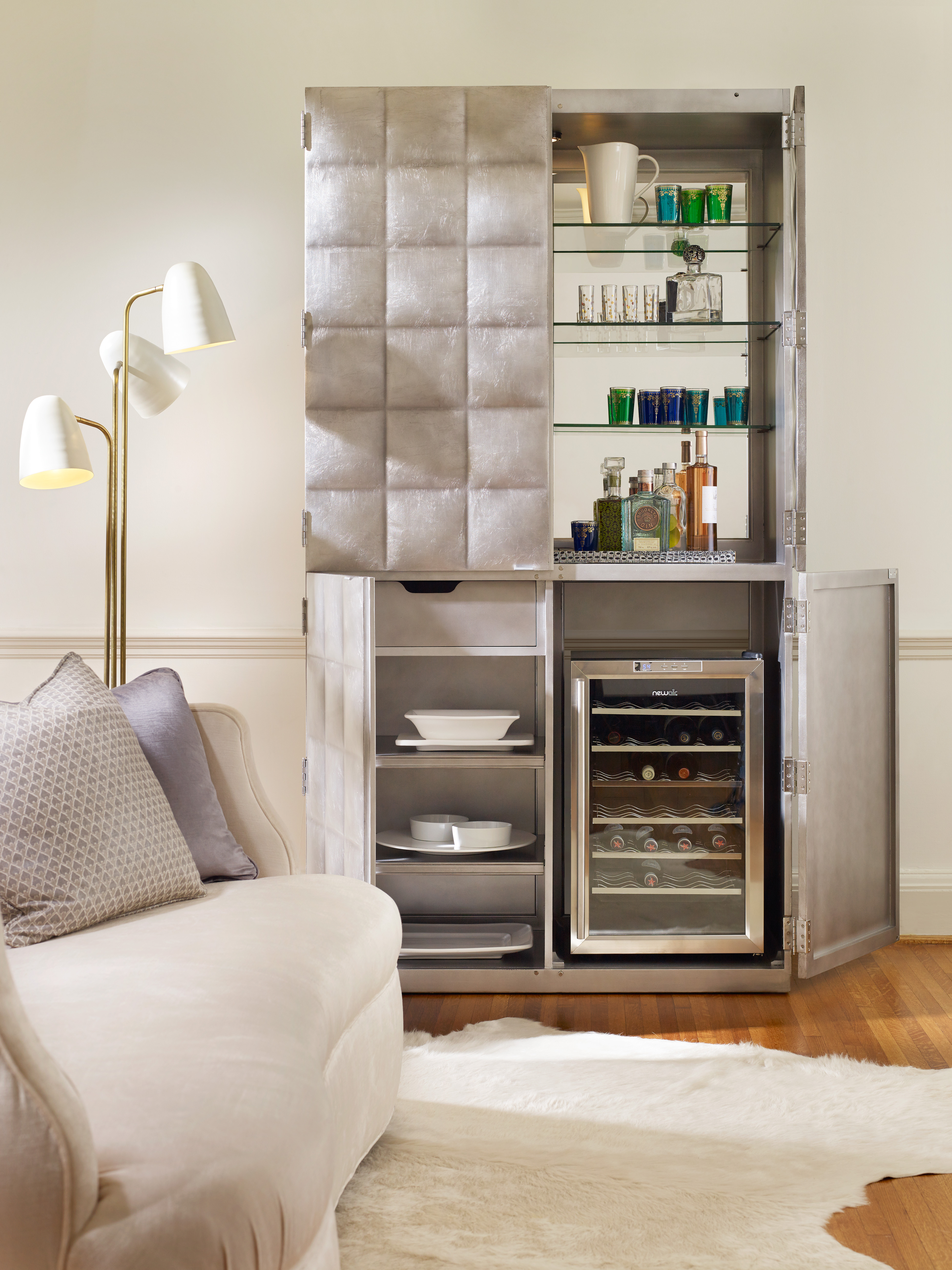
1586-50011-SLV2 Alchemist Bar Cabinet
Balance In All Things
As you work with neutrals in your contemporary kitchen, keep glossy cabinets and pieces with sharp edges grounded by having organic elements brought in. Wooden finishes have the power to amplify the beauty of streamlined looks; so bring softness inside the kitchen by having wooden countertop.
Infuse Lively Colors
Don’t think that life in colors is limited only to the bright hues. You can still use neutral colors but still achieve the beauty of a lively interior. Neutrals provide the usual serenity and cleanliness but there is also no denying that they can enhance the mood in any room.
Raspberry-colored pillows, for instance, that have the same prints as your neutral wallpaper would surely jive.
Don’t Forget the Frivolity
Most of the time, you are so engrossed on how the room would eventually look that you end up missing out on special elements that should be used. Lighten the mood with exciting accessories such as animal print pillows with neutral colors blending well with the rest of the design elements.
If you prefer neutral design with a little edge, then go ahead and combine gray or white walls with some industrical accent pieces. There are many industrial-themed pieces in the market now that will provide a convincing aged look for your home.
Being frivolous is simple if you add some natural elements such as potted plants into your home. Successful neutral design is all about popping the right elements against a muted background. Achieve this and you’re already an expert in your own right.
Tags: adding colors to a home, McCreerys, McCreerys Home Furnishings, neutral design, neutral hues, neutral interior design, neutral interiors, neutrals, tips
Posted in Interior Design 101, Interior Design Themes | No Comments »
Wednesday, February 10th, 2016
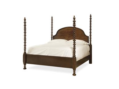
Universal Furniture Bedroom Santa Rosa Poster Bed Queen 313280B
Farmhouse design has been around for many years. Its simplicity is no longer just considered a style but a passion for some. It is casual and basic, none of the frills and excessiveness of the other interior designs.
Farmhouse design makes amazing and exciting vacation houses. The old and the new worlds collide in this perfect union of styles. If you happen to be blessed with an actual, old farmhouse, then learn how you can remodel it and bring it back to its glorious days. If you want to build a farmhouse from scratch, then you have to know the elements that make this design uniquely charming –
Old farmhouses usually have large openings. This is so large furniture and many people can be accommodated. The windows are generally bigger, too, because they are meant to offer a grand view of the farm outside.
Modern farmhouses already share these features. Sure, there might not be a literal farm outside but the wide openings can still be used for the amazing sceneries. These houses also break down the usual barriers of the outdoors and indoors.
Traditional farmhouses were made quickly. Farmers did not have the leisure of time to set up fancy interiors, hence, you won’t find fancy wallpapers, bright paints, or ornate furnishings. Whitewashed or natural woods were preferred as were exposed beams and light-colored walls.
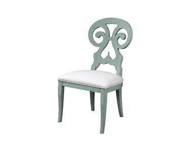
Stanley Furniture Dining Room Fairleigh Fields Host Chair 018-61-70
The Farmhouse Living Room
The same principles of design apply in this room as in the rest of the house. You can mix natural materials with modern elements. Find a neutral carpet that can give the room a simple, warm base. Brown, tan and other natural tones are commonly found in farms so use them liberally.
Keep all your furniture neutral and simple. These pieces should echo the look of the floor.
No country living room is without a fireplace so make sure that you set up one for your home. Use candelabra, old bottles and barrels to decorate the rest of this room in your home.
The Farmhouse Dining Room
Just like your living room, the dining room should come with simple flooring. Weathered wood is best as is neutral carpet. A hardwood dining table is the star of this room so make sure that you choose a lovely piece that will last for many, many years.
Accent the rest of the room with chinaware and simple dishware.
Hooker Furniture Dining Room Willow Bend Bench
The Farmhouse Open Kitchen
Farmhouse kitchens are always open. They are large enough to feed a huge family.
The focal point is the center island where pots and pans are stored. Wood countertops are also common so say goodbye to marble or granite countertops. Find out which glass fronted cabinets will work for you or if you would prefer the wooden ones. Keep in mind that no farmhouse kitchen is considered complete till there are plate racks for those beautiful serving trays and ornamental plates.
Find appliance panels to hide your refrigerator or dishwasher. Keeping the modern appliances maintains the old-fashioned appeal. If you can find retro stoves, then that should keep the antique feel in your place. Add accessories like wooden spoons, old dishes, or antique pitchers.
Maximize natural lighting even if you have to reduce the number of upper cabinets. Open shelves are great in keeping the country feel.
Winners Only Dining Room 57 Inch Farmhouse Single Pedestal Dining Table 54257A
The Farmhouse Bedroom
Pick the simplest four-poster beds, dressers and side chairs. Start with rustic wooden floors, rugs and rustic accessories. You can also add a fireplace in this room. Think well about your lighting options. A rustic chandelier should do the trick.
Other Farmhouse Tips
Tags: designing with wood, farmhouse design, farmhouse remodeling, farmhouse style, McCreerys, McCreerys Home Furnishings, neutral, neutral interior design, neutral interiors, neutral palette, neutrals, old farmhouse, wood, wood elements, wooden elements, wooden furniture
Posted in Bedroom Design, Dining Room Design, Interior Design Themes, Kitchen Design, Living Room Design | No Comments »
Tuesday, January 19th, 2016
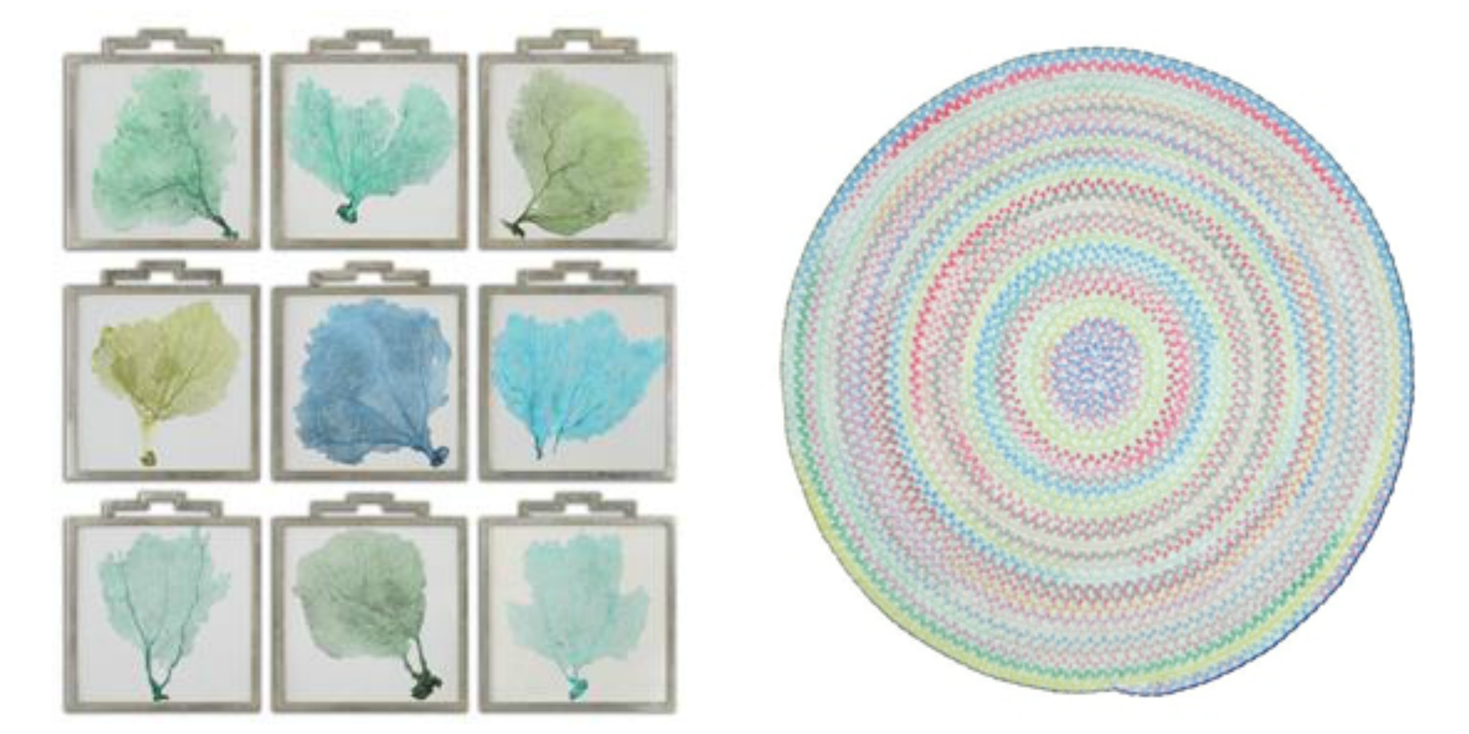
L-R: Accessories Uttermost Sea Fans Framed Art S_9 35239 and the Capel Incorporated Floor Coverings Cutting Garden Rug 0450CS0032610 are both available at McCreerys Home Furnishings.
A lot of the design trends these days involve bright, bold colors. This should not be a reason for you to stop using milder, more calming colors if you really want to. If you are in a pastel mood, then there is no need to conform to the bold patterns that many modern homes use. Creativity is the key to accessing the beauty of pastels. There are so many ways that you can utilize pastels to spotlight spaces or open up dark, crammed up rooms. Creating a winning interior with the use of crisp white combined with irresistible pastels is now easy.
Fine Furniture Design Dining Room Side Chair 1053-820 at McCreerys Home Furnishings
Pastels + White
Heightening the effect of pastel is as easy as pairing it with white. Many designers use soft hues as a standalone color inside many homes. Some use an accent wall complemented with any accessory that comes in the same shade.
A white room is a great playing field for lovers of the pastel palette. The secret to using pastels in a seemingly blank room is to have them as accent pieces like artwork, textiles and lighting fixtures.
Any shade of pastel can be used to achieve a soft glow. Warmth and softness is the beautiful result of cream and gold plus some light pink roses.
When the walls come in any pastel color, then you can use white textiles and furnishings. This is a powerful combo that can be balanced with the use of pastel accents such as throws and some pillows.
Pastels + Bright Colors
If white and pastels result into a crisp interior, then pastels plus some vivid colors equals awesome. The biggest trends today play up the pastel colors by adding neon and other bright hues. For instance, pastel walls can be highlighted by a neon pink cornice. Pastel blue rooms can be heightened with bright colors such as lime green or orange. And while you’re at it, check out the uniqueness of pale green, light chartreuse and lavender. These are all irresistible colors that will look hot with coral pink; light green walls can be paired with peachy sheets; modern shelves can house bright colored books.
You might wonder how two colors on almost opposite ends of the spectrum could fuse so beautifully. Pastels and bright colors are alluring because they complement each other marvellously. For instance – going back to hot pink – it can be your color of choice for the mirrors, bed, lamp and pillows inside your place of relaxation.
 Gentle Pastels
One other approach to pastel interiors is subtlety – like really subtle. An example is a white room with silver motif. Add a dash of blue table lamp and throws and you’ve just achieved a modern room that elevates pastels without being overpowering.
Gray can also be combined with pastel colors to create contemporary look. This can be both soothing and sleek.
Going All Out
The final approach is to go all out. Use monochromatic pastel as a powerful statement on your walls, the furniture pieces, upholstery, and some of the major accessories.
If you want to use more than one pastel color in any room of your home, then be sure to put them all together in a concerted display. A single row of pillows in lemon yellow, green, lavender, or dark pink can make a room pop. A rug such as the braided area rug from Capel Rugs perfectly caps the lovely theme. This soft chenille rug comes in various colors and custom shapes.
Tags: adding colors to a home, artwork, contemporary, gentle, guidelines, McCreerys, McCreerys Home Furnishings, monochromatic color palette, monochromatic color scheme, monochrome, monochrome interiors, neutral colors, neutrals, pastel, pastel color scheme, pastel interior design, pastel interiors, pastel palette, pastel theme, pastels, subtle, textiles, tips
Posted in Color Schemes, Interior Design 101, Interior Design Elements | No Comments »
Sunday, January 17th, 2016
The Hooker Furniture Living Room Sanctuary Chairside Table will catch your guests’ attention if you let it stand against white or any neutral background.
You have probably seen those painting sequences on home TV shopping shows and thought that the people there looked like they were having fun. In reality, painting a home (or even just a portion of it) is far from being glamorous. You can actually exercise your organization skills and patience as you go about with this activity but, in the end, you will feel a level of satisfaction that will make you say – it’s all worth it.
The fundamentals of painting all begin with planning. As what’s always been said, always begin with the end in mind. Try to visualize your space down to the minutest details like what furniture would go with what color, what sort of accessories would blend with your chosen walls, would you use carpets or tiles, and many such details.
After planning and visualizing these things, it’s time to translate your vision into reality. You will surely be surprised to find out that your room or your entire home turned out to be quite like your visualized, ideal space.
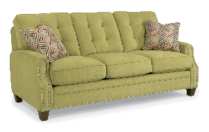
Sloan-Sofa-with-Nails-in-Fabric-917-22 is perfect for any colorful interior design theme.
Consider the Available Space
Many interior designers would agree that one of the first considerations that you have to make before you would start an interior design project is space and how much of it you can work with. The space that you’ll be able to work with validates the colors (paint) that you end up using.
Keep in mind that smaller spaces need light colors such as sand, white and cream. These light hues will give the small space an illusion of being more expansive. On the other hand, bigger spaces are like canvases for the homeowner’s imagination. You can use different hues depending on what needs to be expressed. Colors such as dark brown, navy blue, and black can lend a romantic look and feel.
Consider the Ceilings, Floors and Walls
As soon as you know how much space you can get your hands on, you also need to consider other parts of your home such as your floors, walls and ceiling. These are also parts of your huge masterpiece so they also need to be given some serious planning.
Just think of yourself as the liberal artist. Make a shortlist of all the colors that you think would make these parts of your home come to life. Do not go too crazy on the hues so that your residence remains tasteful. As much as you can, limit your color choices to just five hues.
Just as you would the paint, it pays to ask for swatches when looking for the right fabric for your sofas. This orange/rust fabric comes from the Lexington cover collection available at McCreery’s Home Furnishings.
Get Color Samples
It is best to get paint swatches or samples from different paint centers. As soon as you have mixed the shades, wipe the paint swatch on a sheet of paper.
Test your chosen colors by taping the paint test swatches to the wall. See how the colors work for you visually.
At the moment, the top five designer colors are –
Light gray or ash can work as a substitute for the usual shades of white. It can effectively tone down the mood in any space while not neglecting on modernity and being sleek. Charcoal gray, meanwhile, can draw attention easily which is why it can be an effective paint on your focal wall.
White is timeless and it can efficiently frame any interior. Just make sure that you choose white carefully because it can become glaring.
Orange is a warm color that works best with metallic hues such as gold and copper. It is also the perfect color for autumn-inspired interiors.
Green reminds us of nature, freshness and going organic. This hue can make any space feel more fresh and relaxing. It can also blend well with other neutral colors.
Lastly, neutral paints can suit any style. They are easy to maintain and can become the primary color to an exciting accent color which you would later add.
Tags: accent color, adding colors to a home, colors, designer colors, designer paint, floor color, guidelines, home paint, McCreerys, McCreerys Home Furnishings, neutral paint, neutrals, paint, paint colors, painting, tips, wall color, wall paint
Posted in Color Schemes, Interior Design 101, Interior Design Elements, Interior Design Themes | No Comments »
Thursday, January 14th, 2016
This classic wooden drawer is from FFDM’s American Cherry Collection.
Southwestern design is defined with earth colors and the richest textures. This means that you should use more of orange, yellow, turquoise, and red clay. Clay tile roofs, terracotta and handcrafted stuff are all welcome in a southwestern home.
Upholstery for this design is chiefly woven fabrics, suede, animal hides or leather. Blankets could be made of traditional native clothing. Do not limit the use for these beautiful pieces inside the bedroom because they can also be great wall decor.
Wood furniture is a must and could also feature metal accents or a distressed finish. The accents used in southwestern environments can be anything from painted ceramics to hand-painted tiles. If you can find early pieces dating all the way back to 16th century Mexico, the better.
Tribal Design Elements
You will see a lot of Native American pieces inside a southwestern home. Elements such as latillas, vigas and other artwork are design themes that are commonly used in architecture. This style is quite earthy as well as organic as it captures the heritage of Arizona and New Mexico areas. Natural accents, colors and other elements look and feel a lot like Mexican, Spaniard, and Native American designs; open floor plans, flat roofs and courtyards, even gardens can become a part of your home.
This Hooker Furniture Living Room Covington Bogue Club Chair has the right color to give life to a southwestern habitat.
Southwestern design makes use of subdued earthy tones like tan, cream, brown, terracotta, and white. These colors are great as backdrop for American Indian-inspired textiles and accents. Azure is a famous color for windows and doors. Any color found in nature such as forest green, salmon, sunny yellow and slate blue can fit perfectly in southwestern interiors.
Southwestern furniture should be unpretentious. Say no to anything intricate. Cherry, walnut, pine, and just about any mid-tone wood would do. It should have soft leather or natural textiles as coverings. Make use of huge pillows right on the floor as well as hammocks in your courtyard. These can be alternative seats for your guests. Always remember that the rooms must be spacious or have a natural flow.
As for the walls, they are often made with the same materials as the exteriors. Mostly adobe, interior walls are roughly plastered. Others use smooth stone or stucco. If you want to add warmth and color onto a boring wall, then use hand-painted tiles. They can also be used in covering kitchen backsplash. If not, use the tiles as individual accents.
Murals are also a huge depiction of southwestern culture. Have spiritual stories or rituals painted on murals then have them installed as a statement wall.
You can also try stucco plaster then add builder’s sand to the paint. You may also use special paint effects such as suede, color washing, or faux paint.
Capel Incorporated Floor Coverings Biltmore Select Bidjar Rug 1773RS02000300450 at McCreerys Home Furnishings
Southwestern floors are often honey-colored. Other homeowners prefer terracotta tiles. Adding visual interest on your floors is easy. Just arrange the tiles in patterns and layouts.
Parquet or light wood flooring is widely used. You can color this kind of flooring with cobalt blue or any other earthy color to make it more exciting. Carpets and rugs are valuable pieces but if you do not want these in your home, then be sure to opt for hardwood flooring.
Use brick or stones throughout your home without letting the style suffer. Use lovely rugs with traditional patterns and colors brighten up the room.
Southwestern accents are mostly paintings, candles, wrought-iron stuff, dried flowers, sculptures, pottery (the hand-painted type), and animal skins.
Learn these Southwestern design tips and begin bringing rustic beauty into your lovely home.
Tags: animal print, brick, earthy, guidelines, leather, McCreerys, McCreerys Home Furnishings, Mexican, Mexican interior design, Mexican interiors, Mexican style, Native American, Native American design, natural stone, neutral, neutrals, paint, rustic, rustic decor, rustic design, rustic elements, rustic home, rustic interior design, rustic look, rustic style, rustic theme, southwestern interior design, southwestern interiors, Spanish, stone, textures, tips, tribal, warm colors, wood elements, wood furniture, wooden elements, wrought iron, wrought iron furniture
Posted in Interior Design 101, Interior Design Elements, Interior Design Themes | No Comments »
Follow us on our social media
© McCreery's Home Furnishings | All Rights Reserved | Privacy Policy