- Follow us:


Tuesday, February 5th, 2019
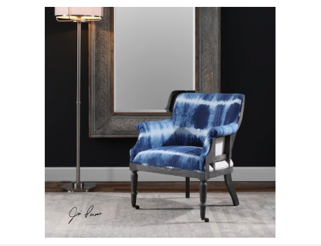
The Uttermost Living Room Royal Cobalt Blue Accent Chair pops from the neutral and dark fusion on its background.
There are many different parameters that help shape design. If one would look at each one’s design, everyone has a preference or taste that’s distinct. Even the relationships that each person goes into are indicative of his or her qualities and perspectives in life. At the bottom of it all is each one’s personality.
Each individual’s personality is the catalyst to an environment, emotions, even the ups and downs of his or her life. This is the same force that repels or attracts other people. Personality almost always dictates ever aspect of a human’s life.
Color is the best way to add unique touches in anyone’s home. It is known to have a profound effect on people’s emotions and moods. Putting bright colors in your interior design can help create a jovial atmosphere.
If you’re willing to go way beyond happy, then you can be playful. Neon shades are the boldest. You can also make use of a feature wall or splashes of hues that are strategically situated. Practically any room can have neon hues or any vibrant colors, it’s all a matter of knowing how to use them.
Lately, modern interiors have been showing a lot of bold colors. The key here is to have restraint no matter how the colors might excite you. Too much of any color isn’t going to look right. Sometimes, all it takes is a hint or two on the furnishings or textiles and you will achieve the ideal.
Here are more ways that you can use bold colors in your home –
Be Familiar with the Color Wheel
If you’re going to use bold colors, then be familiar with the color wheel. This tool can help you pick the right colors for your interior design. The 12 shades have been arranged and divided into cool and warm hues.
The cool colors include shades of blue, turquoise and violets. The warm shades are the red shades and oranges.
Analogous colors, which are placed right beside each other on a color wheel, tend to work well when they are fused. These are the best colors to harmoniously blend everything else in the space.
Consider also the tone and saturation of the colors that you pick. The saturated shades tend to be more vibrant while the less saturated hues are the muted versions of a basic color.
Apply the 80:20 Rule
This rule is crucial when you’re designing. This basically means that 80-percent of the room should be kept neutral while the rest, at 20% must be bright-colored. This is the technique in creating a statement in a way that’s just enough so that the look isn’t ruined.
An example of this is when muted gray and yellows are used on the walls as the sofa is a bright lemon hue. This is an interesting contemporary statement.
If you’re a bit cautious in spending your hard-earned money on colorful pieces of furniture which you may end up regretting, then it’s okay to begin with less of a commitment.
You can always go with a neutral couch that’s highlighted by bright-colored throws. These pieces will give you the same boldness without committing too much. Should you decide to push through with the furnishing investment in the future, at least, you saw and felt how it was to have bold colors in your home in a non-pricey way.
Light and Shade
If you have a home that’s filled with daylight, then all you have to worry about is to look for dramatic tones that will serve as accents. Whichever colors you end up choosing, strive to design the space in an inviting manner and never shocking.
Tags: bold colors, bold hues, bold interior design, bold interiors, McCreerys, McCreerys Home Furnishings
Posted in Accents, Color Schemes, Interior Design 101, Interior Design Elements, Interior Design Themes | Comments Off on Are You Daring Enough for Bold Interiors?
Saturday, December 23rd, 2017
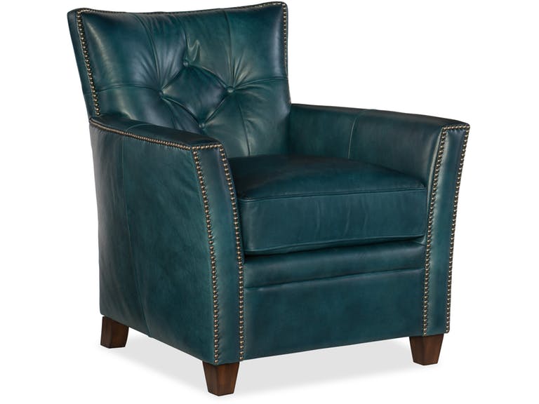
Hooker Furniture Living Room Conner Club Chair
Bold colors aren’t for everyone. So if you’re particularly enamored by the boldest and brightest colors, then you’re one of the few. Being drawn to a bold-colored couch, for instance, might just be what you need to set up a lovely, attention-grabbing, yet enjoyable space.
When you’re adamant about infusing a bright hue into your design, then you can always begin with the sofa. This one piece of furniture can immediately transform the look as well as the general mood in a room. When you’re done infusing bright colors to your main seating unit, then you can spread your gaze towards other pieces that just might add a little more oomph to your design.
Begin with Blue
Cobalt blue is as bold as blue could get. When designers talk about making rooms a lot brighter and airier, then all they often need is a can of the right blue paint. Adding drama is also easy with blue.
Be bold enough to set up an East Coast preppiness or a traditional white and blue fusion. Sea-foam-colored blue is also a saturated kind of blue. This also has East Coast origins. This union of white and blue should easily remind you of colonial hues.
Add velvet to this color and you instantly have a luxurious living space for everyone to enjoy.
Proudly Pink
If you are, on the other hand, looking to create a happier atmosphere then pink is your go-to bold hue. You can always begin with subtle and pretty or you can go gaga over the more energized versions of this color.
Peony is a more intense color of pink. Raspberry undertones work best on entryways and in dining rooms because they reflect warm light.
Pink can also be beautifully paired with many other colors such as black, chocolate brown, mint, metallic gold, green, and silver. Even white and grays look good with it.
Don’t go for sweet and cloying pink straightaway. This hue has a strong potential to create just the right pop of color to make people notice so use it to your advantage.
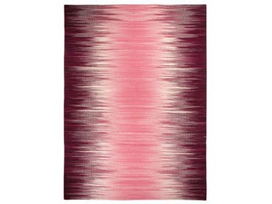
Capel Incorporated Floor Coverings Flash Rug 3634RS Pink
Go Gaga with Green
Green, without a doubt, is a rich color. If you have to use a bold shade of this color, then go for emerald green. It is a color that restores, rejuvenates, and provides a feeling of instant connection with Mother Nature.
Emerald green is also the color of an elegant and luxurious jewel so it communicates just those two things about your home, too.
If this particular tone resonates with you, then use it as a trendy color to surround yourself with. Combine it with equally exciting colors such as red or some pink tones.
Remember to use emerald green with purpose. Consider the atmosphere and mood that you would want to evoke in the room. Decide on the right proportion, combination, and placement of your chosen colors. Keep in mind that every tone has its set of psychological effects.
Perfect in Purple
If you have to use this color in a home, then make sure to use it with care. Make sure that you can tolerate the boldness and drama that this color can bring.
The rich and dark kind of purple is the very color of royalty. You can add this hue to different rooms, depending on the quietness or drama that you would want to set up.
Use the deeper shade of purple for a stunning entryway. A living room with darker purple upholstered chairs can be made light by light lavender walls.
If you want to do just the opposite and make a statement, you might want to try neon purple for your walls. This is the edgiest color that you can use for your dining room.
Tags: bold color palette, bold colors, bold hues, dramatic color palette, dramatic colors, McCreerys, McCreerys Home Furnishings
Posted in Color Schemes, Interior Design 101, Interior Design Elements, Interior Design Themes | Comments Off on 4 Bold, Daring Colors to Invigorate Any Space
Wednesday, July 5th, 2017
(The Third of a Six-Part Series)
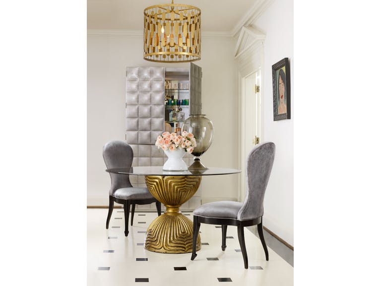
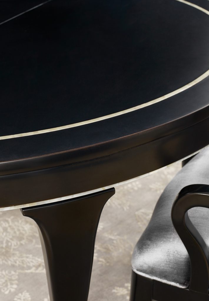
The rich gold hue of the Cynthia Rowley Shangri-la Gilded Dining Table Base is what makes it pop from any neutral background.
Every single one of the homeowners in the world dream of having a happy home. One way that you can achieve this is to dress up your space with the happiest hues. Just think of sunny yellow, tomato red, the hot hue lime green, and much more. Just seeing these will make you want to shout awesome.
Picking bright colors is not easy, though. It entails careful planning. Without proper planning, you could end up with a room that’s overpowering. Use it properly and you would have rooms upon rooms of living spaces that simply leap to life.
The Right Doses of Bright
Bright colors are often associated with modern design. A bright interior design is unique and energizing; it emphasizes the homeowner’s style while also giving personality to the rooms.
The size of a room is one of the most crucial considerations that you need to do when you are selecting vivid hues for your modern interiors. For a small apartment, be sure to stick with colorful decorative accents only.
Remember what you learned on the first of this series? Color 101 Part 1
Let the color wheel guide you in choosing the matching hues for your rooms. Enrich your home’s colors by adding and harmonizing hues.
Led by Red
Red can be the leader color on your color palette. It is fiery, bold, enigmatic, aggressive, and even seductive and powerful. Any furnishing or architecture in red will surely catch your attention. Don’t be afraid to use this color since it has the capacity to make your space glamorous, dramatic and sleek.
The best colors that blend well with red are
White
Blue
Black
Gray
Yellow and
Dark green.
Color psychology-wise, red is indicative of passion, energy, and action. It is a warm color that can be either masculine or feminine depending on the presentation. It also signifies a leader and pioneering spirit.
Since red awakens physical movement, it is best used in areas where you would need people to be more active. The home office and living room are great space to use red in as it can stimulate and create excitement.
Wrapped in Yellow
Yellow in your room can add loads of cheer. Even a small part of the room being yellow livens up space. It is like adding a ray (or two) of sunshine so you’d be inspired to move.
Yellow is also often paired with wooden elements because the latter harmonize well with this hue. Also, none can be a more interesting textural fusion than these two.
When yellow is used on your walls, be sure to temper it with neutral pieces. Imagine a wooden bed nestled by yellow walls. That will make for a cottage-like ambiance.
Try pairing yellow with natural elements such as decorative twigs distressed wooden furnishing, or nature-inspired carpet also in yellow but in a different shade.
Upgrade the color yellow to gold and you are already exuding success, wealth and high status in society. Gold also denotes prestige and masculine energy since it shows the power of the sun.
Zen Is Green
Green is refreshing, breezy and crisp. This is the best hue to use in a tropical setting. You will immediately feel outdoorsy when you use green in any room in your home. Paint the walls as well as your cabinets with this color so you also add a tinge of daintiness.
In color perspective, green is a color of rebirth, renewal, or growth. If you want to relax, then this is the go-to color.
Versatile In Blue
Blue is a unique and versatile hue. It can energize your home office or any other room in your home. This is true for its vibrant variants such as turquoise or those that exude a Bohemian vibe.
Blue can also be youthful or relaxing. Depending on how dark or light the blue is, you achieve different emotions with it.
Blue denotes idealism, intellect, and spiritual perspective. It is the best color for religious study and meditation.
If you’re conservative but would want a bright hue, then blue is your best friend.
Other Energetic Colors
Tags: bold colors, bright colors, bright hues, McCreerys, McCreerys Home Furnishings
Posted in Color Schemes, Interior Design 101, Interior Design Elements, Interior Design Themes | Comments Off on Color 101: The Brights
Wednesday, November 16th, 2016
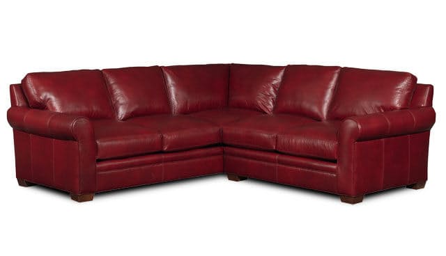
Bradington-Young Sectionals 224 Landry Sectional is red, bold and an obvious statement piece.
The world of neutral and bright-colored palettes can be a wonderful place to be in. You won’t have to worry about adjustment or playing with ugly combinations. It is safe so just about anyone can use them. Make sure that you don’t go overboard when you are out to create a bold statement for your home, though.
Bold does not necessarily mean the saturation of colors or, by default, the accent wall. Bold could also mean the overall appeal of the theme that you have chosen or created. If you would like your home to represent how bold you are, then here are some delicious tips that you shouldn’t miss –
Bold Means to Accentuate
If you want to go beautifully bold in your home, then use colors effectively. Decide which color will accentuate the space best. Having more natural light means you can control the amount of darkness or brightness using curtains, blinds or draperies. Add more dramatic colors to amp up the drama in the room without creating an overpowering space.
For a room that does not have ample lighting, choose bright colors or the more saturated colors. These should naturally reflect the light and would make any bold color appear more inviting rather than daunting.
Bold Means to Decorate
Do you own any bold piece of accessory or artwork? Then this is the perfect time to bring them out. Of course, you wouldn’t want your furnishings to clash so use a neutral palette of white hues and blacks as the backdrop. This should be a gorgeous and bold canvas that anyone with an artistic mind can work on.
You can then pick two colors all throughout your space for a more unified look then showcase your sculptures, wall art, or even a bold area rug as a statement piece. Don’t worry about getting wrong because it’s all about balance. If something appears to be off, then something might really be off. Be sure to balance the bold piece with neutral room finishes, furnishings, etc.
Bold Could Also Mean Subdued
There are interiors that are viewed as both bold yet subdued. These two seemingly clashing descriptions can actually work together – but you should know how. For instance, the Shangri-La guilded table by Cynthia Rowley can play the bold role while the rest of the surroundings remain neutral. Yet, the place looks both bold and calm, it’s all according to your perspective.
Bold Means Making a Statement
Your home is that one place on Earth where you should be the one to dictate everything that’s displayed. Since this is so, you are free to make a statement. Go ahead and hang that flashy chandelier all because you want to! Just learn to play with the rest of the space so that the room won’t appear garish.
If you’re starting to feel that the room has come to a point where there’s too much activity, then remove a bold color or two. It might also be as easy as taking down window treatments that are blocking natural lighting.
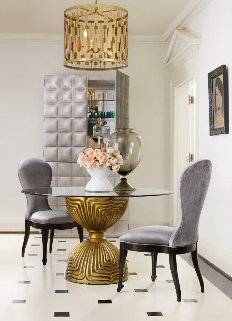
Cynthia Rowley for Hooker Furniture Shangri-La Gilded Dining Table Base: What could be bolder than gold?
Bold Means Colors
Bold would always mean colors. Hues are the best way to add unique touches to a home. Colors have a profound effect on health, feelings and moods. Since this is so, go ahead and decorate for a happier atmosphere. Splashes of color, when strategically placed, will create the best modern interior for a homeowner and bold interiors are all about making that bold statement.
Practice restraint in using bold colors, though. Use hints, here and there, or add a whole new bold wall then pattern the furnishings and textiles to the color that you chose.
Lastly, use the 80:20 rule when decorating. This means 80% of the room must be neutral and the 20% should be bold-colored. Go beyond this and you’re already overdoing it.
Tags: bold colors, bold design, bold hues, bold interiors, bold statement, McCreerys, McCreerys Home Furnishings, tips
Posted in Accents, Interior Design 101, Interior Design Themes | No Comments »
Monday, October 3rd, 2016
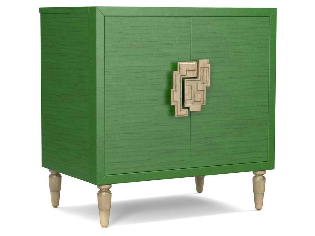
The green hue on this Cynthia Rowley for Hooker Furniture Living Room Sheridan Two-Door Chest 1586-50005-GRN is wonderfully prepped for 2017.
There is no doubt that color is an important element of interior design. It is one of the most influential aspects to human emotions. This is also the fastest way to update a room; what you need to do is just to apply a fresh coat of paint and you’re done. But what do different hues convey and what color forecast best fits the brave new year that is 2017?
Top Hues and Their Meanings
Red. This hue is often associated with determination, leadership and ambition. This can also connote physical desires which is why it is most used in many restaurants.
Pink. This hue represents intimacy, compassion and unconditional love.
Purple. This is the color of creativity and royalty.
Blue. This color represents loyalty, honesty as well as trust.
Orange. This bright hue is linked to optimism and motivation.
Green. This lively color represents vigor and energy. It is often used to create balance and stability.
Yellow. This is a hue that represents enthusiasm, fun, knowledge and hope.
Color Fundamentals
Color is affected by two aspects – the surroundings and the kind of light that shines on it. Try observing any room in your home. You’d soon see that the light is different during different times of the day. Comprehending how light can affect a space during different times of the day will give you the power to choose the correct color scheme that can be used all day through.
This same knowledge will also help you choose the best kind of lighting fixture for that room.
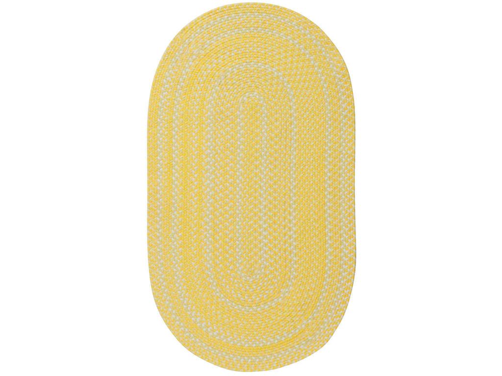
Capel Incorporated Floor Coverings Regatta Rug 0087NS Sunshine
Now, the Forecast
There are many color forecasts that are being done each year but one of the most esteemed are the picks made by Pantone. The upcoming year’s Color of the Year picks are calming, soft and wonderfully romantic. Now don’t worry if those aren’t your exact wish as a color for your home.
Leatrice [Lee] Eseman shared a handful of color palettes that you could choose from. These are all predictably popular colors for the upcoming year that you can use to beautify your home. These colors were also chosen because they address the consumers’ craving for colors that are comfortable yet new. Design trends became inspirations for many of these palettes, so was the film industry (e.g. The Peanuts Movie, Star Wars: The Force Awakens, etc.).
So go ahead and make use of anything silver and metallic or anything bright and colorful (if Charlie Brown inspires you the most). Say yes to orange chiffon, melon as well as dove gray. Grape and lime are also good colors.
Apart from these, there will also be an abundance of florals this upcoming year. Floral hues such as red Dahlia or pink yarrow, plus any shade of green may be acquired tastes but they are beautiful and not-oft used colors.
Gray and red will remain popular in 2017. They will both appear in warmer hues with the backdrop being that of bolder colors. Yellows that look perfect in a harvest setting will also get a lot of attention in the coming year. Yellow with hints of earthiness will look great and would be effectively grounded by classic red or blue.
Any youthful color is also a great choice in 2017. Now don’t be limited to the age-appropriate colors, rather, look for youthful colors with an attitude. So no matter what your age, you can use color palettes that are fluid and can easily morph in the 2017 surroundings.
Find celebratory hues that hail technology and nature. The former will continue to play a vital role in people’s lives. Evolving technology will continue to inspire ambience that is dark or in commanding grays.
Those who love deep plum would also find it a great news that the color forecast for 2017 also includes this hue.
Tags: 2017 color trends, adding colors to a home, blue, bold colors, bold hues, color choices, green, McCreerys, McCreerys Home Furnishings, orange, pink, purple, yellow
Posted in 2017 Trends, Color Schemes, Interior Design 101, Interior Design Elements, Interior Design Themes | No Comments »
Saturday, September 3rd, 2016
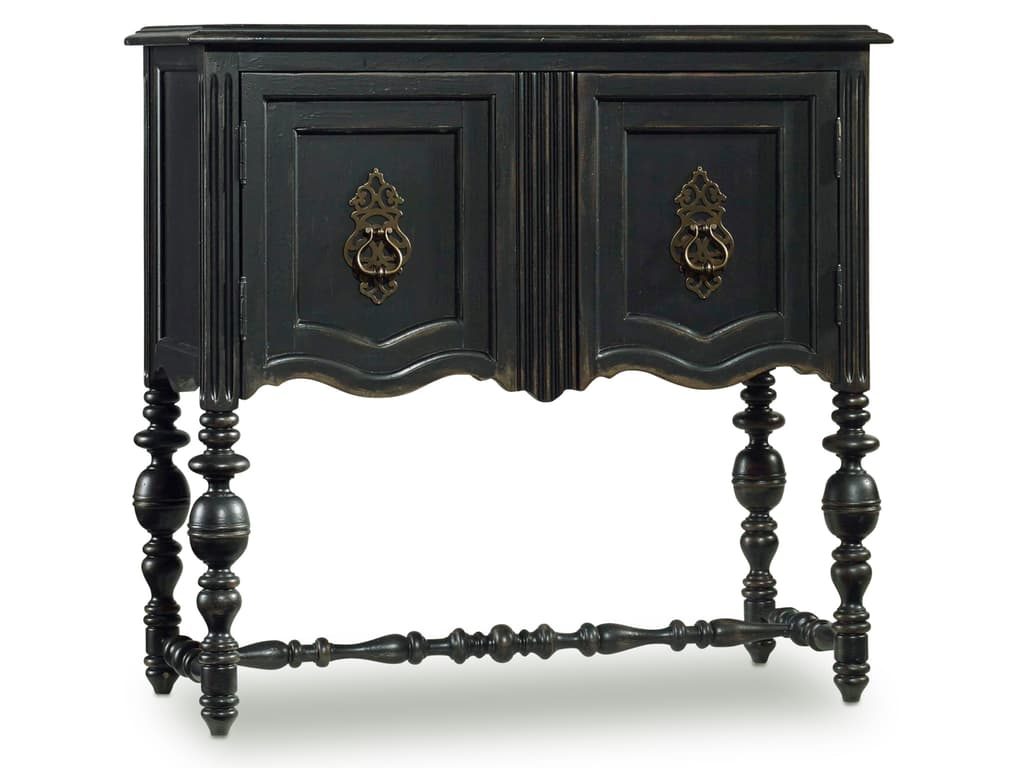
Hooker Furniture Living Room Chest is beautifully earthy.
Earth has its beautiful, signature colors to offer depending on what season the place is on. Fall, for instance, offers browns, golds, oranges, and reds, even yellows. Just find out which one of these colors define your personality and which one can lend a cue to your next interior design project in your home.
Fall’s color palette is always nature-inspired. Just take a look at the turning leaves or the rust-colored skies. These hues bring in warmth even when the weather is actually bringing about a chill to the autumn air.
Bold and Exciting
Many people view earth colors as calming. What they fail to realize is that bold colors are also seen in berries, leaves and wood accents. Nature puts on a great display on the trees, in the sky, and the ground with broad strokes of bright and muted colors.
Fall is also about plums, burgundy, umber orange, and rust. So go ahead and change your bland interiors to an exciting inspiration each time that you enter your home. Alter an accent wall with your favorite fall color. Look for paint shops that have fall-focused palettes and experiment with them during this season.
Simple and Traditional
The classics are difficult to replace. Inspirational colors include sage green, browns, golden yellows, fiery reds, and creamy beiges. Fall is a season that is telling you to slow down since you just came from a season of bright colors.
Traditional upholstered furniture pieces work even during fall. You can also use seasonal arrangements of the most beautiful orange, red or yellow flowers. Use an area rug that can help you pull the space all together.
Simple may be subtle but it is definitely not boring.
BLK1 Bloom Round Dining Table with 1-20in leaf offers a jet black earthiness that’s difficult to ignore.
More Nature Display
Whoever said that nature just has to happen outdoors? The playful colors outside may be truly inspiring which is why most fall designs can be comprised of sea grass, exposed timber, slate and boulders. Other than these usual smorgasbord of hues, why not take a bland wall this time and liven it up with corks, natural rocks or something green, say, green wallpaper.
If the colors are too neutral for you, then just add an eye-popping furniture piece. This should bring visual interest in an instant. Red or orange coffee table can provide just the right amount of excitement.
All-Year-Round Colors
What’s great about fall is that it offers natural, earthy colors that would never go out of style. Spas come in blues and greens as well as browns because these are calming hues. These allude to the skies, earth, water and the sun. They, all together, bring harmony and peace to most people whether talking about physical, mental or subconscious aspects.
Pick from gray tones or from the brightest colors that you could find on the autumnal display. What’s great about the fall palette, too, is that it works well with any style. So, whether you love modern, eclectic, rustic, modern or traditional; fall never disappoints.
If you’re still not ready to alter your entire room during the season, then just bring in some dried pine cones, potpourri, lemons and oranges. Put a vase of your favorite fall flowers and you’re done.
The Fall Furniture Line
Fear no color during this season. Use bright strokes if needs be for your furniture pieces. The simple wooden cabinets can become the focal points if you are willing to invest in sunny yellow ones. The shinier the finish, the more that it would pop out, hence, adding the needed character to the room; just make sure that they don’t look like they are candy-coated, though.
Experiment within bounds – this is your mission for this season.
Tags: bold, bold color palette, bold colors, bold statement, designing for fall, fall, fall design, fall interior design, fall interior design elements, fall style, McCreerys, McCreerys Home Furnishings, rustic, rustic charm, rustic design, rustic elements
Posted in Color Schemes, Fall Season, Interior Design 101, Interior Design Themes | No Comments »
Tuesday, July 5th, 2016
 Neutral colors are often the go-to color when people invest in large upholstered pieces. This often makes sense since neutral hues are easier to harmonize, in short, they are the safest choice. Add to this the fact that the sofa is one of the most expensive pieces of furniture that you buy, and you would understand why most people opt for the safer options. On the other hand, wouldn’t it be nice if your living room didn’t look just like the rest of the neighborhood?
The Story of the Navy Blue Sofa
Consider a bright navy sofa. This can easily become the star of your living room flooded in white. There are many other rich hues in stock. These can also be customized, with so many fabrics to choose from these days, you’re the master when it comes to the final design of your furniture. So, going back on that navy blue sofa, why do you think it can work inside your living room?
The white background works as the canvas to the star of the show – the unique, colorful sofa.
Making the Teal Sectional Legendary
A compact home is the perfect setting for a teal sectional. This will provide ample seating for a small family. A darker color on a jewel-toned fabric is the right material for wear and tear as well as gazillions of spills that could happen in a family that has kids and pets.
This teal furniture can also serve as the focal point of any neutral room. This hue can also be repeated on window treatments and throw pillows.
An Azure Sectional as the Defining Feature
A room that is painted in white and absorbs a great deal of daylight can allow a huge volume of any bold colored furniture piece. It is easy to be visually successful if the rest of the room is whitewashed. Don’t think that the sectional in bold color such as azure would overwhelm the living room because it would never.
Knowing where to place the azure sectional will make it a shoo-in as the focal piece. Just be patient, you would soon get the hang of using a more colorful furniture piece.
Orange Cushions for the Cautious Ones
When the biggest and most colorful furniture pieces don’t work for you or if they are too bold, you can begin your transition to the colorful world of interior design by using some accent pieces first. Rich orange throw pillows will surely be a good addition to a neutral-colored sofa. Pair the sofa with the traditional furniture pieces and appliances plus some accents that may or may not be orange.
It’s really up to you.
This setup works because the rich tones of the throw pillows will create a warm glow that none of the other design elements will be able to provide.
 Purple Is Sophistication
Purple is not a usual color that is used in many upholstered pieces. In a home office or a guest room, this color could work very well when used appropriately.
Purple is equal to sophistication and class. Pair it with warm taupe and you’re in fashion heaven.
A purple sofa can be surrounded with other pieces that have purple undertones. These will make the sofa color pretty much leap out.
Chocolate Velvet Is Rich
A chocolate velvet furniture does not stray too much from neutrals. It can blend beautifully with just about any kind of wall, ceiling or floor. And since it is basically brown, it is also easy to accessorize. It can also match golden tones in many accessories.
Pair this lovely piece with neutral throws and surround it with wood tones to complete the look.
Tags: bold, bold colors, bold hues, bold statement, couch, McCreerys, McCreerys Home Furnishings, sofa, sofa colors, tips
Posted in 2016 Trends, Furniture, Interior Design 101, Interior Design Elements | No Comments »
Follow us on our social media
© McCreery's Home Furnishings | All Rights Reserved | Privacy Policy