- Follow us:


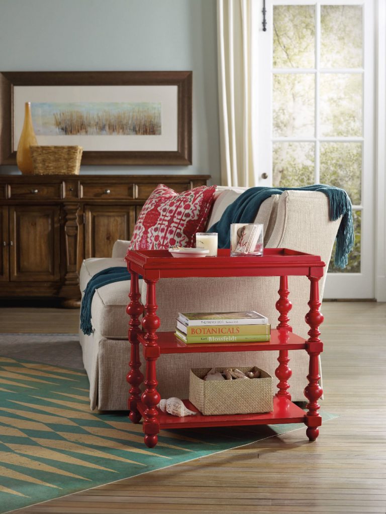
The Hooker Furniture Living Room Sanctuary Chairside Table is as unique and colorful as a side table could get.
When you approach interior design from a homeowner’s point of view, you probably just go about and pick the things that you think are attractive. Also, you tend to make your decisions based on any existing décor or pattern in your home. Color, however is such a powerful tool that you can use to evoke certain emotions. It can also create illusions of space or invoke a dramatic ambience.
Here are tips on how you can effectively use color psychology right in your home –
Bright Colors = Spaciousness
You can create an illusion of space if you use a lot of bright colors in your interior design. Use a lot of eggshells or yellows to make a space seemingly bigger. Don’t immediately go for white, though. Even when it is known to add space, it is not as effective as the tinted hues.
Bright Colors = Happy Educated Crowd
You can appeal to the tastes of the educated few if you learn how to fuse complex colors. For home interiors and exteriors, it has been observed that educated people find two-word colors to be more appealing. Simple colors, on the other hand, appeal to people with lower budgets and those that have lower education levels. When you’re out to pick complex colors, it is best to use names like eggshell white or lime green.
Red = Appetite
You can help build appetite in the dining room or the kitchen by using dashes of red or painting the walls with red paint. A lot of restaurants know this concept which is why they willingly paint their walls with solid red or red patterns.
Use red in the kitchen to up the appetite of people. You can have neutral walls made non-boring when you add red shutters or paint the cabinet doors with any shade of red.
Blended Interior + Exterior = Wow
When you use foyer blends by combining interior and exterior paint, you end up wowing your guests. The entryway or foyer becomes much more exciting if you use this technique.
Deep Tones = Warmth
You can warm up your home by using deep tones during the colder months. Use a lot of yellows, oranges, reds and browns. When you are about to paint your home during the winter because you’re staging it for future selling, remember this advice because it will make the house stand out.
Cool Colors = Fresh and Breezy
If deep tones keep homes warm during the winter, then the opposite, the cooler colors do otherwise. These colors are along the same hues used during fall, especially blue, so use them in abundance during the summer months. Have a white exterior plus a blue trim to achieve a Greek aura which is great if you want a cool-looking home during summer.
Familiar Colors = Fond Memories
If you decide to use familiar colors from your childhood or your not-so-distant past, then you will surely be reminded of wonderful memories. This becomes more special as you put these familiar colors in the kitchen, after all, what could be more pleasant than feeling like you’re back in Grandma’s kitchen?
Reds and yellows are perfect for that playful yet posh look for the kitchen. Don’t use red, though, if you have a high blood pressure. More so, stay away from dark shades of red so that irritability won’t ensue in the house.
Extend the familiar colors into other rooms such as the bathroom. If you love wearing a particular color, then use that same color in your bathroom. Having your fave color on the background will help you look more yearningly at the mirror inside the bathroom. Basically, you will tend to love yourself.
Follow us on our social media
© McCreery's Home Furnishings | All Rights Reserved | Privacy Policy