- Follow us:


Wednesday, December 14th, 2016
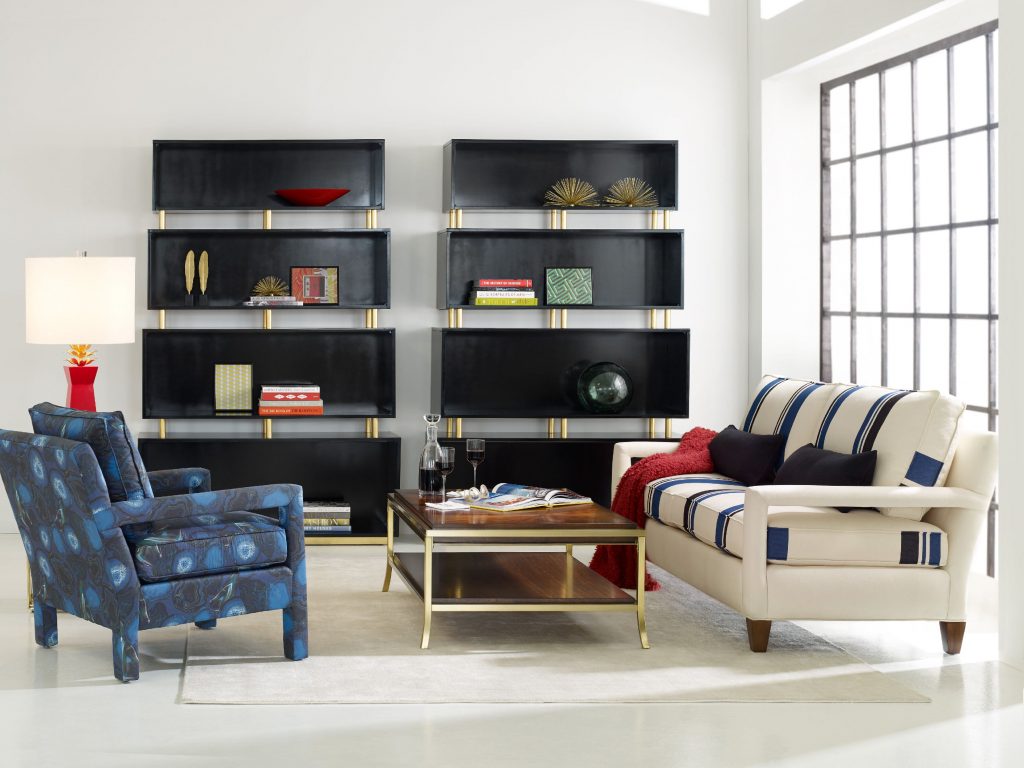
CYNTHIA ROWLEY FOR HOOKER FURNITURE RYDER CHAIR: The play of colors in this living room is deliciously sensational.
Most interior designers make a living by doing what’s often considered a gargantuan task – combining colors in order to achieve an effect or to evoke a certain mood. There are traditional color theory rules to follow and there is also that thin horizon that allows you to experiment and show your true colors. The color theory can guide you in providing a warm and cozy feeling inside your home if that is what you require by adding rustic colors. Understanding how this theory works will help you in successfully applying colors into your design.
The Color Theory in Practice
When you’re still figuring out what colors to use in a room that’s being redesigned, know that there are three crucial considerations – your personal preference, your lifestyle (or how the space is going to be used eventually), and the room’s actual structure. When you have all the information for these, it would be easier for you to determine the color scheme that you’d use.
Some color schemes work better than others depending on the factors just mentioned. For instance, if the structure of your home is mainly country farmhouse, then you should automatically think of monochromes or analogous colors. This means you can use creamy pale yellow palette or the deep reds. Similarly, kitchens with a modern or contemporary vibe are best dressed with bright and bold colors that are found on the triadic color scheme.
If you are looking to achieve tranquility, then consider monochromatic or analogous colors. Think Hawaiian and you’d be on the right track. Think also of rolling hills, lush greens, the blue ocean and the powder blue sky. These are the classic analogous hues.
Refrain from adding too much bright or bold colors as you try to experiment on color combinations. It is crucial to balance the hues with lots of energy or you would end up exhausted over time. This is exactly where complementary color schemes would shine since the hues opposite of each other always achieve balanced, warm and cool hues.
FFDM RayLen Vineyards Collection: This rustic piece makes the ensemble a lot more exciting.
Making Color Fusion Successful
Don’t forget to integrate your lifestyle as you design the interiors of your home. Use Feng Shui and colors in achieving harmony in your home environment.
Color can be the most powerful influence inside a home depending on how effectively you used it. You should be able to understand the basics of color psychology. This means the identification of the numerous psychological effects that colors can have on the human psyche.
Another way to make color combinations work is to divide active and passive spaces. Active spaces include the kitchen, the living room and the dining room. Bathrooms and bedrooms fall on the passive room category.
Blues and greens have a calming effect so they are best used in passive rooms. The more active colors such as reds, yellows and oranges would look better when used in the active rooms. When comprehended on the Feng Shui level, bathroom is blue and the kitchen is bright red.
You can also refer to the color principal which is also known as the 60:30:10 rule. An example is 60% of kitchen or bathroom can use a single color while the cabinetry and other furniture account for the 30%. The rest of the design elements such as accessories and accents complete the whole package with the remaining 10%. These can be in the form of linens, plants or artwork.
It is also important to consider the dominant surfaces in a room. For example, a dominant part could be the accent wall. The use of a red or black accent wall pulls the attention of the beholder towards it. Add some lighter colors for the other three walls and you’ve just confidently mixed colors for a more exciting ambience.
Tags: color fusion, color schemes, fusing colors, McCreerys, McCreerys Home Furnishings, mixing colors
Posted in Color Schemes, Interior Design 101, Interior Design Elements | No Comments »
Friday, June 10th, 2016
FFDM’s Summer Home Collection: Striking contrasts are seen in different design elements here from the shiny woodworks, to nature’s touch, and some metallic and ceramic elements.
Have you ever tried to define the word contrast? This is an oft used word in the world of interior design. Dictionaries define this term as the combination of unlike elements such as tone, colors, textures, patterns or emotions. This can be further defined as the lightest versus the darkest parts of a photo, painting or any other work of art.
Dullness vs. Contrast
Take a careful look at most black and white photographs; these are often difficult to read since there is no color contrast to begin with. This kind of photograph often appears flat except when taken at an angle where the depth is clearly defined. If there is any contrast in a black and white photo, these are the tonal contrasts.
To further define contrast, this is the comparison of two things with respect to their differences. This can also be similar objects but with dissimilar qualities.
Are you starting to get the concept of contrast now? No?
Examples of Contrast
One example of contrast is when an interior designer would want to highlight the intricate designs of a cream-colored cabinet inside a kitchen. This can be achieved if you use a charcoal wall as backdrop. The cabinets would appear to be the star of the show once you achieve this.
This kind of contrast is what’s known as achromatic. This is the contrast between two opposing shades – black and cream.
Contrasts can also be seen in nature each day. The white sheep grazing on the green, grassy landscapes; an orange buoy in the midst of the blue sea; white snow and some black rocks nestled beneath it; and many such contrasts.
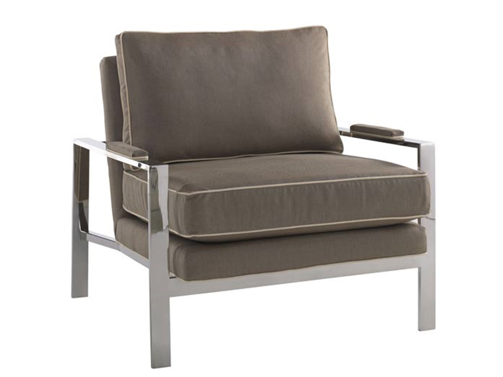
The marriage of fabric and metal in this Miles Talbott Living Room Mesa Chair JR-9440-C is perfect for any living room.
Contrast: A Composition Element
Contrast is a crucial part of composition. You can easily create contrast, more frequently with colors. At times, you can make subtle contrast with texture. Rooms can also play with different forms of shapes which can also represent a kind of contrast.
Geometric pieces like curvy ones can play contrasting roles with edgy pieces.
Above any element, you need to consider the color contrast when you are out to achieve opposition. Contrast makes objects distinguishable.
Here are seven kinds of contrast according to Johannes Itten –
Tags: adding colors to a home, color 101, color basics, contrast, contrast in design, contrast in interior design, McCreerys, McCreerys Home Furnishings, mixing colors
Posted in Color Schemes, Interior Design 101, Interior Design Elements | No Comments »
Tuesday, April 19th, 2016
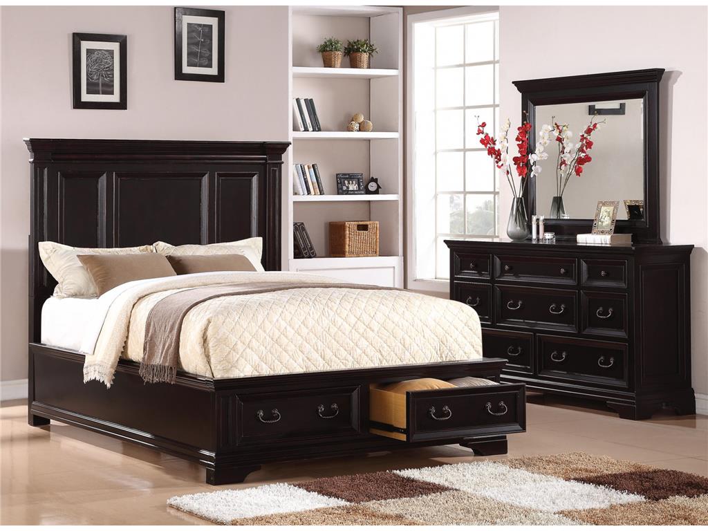
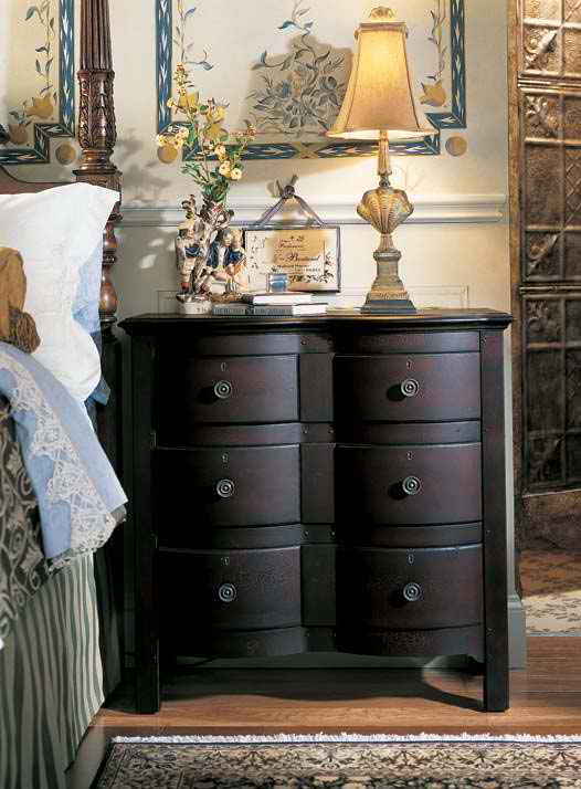
Flexsteel Bedroom Queen Panel Bed With Storage W1909-90QS is perfectly balanced by the red and white floral arrangement and other exciting accessories.
The combination of red and black may not be a mixture that you have given much thought in the past. You might just change your mind once you see the winning reasons why these colors can take your home at the center of everyone’s attention.
Turn Up the Volume
Upping the wow factor of your home could be as easy as choosing the red and black palette. This color scheme offers just one vibrant hue but it does not automatically mean that the other color can’t offer drama on its own.
Red or black, each of these colors can make a bold statement on its own. They can actually be used under any circumstance. So, when you are designing your living room towards a bolder look, be sure to consider this marriage of colors.
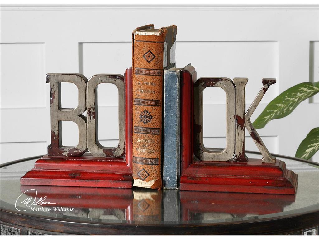
What’s a living room without these exciting Uttermost Accessories Book, Bookends, S2 19589?
Who’s the Boss?
Okay, so you have finally made up your mind and are now bent on using red and black, now what? These are both bold hues so one of them has to give.
Choose which one – red or black would be the dominant color. To choose which, take a careful look at the curtains and walls of the living room. See also the floor as well as the natural light inside the room. Is your living room used generally for simple family get-togethers or more of an out-of-office venue for your colleagues?
Whichever you end up choosing as the more dominant hue, make sure that you harmonize every aspect of your design. Consider salsa red in your living room if you spend more time there and if you perceive it to be a cheerful room with lots of foot traffic.
A more subdued and relaxing living room can make use of deep rose as the central color.
Balancing the red and black palette means using complementing colors on the more dominant color. The complementary colors should be used on your accents. For instance, if you used red as the dominant hue, then you may use the quieter gray on other design elements.
Put In Some Finishes
Metals and woods in the living room can also contribute to your red and black color scheme. The use of lacquered-black wooden furniture pieces adds intensity to any living room.
Do you like the shabby chic look? Then use pale gray on your furniture while accessorizing with the more exciting red and black mixture. Remember, the color of the furniture should balance the rest of the colors and elements that you decided to use. A heavily black room, for instance, can be beautifully balanced by paler shades of red.
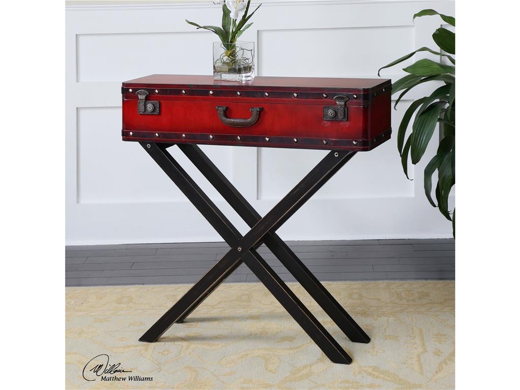
Living Room Uttermost Taggart Red Console Table 24379 does not need to beg for attention with its unique look and color fusion.
Just a Hint
Most of the time, when designers suggest red and black, homeowners have a tendency to wince. What they don’t realize is that this fusion need not be vibrant all the time. Don’t give up on these colors if you are the more traditional type. A hint of red – here and there – can sometimes do the trick. This is just as striking as a whole room filled with vibrant red. A simple red pillow propped against a plush, black sofa can be a simple combination that could also serve as the focal point in your living room.
The clever use of red and black can add the needed drama. The fusion can be used on the walls, floor and major pieces of furniture. If you prefer a less committed take on the red and black palette, then just use the hues on most of your accessories.
Let’s accept it –red is an eye-catching color. A red accent wall is the perfect backdrop for your beautiful black cabinet. These give the eyes a pleasant place to look at while taking the time to absorb the rest of the design elements.
Tags: black, bold, bold color palette, bold design, bold hues, bold interior design, bold statement, guidelines, McCreery's Furnishings, McCreerys, McCreerys Home Furnishings, mixing colors, mixing style, red, tips
Posted in Color Schemes, Living Room Design | No Comments »
Tuesday, January 12th, 2016
5682-10 Sloan Chair without Nails and 5682-08 Sloan Ottoman without Nails in Fabric 917-60. This chair shows that Bohemian is all about vibrant colors.
Bohemian interior design involves the infusion of hippies, travelers, even gypsies. These are the very people who are out to have fun. They also live the most colorful lives as is evident in their style and their homes.
The bohemian interiors are lived spaces. There is nothing drab about this style as it is colorful, full of ornaments, exclusive, and electrifying. Bohemian accessories should be able to showcase a special appearance. The decor is not just amazing to look at in bedrooms and living rooms but also in other areas of your home like your kitchen, even the bathroom.
The Mingling of Creativity and Art
The bohemian style is exclusive because it displays the effects of art and creativity. It can lift a boring facade without you putting too much energy. Just hunt for the right furniture pieces (and colors) that are most suitable for this design.
Step number one is to pick the right color scheme for your home. Whatever hue you settle with, make sure that it has the capacity to deliver a harmonious effect on the walls, floor, accessories and the furniture.
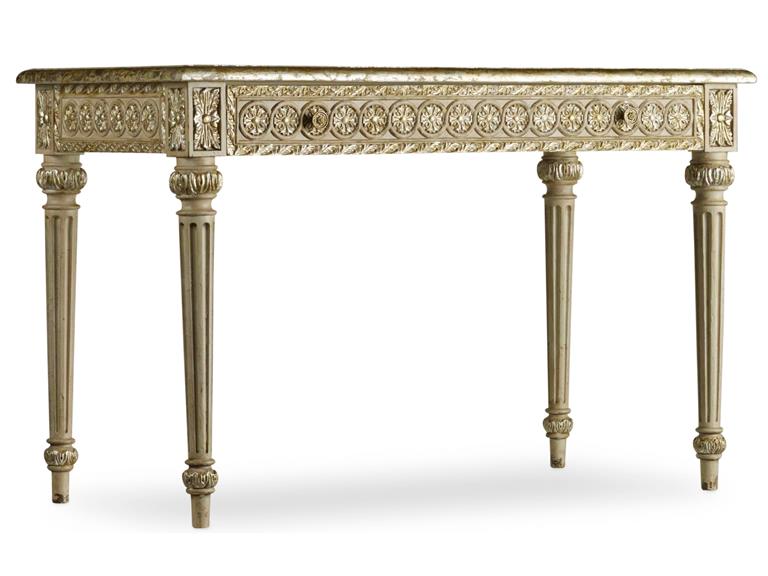
This Hooker Furniture Home Office Accent Desk is what you need for your Bohemian home work space.
There are a few more daring interior designers who choose bold and dark colors for the bohemian look. There are actually a lot of options on your color palette. Combine different colors till you reach a blend that you like. Some of the more interesting hues include rust, brick red, sunny yellow, deep brown, plum, violet, gold, burnt orange, magenta, emerald and camel.
There are also a few color schemes that you should avoid for this design. Colors such as pastel, neon and those shimmering shades (‘cept gold) should be avoided like the plague.
Now for the furniture, you can choose to combine different kinds of furniture to make a room more exciting. A leather sofa would be perfect for your bohemian living room. As for the seating area, be sure to deliver a non-cluttered impression.
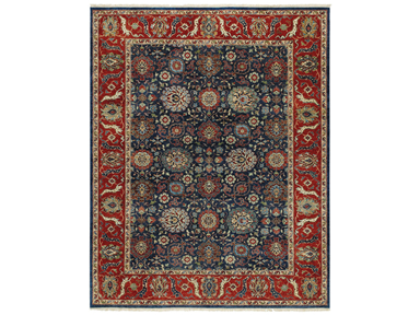
This very bohemian rug is the Capel Incorporated Floor Coverings Biltmore Select Bidjar Rug 1773RS02000300450.
The decorative appeal of this interior style lies heavily on the accessories that you will be bringing in. Choose unique accessories such as artwork coming from Africa, India, and the Middle East. Enhancing the flavor of your bohemian style is as easy as adding an eclectic taste. It wouldn’t be wrong to display accessories that have been inspired by Boho arts including tea seats, musical instrument, easels of vintage artists, some hookah pipes, too.
When it comes to bohemian colors, the most used are warm earthy colors as are metallic hues. So think of gold, terracotta, brown and other hues belonging to this family. Look for jewel tones such as fiery orange, purple, or electric blue. Always think warm when looking for the right bohemian color. White should never be a part of this design.
Bohemian is for people who want their homes to look vibrant, filled with culture and the most appealing pieces. It flees in the presence of modernism but it embraces what’s carefree, unusual and relaxed. Fuse lots of patterns and experiment with the loudest colors. Layer those throws on your sofa, use colorful area rugs, and hang never-before-seen tapestries.
Bohemian means you learn to mix and match. Find natural materials such as sisal, burlap then fuse them with chenille and silk. These materials should look slightly worn. Pillows, lampshades and curtains could have fringe.
Tags: African, art, bohemian, Bohemian art, bohemian interiors, bohemian style, guidelines, harmony, hippie, Indian, McCreerys, McCreerys Home Furnishings, mixing and matching furniture, mixing colors, mixing designs, mixing style, Moroccan, Moroccan interior design, Moroccan interiors, Moroccan style, tips
Posted in Interior Design 101, Interior Design Elements, Interior Design Themes | No Comments »
Follow us on our social media
© McCreery's Home Furnishings | All Rights Reserved | Privacy Policy