- Follow us:


Monday, May 1st, 2017
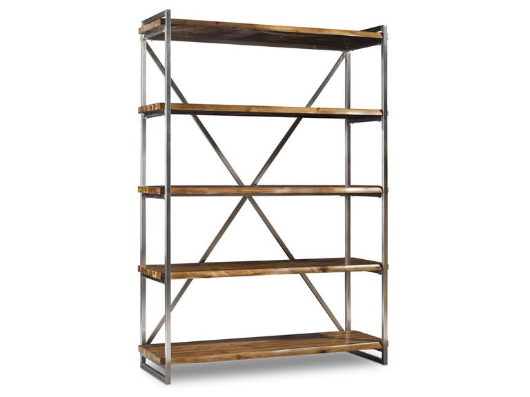
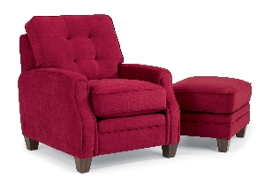
This Hooker Furniture Home Office Live Edge Etagere is an open shelf that will visually connect the living room to another area in your home.
Every homeowner looks at his or her own home as a place to relax. This is where you eat, spend time with your family, and sleep so you can be invigorated for the next days. But there are also moments when your home could feel like you’re riding the train home. It could look and feel chaotic all because the design or architectural elements don’t seem to agree. This is why visually linking all the rooms in your home is such an important thing to do.
Link with Paint
Effective use of color can harmonize different rooms, not just the adjoining ones. Just picture this – the kitchen sitting beside the dining room painted with a clashing hue. This disunity, believe it or not, could lead to heightened negative moods.
Creating a flow through colors, on the other hand, is the best way to create harmony in your habitat. Sure, this takes time and a tad of research but your efforts will definitely be well rewarded.
First, know about your choices. Find out what kind of effect you would want to achieve with the colors that you choose. Look for ideas on this site or in interior design magazines.
If you’re playing safe or if this is your first time to experiment with paint, then try monochromatic colors. Choose one color then just ask for the different shades of this same color. Neutrals in the gray or brown family are a great start.
Analogous colors can still retain the monochrome while creating more gradation. These colors sit right next to each other on the color wheel so they are safe to use together.
The last option is the use of complementary colors, meaning, you use a warm shade with a cool hue (e.g. a marine palette of blues used against deep shades of orange. This should create an impact that’s difficult to match.
You should also learn to smoothly transition from one color to the next. This means picking a dominant color for your favorite room then going lighter or darker depending on the moods that you need to evoke in each room.
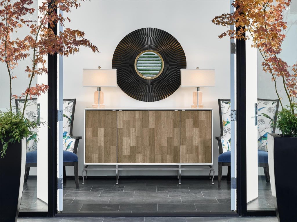
FFDM Brentwood: This Piper Sideboard on the entryway is the rustic color link to the plants by the doorstep.
Link with Dividers
This may be a bit confusing but try to picture a bookcase set between your entryway and the living room. This is especially awesome in an open-plan home. A different floor height for the living room creates the necessary separation while not totally closing off the entryway.
Thick columns can also serve as a divider and connector for the living room and the kitchen. To effectively fuse both rooms, still, just use a half wall between the huge columns. Top this with a lovely granite slab and you can already hold casual breakfasts for everyone or it can simply be the work zone that you’ve been needing.
Windows can also be set up inside your home. A multi-pane window, for instance, can be used to divide the hallway from the living room. Though it may visually appear to divide the room, it also aims to link as both areas are clearly visible. The rooms also feel airier and lighter.
Changes on the floor level could also indicate the change in the room where you’re at but a unified flooring material or color could still unify two separate rooms. An example is when you install a hardwood flooring for both the entryway and the living room. The lowered floor on the living room gives the room a roomier feel.
Lastly, consider having area rugs brought in. These simple floor elements could delineate the living room from the kitchen and the bedroom or the dining room. Having a base color for all area rugs should still be able to unify the different rooms.
Tags: fusing rooms in your home, harmonizing, harmony, linking rooms, McCreerys, McCreerys Home Furnishings
Posted in Color Schemes, Interior Design 101, Interior Design Elements | Comments Off on Interior Design 101: Visual Links Throughout Your Home
Wednesday, September 14th, 2016
FFDM Harbor Springs Collection features these contrasting yet matching hues of natural and whitewashed wood.
Every color is crucial in creating beautiful things in this world. Whether you need colors on your clothes or the interiors of your home, it is the same. While colors are this important, not everyone has the innate skill to point out which color goes with which and which ones would clash. If you cannot trust your eyes to make that judgment for you, then here are some guidelines –
Study the Color Wheel
The basic color wheel should be able to guide you when you make your color choice. You should have seen this colorful pie graph in school but here’s a little something to juggle your memory –
Red, blue and yellow are the three primary colors. Mix red with yellow and what you achieve is orange. Fuse blue and yellow to get the color of nature – green. To get violet, mix red and blue. These are what are known as secondary colors.
Tertiary colors, on the other hand, are the result of the fusion of a primary color and a secondary color. An example is red-violet or and blue-violet.
Every color has tints and shades. The first is a variation of any color when it is mixed with white. Red mixed with white achieves pink which is, in essence, a tint. Shade is a variation of any color when it is mixed with black. Don’t worry too much about shades and tints; what you need to focus on are harmonious color combinations and how to distinguish them.
Color Harmony
The color theory points out that harmonious colors are those that use any two hues that are opposite each other on the wheel. Three colors that are equally spaced on the wheel (or that form a triangle), colors that form a rectangle, are harmonious colors.
These are perfect color schemes or the more proper term is – color harmony. A color scheme should always be harmonious despite the rotation angle.
1586-10458-GRY1 Note-To-Self Writing Desk 1586-75410D-GLD6 Swanson Upholstered Metal Side Chair is featured in a cool, Nordic-themed room.
Warm and Cool Hues
Another separation that you need to be conscious of are warm and cool hues. Every group has its purpose and a spectrum of emotions to convey. Warm colors convey joy, energy and productivity while cool hues convey peace and calmness.
The color wheel can be easily divided if you want to group the warm and cool hues.
Basic Color Schemes
There are fundamental rules to commit to memory if you want to master how to match colors. Don’t worry, they’re quite simple.
Complementary colors are the ones that sit opposite each other on the color wheel (e.g. red and green or blue and orange). These colors have a high contrast so it is best to use them if you want to make a statement. You can use one color as the background and the other as the accent.
You can use shades and tints alternately, for instance, a lighter tint of red can contrast a darker shade of green.
Split complementary hues make use of three colors. This color scheme uses one color plus two adjacent colors. An example is blue, red-orange and yellow-orange. This color scheme is ideal for neophyte interior designers and decorators. This is the scheme to use if you don’t wanna mess up.
Analogous colors are three colors that are next to each other. Yellow, yellow-orange, and orange is an awesome example. This color scheme can be jarring if you mistakenly combine warm and cool colors so be careful.
Triadic colors can also be used in your home. This color scheme is achieved if you use any three colors that sit equally apart. An example of these hues on the color wheel are red, yellow and blue. This is also a high contrast scheme but it is more balanced when compared to complementary colors.
Now that you know the basics, are you ready to experiment on your home’s color schemes?
Tags: adding colors to a home, color 101, color basics, color harmony, color wheel, cool colors, cool hues, harmony, McCreerys, McCreerys Home Furnishings, shades, studying the color wheel, tints, warm colors, warm hues
Posted in Color Schemes, Interior Design 101, Interior Design Elements | No Comments »
Tuesday, July 19th, 2016
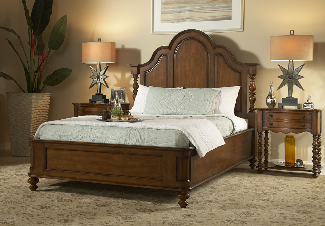
FFDM Summer Home Collection: The unifying color in this traditional bedroom is brown in different shades.
Color preferences vary per person, per personality. Some folks like it bright and daring, some feel more secure with neutrals, still others like to experiment. The good news when it comes to using colors is that there is no such thing as a correct palette.
Have you ever gotten inside a home where there is an explosion of colors only to feel that every room seems to be detached from the rest? What’s missing here is what’s referred to by interior designers as cohesion.
The Cohesive Paint Color
A simple way of creating a more cohesive feel is to have color consistency on walls. Connecting spaces, in particular, should have paint color that will harmonize them. This is especially true in an open floor plan.
This does not mean that you should automatically resort to gray, white or beige. You can still use a color that suits your preference so long as the hallways, the foyer and the main connector room are all painted in the same color. The color that you use there will serve as the dominant color in your home.
Plan the Color for Sightlines
People who want variety in their wall colors should pay more attention to sightlines. These are those areas when you are standing inside the living room and you get to look into the other rooms. A clear view of the dining room or the kitchen from there means you have to paint these three rooms with the same paint color. The key here is for all three rooms to work together. Paint them in different colors and what you’d get is a weird look that simply won’t work.
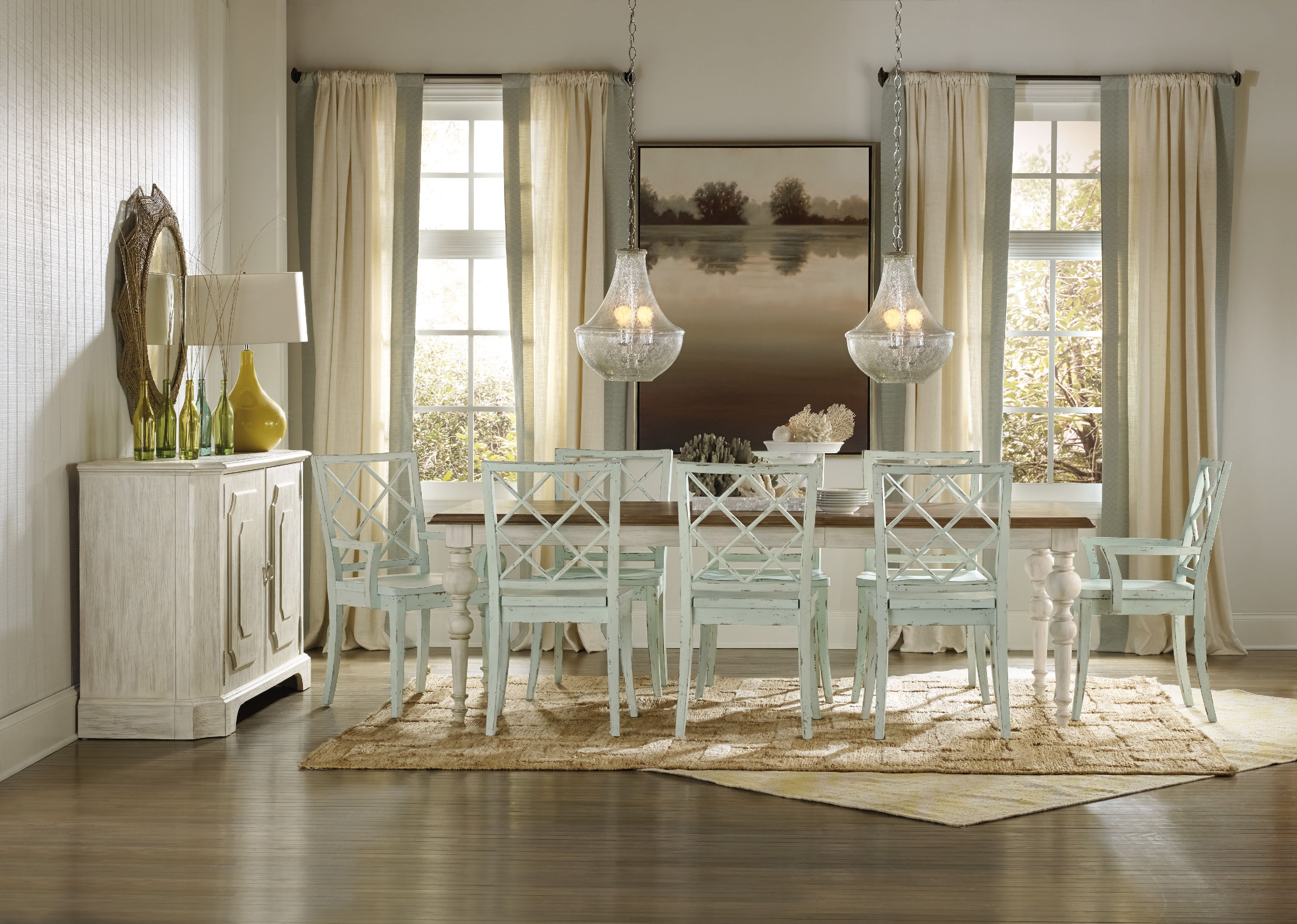
Hooker Furniture Dining Room Sunset Point Rectangle Dining Table with Two 18in Leaves
Pick Color Groups
Just as you are admonished to choose your friends well, this is also the case when it comes to choosing your color gang. Your color scheme must effortlessly flow from one room to the next. To achieve this, make sure that you get colors from the same temperature family.
Some people choose to work with the warm color palette, others the cool color scheme such as the blues, grays, and greens.
Another option is to pick one or two hues then use variations. If blue happens to be the main color, then you could pair it with gray-blue or you can always go with pure blue which shifts to navy blue as you move from one room to the other.
This same concept can be used in using decorative accessories.
As for your wall paint, paint stores can provide you with tint of particular colors. Your chosen main color can be knocked down to about 50%; all the mixer has to do is to add more white each time. You can go lighter or darker with the main color that you choose.
Walls should be painted two to three shades lighter than the ceiling color. This won’t look stark when you decide to use white.
Paint decks are also great inspirations in finding colors that harmonize.
Edgy Colors, Hid
Rooms that are out of sightline are great places to experiment on in terms of wilder colors. Powder rooms, master bedrooms, kids’ rooms, and other rooms that are encased in four walls are places that you could colorfully indulge.
So, have you always wanted to paint a room black? Begin with the bathroom!
Bold Colors, Cute Accessories
Accessorizing is an easy way of introducing dramatic hues. Limit the bold colors on your accessories, this is if you’re still uncomfortable about the whole switch from neutrals to bold colors.
Choose a color that will excite the senses, bright colors are great in highlighting a thing or worth.
Tie the rooms with accent colors that alter from room to room, though continuing with the major color throughout. Blue and green in the living room, for example, will mean using one of these colors inside the dining room. You could do blue and yellow in the next room.
Always keep the colors cohesive so that your theme would make more sense to you.
Tags: adding colors to a home, color 101, color basics, color harmony, harmony, McCreerys, McCreerys Home Furnishings, symmetry
Posted in Interior Design 101, Interior Design Elements | No Comments »
Thursday, February 4th, 2016
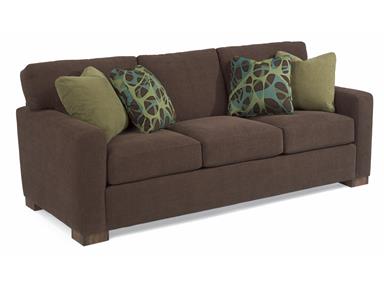
This Flexsteel Living Room Sofa 7399-31 spells urban fashion and comfort.
You may just be in your mid-30’s or 40’s but if you have already accomplished a lot of things in life, then you deserve to have another feather in your cap. The next best accomplishment for you at this point is to obtain your dream home, try urban living, and dress your home up according to your liking.
Would you want a big home right away or would you choose to have a condominium unit as your first home? You can be hands-on with the design process. Whichever you choose, be sure to review your choice of a dream home from the day you get your hands on the blueprint.
Next, find an interior designer whom you can trust. This expert should be able to discuss your personal preferences, what you would want the house to evoke, and your spatial needs.
There are a lot of responsibilities that come with your new home. If you are a hardworking professional, then you deserve to glam up your urban dwelling. You can begin with a white color scheme.
Stylish living begins with this simple color. Shades of white can create a bright and airy atmosphere while creating an aura of peace and balance. As you enter your home, you would soon understand how white opens up the space and gives the dweller a welcoming feeling. Be careful in using white, though, as it can have a stark appearance when left without complement.
Apart from white, earth tones are the next best colors to use when going with the urban look. Green, brown and yellow can be used in varying shades. If you want to contrast the starkness of white, you can bring in potted plants. Just be sure to water it daily and place it atop a side table that is not directly hit by sunlight.
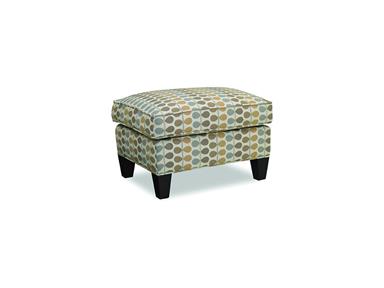
Sam Moore Living Room Urban Ottoman 1061 offers patterns that will stand out in a neutral background.
Create a Homey Aura
Urban interior design makes use of the design concept where only essential furnishings are brought into the home. This means you have to let go of any trinkets or furniture that can clutter the overall look.
Choose your furniture and accents wisely. A quick look on our lovely furniture pieces will soon give you an idea on how to spruce up your new home.
Area rugs will make any living room stand out. Find one that has varied designs since you will be using a neutral backdrop. A decorative area rug will complement, say, a shiny marble flooring. Other attention-getters inside a living room can be a baby grand piano, art sculpture, chandelier and any abstract painting. These will provide the much-needed contrast for the white scheme.
When it comes to the couch, any upholstered kind will do. Here’s a tip – be sure to rotate the cushions. It’s been observed that most homeowners have a tendency to stay on just one side of a couch.
An urban dining area will also look great with a 10-seater table made with wood. Find mirror panels to reflect this grand sight. Hang a crystal chandelier right above this set. The kitchen space can have a breakfast nook right by the window overlooking the garden. Find cabinets and shelves to store your kitchenware.
FFDM’s Boulevard Collection features this streamlined bedroom piece,
The home office for someone who knows success can have an old-meets-new motif. Modern conveniences such as a laptop and LED TV can be placed in the same room as the antique manual typewriter seated on a streamlined desk.
If there’s space to spare, then take time to find an ottoman that will match your office couch. This ottoman will not just serve as a seating piece but also as a table should you nephews decide to play a board game while you’re busy working.
Frame some of your black-and-white photographs and hang them proudly on your office wall. You can also use this room to store your favorite books, trophies, and some personal items.
Have fun with urban glam!
Tags: harmony, homey, homey ambiance, homey ambience, homey interiors, McCreerys, McCreerys Home Furnishings, urban glam, urban interior design, urban living
Posted in Interior Design 101, Interior Design Themes | No Comments »
Thursday, February 4th, 2016
‘Notice the play of colors in this photo? The colors of nature were excellently used inside this cozy bedroom. Wooden pieces come from the Summer Collection of FFDM.
For many interior designers, the color wheel can serve as their guide when mixing and matching stuff. As many would attest, a designer can never go wrong with a color wheel in hand. This nifty tool can help you see the combinations in a glance. From there, you can let your imagination take over and allow color harmonies to naturally take place.
Designers do not just resort to magazines, the Internet or interior design books for guidance. There are also tools such as the color wheel that can help them decide on color schemes, theme, and color combinations.
Harmonizing Hues
There are so many colors and the design possibilities are actually limitless. But before you roll up your sleeves to begin shopping for your home’s needs, you must first learn the basic color harmonies. Mainly, there are three to keep in mind – the primary, secondary and tertiary colors. Each one will be able to help you understand the color wheel better.
The primary colors are also referred to as the anchor hues. These are the pure colors which serve as the foundation of all the other colors that you will ever encounter. The primary colors are red, blue and yellow. Remember that every hue comes from a mixture (in varying degrees) of these basic colors.
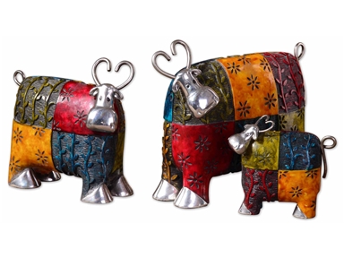
These colorful cows will definitely pop in a stark white background. Made with metal and green, blue, red, and orange finishes, these playful accessories are sure to get your guests’ approval.
Next are the secondary colors. These are a mixture of two primary colors. These include the following –
Just like the primary colors, there are only three colors under the secondary color category.
Lastly, there are tertiary colors. These are those hues result from the mixture of primary plus secondary colors. Examples include –
So now you may be wondering how you would be able to pick the right palette when you have been presented with a lot of inspiring combinations. The initial step is to make a decision on what scheme you really want.
You can just go with a primary color though it is also tempting to pick from the rich hues that are available, after all, there’s the entire spectrum to pick from.
Color harmony can help you make this difficult decision. Harmonizing creates a pleasant ambience, one that is not just visually pleasing but also well-balanced.
Colors can give life, add drama or pique interest. They can also affect the way people interact. For instance, blue elicits productivity so shades of this color are used in many offices all over the world. Red, on the other hand, is used in many restaurants because it is known to create hunger pangs as it also excites the senses. The way people associate with their surroundings rely greatly upon the colors that are found in that environment.
Now it’s time to learn basic color combination techniques. First, there’s monochromatic. This kind of harmony makes use of a single color even when it is mixed with its tints or shades. Tint is a mixture of white plus any color while shades result when a color is mixed with black.
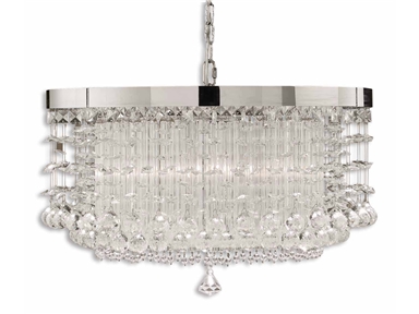
An effective way to achieve color harmony is to install lighting fixtures. This lovely chandelier will surely elicit oohs and aaahs. (Uttermost Lamps and Lighting Fascination, 3 Lt Chandelier 21138).
So if you’ve been wondering if you can work with different shades of yellow, then do so.
Complementary is a kind of harmony that offers a striking contrast between hues. This is especially great when you want a room to stand out. To use, find colors that are opposite each other on the color wheel.
Analogous colors are those that are adjacent to one another on the color wheel. These are often nature colors, therefore, they can match easily.
Triadic scheme makes use of colors that have been evenly spaced on the color wheel. They have been given this name because you can literally draw a triangle to connect these colors.
Split-complementary is great for beginners. The formula to use is –
Tetradic is a scheme that uses four different colors at the same time (two colors plus their complements). What you get is a brazen, multi-colored palette.
Lastly, the square scheme makes use of four colors that are equally spaced from one another. Connect these four and you will be able to form a square. To offset the hues, just remember to use a light-colored, neutral background.
Color harmonies aren’t difficult to achieve. With a little patience and creativity, your home is sure to stand out.
Tags: adding colors to a home, color harmony, color in interior design, colors, harmony, McCreerys, McCreerys Home Furnishings
Posted in Color Schemes, Interior Design 101, Interior Design Elements | Comments Off on Interior Design 101: Fundamental Color Harmonies
Tuesday, January 12th, 2016
5682-10 Sloan Chair without Nails and 5682-08 Sloan Ottoman without Nails in Fabric 917-60. This chair shows that Bohemian is all about vibrant colors.
Bohemian interior design involves the infusion of hippies, travelers, even gypsies. These are the very people who are out to have fun. They also live the most colorful lives as is evident in their style and their homes.
The bohemian interiors are lived spaces. There is nothing drab about this style as it is colorful, full of ornaments, exclusive, and electrifying. Bohemian accessories should be able to showcase a special appearance. The decor is not just amazing to look at in bedrooms and living rooms but also in other areas of your home like your kitchen, even the bathroom.
The Mingling of Creativity and Art
The bohemian style is exclusive because it displays the effects of art and creativity. It can lift a boring facade without you putting too much energy. Just hunt for the right furniture pieces (and colors) that are most suitable for this design.
Step number one is to pick the right color scheme for your home. Whatever hue you settle with, make sure that it has the capacity to deliver a harmonious effect on the walls, floor, accessories and the furniture.
This Hooker Furniture Home Office Accent Desk is what you need for your Bohemian home work space.
There are a few more daring interior designers who choose bold and dark colors for the bohemian look. There are actually a lot of options on your color palette. Combine different colors till you reach a blend that you like. Some of the more interesting hues include rust, brick red, sunny yellow, deep brown, plum, violet, gold, burnt orange, magenta, emerald and camel.
There are also a few color schemes that you should avoid for this design. Colors such as pastel, neon and those shimmering shades (‘cept gold) should be avoided like the plague.
Now for the furniture, you can choose to combine different kinds of furniture to make a room more exciting. A leather sofa would be perfect for your bohemian living room. As for the seating area, be sure to deliver a non-cluttered impression.
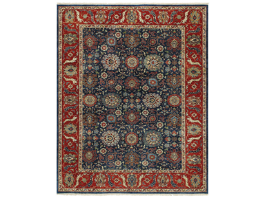
This very bohemian rug is the Capel Incorporated Floor Coverings Biltmore Select Bidjar Rug 1773RS02000300450.
The decorative appeal of this interior style lies heavily on the accessories that you will be bringing in. Choose unique accessories such as artwork coming from Africa, India, and the Middle East. Enhancing the flavor of your bohemian style is as easy as adding an eclectic taste. It wouldn’t be wrong to display accessories that have been inspired by Boho arts including tea seats, musical instrument, easels of vintage artists, some hookah pipes, too.
When it comes to bohemian colors, the most used are warm earthy colors as are metallic hues. So think of gold, terracotta, brown and other hues belonging to this family. Look for jewel tones such as fiery orange, purple, or electric blue. Always think warm when looking for the right bohemian color. White should never be a part of this design.
Bohemian is for people who want their homes to look vibrant, filled with culture and the most appealing pieces. It flees in the presence of modernism but it embraces what’s carefree, unusual and relaxed. Fuse lots of patterns and experiment with the loudest colors. Layer those throws on your sofa, use colorful area rugs, and hang never-before-seen tapestries.
Bohemian means you learn to mix and match. Find natural materials such as sisal, burlap then fuse them with chenille and silk. These materials should look slightly worn. Pillows, lampshades and curtains could have fringe.
Tags: African, art, bohemian, Bohemian art, bohemian interiors, bohemian style, guidelines, harmony, hippie, Indian, McCreerys, McCreerys Home Furnishings, mixing and matching furniture, mixing colors, mixing designs, mixing style, Moroccan, Moroccan interior design, Moroccan interiors, Moroccan style, tips
Posted in Interior Design 101, Interior Design Elements, Interior Design Themes | No Comments »
Monday, January 11th, 2016
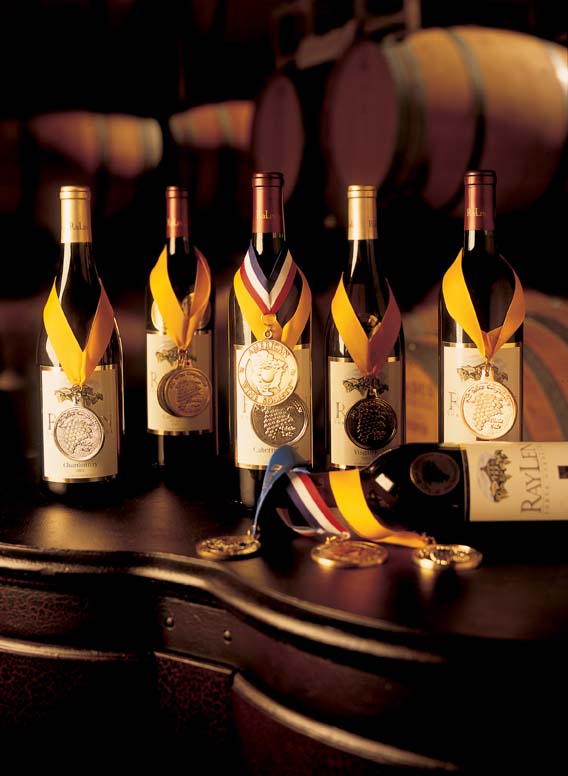
Wine bottles in this photo are from FFDM’s RayLen Vineyards Collection.
Choosing to highlight the rooms in your home with a vineyard or wine theme can add a casual ambience that is often linked to country French or Tuscan style. Wine accents permeate your place with a glamorous yet tranquil atmosphere. Pick hues that are commonly found in nature to harmonize with your wine accents. Use sage green, burgundy, and deep blue for a calming effect. Sunshine yellow and red, on the other hand, can make a room come to life. If you want to add a hacienda feel or mission touch, then use rustic textures.

This lovely wine rack is also from FFDM’s RayLen Vineyards Collection
Guidelines for the Innovative Vineyard Theme
First, what is a wine theme without bottles of wine, right? Keep those wine bottles in a wine rack made of wrought-iron. If you can find those with grapevine and grape bunch embellishments then do so. Display this kind of rack inside your Napa Valley design kitchen.
You can also set up a wine bar with different kinds of wines placed on a glass-topped, wrought-iron table. If you don’t want to take the risk on metal, then go safe with the traditional beauty of wooden racks. To add a country feel, wind some grapevines among the wine bottles.
As guests arrive, place fresh grapes with cheese board showcasing a number of cheeses, crackers, crusty bread, and fruits. Place a terracotta ice bucket complete with a vineyard logo and wine glasses and you’d be the talk of the town!
Now don’t think that the wine theme is just great for your kitchen. You can bring this same rustic look to your bedroom by grouping grapevine wreaths on the place where the headboard should have been. Embellish these with sunflowers to achieve the sunniest Tuscan atmosphere. Here, you should opt for faux grapes complete with dried herbs or some yellow starflowers.
Put this same treatment above the couch in your living room. You can pick one oversized wreath or settle with a group of smaller ones.
Of course, just like any design, one of the fundamental guidelines in achieving cohesion or balance is the use of a focal point.
Make a focal point inside the dining room or kitchen by using a wine puller collection showcased on a bead board backsplash. Put this on the side of the kitchen island or right above the counter.
You can reach a higher level for this look by filling up a pottery bowl (preferably brick red or muted yellow) with different fruits. Use purple and green grapes with all the other fruits, of course. Place this fruit bowl in the middle of your vintage farm dining table. None can be more perfect as a rustic centerpiece.
The bathroom can also be given an eclectic flair as you place vineyard-themed towels, bathrobes and a shower curtain. If you cannot have these theme towels made, then you can just combine white towels with towels in red or purple shades. Highlight the walls with wallpaper in the same hue or print.
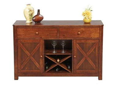
Winners Only Dining Room 52 Inch Franklin Server DFD470B at McCreerys Home Furnishings
Designing a Wine Cellar
You may not be a wine connoisseur but if you enjoy a glass of wine after dinner, then it won’t hurt to use this unique them when you remodel your home. Here are some ideas before you set out to build or remodel –
Never think that the wine cellar is merely a storage area. This is an important room just as much as the dining or living room. Obviously, wine bottles need to be kept in a quiet, undisturbed, cool and private place. While this is so, you should not decorate the space as if no one is ever going to see it.
Add a wooden wine rack or cabinet, even a wrought-iron bar in the corner. These furniture pieces are not just there to beautify; they can also serve as storage units in your cellar or wine room. Add a framed artwork on the wall to complete the artistic vibe in your wine-themed home.
Tags: color harmony, country, country cottage, country style, country style interiors, eclectic, eclectic design, eclectic interiors, eclecticism, French design, French design elements, French furnishing, French furniture, French interior design, French interiors, French Romantic, harmony, McCreerys, McCreerys Home Furnishings, Napa Valley design, rustic, rustic charm, rustic interiors, rustic look, rustic style, rustic theme, Tuscan design, Tuscan interiors, Tuscan style, vineyard theme, wine bar, wine cellar, wine cellar design, wine theme
Posted in Interior Design 101, Interior Design Themes | No Comments »
Follow us on our social media
© McCreery's Home Furnishings | All Rights Reserved | Privacy Policy