- Follow us:


Wednesday, March 7th, 2018

Capel Incorporated Floor Coverings Jazzy Shag Rug 5820RS Purple
There is very little doubt that many people would consider purple to be a unique, quirky color. First of all, it is not always that easy to get it right. It is not a color that you can wear with anything, in fact, you need to carefully think it through before you pair it with anything.
Purple got its name from the Latin word purpura meaning a Tyrian dye made with the mucus of a sea snail from the Mediterranean coasts. This dye was not affordable insomuch that only kings are able to buy it.
Purple is also not an easy color to work with when you want it to become the dominant color in your home. You are certain to get questioning looks if you suddenly announce that purple is going to be your chosen color palette for the year.
Yet this year, 2018, purple does take center stage in so many industries. First, in fashion, it is the hottest color to be used for wardrobes and accessories. The interior design industry, as always, follows closely behind.
Purple is either repellent or a magnetic color for you. Some are scared of its boldness but this does not mean that you have to belong to this group of purple-scared individuals.
Purple Equals Sophistication
Purple is the fusion of two remarkable hues – the passionate color of red and the active color that is blue.
Purple may be the union of these two exciting colors but it is not one to sit in between. It is a bold color and one that is often selected when there is a feature that needs to be highlighted or a room that needs to stand out.
Purple is so beautiful that it is often associated with royalty, spirituality, and wisdom. There is a reason why the Roman emperors loved this color so much as do the Catholic bishops of today. Purple looks amazing on statement pieces, especially on velvet.
It is especially amazing with Mediterranean design where lots of blue are acceptable and hints of red are encouraged.
Vincent Van Gogh loved purple and he used it often in his paintings. His famous painting Starry Night is chiefly purple with touches of yellow and blue. Leonardo da Vinci even believed in meditation being 10 times more powerful when done under a purple light.
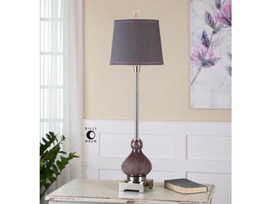
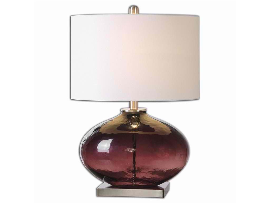
Uttermost Lamps and Lighting Charoite Deep Purple Buffet Lamp
Purple is Stylish
Where purple is featured, you are sure to find a strong, striking presence of the color. It can be a featured artwork or a piece of furniture. It can also be a lovely rug that anchors furniture sets.
The aubergine type of purple can also be a relaxing color, especially when used in the bedroom or the bathroom. Combine this with green or white and you will have a spa-like ambiance to relax in.
Working with Purple
While it is easy to just default to the plum shade of purple, this color offers so many varieties that could better express who you are. Purple is so versatile that you just need to find the right shade to work with or choose the best color to pair it with.
First, let’s have plum with chartreuse. This fusion looks amazing throughout the year. It does not choose a proper season as it is forever connected to Mother Nature. This color fusion blends well with natural materials such as leather, wood, woven items, silk and wool rugs.
Purple also goes well with warm metals. Let’s emphasize on that once more – you need to work with warm metals so stay away from silver. Instead, find copper, gold, brass or bronze pieces that will warm up your interiors.
Other colors that also work well with purple are lime green, light cobalt blue, olive green, pale gold, winter white, dusty turquoise, pomegranate red, charcoal, and teal.
Tags: McCreerys, McCreerys Home Furnishings, Pantone color of the year, Pantone Ultra Violet, purple, Ultra Violet, violet
Posted in 2018 Trends, Color Schemes, Interior Design 101, Interior Design Elements, Interior Design Themes | Comments Off on Reasons to Love the Quirkiness of Purple
Tuesday, January 23rd, 2018
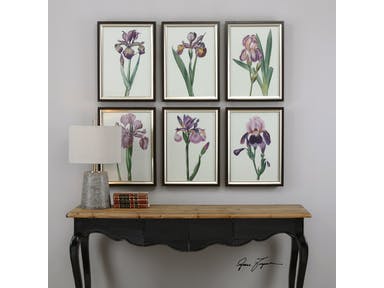
Uttermost Accessories Iris Beauties Floral Prints in Sets of 6.
What color do you get when you mix red and blue? You get a most interesting hue called purple or violet. This year, this awesome color takes center stage as it becomes the Pantone Color of the Year. Ultra Violet takes the limelight with its luxurious, powerful, and magical beauty.
Purple in Color Psychology
As many people already know, colors have a way of affecting people’s psyche. As for purple, it is a color that’s known to calm the nerves. It is also known to trigger a person’s creativity as well as spur calmness over the mind.
Bright purple, in particular, is seen as the color of royalty and having a vast amount of riches. Dark purple, on the other hand, is the color of sadness and even frustration.
Compared to primary colors, purple is not used as often in decorating or designing homes. Yet when used, this color is no less than the symbol of quality and royalty. In fact, many businesses who want to be recognized as luxurious brands tend to consider purple as their company or logo color. Examples of these are the Hallmark logo, Cadbury, Yahoo, and the LA Lakers.
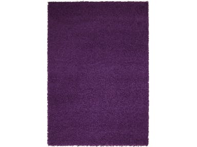
The Capel Incorporated Floor Coverings Jazzy Shag Rug in purple is the epitome of comfort and luxury.
Purple Interiors
If you want a unique color to design with, then Pantone’s 2018 color choice should be your first option. This is a wonderful color to decorate with. Think of using lavender, lilac or other shades of this royal color. Don’t just stick with Ultra Violet even though this is touted as the color to paint your walls or to upholster your furnishings with this year.
There is so much to embrace in purple that is awesome. It is not a color that’s to be used on an accent wall alone. It can be as vast as the theme of a winter or spring wedding or it can be the accent to add visual interest in a mainly neutral home.
So, if purple is such an amazing color, why did it take this long for it to become the color of the year? Also, why are a lot of people afraid to decorate with it?
Purple can be a hue that is so powerful that it can easily overpower a space. You have to learn to handle this color with such confidence so that you won’t create chaos. Instead, you should be able to create a home with purple blended professionally and infused with care with all the other design elements.
Whether you love or hate this color, the truth remains that it is the star hue this year and you’ve got to learn how to decorate carefully with it. Of course, it would be unwise to paint an entire bedroom with glossy purple.
For anyone who is looking into using purple, you might want to begin with lighter shades first. The lighter the shades, the less overwhelming they can be. Begin with accents in purple. If you’re feeling more confident, then you can go ahead and paint an entire wall purple or have the couch upholstered in purple.
Your wall’s decorative elements will also play a huge role this year. These can also become more interesting if purple were to become the contrasting color. Contrasting hues of purple are gold or lime green, even yellow. You can also do the ombre effect by using lighter or darker shades of purple for your chairs and other furnishings. Wall décor, side lamps, frames, and artworks can also come in bold purple hues this year. Just make sure to blend them properly with the rest of your design elements.
There is no denying it – purple is trendy this year. When you are looking forward to having a spectacular and fashionable interior design this 2018, then this is your jaw-dropping, go-to color. In a nutshell, here are some suggestions where you can use purple –
Tags: McCreerys, McCreerys Home Furnishings, Pantone color of the year, Pantone Ultra Violet, purple, purple color scheme, purple interiors, Ultra Violet, violet
Posted in 2018 Trends, Accents, Color Schemes, Interior Design 101, Interior Design Elements, Interior Design Themes | Comments Off on It’s a Purple 2018
Tuesday, October 4th, 2016
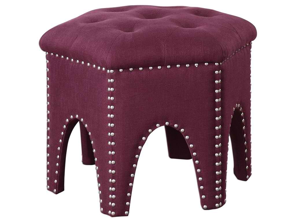
Living Room Uttermost Pippa Purple Small Stool 23286
Purple – just like any other color – can have many different meanings. As a homeowner, it is your privilege to know what colors are, what they’re made of, which colors best team up with which, and what emotions are invoked by each.
Knowing what the color purple can offer is also the duty of interior designers to learn. This is because they are the experts that many clients rely on. Through them, homeowners can make informed and educated choices regarding colors and how they can be used in their dwellings.
If you want to use purple in your kitchen, for instance, you need to find out whether you can use it subtly or more frequently. Look at elements where you could use purple and places where you’ve never used them in the past – wallpapers, fabrics, even accessories.
Purple can mean a lot of things. It could be restful, serene, elegant, spiritual, reverent, and calm. Yet it can also be philosophical, overactive, and creative in the right hue.
Royally Purple
Purple is a regal color this is why it is not commonly used in many homes. There are various forms where you could use this beautiful color. You could add white to come up with a tint that’s unique – lilac, mauve or lavender are all wonderful tints that come from the fusion of white and different hues of purple.
The more subtle or restful versions of this color can be used inside homes especially inside the bathroom and the bedroom. This is a color that promotes calmness (just make sure to use the right tint), even daydreaming.
Purple is also often used with yellow as they are hues that complement each other. These two can create a forceful statement that is both royal and dignified. Purple looks stunning on dining chairs and other pieces that feature fabrics; this is also the perfect accent color especially when used on a triadic scheme. This will blend well with orange and green as it provides a supremacy that may appear striking at first yet beautifully balances the rest of the design elements.
Purple in the Bedroom
Purple is versatile because it is a bright, fun color. It is great for different rooms in your home. You can create a beautiful atmosphere by adding purple, first, in the bedroom. Paint the walls with this beautiful color. It’s bright but also relaxing, use the eggplant shade to make the room more elegant. Use lavender in a pale shade to balance this dark color.
Take a step back and enjoy your work.
Lamps and Lighting Uttermost Tyrian Purple Glass Table Lamp 26190-1
Purple in the Living Room
The living room could evoke different emotions depending on the theme that you are trying to achieve. A shade of purple can be used as an accent wall. Actually, when you take a closer look at it, you could even mistake it as a color blue.
Use purple chairs, accent pillows and rugs. The living room becomes more exciting as you add this purple stuff. Just don’t make the mistake of using purple on every single wall or you would end up feeling woozy.
Purple Bathroom
When it comes to the bathroom, it’s time to use a tint of purple – lavender. This offers a feminine touch without being too womanly.
Purple is a relaxing hue that can work pretty well on the tub. You could spend hours in a relaxing bath as you redo the purple to a tint of lavender on your bathtub.
Deeper shades of purple could stage an air of royalty and mystery.
Again, you don’t have to paint every wall in your home with purple paint. Just know where to add purple touches and you would create an opulent-looking home with close to zero effort.
Tags: color choices, McCreerys, McCreerys Home Furnishings, purple, purple color scheme, purple design, purple interior design, purple interiors, purple theme, tips, violet
Posted in Color Schemes, Interior Design 101, Interior Design Elements | No Comments »
Monday, October 3rd, 2016
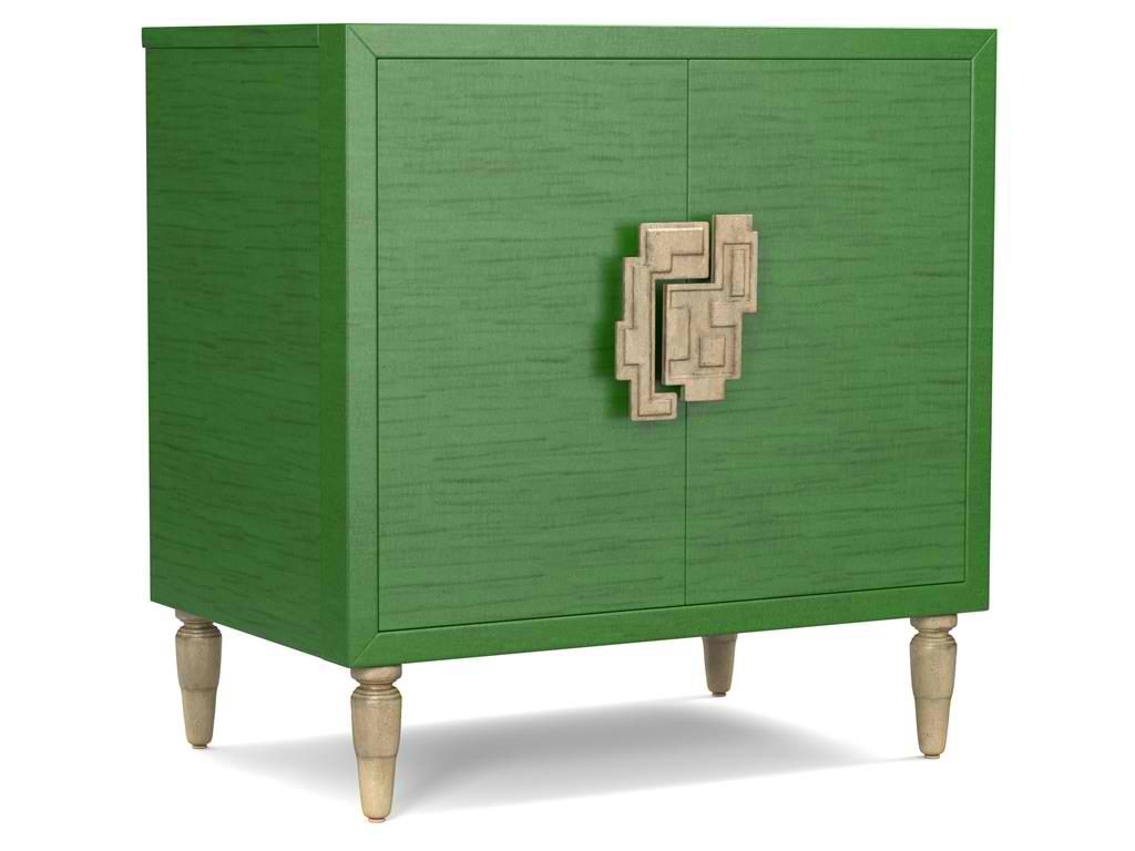
The green hue on this Cynthia Rowley for Hooker Furniture Living Room Sheridan Two-Door Chest 1586-50005-GRN is wonderfully prepped for 2017.
There is no doubt that color is an important element of interior design. It is one of the most influential aspects to human emotions. This is also the fastest way to update a room; what you need to do is just to apply a fresh coat of paint and you’re done. But what do different hues convey and what color forecast best fits the brave new year that is 2017?
Top Hues and Their Meanings
Red. This hue is often associated with determination, leadership and ambition. This can also connote physical desires which is why it is most used in many restaurants.
Pink. This hue represents intimacy, compassion and unconditional love.
Purple. This is the color of creativity and royalty.
Blue. This color represents loyalty, honesty as well as trust.
Orange. This bright hue is linked to optimism and motivation.
Green. This lively color represents vigor and energy. It is often used to create balance and stability.
Yellow. This is a hue that represents enthusiasm, fun, knowledge and hope.
Color Fundamentals
Color is affected by two aspects – the surroundings and the kind of light that shines on it. Try observing any room in your home. You’d soon see that the light is different during different times of the day. Comprehending how light can affect a space during different times of the day will give you the power to choose the correct color scheme that can be used all day through.
This same knowledge will also help you choose the best kind of lighting fixture for that room.
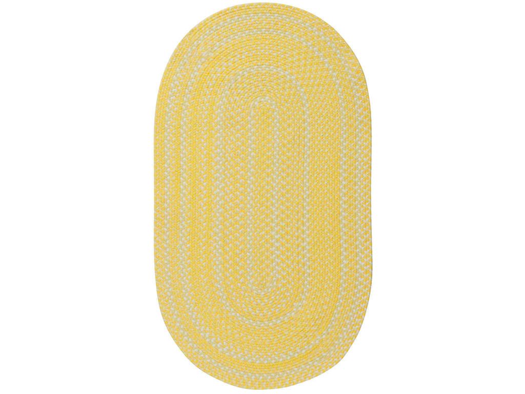
Capel Incorporated Floor Coverings Regatta Rug 0087NS Sunshine
Now, the Forecast
There are many color forecasts that are being done each year but one of the most esteemed are the picks made by Pantone. The upcoming year’s Color of the Year picks are calming, soft and wonderfully romantic. Now don’t worry if those aren’t your exact wish as a color for your home.
Leatrice [Lee] Eseman shared a handful of color palettes that you could choose from. These are all predictably popular colors for the upcoming year that you can use to beautify your home. These colors were also chosen because they address the consumers’ craving for colors that are comfortable yet new. Design trends became inspirations for many of these palettes, so was the film industry (e.g. The Peanuts Movie, Star Wars: The Force Awakens, etc.).
So go ahead and make use of anything silver and metallic or anything bright and colorful (if Charlie Brown inspires you the most). Say yes to orange chiffon, melon as well as dove gray. Grape and lime are also good colors.
Apart from these, there will also be an abundance of florals this upcoming year. Floral hues such as red Dahlia or pink yarrow, plus any shade of green may be acquired tastes but they are beautiful and not-oft used colors.
Gray and red will remain popular in 2017. They will both appear in warmer hues with the backdrop being that of bolder colors. Yellows that look perfect in a harvest setting will also get a lot of attention in the coming year. Yellow with hints of earthiness will look great and would be effectively grounded by classic red or blue.
Any youthful color is also a great choice in 2017. Now don’t be limited to the age-appropriate colors, rather, look for youthful colors with an attitude. So no matter what your age, you can use color palettes that are fluid and can easily morph in the 2017 surroundings.
Find celebratory hues that hail technology and nature. The former will continue to play a vital role in people’s lives. Evolving technology will continue to inspire ambience that is dark or in commanding grays.
Those who love deep plum would also find it a great news that the color forecast for 2017 also includes this hue.
Tags: 2017 color trends, adding colors to a home, blue, bold colors, bold hues, color choices, green, McCreerys, McCreerys Home Furnishings, orange, pink, purple, yellow
Posted in 2017 Trends, Color Schemes, Interior Design 101, Interior Design Elements, Interior Design Themes | No Comments »
Friday, April 1st, 2016

Lamps and Lighting Uttermost Tyrian Purple Glass Table Lamp 26190-1.
The color purple is an exciting color that depicts an equally great list of personalities. In color psychology, lovers of the color purple showcase personalities such as being more sensitive, understanding, supportive, gentle, and serene. This is also believed to be the color of creativity, idealism and intuition. With these beautiful characteristics, imagine what sort of home you would have if you embrace this color as a main theme.
Purple in Nature and in Interior Design
Nature shows a wide array of purple hues from the softest lavender to the pungent purple. This color is obvious in Rosie Posie – a flowering plant – and in violets, those flowers that grow in dark corners.
Purple is a mixture of red and blue. It has the capacity to evoke a wide range of human emotions depending on its shades. It is often worn by royalty as is evident in monarchs’ robes. It is also seen in spring flowers and on that popular dinosaur that sings I Love You as he dances with children.
Purple is not one of those safe colors that you can use when decorating. Browns, neutrals and grays are choices that most homeowners automatically resort to because they are predictable and easy to work with.For adults, this color is quickly becoming a part in many interior designs. The trendsetters have seen the uniqueness offered by this color that it can be seen in a range of designs from the Goth home to high schools and runways.
This does not mean that you should say no to a purple home, though. You only have to be confident and more courageous in choosing this version of violet.
Purple is a flexible color; it can be overpowering when overused or it can be passionately warm in the right hands.
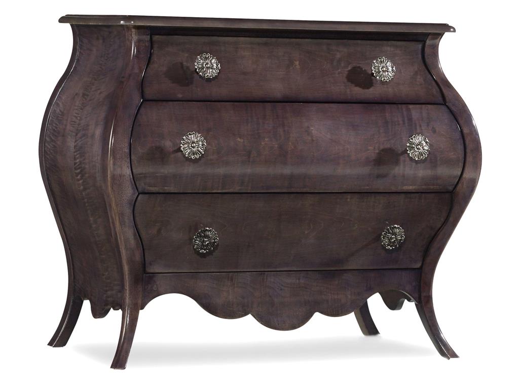
Hooker Furniture Living Room Melange Mini Nina Bombe Chest 638-50180
The most skilled designers are able to create the most sophisticated and playful rooms using this exciting color. If you like this color, it could be challenging to find a design professional that would be willing to work with it. Only the bold ones are able to appreciate the power that purple holds and are able to capture its beauty and apply it to homes.
There are many advantages in using purple. It will work well with cream, gold and white as well as brown, blue and gray shades.
Purple is the perfect color to use during the coldest seasons so make sure that you choose the cooler shades of purple during the hot summer months.
This can also be included in a masculine setting especially when the darker tones are used. This can effectively add richness and luxury in any room.
You will have to use purple in a way that it won’t throw off the rest of the color schemes. Its misuse could result in an undesirably dark space or association with bruises, grape candy or being a toddler.
Whether you intend to use purple as a funky, dark, light, fruity or mature element, it’s all up to you. Just remember that this can set the mood for the rest of your home. Crisp and deep shades of purple can make an engaging contrast in a white backdrop. People will surely be drawn to your furniture or accessories if you use this exhilarating color.
There are now design professionals that feel the thrill of working with purple in their interior design projects. If you are adamant in using this color inside your home, then your first question when hiring a professional designer should be – how much do you love purple?
If you can sense a flicker of excitement on the tone or right in the eyes of the design expert, then you’re practically in good hands. You love purple, she loves purple, then what are you both still waiting for?
Tags: McCreerys, McCreerys Home Furnishings, purple, purple color scheme, purple design, purple interior design, purple interiors, purple theme, violet
Posted in Color Schemes, Interior Design 101, Interior Design Elements, Interior Design Themes | No Comments »
Follow us on our social media
© McCreery's Home Furnishings | All Rights Reserved | Privacy Policy