- Follow us:


Wednesday, February 7th, 2018
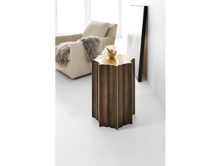
Hooker Furniture Living Room Melange Eden Drink Table is coming very soon!
Color theory is an all-encompassing definition of concepts and designs. There are three categories, though, that can be logically used in fashion or interior design. You have, of course, already heard of the color wheel, the color harmony, and how each color is used according to context.
Color theories are there for a structural comprehension of hues. For instance, if you see a table laden with fabrics, then you can categorize according to color.
How to Use the Color Wheel
Also known as the color circle, this is based on yellow, red, and blue which are the traditional, basic colors. Sir Isaac Newton was the first to develop the circular diagram in 1666. Scientists and artists, since then, have come up with designs and variations based on the said diagram.
The color wheel is a representation of the logical arrangement of hues in their purity. First, take a look at the primary colors. These cannot be formed when you mix other colors. These are self-sustaining hues and are used to create other hues.
The secondary colors, on the other hand, are formed as you mix the primary colors. When you mix red and yellow, you end up with orange. Purple – which is the color of 2018 – can be made by fusing red with blue. Mixing yellow and blue means you will have a green hue soon.
Tertiary colors are red-orange, yellow-orange, red-purple, blue-purple, yellow-green and blue-green. These are made by mixing a primary color with a secondary color, hence, the two-color names.
What Is Color Harmony?
Harmony is the pleasant arrangement of music, color or poetry. When pertaining to visual experiences, this is one that pleases the beholder. It must be able to engage the viewer and create a sense of balance or order.
When was the last time that you saw something that was not in harmony with something else? You would probably define that space as chaotic or boring. Either way, you were not pleased with what you saw so your brain rejected the image.
There are formulas to follow with regard to color harmony. There are color schemes that come from analogous hues. These are colors that sit side-by-side on the color wheel such as yellow-green, yellow, and the exciting yellow-orange.
If you want to use two colors that are seated opposite from each other, then what you want are complementary colors. An example of these is green and red as well as yellow-green and red-purple. The two colors may seem to oppose but they actually provide the needed contrast as well as optimized stability.
If you want to use additive colors, then you would want the primary hues that make up the white light. These are green, red, and blue or RGB. Subtractive primary colors, on the other hand, uses a color-printing process referred to as the CMYK or the use of cyan, magenta, yellow, and black.
Tints are mixtures of any color with white while shades are mixtures of any color with black. Toning is the creation of anything that is grayed down (white and black are both added to a hue). There are three ways to alter the basic color wheel and these are to tint, shade or tone.
The 60-30-10 Rule
The key to being confident in combining colors is to use this simple rule. This concept follows the rule of three which is used in almost everything from marketing to writing and even floral arrangements.
This is not a precise formula, okay, so relax. Don’t go all matchy-matchy, just be careful with cohesion and balance.
The 60 in this rule stands for 60% of the room should be occupied by anchor pieces and walls. The next 30% should be for accent furniture, wood trim, area rugs, and textiles, while the last 10% is for artwork, decorative pieces, and other small items.
Tags: color harmony, color theory, color wheel, McCreerys, McCreerys Home Furnishings
Posted in 2018 Trends, Color Schemes, Interior Design 101, Interior Design Elements | Comments Off on The Relevance of Color Theory in Interior Design
Wednesday, September 14th, 2016
FFDM Harbor Springs Collection features these contrasting yet matching hues of natural and whitewashed wood.
Every color is crucial in creating beautiful things in this world. Whether you need colors on your clothes or the interiors of your home, it is the same. While colors are this important, not everyone has the innate skill to point out which color goes with which and which ones would clash. If you cannot trust your eyes to make that judgment for you, then here are some guidelines –
Study the Color Wheel
The basic color wheel should be able to guide you when you make your color choice. You should have seen this colorful pie graph in school but here’s a little something to juggle your memory –
Red, blue and yellow are the three primary colors. Mix red with yellow and what you achieve is orange. Fuse blue and yellow to get the color of nature – green. To get violet, mix red and blue. These are what are known as secondary colors.
Tertiary colors, on the other hand, are the result of the fusion of a primary color and a secondary color. An example is red-violet or and blue-violet.
Every color has tints and shades. The first is a variation of any color when it is mixed with white. Red mixed with white achieves pink which is, in essence, a tint. Shade is a variation of any color when it is mixed with black. Don’t worry too much about shades and tints; what you need to focus on are harmonious color combinations and how to distinguish them.
Color Harmony
The color theory points out that harmonious colors are those that use any two hues that are opposite each other on the wheel. Three colors that are equally spaced on the wheel (or that form a triangle), colors that form a rectangle, are harmonious colors.
These are perfect color schemes or the more proper term is – color harmony. A color scheme should always be harmonious despite the rotation angle.
1586-10458-GRY1 Note-To-Self Writing Desk 1586-75410D-GLD6 Swanson Upholstered Metal Side Chair is featured in a cool, Nordic-themed room.
Warm and Cool Hues
Another separation that you need to be conscious of are warm and cool hues. Every group has its purpose and a spectrum of emotions to convey. Warm colors convey joy, energy and productivity while cool hues convey peace and calmness.
The color wheel can be easily divided if you want to group the warm and cool hues.
Basic Color Schemes
There are fundamental rules to commit to memory if you want to master how to match colors. Don’t worry, they’re quite simple.
Complementary colors are the ones that sit opposite each other on the color wheel (e.g. red and green or blue and orange). These colors have a high contrast so it is best to use them if you want to make a statement. You can use one color as the background and the other as the accent.
You can use shades and tints alternately, for instance, a lighter tint of red can contrast a darker shade of green.
Split complementary hues make use of three colors. This color scheme uses one color plus two adjacent colors. An example is blue, red-orange and yellow-orange. This color scheme is ideal for neophyte interior designers and decorators. This is the scheme to use if you don’t wanna mess up.
Analogous colors are three colors that are next to each other. Yellow, yellow-orange, and orange is an awesome example. This color scheme can be jarring if you mistakenly combine warm and cool colors so be careful.
Triadic colors can also be used in your home. This color scheme is achieved if you use any three colors that sit equally apart. An example of these hues on the color wheel are red, yellow and blue. This is also a high contrast scheme but it is more balanced when compared to complementary colors.
Now that you know the basics, are you ready to experiment on your home’s color schemes?
Tags: adding colors to a home, color 101, color basics, color harmony, color wheel, cool colors, cool hues, harmony, McCreerys, McCreerys Home Furnishings, shades, studying the color wheel, tints, warm colors, warm hues
Posted in Color Schemes, Interior Design 101, Interior Design Elements | No Comments »
Follow us on our social media
© McCreery's Home Furnishings | All Rights Reserved | Privacy Policy