- Follow us:


Tuesday, July 4th, 2017
(The First of a Six-Part Series)
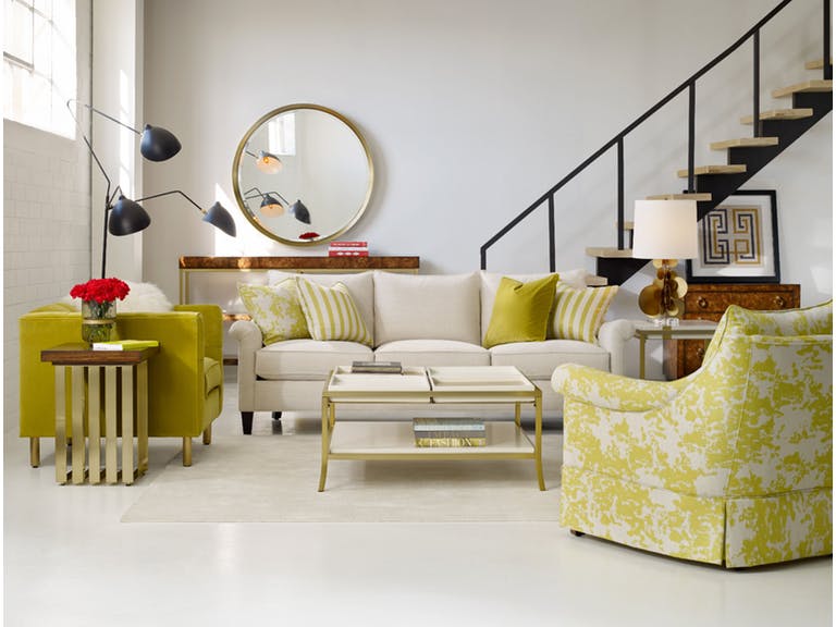
Cynthia Rowley’s Rivington 3-Over-3 Sofa together with the most colorful decorative elements to adorn a living room.
Adding color to your home – or at the very least, conceptualizing how the hues will make your habitat more amazing – is also a way to add more color to your life. Yet there are a lot of questions as to what paint color to use in a home as well as color predicaments like whether to pick gray or blue.
Of course we won’t be able to send you paint swatches just so you know how to begin your color 101 journey. What you can do is to read this series of color and paint basics that will teach you how to shop for the best colors and to effectively use them in your home.
This first of a six-part series will teach you about color fundamentals – this is more like a crash course to reading the color wheel and how to harmonize hues.
Matching and mixing colors is no easy business, though. Don’t get the idea that everyone can do this without any knowledge of color fundamentals, don’t feel, insecure in pairing unique hues, too. It’s all about learning the science and the art behind it all and being comfortable in using it in your own home.
Decorating with Hues
It is crucial to keep the color theory in mind when it comes to color decoration. Before you start thinking if it’s complicated or not, here are the basic principles –
Color theory also creates logical color structure. For instance, you could have a bunch of vegetables and fruits. Color theory would dictate that you would organize these based on their color relation. The oranges would sit next to the lemons while the lemons would be right next to the green apples which sit right next to the blueberries, and so on.
Don’t fret, it is not as complex as it seems to sound. You just have to, primarily, orient yourself to the color wheel. This is a tool, a handy helper of sorts, which will guide you in picking the specific colors – even down to the specific shades – that you want.
The color wheel comprises 12 basic colors which are –
When dealing with paint, remember these terms –
Shade means any pure hue fused with black.
Tone is a hue mixed with gray.
Hue is any pure color with the exception of white or black.
Tint is a color mixed with white.
Here are the fundamental color harmonies that you need to keep in mind –
Analogous hues are three hues that sit side-by-side on your color wheel such as green, yellow green and yellow.
Note that every hue outside of these already come from a mixture of hues to varying degrees.
Use the color wheel and these basic color guides so you don’t go wrong. Also, make it a point to look at Mother Nature for color inspirations. Just imagine a red flower encircled by green and yellow leaves. All these, the color of the leaves, the flowers and grass, all are inspirations for your color palette.
What about you, what are your color inspiration sources? Look around you – the possibilities are actually endless.
Tags: color 101, color basics, color choices, color combination, color fusion, color options, color palette, color schemes, McCreerys, McCreerys Home Furnishings
Posted in Color Schemes, Interior Design 101, Interior Design Elements | Comments Off on Color 101: Using the Color Wheel, Choosing and Matching Hues
Wednesday, December 14th, 2016
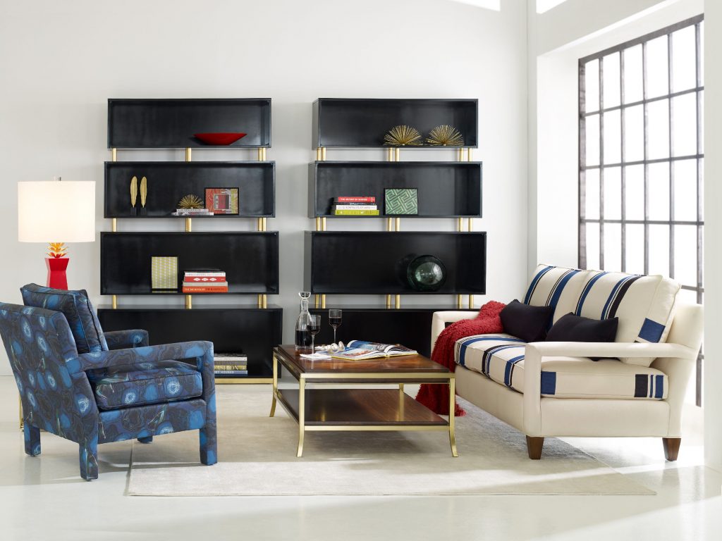
CYNTHIA ROWLEY FOR HOOKER FURNITURE RYDER CHAIR: The play of colors in this living room is deliciously sensational.
Most interior designers make a living by doing what’s often considered a gargantuan task – combining colors in order to achieve an effect or to evoke a certain mood. There are traditional color theory rules to follow and there is also that thin horizon that allows you to experiment and show your true colors. The color theory can guide you in providing a warm and cozy feeling inside your home if that is what you require by adding rustic colors. Understanding how this theory works will help you in successfully applying colors into your design.
The Color Theory in Practice
When you’re still figuring out what colors to use in a room that’s being redesigned, know that there are three crucial considerations – your personal preference, your lifestyle (or how the space is going to be used eventually), and the room’s actual structure. When you have all the information for these, it would be easier for you to determine the color scheme that you’d use.
Some color schemes work better than others depending on the factors just mentioned. For instance, if the structure of your home is mainly country farmhouse, then you should automatically think of monochromes or analogous colors. This means you can use creamy pale yellow palette or the deep reds. Similarly, kitchens with a modern or contemporary vibe are best dressed with bright and bold colors that are found on the triadic color scheme.
If you are looking to achieve tranquility, then consider monochromatic or analogous colors. Think Hawaiian and you’d be on the right track. Think also of rolling hills, lush greens, the blue ocean and the powder blue sky. These are the classic analogous hues.
Refrain from adding too much bright or bold colors as you try to experiment on color combinations. It is crucial to balance the hues with lots of energy or you would end up exhausted over time. This is exactly where complementary color schemes would shine since the hues opposite of each other always achieve balanced, warm and cool hues.
FFDM RayLen Vineyards Collection: This rustic piece makes the ensemble a lot more exciting.
Making Color Fusion Successful
Don’t forget to integrate your lifestyle as you design the interiors of your home. Use Feng Shui and colors in achieving harmony in your home environment.
Color can be the most powerful influence inside a home depending on how effectively you used it. You should be able to understand the basics of color psychology. This means the identification of the numerous psychological effects that colors can have on the human psyche.
Another way to make color combinations work is to divide active and passive spaces. Active spaces include the kitchen, the living room and the dining room. Bathrooms and bedrooms fall on the passive room category.
Blues and greens have a calming effect so they are best used in passive rooms. The more active colors such as reds, yellows and oranges would look better when used in the active rooms. When comprehended on the Feng Shui level, bathroom is blue and the kitchen is bright red.
You can also refer to the color principal which is also known as the 60:30:10 rule. An example is 60% of kitchen or bathroom can use a single color while the cabinetry and other furniture account for the 30%. The rest of the design elements such as accessories and accents complete the whole package with the remaining 10%. These can be in the form of linens, plants or artwork.
It is also important to consider the dominant surfaces in a room. For example, a dominant part could be the accent wall. The use of a red or black accent wall pulls the attention of the beholder towards it. Add some lighter colors for the other three walls and you’ve just confidently mixed colors for a more exciting ambience.
Tags: color fusion, color schemes, fusing colors, McCreerys, McCreerys Home Furnishings, mixing colors
Posted in Color Schemes, Interior Design 101, Interior Design Elements | No Comments »
Monday, January 18th, 2016
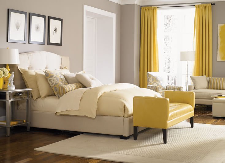
This neutral-colored bed from the Bergman Bedroom Collection of Jonathan Louis is perfect with yellow curtains, that yellow chair at the foot of the bed, and yellow-striped bolster, and other yellow accessories.
The color yellow is a wonderful hue. It is intense, it is bright, and it can even evoke the strongest emotions. Yellow is an attention-grabbing color yet it can also become abrasive should you make the mistake of overusing it. This color can appear bright and warm but in the wrong hands, it can also be visually tiresome.
Yellow can cause eye fatigue because of the high amount of light which it can reflect. The use of this color as a wallpaper on computer monitors can cause eye strain, even vision loss for some. Though this is the case, it can also be used (in moderation) to grab people’s attention. This is why yellow is used mostly in most roadside advertisements.
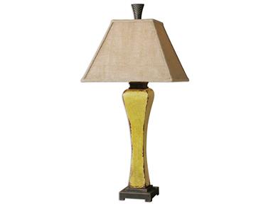
Lamps and Lighting Uttermost Oratino Burnt Yellow Lamp 26476 at McCreerys Home Furnishings. This fascinating lamp comes with a crackled ceramic. You will love the burnt yellow glaze as well as the rust bronze detail.
The Sunny Color
Using yellow in interior design means you are ready to stage warm and happy feelings inside your home.
Color therapy makes use of this color to evoke feelings of happiness in people. In interior design, it creates coziness and feelings of warmth. This is quite a popular color for wall paints.
Splashes of yellow can be used inside your home through golden carpet hues, warm room furniture, and yellow lighting fixtures. Accessories in yellow can also make a rather dull room appear more exciting.
Yellow is a highly recommended color for decorating rooms. This is the color that can brighten up any dark, gloomy room. Painting the walls light yellow, creamy yellow or any yellowish tint on wallpapers is great for small and dark rooms.
Mix decorative items of yellow and colors that match this lovely hue. If you have used yellow as paint or wallpaper, then find a neutral color for your ceiling and floor. This should balance the looks of your interiors while also creating a pleasant atmosphere.
Yellow can be so many things – it can be juicy, subtle, even dimmed. The living room walls can be painted with this juicy shade. If used as a tint, it can be mixed with brown, cream or brick red. Speaking of duos, what could be considered as the marital pair for yellow is the color green. This is a combination that is typically used in kitchens and children’s bedrooms. Bright accessories can be a fusion of two colors: red, coral, blue, orange or turquoise.
If you want to use yellow inside classical interiors, then have it combined with white. This is a great mixture for dining rooms, offices and living rooms. These two colors can make any room look larger, clean and bright. If you used the color combination as a backdrop, then be sure to use moss-colored, terracotta, or burgundy accessories. Wooden oak furniture will also look great inside such interiors.
If, on the other hand, you decide to use yellow and white furniture and accessories, then be sure to have a more exciting ceiling to floor colors such as lilac, green, or shades of blue.
It is also safe to experiment with yellow and chocolate. You will never go wrong with this combination as it offers a warm contrast to the usual sunny feelings that yellow evokes. Mix the same color with red and you will instantly bring life into a room.
Purple is also a great combination for bright yellow. Children’s rooms often come with pastel green with purple accessories. This is never irritating to the eye.
All in all, yellow can be used in different shades and can be easily combined with many different colors. Just learn to put balance these awesome colors by knowing their limits. Just remember this – too much of anything can always annoy.
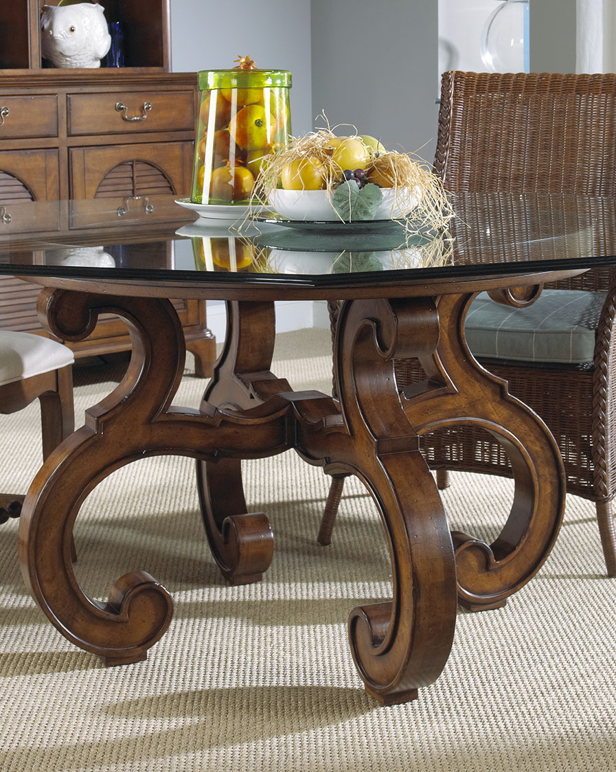
Yellow lemons – in this case oranges – can add a unique tinge of yellow on your dining table. This wooden masterpiece is from FFDM’s Sunset Collection available at McCreerys Home Furnishings.
Tags: bright colors, bright hues, bright paint colors, brightening up rooms, color combination, color fusion, color psychology, contrast, guidelines, McCreerys, McCreerys Home Furnishings, tint, tips, warm colors, yellow, yellow color palette, yellow in interior design, yellow interior design, yellow interiors
Posted in Color Schemes, Interior Design 101, Interior Design Elements, Interior Design Themes | No Comments »
Follow us on our social media
© McCreery's Home Furnishings | All Rights Reserved | Privacy Policy