- Follow us:


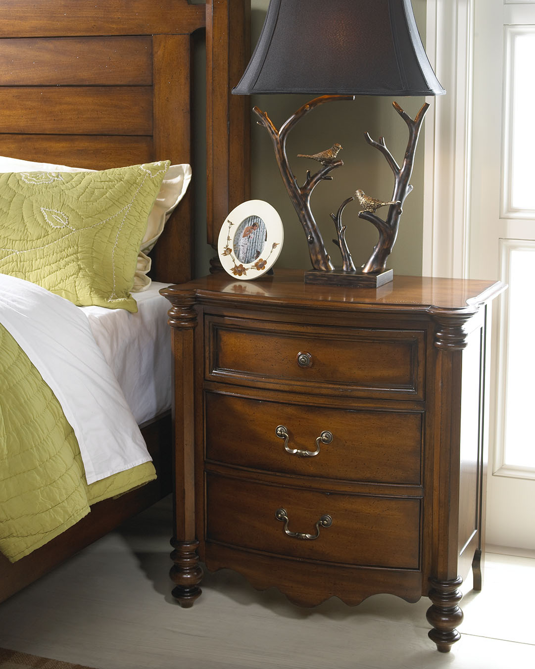
‘Notice the play of colors in this photo? The colors of nature were excellently used inside this cozy bedroom. Wooden pieces come from the Summer Collection of FFDM.
For many interior designers, the color wheel can serve as their guide when mixing and matching stuff. As many would attest, a designer can never go wrong with a color wheel in hand. This nifty tool can help you see the combinations in a glance. From there, you can let your imagination take over and allow color harmonies to naturally take place.
Designers do not just resort to magazines, the Internet or interior design books for guidance. There are also tools such as the color wheel that can help them decide on color schemes, theme, and color combinations.
Harmonizing Hues
There are so many colors and the design possibilities are actually limitless. But before you roll up your sleeves to begin shopping for your home’s needs, you must first learn the basic color harmonies. Mainly, there are three to keep in mind – the primary, secondary and tertiary colors. Each one will be able to help you understand the color wheel better.
The primary colors are also referred to as the anchor hues. These are the pure colors which serve as the foundation of all the other colors that you will ever encounter. The primary colors are red, blue and yellow. Remember that every hue comes from a mixture (in varying degrees) of these basic colors.

These colorful cows will definitely pop in a stark white background. Made with metal and green, blue, red, and orange finishes, these playful accessories are sure to get your guests’ approval.
Next are the secondary colors. These are a mixture of two primary colors. These include the following –
Just like the primary colors, there are only three colors under the secondary color category.
Lastly, there are tertiary colors. These are those hues result from the mixture of primary plus secondary colors. Examples include –
So now you may be wondering how you would be able to pick the right palette when you have been presented with a lot of inspiring combinations. The initial step is to make a decision on what scheme you really want.
You can just go with a primary color though it is also tempting to pick from the rich hues that are available, after all, there’s the entire spectrum to pick from.
Color harmony can help you make this difficult decision. Harmonizing creates a pleasant ambience, one that is not just visually pleasing but also well-balanced.
Colors can give life, add drama or pique interest. They can also affect the way people interact. For instance, blue elicits productivity so shades of this color are used in many offices all over the world. Red, on the other hand, is used in many restaurants because it is known to create hunger pangs as it also excites the senses. The way people associate with their surroundings rely greatly upon the colors that are found in that environment.
Now it’s time to learn basic color combination techniques. First, there’s monochromatic. This kind of harmony makes use of a single color even when it is mixed with its tints or shades. Tint is a mixture of white plus any color while shades result when a color is mixed with black.
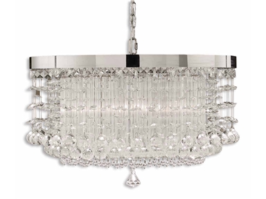
An effective way to achieve color harmony is to install lighting fixtures. This lovely chandelier will surely elicit oohs and aaahs. (Uttermost Lamps and Lighting Fascination, 3 Lt Chandelier 21138).
So if you’ve been wondering if you can work with different shades of yellow, then do so.
Complementary is a kind of harmony that offers a striking contrast between hues. This is especially great when you want a room to stand out. To use, find colors that are opposite each other on the color wheel.
Analogous colors are those that are adjacent to one another on the color wheel. These are often nature colors, therefore, they can match easily.
Triadic scheme makes use of colors that have been evenly spaced on the color wheel. They have been given this name because you can literally draw a triangle to connect these colors.
Split-complementary is great for beginners. The formula to use is –
Tetradic is a scheme that uses four different colors at the same time (two colors plus their complements). What you get is a brazen, multi-colored palette.
Lastly, the square scheme makes use of four colors that are equally spaced from one another. Connect these four and you will be able to form a square. To offset the hues, just remember to use a light-colored, neutral background.
Color harmonies aren’t difficult to achieve. With a little patience and creativity, your home is sure to stand out.
Follow us on our social media
© McCreery's Home Furnishings | All Rights Reserved | Privacy Policy