- Follow us:


Monday, July 23rd, 2018
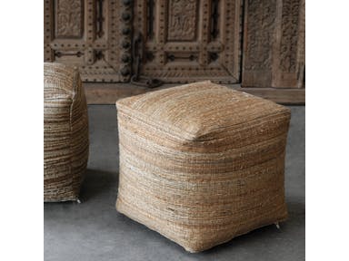
Neutral on neutral: Uttermost Accessories Shiro Ecru Pouf 23959
The simple act of changing the color in a room could transform the overall appearance of that space. It can be as basic as changing the backsplash pattern or painting the walls anew. The colors that you use should be the right one or the correct combination so you end up creating a timeless classic or a contemporary look that is to die for.
Before you hire the best painting contractor, though, you need to decide why certain colors are well-liked while others are simply…bland.
The Renowned Neutrals
If you are a homeowner who is looking for ways to make your home accessories pop or if you’ve made the major decision of selling your home, then it’s high time to decide also on the paint colors that you will use.
Neutrals are the safest way to go as they are guaranteed to liven up any living room or bedroom. Gray is an amazing canvas to any design element. It is also set to make unique features pop. But don’t limit yourself to just gray, white, brown or black, though.
You can also go for neutral orange and green which are always trendy. These are muted hues that are not so bold. They can also be easily paired with tan or gray hues. These plus some neutrals will add to the depth of a space as well as the warmth.
Go Gaga Over These Kitchen Hues
Kitchens usually come with interesting design features. Consider installing a lighter wood color on the kitchen cabinets. This is the most appealing that you could use when you’re pairing with pastel. A brighter hue might easily clash with a bright-colored tile countertop.
Always consider these factors when you are picking the best kitchen paint color.
When you want to play safe and you use neutrals in this area as well, then go for traditional white. Just picture an all-white kitchen which offers a clean and fresh appeal. If this is a bit more difficult to clean, then look for warmer hues such as reds or its more cheerful counterpart which is yellow.
Living Room Hues to Covet
The living room is also a wonderful area to use neutral colors. The most reliable backdrop will always be any neutral color such as beige, tan, white or cream. Mixing gray with beige is what’s now known as greige. This is a hot hue to have inside any living room.
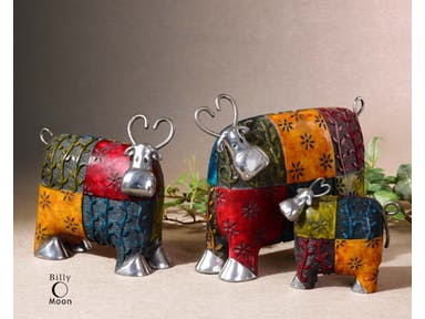
Bold Colors on Neutral: Uttermost Accessories Colorful Cows Metal Figurines
Bedroom Colors to Die For
A bedroom is a place of relaxation so make sure that there are no jolting colors there that would disrupt the quality of your sleep. You can paint the room with deep blue or a light green. Your preference is highly considered when picking the correct color in this part of your home. But you have to remember that creating a spa-like space is more important than the need to satiate your craving for, say, a tangerine color inside the bedroom.
Popular Bathroom Hues
Paint can make a room appear larger or smaller depending on how you would want to use it. If you have a small bathroom, then widen the room by painting it with light colors such as powder blue or pastels. Those who are bold enough to use black or navy blue are confident that they have ample space to paint.
Now the Costs
As soon as you have already decided which color to paint a room with, it’s likely that you would want to begin planning on the budget. The best results require professional help. These experts know how to best apply the paint that you want.
Average interior painting cost is at $1,679.
Tags: bright colors, bright paint colors, color palette, McCreerys, McCreerys Home Furnishings, neutral colors, neutral hues, neutral paint colors, paint colors
Posted in Color Schemes, Interior Design 101, Interior Design Elements, Interior Design Themes | Comments Off on Why Are These Colors So Popular?
Wednesday, September 27th, 2017
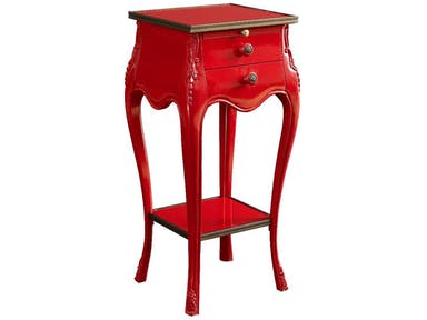
Fine Furniture Design Living Room Accent Table 1160-961: A lovely focal piece
Designers – whether in the world of fashion or interior design – know that colors bring life to creations. They do not only do this, these hues can also affect human emotions. Colors can inevitably influence people’s feelings, even their perceptions.
Colors can make people interested or disinterested; they also have the power to captivate or cause boredom, and they can also motivate. Interestingly, adults perceive colors not only physically but also psychologically.
Colors could also be linked by humans to certain experiences. There are certain colors that remind people of their childhood or hues that they associate with a pleasant or even a traumatic experience. The more pleasant hues are the ones that people tend to gravitate to.
While color choice tends to be subjective, there are certain hues that work a certain way. Relaxation is often brought about by lighter colors while darker ones could either make you feel more active or homey.
Energizing Hues
If you want to be woken up, stimulated, or to feel more energetic, then you should look for bright hues. Of course, you must remember the chief function of the room where you are going to use the colors at.
Color appropriateness is vital to room functions. For instance, if you want a room to sustain stimulating activities (e.g. a family room), then go for heavy and more attractive hues such as green, red, pink and yellow tones.
These colors help promote excitement and even happiness. Ophthalmology theories suggest that red can even stimulate the eye nerves. A psychological factor about the color red is that it can also be attributed to violence and blood. This is why you would feel like you’re in a fight or flight mode when you’re in a red room.
Playful Hues
There are also colors that do not excite as much but would also not induce sleep. These playful hues go beyond the common blue or pink. Don’t just settle for pastels when you are expectant. Go for more playful tints such as seafoam green or robin’s egg blue.
There are also more sophisticated shades of beige that could excite the senses. Consider also how you will effectively use black or white or even a combination of the two.
As for your baby’s nursery or toddler room, know that babies are able to perceive colors from the fourth month onwards. Moreover, they are also able to perceive contrast in colors. This means that they will, somehow, be able to appreciate the colors that you put inside their rooms and how each hue interacts with its neighboring colors.
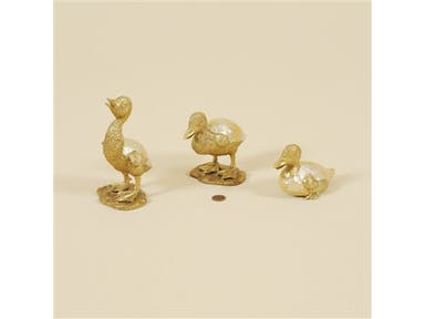
Maitland-Smith Accessories Set Of Three Satina Finished Cast Brass Ducklings, Yellow Mother Of Pearl Inlaid Accents 1054-264
Soothing Hues
Lastly, there are the calming colors. These are those hues that make you relax and think of tranquility and peace. Green is an amazing choice for relaxation. Remember that the color spectrum has two separate ends. The short wavelength is where blue resides while on the other end is red. Right in the middle of this spectrum is the color green.
In between the two extreme sides is where the human eye relaxes the most. So go ahead and choose green in different shades. Choose green for your bedroom, even for the bathroom and the reading areas.
Must-have Paint Tools
For your home’s color makeover, make sure that you have the right set of tools. Here’s a concise list –
Tags: color choices, color psychology, effects of colors, McCreerys, McCreerys Home Furnishings, moody colors, paint colors
Posted in Color Schemes, Interior Design 101, Interior Design Elements | Comments Off on Moody Colors: Energizing, Playful, and Soothing Hues
Sunday, January 17th, 2016
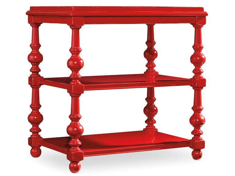
The Hooker Furniture Living Room Sanctuary Chairside Table will catch your guests’ attention if you let it stand against white or any neutral background.
You have probably seen those painting sequences on home TV shopping shows and thought that the people there looked like they were having fun. In reality, painting a home (or even just a portion of it) is far from being glamorous. You can actually exercise your organization skills and patience as you go about with this activity but, in the end, you will feel a level of satisfaction that will make you say – it’s all worth it.
The fundamentals of painting all begin with planning. As what’s always been said, always begin with the end in mind. Try to visualize your space down to the minutest details like what furniture would go with what color, what sort of accessories would blend with your chosen walls, would you use carpets or tiles, and many such details.
After planning and visualizing these things, it’s time to translate your vision into reality. You will surely be surprised to find out that your room or your entire home turned out to be quite like your visualized, ideal space.
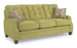
Sloan-Sofa-with-Nails-in-Fabric-917-22 is perfect for any colorful interior design theme.
Consider the Available Space
Many interior designers would agree that one of the first considerations that you have to make before you would start an interior design project is space and how much of it you can work with. The space that you’ll be able to work with validates the colors (paint) that you end up using.
Keep in mind that smaller spaces need light colors such as sand, white and cream. These light hues will give the small space an illusion of being more expansive. On the other hand, bigger spaces are like canvases for the homeowner’s imagination. You can use different hues depending on what needs to be expressed. Colors such as dark brown, navy blue, and black can lend a romantic look and feel.
Consider the Ceilings, Floors and Walls
As soon as you know how much space you can get your hands on, you also need to consider other parts of your home such as your floors, walls and ceiling. These are also parts of your huge masterpiece so they also need to be given some serious planning.
Just think of yourself as the liberal artist. Make a shortlist of all the colors that you think would make these parts of your home come to life. Do not go too crazy on the hues so that your residence remains tasteful. As much as you can, limit your color choices to just five hues.
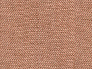
Just as you would the paint, it pays to ask for swatches when looking for the right fabric for your sofas. This orange/rust fabric comes from the Lexington cover collection available at McCreery’s Home Furnishings.
Get Color Samples
It is best to get paint swatches or samples from different paint centers. As soon as you have mixed the shades, wipe the paint swatch on a sheet of paper.
Test your chosen colors by taping the paint test swatches to the wall. See how the colors work for you visually.
At the moment, the top five designer colors are –
Light gray or ash can work as a substitute for the usual shades of white. It can effectively tone down the mood in any space while not neglecting on modernity and being sleek. Charcoal gray, meanwhile, can draw attention easily which is why it can be an effective paint on your focal wall.
White is timeless and it can efficiently frame any interior. Just make sure that you choose white carefully because it can become glaring.
Orange is a warm color that works best with metallic hues such as gold and copper. It is also the perfect color for autumn-inspired interiors.
Green reminds us of nature, freshness and going organic. This hue can make any space feel more fresh and relaxing. It can also blend well with other neutral colors.
Lastly, neutral paints can suit any style. They are easy to maintain and can become the primary color to an exciting accent color which you would later add.
Tags: accent color, adding colors to a home, colors, designer colors, designer paint, floor color, guidelines, home paint, McCreerys, McCreerys Home Furnishings, neutral paint, neutrals, paint, paint colors, painting, tips, wall color, wall paint
Posted in Color Schemes, Interior Design 101, Interior Design Elements, Interior Design Themes | No Comments »
Follow us on our social media
© McCreery's Home Furnishings | All Rights Reserved | Privacy Policy