- Follow us:


Tuesday, July 26th, 2016
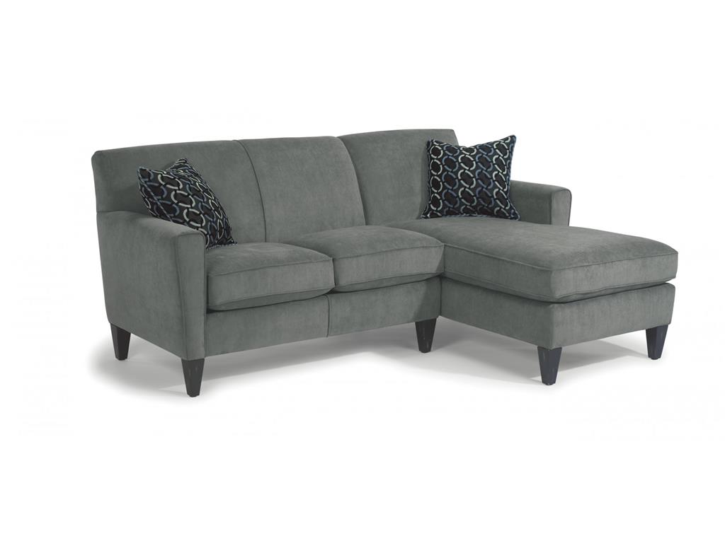
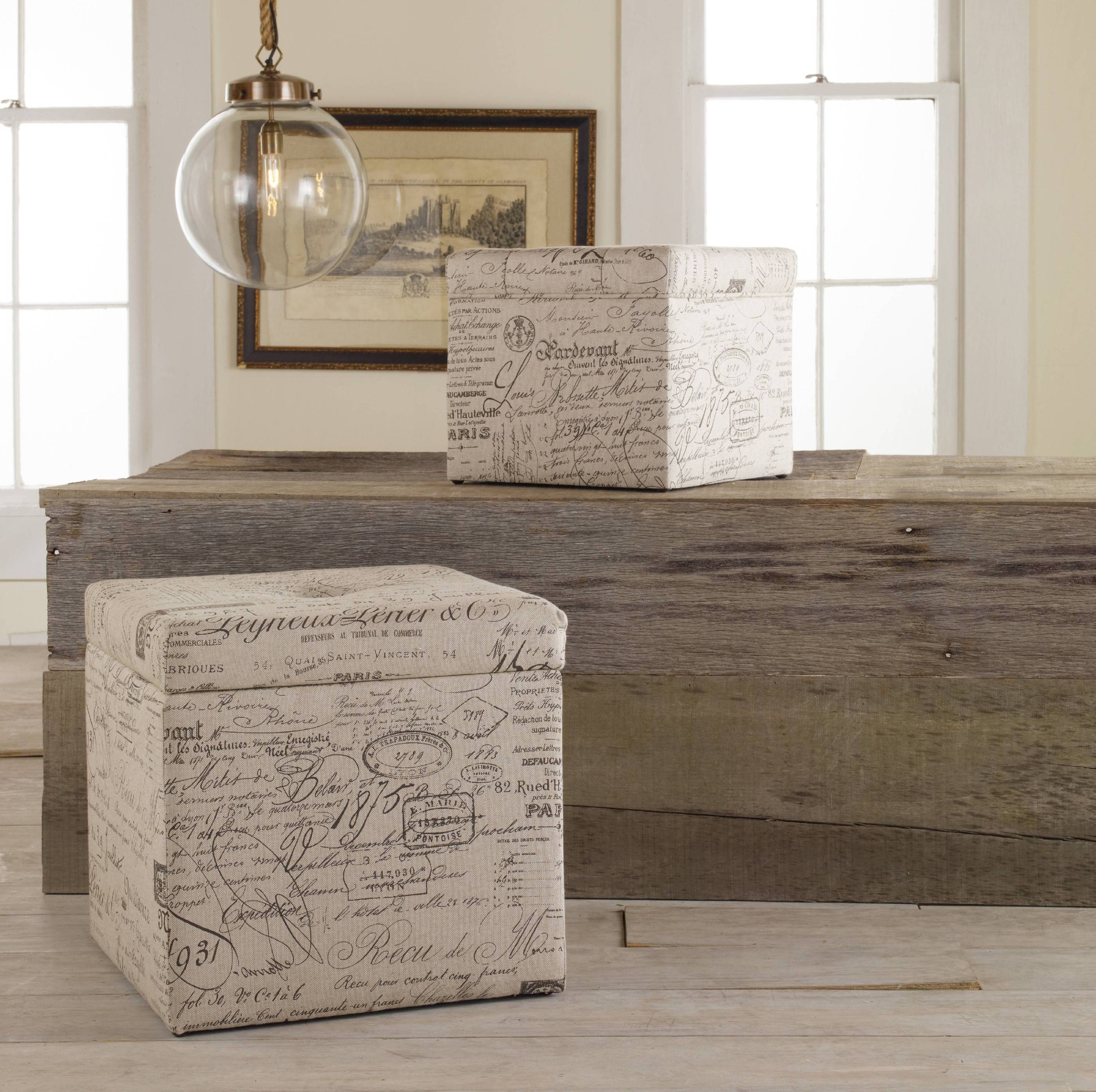
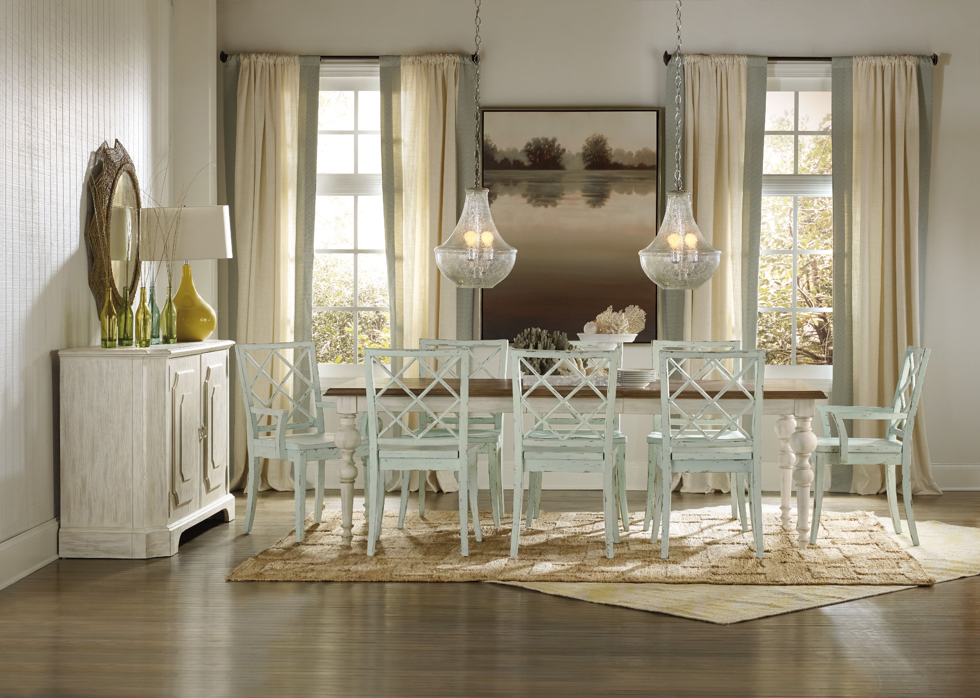
The geometrical patterns on the accent pillows work well with this Flexsteel Living Room Fabric Sectional 5966-Sect
Many designers are being asked how they go about in their selection of finishing touches for spaces that they work on. Seemingly unimportant stuff such as window treatments, rugs and decorative accessories can make or break the entire design. Pillows, in particular, are a bit overwhelming to shop for. After all, there are just so many materials, sizes, patterns and colors to pick from. If you’re uncertain about which accent pillow to get for your home, here’s what you should do –
Consider the Price
This is a basic advice when it comes to projects that you need to tackle. One of the first things that you should look into is the amount of money needed to get the pillows that would work for you. Decorative pillows differ greatly in cost, from just a few dollars to a few hundred dollars. The luxuriousness of the fabric can also make a huge difference on the price.
See also how many pillows you would need and what your ceiling is with regard to your finance. Achieve to have one or two pillows for every chair and about three to five for the sofa.
Check the Material
If you still have young children in your family or if you are taking care of pets, then you should avoid accent pillows that are made of silk, velvet and other hard-to-clean materials. If this is the case in your home, then be sure to find outdoor-grade fabrics. These are easier to clean and are proven to be more durable.
Look at the label on the pillows and find out if they are for dry-cleaning or just washable. A pillow could be machine-washed but it is still best to spot clean it most of the time. This would avoid wearing and tearing which repeated machine washing could cause.
Check the Size
Decorative pillow sizes usually range from 14 to 20 inches square. The rectangular ones measure at 12’x16’ to 16’x26’. See if you prefer to mix and match the different shapes and sizes that are available to you. Modern look means you should use uniform size, color and shape. The more traditional vibe requires an assortment of sizes, colors and shapes.
Huntington House Living Room Sectional 7107C looks more beautiful with these striped, block and paisley patterned pillows.
Find the Best Color and Pattern
This is the fun part of shopping for accent pillows. Find pillow patterns and colors according to these five approaches –
Warm palette
Cool palette
Neutral palette
Neutral with a twist and
Mixed or colorful
Pick the color or pattern according to the existing furnishings in your home. If this is a remodel or the creation of a first-time interior design, then base your choice according to your taste. There are two items from which you can launch – your preference or the existing color palette or theme.
Are You Cool or Warm?
Another common advice in determining your preferred color is to look at your closet contents. If most of the stuff there are in blue, green, gray or purple, then you are a huge fan of cool colors. This is also the case if your wall color, flooring and furniture come in the same hues.
People who live in hotter climates tend to lean towards the warmer hues such as orange, brown, red or yellow.
Narrowing down your color choice will help you decide on the kind of accent pillow that you will eventually purchase. So go ahead, don’t be afraid to experiment on the patterns, textures and colors.
If none of these work, then it’s safe to go to the neutral palette of whites, beige, and creams.
Add a Little Twist
Use your neutral base then add some drama and boldness. An interesting palette can be a mixture of cool and warm colors. Patterned decorative pillows will look great when paired with a neutral seating unit and vice versa.
Tags: accent pillow, McCreerys, McCreerys Home Furnishings, picking pillows, pillow, throw pillow, throw pillows, what pillows to choose
Posted in Accents, Accessories, Interior Design 101, Interior Design Elements | No Comments »
Tuesday, July 26th, 2016
The Century Furniture Living Room Fushun Bunching Cocktail Table 699-606-2 will look great with a garden wall right behind it.
Have you ever heard of a vertical garden before? This can generate healthy oxygen while offering a lovely focal point. This system is as stunning as a beautiful piece of art. It does require more maintenance compared to other wall coverings but its texture and power to bring life to a room is worth every extra ounce of energy that you exert. Make sure that you replace the plants now and then. Taking care of the system is paramount if you want the garden wall to look great all the time.
‘Can’t wait to get started? Here’s how –
Pick the Planting System
A lot of garden stores sell garden walls or the so-called vertical planter. There are some who use fiberglass planter tray systems. With them, planting becomes easy and fast and the replacement of plants become worry-free.
Remember that when one of the plants in your system is suffering from pest, disease or burning, it should be taken out and replaced right away. Doing this will prevent the death of the rest of your plants.
Trays are durable. It is best to ask the help of a professional when you finally decide to hang yours. Once the tray is hung, all you have to do is to take care of the plants.
Another good choice for DIY enthusiasts is the pocket system. This is soft to touch and easy to hang even on your own. This system is great for a small scale garden wall because you can hang it at the back of doors.
Pick the Plants
Choose six-inch plants for your green wall. Make sure that these are the types of plants that interest you the most. Keep in mind the texture and effect that they have. Consider also their lighting needs.
Succulents are the most robust. They need very little water yet they could provide an amazing visual presentation. Sedum can also be a great choice.
Don’t be afraid to use plants with different water needs. You can actually put them all together in the same tray. The plants will pick up the right amount of water that they need, just make sure that you set up the recommended type of pebbles and soil for your planter.
Here’s another tip – use draping plants to enhance and cover more space. These plants are sure to give more bang to your buck.
Wallpapering is not such a great idea to use in the bathroom. Moisture tends to destroy it; so, instead of the usual wallpaper, you may use green walls, roof, and a Zen-like garden wall.
Choose Your Wall
Always keep in mind that you are literally hanging a garden. You will need nails, dirt, even fertilizer. There are plants that are trickier to hang and there are also planting systems that require studs to support them.
A professional is your best option when it comes to hanging the plant system. This expert will take into account the size and weight of the plant system to make sure that the wall in your home would be able to accommodate it.
The wall that you choose should also be easy to access.
7070-002CR Rivington 3 over 3 Sofa will surely look livelier with a garden wall behind it.
Find a Light Source
The wall should always be near a window or a light source. Make sure that you use natural light so that your plants will live a healthy life. Green walls can bring life to exposed bricks. It can also be a great connector for indoor and outdoor spaces.
It might get expensive to fill the planters so find draping plants or vines instead. A minimalist look would also go a long way when it comes to visual impact.
Find a Steady Water Source
At the end of the day, your plants will need water indoors. Succulents can go for almost an entire week without watering. Others need more so check out your local nurseries for details.
Tags: accent wall, artwork on walls, blank wall designs, dressing up blank walls, garden wall, garden wall design, garden wall system, McCreerys, McCreerys Home Furnishings, tips, wall art
Posted in Accents, Interior Design 101, Interior Design Elements | No Comments »
Monday, July 25th, 2016
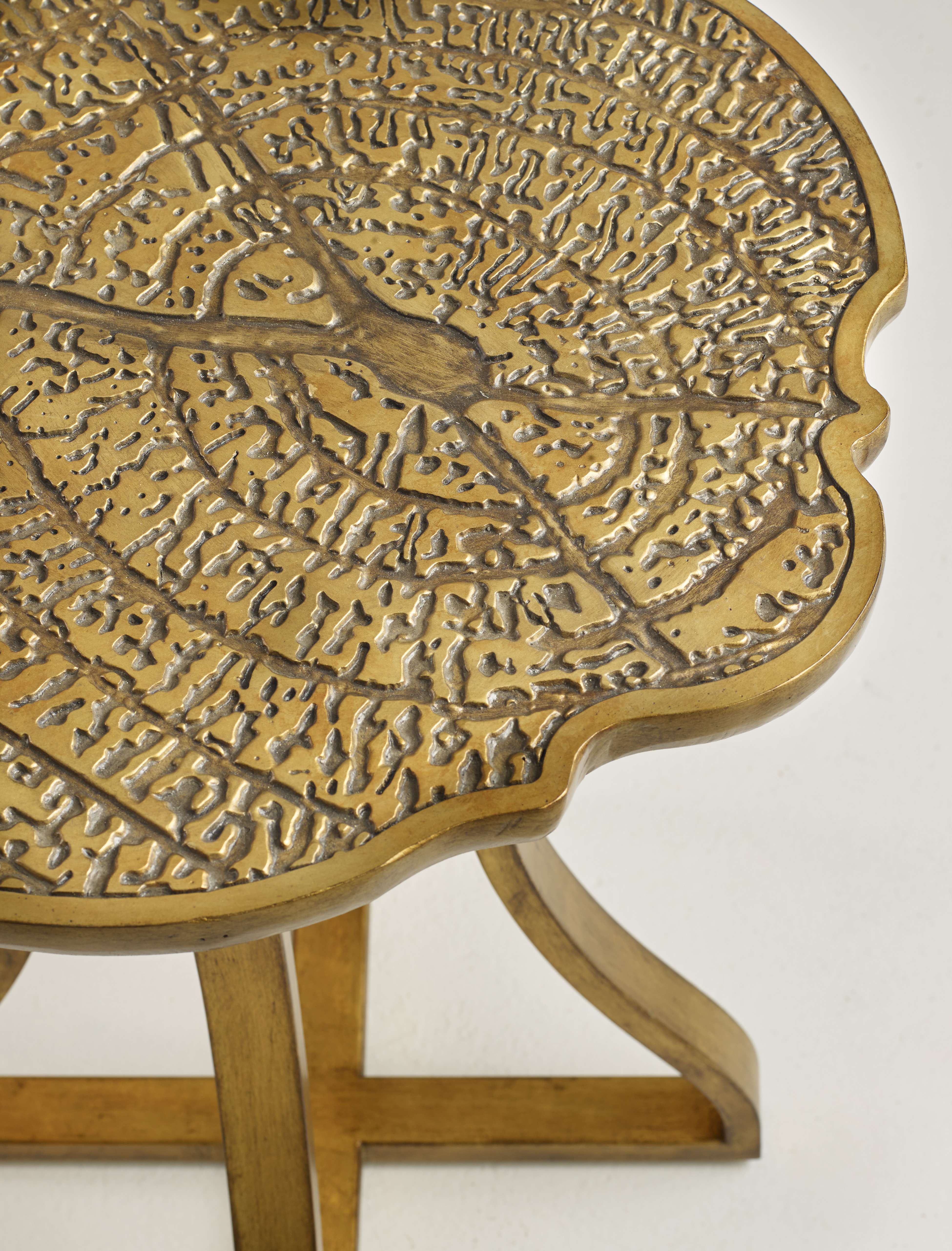
1586-50010-GLD2 Gold Bois Round Accent Table
Do you live in a place where the climate is harsh especially during the winter season? Where other people look forward to summertime, there are those who look at it like as curse because it can also be a cruel season. While you are looking to soak up the sun during the summer months, it might be difficult to justify an investment on furnishings which you would just use for a third of the entire year.
Don’t fret, though. There are now a lot of great options to look at for those great outdoor furnishings. Keep in mind that these pieces can also be used indoors should you want them there –
Powder-Coated Metal Furniture
Powder-coated metal seat is a great way to add color to your interior design. This is especially true during the winter months. In fact, if you use them indoors long enough, you might end up not taking them outdoors anymore. Whatever you end up doing with such a seat, this is a welcome addition to outdoor seating when you are setting up a barbecue party.
If the look of metal is too sharp for you, the best way to soften it is to throw a sheepskin on.
Garden Chair
You can create a more dramatic statement when you take a metal yet lace-laden garden chair. This can work well indoors, too, just use it with a modern console to set up the perfect writing nook in the living room or the bedroom. It can work beautifully in any rustic-themed bedroom. Place the chair beside a nightstand so you can have a read before you doze off.
Use the garden chair outdoors when spring has come. A more modern option is the plastic side chair that can be moved indoors and outdoors according to your needs. White is a versatile color whether the chair is painted wood, has fabric upholstery, or is made with plastic.
If the white chair doesn’t work for you, then consider using a white garden stool as an end seat for your casual dining needs. This will give you that bohemian flair.
Pair metallic chairs and have them placed at the foot of the bed. This should give the room a more charming appeal. This pair offers more versatility than the usual single bench.
Add bronze metallic chairs for a cozier breakfast nook. Bring in some potted plants or a vase of flowers for that unexpected fresh twist to any stainless steel kitchen or dining area.
Lantern
Even a well-lit home deserves decorative lanterns for a more charming ambience. These beautiful lights will add happiness indoors during the coldest winter months. During the warmer season, these lighting fixtures will surely work wonders on walkways and patios.
Stringing the lantern lights will also make them more awesome. Say yes to this and skip those holiday lights during the holidays.
Chinese Garden Stools
Two or four of these stools can be grouped to create a smarter alternative to the coffee table. These can be moved according to the needs of the party guests. As soon as it’s time to move to the patio, then all you have to do is to carry these stools without having your living room turn into a deserted area.
A garden stool made with ceramic can add color to the bathroom. This is the perfect place to put a towel, robe, even a book.
Kitchen Cart
Simple kitchen carts can also be beautiful accessories apart from being functional work surfaces. These are indispensable during summer when you want to do much of your cooking outdoors. A garden cart can also have practical uses indoors. This can be used to hold art materials, unused clothing and goods for donation or charity.
Tags: deck furniture, indoor-outdoor furniture, McCreerys, McCreerys Home Furnishings, outdoor furniture, outdoor living, outdoor view, patio furniture
Posted in Furniture, Interior Design 101, Interior Design Elements, Outdoors Style | No Comments »
Monday, July 25th, 2016
Hooker Furniture Living Room Sanctuary Four-Drawer Chest
Sky blue is a color that hints of the seaside; lets you picture springtime; and the bright blue skies. There are many reasons to love this calm color. You can use this in both interior and exterior parts of your home namely the ceilings, kitchens, bedrooms, even that cute picket fence.
All About Blue
Blue is the color of honesty, trust, even loyalty. It is often quiet, sincere and reserved. This isn’t your go-to color if you don’t want to draw attention as it detests confrontation.
Speaking of color psychology, blue is also believed to be a reliable as well as a responsible hue. Sky blue is confident and secure, it is a great color to give direction and order in any work or living space.
Blue seeks out tranquility and peace above any other characteristic. It is a color that promotes mental and physical relaxation, thus, it can reduce stress.
Don’t you just feel a sense of calm if you see a sea of cloud-like blue? It is because it can slow down one’s metabolism. The paler the blue color is the more independent you would feel.
In giving meaning to blue, it can also relate to one-on-one communication. This is especially true when you speak the truth verbally. Blue, in essence, is the public speaker, also the teacher.
Blue is an idealistic color. It enhances self-expression and one’s ability to communicate his wants or needs. This is a color that inspires high ideals.
If you are conservative when it comes to interior design, then blue is the right color for you. It is predictable, non-threatening, and safe. Blue can be determined in pursuing any endeavor that it is after.
Blue is difficult to alter because it is inflexible when faced with a different or new idea. It may analyze, consider, and mull things over but it has its own version of reality.
Blue can also be nostalgic as it tends to live in the past. If all these descriptions reflect your personality then you can go ahead and pick blue as your color scheme.
There are many other reasons why blue would work for you –
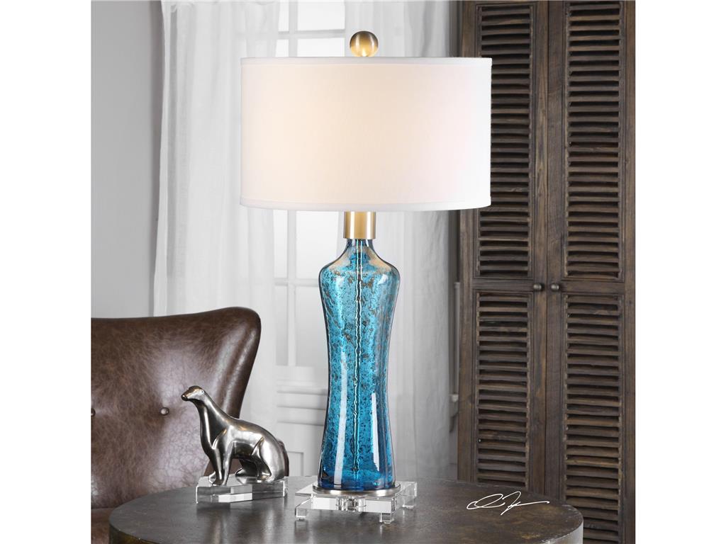
The sky blue of this Uttermost Lamps and Lighting Sekani 27207 blends beautifully with the chocolate brown background.
Blue Is Classic
Sky blue can be worn all year long. It can look great in spring, look fresh when paired with citron and pale green. During summer, sky blue’s vibrant partners are turquoise and white; and in the cooler months, you can warm up this color by adding rich orange, gold and chocolate.
Sky Blue Is A Crowd Favorite
Are you searching for a color that is usable in your home? Sky blue is fun and bright for those who like things to be flamboyant. It is also a subdued color for people who love the classics. This is a hue that is non-gender specific.
Sky Blue Is Enduring
If you are picking the colors for tile work, cabinetry, or a new sofa, then sky blue is a great hue to resort to. It will not look old or tired even after you use it for a season or two.
One other reason why sky blue is enduring is because it can cool down any warm hue. You can pair it with bright colors such as cherry red if you want to achieve a summery look. This color can also remind people of their childhood memories where they go to the beach or look at the clear, blue skies. Remember that nothing can be more beach-like than sky blue.
For a more polished look, sky blue can be paired with sandy or creamy hues. This is the traditional choice for a subdued living room scheme.
Tags: blue, blue color psychology, blue color scheme, blue design, blue interiors, McCreerys, McCreerys Home Furnishings, sky blue color scheme, sky blue design, sky blue interior design, sky blue interiors, tips
Posted in Color Schemes, Interior Design 101, Interior Design Elements | No Comments »
Friday, July 22nd, 2016
The Fine Furniture Design Living Room Settee 0811-02 is great for small homes because it is compact yet it is visually enticing nonetheless.
Have you taken the time to notice, lately, that most neighborhoods are showing bigger and bigger houses? See also how a nice row of like-looking houses is still an ongoing trend? More often than not, though, these homes are owned by small families. This spells less interaction among family members. The building of these giant structures are breaking down what should have been a close relationship among family members.
Going Non-Palatial
The recession made a lot of people realize that homes can be built a little smaller. They are a lot easier to maintain (and even pay for). And with the living costs rising each year, it becomes more and more reasonable to live affordably. This can be done by starting with the structure of your home.
It may not be that appealing to live in a smaller home if the basis is the series of United States Census where the average American home size is at 2,400 square feet in 2010. Large homes may be dominant but there are benefits that these colossal structures won’t be able to give.
Here are some of the major benefits of living in smaller spaces –
Energy Eficiency
Smaller homes are known to be more energy efficient. There is less space to cool or heat which also means that a smaller home as a lower carbon footprint.
Having fewer rooms also means that you won’t have a pricier maintenance expense. This also means less time spent on cleaning a lot of rooms. The time that you used to spend cleaning your home can now be spent on quality activities with your family. You can now spend more time outdoors, doing the things that you all love.
Hooker Furniture Living Room Melange Joli Nesting Ottomans: Find pieces that have dual functions.
Coziness
Gigantic rooms are often not cozy. Only smaller rooms can evoke this kind of feeling, and can even add a sense of intimacy which all larger homes lack.
Less Expense
Smaller homes are also less expensive to keep. These are designed to stay cool using cross-ventilation and shade. You can also enjoy the summer months by staying on the porch, keeping the windows open and using only fans. You will spend less with electricity when you use natural light and enjoy the natural breeze.
Compact homes are also well-built. They are less exposed to the natural elements. Just make sure that the construction materials used are sturdy.
An Improved Social Life
Being in a neighborhood with smaller homes means the structures are built closer to each other. Most gigantic homes are built with a large front and back lawns, plus more square feet of extra space. Add to that the fence, bushes and trees that cover these giant homes and socialization becomes virtually impossible.
City or city-like living means you have less space to sleep and walk around in but the great outdoors will serve as your grander home. With small space living, you have to learn to schedule your activities as a family outside of your home. If you live alone, then walk to and from work; enjoy biking rather than running in an elliptical trainer; or have dinner with someone at a fancy restaurant somewhere.
Front porches in neighboring small homes also have a welcoming feel to them. It’s like begging for you to pay your neighbor a visit. Big and grand areas are never within walking distance so if you want a lot of socialization, then it’s time to live in a smaller home.
Small Space Challenges
It would be wrong to think that small space living is sublime all the time. Smaller kitchen means less space for you to move around as you cook your food. It may also be awkward to live in a limited amount of space at first but you’d surely get used to it. Later on, you’ll realize that there are more benefits to living in smaller space than to keep a humongous place.
Tags: decorating a small home, decorating a small space, designing a small apartment, designing small homes, designing small space, energy efficient living, energy-efficiency, energy-efficient home, furnishing small apartments, furniture for small apartments, McCreerys, McCreerys Home Furnishings, small apartment furniture
Posted in Apartment Living, Condo Living, Interior Design 101, Interior Design Elements, Tiny Homes | No Comments »
Friday, July 22nd, 2016
1586-75200B-BRN Long Board Rectangle Dining Table with 2-20in leaves
The growing demand for brass, gold and other metallic accents has thrust the mixed-metal schemes to the public’s attention. The classic combination of gold and silver, the rustic charm of copper, and other metallic fusions form the foundations of a design or are just pieces of a much larger puzzle. So, whether you lovev Art Deco or the contemporary look, there is much, much more to the mixed metal theme that you can enjoy –
Pick Your Favorite
When you are out to mix metals, remember that you are still basically mixing colors. So the same rules apply – the dominant tone must have a secondary tone that would give the room a visual structure that works. Different items can have steely tones like the chair legs, the base of a lamp, or the curtain rods.
There isn’t a single, concrete formula that works for every home. How much metal you use depends on your taste. If you have no idea on how to begin, then it’s safe to start with 70-percent and 30-percent. This is a good ratio for one tone that is dominant and the other being the secondary hue.
Gold Is the Star of the Show
What is a metallic theme without gold, right? A lot of common items have gold tones such as small accessories and curtains. Not a lot come in silver, though. The most common silver pieces are mantel vases.
For gold-inspired theme to work, you have to make sure that the tone is carefully spread throughout the entire room. This color should not be cramped in just one place.
A large room with more elements and accessories should have a single goal – to keep the eyes moving throughout the room, with each metallic element shown here and there.
Fabrics in Metallic Finishes
Don’t forget to use fabric with metallic finishes when working with metallic tones. Add variety then spread the palette everywhere in your home. For example, you can use a gold-yellow accent pillow to bring warmth on a seat. This is an effective way of using metallic tones without going overboard.
You can also use one large object such as a coffee table as an anchor. The gold color of this table will serve as the dominant color and then accents can be added everywhere else.
While gold and silver are a great combo, it wouldn’t be wise to use a lot of silver. Silver is brighter and it tends to sparkle more than gold. Don’t drown the beauty of gold by using more silver. Just have a few hints of silver against the more dominant gold tone.
Choose and Fuse
It is possible to use more than two metal tones inside a room. When you do this, though, be sure to consider the actual size of the room. A wide room should have dashes of silver, copper and gold. These will add personality to the space without making it look cluttered.
Every metal must be equally represented. Allow each to blend with the rest of the natural and eclectic finishes. Every metal is approximately 1/3 of the metal palette so use it sparingly but visibly.
A smaller space – the ones that are smaller than 500 square feet – should have no more than two metal tones. This is so the space won’t look like an antique shop in the process.
Mismatch Mishaps
At times, the best way to have finishes balance elegantly is to not match them at all. An example of a dreamy space made dreamy by metallic tones is having a stool, accessories, and nightstand in different metallic colors. When you do this, be sure to make the cooler tones more dominant. So use more pale gold than silver.
Objects must also come with varying finishes. Your options range from the aged, polished to brushed.
Tags: McCreerys, McCreerys Home Furnishings, metal, metal design, metal theme, metallic, metallic decor, metallic design, metallic interior design, metallic interiors, metallics, tips
Posted in Accents, Interior Design 101, Interior Design Themes | No Comments »
Thursday, July 21st, 2016
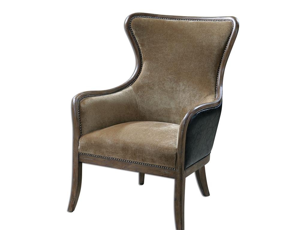
Living Room Uttermost Snowden Tan Wing Chair 23158
There is an ever-growing trend on velvet interiors lately. There are many beautifully-designed places – some are even featured in interior design magazines – where this lovely material is used. Using velvet as a replacement for any other material can surely be considered an upgrade. Before you set out and find furniture pieces clothes in this classy material, you might as well learn its history to appreciate it more.
Velvet and Its Rich History
Velvet, believe it or not, has been around for thousands of years. Different nations have used it for different cultural reasons, through the centuries. Velvet is a highly-valued material that was equated to power, wealth and royalty.
The modern world now has manufacturing methods that made velvet available to everyone. Thanks to the expertise of Englishman Edmund Cartwright who made the power loom in 1785. In our day, velvet is known to be more versatile than the type that ancient people used.
What’s great about this textile is that it will never go out of style. Imagine this material lasting through the early Renaissance, to the early Asian palace dwellers, all the way to Belgium which became a major producer of velvet during the 1500s.
Silk Velvet
This kind of velvet has a signature sheen and it is also soft to touch. One touch and you know you’re feeling a luxurious material. Use this material in areas that have light traffic only. Take note of this as it is keen on revealing the pressures that it goes through. Highly-exposed silk velvet will end up with a lot of marks and creases so limit it to rooms such as the bedroom.
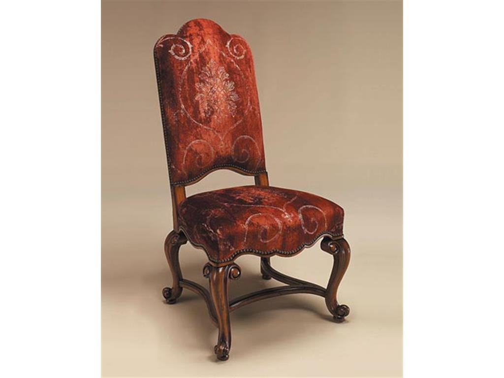
Maitland-Smith Dining Room Hand Carved Side Chair 4030-621
Linen Velvet
In contrast to the first type, linen velvet is more matte, hence, it has a shorter pile. It even feels drier when you touch it. It is easy to detect this kind of velvet; just look for that subtle strie and you know you’ve found one. This is not a defect, rather, a natural result of not being able to spin uniform-gauge yarn.
Here’s a tip, if you want to know the fiber content of a fabric, then be sure to read the showroom tags. The first item is often the face fiber while the second one is the ground fiber.
Cotton Velvet
This is considered as a tufted fabric. It is plain-woven with the pile and has about three millimeters of surface fiber length.
Cotton velvet may not be easy to clean, it even absorbs dyes well, but it is a thing of beauty if you know how to take care of it.
Nowadays, modern cotton velvet contains polyester fibers which make the fabric more resistant to wearing and tearing.
There may be dye-lot issues so ask for the showroom staff to order you swatches of the present dye lot. You would be surprised that velvet color may look different in the store than when you bring the actual swatches in your home.
Wool Velvet
Coziness and warmth are two of the elements that make velvet stunning. Wool velvet is a durable upholstery for those wintry months. This will feel hot during the summer season, though, so use a slipcover during the warmer seasons. Just make sure that the slipcover is loose, though, as it may ruin the nap if it’s too tight.
Mohair Velvet
This is a kind of wooly, soft fabric made from the silky hair of an Angora goat. And, nope, this is not the same as the Angora rabbit wool. If you want to cover your headboard or sofa with mohair, then be sure that you are really decided. This material could last for a very, very long time.
Tags: design textures, history, McCreerys, McCreerys Home Furnishings, texture in interior design, textures, tips, velvet, velvet design, velvet designs, velvet furniture, velvet history, velvet in interior design, velvet pieces, velvet styles
Posted in Accents, Interior Design 101, Interior Design Elements | No Comments »
Wednesday, July 20th, 2016
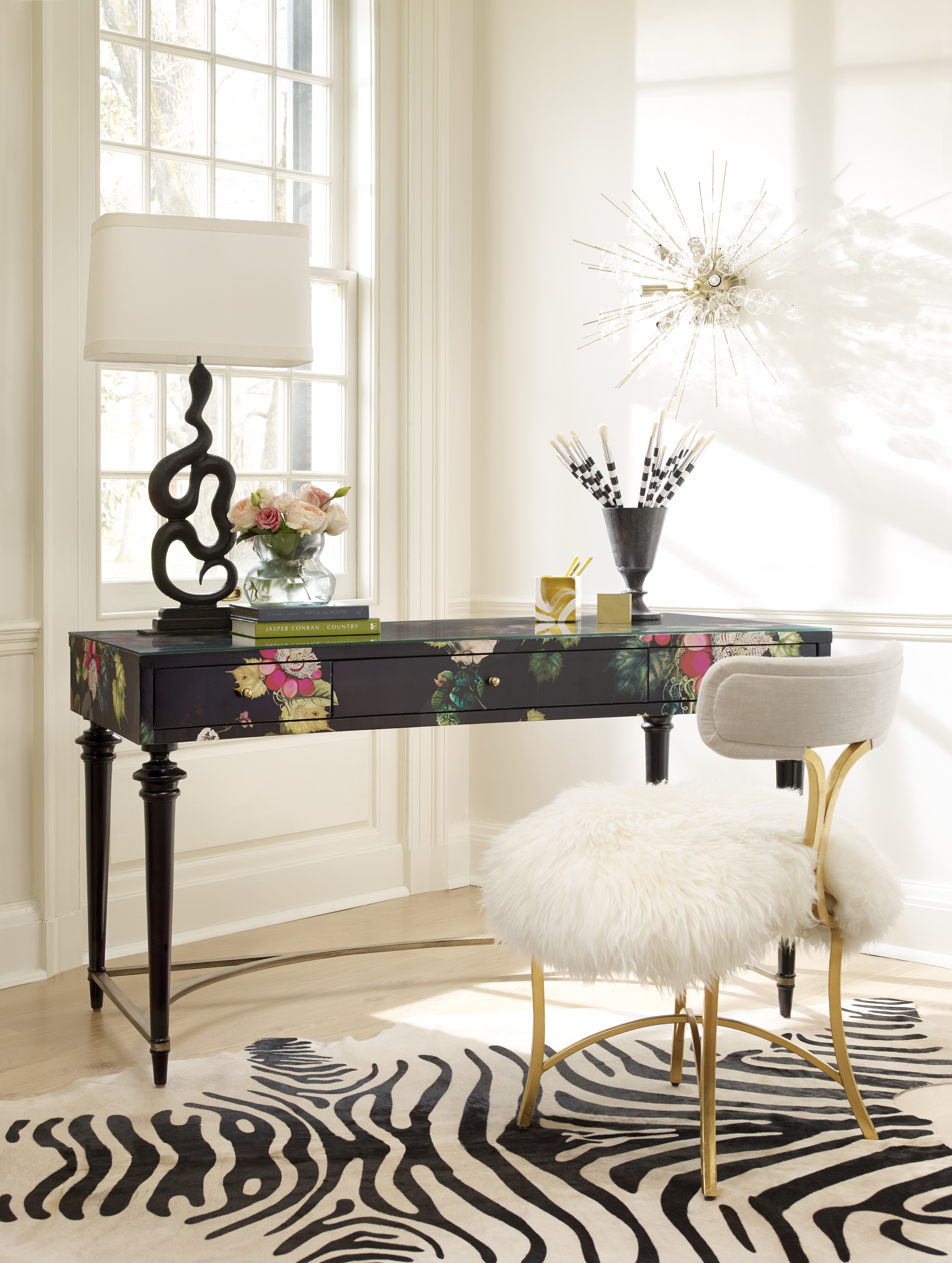
1586-10458A-MULTI2 Fleur de Glee Writing Desk 1586-75410D-GLD6 Swanson Upholstered Metal Side Chair
White may be white but there’s a lot of white to choose from. Neutrals may be quite popular but they can be uninspiring especially in the wrong hands. Popular design options include owning investment pieces such as sofas and sturdy cabinets that are neutrals yet it can be fun to take a risk sometimes. Your paisleys may not awe everyone all the time yet it’s the thought of being fearless that counts. If you’re ready to take risks in interior design, then here are some tips that you can consider –
Be Yourself
Here’s a point when you have to be honest. Not a lot of people would want to combine three different fabrics plus an animal print rug so why jump in? Most of the time, simplicity is all it takes to have fashionable interiors.
Fuse shades and hues coming from a single color. This monochromatic move is a popular scheme used by many designers. When you step up and layer two different shades of blue, with two shades of red, plus an accent of neutrals, then what you have achieved is a risk worth taking.
All that taking risks entails is for you to be yourself and to not try to pretend to be someone else.
Lovely Neutrals
If you happen to own a neutral sofa, then you have the leeway to use pillows, paint colors, and draperies in bright colors. Are you a huge fan of brown? Then pair it with your textured, neutral-colored sofa.
Fear Not
Don’t think that being artsy is all for Art students. You, too, can take risks by using bright, clear hues and having them mixed with other interesting colors. Bold may be dramatic but it is a good way to make a statement. The colors of the pillows that you use on your sofa will surely capture the attention of your guests.
The stairs are an often overlooked place when it comes to interior design. This may be on the same level that you use the powder room to experiment on a few wallpaper options. Stairwells are small spaces that do not have furniture. It doesn’t have much of the design elements that are often used in other rooms. Since this is the case, make good use of the non-existence of furniture here by hanging a beautiful, framed work of art. This can be a colorful painting or a huge photograph of your entire family.
Focal Points and Your Leap of Faith
There are many design tricks in interior design books but one of the rules that can magnify the impact of design in your home is to pick a focal point that you could use. Having a transparent coffee table, for instance, will not strain the eyes, thus, they will have time to look at the visual load that is offered by the furniture pieces.
So don’t chicken out – just take your time and choose the pieces that will go in creating that non-traditional look.
Did you know that not all geometric pattern pieces automatically become the focal point? Add interest by using a little geometry to make the room a little more interesting.
If you want to go on high speed in terms of your interior design, then just have a single expressive wall color. Find also an adorable fabric that can make hearts beat a tad faster. Weave the fabric throughout the room, there’s no need for a lot of patterns in order for a room to become more exciting. At times, all that you would need is a fusion of one bold color and a special pattern and you’re good.
Tags: bold design, bold interior design, bold interiors, bold statement, interior design risks, McCreerys, McCreerys Home Furnishings, neutral, neutral colors, neutral hues, taking the risk in interior design, tips
Posted in Color Schemes, Interior Design 101, Interior Design Themes | No Comments »
Wednesday, July 20th, 2016
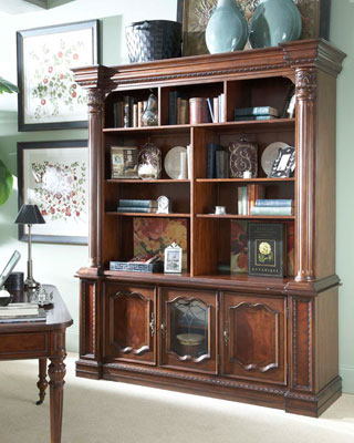
FFDM Antebellum Collection: This is a classic take in setting up a library.
Organizing bookshelves may not be your idea of spending the weekend but there are actually people who are extreme enthusiasts. The bibliophiles even think that books have their own personalities, even histories, thus, they should be displayed for the world to see, not hidden. You may not be as extreme as these people but it is, nevertheless, needful to have books organized.
The Book Organizing Project
It might be a bit challenging to begin organizing your book collections but your efforts will not be wasted, you’ll see. Once every book has a place to call its home, you will soon feel the joys of clutter-free surroundings.
Consider also if there are books that you would be willing to donate. Once you have segregated the books that you still read and those that you will give away, then it’s time to see what sort of bookshelf you will be investing in.
A Place to Reflect
You don’t have to be obsessessed with books just to organize your own library. Actually, it doesn’t even have to be a designated library. There are corners and spaces in your home that are not used or misused. Find those areas and consider setting up your bookshelves or book cabinets there.
If you have a huge collection of books, though, you can make the library as the heart of your home. You can combine the first and second floors of your home then have a circular staircase complete the two-storey library. The double-height book home will surely be more enticing if the stairs are made with elegant oak.
Other options for larger book collections is for the shelves to run from floor to ceiling. You can have a special ladder to go with these shelves. This is the best tool for easy browsing among these shelves.
If you are feeling more magnanimous with your budget, then have your house built around your book cabinets or shelves. These shelvings look best with exposed wood beams and other industrial theme elements. Your book volumes could also stretch up to two storeys accessible by a wooden staircase. The top can have a simple desk overlooking the garden right outside your home. Picture yourself reading a book here while you peek – once-in-a-while – over the top of the novel that you’re reading.
With smaller collections, you can make do with a book tower. Build this by simply stacking books on the floor. A small wooden desk can also hold your small collections.
Another choice that you can make is to convert an unused corner into your reading nook. Have a designated desk and chair by that corner and have a small stack of books placed on the desk. If you install a corner shelf to house your books, then make sure that it follows the ceiling’s angle. Yet another wooden ladder would make accessibility a breeze.
A crafts desk could also serve as a companion to your bookshelves. Here, you get to hang your arts and crafts on the wall where the desk is nearest. The books can be organized according to the color of their spines if you want to up the level of artistry in that corner.
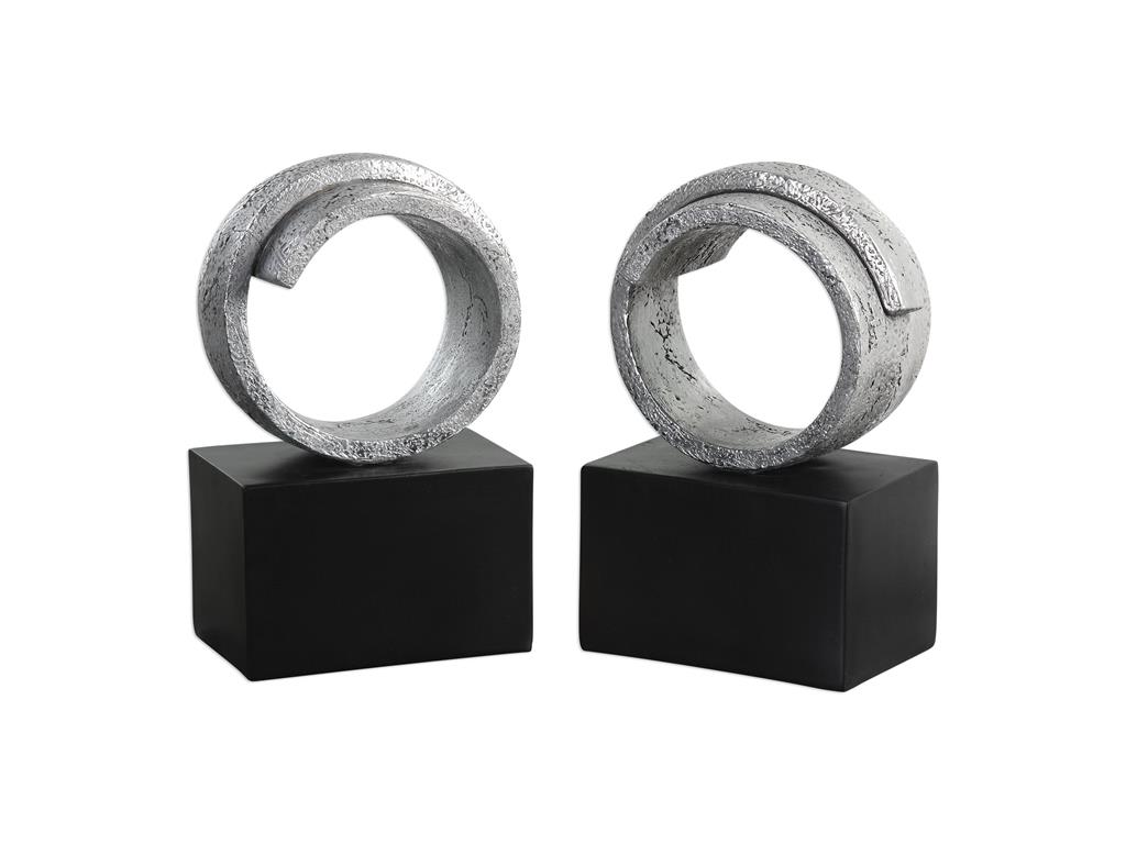
The Uttermost Accessories Twist Bookends 20140 aren’t your usual bookends.
A Last Reminder
No matter what you decide to come up with regarding your home library, the key is to be able to display the books in a manner that won’t look boring. These books, after all, are meant to be shown. Add a personal touch by mixing a photograph or two in the bookshelves. Remember that saying which says a picture is worth a thousand words? These framed photos should make the display a lot more interesting.
Tags: book collection, book display, book organization, decorating the bookshelf, display tips for books, displaying book collections, displaying books, home library, how to display books, library in your home, McCreerys, McCreerys Home Furnishings, organizing books, setting up a home library, tips
Posted in Interior Design 101, Interior Design Elements, Special Rooms In Your Home | No Comments »
Tuesday, July 19th, 2016
FFDM Summer Home Collection: The unifying color in this traditional bedroom is brown in different shades.
Color preferences vary per person, per personality. Some folks like it bright and daring, some feel more secure with neutrals, still others like to experiment. The good news when it comes to using colors is that there is no such thing as a correct palette.
Have you ever gotten inside a home where there is an explosion of colors only to feel that every room seems to be detached from the rest? What’s missing here is what’s referred to by interior designers as cohesion.
The Cohesive Paint Color
A simple way of creating a more cohesive feel is to have color consistency on walls. Connecting spaces, in particular, should have paint color that will harmonize them. This is especially true in an open floor plan.
This does not mean that you should automatically resort to gray, white or beige. You can still use a color that suits your preference so long as the hallways, the foyer and the main connector room are all painted in the same color. The color that you use there will serve as the dominant color in your home.
Plan the Color for Sightlines
People who want variety in their wall colors should pay more attention to sightlines. These are those areas when you are standing inside the living room and you get to look into the other rooms. A clear view of the dining room or the kitchen from there means you have to paint these three rooms with the same paint color. The key here is for all three rooms to work together. Paint them in different colors and what you’d get is a weird look that simply won’t work.
Hooker Furniture Dining Room Sunset Point Rectangle Dining Table with Two 18in Leaves
Pick Color Groups
Just as you are admonished to choose your friends well, this is also the case when it comes to choosing your color gang. Your color scheme must effortlessly flow from one room to the next. To achieve this, make sure that you get colors from the same temperature family.
Some people choose to work with the warm color palette, others the cool color scheme such as the blues, grays, and greens.
Another option is to pick one or two hues then use variations. If blue happens to be the main color, then you could pair it with gray-blue or you can always go with pure blue which shifts to navy blue as you move from one room to the other.
This same concept can be used in using decorative accessories.
As for your wall paint, paint stores can provide you with tint of particular colors. Your chosen main color can be knocked down to about 50%; all the mixer has to do is to add more white each time. You can go lighter or darker with the main color that you choose.
Walls should be painted two to three shades lighter than the ceiling color. This won’t look stark when you decide to use white.
Paint decks are also great inspirations in finding colors that harmonize.
Edgy Colors, Hid
Rooms that are out of sightline are great places to experiment on in terms of wilder colors. Powder rooms, master bedrooms, kids’ rooms, and other rooms that are encased in four walls are places that you could colorfully indulge.
So, have you always wanted to paint a room black? Begin with the bathroom!
Bold Colors, Cute Accessories
Accessorizing is an easy way of introducing dramatic hues. Limit the bold colors on your accessories, this is if you’re still uncomfortable about the whole switch from neutrals to bold colors.
Choose a color that will excite the senses, bright colors are great in highlighting a thing or worth.
Tie the rooms with accent colors that alter from room to room, though continuing with the major color throughout. Blue and green in the living room, for example, will mean using one of these colors inside the dining room. You could do blue and yellow in the next room.
Always keep the colors cohesive so that your theme would make more sense to you.
Tags: adding colors to a home, color 101, color basics, color harmony, harmony, McCreerys, McCreerys Home Furnishings, symmetry
Posted in Interior Design 101, Interior Design Elements | No Comments »
Follow us on our social media
© McCreery's Home Furnishings | All Rights Reserved | Privacy Policy