- Follow us:


Tuesday, February 5th, 2019
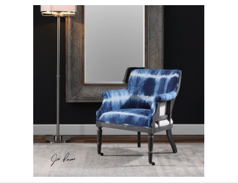
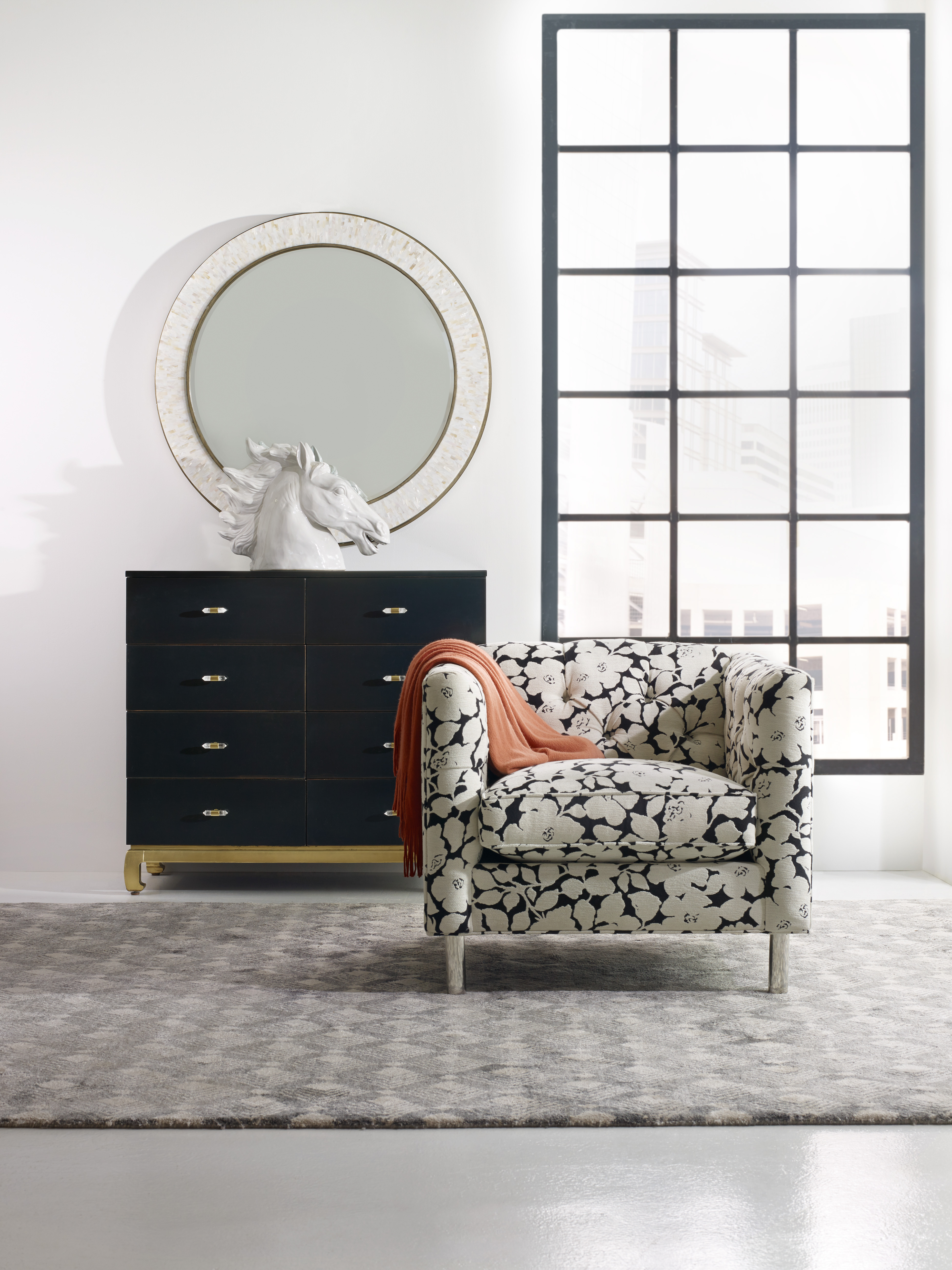
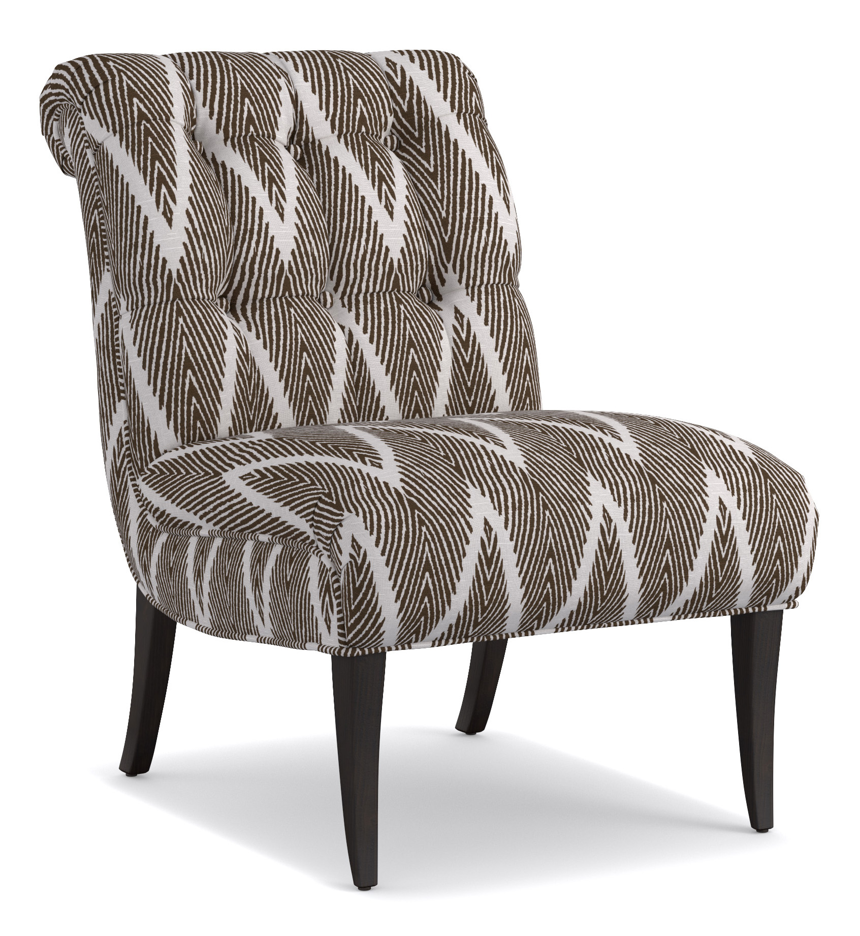
The Uttermost Living Room Royal Cobalt Blue Accent Chair pops from the neutral and dark fusion on its background.
There are many different parameters that help shape design. If one would look at each one’s design, everyone has a preference or taste that’s distinct. Even the relationships that each person goes into are indicative of his or her qualities and perspectives in life. At the bottom of it all is each one’s personality.
Each individual’s personality is the catalyst to an environment, emotions, even the ups and downs of his or her life. This is the same force that repels or attracts other people. Personality almost always dictates ever aspect of a human’s life.
Color is the best way to add unique touches in anyone’s home. It is known to have a profound effect on people’s emotions and moods. Putting bright colors in your interior design can help create a jovial atmosphere.
If you’re willing to go way beyond happy, then you can be playful. Neon shades are the boldest. You can also make use of a feature wall or splashes of hues that are strategically situated. Practically any room can have neon hues or any vibrant colors, it’s all a matter of knowing how to use them.
Lately, modern interiors have been showing a lot of bold colors. The key here is to have restraint no matter how the colors might excite you. Too much of any color isn’t going to look right. Sometimes, all it takes is a hint or two on the furnishings or textiles and you will achieve the ideal.
Here are more ways that you can use bold colors in your home –
Be Familiar with the Color Wheel
If you’re going to use bold colors, then be familiar with the color wheel. This tool can help you pick the right colors for your interior design. The 12 shades have been arranged and divided into cool and warm hues.
The cool colors include shades of blue, turquoise and violets. The warm shades are the red shades and oranges.
Analogous colors, which are placed right beside each other on a color wheel, tend to work well when they are fused. These are the best colors to harmoniously blend everything else in the space.
Consider also the tone and saturation of the colors that you pick. The saturated shades tend to be more vibrant while the less saturated hues are the muted versions of a basic color.
Apply the 80:20 Rule
This rule is crucial when you’re designing. This basically means that 80-percent of the room should be kept neutral while the rest, at 20% must be bright-colored. This is the technique in creating a statement in a way that’s just enough so that the look isn’t ruined.
An example of this is when muted gray and yellows are used on the walls as the sofa is a bright lemon hue. This is an interesting contemporary statement.
If you’re a bit cautious in spending your hard-earned money on colorful pieces of furniture which you may end up regretting, then it’s okay to begin with less of a commitment.
You can always go with a neutral couch that’s highlighted by bright-colored throws. These pieces will give you the same boldness without committing too much. Should you decide to push through with the furnishing investment in the future, at least, you saw and felt how it was to have bold colors in your home in a non-pricey way.
Light and Shade
If you have a home that’s filled with daylight, then all you have to worry about is to look for dramatic tones that will serve as accents. Whichever colors you end up choosing, strive to design the space in an inviting manner and never shocking.
Tags: bold colors, bold hues, bold interior design, bold interiors, McCreerys, McCreerys Home Furnishings
Posted in Accents, Color Schemes, Interior Design 101, Interior Design Elements, Interior Design Themes | Comments Off on Are You Daring Enough for Bold Interiors?
Wednesday, November 16th, 2016
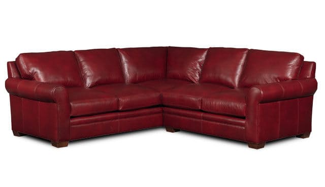
Bradington-Young Sectionals 224 Landry Sectional is red, bold and an obvious statement piece.
The world of neutral and bright-colored palettes can be a wonderful place to be in. You won’t have to worry about adjustment or playing with ugly combinations. It is safe so just about anyone can use them. Make sure that you don’t go overboard when you are out to create a bold statement for your home, though.
Bold does not necessarily mean the saturation of colors or, by default, the accent wall. Bold could also mean the overall appeal of the theme that you have chosen or created. If you would like your home to represent how bold you are, then here are some delicious tips that you shouldn’t miss –
Bold Means to Accentuate
If you want to go beautifully bold in your home, then use colors effectively. Decide which color will accentuate the space best. Having more natural light means you can control the amount of darkness or brightness using curtains, blinds or draperies. Add more dramatic colors to amp up the drama in the room without creating an overpowering space.
For a room that does not have ample lighting, choose bright colors or the more saturated colors. These should naturally reflect the light and would make any bold color appear more inviting rather than daunting.
Bold Means to Decorate
Do you own any bold piece of accessory or artwork? Then this is the perfect time to bring them out. Of course, you wouldn’t want your furnishings to clash so use a neutral palette of white hues and blacks as the backdrop. This should be a gorgeous and bold canvas that anyone with an artistic mind can work on.
You can then pick two colors all throughout your space for a more unified look then showcase your sculptures, wall art, or even a bold area rug as a statement piece. Don’t worry about getting wrong because it’s all about balance. If something appears to be off, then something might really be off. Be sure to balance the bold piece with neutral room finishes, furnishings, etc.
Bold Could Also Mean Subdued
There are interiors that are viewed as both bold yet subdued. These two seemingly clashing descriptions can actually work together – but you should know how. For instance, the Shangri-La guilded table by Cynthia Rowley can play the bold role while the rest of the surroundings remain neutral. Yet, the place looks both bold and calm, it’s all according to your perspective.
Bold Means Making a Statement
Your home is that one place on Earth where you should be the one to dictate everything that’s displayed. Since this is so, you are free to make a statement. Go ahead and hang that flashy chandelier all because you want to! Just learn to play with the rest of the space so that the room won’t appear garish.
If you’re starting to feel that the room has come to a point where there’s too much activity, then remove a bold color or two. It might also be as easy as taking down window treatments that are blocking natural lighting.
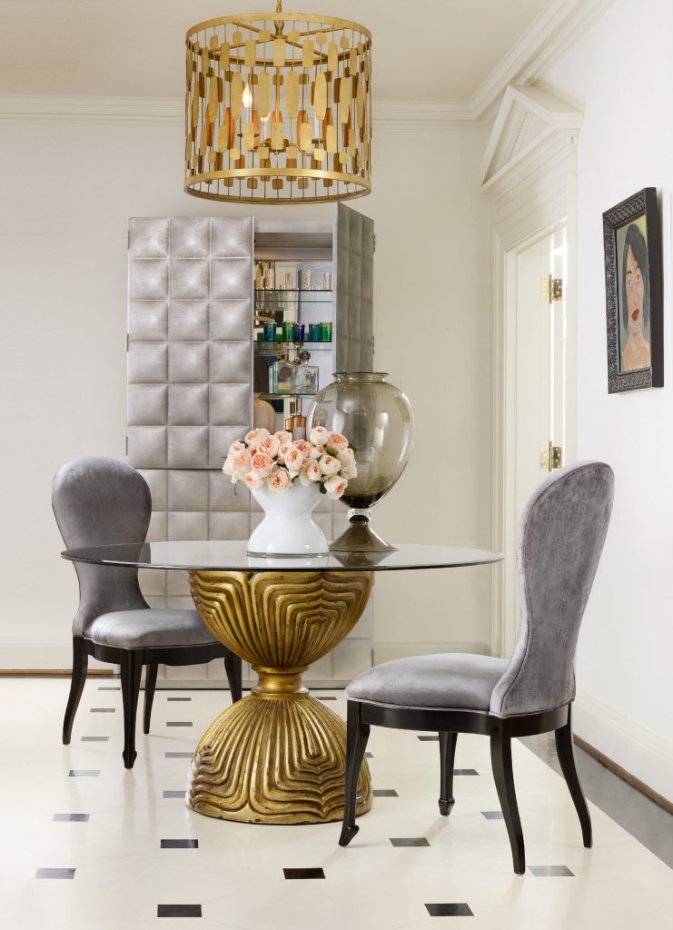
Cynthia Rowley for Hooker Furniture Shangri-La Gilded Dining Table Base: What could be bolder than gold?
Bold Means Colors
Bold would always mean colors. Hues are the best way to add unique touches to a home. Colors have a profound effect on health, feelings and moods. Since this is so, go ahead and decorate for a happier atmosphere. Splashes of color, when strategically placed, will create the best modern interior for a homeowner and bold interiors are all about making that bold statement.
Practice restraint in using bold colors, though. Use hints, here and there, or add a whole new bold wall then pattern the furnishings and textiles to the color that you chose.
Lastly, use the 80:20 rule when decorating. This means 80% of the room must be neutral and the 20% should be bold-colored. Go beyond this and you’re already overdoing it.
Tags: bold colors, bold design, bold hues, bold interiors, bold statement, McCreerys, McCreerys Home Furnishings, tips
Posted in Accents, Interior Design 101, Interior Design Themes | No Comments »
Wednesday, July 20th, 2016
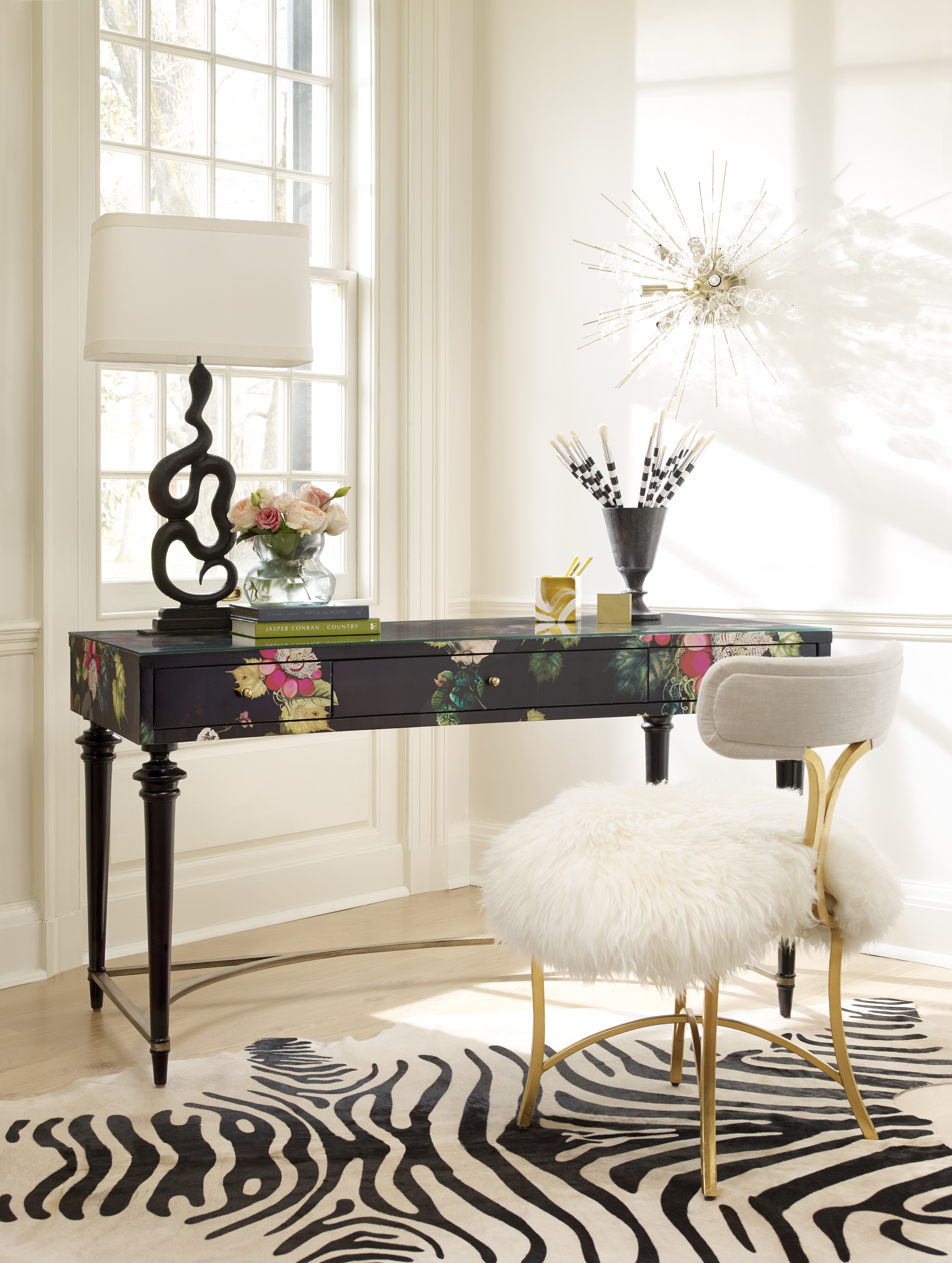
1586-10458A-MULTI2 Fleur de Glee Writing Desk 1586-75410D-GLD6 Swanson Upholstered Metal Side Chair
White may be white but there’s a lot of white to choose from. Neutrals may be quite popular but they can be uninspiring especially in the wrong hands. Popular design options include owning investment pieces such as sofas and sturdy cabinets that are neutrals yet it can be fun to take a risk sometimes. Your paisleys may not awe everyone all the time yet it’s the thought of being fearless that counts. If you’re ready to take risks in interior design, then here are some tips that you can consider –
Be Yourself
Here’s a point when you have to be honest. Not a lot of people would want to combine three different fabrics plus an animal print rug so why jump in? Most of the time, simplicity is all it takes to have fashionable interiors.
Fuse shades and hues coming from a single color. This monochromatic move is a popular scheme used by many designers. When you step up and layer two different shades of blue, with two shades of red, plus an accent of neutrals, then what you have achieved is a risk worth taking.
All that taking risks entails is for you to be yourself and to not try to pretend to be someone else.
Lovely Neutrals
If you happen to own a neutral sofa, then you have the leeway to use pillows, paint colors, and draperies in bright colors. Are you a huge fan of brown? Then pair it with your textured, neutral-colored sofa.
Fear Not
Don’t think that being artsy is all for Art students. You, too, can take risks by using bright, clear hues and having them mixed with other interesting colors. Bold may be dramatic but it is a good way to make a statement. The colors of the pillows that you use on your sofa will surely capture the attention of your guests.
The stairs are an often overlooked place when it comes to interior design. This may be on the same level that you use the powder room to experiment on a few wallpaper options. Stairwells are small spaces that do not have furniture. It doesn’t have much of the design elements that are often used in other rooms. Since this is the case, make good use of the non-existence of furniture here by hanging a beautiful, framed work of art. This can be a colorful painting or a huge photograph of your entire family.
Focal Points and Your Leap of Faith
There are many design tricks in interior design books but one of the rules that can magnify the impact of design in your home is to pick a focal point that you could use. Having a transparent coffee table, for instance, will not strain the eyes, thus, they will have time to look at the visual load that is offered by the furniture pieces.
So don’t chicken out – just take your time and choose the pieces that will go in creating that non-traditional look.
Did you know that not all geometric pattern pieces automatically become the focal point? Add interest by using a little geometry to make the room a little more interesting.
If you want to go on high speed in terms of your interior design, then just have a single expressive wall color. Find also an adorable fabric that can make hearts beat a tad faster. Weave the fabric throughout the room, there’s no need for a lot of patterns in order for a room to become more exciting. At times, all that you would need is a fusion of one bold color and a special pattern and you’re good.
Tags: bold design, bold interior design, bold interiors, bold statement, interior design risks, McCreerys, McCreerys Home Furnishings, neutral, neutral colors, neutral hues, taking the risk in interior design, tips
Posted in Color Schemes, Interior Design 101, Interior Design Themes | No Comments »
Thursday, June 16th, 2016
1586-90001-BLK2 The Poet Eight-Drawer Dresser
Modern design embodies a lot of elements which is why it is not easy to define it. In the most basic terms, though, this is the reflection of modern art movements inside homes. There are different central features and design themes that can be considered modern.
Modern designs were society’s objection and rejection of the ornate styles like Renaissance, Gothic and Victorian. Furnishing designs that you could include are Art Deco, Mission Style, and Shaker.
Modernism Means Clean, Straight Lines
Modern design – since it was designed to become the antithesis of complex themes, heavy textures, wood tones and carvings – is supposed to have nothing but linear designs. If anything geometric is to be placed, then it has to be controlled and scarce.
Modern furniture and other design components include clean lines with no frills. It differs from contemporary design which can include sweeping lines and curves. The lines in modern design are more crisp and sharper.
Materials that you could pair with your furnishings include oversized tiles, sanded wood flooring with minimized grain and smaller shelves and bookcases. The open space layout is most welcome as is the lack of molding and trimming on doors, windows and walls.
Say Hello to Metal
Stainless steel and chrome are two of the biggest elements used in modern design. In fact, a modern home would be less, well, modern in the absence of metallic pieces. Stay away from traditional metals, though, such as wrought iron. Instead, go for the cleaner, most polished metals.
For your home to be considered modern, be sure to use a lot of stainless steel and chrome. Have the exposed chair frames and table legs covered with any of these two metals.
Chrome is also used extensively in other home components such as doorknobs, faucets, lamps, cabinet handles and railings. It is known for its polished beauty and a slightly blue undertone.
Less Is More
Modern homes are also minimalist homes. The basics of being a minimalist are the absence of complex details, less color, and just the right amount of textiles. Even in the absence of a lot of things, it is safe to say that minimalist homes are well-planned homes. They are actually comfortable since all are streamlined for efficiency.
The minimalist and modern approaches share one other great aspect – zero-clutter. Clutter could mean different thing to different people but if you want the modern design, then just retain the essential pieces. This means saying no to pottery, vases, trinkets, and a lot of throw pillows.
Necessities are books, keepsakes and electronics. While these are still needful, they are almost always kept out of sight through proper storage.
Modernism Is Bold
Many homes designed in modern styles make use of neutrals, black and white. Yet this does not mean that you should shun using brighter colors. You can break the monotony created by the neutrals by setting up focal points. The primary colors are often used sparingly.
Hang a colorful wall art, a bold-colored sofa, brightly-colored pillows, or an accent wall.
Modernism, Modern You
In essence, all the things that you see in modern design are the result of modern thinking. Modernists were allergic to excessiveness, too much intellect, and cultural norms. They wanted to push off boundaries with regard to creativity and culture.
The modernists’ movements also included saying no to organized religion and the belief in a god. To them, modern norms had to be created and more suitable norms be instilled, hence, the birth of futurism, cubism, Neo-Dada, Bauhaus, abstract expressionism, and others.
To the world they shouted – Make It New. So, are you ready to apply what you have read?
7067-001CR Wallis 2 Cushion Sofa
Tags: bold, bold design, bold interiors, McCreerys, McCreerys Home Furnishings, minimalism, minimalist, minimalist design, minimalist space, minimalist style, modern, modern design, modern interior design, modern interior design tips, modern interiors, modern style, modern theme, modernism
Posted in Interior Design 101, Interior Design Themes | No Comments »
Tuesday, May 17th, 2016
This Cynthia Rowley ensemble incorporates geometric patterns among neutrals, dark hues, metals and colors.
Isn’t it a designer’s job to keep an eye on the latest trends? The answer here is no. As a homeowner, it is also your responsibility to be abreast with the latest when it comes to interior design trends. What are hot right now are geometric patterns with these popping more and more in many modern homes. There shouldn’t be any reason to shun this bold style. As long as it is done correctly, following the trend can be a wonderful way to boost the look of any room.
A Blast from the Past
Here’s great news about trends whether relating to fashion or the interiors of a home – they share common properties. So whether these existed in the ‘70s or are contemporary, you will soon see something common in the geometric patterns that were used in homes then and now.
The popularity of geometric patterns, or any other interior design trend for that matter, comes back in a circle. It is a cycle that can be reinvented in every new decade. Try to look through pictures from your childhood. What was considered chic then are often not too different from what we consider to be stylish nowadays.
It won’t be a stretch to notice that geometric patterns have just returned. Just keep an eye on the simpler and bigger patterns, though, as these can give your place a more refined ambience. The traditional look has always been able to evoke the ‘70s vibe. If you want this retro look in your home, then consider the thinner stripes and shapes.
Cynthia Rowley for Hooker Furniture: 1118CR Delancey Club Chair
Visually Stimulating
Achieving the look of a home that seemingly leapt off an interior design magazine is not impossible. All you need is to add something that will make the place more visually interesting.
So what’s geometry got to do with visual stimulation?
A lot, actually.
There is nothing more boring than looking at walls upon walls of neutral paint and rows of boring furniture. As far as adding visual interest, you should consider using patterns in your design. geometric patterns create visually enticing rooms as they move the eyes from the boring stuff and, inevitably, towards them.
To choose the right kind of geometric patterns, you have to know what color scheme you have to work on. Make sure that you use the correct size of print which won’t overwhelm the room’s size or the design which you are trying to set up.
Cynthia Rowley 1102CR Perry Chair
A Dash Is All It Takes
Having a great interior design is all about knowing the elements that would work together. Harmony, after all, is a major concept that you have to master when it comes to interior design.
Would you be using geometric patterns as a dominant element or would they play an accent role? It will be overwhelming to have an entire room filled with geometric patterns. While it is not your desire to bore your visitors or loved ones with neutrals, it is also not good to resort to too much activity by bringing in all the geometric patterns that you could find.
Geometric Upholstered Furniture
The applications for geometric patterns are actually limitless. The great thing about them, too, is that every piece will comfortably fit in any kind of design. Blending with the room features is also not difficult.
So as not to overwhelm, you can have the geometric patterns on your upholstered furniture. This is the safest and most stylish way that you could incorporate this design element to your home. Being more powerful in your design is also easy; all you have to do is to seek out the bolder geometric patterns and you’re on your way to create a
Tags: bold, bold design, bold interior design, bold interiors, bold statement, geometric, geometric concept, geometric design, geometric elements, geometric furniture, geometric interior design, geometric interiors, geometric patterns, geometric style, geometric upholstery, McCreerys, McCreerys Home Furnishings, patterns
Posted in Interior Design 101, Interior Design Elements, Interior Design Themes | No Comments »
Wednesday, April 6th, 2016
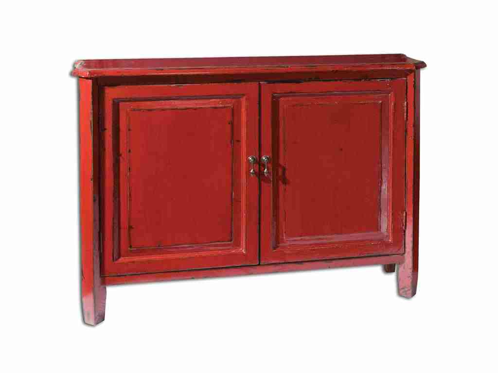
Living Room Uttermost Altair Red Console Cabinet 24404 is vibrant, attractive and one-of-a-kind.
Many designers casually use the terms tint, hue, shade or tone when referring to colors. But do most homeowners actually understand the meaning of each? Or are they just different names for the same term? The painter has to know the difference in each so he will be able to communicate effectively about color mixing and his painting job in general. As a homeowner, perhaps, it is about time to get to know the terms often used when it comes to paint and color schemes.
The term hue is far from being complex. This is a reference to color more specifically the colors found on the color wheel. If you are familiar with the color wheel, then you’d know that there are three primary colors which are red, blue and yellow. The secondary colors are violet, green, and orange. The tertiary colors are those that fill in the gaps between the primary and secondary hues.
Have you noticed how black or white is not considered a color? And have you wondered further where they should be located in the color wheel? You won’t have to worry about these two because you won’t
Canadel Dining Room Arm Chair CHA5040TF has a sienna washed colored fabric.
find them on the color wheel. What you need to study are how shades, tones and tints can be variations of different hues that are found on the color wheel once black or white are mixed with any of them.
Canadel Dining Room Arm Chair CHA5040TF has a sienna washed colored fabric.
Hello New Colors
You probably love colors but very few people are familiar with the most exotic hues used in interior design. There are literally hundreds of colors that you need to become familiar with if you want to be well-versed in color knowledge. For example, there are hundreds of blue shades. Most of the time, there are even histories involved in the creation of a unique color.
Why not be the first one in your group to extensively discuss these new hues?
For the first example, there’s smalt.
Smalt is a deep blue shade that is often used in ceramics. Literally, this is glass that is made when cobalt salts a11re mixed with molten glass. This mixture creates purple undertone that is barely distinguishable. It offers a luminescent quality which is why it is best used on statement walls.
The next new color on our list is byzantium. This is a lively purple shade that is sometimes interchanged with fuchsia. Byzantium is derived from purple while fuchsia comes from pink.
Byzantium looks great with gray, black, yellow or blue.
Cordovan is a rich hue of brown or burgundy. This is often associated with leather, mostly leather sofas. The name came from Cordova city in Spain which is famous for its manufacture of fine leather.
Sienna is one of the more famous colors on this list of unique hues. It is reddish brown and is often used in earthy themes. Its name comes from Siena, Italy and is also used in reference to clay that contains manganese oxide and iron oxide.
Vermilion also comes with a bright red hue. It can also be reddish orange at times. This is a classic shade that is used on many gorgeous lamps and lacquer ware.
‘Ever heard of gamboge? This is that deep mustard yellow color that got its name from the gamboge tree. This tree secretes a mustard yellow sap, hence, the name. Imagine having a pair of sofas in the gamboge hue. It’s sublime.
Pavo is another shade of blue but it is electric blue that is closest to the colors of peacock feathers. This can be best described as the marriage of deep turquoise and royal blue. Try pavo as the color of your sofa throw pillows.
Lastly, there’s aubergine. You have probably heard of this deep brownish purple hue before. This is just like the color of eggplants. Add this to a shade of turquoise or gray and you’ll achieve a unique color mixture that will catch people’s attention.
Tags: adding colors to a home, bold, bold color palette, bold design, bold interiors, bold statement, color choices, color combination, McCreerys, McCreerys Home Furnishings, unique interior design colors
Posted in Color Schemes, Interior Design 101, Interior Design Elements | No Comments »
Follow us on our social media
© McCreery's Home Furnishings | All Rights Reserved | Privacy Policy