- Follow us:


Monday, July 23rd, 2018
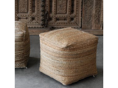
Neutral on neutral: Uttermost Accessories Shiro Ecru Pouf 23959
The simple act of changing the color in a room could transform the overall appearance of that space. It can be as basic as changing the backsplash pattern or painting the walls anew. The colors that you use should be the right one or the correct combination so you end up creating a timeless classic or a contemporary look that is to die for.
Before you hire the best painting contractor, though, you need to decide why certain colors are well-liked while others are simply…bland.
The Renowned Neutrals
If you are a homeowner who is looking for ways to make your home accessories pop or if you’ve made the major decision of selling your home, then it’s high time to decide also on the paint colors that you will use.
Neutrals are the safest way to go as they are guaranteed to liven up any living room or bedroom. Gray is an amazing canvas to any design element. It is also set to make unique features pop. But don’t limit yourself to just gray, white, brown or black, though.
You can also go for neutral orange and green which are always trendy. These are muted hues that are not so bold. They can also be easily paired with tan or gray hues. These plus some neutrals will add to the depth of a space as well as the warmth.
Go Gaga Over These Kitchen Hues
Kitchens usually come with interesting design features. Consider installing a lighter wood color on the kitchen cabinets. This is the most appealing that you could use when you’re pairing with pastel. A brighter hue might easily clash with a bright-colored tile countertop.
Always consider these factors when you are picking the best kitchen paint color.
When you want to play safe and you use neutrals in this area as well, then go for traditional white. Just picture an all-white kitchen which offers a clean and fresh appeal. If this is a bit more difficult to clean, then look for warmer hues such as reds or its more cheerful counterpart which is yellow.
Living Room Hues to Covet
The living room is also a wonderful area to use neutral colors. The most reliable backdrop will always be any neutral color such as beige, tan, white or cream. Mixing gray with beige is what’s now known as greige. This is a hot hue to have inside any living room.
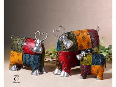
Bold Colors on Neutral: Uttermost Accessories Colorful Cows Metal Figurines
Bedroom Colors to Die For
A bedroom is a place of relaxation so make sure that there are no jolting colors there that would disrupt the quality of your sleep. You can paint the room with deep blue or a light green. Your preference is highly considered when picking the correct color in this part of your home. But you have to remember that creating a spa-like space is more important than the need to satiate your craving for, say, a tangerine color inside the bedroom.
Popular Bathroom Hues
Paint can make a room appear larger or smaller depending on how you would want to use it. If you have a small bathroom, then widen the room by painting it with light colors such as powder blue or pastels. Those who are bold enough to use black or navy blue are confident that they have ample space to paint.
Now the Costs
As soon as you have already decided which color to paint a room with, it’s likely that you would want to begin planning on the budget. The best results require professional help. These experts know how to best apply the paint that you want.
Average interior painting cost is at $1,679.
Tags: bright colors, bright paint colors, color palette, McCreerys, McCreerys Home Furnishings, neutral colors, neutral hues, neutral paint colors, paint colors
Posted in Color Schemes, Interior Design 101, Interior Design Elements, Interior Design Themes | Comments Off on Why Are These Colors So Popular?
Friday, December 23rd, 2016
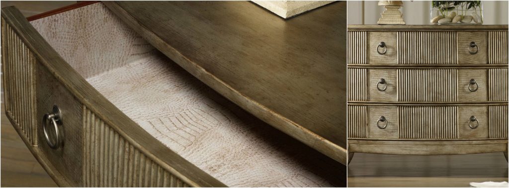
Hooker Furniture Living Room Latico Chest is an interesting home for your drabware.
Call it khaki, beige or greenish brownish, this complex color may often be used in drabware but it’s far from being drab.
Drabware is a term used to describe the color of tableware. These are the ultimate neutrals. It can also be a chameleon as it takes on a different tone based on the light that’s shining upon it.
Neutral is one of the finest backgrounds when you decorate. You can actually decorate with your drabware, more so if they’re vintage. Make your collection grow then store them inside equally interesting china cabinets.
Let these pieces inspire you to decorate the rest of your home. Think out of the box – go beyond the usual plates on walls or pairing drabware with the same-colored textiles. Neutrals sit beautifully inside any home because it is versatile.
The Drabware History
Drabware has seen a lot of admirers in English pottery when it was introduced in the early nineteenth century. Back then, monarchs and commoners alike aspired to have a piece. Those who are able to, even print their coat of arms on every piece.
Drabware also became popular among the upper-middle class as it was also used in creating other objects. These include incense burners, ink sets, candlesticks and miniature toys for kids.
Cornish clay was used in making drabware as nickel and flint were also added. This resulted in the beautiful, earthy tone that is descriptive of drabware. These earthy drabware, however, did not have a consistent color. Variables like the amount of clay and minerals, as well as the kiln temperature result in skewed hues that look more like gray, brown or green.
A pinkish tinge is also a possible partner of drabware. In fact, drab grounds the pink so that you won’t have to worry about experimenting with this feminine color. Pick dusty shades so that they will also complement the drab. This will easily offer a more calming, tranquil effect in your dining room.
Light natural wood also pairs well with drab. If you want to bring in some patterns and textures, just install wallpaper.
Unlike ceramics that get colors from surface glazing, drabware is drab throughout. It only has a clear glaze though some pieces now have decorative paint, gilding, and colored enamel. Other embellishments are also available.
Drab-colored paint is also now available for cozy areas such as a breakfast nook or a small living room. Metallic pieces will be highlighted by a coat of drab paint.
The 20th century showed an on and off production for drabware. Smaller companies made their own versions with Tiffany & Company joining the bandwagon. Even Martha Stewart and her company took their inspiration from drabware and upped its visual appeal by offering it in both plain and gilded-rim types.
The earliest drabware were platters and pitches which – when you can find them today – are of great worth. These are valuable collections that only a few are able to get their hands on. The smallest pieces can amount to thousands of dollars with auction sites opening their bids at hefty amounts.
If, however, you would just want to take home the beauty of classic drabware, then there are also modern sites and shops to buy them from. A five-piece set that was made in 2000 could now be bought for $200. Of course, the later the year, the more affordable the pieces would cost.
Housing Your Drabware Collection
It is important to preserve your collection by keeping your pieces safe from dust, the natural elements, insects and breakage. You can effectively do this if you are ready to unleash your artistic potential.
There are many china cabinets to choose from. Pick one based on your chosen theme. Wooden ones go best inside rustic interiors while the sleeker ones will be at home in a modern or contemporary setting.
Tags: McCreerys, McCreerys Home Furnishings, neutral colors, neutral hues, neutral interiors, neutral palette
Posted in Color Schemes, Interior Design 101, Interior Design Elements, Interior Design Themes | No Comments »
Thursday, November 17th, 2016
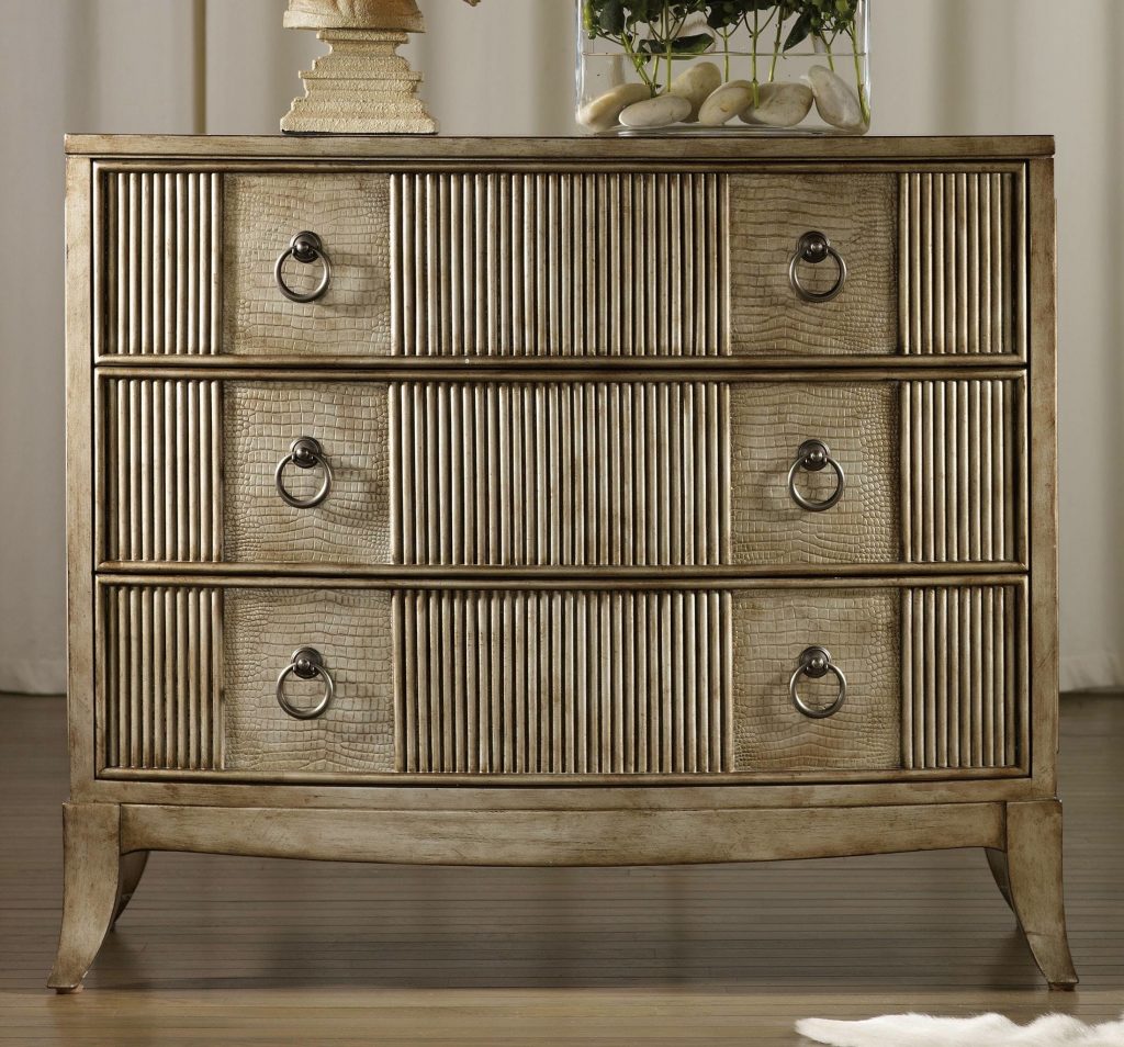
Fine Furniture Design Bedroom Bamboo Drawer Chest 1050-116
What did you feel when you last saw an all-white home? Did you feel relaxed or was it the opposite? White is a color that most homeowners would just use to mix with other colors but using it – on its own – is not something that many would venture to. A lot of people are nervous about the use of white especially when they want their home to look homier. Yet white can be a refreshing color compared to many other colors on the spectrum.
White evokes cleanliness, purity, even sophistication and confidence. Prior to using white in your home, be sure to check out the following tips first –
White as Clean Slate
Instead of feeling nervous about white, look at it as a way to achieve a fresh start. White can release your creativity without you even becoming totally aware of it. A white room is a wonderful way to decide what inspirations you have for your room. For instance, if you have a scenic view from the living room, then it would be a great idea to frame this in white walls. There is nothing more beautiful than white as a backdrop for the most gorgeous vistas.
Know also that there are different shades of white that are not automatically beige. Every hue, in fact, has a corresponding white tint, from yellows, pinks to purples and greens.
White on Upholstery
Sure, white upholstery is a bit more difficult to clean as it gathers dirt more quickly, but using white in this case means knowing what fabric type to pick. Having children and pets in your home would call for sturdier fabrics such as khaki or faux suede. There are also slipcovers that are now made with white denim so find out if that’s also suitable for your active home.
Let Art Do the Talking
A great asset that you can actually show off using a white wall is an interesting piece of art. Show your personality by putting up a framed painting or any interesting piece of art on the wall. Such pieces command attention and adding the bareness of white make them the perfect focal points in rooms.
Use Tone-on-Tone Layering
Should you ever feel that your room lacks warmth or personality, think of layering the whites in like shades. Use warm whites and warm grays, for instance. Use textures and patterns that are similar to the white hues that you used.
White Spells Versatility
White will always be a rich canvas where you can decorate and style all year round. Whether you’re ushering in the winter season or welcoming the advent of spring, there will always be shades of white that go well with the interesting colors of the season.
White can also be used to frame interesting architectural features. For example, an all-white bathroom would effectively highlight a colorful vanity table. With the right accessories, white can actually look cosmopolitan, even sophisticated.
Risk aversion or veering away from idea overload is also the role of white paint. As a homeowner, it is often easy to get lost in the trendiest interior designs. If you want to have a more grounded setting, then use white to anchor your most interesting designs.
White Means Erasing Blemishes
White is an eraser of any architectural error – from blemish on the drywall to exposed ducts. White is an effective way to camouflage eyesores. If you’re living in an older home, then this can also highlight the most beautiful crown molding.
Use white to transform your home to the modern minimalist, classic neutral or traditional setting that you dreamed it to be.
Tags: McCreerys, McCreerys Home Furnishings, neutral, neutral colors, neutral hues, neutral interior design, neutral interiors, neutral palette, white, white color palette, white color scheme, white in interior design, white interiors, white palette
Posted in Color Schemes, Interior Design 101, Interior Design Elements, Interior Design Themes | No Comments »
Wednesday, November 9th, 2016
Hooker Furniture Living Room Latico Chest
Did you know that colors behave in three ways? They can be passive, active or neutral. The term neutral actually means unbiased or impartial. It is because of this that the use of neutral colors is quite common in many homes.
Neutrals Pair with Any Hue
To begin with, neutrals like black, white, cream, brown, gray or any earthy tone can work with any color. Neutrals are versatile when it comes to decoration and interior design. This means that even through the years, as trends and preferences change, your color scheme remains in style.
Neutrals are hues that also provide the best background to any other color. It provides solid foundation for any décor whatever your style is.
Don’t overuse neutrals to the point that they become boring. Imagine seeing walls upon walls of cream or beige. That’s absolutely aesthetically stagnating.
Neutrals Add Visual and Tactile Textures
When you plan any neutral room, consider texture. This is a term that refers to an object’s appearance or surface characteristics. Texture isn’t all about seeing but touching, too. Tactile texture is the actual surface feeling whether it is smooth, rough, hard or soft.
Create a room that is multisensory. The design and décor mustn’t just look great but also begging to be touched. Imagine having a plush carpet right in the middle of the living room. Wouldn’t you want to remove your shoes and just lie down?
Neutrals in the Entryway
The entryway is where most first impressions take place. This is the right spot to show your being savvy in choosing a design. Don’t jar your guests with bright colors, though, only to make an impression. It’s better to select some patterns that may be neutral but still add visual interest to this part of your home. Think of runners, wallpaper, rugs, and art.
It would also be nice to place an unexpected furniture piece on the entryway. Imagine having a wing-backed chair right by the rack where the shoes are kept.
If you’re looking for the best neutral color to use, you can have inspiration from the floor tiles. Use the neutral colors of your tiles then bring that same shade to the entryway. This should give the space a more cohesive look.
Neutrals in the Living Room
If you’re still interested in having pops of colors elsewhere, then use them on the window treatments or the throw pillows. Enliven the living room by adding mirrors. These will reflect the neutrals while adding depth to the palette whether it is based on whites, browns, creams, or grays.
If you are decorating a living room that’s mainly neutral, then use slight variations of the same color. This should warm up the space and make it more aesthetically pleasant. Think of the neutral palette’s role on your window treatments, walls, floors, furniture and lighting fixtures.
It would also be nice to feature a beautiful architectural part of your home by using neutrals. Use neutral décor or color to highlight. Remember that a lighter shade on an architectural feature like a fireplace will highlight its very presence.
To add drama to a neutral living room, be sure to use a large chandelier. This isn’t just a beautiful addition to the décor but it’s a lighting fixture that will give a sense of purpose to an otherwise dull open space.
Neutrals in the Kitchen
Neutral kitchens are quickly gaining popularity each year. Guide the eyes of your guests by having the shapes repeated throughout the room. Find a cabinet that has the same color as some of the appliances. Don’t be afraid to mix media inside the kitchen. It’s an effective way to make the neutrals feel alive somehow.
Tags: McCreerys, McCreerys Home Furnishings, neutral, neutral colors, neutral design, neutral hues, neutral interior design, neutral interiors
Posted in Color Schemes, Interior Design 101, Interior Design Themes | No Comments »
Wednesday, September 21st, 2016
1586-80116-MULTI Aura Round Accent Table with Shell Top 1118CR Delancey Club Chair
Scandinavian design is maximized styling with the least amount of fuss, the two guiding principles being function and fundamentalism. This design has been shaped by the sensible minds in Old Nordic Europe resulting in airiness, light, serenity, even a stark oneness with Mother Nature.
Scandinavian trend is a concoction of Danish, Norwegian, Swedish and Finnish design principles. All of these use natural elements which favor the neutral color palette. Remember to keep lines more basic.
Winning the World Over with the Scandinavian Look
Scandinavian home design invaded the world right after the 1947 Triennale di Milano edition. This is a renowned design exhibit in Milan. Here, glassware, accessories and furniture pieces coming from Nordic regions are shown. Later, the world caught on as they saw the beauty that this stark white design can offer.
The design show soon travelled to the U.S. and in Canada. The years 1954 through 1957 were the most fascinating years for this design as more and more ideas were added.
It is interesting that Scandinavian trends have evolved from the usual European look of favored ornate and opulent décor brought to the world by royalty and aristocracy. The Nordic people embraced a more practical look though plush pieces also appear now and then.
Scandinavian Light
Lighting is key in the Nordic regions with only seven daylight hours during the winter season. The look and feel of your lighting fixture will say a lot about whether or not you have achieved the Scandinavian design.
Scandinavian interiors have different kinds of lighting for mood building and correct illumination. This usually hangs between the industrial and modern looks. The styles could be anything from pendant to wall sconces.
Candlelight is also a must as it can automatically add a beautiful glow to any space. Votives are a beautiful deviation though you can be traditional by using candelabra.
Hooker Furniture Dining Room Mimosa – Cottage Fabric Barstool
Scandinavian Form and Function
Scandinavian furniture is all about the use of clean lines. Find chairs, tables and sofas that have a Mid-Century modern look. These are the ones that have rounded, smooth edges and neutral hues.
This design also focuses on function and innovative look.
Scandinavian Flooring
Don’t ever use wall-to-wall carpeting as this never happens in Scandinavian interiors. Flooring is traditionally hardwood, used in its natural color or, often, painted white. Since it is white, it automatically contributes to the expansion of the space and allowing more light inside.
Scandinavian Living Elements
It is also crucial to bring in living elements of beauty and color in this design. Fresh flowers are an absolute necessity. This is apparent with all those sidewalk florists in Copenhagen who sell tulips in every possible color.
Succulents are also a welcoming vision in any Scandinavian home.
Scandinavian Means Neutral
If there is one color palette that is most associated with Scandinavian design, then it would have to be neutrals. So go ahead and use a lot of whites, grays, browns and blacks. These can be interwoven throughout your home if you want to create a calming and clean look.
Designers have introduced pop colors throughout the years so sea greens and light pinks are also now acceptable.
Regular Scandinavian homes have white walls that allow art and furniture to mesmerize.
Scandinavian Means Zero Clutter and Limitations
One of the best features of Scandinavian interiors is cleanliness. Storage is a must and is often implemented through shelves and cabinets. Décor is always intentional where less is more. Always remember visually relaxing as your mantra.
Inviting light in is a major concept in Scandinavian interior design. Windows from these European regions have windows that are often stripped bare. Should the homeowners consider using window treatments, then the materials should be sheer or linen.
Tags: McCreerys, McCreerys Home Furnishings, neutral, neutral colors, neutral design, neutral hues, neutral palette, Nordic design, Nordic interiors, Scandinavian, Scandinavian design, Scandinavian interior design, Scandinavian interiors, Scandinavian style, white, white color palette, white color scheme, white interior design, white interiors
Posted in Interior Design 101, Interior Design Themes | No Comments »
Wednesday, July 20th, 2016
1586-10458A-MULTI2 Fleur de Glee Writing Desk 1586-75410D-GLD6 Swanson Upholstered Metal Side Chair
White may be white but there’s a lot of white to choose from. Neutrals may be quite popular but they can be uninspiring especially in the wrong hands. Popular design options include owning investment pieces such as sofas and sturdy cabinets that are neutrals yet it can be fun to take a risk sometimes. Your paisleys may not awe everyone all the time yet it’s the thought of being fearless that counts. If you’re ready to take risks in interior design, then here are some tips that you can consider –
Be Yourself
Here’s a point when you have to be honest. Not a lot of people would want to combine three different fabrics plus an animal print rug so why jump in? Most of the time, simplicity is all it takes to have fashionable interiors.
Fuse shades and hues coming from a single color. This monochromatic move is a popular scheme used by many designers. When you step up and layer two different shades of blue, with two shades of red, plus an accent of neutrals, then what you have achieved is a risk worth taking.
All that taking risks entails is for you to be yourself and to not try to pretend to be someone else.
Lovely Neutrals
If you happen to own a neutral sofa, then you have the leeway to use pillows, paint colors, and draperies in bright colors. Are you a huge fan of brown? Then pair it with your textured, neutral-colored sofa.
Fear Not
Don’t think that being artsy is all for Art students. You, too, can take risks by using bright, clear hues and having them mixed with other interesting colors. Bold may be dramatic but it is a good way to make a statement. The colors of the pillows that you use on your sofa will surely capture the attention of your guests.
The stairs are an often overlooked place when it comes to interior design. This may be on the same level that you use the powder room to experiment on a few wallpaper options. Stairwells are small spaces that do not have furniture. It doesn’t have much of the design elements that are often used in other rooms. Since this is the case, make good use of the non-existence of furniture here by hanging a beautiful, framed work of art. This can be a colorful painting or a huge photograph of your entire family.
Focal Points and Your Leap of Faith
There are many design tricks in interior design books but one of the rules that can magnify the impact of design in your home is to pick a focal point that you could use. Having a transparent coffee table, for instance, will not strain the eyes, thus, they will have time to look at the visual load that is offered by the furniture pieces.
So don’t chicken out – just take your time and choose the pieces that will go in creating that non-traditional look.
Did you know that not all geometric pattern pieces automatically become the focal point? Add interest by using a little geometry to make the room a little more interesting.
If you want to go on high speed in terms of your interior design, then just have a single expressive wall color. Find also an adorable fabric that can make hearts beat a tad faster. Weave the fabric throughout the room, there’s no need for a lot of patterns in order for a room to become more exciting. At times, all that you would need is a fusion of one bold color and a special pattern and you’re good.
Tags: bold design, bold interior design, bold interiors, bold statement, interior design risks, McCreerys, McCreerys Home Furnishings, neutral, neutral colors, neutral hues, taking the risk in interior design, tips
Posted in Color Schemes, Interior Design 101, Interior Design Themes | No Comments »
Monday, May 9th, 2016
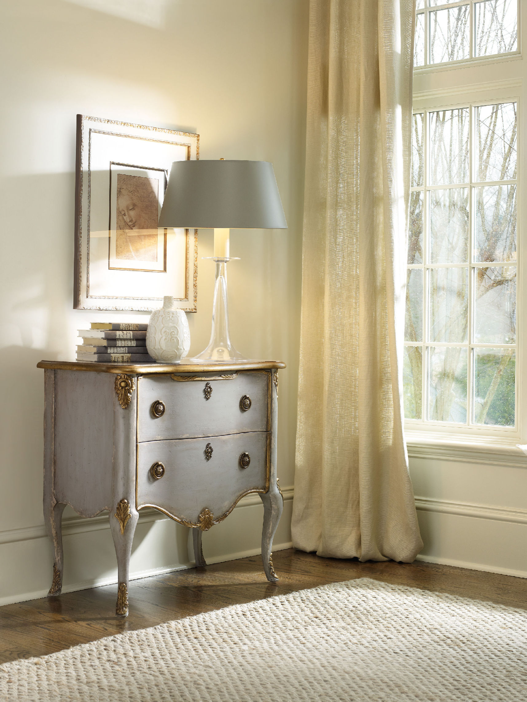
Hooker Furniture Living Room French Two Drawer Chest offers a distressed yet elegant optimization to the white walls.
There are many ways of freshening up a home in terms of its overall look. If you plan to level up on your cleanup, there is a clean-slate strategy that is hassle-free and safe. Painting your walls white is a technique that will make your home into a blank canvas that is ready to be doused with your personality.
A Word of Caution
Before you delve into this undertaking, you might want to look into the possible effects of the color. First, white paint may be the magical solution to many homes that want to start anew but it can also be a cold, unfeeling color.
Just like any other color, consider white to have its own temperature, lighting requirements, mood, even style. It has – more than any other color – maintenance requirements as well as a rich history. If you make the mistake of ignoring these elements, then you end up with a stark color as opposed to the clean, crisp hue that you wanted.
Do not be afraid to use white, though. Most of the time, all it needs is just a dash of another hue to tone down or warm things up.
Room Considerations
Prior to painting your home white, you must take a careful look at its orientation. Those rooms that turn away from midday sun have a gray-blue light. These rooms are great for summer bedrooms, a studio or a gym. This is so because the sun’s angle at this point provides the needed consistency.
White paint tends to optimize the lighting in these spaces. While it works in these rooms, white won’t work in rooms that face the north. White will link the snow-laden outdoors to your home without being visually distressing.
Use red, orange or yellow tint with white when you paint the areas of socialization and dining. Rooms that don’t have a direct access to natural light are the best candidates for these color fusions. The warmth of yellow, orange and red will make up for the heat lost from the sun. These colors are also known to raise blood pressure, thus, upping your level of activity and positive vibe.
Scientific evidences have proven that colors can create a certain psyche, in this case, the warm colors make the body feel heat even in the absence of real warmth.
Rooms that face the south are the ones that receive the most amount of sunlight during the morning. Summer or winter, this side of your home will receive a red-yellow sort of light during a clear day.
White-painted walls will cool such spaces while not limiting your color choices. You can still adjust the glare by looking at your pigmenting options. An example is using gray to soften the reflective property of white. This combination should create a hush-hush feeling inside your living space.
One color choice will not be able to offer the lighting changes required in different seasonal circumstances, however, there are times during the day also certain seasons when rooms get the most lighting wear.
It is during such times that you should dampen or radiate the natural light that comes in. To do this, choose a conditioning color that you can use with white. Cool colors include green, gray and blue tones while the warm ones are orange, red and yellow.
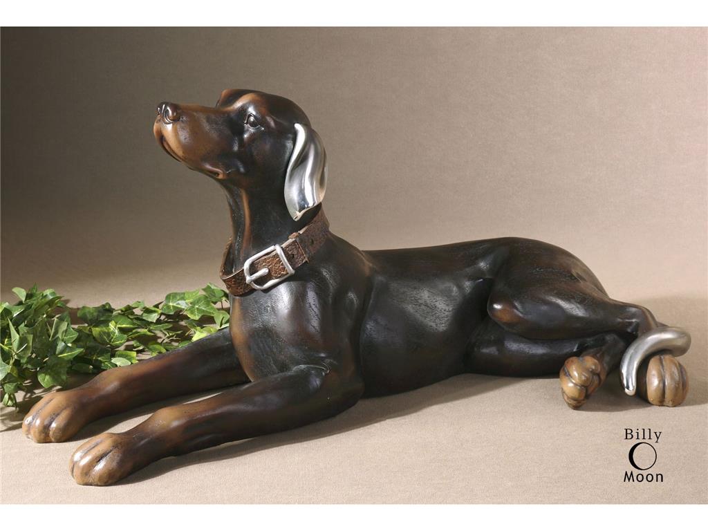
The Uttermost Accessories Resting Dog, Statue 19070 offers an amazing contrast to the starkness of white.
Outside-In
Remember that the outdoors can greatly affect what you have inside. If you have an awesome view of the ocean outside or, perhaps, a beautiful garden, then use it to your advantage. White walls will be able to enhance such picturesque views. White is the perfect solution for that much-wanted year-round shoreline view. You can enhance the view by fusing white with just a small quantity of yellow-orange pigment. This combination should frame the coolness of the view outside.
Now ain’t white beautiful?
Tags: McCreerys, McCreerys Home Furnishings, neutral, neutral colors, neutral hues, neutral interior design, neutral interiors, neutral palette, white, white color palette, white color scheme, white in interior design, white interior design, white interiors, white palette, white walls
Posted in Color Schemes, Interior Design 101, Interior Design Elements | No Comments »
Sunday, January 31st, 2016
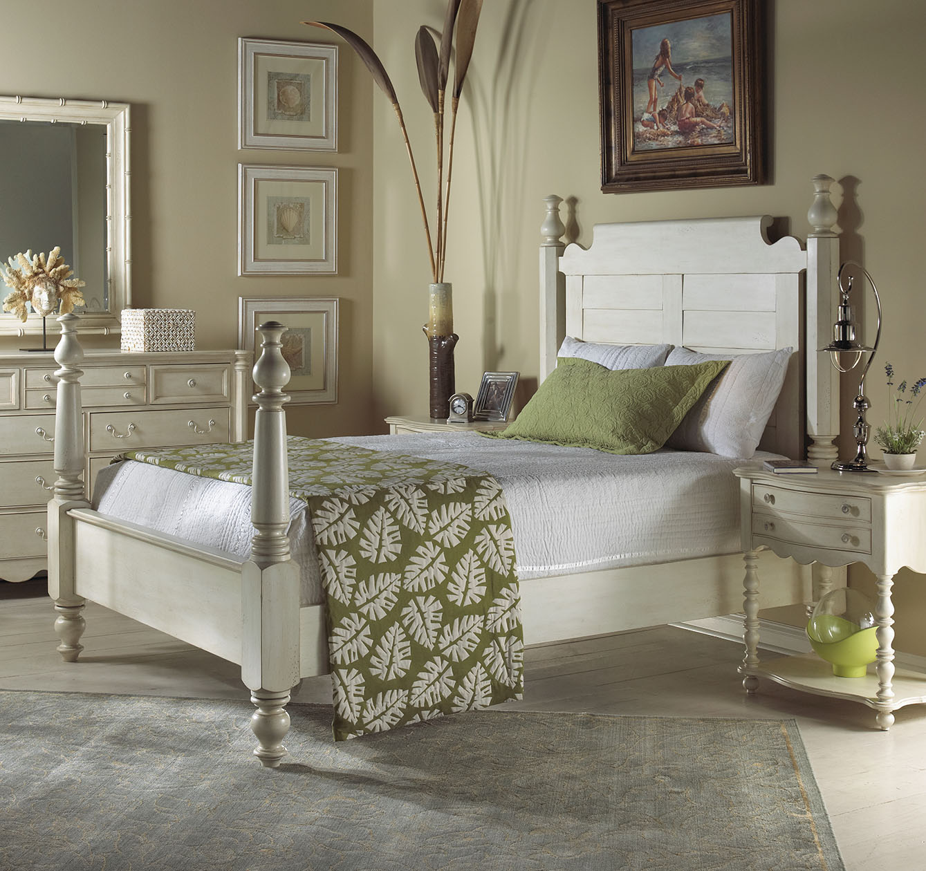
The Summer Home Collection of FFDM features this neutral colored bed and nature-inspired blanket, all perfect for a Maori-inspired home. Notice how the blanket connects with the accent pillow, framed artworks, and the decorative piece underneath the bedside table.
There are many benefits to island living. The most obvious are a relaxed atmosphere, having the chance to breathe in the fresh sea air every day, and a congenial community. Tropical living is impossible in city dwelling but the same ambiance can actually be replicated. Are you up for the Maori interior design?
Maori or tropical island design is one of the hottest styles or trends in interior design these days. This design covers just about anything from sports, modern to contemporary living. Jump start your island setting by using fine art, colorful furniture and accent pieces, paintings, etc.
What is island living without any plants?Find colors that signify your chosen theme including different shades of blue and other natural colors. Burlap material is a great choice for your wall covering. The Tiki also depicts island living with its bamboo bed sheets and shades.
Fine Furniture Design Home Entertainment Maori Entertainment Base 1220-693
Tropical plants are must-have decorative pieces when you want to go Maori. Use live or silk vegetation, even timber statues. Bring in palms (the natural types are best) to your living room.
Window treatments must be airy and gentle to the sight. Bamboo bed sheet colors should also be easy on the eyes. Other valuable options include bright colored drapes and sheers. Island prints are also the best pattern for your sheer curtains.
Various crafts can be acquired in order to come up with the Maori style. It is best to look through photographs that involve sugar plantations and areas that plant blueberries. You can also look for essential oil pictures that are linked to yachts and freight boats. And just to prove your point, go on and have pelicans, seagulls, turtles, whales and other forms of sea life as art inspirations.
You are showcasing no less than the beauty of Maori living so go all out.
Another design element that you need to consider in island living is the use of more space. This kind of lifestyle has to be inviting and comfortable. The designs must be relaxing especially inside the master bedroom and bathroom.
You can also adapt the same concept inside your children’s rooms. Many youngsters love the idea of being flanked by a lot of seashore images. They are also settled by the lively yet comforting colors.
Lavatories are organic pieces in any island inspired bathroom. As for the kitchen, make use of bamboo, wicker, and the open picnic stands. Outdoor desks are also welcome in this environment. A lovely Tiki hut can serve as the island in an outrageously spacious kitchen.
Another important part of Maori design is to achieve a clutter-free setting, hence, you would need a lot of storage regions. Add a dash of tropical colors, wicker baskets, fresh paint shelving units, and wooden partitions.
Fine Furniture Design Home Entertainment Maori Entertainment Base 1220-693
Maori design can be used in either the home or work setting. This is an appealing, friendly and warm style that can make work environments more joyful and homes more pleasant. Search from among our accent pieces and furnishings to give life to your planned theme.Tropical island living becomes more appealing and enjoyable when you share it with your loved ones and your friends. So, as soon as you are able to set up a welcoming fountain outdoors (or any obvious water element), bring in some fresh potted plants, and invest in some wicker or wooden furniture; you should call those closest to you and celebrate the beauty of your new place.
Go ahead and grab the best interior design magazines and glean more ideas regarding island living. The Maori style is one-of-a-kind; the sky’s practically the limit when it comes to this theme so visualize, experiment and celebrate.
Maori interior design is awesome!
Tags: bamboo, bamboo furniture, bamboo interiors, contemporary, guidelines, Maori, Maori design, Maori interior design, Maori style, McCreerys, McCreerys Home Furnishings, natural, natural colors, natural elements, natural hues, natural wood, nature in interior design, nature-inspired design, nature's colors, neutral, neutral colors, neutral hues, patterns, tips, tropical colors, wicker, wicker furniture, wicker furniture pieces, wicker pieces
Posted in Interior Design 101, Interior Design Elements, Interior Design Themes | No Comments »
Tuesday, January 19th, 2016
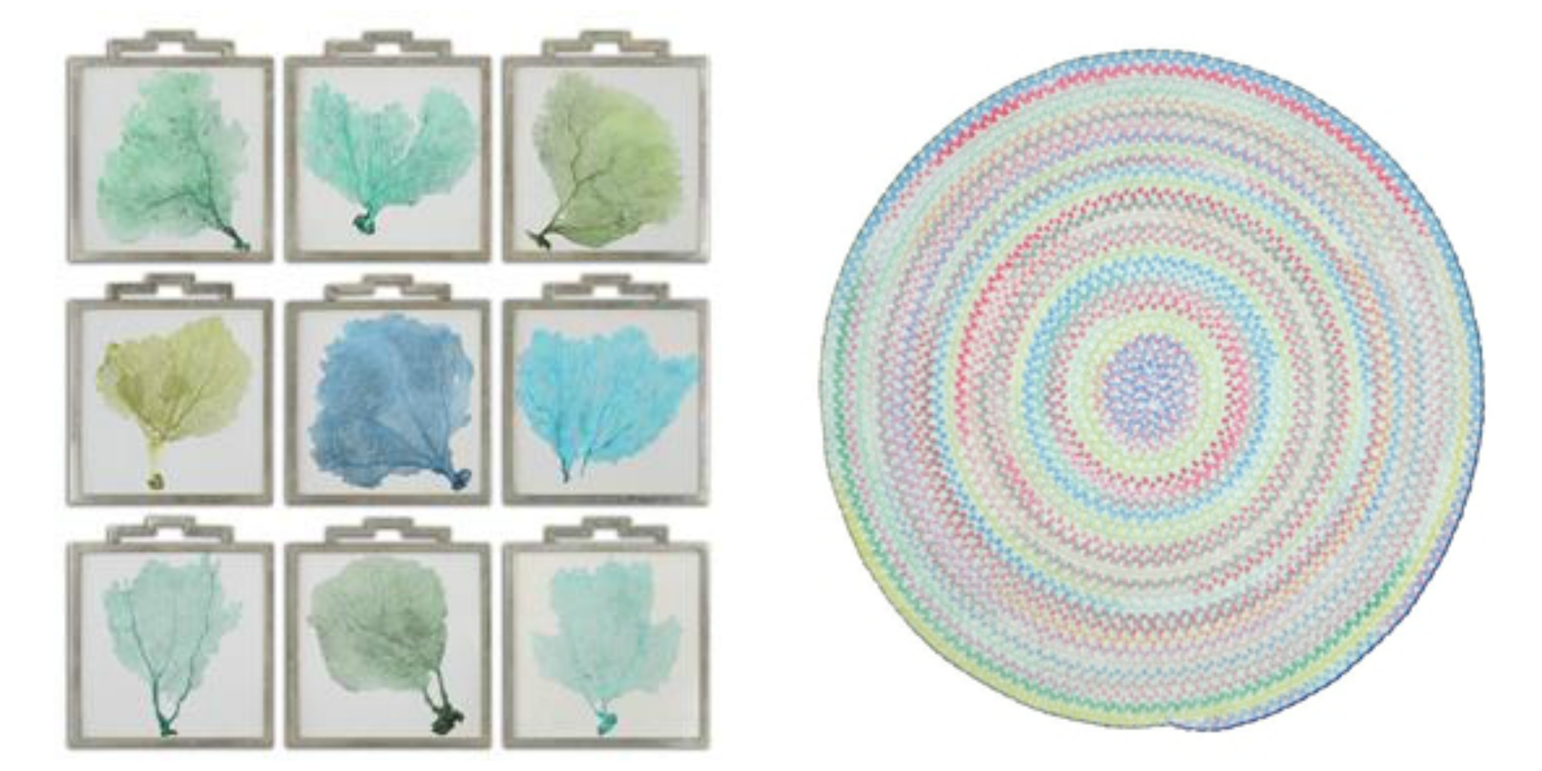
L-R: Accessories Uttermost Sea Fans Framed Art S_9 35239 and the Capel Incorporated Floor Coverings Cutting Garden Rug 0450CS0032610 are both available at McCreerys Home Furnishings.
A lot of the design trends these days involve bright, bold colors. This should not be a reason for you to stop using milder, more calming colors if you really want to. If you are in a pastel mood, then there is no need to conform to the bold patterns that many modern homes use. Creativity is the key to accessing the beauty of pastels. There are so many ways that you can utilize pastels to spotlight spaces or open up dark, crammed up rooms. Creating a winning interior with the use of crisp white combined with irresistible pastels is now easy.
Fine Furniture Design Dining Room Side Chair 1053-820 at McCreerys Home Furnishings
Pastels + White
Heightening the effect of pastel is as easy as pairing it with white. Many designers use soft hues as a standalone color inside many homes. Some use an accent wall complemented with any accessory that comes in the same shade.
A white room is a great playing field for lovers of the pastel palette. The secret to using pastels in a seemingly blank room is to have them as accent pieces like artwork, textiles and lighting fixtures.
Any shade of pastel can be used to achieve a soft glow. Warmth and softness is the beautiful result of cream and gold plus some light pink roses.
When the walls come in any pastel color, then you can use white textiles and furnishings. This is a powerful combo that can be balanced with the use of pastel accents such as throws and some pillows.
Pastels + Bright Colors
If white and pastels result into a crisp interior, then pastels plus some vivid colors equals awesome. The biggest trends today play up the pastel colors by adding neon and other bright hues. For instance, pastel walls can be highlighted by a neon pink cornice. Pastel blue rooms can be heightened with bright colors such as lime green or orange. And while you’re at it, check out the uniqueness of pale green, light chartreuse and lavender. These are all irresistible colors that will look hot with coral pink; light green walls can be paired with peachy sheets; modern shelves can house bright colored books.
You might wonder how two colors on almost opposite ends of the spectrum could fuse so beautifully. Pastels and bright colors are alluring because they complement each other marvellously. For instance – going back to hot pink – it can be your color of choice for the mirrors, bed, lamp and pillows inside your place of relaxation.
 Gentle Pastels
One other approach to pastel interiors is subtlety – like really subtle. An example is a white room with silver motif. Add a dash of blue table lamp and throws and you’ve just achieved a modern room that elevates pastels without being overpowering.
Gray can also be combined with pastel colors to create contemporary look. This can be both soothing and sleek.
Going All Out
The final approach is to go all out. Use monochromatic pastel as a powerful statement on your walls, the furniture pieces, upholstery, and some of the major accessories.
If you want to use more than one pastel color in any room of your home, then be sure to put them all together in a concerted display. A single row of pillows in lemon yellow, green, lavender, or dark pink can make a room pop. A rug such as the braided area rug from Capel Rugs perfectly caps the lovely theme. This soft chenille rug comes in various colors and custom shapes.
Tags: adding colors to a home, artwork, contemporary, gentle, guidelines, McCreerys, McCreerys Home Furnishings, monochromatic color palette, monochromatic color scheme, monochrome, monochrome interiors, neutral colors, neutrals, pastel, pastel color scheme, pastel interior design, pastel interiors, pastel palette, pastel theme, pastels, subtle, textiles, tips
Posted in Color Schemes, Interior Design 101, Interior Design Elements | No Comments »
Follow us on our social media
© McCreery's Home Furnishings | All Rights Reserved | Privacy Policy