- Follow us:


Tuesday, February 5th, 2019
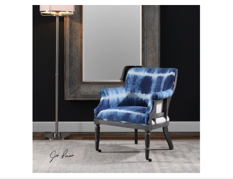
The Uttermost Living Room Royal Cobalt Blue Accent Chair pops from the neutral and dark fusion on its background.
There are many different parameters that help shape design. If one would look at each one’s design, everyone has a preference or taste that’s distinct. Even the relationships that each person goes into are indicative of his or her qualities and perspectives in life. At the bottom of it all is each one’s personality.
Each individual’s personality is the catalyst to an environment, emotions, even the ups and downs of his or her life. This is the same force that repels or attracts other people. Personality almost always dictates ever aspect of a human’s life.
Color is the best way to add unique touches in anyone’s home. It is known to have a profound effect on people’s emotions and moods. Putting bright colors in your interior design can help create a jovial atmosphere.
If you’re willing to go way beyond happy, then you can be playful. Neon shades are the boldest. You can also make use of a feature wall or splashes of hues that are strategically situated. Practically any room can have neon hues or any vibrant colors, it’s all a matter of knowing how to use them.
Lately, modern interiors have been showing a lot of bold colors. The key here is to have restraint no matter how the colors might excite you. Too much of any color isn’t going to look right. Sometimes, all it takes is a hint or two on the furnishings or textiles and you will achieve the ideal.
Here are more ways that you can use bold colors in your home –
Be Familiar with the Color Wheel
If you’re going to use bold colors, then be familiar with the color wheel. This tool can help you pick the right colors for your interior design. The 12 shades have been arranged and divided into cool and warm hues.
The cool colors include shades of blue, turquoise and violets. The warm shades are the red shades and oranges.
Analogous colors, which are placed right beside each other on a color wheel, tend to work well when they are fused. These are the best colors to harmoniously blend everything else in the space.
Consider also the tone and saturation of the colors that you pick. The saturated shades tend to be more vibrant while the less saturated hues are the muted versions of a basic color.
Apply the 80:20 Rule
This rule is crucial when you’re designing. This basically means that 80-percent of the room should be kept neutral while the rest, at 20% must be bright-colored. This is the technique in creating a statement in a way that’s just enough so that the look isn’t ruined.
An example of this is when muted gray and yellows are used on the walls as the sofa is a bright lemon hue. This is an interesting contemporary statement.
If you’re a bit cautious in spending your hard-earned money on colorful pieces of furniture which you may end up regretting, then it’s okay to begin with less of a commitment.
You can always go with a neutral couch that’s highlighted by bright-colored throws. These pieces will give you the same boldness without committing too much. Should you decide to push through with the furnishing investment in the future, at least, you saw and felt how it was to have bold colors in your home in a non-pricey way.
Light and Shade
If you have a home that’s filled with daylight, then all you have to worry about is to look for dramatic tones that will serve as accents. Whichever colors you end up choosing, strive to design the space in an inviting manner and never shocking.
Tags: bold colors, bold hues, bold interior design, bold interiors, McCreerys, McCreerys Home Furnishings
Posted in Accents, Color Schemes, Interior Design 101, Interior Design Elements, Interior Design Themes | Comments Off on Are You Daring Enough for Bold Interiors?
Wednesday, July 20th, 2016
1586-10458A-MULTI2 Fleur de Glee Writing Desk 1586-75410D-GLD6 Swanson Upholstered Metal Side Chair
White may be white but there’s a lot of white to choose from. Neutrals may be quite popular but they can be uninspiring especially in the wrong hands. Popular design options include owning investment pieces such as sofas and sturdy cabinets that are neutrals yet it can be fun to take a risk sometimes. Your paisleys may not awe everyone all the time yet it’s the thought of being fearless that counts. If you’re ready to take risks in interior design, then here are some tips that you can consider –
Be Yourself
Here’s a point when you have to be honest. Not a lot of people would want to combine three different fabrics plus an animal print rug so why jump in? Most of the time, simplicity is all it takes to have fashionable interiors.
Fuse shades and hues coming from a single color. This monochromatic move is a popular scheme used by many designers. When you step up and layer two different shades of blue, with two shades of red, plus an accent of neutrals, then what you have achieved is a risk worth taking.
All that taking risks entails is for you to be yourself and to not try to pretend to be someone else.
Lovely Neutrals
If you happen to own a neutral sofa, then you have the leeway to use pillows, paint colors, and draperies in bright colors. Are you a huge fan of brown? Then pair it with your textured, neutral-colored sofa.
Fear Not
Don’t think that being artsy is all for Art students. You, too, can take risks by using bright, clear hues and having them mixed with other interesting colors. Bold may be dramatic but it is a good way to make a statement. The colors of the pillows that you use on your sofa will surely capture the attention of your guests.
The stairs are an often overlooked place when it comes to interior design. This may be on the same level that you use the powder room to experiment on a few wallpaper options. Stairwells are small spaces that do not have furniture. It doesn’t have much of the design elements that are often used in other rooms. Since this is the case, make good use of the non-existence of furniture here by hanging a beautiful, framed work of art. This can be a colorful painting or a huge photograph of your entire family.
Focal Points and Your Leap of Faith
There are many design tricks in interior design books but one of the rules that can magnify the impact of design in your home is to pick a focal point that you could use. Having a transparent coffee table, for instance, will not strain the eyes, thus, they will have time to look at the visual load that is offered by the furniture pieces.
So don’t chicken out – just take your time and choose the pieces that will go in creating that non-traditional look.
Did you know that not all geometric pattern pieces automatically become the focal point? Add interest by using a little geometry to make the room a little more interesting.
If you want to go on high speed in terms of your interior design, then just have a single expressive wall color. Find also an adorable fabric that can make hearts beat a tad faster. Weave the fabric throughout the room, there’s no need for a lot of patterns in order for a room to become more exciting. At times, all that you would need is a fusion of one bold color and a special pattern and you’re good.
Tags: bold design, bold interior design, bold interiors, bold statement, interior design risks, McCreerys, McCreerys Home Furnishings, neutral, neutral colors, neutral hues, taking the risk in interior design, tips
Posted in Color Schemes, Interior Design 101, Interior Design Themes | No Comments »
Tuesday, May 17th, 2016
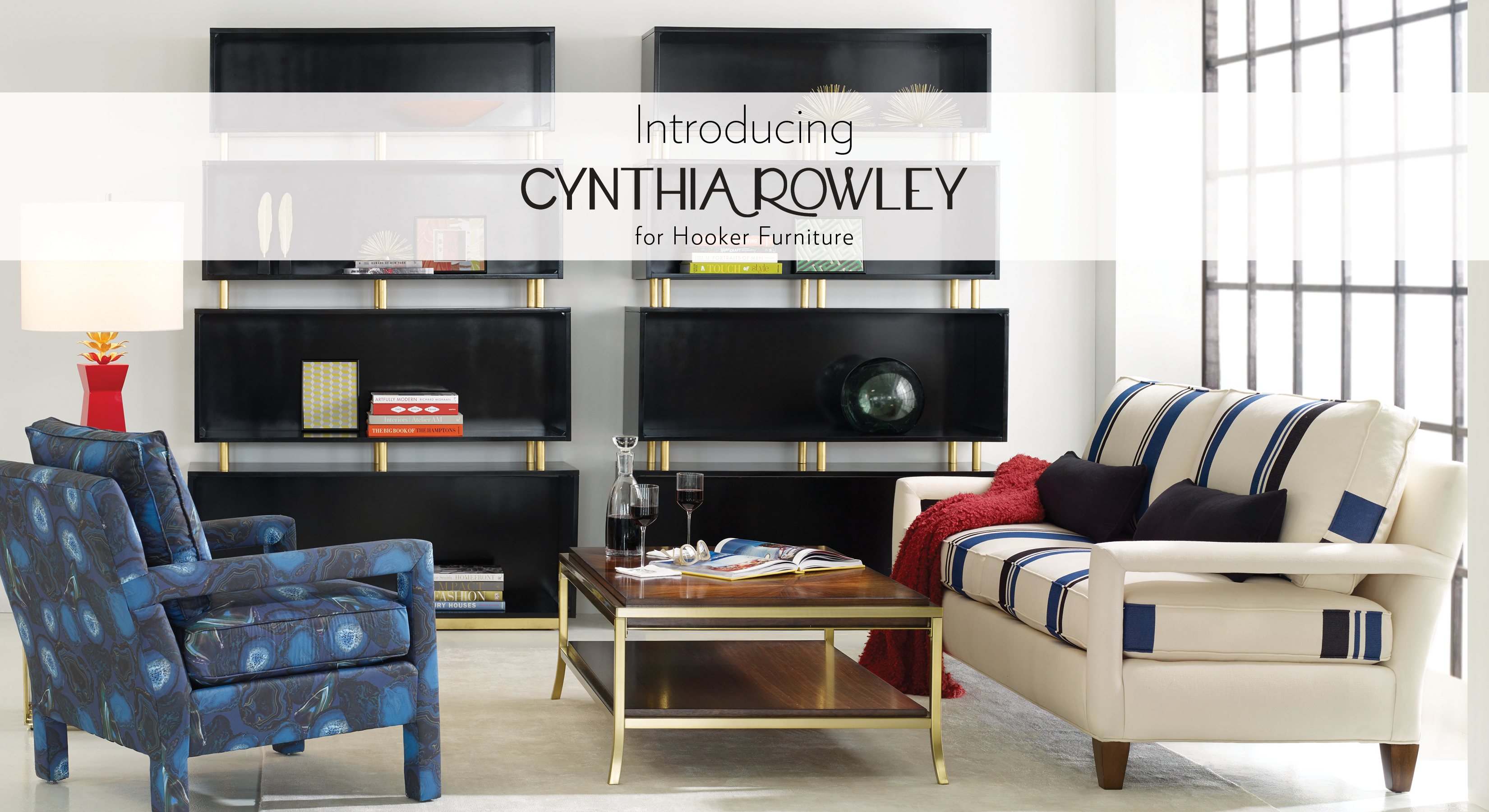
This Cynthia Rowley ensemble incorporates geometric patterns among neutrals, dark hues, metals and colors.
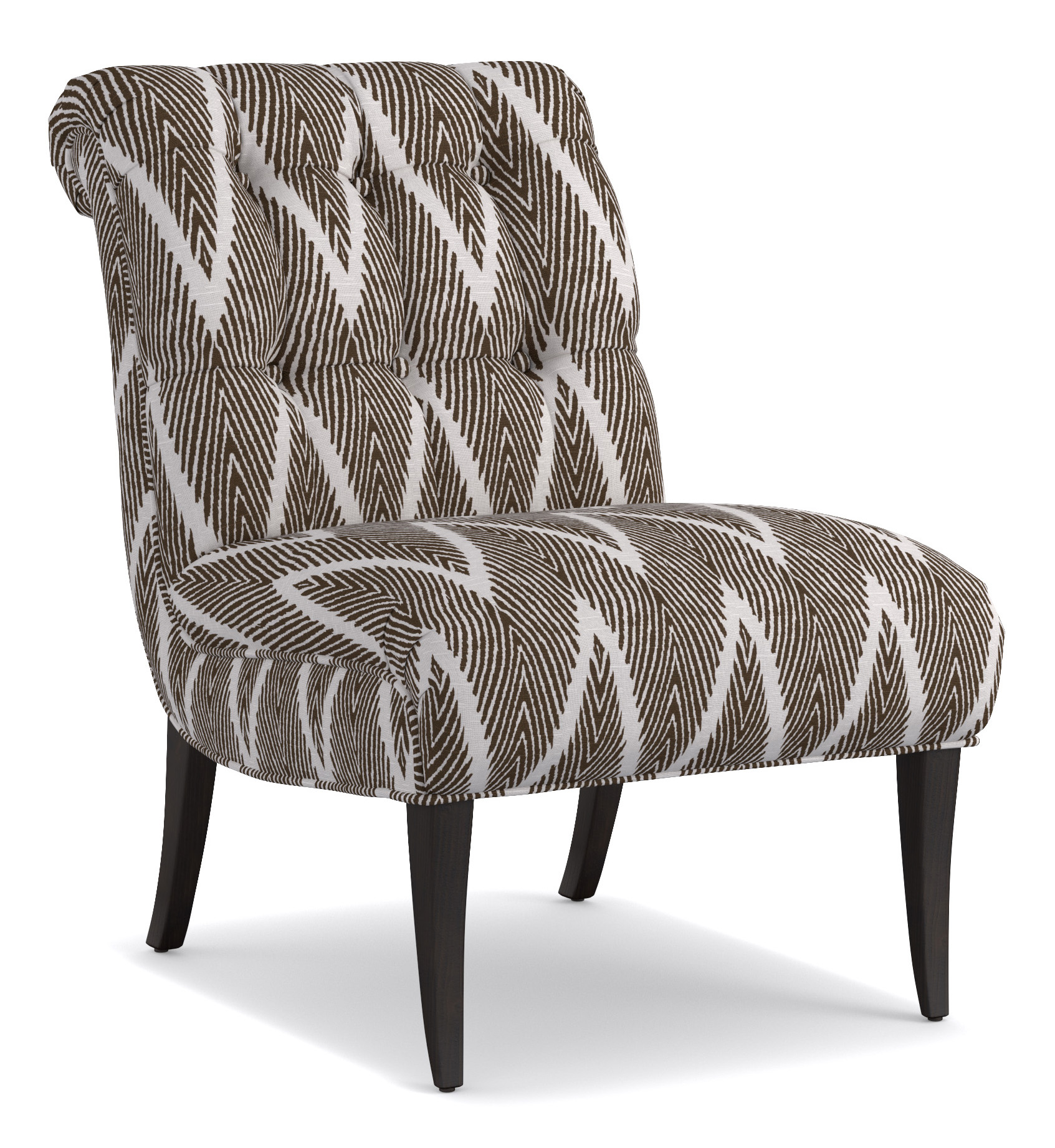
Isn’t it a designer’s job to keep an eye on the latest trends? The answer here is no. As a homeowner, it is also your responsibility to be abreast with the latest when it comes to interior design trends. What are hot right now are geometric patterns with these popping more and more in many modern homes. There shouldn’t be any reason to shun this bold style. As long as it is done correctly, following the trend can be a wonderful way to boost the look of any room.
A Blast from the Past
Here’s great news about trends whether relating to fashion or the interiors of a home – they share common properties. So whether these existed in the ‘70s or are contemporary, you will soon see something common in the geometric patterns that were used in homes then and now.
The popularity of geometric patterns, or any other interior design trend for that matter, comes back in a circle. It is a cycle that can be reinvented in every new decade. Try to look through pictures from your childhood. What was considered chic then are often not too different from what we consider to be stylish nowadays.
It won’t be a stretch to notice that geometric patterns have just returned. Just keep an eye on the simpler and bigger patterns, though, as these can give your place a more refined ambience. The traditional look has always been able to evoke the ‘70s vibe. If you want this retro look in your home, then consider the thinner stripes and shapes.
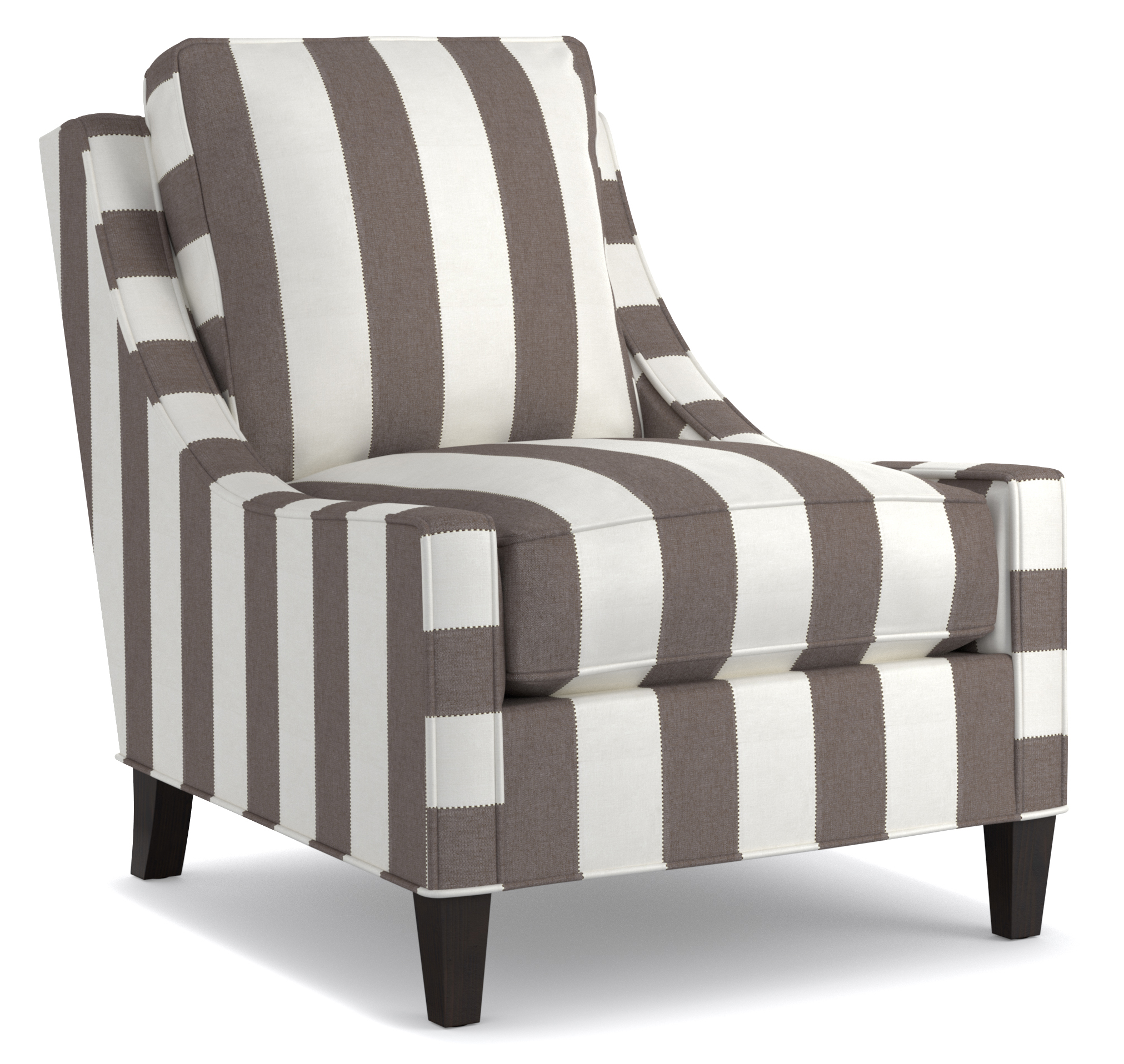
Cynthia Rowley for Hooker Furniture: 1118CR Delancey Club Chair
Visually Stimulating
Achieving the look of a home that seemingly leapt off an interior design magazine is not impossible. All you need is to add something that will make the place more visually interesting.
So what’s geometry got to do with visual stimulation?
A lot, actually.
There is nothing more boring than looking at walls upon walls of neutral paint and rows of boring furniture. As far as adding visual interest, you should consider using patterns in your design. geometric patterns create visually enticing rooms as they move the eyes from the boring stuff and, inevitably, towards them.
To choose the right kind of geometric patterns, you have to know what color scheme you have to work on. Make sure that you use the correct size of print which won’t overwhelm the room’s size or the design which you are trying to set up.
Cynthia Rowley 1102CR Perry Chair
A Dash Is All It Takes
Having a great interior design is all about knowing the elements that would work together. Harmony, after all, is a major concept that you have to master when it comes to interior design.
Would you be using geometric patterns as a dominant element or would they play an accent role? It will be overwhelming to have an entire room filled with geometric patterns. While it is not your desire to bore your visitors or loved ones with neutrals, it is also not good to resort to too much activity by bringing in all the geometric patterns that you could find.
Geometric Upholstered Furniture
The applications for geometric patterns are actually limitless. The great thing about them, too, is that every piece will comfortably fit in any kind of design. Blending with the room features is also not difficult.
So as not to overwhelm, you can have the geometric patterns on your upholstered furniture. This is the safest and most stylish way that you could incorporate this design element to your home. Being more powerful in your design is also easy; all you have to do is to seek out the bolder geometric patterns and you’re on your way to create a
Tags: bold, bold design, bold interior design, bold interiors, bold statement, geometric, geometric concept, geometric design, geometric elements, geometric furniture, geometric interior design, geometric interiors, geometric patterns, geometric style, geometric upholstery, McCreerys, McCreerys Home Furnishings, patterns
Posted in Interior Design 101, Interior Design Elements, Interior Design Themes | No Comments »
Wednesday, April 20th, 2016
Flexsteel Living Room Fabric Chair 0102-10 showcases floral fabric fused with the beauty of wood.
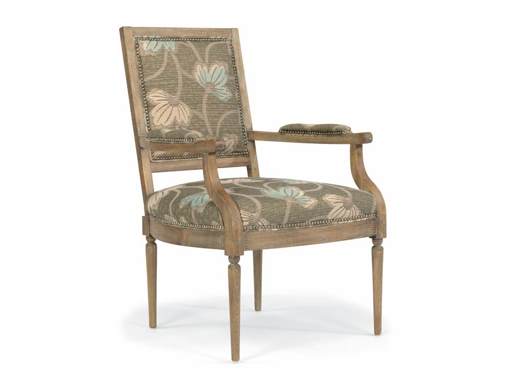
One of the most noticeable comebacks happening in interior design these days is the return of strong patterns and prints. Large scale designs are being paired with oversized florals as well as the trendiest colors.
Let’s begin with poppy which is a bold floral design that is printed digitally to a linen or poly-linen base. This is a great choice for cushions and upholstery. It is also a fashionable material for drapery.
Natural fibers continue to be featured on many furniture showrooms – and for a good reason. The trend proves that organic looks will remain and that eco-friendly lifestyles are here to stay.
Falling In Love with Florals
Stanley Furniture Bedroom Chaise Banquette 222-23-72 shows shabby chic perfection.
And so it happened – you have fallen in love with the beauty of floral upholstery and fabrics and now you are wondering how you can bring it home. Floral prints can be too loud, others may say, but this is only if you are not careful.
So what should you do?
If you are thinking of how to match floral upholstery with other interior design elements, then you are not alone. There are many before you whose spirits have been dampened by the wrong use of florals. And now they are still rattled by the very idea of combining it with furniture, lighting, etc.
Now, the first step is to look for graphic prints. You must start somewhere so begin with the simple prints. A single, large-scale graphic print rug can go a long way in terms of making good use of florals in your home. If large-scale prints are still bold for you, then settle for medium and small-scale prints that have been fused to make a room pop.
A floral print armchair, for instance, will balance graphic curtains and an equally graphic rug. In this case, you can afford to use neutrals in solid hues for the rest of the room.
Next, if you happened to fall in love with a bold floral sofa, then don’t rack your brains trying to find out what would go with it. Pair it with white and call it a day! White or any neutral color (cream, wood or beige would also do) for your walls and accessories would balance that big, bold floral sofa. This is the widest space that the sofa could breathe in so provide just that.
Third, find out what colors are included in your floral piece. Pull a color from the group of colors used then create a scheme from there. Just make sure that you get the exact shade used on the florals. Ask for a swatch of the floral print as you shop for other pieces inside your home.
The background hue can be used as a wall color and one of the vibrant colors can be used as solid upholstery or curtain color. Choose also an accent color from the floral hues. Use this on your pillows and accessories.
Grounding the bold look offered by florals is easy with leather. The ever reliable leather is there to provide the necessary weight in a room. Add the floral print and you’ve created a seemingly unbalanced look yet one that is beautifully grounded.
Repeating the motif for the rest of the rooms would not hurt.
Lastly, you can also go wild and pair florals with animal print, the latter being the staple piece as it can work with anything. Try animal print on a small rug or on your living room ottoman. This, when paired with florals, will be an eclectic yet glamorous ensemble. This pairing will surely alter the look and feel of any room in your home.
So go ahead, fall in love with floral upholstery. It can be bold or subdued, it’s really up to you.
Tags: bold, bold design, bold interior design, bold statement, chair, floral, floral design, floral interior design, floral upholstery, flower upholstery, McCreery's Furnishings, McCreerys, McCreerys Home Furnishings, patterns, seat
Posted in Accents, Interior Design 101, Interior Design Elements, Interior Design Themes | No Comments »
Tuesday, April 19th, 2016
Flexsteel Bedroom Queen Panel Bed With Storage W1909-90QS is perfectly balanced by the red and white floral arrangement and other exciting accessories.
The combination of red and black may not be a mixture that you have given much thought in the past. You might just change your mind once you see the winning reasons why these colors can take your home at the center of everyone’s attention.
Turn Up the Volume
Upping the wow factor of your home could be as easy as choosing the red and black palette. This color scheme offers just one vibrant hue but it does not automatically mean that the other color can’t offer drama on its own.
Red or black, each of these colors can make a bold statement on its own. They can actually be used under any circumstance. So, when you are designing your living room towards a bolder look, be sure to consider this marriage of colors.
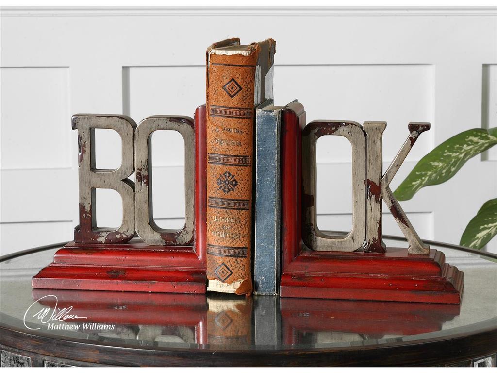
What’s a living room without these exciting Uttermost Accessories Book, Bookends, S2 19589?
Who’s the Boss?
Okay, so you have finally made up your mind and are now bent on using red and black, now what? These are both bold hues so one of them has to give.
Choose which one – red or black would be the dominant color. To choose which, take a careful look at the curtains and walls of the living room. See also the floor as well as the natural light inside the room. Is your living room used generally for simple family get-togethers or more of an out-of-office venue for your colleagues?
Whichever you end up choosing as the more dominant hue, make sure that you harmonize every aspect of your design. Consider salsa red in your living room if you spend more time there and if you perceive it to be a cheerful room with lots of foot traffic.
A more subdued and relaxing living room can make use of deep rose as the central color.
Balancing the red and black palette means using complementing colors on the more dominant color. The complementary colors should be used on your accents. For instance, if you used red as the dominant hue, then you may use the quieter gray on other design elements.
Put In Some Finishes
Metals and woods in the living room can also contribute to your red and black color scheme. The use of lacquered-black wooden furniture pieces adds intensity to any living room.
Do you like the shabby chic look? Then use pale gray on your furniture while accessorizing with the more exciting red and black mixture. Remember, the color of the furniture should balance the rest of the colors and elements that you decided to use. A heavily black room, for instance, can be beautifully balanced by paler shades of red.
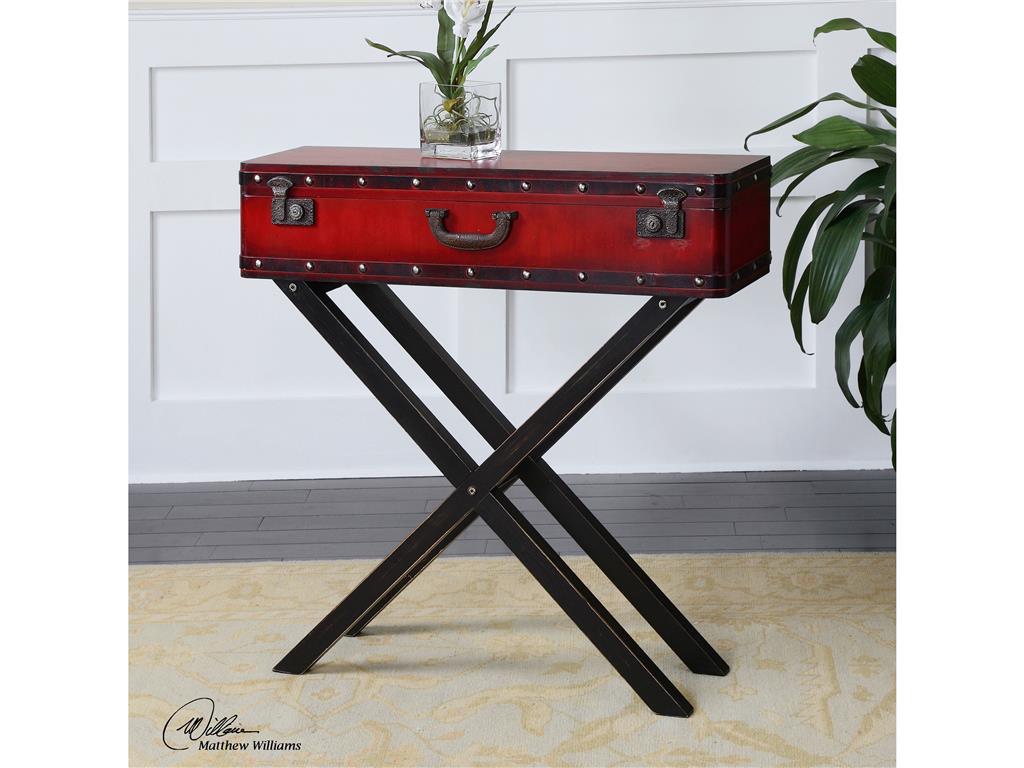
Living Room Uttermost Taggart Red Console Table 24379 does not need to beg for attention with its unique look and color fusion.
Just a Hint
Most of the time, when designers suggest red and black, homeowners have a tendency to wince. What they don’t realize is that this fusion need not be vibrant all the time. Don’t give up on these colors if you are the more traditional type. A hint of red – here and there – can sometimes do the trick. This is just as striking as a whole room filled with vibrant red. A simple red pillow propped against a plush, black sofa can be a simple combination that could also serve as the focal point in your living room.
The clever use of red and black can add the needed drama. The fusion can be used on the walls, floor and major pieces of furniture. If you prefer a less committed take on the red and black palette, then just use the hues on most of your accessories.
Let’s accept it –red is an eye-catching color. A red accent wall is the perfect backdrop for your beautiful black cabinet. These give the eyes a pleasant place to look at while taking the time to absorb the rest of the design elements.
Tags: black, bold, bold color palette, bold design, bold hues, bold interior design, bold statement, guidelines, McCreery's Furnishings, McCreerys, McCreerys Home Furnishings, mixing colors, mixing style, red, tips
Posted in Color Schemes, Living Room Design | No Comments »
Follow us on our social media
© McCreery's Home Furnishings | All Rights Reserved | Privacy Policy