- Follow us:


Friday, December 23rd, 2016
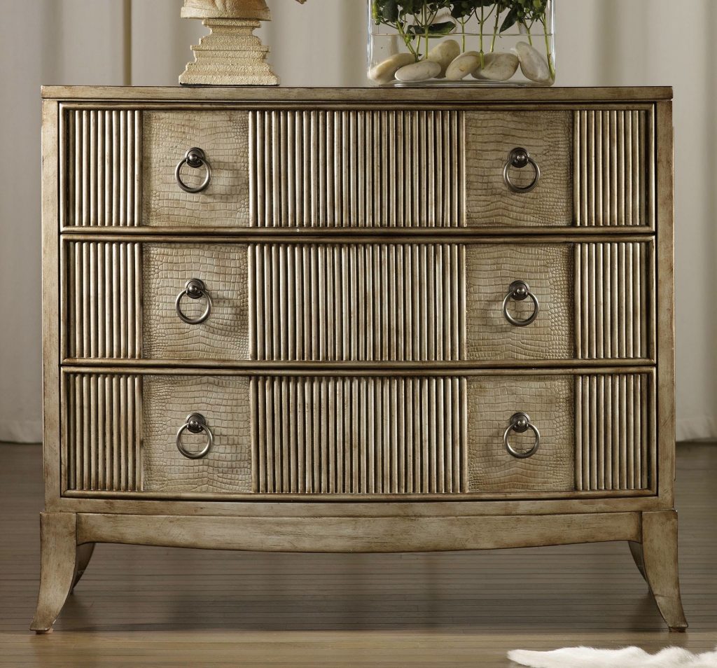
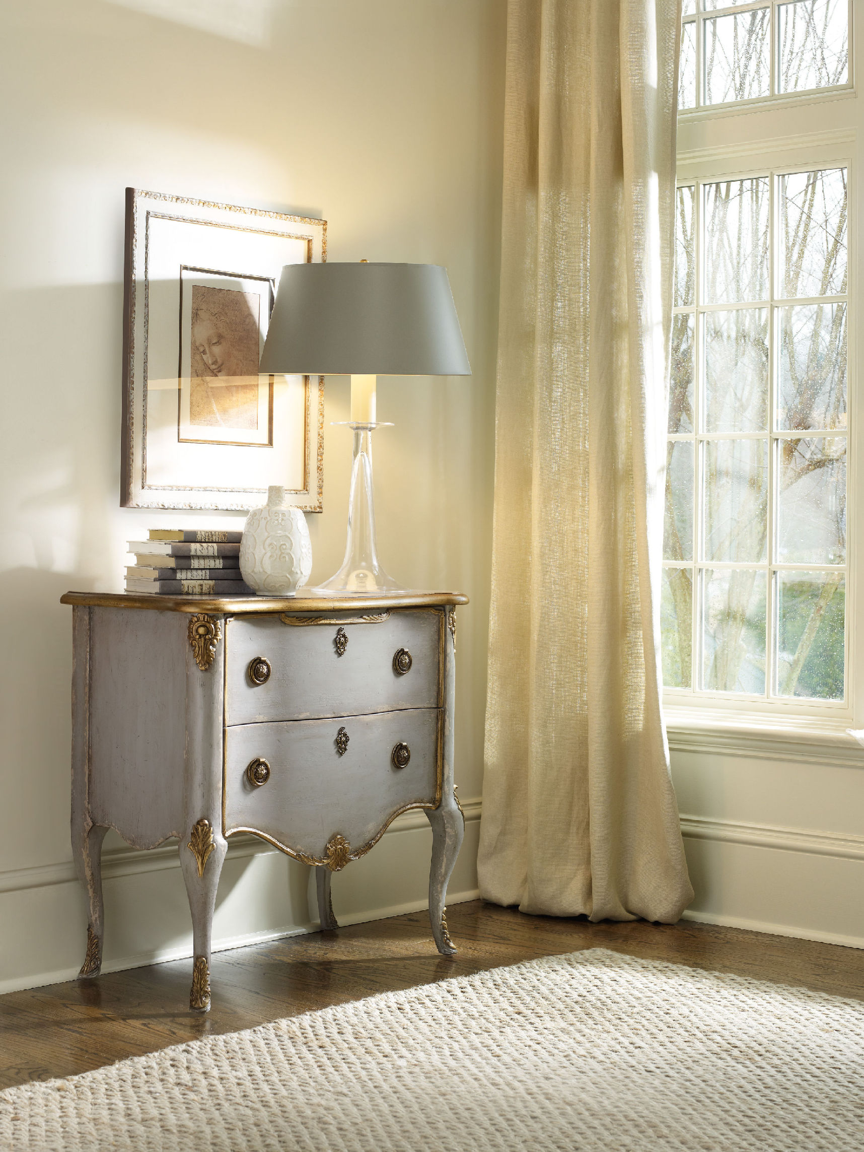
Hooker Furniture Living Room Latico Chest is an interesting home for your drabware.
Call it khaki, beige or greenish brownish, this complex color may often be used in drabware but it’s far from being drab.
Drabware is a term used to describe the color of tableware. These are the ultimate neutrals. It can also be a chameleon as it takes on a different tone based on the light that’s shining upon it.
Neutral is one of the finest backgrounds when you decorate. You can actually decorate with your drabware, more so if they’re vintage. Make your collection grow then store them inside equally interesting china cabinets.
Let these pieces inspire you to decorate the rest of your home. Think out of the box – go beyond the usual plates on walls or pairing drabware with the same-colored textiles. Neutrals sit beautifully inside any home because it is versatile.
The Drabware History
Drabware has seen a lot of admirers in English pottery when it was introduced in the early nineteenth century. Back then, monarchs and commoners alike aspired to have a piece. Those who are able to, even print their coat of arms on every piece.
Drabware also became popular among the upper-middle class as it was also used in creating other objects. These include incense burners, ink sets, candlesticks and miniature toys for kids.
Cornish clay was used in making drabware as nickel and flint were also added. This resulted in the beautiful, earthy tone that is descriptive of drabware. These earthy drabware, however, did not have a consistent color. Variables like the amount of clay and minerals, as well as the kiln temperature result in skewed hues that look more like gray, brown or green.
A pinkish tinge is also a possible partner of drabware. In fact, drab grounds the pink so that you won’t have to worry about experimenting with this feminine color. Pick dusty shades so that they will also complement the drab. This will easily offer a more calming, tranquil effect in your dining room.
Light natural wood also pairs well with drab. If you want to bring in some patterns and textures, just install wallpaper.
Unlike ceramics that get colors from surface glazing, drabware is drab throughout. It only has a clear glaze though some pieces now have decorative paint, gilding, and colored enamel. Other embellishments are also available.
Drab-colored paint is also now available for cozy areas such as a breakfast nook or a small living room. Metallic pieces will be highlighted by a coat of drab paint.
The 20th century showed an on and off production for drabware. Smaller companies made their own versions with Tiffany & Company joining the bandwagon. Even Martha Stewart and her company took their inspiration from drabware and upped its visual appeal by offering it in both plain and gilded-rim types.
The earliest drabware were platters and pitches which – when you can find them today – are of great worth. These are valuable collections that only a few are able to get their hands on. The smallest pieces can amount to thousands of dollars with auction sites opening their bids at hefty amounts.
If, however, you would just want to take home the beauty of classic drabware, then there are also modern sites and shops to buy them from. A five-piece set that was made in 2000 could now be bought for $200. Of course, the later the year, the more affordable the pieces would cost.
Housing Your Drabware Collection
It is important to preserve your collection by keeping your pieces safe from dust, the natural elements, insects and breakage. You can effectively do this if you are ready to unleash your artistic potential.
There are many china cabinets to choose from. Pick one based on your chosen theme. Wooden ones go best inside rustic interiors while the sleeker ones will be at home in a modern or contemporary setting.
Tags: McCreerys, McCreerys Home Furnishings, neutral colors, neutral hues, neutral interiors, neutral palette
Posted in Color Schemes, Interior Design 101, Interior Design Elements, Interior Design Themes | No Comments »
Thursday, November 17th, 2016
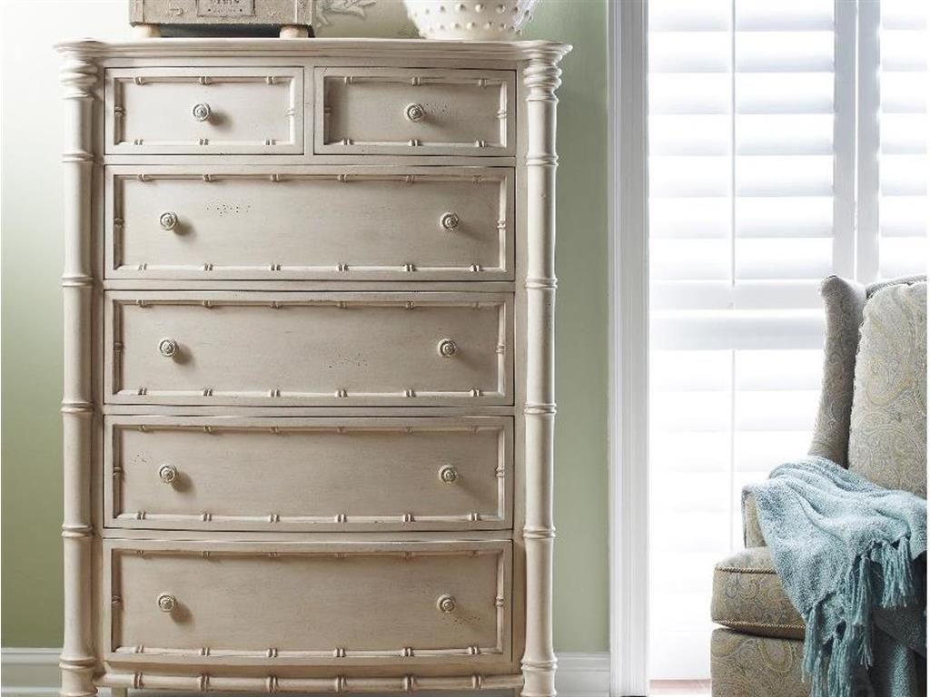
Fine Furniture Design Bedroom Bamboo Drawer Chest 1050-116
What did you feel when you last saw an all-white home? Did you feel relaxed or was it the opposite? White is a color that most homeowners would just use to mix with other colors but using it – on its own – is not something that many would venture to. A lot of people are nervous about the use of white especially when they want their home to look homier. Yet white can be a refreshing color compared to many other colors on the spectrum.
White evokes cleanliness, purity, even sophistication and confidence. Prior to using white in your home, be sure to check out the following tips first –
White as Clean Slate
Instead of feeling nervous about white, look at it as a way to achieve a fresh start. White can release your creativity without you even becoming totally aware of it. A white room is a wonderful way to decide what inspirations you have for your room. For instance, if you have a scenic view from the living room, then it would be a great idea to frame this in white walls. There is nothing more beautiful than white as a backdrop for the most gorgeous vistas.
Know also that there are different shades of white that are not automatically beige. Every hue, in fact, has a corresponding white tint, from yellows, pinks to purples and greens.
White on Upholstery
Sure, white upholstery is a bit more difficult to clean as it gathers dirt more quickly, but using white in this case means knowing what fabric type to pick. Having children and pets in your home would call for sturdier fabrics such as khaki or faux suede. There are also slipcovers that are now made with white denim so find out if that’s also suitable for your active home.
Let Art Do the Talking
A great asset that you can actually show off using a white wall is an interesting piece of art. Show your personality by putting up a framed painting or any interesting piece of art on the wall. Such pieces command attention and adding the bareness of white make them the perfect focal points in rooms.
Use Tone-on-Tone Layering
Should you ever feel that your room lacks warmth or personality, think of layering the whites in like shades. Use warm whites and warm grays, for instance. Use textures and patterns that are similar to the white hues that you used.
White Spells Versatility
White will always be a rich canvas where you can decorate and style all year round. Whether you’re ushering in the winter season or welcoming the advent of spring, there will always be shades of white that go well with the interesting colors of the season.
White can also be used to frame interesting architectural features. For example, an all-white bathroom would effectively highlight a colorful vanity table. With the right accessories, white can actually look cosmopolitan, even sophisticated.
Risk aversion or veering away from idea overload is also the role of white paint. As a homeowner, it is often easy to get lost in the trendiest interior designs. If you want to have a more grounded setting, then use white to anchor your most interesting designs.
White Means Erasing Blemishes
White is an eraser of any architectural error – from blemish on the drywall to exposed ducts. White is an effective way to camouflage eyesores. If you’re living in an older home, then this can also highlight the most beautiful crown molding.
Use white to transform your home to the modern minimalist, classic neutral or traditional setting that you dreamed it to be.
Tags: McCreerys, McCreerys Home Furnishings, neutral, neutral colors, neutral hues, neutral interior design, neutral interiors, neutral palette, white, white color palette, white color scheme, white in interior design, white interiors, white palette
Posted in Color Schemes, Interior Design 101, Interior Design Elements, Interior Design Themes | No Comments »
Wednesday, September 21st, 2016
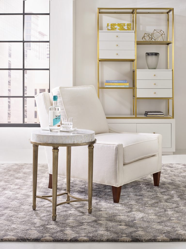
1586-80116-MULTI Aura Round Accent Table with Shell Top 1118CR Delancey Club Chair
Scandinavian design is maximized styling with the least amount of fuss, the two guiding principles being function and fundamentalism. This design has been shaped by the sensible minds in Old Nordic Europe resulting in airiness, light, serenity, even a stark oneness with Mother Nature.
Scandinavian trend is a concoction of Danish, Norwegian, Swedish and Finnish design principles. All of these use natural elements which favor the neutral color palette. Remember to keep lines more basic.
Winning the World Over with the Scandinavian Look
Scandinavian home design invaded the world right after the 1947 Triennale di Milano edition. This is a renowned design exhibit in Milan. Here, glassware, accessories and furniture pieces coming from Nordic regions are shown. Later, the world caught on as they saw the beauty that this stark white design can offer.
The design show soon travelled to the U.S. and in Canada. The years 1954 through 1957 were the most fascinating years for this design as more and more ideas were added.
It is interesting that Scandinavian trends have evolved from the usual European look of favored ornate and opulent décor brought to the world by royalty and aristocracy. The Nordic people embraced a more practical look though plush pieces also appear now and then.
Scandinavian Light
Lighting is key in the Nordic regions with only seven daylight hours during the winter season. The look and feel of your lighting fixture will say a lot about whether or not you have achieved the Scandinavian design.
Scandinavian interiors have different kinds of lighting for mood building and correct illumination. This usually hangs between the industrial and modern looks. The styles could be anything from pendant to wall sconces.
Candlelight is also a must as it can automatically add a beautiful glow to any space. Votives are a beautiful deviation though you can be traditional by using candelabra.
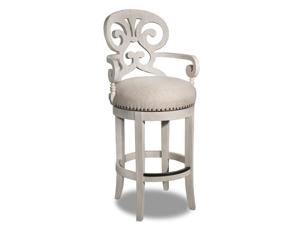
Hooker Furniture Dining Room Mimosa – Cottage Fabric Barstool
Scandinavian Form and Function
Scandinavian furniture is all about the use of clean lines. Find chairs, tables and sofas that have a Mid-Century modern look. These are the ones that have rounded, smooth edges and neutral hues.
This design also focuses on function and innovative look.
Scandinavian Flooring
Don’t ever use wall-to-wall carpeting as this never happens in Scandinavian interiors. Flooring is traditionally hardwood, used in its natural color or, often, painted white. Since it is white, it automatically contributes to the expansion of the space and allowing more light inside.
Scandinavian Living Elements
It is also crucial to bring in living elements of beauty and color in this design. Fresh flowers are an absolute necessity. This is apparent with all those sidewalk florists in Copenhagen who sell tulips in every possible color.
Succulents are also a welcoming vision in any Scandinavian home.
Scandinavian Means Neutral
If there is one color palette that is most associated with Scandinavian design, then it would have to be neutrals. So go ahead and use a lot of whites, grays, browns and blacks. These can be interwoven throughout your home if you want to create a calming and clean look.
Designers have introduced pop colors throughout the years so sea greens and light pinks are also now acceptable.
Regular Scandinavian homes have white walls that allow art and furniture to mesmerize.
Scandinavian Means Zero Clutter and Limitations
One of the best features of Scandinavian interiors is cleanliness. Storage is a must and is often implemented through shelves and cabinets. Décor is always intentional where less is more. Always remember visually relaxing as your mantra.
Inviting light in is a major concept in Scandinavian interior design. Windows from these European regions have windows that are often stripped bare. Should the homeowners consider using window treatments, then the materials should be sheer or linen.
Tags: McCreerys, McCreerys Home Furnishings, neutral, neutral colors, neutral design, neutral hues, neutral palette, Nordic design, Nordic interiors, Scandinavian, Scandinavian design, Scandinavian interior design, Scandinavian interiors, Scandinavian style, white, white color palette, white color scheme, white interior design, white interiors
Posted in Interior Design 101, Interior Design Themes | No Comments »
Monday, May 9th, 2016
Hooker Furniture Living Room French Two Drawer Chest offers a distressed yet elegant optimization to the white walls.
There are many ways of freshening up a home in terms of its overall look. If you plan to level up on your cleanup, there is a clean-slate strategy that is hassle-free and safe. Painting your walls white is a technique that will make your home into a blank canvas that is ready to be doused with your personality.
A Word of Caution
Before you delve into this undertaking, you might want to look into the possible effects of the color. First, white paint may be the magical solution to many homes that want to start anew but it can also be a cold, unfeeling color.
Just like any other color, consider white to have its own temperature, lighting requirements, mood, even style. It has – more than any other color – maintenance requirements as well as a rich history. If you make the mistake of ignoring these elements, then you end up with a stark color as opposed to the clean, crisp hue that you wanted.
Do not be afraid to use white, though. Most of the time, all it needs is just a dash of another hue to tone down or warm things up.
Room Considerations
Prior to painting your home white, you must take a careful look at its orientation. Those rooms that turn away from midday sun have a gray-blue light. These rooms are great for summer bedrooms, a studio or a gym. This is so because the sun’s angle at this point provides the needed consistency.
White paint tends to optimize the lighting in these spaces. While it works in these rooms, white won’t work in rooms that face the north. White will link the snow-laden outdoors to your home without being visually distressing.
Use red, orange or yellow tint with white when you paint the areas of socialization and dining. Rooms that don’t have a direct access to natural light are the best candidates for these color fusions. The warmth of yellow, orange and red will make up for the heat lost from the sun. These colors are also known to raise blood pressure, thus, upping your level of activity and positive vibe.
Scientific evidences have proven that colors can create a certain psyche, in this case, the warm colors make the body feel heat even in the absence of real warmth.
Rooms that face the south are the ones that receive the most amount of sunlight during the morning. Summer or winter, this side of your home will receive a red-yellow sort of light during a clear day.
White-painted walls will cool such spaces while not limiting your color choices. You can still adjust the glare by looking at your pigmenting options. An example is using gray to soften the reflective property of white. This combination should create a hush-hush feeling inside your living space.
One color choice will not be able to offer the lighting changes required in different seasonal circumstances, however, there are times during the day also certain seasons when rooms get the most lighting wear.
It is during such times that you should dampen or radiate the natural light that comes in. To do this, choose a conditioning color that you can use with white. Cool colors include green, gray and blue tones while the warm ones are orange, red and yellow.
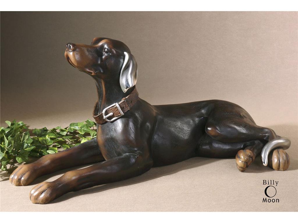
The Uttermost Accessories Resting Dog, Statue 19070 offers an amazing contrast to the starkness of white.
Outside-In
Remember that the outdoors can greatly affect what you have inside. If you have an awesome view of the ocean outside or, perhaps, a beautiful garden, then use it to your advantage. White walls will be able to enhance such picturesque views. White is the perfect solution for that much-wanted year-round shoreline view. You can enhance the view by fusing white with just a small quantity of yellow-orange pigment. This combination should frame the coolness of the view outside.
Now ain’t white beautiful?
Tags: McCreerys, McCreerys Home Furnishings, neutral, neutral colors, neutral hues, neutral interior design, neutral interiors, neutral palette, white, white color palette, white color scheme, white in interior design, white interior design, white interiors, white palette, white walls
Posted in Color Schemes, Interior Design 101, Interior Design Elements | No Comments »
Thursday, April 21st, 2016
Whitewashed piece is from FFDM’s Campton Grove Collection
Antique finds and vintage pieces – the distressed, imperfect and cracked finishes, add the sparkling crystal chandeliers, old yet fresh-smelling linens, lots of white – yes, these describe the shabby chic style perfectly. This interior design theme is not for everyone, though. Shabby chic is luxurious yet still comfortable. This thrives in the spirit of seemingly old stuff yet new and clean.
This Style Ain’t Shabby
Don’t ever let the word shabby fool you into embracing the principles of this wonderful theme. It may seem unstructured to look at, at first, but the lack of formal rules is what makes this style timeless. It brings in an effortless sophistication into any home.
Don’t think of flea markets, though, or cheap retail shops or you would be disappointed with what you would find.
Say yes to handicrafts, vintage textiles , and white, distressed furniture. There is no need to search high and low for the best whitewashed furniture pieces, we have everything that you would need to set up your shabby chic home.
Get the look with these simple guidelines –
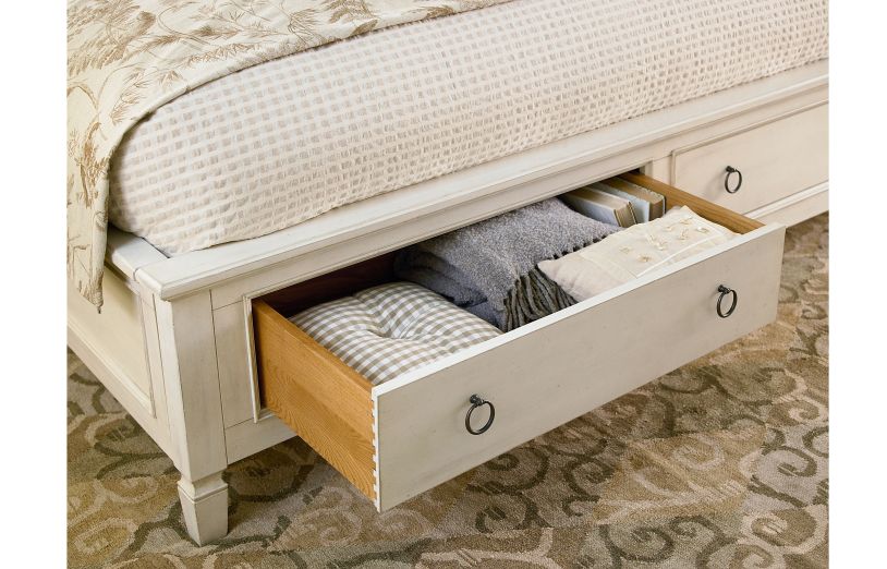
Universal Furniture Bedroom Storage Bed King 987260SB
Tags: McCreerys, McCreerys Home Furnishings, neutral, neutral design, neutral palette, rustic, rustic charm, rustic home, rustic interior design, rustic interiors, rustic look, rustic style, shabby chic, shabby chic design, shabby chic interior design, shabby chic interiors, shabby chic style, vintage, vintage design, vintage furniture, vintage interior design, vintage interiors, white, white color palette, white color scheme, white furnishings, white interior design, white interiors, wood, wood design element, wood elements, wooden, wooden elements, wooden furniture
Posted in Color Schemes, Interior Design 101, Interior Design Elements, Interior Design Themes | No Comments »
Wednesday, February 10th, 2016
Universal Furniture Bedroom Santa Rosa Poster Bed Queen 313280B
Farmhouse design has been around for many years. Its simplicity is no longer just considered a style but a passion for some. It is casual and basic, none of the frills and excessiveness of the other interior designs.
Farmhouse design makes amazing and exciting vacation houses. The old and the new worlds collide in this perfect union of styles. If you happen to be blessed with an actual, old farmhouse, then learn how you can remodel it and bring it back to its glorious days. If you want to build a farmhouse from scratch, then you have to know the elements that make this design uniquely charming –
Old farmhouses usually have large openings. This is so large furniture and many people can be accommodated. The windows are generally bigger, too, because they are meant to offer a grand view of the farm outside.
Modern farmhouses already share these features. Sure, there might not be a literal farm outside but the wide openings can still be used for the amazing sceneries. These houses also break down the usual barriers of the outdoors and indoors.
Traditional farmhouses were made quickly. Farmers did not have the leisure of time to set up fancy interiors, hence, you won’t find fancy wallpapers, bright paints, or ornate furnishings. Whitewashed or natural woods were preferred as were exposed beams and light-colored walls.
Stanley Furniture Dining Room Fairleigh Fields Host Chair 018-61-70
The Farmhouse Living Room
The same principles of design apply in this room as in the rest of the house. You can mix natural materials with modern elements. Find a neutral carpet that can give the room a simple, warm base. Brown, tan and other natural tones are commonly found in farms so use them liberally.
Keep all your furniture neutral and simple. These pieces should echo the look of the floor.
No country living room is without a fireplace so make sure that you set up one for your home. Use candelabra, old bottles and barrels to decorate the rest of this room in your home.
The Farmhouse Dining Room
Just like your living room, the dining room should come with simple flooring. Weathered wood is best as is neutral carpet. A hardwood dining table is the star of this room so make sure that you choose a lovely piece that will last for many, many years.
Accent the rest of the room with chinaware and simple dishware.
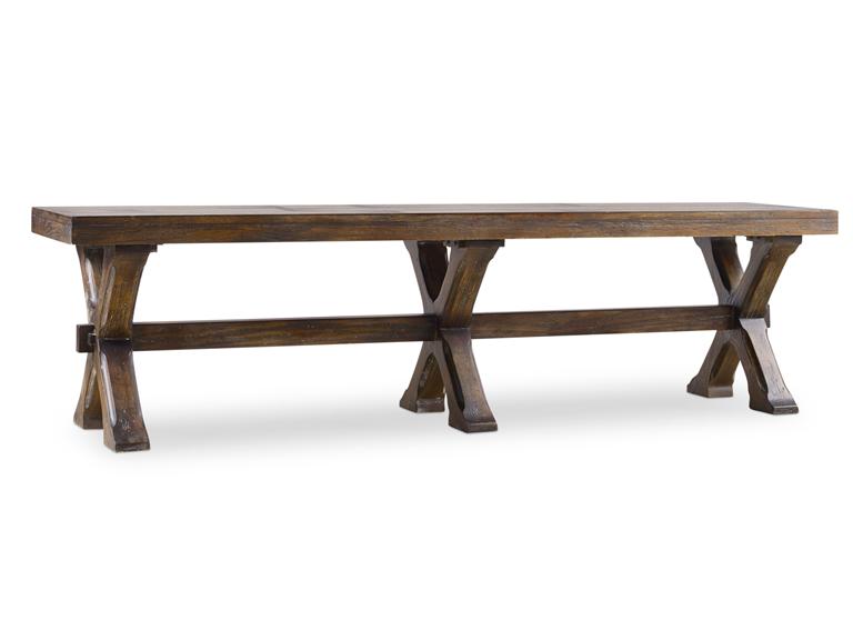
Hooker Furniture Dining Room Willow Bend Bench
The Farmhouse Open Kitchen
Farmhouse kitchens are always open. They are large enough to feed a huge family.
The focal point is the center island where pots and pans are stored. Wood countertops are also common so say goodbye to marble or granite countertops. Find out which glass fronted cabinets will work for you or if you would prefer the wooden ones. Keep in mind that no farmhouse kitchen is considered complete till there are plate racks for those beautiful serving trays and ornamental plates.
Find appliance panels to hide your refrigerator or dishwasher. Keeping the modern appliances maintains the old-fashioned appeal. If you can find retro stoves, then that should keep the antique feel in your place. Add accessories like wooden spoons, old dishes, or antique pitchers.
Maximize natural lighting even if you have to reduce the number of upper cabinets. Open shelves are great in keeping the country feel.
Winners Only Dining Room 57 Inch Farmhouse Single Pedestal Dining Table 54257A
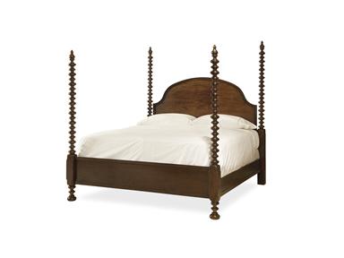
The Farmhouse Bedroom
Pick the simplest four-poster beds, dressers and side chairs. Start with rustic wooden floors, rugs and rustic accessories. You can also add a fireplace in this room. Think well about your lighting options. A rustic chandelier should do the trick.
Other Farmhouse Tips
Tags: designing with wood, farmhouse design, farmhouse remodeling, farmhouse style, McCreerys, McCreerys Home Furnishings, neutral, neutral interior design, neutral interiors, neutral palette, neutrals, old farmhouse, wood, wood elements, wooden elements, wooden furniture
Posted in Bedroom Design, Dining Room Design, Interior Design Themes, Kitchen Design, Living Room Design | No Comments »
Follow us on our social media
© McCreery's Home Furnishings | All Rights Reserved | Privacy Policy