- Follow us:


Tuesday, July 4th, 2017
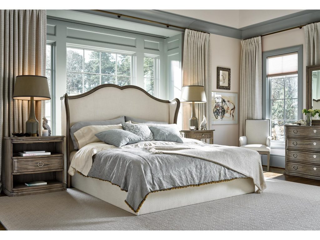
This bedroom still manages to stand out even with an all-neutral background and furnishings. Featured furniture is the Lazarus Queen Headboard piece from FFDM’s Meritage Collection.
(Second in a Six-Part Series)
Pronounced (NOO-trul), neutral colors are not the hues that you would expect to see on your color wheel. Neutrals include light, midtone and the darker shades that are all classified as earthen colors. When talking about the interior design context, neutral actually means minus the color.
The most famous neutrals include black, ivory, beige, taupe, shades of gray, and white. These colors plus undertones will create variety despite your color palette being neutral.
To illustrate this, picture different shades of beige. There are actually some that have undertones of pink, gold or tan. Even white is not just the stark white that we compare hospital environments to. White can be bluish, ivory, or yellowish.
The Light Neutrals
Beige and white are two favorite light neutrals that are standalone hues. While this is so, they are still versatile enough to be used with other equally subtle colors.
White and beige are not even referred to as real colors but they do give a clean and classic feeling especially when used in the right rooms such as the bedroom, powder room or the dining room.
Light neutrals are there to trick the eye to believe that there is more space when it is actually limited. When you pair furnishings with like shades, you could create a sprawling room illusion without too much effort.
The Midtones
Mid-tones are cocoa, khaki, camel, and sand which all offer a natural ambiance. These hues also provide the best backdrop for colorful or like-colored furnishings.
The use of midtone in interior design is now a popular move among homeowners. These neutrals give comfort and warmth where necessary though they are also versatile to work with tropical, classical, and even modern designs.
In essence, the mid-tone is any indirect lighting that is directed at an object. Just imagine an apple that is receiving an enormous amount of sunlight. The surface that gets hit with the most light is the highlighted area. The shadows are the areas where there is no light. Now imagine the line where these two meet – that’s the perfect midtone.
The Dark Neutrals
The best examples of dark neutrals are black and gray. These are the colors that can effortlessly add drama, sexiness, and a dash of sleek to any living space.
Dark neutrals are sophisticated tones whether you intend to use them as an accent or background. Make a minimalist and stark statement as you contrast the dark colors against a lighter, neutral background (white and beige are absolutely perfect). You can also choose to be bold by pairing black or gray with bright colors such as yellow or red.
The All-Neutral Living Space
If you’re brave enough to do the all-neutral theme, then be sure to layer the varying hues of the color that you choose to use. This will ensure that you achieve a sophisticated ambiance.
Still, be sure to use colors that harmonize with one another. Pick a lighter shade for your walls (take note to always begin with the walls) while you use dark upholstery. You can also use an area rug in hues that blend well with a wood flooring. Just make sure that this shade is darker than your walls so that your furniture will still stand out.
Be sure to tie the room with the right accessories. When you properly use neutrals to your advantage, then you will see that all these stand out – the fireplace surrounded with stone, wood, and bricks’; the exposed beams; the hardwood flooring; and the wooden window frames.
Having a light and large home means you have a lot of options. If your home is small and a little on the dark side, then it would do you good to lighten up your neutral color palette.
Tags: light neutrals, McCreerys, McCreerys Home Furnishings, midtone, midtones, neutrals
Posted in Color Schemes, Interior Design 101, Interior Design Elements, Interior Design Themes | Comments Off on Color 101: Lovin’ the Neutrals
Follow us on our social media
© McCreery's Home Furnishings | All Rights Reserved | Privacy Policy