- Follow us:


Saturday, November 3rd, 2018
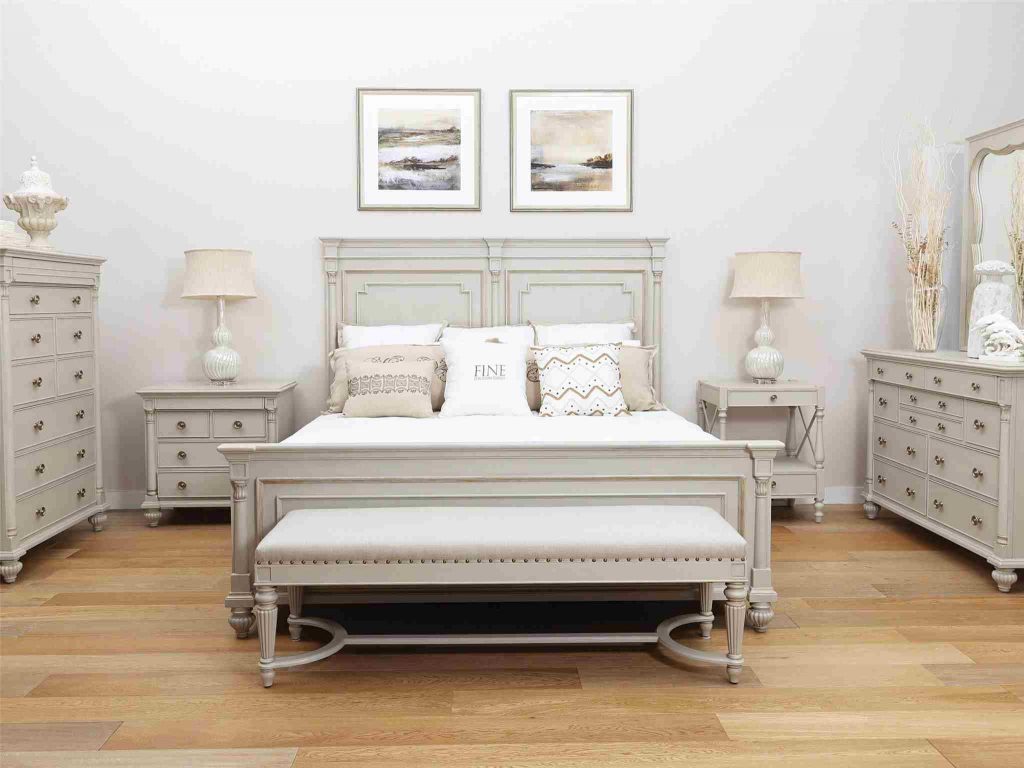
What element broke the monotony in this room? If you answered the rich, wood flooring, then you’re correct. Featured here is the Brookston King Bed from Fine Furniture Design.
Most people try to counter the cold seasons by using warmer color palettes. You don’t have to be led down the same path. You can, instead, embrace the stark beauty that the upcoming winter season is about to offer.
Keeping a home white and neutral can make a dark space appear illuminated and spacious. And since autumn and winter are seasons that require you to shut the windows, then a monochromatic color palette will definitely work to your advantage.
Now here’s a word of caution; a monochrome home could easily look bland, too, so you have to know how to set up a white-walled home without making it appear this way.
Choose the Right Furniture
The first step in achieving a beautiful neutral home is to pick the right pieces of furniture. In the living room, for instance, the right couch, accent pieces, and chairs can complement even the whitest of white walls. Stick with off-white cotton or linen on your seat fabrics. The right amount of wood elements will balance the starkness.
Add a Dash of Color
Here and there, don’t be afraid to add a dash of color that will balance the whitewashed surroundings. While your chosen style is streamlined and clean, it won’t hurt to add a pop of color that will cap the look.
An example is to put brass or gold hardware in an all-white kitchen. The hanging pendants in that room, if well chosen, should provide the necessary welcoming ingredient to the whitewashed ambiance.
Correct Lighting Only
The Boho chic room should have soft and romantic lighting. Nothing about it should be jarring, as this will only emphasize the unembellished theme that you’re setting up.
The Parisian bedroom is no longer just a dream. You can have this right in your own bedroom when you use twinkle lights along with a rustic wood headboard. Add a pair of warm-colored bed sconces and you have an intentionally stylish place of rest.
The Right Kind of White Please
You might think that whitewashing your home immediately means buying gallons of white paint. A monochrome home can have several layers of shades of the same neutral color.
When you still haven’t decided on the color that you would use to paint your room, be sure to pay attention to the lighting. A room that’s filled with natural light will naturally provide a warm tone. This is the room that needs the cool shades of white with gray or blue hues to balance the whiteness.
In the same manner, a smaller room that needs artificial lighting most hours of the day would benefit from the warmer shades of beige and creams.
Remember that white rooms can easily feel monotonous so know how to break up the zones by adding the correct textures and layers. Layering elements could be wooden logs, bricks, even that cozy area rug that you’ve been eyeing for the longest time.
Be Realistic
It pays to know your home. Not every shade or tint of white can work in your home. Of course, you still have to approach this project with a realistic mind. If your kitchen is a mess each time you end your cooking, then it would be a bad idea to have white walls there.
If you’re an art lover, then you can showcase a masterpiece on a blank wall. This can be that wide space right above the headboard or it can also be that spacious wall in the living room.
Whether you’ve decided to stage a Scandinavian space or just the cute shabby chic details, it’s really up to you. Just know that white is a wonderful canvas but it has the power to break your design scheme, too, so be very careful.
Tags: McCreerys, McCreerys Home Furnishings, monochrome, monochrome design, monochrome interiors, monochrome palette, Nordic interiors, Nordic style, Scandinavian, Scandinavian design
Posted in Color Schemes, Interior Design 101, Interior Design Elements, Interior Design Themes | Comments Off on The Monochrome Home These Holidays
Saturday, August 11th, 2018
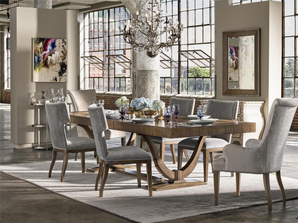
The Fine Furniture Design Portfolio Collection shows how beautiful monochrome could get.
It can get intimidating to think that you need to complete a design project using only a single color. Only the bold and the confident can get away with this. But here’s the great news – a monochromatic color scheme is actually hot right now. So how can you use it in your home?
Stylizing with monochromatic color is a lot more than picking a single color and flooding your interior with it. You would want to consider a lot of things such as what moods are associated with what colors. You will also need to explore your preferred hues and which ones are actually usable.
So What Is Monochrome?
The simplest definition of monochrome is that it is a single color that’s used as a base for all the tints, shades, and tones. There are some purists who argue that the first hue must come from the primary, secondary or tertiary hues on the color wheel. But it’s as simple as beginning with one color and moving on from there.
This only means that you can use any color from beige to purple and even jet black.
Go Classic
If you’re just starting and you do not have a style guide or even a preference yet, then you could be inspired by the classic color theory. Don’t make the mistake of thinking that the Color Theory is only for the artistically inclined. This has helped many interior designers for years and it’s about time to use it to visually engage your beholders, too.
The monochromatic approach to design is to pick that base color from the color wheel and then to add variants of that same hue.
Creating the Single Hue Palette
Your top consideration in creating the monochromatic scheme is contrast. How will you be able to create contrast with just a single color? Your biggest problem is to add depth and making the room stand out despite using just one color.
Be more confident in monotony by adding a sharp contrast.
You can do this by adding dark or lighter variants of the same color. Create a palette with just your artistic sense or you can use Adobe Color CC and other such tools.
Begin with that base color and then have a minimum of two other choices which are the lighter and darker versions of the same color. And just like any other color palette, you will need to establish where to use each color variation. Decide how each is going to appear in your design.
Understand Tints, Tones, and Shades
These are no less than your biggest tools when it comes to setting up a monochromatic home. Familiarize yourself with each so that you’ll know how to use them to your advantage. A hue is one of the 12 colors – the purest ones – on the color wheel. These are the colors that are either primary, secondary or tertiary colors.
The base color is the dominant or most prevalent color on your color scheme. This is where your design would all begin.
Tints are any color with added white so that it becomes lighter. When you do the opposite and add black, then what you get is the shade. Tone, on the other hand, is the addition of gray to intensify the color.
Why Monochrome?
So why should you go for a monochromatic color palette? It could get monotonous when not done correctly but it can also look amazing when artistically executed.
If you are a lover of simple and harmonious things, then this is the color scheme for you. It is also quite easy to design when you only have to worry about a base color and its tint and shade.
Minimalists will surely embrace this color palette for obvious reasons.
Tags: McCreerys, McCreerys Home Furnishings, monochromatic color palette, monochromatic color scheme, monochrome, monochrome color palette
Posted in Color Schemes, Interior Design 101, Interior Design Elements, Interior Design Themes | Comments Off on Excitingly Monochrome
Tuesday, July 17th, 2018
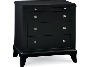
BLACK: Thomasville Bedroom Night Stand 82919-810
If you’re thinking that choosing a monochromatic palette is limiting your design potential, then think again. As opposed to popular notion, monochrome could actually give you more options than you think. And no matter the size of the space that you’re about to design or the budget that you have, there are special techniques that can give you the right monochrome look.
Since It’s Monochrome
Because we’re talking about a monochromatic look, you should always begin with a single hue. Pick any color from beige to purple to burgundy. The secret to this design is to use derivatives of the same hue.
Pick a base color that you can live with then begin looking at lighter or darker variants of the same color. These will become your secondary options.
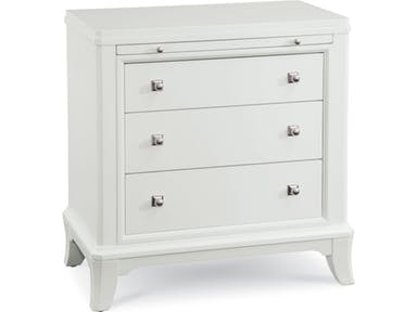
Or White: Thomasville Bedroom Night Stand 82915-810
What’s Right for You?
So your concern now is to get the right look for your monochromatic home. Now, before you begin worrying about rules, don’t. More than any set standards, you need to make the space look and represent you.
Your starting point all begins with the theme. The leading interior designers have come up with a bunch of categories for the monochromatic palette. These are the –
The romantic monochromatic style uses a lot of detailed and delicate textiles. You should freely use pastels and decorate with just subtle ornaments. As for the graphic monochromatic style, it is different from the first one because it features clean and strong lines. You are sure to find geometric patterns as they fill the backdrop that is chiefly black and white.
Monochrome in the industrial style shows a more warehouse look and feel. It comes with soft lines in just the right areas and there are variations of charcoals and grays that you can add to your color scheme. Use soft-textured furnishings, never think that industrial style should be stark and unwelcoming.
The Monochromatic Balance
Again, don’t be too strict with your color distribution. You don’t have to stick to equal amounts of black and white. This is more so when you are designing a small space. Begin with white walls and slowly infuse black as you continue. You will soon find out that you get the right balance each time.
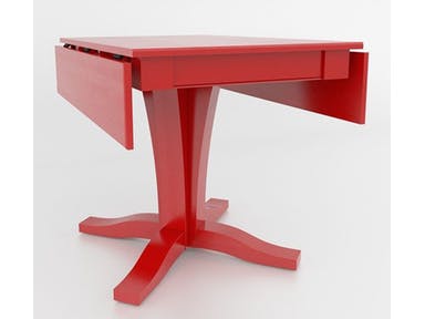
Or Boldly Red: Canadel Dining Room Drop Leaf Table With Pedestal TDL4210VR-F
Monochrome Is Bold
Deciding on a monochromatic interior means you can experiment with almost any kind of pattern. Since this is so, you might as well be bold. Know how to create visual impact. This is an awesome way to keep updating the space as often as you want.
The stars to a monochromatic interior are often the textures and patterns. Don’t treat these are the sidekick elements anymore because they have a lot to offer in making your monochromatic interiors more interesting.
Look at the shades in your home and notice how they tend to blend. You will soon realize that patterns and textures tend to add visual interest. You can mix and match and use your creative skills in creating the best patterns.
Having a single color with varying degrees of lightness or darkness allows you to either be bashful or brash. The choice is really up to you.
The Monochromatic Lighting
Speaking of impact, the best way to introduce this to your home is to use an all-black ensemble for the floor lamps as well as the ceiling fixture. You can also move these lamps around to change the look of your space now and then.
Not All Black and White
Again, don’t box your style to just the monochromatic black and white. Just think about the varied grays and silvers, even the light pastel hues which all can help create a monochromatic look.
Tags: McCreerys, McCreerys Home Furnishings, monochromatic color palette, monochromatic color scheme, monochrome, monochrome interiors
Posted in Color Schemes, Interior Design 101, Interior Design Elements, Interior Design Themes | Comments Off on Can Monochrome Work in Interior Design?
Thursday, April 28th, 2016
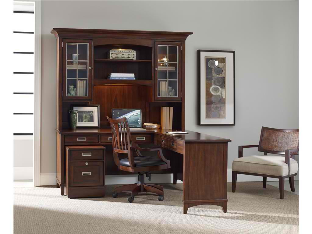
Hooker Furniture Home Office. Latitude Modular Group
What is transitional design? This is known as a design that is just right. It is not too formal, yet not too casual. It is also comfortable even while offering clean profiles. Transitional design also spells understated colors and the modern look. The result is a streamlined yet gracious space that’s right about in the middle.
Transitional design works because it is a look that’s familiar. If you try to browse home design magazines, you would be surprised that more than half of the featured homes there are transitional.
Transitional design is much like a world that lies between two dimensions. You have the leeway to find something fresh yet not straying from the proverbial.
Transitional also means being able to balance the traditional with the modern. The beauty of it is that you can mix a dash of other styles so long as they do not stray from the tailored setup.
If you love everything that is natural, then you will love the look that transitional design offers.
Defining Tone-on-Tone
Transitional design isn’t for color junkies, though. The palette that rules is – warm neutrals. So it’s time to use a lot of taupe, cream, khaki, tan, and gray. You can have a hint of espresso or chocolate here and there.
In essence, the brown palette reigns supreme. Keep patterns to a bare minimum. Say no to the punchy look of florals and Pucci prints.
If you think that you can’t live without bright colors, then be strategic in using transitional palette. Use bright turquoise, for instance, with coral in an interesting piece of artwork.
Use a pair of lamps or some throw pillows to add a bit of color inside a transitional home.
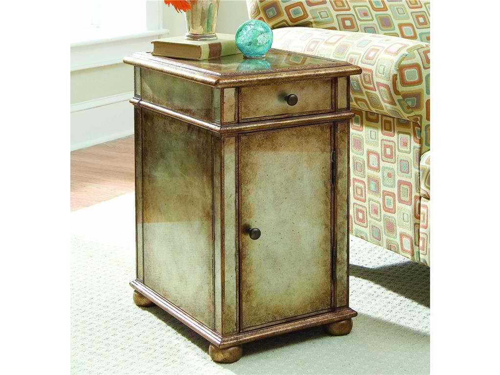
Hooker Furniture Living Room One-Door One-Drawer Antique Mirror Chest is a transitional chest with gold/silver metallic paint.
Monochrome Is In
The living area can be monochromatic though not boring. The furniture that you choose should be able to carry the space. There must be some patterns on the curtains and the coffee table’s grain can break the monotony of neutrals.
Wide windows also provide a bright source of light. If you want shading, then use light shades on the rug, walls and upholstery.
Neutral flooring plays a huge role in transitional rooms. Don’t think too much about the materials that you would use but more of the colors. Go with natural woods, tiles, stone, and carpeting. Transitional palette is a subtle palette. You can combine various floor surfaces, though.
A muted stone tile can be used in bathrooms. Carrying it up the walls can give it a more noticeable presence.
Basic Silhouettes
Furnishings for transitional homes offer crisp looks. They should be pretty straightforward. You will never be able to see a hint of baroque in any of the design elements. Rigid lines and the gentlest curves create energy.
Older furniture styles don’t have to be completely snubbed, though. You can use the more updated versions like a modern chair. Use large scales to make the place more inviting and comfortable. You would want the guests to feel relaxed.
Add Textures
You cannot rely on colors to create the needed punch in a transitional home. Texture can rise to the challenge. Fabrics that you use are coarse, made of natural fibers, shiny or matte finishes. You can also combine these elements for layering.
Think of burlap, leather, sisal, rattan, chenille, and others. Any materials that are tactile would be suitable for a transitional home.
Add some beaded board right up the ceiling and place a rattan chair right by a wooden desk to complete the look. Limit your accessories while still creating some impact. This is especially useful in a style that says no to frills.
Tags: McCreerys, McCreerys Home Furnishings, mixing and matching furniture, mixing designs, mixing style, monochromatic color palette, monochromatic color scheme, monochrome, monochrome color palette, monochrome design, monochrome interiors, monochrome palette, texture in interior design, textures, transitional design, transitional interior design, transitional style, transitional theme
Posted in Interior Design 101, Interior Design Elements, Interior Design Themes | No Comments »
Tuesday, January 19th, 2016
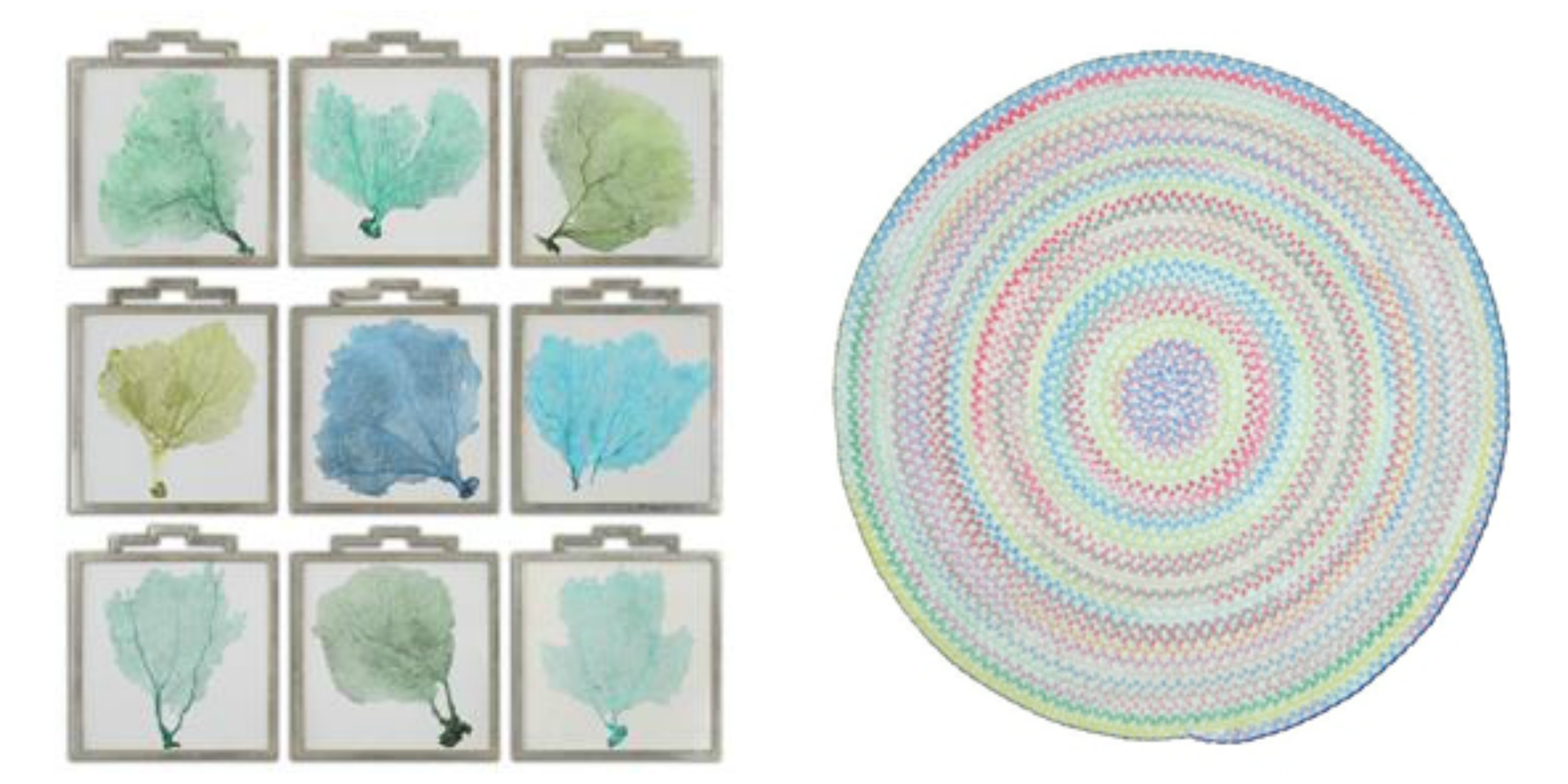
L-R: Accessories Uttermost Sea Fans Framed Art S_9 35239 and the Capel Incorporated Floor Coverings Cutting Garden Rug 0450CS0032610 are both available at McCreerys Home Furnishings.
A lot of the design trends these days involve bright, bold colors. This should not be a reason for you to stop using milder, more calming colors if you really want to. If you are in a pastel mood, then there is no need to conform to the bold patterns that many modern homes use. Creativity is the key to accessing the beauty of pastels. There are so many ways that you can utilize pastels to spotlight spaces or open up dark, crammed up rooms. Creating a winning interior with the use of crisp white combined with irresistible pastels is now easy.
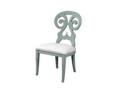
Fine Furniture Design Dining Room Side Chair 1053-820 at McCreerys Home Furnishings
Pastels + White
Heightening the effect of pastel is as easy as pairing it with white. Many designers use soft hues as a standalone color inside many homes. Some use an accent wall complemented with any accessory that comes in the same shade.
A white room is a great playing field for lovers of the pastel palette. The secret to using pastels in a seemingly blank room is to have them as accent pieces like artwork, textiles and lighting fixtures.
Any shade of pastel can be used to achieve a soft glow. Warmth and softness is the beautiful result of cream and gold plus some light pink roses.
When the walls come in any pastel color, then you can use white textiles and furnishings. This is a powerful combo that can be balanced with the use of pastel accents such as throws and some pillows.
Pastels + Bright Colors
If white and pastels result into a crisp interior, then pastels plus some vivid colors equals awesome. The biggest trends today play up the pastel colors by adding neon and other bright hues. For instance, pastel walls can be highlighted by a neon pink cornice. Pastel blue rooms can be heightened with bright colors such as lime green or orange. And while you’re at it, check out the uniqueness of pale green, light chartreuse and lavender. These are all irresistible colors that will look hot with coral pink; light green walls can be paired with peachy sheets; modern shelves can house bright colored books.
You might wonder how two colors on almost opposite ends of the spectrum could fuse so beautifully. Pastels and bright colors are alluring because they complement each other marvellously. For instance – going back to hot pink – it can be your color of choice for the mirrors, bed, lamp and pillows inside your place of relaxation.
 Gentle Pastels
One other approach to pastel interiors is subtlety – like really subtle. An example is a white room with silver motif. Add a dash of blue table lamp and throws and you’ve just achieved a modern room that elevates pastels without being overpowering.
Gray can also be combined with pastel colors to create contemporary look. This can be both soothing and sleek.
Going All Out
The final approach is to go all out. Use monochromatic pastel as a powerful statement on your walls, the furniture pieces, upholstery, and some of the major accessories.
If you want to use more than one pastel color in any room of your home, then be sure to put them all together in a concerted display. A single row of pillows in lemon yellow, green, lavender, or dark pink can make a room pop. A rug such as the braided area rug from Capel Rugs perfectly caps the lovely theme. This soft chenille rug comes in various colors and custom shapes.
Tags: adding colors to a home, artwork, contemporary, gentle, guidelines, McCreerys, McCreerys Home Furnishings, monochromatic color palette, monochromatic color scheme, monochrome, monochrome interiors, neutral colors, neutrals, pastel, pastel color scheme, pastel interior design, pastel interiors, pastel palette, pastel theme, pastels, subtle, textiles, tips
Posted in Color Schemes, Interior Design 101, Interior Design Elements | No Comments »
Follow us on our social media
© McCreery's Home Furnishings | All Rights Reserved | Privacy Policy