- Follow us:


Thursday, December 21st, 2017
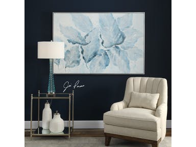
Just how beautiful is the Uttermost Accessories Blue Belle Floral Art 36112 against a dark backdrop? It’s just breathtaking.
Who says pastels are just for spring?
Pastels are popping almost everywhere and every season. The interior design industry is brimming with these amazingly refreshing colors. While they are pretty, in the wrong hands, they can turn a tad too girly.
A Single Pastel
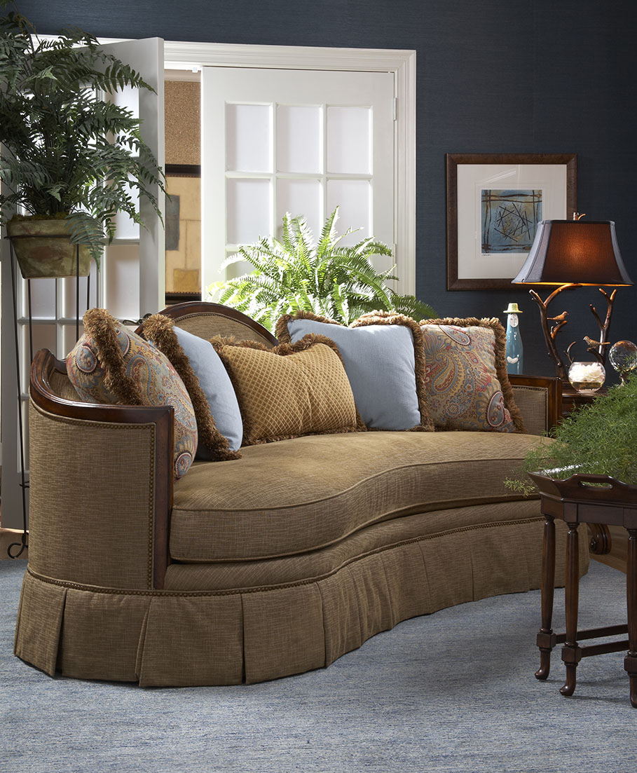
If you want just a simple update this holiday season, then all you need to do is to pick just a single piece for your home. An example is when you choose a pastel sofa, say, a soft, blue tone. This is neutral enough for any room and it can easily last through the years.
Going monochromatic with your pastel is a great idea because it means – you mean business. If you are obsessed with the beauty of gray-green, then find a way to incorporate it into every piece that you would pick for a particular room in your home.
Pastel Pairing
Or you can make a statement by using multiple pastels. To play with pastels, use a tone that you particularly like then bring it the room that you like most. Find two or more of this same seating unit to complete the pairing.
Dependably Pink
What could be more pastel and candy-like than pastel pink?
A room can be pretty in pink without being saccharine. Pick modern pastel pinks in florals and soft solids. Find textiles with these hues for the ultimate fusion.
It is always best to try smaller pieces at first. A few pastel pink accents should be enough to jump-start your pastel adventure.
If you have a chiefly gray or any neutral-colored room, then it would be easier for you to slink into your pastel mode. Pastel pink is naturally at home with shades of gray.
Pastel Cabinets
Pastels are a great way to soften or freshen up a room. But more than just pastel cushions or throws, you can make better and bolder use of these colors by painting your cabinets with them. When you do this, you are introducing an interesting amount of texture and depth into a room.
Pastels have been dominant in the past years and for a good reason. Dusted heathers, as well as blues, work amazingly well on cabinetry and architecture. Praline hues have a calming effect because they have a gentle sense of simplicity in them.
Your pastel-painted cabinet could be your one hero piece.
Welcome your guests with pastel with this Capel Incorporated Floor Coverings Cutting Garden Rug 0450CS Tea Rose.
Sugary Shades on Homeware
Pastels are always on the interior design menu. Don’t think that they are limited to spring. If you want a pastel holiday this year, then, by all means, go for it.
Frosted hues are going to look great with your Christmas decorative elements. Just imagine how beautiful your pastel blue would be with your silver bells, frost, and hollies.
Use pastel tableware. This is the easiest way to add pastel to your kitchen and the dining room. There are many decorating stores and shops that sell these colorful wares. When running out of ideas, just go for pastel accessories such as planters and throws.
Pastel Mix
Pastels are whimsical hues. They may have been used more in spring but they can also become popular this holiday season. Find pastel accessories that you can pair with your bigger furniture pieces. A light blue decorative bowl will look perfect with a traditional lamp with green shade.
Pillows in different pastel colors add a wonderful touch to a chair, couch or a bed. Consider the hues that your room currently has. Pick colors that jive well with these current colors.
Light yellow and purple are amazing hues to work with when you want to create a comfy and serene environment.
Tags: McCreerys, McCreerys Home Furnishings, pastel, pastel color palette, pastel color scheme, pastel palette, pastels
Posted in 2017 Trends, Accents, Color Schemes, Interior Design 101, Interior Design Elements, Interior Design Themes, Winter Season | Comments Off on A Pastel Holiday
Wednesday, December 20th, 2017
Brentwood Collection offers this Kent Cocktail Table made more beautiful by pastel throws and lampshades.
If you’re still categorizing pastel colors as hues only for girls’ bedrooms or nurseries, then you’re hugely mistaken. There is so much more to these awesome colors that can freshen up and uplift the natural beauty of homes. Gone are those days when they are just paired with equally neutral colors. These days, they can go with pretty much any color that you can think of including black.
Here are many other pastel pairings that will surely amaze you –
Pastels + White Elements
Pastels are growing to be more and more stylish each year. These wonderful soft colors can be infused in a bedroom that’s chiefly white. When you do so, more often than not, the result is a wonderful modern yet sophisticated room.
Just imagine the delicious ambiance that pastel green walls can provide to white furniture pieces. Or if you prefer it the other way around, place pastel furniture inside a mainly white room.
Pastels together with white walls can make even the smallest rooms appear spacious. This is also one of the reasons why pastels are becoming more popular. While they are light-colored, they are far from boring unlike the usual neutrals that dominate many homes. Just picture a unique mint green or sunny yellow bedroom – ain’t it awesome?
Pastels + Traditional Prints
How about filling a sunny room with fresh pastels and traditional elements? The former is quite cheerful and so they are the perfect elements that would balance the rest of the old-fashioned elements.
Classic prints such as lattice, checks, and seersucker blend pretty well with any pastel color. They can also help make the place appear more laidback.
Unique Pastels
When talking about pastels, don’t automatically go for pastel pink or blue, or their cousins green and yellow. There are so many other tints of pastels that you can experiment with. Don’t be bound by just the classics. When you’re feeling up to it, you can also use purple or the incredibly chic pale mustard yellow.
Pastels + Earthy Pieces
You just gotta love pastels because they pair up with just about any style and color that you can think of. If you love rustic, earthy pieces, then pastels are just as wonderful with them. Try pairing a leather chair with some pastel elements, say, some pastel throws or a pastel area rug. Even a unique sculptural lamp with pastel shade would look great with wood furniture.
Dirty Pastels
‘Ever heard of dirty pastels?
Pastel colors are supposed to be soothing, washed out or soft. But when you choose to be unique by combining pastels of different tints and shades, you could come across something more interesting – dirty pastels.
Some of known dirty pastels include #c3a3a3 (which has a red value of 195, green value of 163, and a blue value of 163), #baa0a8 (RGB of 186, 160, 168); #aa97ab (RGB 170, 151, 171); #9492b0 (RGB 148, 146, 176); and #929fb0 (RGB 146, 159, 176).
Pastels with a tinge of brown or gray also work well with the serenity of pastels. If you want to achieve a seamless look, paint the trim with the same color family as the walls. Don’t always go for standard-issue neutrals.
The Pastel In-betweens
Another strategy to make good use of pastel colors is to surround them with white and then to use an accent that is saturated with the same hue. An example is when you use pale pastel pink with deep coral for a romantic yet not-too-feminine look.
Pastel Contrasts
Periwinkle. This is an interesting color that will make red accessories stand out. If you want to follow this same pattern throughout your home, then pick a pastel color for your walls and then finish with a stronger, bolder color right across the color wheel (e.g. pastel pink walls go well with turquoise accents).
Tags: McCreerys, McCreerys Home Furnishings, pastel, pastel color palette, pastel color scheme, pastel interior design, pastels
Posted in 2017 Trends, Accents, Color Schemes, Interior Design 101, Interior Design Elements | Comments Off on Modestly Pastel
Tuesday, December 5th, 2017
Uttermost Accessories A Touch Of Blush And Rosewood Fences Art, S/2 41557
People who refer to pastel colors actually mean tints of any color. These are those colors that come with their lightest values. Try mixing any color with white and what you eventually achieve is pastel. So this could be aqua, lavender, lilac, rose, ash blond, peach, and many such hues.
What feelings do you have when you see pastel colors? Don’t they evoke a certain level of coolness? Wearing pastels in the summer or spring seems to be a common practice. It’s as if the mind tells you to wear something that won’t absorb too much heat.
Pastel colors tend to veer towards the feminine side yet there are now more and more men’s clothing that come in pastels.
The Pastel Psychology
When spring comes, try to take note of the colors that are most used by advertisers. You will soon realize that these colors are pastels.
Pastels are known to have a calming effect and they are sure to capture anyone’s attention.
To understand how pastels captivate those who see them, you need to perceive them as light. All pastel colors are light and, in turn, light is a form of energy. This means, therefore, that since they are forms of energy, then can excite or stimulate.
So don’t be surprised when pastels make you feel happy or tranquil. The wrong colors placed in a certain room could bring about depression. The psychological effects of colors are experienced by humans day in and day out.
There are certain pastel colors that can increase people’s blood pressure, pulse, and even up your adrenaline. Combine red and yellow and you would feel hungry – McDonald’s burger anyone?
Orange can excite, hence, it is an effective color to invite customers to buy something. Seeing this color just makes you want whatever is associated with it. Yellow, on the other hand, makes you think of the sun and comfort.
Pastel colors are less saturated when compared with the primary colors – red, yellow, and blue. They are soft, they feel light, and they offer a calming effect.
Pastel in Modern Homes
Don’t just stick to baby blue or baby pink for your pastel choices. Once associated with boys and girls, respectively, these are now seated behind many other interesting pastel hues.
Today’s homes show pastels in many different light. Kitchens are chiefly beige, white, and black by default but those who plunge into the pastel bandwagon feel the energy brought about by their color choice.
Blenders, mixers, and just about every countertop appliance now come in pastel colors. They simply look beautiful when placed right next to your professional grade oven and stove.
Pastels are also great in creating relaxing interiors. Bedrooms, bathrooms, and sitting rooms are often the rooms that get a pastel makeover. There are those who venture into pastel remodels as they turn the private rooms into a more relaxing sphere.
Living rooms are now more bright and welcoming – right to the very edge of being Martha Stewart worthy – because of the addition of pastel accents.
Homeowners who want to balance their darker-colored tiles or granite countertops resort to pastel additions.
Homeowners who want to have a country cottage home also turn to pastels for their theme. If you feel that your home lacks the shabby chic requirements or the weather look of a cottage style, then add some pastel hues here and there.
Be careful in choosing the wood finishes that you pair with your pastel color scheme. Be sure to use pastel only with the finishes that compliment your pastels. Wood paneling, rattan, wood floors, and sea grass will all look perfect with pastel additions. So would cherry wood, and mahogany.
Tags: McCreerys, McCreerys Home Furnishings, pastel, pastel color palette, pastel color scheme, pastel colors, pastel interior design, pastel interiors, pastel palette, pastels
Posted in Interior Design 101 | Comments Off on Making Sense of the Pastel Appeal
Tuesday, April 18th, 2017
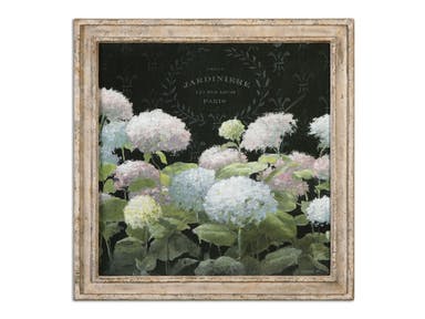
Uttermost Accessories La Belle Jardiniere Crop Framed Art 56056
What goes through your mind when the word pastel is mentioned? If you’re unsure about this term, then know that this is any hue that has tint. Pastel-colored clothing often looks great during spring or summer so, yes, this is the perfect season to use this color palette in your home.
Pastels are innately feminine. They are also perceived to be cool. Don’t worry about these descriptions, though, since man caves and other areas where men are supposed to stay can also take such colors.
Pastel also often remind us of cakes and anything sweet, babies, Easter eggs, and marzipan.
There is also something really comforting about pastels. Through the ‘50s, ‘60s, ’70 and ‘80s, people have embraced these colors for their freshness. If you want to optimize the use of pastels in your home, then it’s time to follow some fundamental guidelines –
Explore Pastel
There were moments when the leading colors for baby girls’ and boys’ nurseries were pastel pink and blue. While these colors were once associated only with babies and femininity, the ‘50s and ‘60s welcomed a bolder and more striking use for them.
Interior pastels then and up till today have the power to create the most powerful makeovers. Pastel is no longer just a hue for wall paint. Pastel touches are now used in other interior design elements such as art, furniture, accents, etc.
Go ahead and be playful with this color palette, experiment, breathe, live. You can make contrasting hues add drama or you can have pastel textiles pop on your ensemble.
Pastels in the Kitchen
Black, white and beige are no longer the only colors to choose from when it comes to kitchen appliances. Almost every rainbow color is now available for stoves, refrigerators, blenders, stand mixers, and ovens.
If you’re not ready to go big on pastel appliances, then you can use this calm color palette on other design elements in your kitchen. Imagine a buttery yellow fruit bowl or lavender kitchen tools – it becomes more exciting to cook and move about the kitchen with these colorful stuff doesn’t it?
Relax with Pastel
Since pastels are relaxing colors, you should use them in rooms where you need to unwind or rest. The bedroom and bathroom are two such rooms that are in need of pastel-colored elements. For a more masculine edge, mix pastel with darker colors especially on hard surfaces such as hardwood flooring.
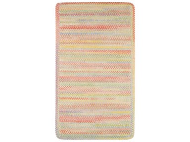
Capel Incorporated Floor Coverings Cutting Garden Rug 0450XS Buttercup
Pastel and Country Cottage
Shabby chic offers a laid-back appeal that can also be seen on rustic weathered style. Pastel colors will look great as an added hue. Begin with furniture; mix solids, patterns and interesting textures. Distressed wood can also create a wonderful backdrop. Invest in faux antique pieces in pastel inspirations.
Reupholster with Pastel
A lot of homeowners are not too sure when it comes to pastel colors. They feel hesitant because they do not know if pastel can be sophisticated or if it will be nothing more than a soft hue. Instead of being worried about these colors, pick furniture that you are most familiar with. Your fave sofa and end tables can have hints of stripes, florals and polka dot pastel fabrics.
You will soon realize that you have enhanced the look of your home with your reupholstered pieces.
Pastel and the Right Wood Finish
Pastel colors are quite versatile which means they can blend with any natural material like wood floors, wood paneling, sea grass, rattan, and others. Gear towards lighter woods – bamboo, white oak, lighter maple and similar varieties – to compliment the pastel decorative elements.
To add contrast, choose woods such as cherry wood.
Tags: McCreerys, McCreerys Home Furnishings, pastel, pastel color palette, pastel interior design, pastel interiors, pastel theme, pastels
Posted in Color Schemes, Interior Design 101, Interior Design Elements, Interior Design Themes | Comments Off on Pastel Colors: Comforting, Welcoming Hues for Your Home
Tuesday, January 19th, 2016
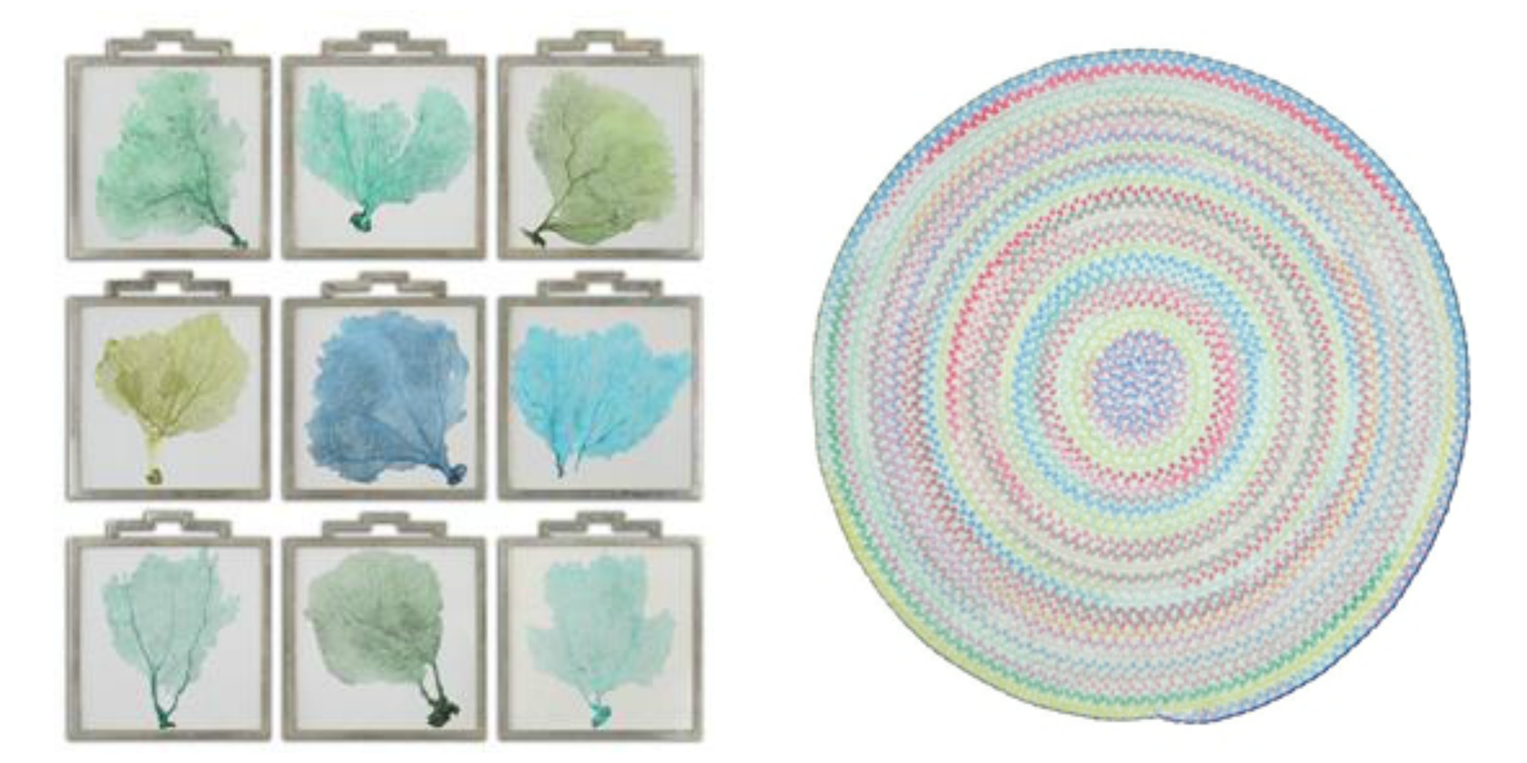
L-R: Accessories Uttermost Sea Fans Framed Art S_9 35239 and the Capel Incorporated Floor Coverings Cutting Garden Rug 0450CS0032610 are both available at McCreerys Home Furnishings.
A lot of the design trends these days involve bright, bold colors. This should not be a reason for you to stop using milder, more calming colors if you really want to. If you are in a pastel mood, then there is no need to conform to the bold patterns that many modern homes use. Creativity is the key to accessing the beauty of pastels. There are so many ways that you can utilize pastels to spotlight spaces or open up dark, crammed up rooms. Creating a winning interior with the use of crisp white combined with irresistible pastels is now easy.
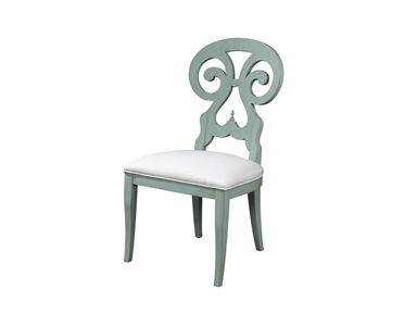
Fine Furniture Design Dining Room Side Chair 1053-820 at McCreerys Home Furnishings
Pastels + White
Heightening the effect of pastel is as easy as pairing it with white. Many designers use soft hues as a standalone color inside many homes. Some use an accent wall complemented with any accessory that comes in the same shade.
A white room is a great playing field for lovers of the pastel palette. The secret to using pastels in a seemingly blank room is to have them as accent pieces like artwork, textiles and lighting fixtures.
Any shade of pastel can be used to achieve a soft glow. Warmth and softness is the beautiful result of cream and gold plus some light pink roses.
When the walls come in any pastel color, then you can use white textiles and furnishings. This is a powerful combo that can be balanced with the use of pastel accents such as throws and some pillows.
Pastels + Bright Colors
If white and pastels result into a crisp interior, then pastels plus some vivid colors equals awesome. The biggest trends today play up the pastel colors by adding neon and other bright hues. For instance, pastel walls can be highlighted by a neon pink cornice. Pastel blue rooms can be heightened with bright colors such as lime green or orange. And while you’re at it, check out the uniqueness of pale green, light chartreuse and lavender. These are all irresistible colors that will look hot with coral pink; light green walls can be paired with peachy sheets; modern shelves can house bright colored books.
You might wonder how two colors on almost opposite ends of the spectrum could fuse so beautifully. Pastels and bright colors are alluring because they complement each other marvellously. For instance – going back to hot pink – it can be your color of choice for the mirrors, bed, lamp and pillows inside your place of relaxation.
 Gentle Pastels
One other approach to pastel interiors is subtlety – like really subtle. An example is a white room with silver motif. Add a dash of blue table lamp and throws and you’ve just achieved a modern room that elevates pastels without being overpowering.
Gray can also be combined with pastel colors to create contemporary look. This can be both soothing and sleek.
Going All Out
The final approach is to go all out. Use monochromatic pastel as a powerful statement on your walls, the furniture pieces, upholstery, and some of the major accessories.
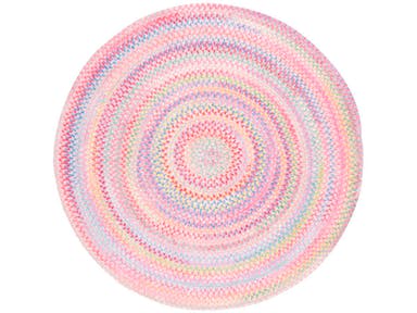
If you want to use more than one pastel color in any room of your home, then be sure to put them all together in a concerted display. A single row of pillows in lemon yellow, green, lavender, or dark pink can make a room pop. A rug such as the braided area rug from Capel Rugs perfectly caps the lovely theme. This soft chenille rug comes in various colors and custom shapes.
Tags: adding colors to a home, artwork, contemporary, gentle, guidelines, McCreerys, McCreerys Home Furnishings, monochromatic color palette, monochromatic color scheme, monochrome, monochrome interiors, neutral colors, neutrals, pastel, pastel color scheme, pastel interior design, pastel interiors, pastel palette, pastel theme, pastels, subtle, textiles, tips
Posted in Color Schemes, Interior Design 101, Interior Design Elements | No Comments »
Follow us on our social media
© McCreery's Home Furnishings | All Rights Reserved | Privacy Policy