- Follow us:


Saturday, December 23rd, 2017
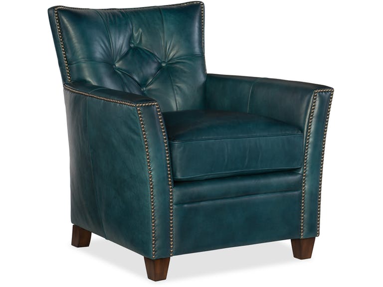
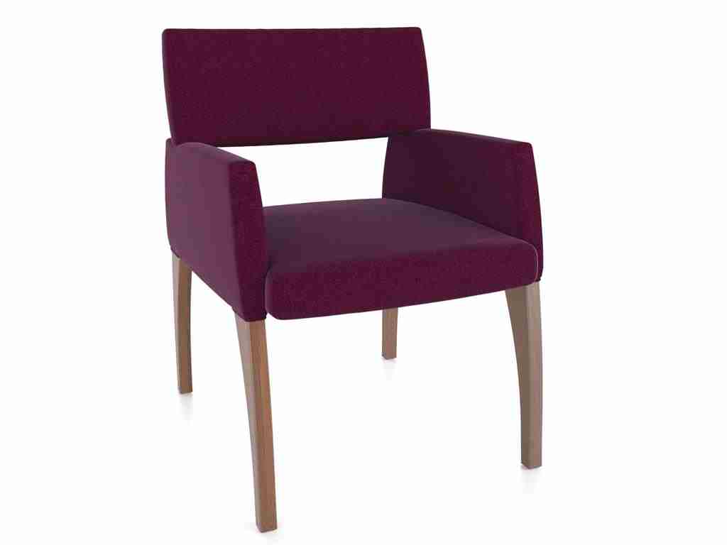
Hooker Furniture Living Room Conner Club Chair
Bold colors aren’t for everyone. So if you’re particularly enamored by the boldest and brightest colors, then you’re one of the few. Being drawn to a bold-colored couch, for instance, might just be what you need to set up a lovely, attention-grabbing, yet enjoyable space.
When you’re adamant about infusing a bright hue into your design, then you can always begin with the sofa. This one piece of furniture can immediately transform the look as well as the general mood in a room. When you’re done infusing bright colors to your main seating unit, then you can spread your gaze towards other pieces that just might add a little more oomph to your design.
Begin with Blue
Cobalt blue is as bold as blue could get. When designers talk about making rooms a lot brighter and airier, then all they often need is a can of the right blue paint. Adding drama is also easy with blue.
Be bold enough to set up an East Coast preppiness or a traditional white and blue fusion. Sea-foam-colored blue is also a saturated kind of blue. This also has East Coast origins. This union of white and blue should easily remind you of colonial hues.
Add velvet to this color and you instantly have a luxurious living space for everyone to enjoy.
Proudly Pink
If you are, on the other hand, looking to create a happier atmosphere then pink is your go-to bold hue. You can always begin with subtle and pretty or you can go gaga over the more energized versions of this color.
Peony is a more intense color of pink. Raspberry undertones work best on entryways and in dining rooms because they reflect warm light.
Pink can also be beautifully paired with many other colors such as black, chocolate brown, mint, metallic gold, green, and silver. Even white and grays look good with it.
Don’t go for sweet and cloying pink straightaway. This hue has a strong potential to create just the right pop of color to make people notice so use it to your advantage.
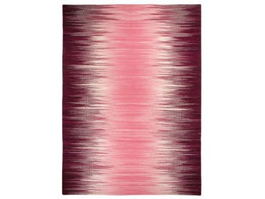
Capel Incorporated Floor Coverings Flash Rug 3634RS Pink
Go Gaga with Green
Green, without a doubt, is a rich color. If you have to use a bold shade of this color, then go for emerald green. It is a color that restores, rejuvenates, and provides a feeling of instant connection with Mother Nature.
Emerald green is also the color of an elegant and luxurious jewel so it communicates just those two things about your home, too.
If this particular tone resonates with you, then use it as a trendy color to surround yourself with. Combine it with equally exciting colors such as red or some pink tones.
Remember to use emerald green with purpose. Consider the atmosphere and mood that you would want to evoke in the room. Decide on the right proportion, combination, and placement of your chosen colors. Keep in mind that every tone has its set of psychological effects.
Perfect in Purple
If you have to use this color in a home, then make sure to use it with care. Make sure that you can tolerate the boldness and drama that this color can bring.
The rich and dark kind of purple is the very color of royalty. You can add this hue to different rooms, depending on the quietness or drama that you would want to set up.
Use the deeper shade of purple for a stunning entryway. A living room with darker purple upholstered chairs can be made light by light lavender walls.
If you want to do just the opposite and make a statement, you might want to try neon purple for your walls. This is the edgiest color that you can use for your dining room.
Tags: bold color palette, bold colors, bold hues, dramatic color palette, dramatic colors, McCreerys, McCreerys Home Furnishings
Posted in Color Schemes, Interior Design 101, Interior Design Elements, Interior Design Themes | Comments Off on 4 Bold, Daring Colors to Invigorate Any Space
Saturday, September 3rd, 2016
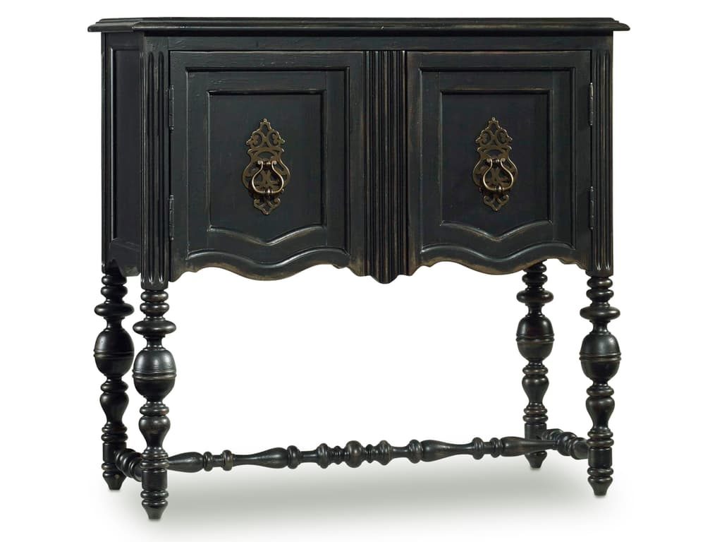
Hooker Furniture Living Room Chest is beautifully earthy.
Earth has its beautiful, signature colors to offer depending on what season the place is on. Fall, for instance, offers browns, golds, oranges, and reds, even yellows. Just find out which one of these colors define your personality and which one can lend a cue to your next interior design project in your home.
Fall’s color palette is always nature-inspired. Just take a look at the turning leaves or the rust-colored skies. These hues bring in warmth even when the weather is actually bringing about a chill to the autumn air.
Bold and Exciting
Many people view earth colors as calming. What they fail to realize is that bold colors are also seen in berries, leaves and wood accents. Nature puts on a great display on the trees, in the sky, and the ground with broad strokes of bright and muted colors.
Fall is also about plums, burgundy, umber orange, and rust. So go ahead and change your bland interiors to an exciting inspiration each time that you enter your home. Alter an accent wall with your favorite fall color. Look for paint shops that have fall-focused palettes and experiment with them during this season.
Simple and Traditional
The classics are difficult to replace. Inspirational colors include sage green, browns, golden yellows, fiery reds, and creamy beiges. Fall is a season that is telling you to slow down since you just came from a season of bright colors.
Traditional upholstered furniture pieces work even during fall. You can also use seasonal arrangements of the most beautiful orange, red or yellow flowers. Use an area rug that can help you pull the space all together.
Simple may be subtle but it is definitely not boring.
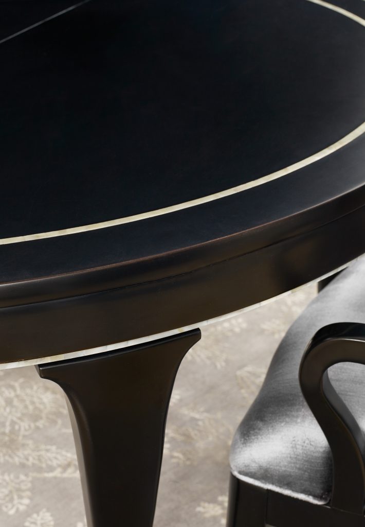
BLK1 Bloom Round Dining Table with 1-20in leaf offers a jet black earthiness that’s difficult to ignore.
More Nature Display
Whoever said that nature just has to happen outdoors? The playful colors outside may be truly inspiring which is why most fall designs can be comprised of sea grass, exposed timber, slate and boulders. Other than these usual smorgasbord of hues, why not take a bland wall this time and liven it up with corks, natural rocks or something green, say, green wallpaper.
If the colors are too neutral for you, then just add an eye-popping furniture piece. This should bring visual interest in an instant. Red or orange coffee table can provide just the right amount of excitement.
All-Year-Round Colors
What’s great about fall is that it offers natural, earthy colors that would never go out of style. Spas come in blues and greens as well as browns because these are calming hues. These allude to the skies, earth, water and the sun. They, all together, bring harmony and peace to most people whether talking about physical, mental or subconscious aspects.
Pick from gray tones or from the brightest colors that you could find on the autumnal display. What’s great about the fall palette, too, is that it works well with any style. So, whether you love modern, eclectic, rustic, modern or traditional; fall never disappoints.
If you’re still not ready to alter your entire room during the season, then just bring in some dried pine cones, potpourri, lemons and oranges. Put a vase of your favorite fall flowers and you’re done.
The Fall Furniture Line
Fear no color during this season. Use bright strokes if needs be for your furniture pieces. The simple wooden cabinets can become the focal points if you are willing to invest in sunny yellow ones. The shinier the finish, the more that it would pop out, hence, adding the needed character to the room; just make sure that they don’t look like they are candy-coated, though.
Experiment within bounds – this is your mission for this season.
Tags: bold, bold color palette, bold colors, bold statement, designing for fall, fall, fall design, fall interior design, fall interior design elements, fall style, McCreerys, McCreerys Home Furnishings, rustic, rustic charm, rustic design, rustic elements
Posted in Color Schemes, Fall Season, Interior Design 101, Interior Design Themes | No Comments »
Tuesday, April 19th, 2016
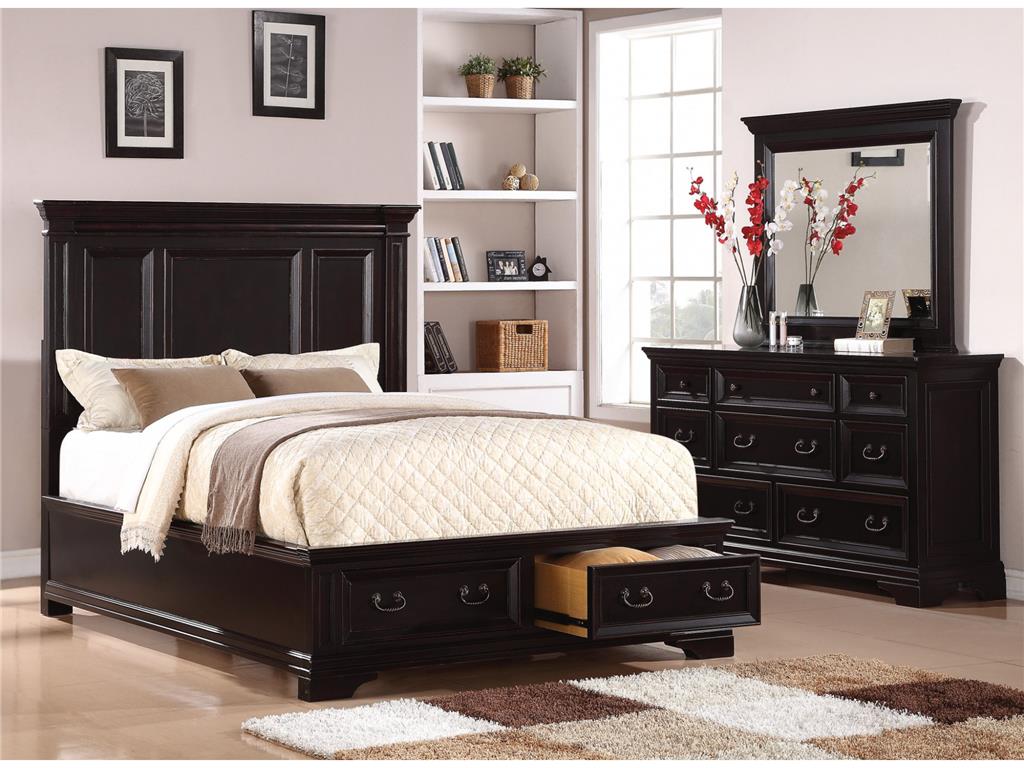
Flexsteel Bedroom Queen Panel Bed With Storage W1909-90QS is perfectly balanced by the red and white floral arrangement and other exciting accessories.
The combination of red and black may not be a mixture that you have given much thought in the past. You might just change your mind once you see the winning reasons why these colors can take your home at the center of everyone’s attention.
Turn Up the Volume
Upping the wow factor of your home could be as easy as choosing the red and black palette. This color scheme offers just one vibrant hue but it does not automatically mean that the other color can’t offer drama on its own.
Red or black, each of these colors can make a bold statement on its own. They can actually be used under any circumstance. So, when you are designing your living room towards a bolder look, be sure to consider this marriage of colors.
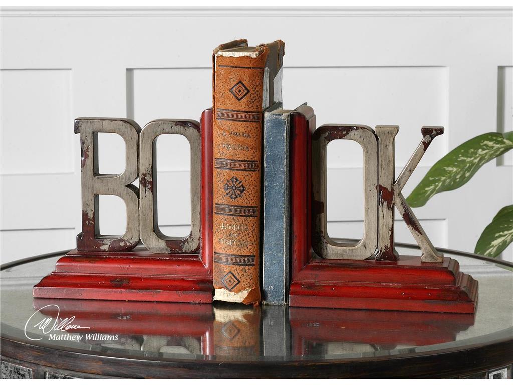
What’s a living room without these exciting Uttermost Accessories Book, Bookends, S2 19589?
Who’s the Boss?
Okay, so you have finally made up your mind and are now bent on using red and black, now what? These are both bold hues so one of them has to give.
Choose which one – red or black would be the dominant color. To choose which, take a careful look at the curtains and walls of the living room. See also the floor as well as the natural light inside the room. Is your living room used generally for simple family get-togethers or more of an out-of-office venue for your colleagues?
Whichever you end up choosing as the more dominant hue, make sure that you harmonize every aspect of your design. Consider salsa red in your living room if you spend more time there and if you perceive it to be a cheerful room with lots of foot traffic.
A more subdued and relaxing living room can make use of deep rose as the central color.
Balancing the red and black palette means using complementing colors on the more dominant color. The complementary colors should be used on your accents. For instance, if you used red as the dominant hue, then you may use the quieter gray on other design elements.
Put In Some Finishes
Metals and woods in the living room can also contribute to your red and black color scheme. The use of lacquered-black wooden furniture pieces adds intensity to any living room.
Do you like the shabby chic look? Then use pale gray on your furniture while accessorizing with the more exciting red and black mixture. Remember, the color of the furniture should balance the rest of the colors and elements that you decided to use. A heavily black room, for instance, can be beautifully balanced by paler shades of red.
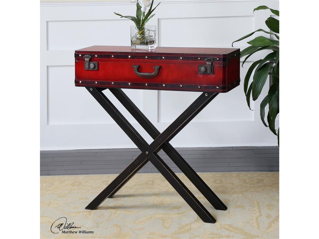
Living Room Uttermost Taggart Red Console Table 24379 does not need to beg for attention with its unique look and color fusion.
Just a Hint
Most of the time, when designers suggest red and black, homeowners have a tendency to wince. What they don’t realize is that this fusion need not be vibrant all the time. Don’t give up on these colors if you are the more traditional type. A hint of red – here and there – can sometimes do the trick. This is just as striking as a whole room filled with vibrant red. A simple red pillow propped against a plush, black sofa can be a simple combination that could also serve as the focal point in your living room.
The clever use of red and black can add the needed drama. The fusion can be used on the walls, floor and major pieces of furniture. If you prefer a less committed take on the red and black palette, then just use the hues on most of your accessories.
Let’s accept it –red is an eye-catching color. A red accent wall is the perfect backdrop for your beautiful black cabinet. These give the eyes a pleasant place to look at while taking the time to absorb the rest of the design elements.
Tags: black, bold, bold color palette, bold design, bold hues, bold interior design, bold statement, guidelines, McCreery's Furnishings, McCreerys, McCreerys Home Furnishings, mixing colors, mixing style, red, tips
Posted in Color Schemes, Living Room Design | No Comments »
Sunday, April 10th, 2016
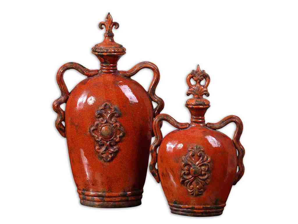
Uttermost Accessories Raya, Containers, S2 19525
When you are trying to make a bold statement in your home through your interior design, then it is wise to note that you should not go overboard. Bold does not automatically mean going over the top. This can be as simple as color saturation for the accent wall. Bold colors can also be used on textiles, furnishings and artwork.
Boldly Accentuate
You can tastefully bring in boldness into your home by determining which hues will highlight the space. Having enough natural light pouring into rooms can effortlessly brighten up any room. The darker rooms, on the other hand, can be overpowering if you allow the dimness to remain. Having a space that does not have ample lighting means you can opt for brighter and more cheerful colors. The more saturated hues will naturally reflect light.
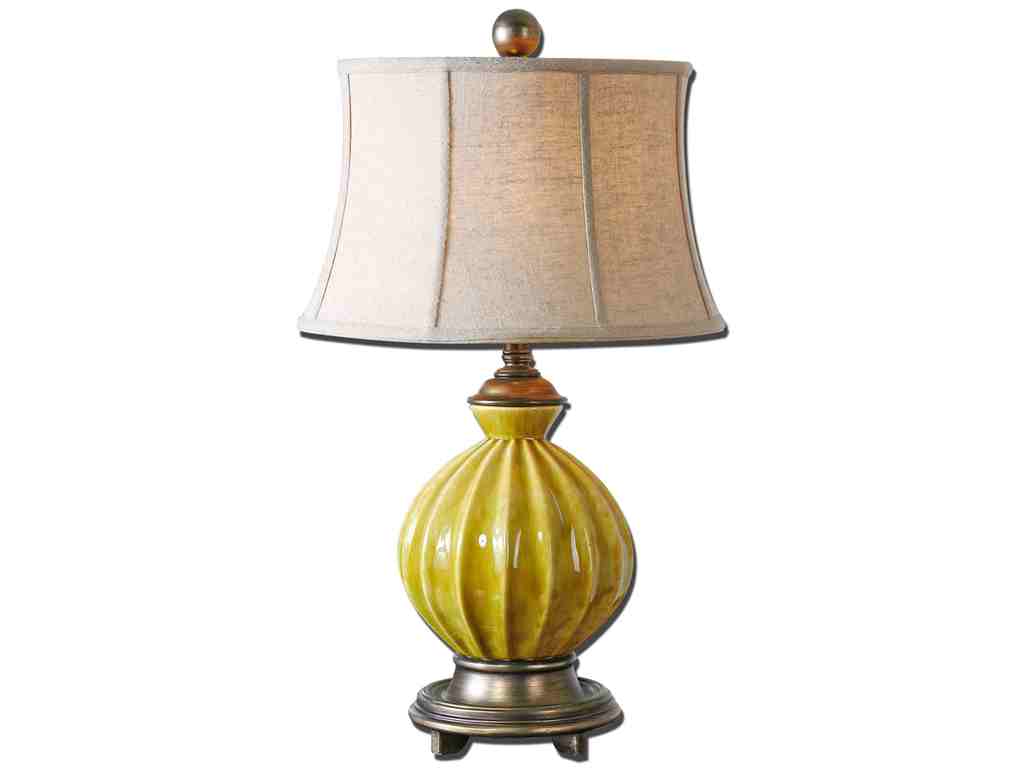
Uttermost Lamps and Lighting Pratella Lamp 27491
Bold Decor
If you have bold artwork or accessories that you would want to display, then just make sure that they will not clash once they are displayed on the walls or on shelves.
Try using neutrals or whites, even shades of black as the backdrop for any bold decor or artwork.
Choose one or two colors that you can use throughout your home. The two colors should hold the rest of the interior design elements. The secret to all these is to achieve balance. Remember that a single piece of bold decor should be balanced by neutral room finish, furnishings or accessories.
Bold Yet Subdued
The greatest interior spaces are those that have both bold and subdued elements. A flaming red couch can be placed as a focal piece in the middle of a living room. The rest of the furnishings should be tame enough so that they won’t clash with the couch.
Mix traditional and trendy bold hues. You are sure to create a lovely synergy where classical lines meet with bold colors.
Do not be afraid to make a statement. Your home, after all, is the one place on the planet that you have complete dominion over so it is there that you should make a bold statement. Be sure to figure out how to install the correct lighting fixture as this can make or break the statement that you just set.
Be Fierce, Be Bold
As a homeowner, you should be fearless when it comes to painting your home or in finding the right textiles. Empty nesters are ready to embrace a bolder phase in their lives. They are the homeowners who are ready to embrace big changes in their lives. These are the people who can shake things up a bit. They could already own antiques and all they need to do now is to find transitional pieces that will balance the space. Instead of having interior design leftovers in the living room, why not create a blank canvas? Even when there are existing fireplaces, moldings and flooring; you have the freedom to use the color that motivates or excites you.
Fireplaces can be aged if you want to keep them. Hang a traditional mirror that goes all the way up to the ceiling. This can effectively bounce light from windows and light sources.
You can cap the bold statement project with an abstract piece from an artist that you know. Bring in colorful pillows but be selective about the fabric, patterns and texture.
Lacquer furniture pieces can also be used as anchor inside a usually dull room. The dark color can be used in other portions of the home. To up the level of sophistication, you can add gold-leafed trays or the most beautiful furniture pieces that have been aged.
Using bold colors and statement pieces can be fun. Just have the confidence to set your foot and define what you want.
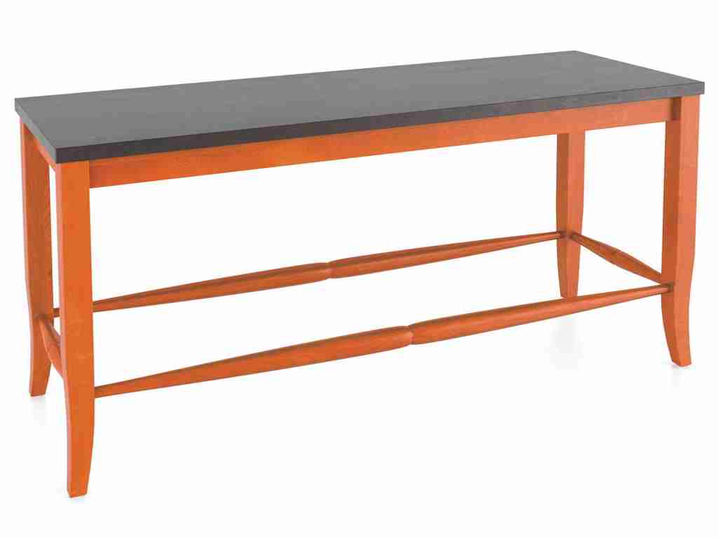
Canadel Dining Room Wooden Seat Bench BEN8903-24
Tags: bold color palette, bold design, bold hues, bold statement, McCreerys, McCreerys Home Furnishings
Posted in Color Schemes, Decorative Elements, Interior Design 101, Interior Design Elements, Interior Design Themes | No Comments »
Wednesday, April 6th, 2016
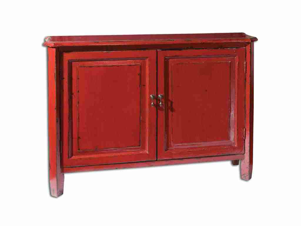
Living Room Uttermost Altair Red Console Cabinet 24404 is vibrant, attractive and one-of-a-kind.
Many designers casually use the terms tint, hue, shade or tone when referring to colors. But do most homeowners actually understand the meaning of each? Or are they just different names for the same term? The painter has to know the difference in each so he will be able to communicate effectively about color mixing and his painting job in general. As a homeowner, perhaps, it is about time to get to know the terms often used when it comes to paint and color schemes.
The term hue is far from being complex. This is a reference to color more specifically the colors found on the color wheel. If you are familiar with the color wheel, then you’d know that there are three primary colors which are red, blue and yellow. The secondary colors are violet, green, and orange. The tertiary colors are those that fill in the gaps between the primary and secondary hues.
Have you noticed how black or white is not considered a color? And have you wondered further where they should be located in the color wheel? You won’t have to worry about these two because you won’t
Canadel Dining Room Arm Chair CHA5040TF has a sienna washed colored fabric.
find them on the color wheel. What you need to study are how shades, tones and tints can be variations of different hues that are found on the color wheel once black or white are mixed with any of them.
Canadel Dining Room Arm Chair CHA5040TF has a sienna washed colored fabric.
Hello New Colors
You probably love colors but very few people are familiar with the most exotic hues used in interior design. There are literally hundreds of colors that you need to become familiar with if you want to be well-versed in color knowledge. For example, there are hundreds of blue shades. Most of the time, there are even histories involved in the creation of a unique color.
Why not be the first one in your group to extensively discuss these new hues?
For the first example, there’s smalt.
Smalt is a deep blue shade that is often used in ceramics. Literally, this is glass that is made when cobalt salts a11re mixed with molten glass. This mixture creates purple undertone that is barely distinguishable. It offers a luminescent quality which is why it is best used on statement walls.
The next new color on our list is byzantium. This is a lively purple shade that is sometimes interchanged with fuchsia. Byzantium is derived from purple while fuchsia comes from pink.
Byzantium looks great with gray, black, yellow or blue.
Cordovan is a rich hue of brown or burgundy. This is often associated with leather, mostly leather sofas. The name came from Cordova city in Spain which is famous for its manufacture of fine leather.
Sienna is one of the more famous colors on this list of unique hues. It is reddish brown and is often used in earthy themes. Its name comes from Siena, Italy and is also used in reference to clay that contains manganese oxide and iron oxide.
Vermilion also comes with a bright red hue. It can also be reddish orange at times. This is a classic shade that is used on many gorgeous lamps and lacquer ware.
‘Ever heard of gamboge? This is that deep mustard yellow color that got its name from the gamboge tree. This tree secretes a mustard yellow sap, hence, the name. Imagine having a pair of sofas in the gamboge hue. It’s sublime.
Pavo is another shade of blue but it is electric blue that is closest to the colors of peacock feathers. This can be best described as the marriage of deep turquoise and royal blue. Try pavo as the color of your sofa throw pillows.
Lastly, there’s aubergine. You have probably heard of this deep brownish purple hue before. This is just like the color of eggplants. Add this to a shade of turquoise or gray and you’ll achieve a unique color mixture that will catch people’s attention.
Tags: adding colors to a home, bold, bold color palette, bold design, bold interiors, bold statement, color choices, color combination, McCreerys, McCreerys Home Furnishings, unique interior design colors
Posted in Color Schemes, Interior Design 101, Interior Design Elements | No Comments »
Follow us on our social media
© McCreery's Home Furnishings | All Rights Reserved | Privacy Policy