- Follow us:


Thursday, March 22nd, 2018
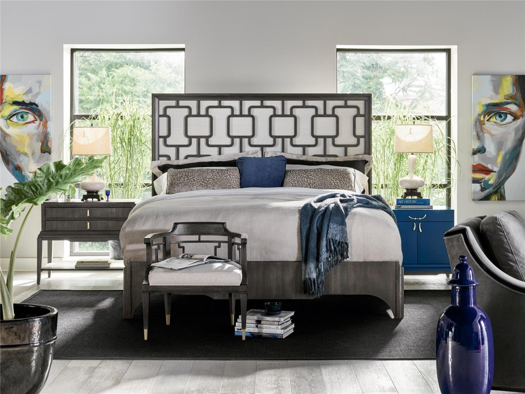
Panache Panel King Bed from the Fusion Collection of Fine Furniture Design. Define how the 80/20 rule is followed in this room – the main furniture pieces comprise the 80% while the accents and accessories, all colorful and bold, comprise 20% of the space.
Have you ever come to a point, when designing your home, that your style is too broad to be defined by just one theme? Sometimes, you might even think that you’re the only one with such sense of style. Don’t fret, the fusion of two design themes is a common practice in the world of interior design. Combining style, however, requires the most skilled hands so you won’t turn elegance into a garish display of mismatched elements.
When fusing more than one design, always remember that your preference matters. While this is so, don’t forget about these simple rules, too –
Function on a Pedestal
Always put function first so you won’t end up getting confused. There are even a few designers who think that when filling a space, they need to use the different design elements all at once. They end up with an overfilled or overstuffed space with an unclear style.
To veer away from this mistake, just consider function first. This means that you use functional pieces of furniture guide you in starting your design. While every space is in need of aesthetic touches, these should take the backseat where function is needed.
Ideally, the room’s purpose must be evident from the furnishings that one can see inside that space.
Learn and Apply the 80-20 Rule
Using two designs is all about making sure that both work together rather than against each other. Assign a definitive role for each style and then follow this as you continue designing the rest of the room.
The 80-20 rule means you have to allocate 80% of the design to the style that you would want to dominate. This is going to be your main focus and will be your chief influencer throughout the room. Always use the dominant style in deciding the main color palette, furniture, flooring, and lighting materials.
As for the remaining 20%, this must become the background. Its background role is to provide accent pieces that would go with your dominant design. Pick lighting fixtures based on this role, too. Choose eye-catching lighting pieces, wall art, and other accessories.
Infuse General Threads
Every space must include the elements that have general threads that join them. This is especially applicable when you’re trying to fuse two distinct styles that do not normally go together. You might want to pay attention to the common ground between these looks that you have chosen.
One of the successful hybrid interior designs is the so-called Japandi which is a mixture of Japanese and Scandinavian styles. What common elements could you see in both? One would picture wintry days as well as the simplicity of the furnishings.
No matter which styles you choose to combine, you will need to consider the colors that complement or contrast each other. It’s as basic as that. Tying the details altogether means knowing which colors can be mixed and which textures or patterns would go well together.
Learn to Highlight
As you create a hybrid style, you might end up with one piece that just simply doesn’t belong in the group. When you are faced with this dilemma, don’t resort to hiding that piece straightaway. Instead, let it stand out and be the central piece. Highlight this piece and have it become the focal point.
You may want to work on the angle that you place this furniture piece so that the eyes of your visitors will all be drawn to it. See also that the rest of the furniture pieces are angled towards it highlighting it all the more. If you’re highlighting a piece of art or mirror, then be sure to position it above a significant architectural feature such as a fireplace.
Tags: fusing two styles, McCreerys, McCreerys Home Furnishings, mixing designs, mixing interior designs, mixing style, two styles
Posted in Accents, Accessories, Furniture, Interior Design 101, Interior Design Elements, Interior Design Themes | Comments Off on Fusing Designs Minus the Confusion
Thursday, April 28th, 2016
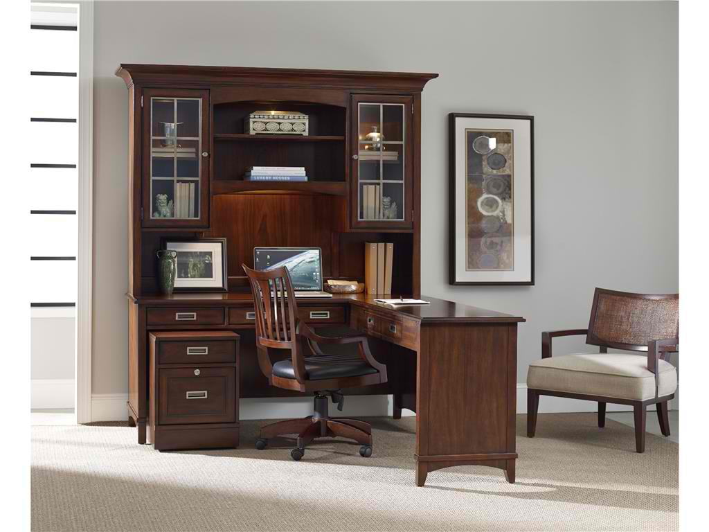
Hooker Furniture Home Office. Latitude Modular Group
What is transitional design? This is known as a design that is just right. It is not too formal, yet not too casual. It is also comfortable even while offering clean profiles. Transitional design also spells understated colors and the modern look. The result is a streamlined yet gracious space that’s right about in the middle.
Transitional design works because it is a look that’s familiar. If you try to browse home design magazines, you would be surprised that more than half of the featured homes there are transitional.
Transitional design is much like a world that lies between two dimensions. You have the leeway to find something fresh yet not straying from the proverbial.
Transitional also means being able to balance the traditional with the modern. The beauty of it is that you can mix a dash of other styles so long as they do not stray from the tailored setup.
If you love everything that is natural, then you will love the look that transitional design offers.
Defining Tone-on-Tone
Transitional design isn’t for color junkies, though. The palette that rules is – warm neutrals. So it’s time to use a lot of taupe, cream, khaki, tan, and gray. You can have a hint of espresso or chocolate here and there.
In essence, the brown palette reigns supreme. Keep patterns to a bare minimum. Say no to the punchy look of florals and Pucci prints.
If you think that you can’t live without bright colors, then be strategic in using transitional palette. Use bright turquoise, for instance, with coral in an interesting piece of artwork.
Use a pair of lamps or some throw pillows to add a bit of color inside a transitional home.
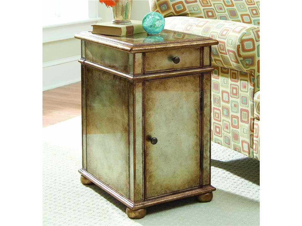
Hooker Furniture Living Room One-Door One-Drawer Antique Mirror Chest is a transitional chest with gold/silver metallic paint.
Monochrome Is In
The living area can be monochromatic though not boring. The furniture that you choose should be able to carry the space. There must be some patterns on the curtains and the coffee table’s grain can break the monotony of neutrals.
Wide windows also provide a bright source of light. If you want shading, then use light shades on the rug, walls and upholstery.
Neutral flooring plays a huge role in transitional rooms. Don’t think too much about the materials that you would use but more of the colors. Go with natural woods, tiles, stone, and carpeting. Transitional palette is a subtle palette. You can combine various floor surfaces, though.
A muted stone tile can be used in bathrooms. Carrying it up the walls can give it a more noticeable presence.
Basic Silhouettes
Furnishings for transitional homes offer crisp looks. They should be pretty straightforward. You will never be able to see a hint of baroque in any of the design elements. Rigid lines and the gentlest curves create energy.
Older furniture styles don’t have to be completely snubbed, though. You can use the more updated versions like a modern chair. Use large scales to make the place more inviting and comfortable. You would want the guests to feel relaxed.
Add Textures
You cannot rely on colors to create the needed punch in a transitional home. Texture can rise to the challenge. Fabrics that you use are coarse, made of natural fibers, shiny or matte finishes. You can also combine these elements for layering.
Think of burlap, leather, sisal, rattan, chenille, and others. Any materials that are tactile would be suitable for a transitional home.
Add some beaded board right up the ceiling and place a rattan chair right by a wooden desk to complete the look. Limit your accessories while still creating some impact. This is especially useful in a style that says no to frills.
Tags: McCreerys, McCreerys Home Furnishings, mixing and matching furniture, mixing designs, mixing style, monochromatic color palette, monochromatic color scheme, monochrome, monochrome color palette, monochrome design, monochrome interiors, monochrome palette, texture in interior design, textures, transitional design, transitional interior design, transitional style, transitional theme
Posted in Interior Design 101, Interior Design Elements, Interior Design Themes | No Comments »
Tuesday, April 19th, 2016
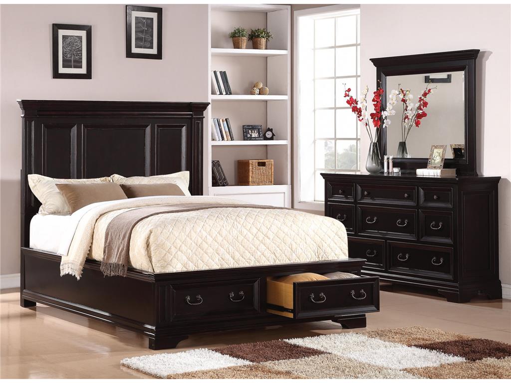
Flexsteel Bedroom Queen Panel Bed With Storage W1909-90QS is perfectly balanced by the red and white floral arrangement and other exciting accessories.
The combination of red and black may not be a mixture that you have given much thought in the past. You might just change your mind once you see the winning reasons why these colors can take your home at the center of everyone’s attention.
Turn Up the Volume
Upping the wow factor of your home could be as easy as choosing the red and black palette. This color scheme offers just one vibrant hue but it does not automatically mean that the other color can’t offer drama on its own.
Red or black, each of these colors can make a bold statement on its own. They can actually be used under any circumstance. So, when you are designing your living room towards a bolder look, be sure to consider this marriage of colors.
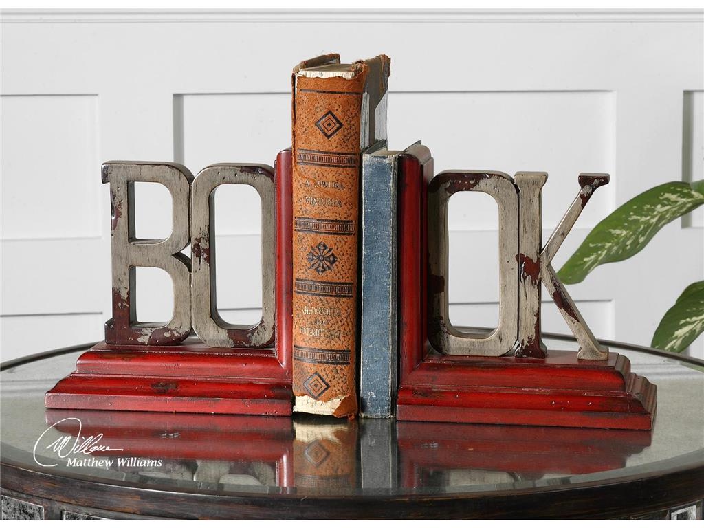
What’s a living room without these exciting Uttermost Accessories Book, Bookends, S2 19589?
Who’s the Boss?
Okay, so you have finally made up your mind and are now bent on using red and black, now what? These are both bold hues so one of them has to give.
Choose which one – red or black would be the dominant color. To choose which, take a careful look at the curtains and walls of the living room. See also the floor as well as the natural light inside the room. Is your living room used generally for simple family get-togethers or more of an out-of-office venue for your colleagues?
Whichever you end up choosing as the more dominant hue, make sure that you harmonize every aspect of your design. Consider salsa red in your living room if you spend more time there and if you perceive it to be a cheerful room with lots of foot traffic.
A more subdued and relaxing living room can make use of deep rose as the central color.
Balancing the red and black palette means using complementing colors on the more dominant color. The complementary colors should be used on your accents. For instance, if you used red as the dominant hue, then you may use the quieter gray on other design elements.
Put In Some Finishes
Metals and woods in the living room can also contribute to your red and black color scheme. The use of lacquered-black wooden furniture pieces adds intensity to any living room.
Do you like the shabby chic look? Then use pale gray on your furniture while accessorizing with the more exciting red and black mixture. Remember, the color of the furniture should balance the rest of the colors and elements that you decided to use. A heavily black room, for instance, can be beautifully balanced by paler shades of red.
Living Room Uttermost Taggart Red Console Table 24379 does not need to beg for attention with its unique look and color fusion.
Just a Hint
Most of the time, when designers suggest red and black, homeowners have a tendency to wince. What they don’t realize is that this fusion need not be vibrant all the time. Don’t give up on these colors if you are the more traditional type. A hint of red – here and there – can sometimes do the trick. This is just as striking as a whole room filled with vibrant red. A simple red pillow propped against a plush, black sofa can be a simple combination that could also serve as the focal point in your living room.
The clever use of red and black can add the needed drama. The fusion can be used on the walls, floor and major pieces of furniture. If you prefer a less committed take on the red and black palette, then just use the hues on most of your accessories.
Let’s accept it –red is an eye-catching color. A red accent wall is the perfect backdrop for your beautiful black cabinet. These give the eyes a pleasant place to look at while taking the time to absorb the rest of the design elements.
Tags: black, bold, bold color palette, bold design, bold hues, bold interior design, bold statement, guidelines, McCreery's Furnishings, McCreerys, McCreerys Home Furnishings, mixing colors, mixing style, red, tips
Posted in Color Schemes, Living Room Design | No Comments »
Tuesday, January 12th, 2016
5682-10 Sloan Chair without Nails and 5682-08 Sloan Ottoman without Nails in Fabric 917-60. This chair shows that Bohemian is all about vibrant colors.
Bohemian interior design involves the infusion of hippies, travelers, even gypsies. These are the very people who are out to have fun. They also live the most colorful lives as is evident in their style and their homes.
The bohemian interiors are lived spaces. There is nothing drab about this style as it is colorful, full of ornaments, exclusive, and electrifying. Bohemian accessories should be able to showcase a special appearance. The decor is not just amazing to look at in bedrooms and living rooms but also in other areas of your home like your kitchen, even the bathroom.
The Mingling of Creativity and Art
The bohemian style is exclusive because it displays the effects of art and creativity. It can lift a boring facade without you putting too much energy. Just hunt for the right furniture pieces (and colors) that are most suitable for this design.
Step number one is to pick the right color scheme for your home. Whatever hue you settle with, make sure that it has the capacity to deliver a harmonious effect on the walls, floor, accessories and the furniture.
This Hooker Furniture Home Office Accent Desk is what you need for your Bohemian home work space.
There are a few more daring interior designers who choose bold and dark colors for the bohemian look. There are actually a lot of options on your color palette. Combine different colors till you reach a blend that you like. Some of the more interesting hues include rust, brick red, sunny yellow, deep brown, plum, violet, gold, burnt orange, magenta, emerald and camel.
There are also a few color schemes that you should avoid for this design. Colors such as pastel, neon and those shimmering shades (‘cept gold) should be avoided like the plague.
Now for the furniture, you can choose to combine different kinds of furniture to make a room more exciting. A leather sofa would be perfect for your bohemian living room. As for the seating area, be sure to deliver a non-cluttered impression.
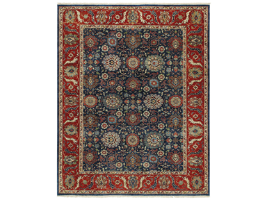
This very bohemian rug is the Capel Incorporated Floor Coverings Biltmore Select Bidjar Rug 1773RS02000300450.
The decorative appeal of this interior style lies heavily on the accessories that you will be bringing in. Choose unique accessories such as artwork coming from Africa, India, and the Middle East. Enhancing the flavor of your bohemian style is as easy as adding an eclectic taste. It wouldn’t be wrong to display accessories that have been inspired by Boho arts including tea seats, musical instrument, easels of vintage artists, some hookah pipes, too.
When it comes to bohemian colors, the most used are warm earthy colors as are metallic hues. So think of gold, terracotta, brown and other hues belonging to this family. Look for jewel tones such as fiery orange, purple, or electric blue. Always think warm when looking for the right bohemian color. White should never be a part of this design.
Bohemian is for people who want their homes to look vibrant, filled with culture and the most appealing pieces. It flees in the presence of modernism but it embraces what’s carefree, unusual and relaxed. Fuse lots of patterns and experiment with the loudest colors. Layer those throws on your sofa, use colorful area rugs, and hang never-before-seen tapestries.
Bohemian means you learn to mix and match. Find natural materials such as sisal, burlap then fuse them with chenille and silk. These materials should look slightly worn. Pillows, lampshades and curtains could have fringe.
Tags: African, art, bohemian, Bohemian art, bohemian interiors, bohemian style, guidelines, harmony, hippie, Indian, McCreerys, McCreerys Home Furnishings, mixing and matching furniture, mixing colors, mixing designs, mixing style, Moroccan, Moroccan interior design, Moroccan interiors, Moroccan style, tips
Posted in Interior Design 101, Interior Design Elements, Interior Design Themes | No Comments »
Follow us on our social media
© McCreery's Home Furnishings | All Rights Reserved | Privacy Policy