- Follow us:


Saturday, August 11th, 2018
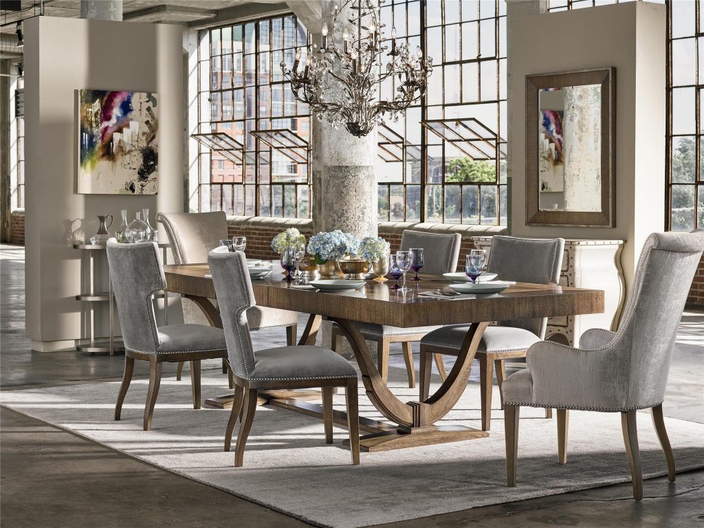
The Fine Furniture Design Portfolio Collection shows how beautiful monochrome could get.
It can get intimidating to think that you need to complete a design project using only a single color. Only the bold and the confident can get away with this. But here’s the great news – a monochromatic color scheme is actually hot right now. So how can you use it in your home?
Stylizing with monochromatic color is a lot more than picking a single color and flooding your interior with it. You would want to consider a lot of things such as what moods are associated with what colors. You will also need to explore your preferred hues and which ones are actually usable.
So What Is Monochrome?
The simplest definition of monochrome is that it is a single color that’s used as a base for all the tints, shades, and tones. There are some purists who argue that the first hue must come from the primary, secondary or tertiary hues on the color wheel. But it’s as simple as beginning with one color and moving on from there.
This only means that you can use any color from beige to purple and even jet black.
Go Classic
If you’re just starting and you do not have a style guide or even a preference yet, then you could be inspired by the classic color theory. Don’t make the mistake of thinking that the Color Theory is only for the artistically inclined. This has helped many interior designers for years and it’s about time to use it to visually engage your beholders, too.
The monochromatic approach to design is to pick that base color from the color wheel and then to add variants of that same hue.
Creating the Single Hue Palette
Your top consideration in creating the monochromatic scheme is contrast. How will you be able to create contrast with just a single color? Your biggest problem is to add depth and making the room stand out despite using just one color.
Be more confident in monotony by adding a sharp contrast.
You can do this by adding dark or lighter variants of the same color. Create a palette with just your artistic sense or you can use Adobe Color CC and other such tools.
Begin with that base color and then have a minimum of two other choices which are the lighter and darker versions of the same color. And just like any other color palette, you will need to establish where to use each color variation. Decide how each is going to appear in your design.
Understand Tints, Tones, and Shades
These are no less than your biggest tools when it comes to setting up a monochromatic home. Familiarize yourself with each so that you’ll know how to use them to your advantage. A hue is one of the 12 colors – the purest ones – on the color wheel. These are the colors that are either primary, secondary or tertiary colors.
The base color is the dominant or most prevalent color on your color scheme. This is where your design would all begin.
Tints are any color with added white so that it becomes lighter. When you do the opposite and add black, then what you get is the shade. Tone, on the other hand, is the addition of gray to intensify the color.
Why Monochrome?
So why should you go for a monochromatic color palette? It could get monotonous when not done correctly but it can also look amazing when artistically executed.
If you are a lover of simple and harmonious things, then this is the color scheme for you. It is also quite easy to design when you only have to worry about a base color and its tint and shade.
Minimalists will surely embrace this color palette for obvious reasons.
Tags: McCreerys, McCreerys Home Furnishings, monochromatic color palette, monochromatic color scheme, monochrome, monochrome color palette
Posted in Color Schemes, Interior Design 101, Interior Design Elements, Interior Design Themes | Comments Off on Excitingly Monochrome
Thursday, April 19th, 2018
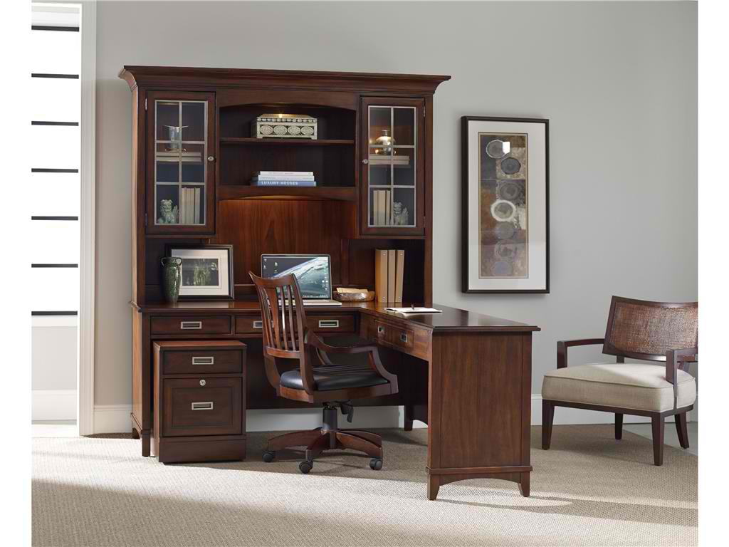
Hooker Furniture Home Office Modern Romance Writing Desk
Interior design has evolved through the years but one staple remained – the black and white combo. If you choose to live with a monochrome palette, then you’re one of the very few who are taking the plunge. The monochrome palette is not for everyone, this is certain but there is no denying the appeal that this offers to any home.
Monochrome décor is all about choosing a single color which will serve as the foundational hue. This single color family is used on every wall, surface, and space. This does not mean that the space is bathed in one color. Stunning monochrome design is all about using different tints or shades from the same color family.
So, do you think that you have what it takes to set up a monochromatic-themed home?
Monochrome Benefits
If you’re one of those who are confused about which color goes with which, then having a color palette that’s already decided for you is the way to go. Black and white are considered achromatic, meaning, they can be included on any monochrome palette that you choose.
Another benefit of the monochrome palette is that you’re working with the same hue but with slight variations. These colors, therefore, work effortlessly altogether. If you want tints of the same color, then mix it with white. Create shades by mixing your chosen color with black.
Decorating with a monochrome palette is also easy. You practically take the guesswork out since you no longer have to wonder whether the pieces would work well with each other. You can then turn your attention to the incorporation of details like shine, texture, depth, and shape.
Achieving balance is also fairly easy. Just define the mood that you would want to evoke then create the colors according to those moods. More design probabilities also open up to you. You will soon discover that there are more textural and color variations to play with. Before you know it, you have already created an amazing space which you have just dreamed up for so long.
The Neutral Bathroom
Creating a relaxing and tranquil bathroom is not that easy when you also want it to be functional. You need to learn balance early on. Try installing black moldings or drop-in black tiles. These can be used on glossy walls or a field of white. Brick walls would also be perfect.
If you want to create a more dramatic look, consider setting up a feature wall made of glass tiles (again, colored black). A black flooring is also great for a chiefly white bathroom suite.
Bold Monochrome Kitchens
White or black kitchens are able to remain relevant for years. This is also true with fittings and fixtures in the same color family. Don’t be afraid to go all out on your black or white splash back.
The Seasonal Neutrals
Black and white fusion is a style that can be used all-year-round. This is especially the case when you use patterns. Geometrics have been hot for the longest time. Victorian tiles also have a classic look that is great to pair with geometric shapes.
Monochromatic Downsides
There are also disadvantages in opting for a monochrome palette. First, you might feel confined by this theme. Refrain from imploding and excluding other interesting colors. It could also be difficult to create contrast if you’re not able to mix the right tints or shades with your chosen color. You need to be highly creative to make monochromatic style work.
People who use muted colors also tend to mutate towards blandness. It can be a bad thing when vibrancy is already limited. Remember that you can be subtle while still being visually interesting.
Tags: McCreerys, McCreerys Home Furnishings, monochrome color palette, monochrome design, monochrome interiors, monochrome palette
Posted in Color Schemes, Interior Design 101, Interior Design Elements, Interior Design Themes | Comments Off on The Monochrome Interior and Its Benefits
Thursday, April 28th, 2016
Hooker Furniture Home Office. Latitude Modular Group
What is transitional design? This is known as a design that is just right. It is not too formal, yet not too casual. It is also comfortable even while offering clean profiles. Transitional design also spells understated colors and the modern look. The result is a streamlined yet gracious space that’s right about in the middle.
Transitional design works because it is a look that’s familiar. If you try to browse home design magazines, you would be surprised that more than half of the featured homes there are transitional.
Transitional design is much like a world that lies between two dimensions. You have the leeway to find something fresh yet not straying from the proverbial.
Transitional also means being able to balance the traditional with the modern. The beauty of it is that you can mix a dash of other styles so long as they do not stray from the tailored setup.
If you love everything that is natural, then you will love the look that transitional design offers.
Defining Tone-on-Tone
Transitional design isn’t for color junkies, though. The palette that rules is – warm neutrals. So it’s time to use a lot of taupe, cream, khaki, tan, and gray. You can have a hint of espresso or chocolate here and there.
In essence, the brown palette reigns supreme. Keep patterns to a bare minimum. Say no to the punchy look of florals and Pucci prints.
If you think that you can’t live without bright colors, then be strategic in using transitional palette. Use bright turquoise, for instance, with coral in an interesting piece of artwork.
Use a pair of lamps or some throw pillows to add a bit of color inside a transitional home.
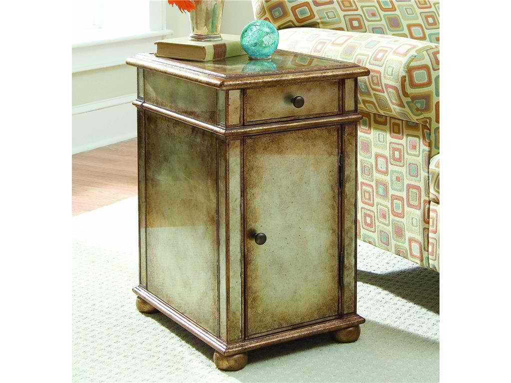
Hooker Furniture Living Room One-Door One-Drawer Antique Mirror Chest is a transitional chest with gold/silver metallic paint.
Monochrome Is In
The living area can be monochromatic though not boring. The furniture that you choose should be able to carry the space. There must be some patterns on the curtains and the coffee table’s grain can break the monotony of neutrals.
Wide windows also provide a bright source of light. If you want shading, then use light shades on the rug, walls and upholstery.
Neutral flooring plays a huge role in transitional rooms. Don’t think too much about the materials that you would use but more of the colors. Go with natural woods, tiles, stone, and carpeting. Transitional palette is a subtle palette. You can combine various floor surfaces, though.
A muted stone tile can be used in bathrooms. Carrying it up the walls can give it a more noticeable presence.
Basic Silhouettes
Furnishings for transitional homes offer crisp looks. They should be pretty straightforward. You will never be able to see a hint of baroque in any of the design elements. Rigid lines and the gentlest curves create energy.
Older furniture styles don’t have to be completely snubbed, though. You can use the more updated versions like a modern chair. Use large scales to make the place more inviting and comfortable. You would want the guests to feel relaxed.
Add Textures
You cannot rely on colors to create the needed punch in a transitional home. Texture can rise to the challenge. Fabrics that you use are coarse, made of natural fibers, shiny or matte finishes. You can also combine these elements for layering.
Think of burlap, leather, sisal, rattan, chenille, and others. Any materials that are tactile would be suitable for a transitional home.
Add some beaded board right up the ceiling and place a rattan chair right by a wooden desk to complete the look. Limit your accessories while still creating some impact. This is especially useful in a style that says no to frills.
Tags: McCreerys, McCreerys Home Furnishings, mixing and matching furniture, mixing designs, mixing style, monochromatic color palette, monochromatic color scheme, monochrome, monochrome color palette, monochrome design, monochrome interiors, monochrome palette, texture in interior design, textures, transitional design, transitional interior design, transitional style, transitional theme
Posted in Interior Design 101, Interior Design Elements, Interior Design Themes | No Comments »
Follow us on our social media
© McCreery's Home Furnishings | All Rights Reserved | Privacy Policy