- Follow us:


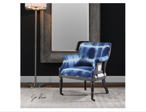
The Uttermost Living Room Royal Cobalt Blue Accent Chair pops from the neutral and dark fusion on its background.
There are many different parameters that help shape design. If one would look at each one’s design, everyone has a preference or taste that’s distinct. Even the relationships that each person goes into are indicative of his or her qualities and perspectives in life. At the bottom of it all is each one’s personality.
Each individual’s personality is the catalyst to an environment, emotions, even the ups and downs of his or her life. This is the same force that repels or attracts other people. Personality almost always dictates ever aspect of a human’s life.
Color is the best way to add unique touches in anyone’s home. It is known to have a profound effect on people’s emotions and moods. Putting bright colors in your interior design can help create a jovial atmosphere.
If you’re willing to go way beyond happy, then you can be playful. Neon shades are the boldest. You can also make use of a feature wall or splashes of hues that are strategically situated. Practically any room can have neon hues or any vibrant colors, it’s all a matter of knowing how to use them.
Lately, modern interiors have been showing a lot of bold colors. The key here is to have restraint no matter how the colors might excite you. Too much of any color isn’t going to look right. Sometimes, all it takes is a hint or two on the furnishings or textiles and you will achieve the ideal.
Here are more ways that you can use bold colors in your home –
Be Familiar with the Color Wheel
If you’re going to use bold colors, then be familiar with the color wheel. This tool can help you pick the right colors for your interior design. The 12 shades have been arranged and divided into cool and warm hues.
The cool colors include shades of blue, turquoise and violets. The warm shades are the red shades and oranges.
Analogous colors, which are placed right beside each other on a color wheel, tend to work well when they are fused. These are the best colors to harmoniously blend everything else in the space.
Consider also the tone and saturation of the colors that you pick. The saturated shades tend to be more vibrant while the less saturated hues are the muted versions of a basic color.
Apply the 80:20 Rule
This rule is crucial when you’re designing. This basically means that 80-percent of the room should be kept neutral while the rest, at 20% must be bright-colored. This is the technique in creating a statement in a way that’s just enough so that the look isn’t ruined.
An example of this is when muted gray and yellows are used on the walls as the sofa is a bright lemon hue. This is an interesting contemporary statement.
If you’re a bit cautious in spending your hard-earned money on colorful pieces of furniture which you may end up regretting, then it’s okay to begin with less of a commitment.
You can always go with a neutral couch that’s highlighted by bright-colored throws. These pieces will give you the same boldness without committing too much. Should you decide to push through with the furnishing investment in the future, at least, you saw and felt how it was to have bold colors in your home in a non-pricey way.
Light and Shade
If you have a home that’s filled with daylight, then all you have to worry about is to look for dramatic tones that will serve as accents. Whichever colors you end up choosing, strive to design the space in an inviting manner and never shocking.
Follow us on our social media
© McCreery's Home Furnishings | All Rights Reserved | Privacy Policy