- Follow us:


Friday, August 31st, 2018

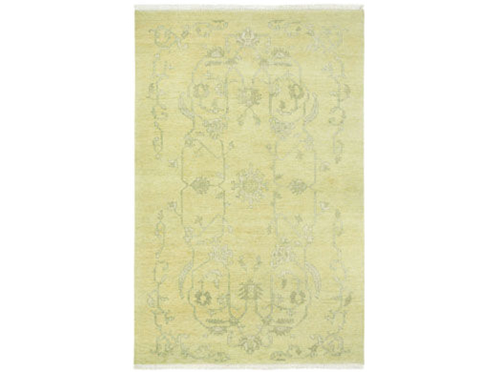
FFDM Brentwood Collection: The light touch of yellow on the lampshade, artwork, area rug and accent chair makes it a noticeable yet non-glaring element inside this beautiful room.
It’s now whether you like or have a disdain for the color yellow. The thing is, it is a vibrant hue that can stand on its own or help highlight another hue. If you’re thinking of ways to redress your home, then going for this unconventional color just might be the best way to go and we’ll tell you why –
The Physiological Magic of Yellow
Color, as you probably already know, can affect us in so many ways. It can make you mad, it can make you cry, it can even make you hungry or laugh. The right color combinations can bring the needful positive psychological effects like optimism, productivity, and happiness.
Yellow is both trendy and retro. It is used in contemporary settings while it can also bring back memories of interior designs of the past.
Just be careful in choosing yellow because its negative tone could bring about anxiety.
Positive Interiors with Yellow
When you use the right tint or shade of yellow, you bring into your home a unique impact. It can instantly become a cheerful space. And when you decide to use it as an accent color, it makes the guests feel warm and welcome. Use this color in your breakfast nook and you will wake up to a great start each day.
Other spaces can use yellow also as a warming tone. When paired with dark tones (the darkest being black), yellow tends to be highlighted so you can combine, say, a yellow couch with dark-colored interiors.
Energize with Yellow
Crafting the right kind of ambiance, especially in a workspace, is an important part of interior design. Whether you like taking home your work or if you already set up a home office, then what you need is a space that is dedicated to organization and productivity.
But how do you go about with this? It’s not enough to just paint the walls yellow. Do this and it gets jarring. Apply too little and you end up with a dull and monotonous room.
What to do, what to do?
You can beautify and energize at the same time when you fuse yellow and gray. This fusion of a refined color and its bright counterpart is, unarguably, a popular go-to color combination. Your home office would do well with this color fusion and so could your living room and the bedroom.
When you decide to accessorize with yellow, then you energize your home in a different way. Let go of those neutral curtains and replace them with the luscious yellow sheer curtains. Let in the light and organize with light yellow desk paired with a gold-colored chair.
Be Cozy with Yellow
When you grow tired of energetic and productive hours, and it’s finally time to wind down, then you can still depend upon yellow to help you cloak your home with the needed hominess.
Use a mellow yellow sort of yellow as a backdrop in the living room. This is a great way to move away from the traditional neutrals and to move towards the elegant and vintage beauty that this tint of yellow offers.
Coupled with the right kind of lighting fixture, you are sure to amaze your guests as they marvel at the chic elegance that your living room will evoke.
Yellow is also an amazing color when you want the eyes of your guests to rest on a gallery wall. This accent wall need not be bold all the time. You can also use a pale tint of yellow and then have your artworks hung.
‘Talk of texture in the living room or the home office.
Tags: McCreerys, McCreerys Home Furnishings, psychological effects of yellow, yellow, yellow color palette, yellow color psychology, yellow interior design, yellow interiors
Posted in Accents, Color Schemes, Interior Design 101, Interior Design Elements | Comments Off on The Yellow Rave
Saturday, May 14th, 2016
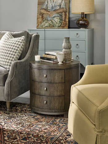
FFDM Brentwood Collection: The light touch of yellow on the lampshade, artwork, area rug and accent chair makes it a noticeable yet non-glaring element inside this beautiful room.
You either love or hate yellow – what is it? Some may answer that their level of emotion towards this color depends on how vibrant or soft it is. Believe it or not, though, yellow is crucial in interior design.
Color can affect humans physiologically without them noticing it most of the time. This only means that you must never underestimate the power that colors or color combinations have among humans.
A Fair Share of Yellow
You might have seen a good amount of yellow in interior design magazines and sites these days. Stop wondering why yellow seems to be taking the interior design industry by storm.
Yellow is a retrospective color, meaning, your grandma and grandpa did enjoy using this color during their days.
Yellow is often used because of its positive qualities. It is known to evoke happiness, confidence and optimism. Imagine feeling optimistic just because you wake up to a sunny yellow room every day. There is a downside to this color, though. Overusing it (meaning you surround yourself with everything that’s yellow), or using the wrong tone, even pairing it with the wrong hue will render the yellow useless (if not damaging to the overall design).
This means that you should harness just the right shade of yellow. If you don’t know what shade to pick, then find the one that resonates the most with you. See also that this shade of yellow does not create disharmony in your existing interior design theme.
Yellow can range from daffodil, creams, sunflower shades and acid hues.
Choosing or Avoiding Yellow
The rooms where you should use yellow are the hallways, the breakfast nook, and any room that asks for a lot of activities and foot traffic. The hallways, for instance, are often dark and so yellow is the best welcoming color that you can use there.
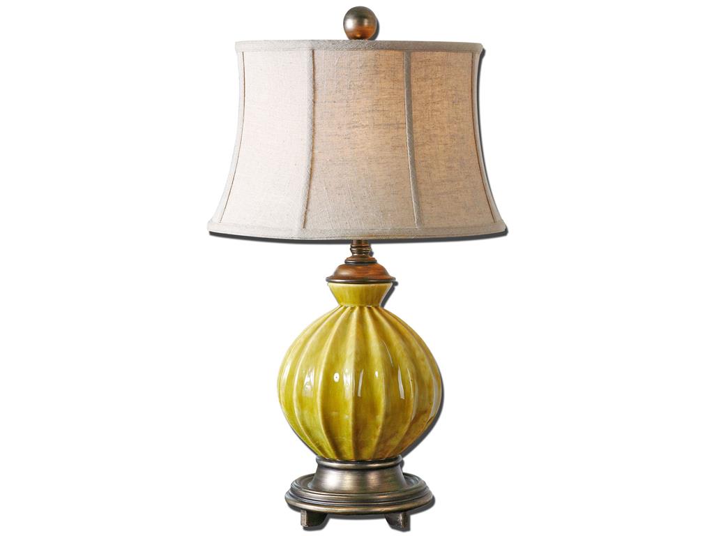
Uttermost Lamps and Lighting Pratella Lamp 27491 features a bright yellow base that will surely captivate the beholder.
Teaming Up with YellowYellow can relate to the emotions just like a person taking an upper. This only means that you shouldn’t use yellow in areas where you should be resting such as the bedroom or the bathroom. The reading room might not be a good area to use this color in. Being exposed to yellow in these places of relaxation will only make the person annoyed or irritable in the long run. Remember that even as you sleep, the psychological properties of yellow are still at work so better be careful in using this activity-inducing hue.
You are seeing a lot of yellow pairings in many interiors at the moment. Different combinations are being used under different circumstances. Depending on yellow’s strengths, gray is often used as the hue to tone down this active color.
Tonal white versions of yellow include ivory, cream and oyster hues. These look lively, fresh and happy and are known to excite the senses. Spring showed much of these beautiful colors so it would be a waste if you would not be able to harness yellow to your home’s advantage.
A complementary color to yellow is any shade of purple. If you think you have doused your home with too much yellow, then freely use purple to counteract the overactive environment that you have created.
For a calmer color scheme, find the analogous colors. Which colors sit right next to yellow on the color wheel?
For yellow, these would be red and orange.
The key to successfully using yellow as a color scheme is to use it together with the hues from the same family. It also pays to identify which colors are primary, secondary and accents.
Yellow has always been a contradictory color. It can be the color of slaves (during the Spanish Inquisition) or it can represent nobility (this is apparent among the Chinese). At the end of the day, it will always represent cheerfulness so use it with caution.
Tags: bright colors, bright hues, bright paint colors, brightening up rooms, brightening up your home, McCreerys, McCreerys Home Furnishings, yellow, yellow color palette, yellow color psychology, yellow interior design, yellow interiors
Posted in Color Schemes, Interior Design 101, Interior Design Elements, Interior Design Themes | No Comments »
Follow us on our social media
© McCreery's Home Furnishings | All Rights Reserved | Privacy Policy