- Follow us:


Monday, March 4th, 2019
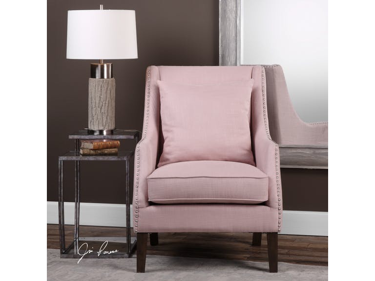
Uttermost Living Room Arieat Pink Armchair 23370: This pop of pink is just the needed visual interest in this neutral room.
Pantone is a company that prides itself in being the global authority when it comes to color. For many years now, it’s been unveiling its versions of Color of the Year and it seems that the fashion and interior design industries are following the trends.
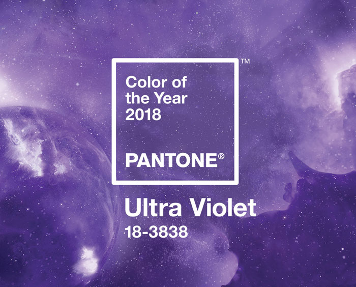
In 2017, the Color of the Year was Greenery and just last year, it was more eye-catching with UltraViolet taking center stage.
Did you ever wonder how Pantone chooses the colors that they highlight each year? They have been at it since the year 2000. It all began with the discussion among 20 people and it eventually evolved into a team which became the Pantone Color Institute.
The process of choosing the subsequent year’s central color takes almost nine months. The chosen color is actually a global expression of people’s moods and attitudes.
Following the color trends isn’t new. Homeowners want to stay up-to-date with the current styles that they could use in their own habitats. And two months into this new year, you have ample time to understand this year’s color and how you can apply it in your interior design.
Living Coral in Your Home
So Pantone has finally proclaimed this year’s color to guide the decorators, designers, and homeowners with their color schemes. Current events pointed towards Living Coral, an exciting yet subdued pink that would be great to incorporate in any design.
UltraViolet, last year, promised that it would point to what’s about to come. Many people did not know how to use this eccentric color. It became a trial and error of sorts for some.
Pantone stated that Living Coral is meant to energize and it is familiar because it is a hue that’s commonly found in nature. More specifically, this color is displayed beautifully underneath the seas so very few have enjoyed its actual beauty. A lot of designers are excited to use this rare hue in their homes.
Living Coral is vibrant and charming so it could bring just these beautiful adjectives to your home. You can either use it as a bold statement or it can also take the backseat to become the light accent.
Allow Living Coral to participate in the whole design harmony that you’re trying to set up in your home. And allow yourself to be playful, too, as you experiment on how you can better use this lovely hue.
So, Living Coral is, somehow, a shade of pink. What’s great with this hue is that you can match it with many different colors. Even when it’s categorized as a shade of pink, it’s a mellow version so it is nearer the neutral plate more than any other color scheme.
Living Coral does not have to be used in a totally pink home. Match it with whites, grays, creams, greens or blues. These complimentary colors can help neutralize the pinkness.
Add a partial or full accent wall then pair the color with pure white and natural wood. This simple ensemble will give you a contemporary vibe. If you’re not afraid to play with colors, then go bold with the Living Coral being the anchor color for metallic accents.
Living Coral can be so beautiful inside the bedroom. It can be used as the color for the bedding or the furniture. This hue would surely bring restful sleeps in the nights to come.
If you want to add Living Coral in the kitchen, then add it to an all white space. The pop of color will add the fun vibe to what is an otherwise neutral room. Imagine a Living Coral colored set of coffee mugs and kitchen towels.
They’re a thing of beauty, aren’t they?
Tags: 2019 Pantone Color of the Year, Living Coral, McCreerys, McCreerys Home Furnishings, Pantone color of the year
Posted in 2019 Trends, Accents, Color Schemes, Decorative Elements, Interior Design 101, Interior Design Elements, Interior Design Themes | Comments Off on Making Living Coral the Focal Element of Your Home
Thursday, January 3rd, 2019
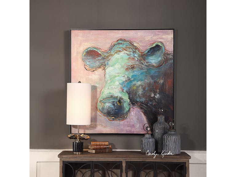
The Uttermost Accessories Matty The Cow Animal Art 41917 makes it easier to embrace this year’s Pantone Color – Living Coral. It is a more subdued version of the hue so it’s easier on the eye while still visually delicious.
The Pantone Color of the Year is both vividly bold and soft; it can be warm and comforting while, at the same time, beautifully buoyant. Get ready to welcome – Living Coral.
Also known as Pantone 16-1546, Living Coral is a spirited and appealing. Those who have a playful attitude and spirit will surely love this delicious color.
Living Coral, according to Pantone, represents the harmony between modern life and nature. It is also the color of the liveliness of social media.
Pantone Color of the Year: The Beginning
For 20 years now, Pantone has been influencing product improvement and has affected many purchasing decisions in varying industries including the world of fashion, industrial design, and furnishings.
The selection of the color is a thorough process that includes many thoughtful decisions and analyses of trends. This trends analyses could include looking at films, travels, works of new artists, artworks, and many other areas of design.
Other influences include textures, new technology, and social media platforms.
Pantone Color Institute is the unit in charge of emphasizing trending runway hues and color forecasts. This Color Institute works together with global brands to sway the psychology and color emotion in design strategies.
Let’s Use Living Coral
There are five color palettes that could fuse well with Living Coral. Use these and you will surely bring out the flexible nature of this beautiful shade.
The first on the list is Pantone 15-4003 or Storm Gray. Gray is a subdued color that will tone down the bright nature of Living Coral. Gray is there to create balance.
Pantone 19-5230 or Forest Biome. Forest biome is actually a term used to generally describe coniferous forests, mixed leaf forest and deciduous forests. The three types that are classified according to latitude are temperate, tropical, and taiga or Boreal forests.
This delicious green will further excite the vibrant Living Coral so it is awesome for rooms that are in need of energy and activity.
The next set of hues that you can partner with Living Coral is Martini Olive or Pantone 18-0625, Mauvewood (which looks relatively close to this year’s Pantone Color), Twill, and Beluga.
Now, don’t be afraid of this mellow color. This orange peace shade is perfect for people who are optimistic. It is a hue that promotes happiness, integrity, self-respect, longevity, to name a few.
Stress reduction is also a known benefit.
Living Coral is vibrantly fresh so you can use it in rooms that need to be energized. This can be used on bathroom tiles so that the room looks more refreshing. If used as a focal point, it can be painted on a wall to draw attention. This feature wall will surely become a classic so use it when you want the room to become an instant hit.
How about a Living Coral rug? Any dreary space is sure to come to life if this is the color that you’d choose.
It can also be the color of a major piece of furniture. Now picture this – a room with pink walls that is perfectly balanced by the furnishings that come in the darker shade of Living Coral.
Since this shade can also be playful, you can use it in the hallway or in kids’ playrooms. Pair it with nude hues to create the perfect welcoming work. In the living room, Living Coral is the right accent that is the perfect companion to indigo and deep teals. It becomes a warm shade as it is paired with cooler blue shades.
If Living Coral is too vibrant for your taste, then try finding a lighter shade of peach. This should still help you embrace the trend.
Tags: 2019 Pantone Color of the Year, Living Coral, McCreerys, McCreerys Home Furnishings, Pantone 16-1546, Pantone Color of 2019, Pantone color of the year
Posted in 2019 Trends, Color Schemes, Interior Design 101, Interior Design Elements, Interior Design Themes | Comments Off on Living Coral: The Hub of Color Schemes This 2019
Tuesday, December 11th, 2018
Credit: Pantone.com
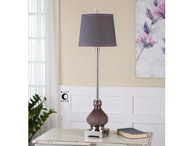
Purple and its different shades are often associated with wealth, power, and royalty. It is no surprise that this year’s Pantone Color went high-flying-adored with its luscious UltraViolet shade. If you want to end the year with a bang, then why not redecorate your home with this lovely color?
From Tyrian Purple to UltraViolet
Purple was the hue worn by the magistrates of Rome. The Byzantine Empire’s rulers also regarded this hue to be the imperial color. The Roman Catholic church also has a high regard for it.
But where and when did purple begin?
The Old English word purpul derived from the Latin word purpura is where the modern term purple came from. The first recorded use of this word was in 975 AD. The Neolithic era showed the first prehistoric art containing this color. Sticks of hematite powder and manganese were used in drawing animals and outlining the cavemen’s hands (between 16,000-25,000 BC).
Violet sits closer to the color blue than purple. It is also a spectral color as compared to purple which is always a fusion of two hues.
Manufacturing the purple dye used to be a long and arduous process. It was also expensive to make since thousands of small snails were needed to provide the color needed. Tyrian purple was the standard color for royal personages, nobles, magistrates, and priests.
Purple is so beautiful that it was even mentioned in the Bible when God instructed Moses to tell the Israelites to make an offering blue, purple, and scarlet cloth. This Tyrian color varied greatly from a reddish to bluish purple.
The recreation of the Tyrian purple in modern times required 12,000 mollusks to provide just 1.4 ounces of the dye. This dye now costs more than 2,000 euros in our time.
Han purple became the synthetic source of purple pigment. This was invented in China at about 700 BC. It was then used on potteries and wall painting. This looked more like indigo and was often the result of the breakdown of the chemical Han blue.
French purple was born in the 18th century while the synthetic pigment Cobalt violet became available on the second half of the 19th century. In 1856, aniline purple or mauve was finally discovered.
By the 1950s, quinacridone became available to the market. While it was discovered in 1896, it was only synthesized in 1936 and manufactured in the ‘50s.
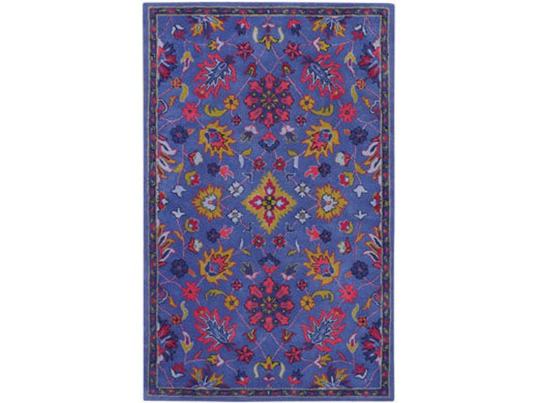
Accentuate a space with this Capel Incorporated Floor Coverings Panache-Ziegler Rug 3126RS Purple.
UltraViolet Winter
It’s the end of the year now but before you declare that UltraViolet is going to fade, make good use of it instead in your home.
UltraViolet has an energizing effect which is great because people have a tendency to feel depressed during the wintry months. This hue is so versatile that it can be fun and subdued at the same time.
You can make use of an UltraViolet accent wall before winter ends. None can be more enigmatic than this color for this year. This also provides a cosmic vibe to your home.
UltraViolet can also add the needed feminine vibe in the bathroom. ‘Want the tub to stand out? Have it in UltraViolet. This room has never been more majestic and mysterious at the same time. You can literally spend hours dipped in this exciting tub.
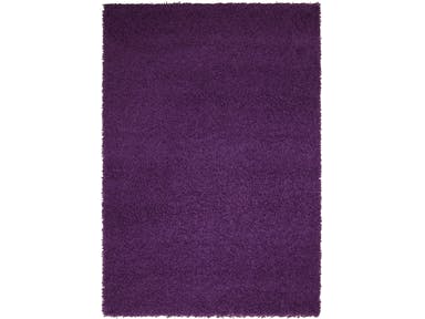
Sweet, soft, regal and proud – all these represent purple. So you can use vibrant UltraViolet as a blanket in the bedroom or as an area rug. It can also be the color of your walls if you’re feeling more adventurous.
Pair UltraViolet with creamy whites and you’d get a feminine vibe indeed. Fuse silver and white with it and it’s the perfect combination for Christmas.
Tags: McCreerys, McCreerys Home Furnishings, Pantone color of the year, UltraViolet, UltraViolet decor, UltraViolet in interior design
Posted in 2018 Trends, Accents, Color Schemes, Interior Design 101, Interior Design Elements | Comments Off on UltraViolet 2018: Ending the Year on a High Note
Wednesday, March 7th, 2018

Capel Incorporated Floor Coverings Jazzy Shag Rug 5820RS Purple
There is very little doubt that many people would consider purple to be a unique, quirky color. First of all, it is not always that easy to get it right. It is not a color that you can wear with anything, in fact, you need to carefully think it through before you pair it with anything.
Purple got its name from the Latin word purpura meaning a Tyrian dye made with the mucus of a sea snail from the Mediterranean coasts. This dye was not affordable insomuch that only kings are able to buy it.
Purple is also not an easy color to work with when you want it to become the dominant color in your home. You are certain to get questioning looks if you suddenly announce that purple is going to be your chosen color palette for the year.
Yet this year, 2018, purple does take center stage in so many industries. First, in fashion, it is the hottest color to be used for wardrobes and accessories. The interior design industry, as always, follows closely behind.
Purple is either repellent or a magnetic color for you. Some are scared of its boldness but this does not mean that you have to belong to this group of purple-scared individuals.
Purple Equals Sophistication
Purple is the fusion of two remarkable hues – the passionate color of red and the active color that is blue.
Purple may be the union of these two exciting colors but it is not one to sit in between. It is a bold color and one that is often selected when there is a feature that needs to be highlighted or a room that needs to stand out.
Purple is so beautiful that it is often associated with royalty, spirituality, and wisdom. There is a reason why the Roman emperors loved this color so much as do the Catholic bishops of today. Purple looks amazing on statement pieces, especially on velvet.
It is especially amazing with Mediterranean design where lots of blue are acceptable and hints of red are encouraged.
Vincent Van Gogh loved purple and he used it often in his paintings. His famous painting Starry Night is chiefly purple with touches of yellow and blue. Leonardo da Vinci even believed in meditation being 10 times more powerful when done under a purple light.
Uttermost Lamps and Lighting Charoite Deep Purple Buffet Lamp
Purple is Stylish
Where purple is featured, you are sure to find a strong, striking presence of the color. It can be a featured artwork or a piece of furniture. It can also be a lovely rug that anchors furniture sets.
The aubergine type of purple can also be a relaxing color, especially when used in the bedroom or the bathroom. Combine this with green or white and you will have a spa-like ambiance to relax in.
Working with Purple
While it is easy to just default to the plum shade of purple, this color offers so many varieties that could better express who you are. Purple is so versatile that you just need to find the right shade to work with or choose the best color to pair it with.
First, let’s have plum with chartreuse. This fusion looks amazing throughout the year. It does not choose a proper season as it is forever connected to Mother Nature. This color fusion blends well with natural materials such as leather, wood, woven items, silk and wool rugs.
Purple also goes well with warm metals. Let’s emphasize on that once more – you need to work with warm metals so stay away from silver. Instead, find copper, gold, brass or bronze pieces that will warm up your interiors.
Other colors that also work well with purple are lime green, light cobalt blue, olive green, pale gold, winter white, dusty turquoise, pomegranate red, charcoal, and teal.
Tags: McCreerys, McCreerys Home Furnishings, Pantone color of the year, Pantone Ultra Violet, purple, Ultra Violet, violet
Posted in 2018 Trends, Color Schemes, Interior Design 101, Interior Design Elements, Interior Design Themes | Comments Off on Reasons to Love the Quirkiness of Purple
Tuesday, January 23rd, 2018

Uttermost Accessories Iris Beauties Floral Prints in Sets of 6.
What color do you get when you mix red and blue? You get a most interesting hue called purple or violet. This year, this awesome color takes center stage as it becomes the Pantone Color of the Year. Ultra Violet takes the limelight with its luxurious, powerful, and magical beauty.
Purple in Color Psychology
As many people already know, colors have a way of affecting people’s psyche. As for purple, it is a color that’s known to calm the nerves. It is also known to trigger a person’s creativity as well as spur calmness over the mind.
Bright purple, in particular, is seen as the color of royalty and having a vast amount of riches. Dark purple, on the other hand, is the color of sadness and even frustration.
Compared to primary colors, purple is not used as often in decorating or designing homes. Yet when used, this color is no less than the symbol of quality and royalty. In fact, many businesses who want to be recognized as luxurious brands tend to consider purple as their company or logo color. Examples of these are the Hallmark logo, Cadbury, Yahoo, and the LA Lakers.
The Capel Incorporated Floor Coverings Jazzy Shag Rug in purple is the epitome of comfort and luxury.
Purple Interiors
If you want a unique color to design with, then Pantone’s 2018 color choice should be your first option. This is a wonderful color to decorate with. Think of using lavender, lilac or other shades of this royal color. Don’t just stick with Ultra Violet even though this is touted as the color to paint your walls or to upholster your furnishings with this year.
There is so much to embrace in purple that is awesome. It is not a color that’s to be used on an accent wall alone. It can be as vast as the theme of a winter or spring wedding or it can be the accent to add visual interest in a mainly neutral home.
So, if purple is such an amazing color, why did it take this long for it to become the color of the year? Also, why are a lot of people afraid to decorate with it?
Purple can be a hue that is so powerful that it can easily overpower a space. You have to learn to handle this color with such confidence so that you won’t create chaos. Instead, you should be able to create a home with purple blended professionally and infused with care with all the other design elements.
Whether you love or hate this color, the truth remains that it is the star hue this year and you’ve got to learn how to decorate carefully with it. Of course, it would be unwise to paint an entire bedroom with glossy purple.
For anyone who is looking into using purple, you might want to begin with lighter shades first. The lighter the shades, the less overwhelming they can be. Begin with accents in purple. If you’re feeling more confident, then you can go ahead and paint an entire wall purple or have the couch upholstered in purple.
Your wall’s decorative elements will also play a huge role this year. These can also become more interesting if purple were to become the contrasting color. Contrasting hues of purple are gold or lime green, even yellow. You can also do the ombre effect by using lighter or darker shades of purple for your chairs and other furnishings. Wall décor, side lamps, frames, and artworks can also come in bold purple hues this year. Just make sure to blend them properly with the rest of your design elements.
There is no denying it – purple is trendy this year. When you are looking forward to having a spectacular and fashionable interior design this 2018, then this is your jaw-dropping, go-to color. In a nutshell, here are some suggestions where you can use purple –
Tags: McCreerys, McCreerys Home Furnishings, Pantone color of the year, Pantone Ultra Violet, purple, purple color scheme, purple interiors, Ultra Violet, violet
Posted in 2018 Trends, Accents, Color Schemes, Interior Design 101, Interior Design Elements, Interior Design Themes | Comments Off on It’s a Purple 2018
Wednesday, January 3rd, 2018

Uttermost Lamps and Lighting Charoite Deep Purple Buffet Lamp 29346: Thick, deep purple, seeded glass accented with polished nickel plated details and a crystal finial. The tapered round hardback shade is a charcoal linen fabric with natural slubbing and purple double trim.
It’s time to let go of millennial pink. Everyone, say hello to this year’s featured color – purple.
The Pantone Color Institute has now unveiled its choice for 2018’s Color of the Year. It picked an awesome hue that, without a doubt, conveys originality as well as ingenuity. Purple is a complex and distinctive hue that can easily fascinate because of its enigmatic presence.
Pantone Ultra Violet
What could be a more intriguing color for this year? This will also become an inevitable color that will be extensively used on the catwalk. Expect mixed reviews, of course, as purple is an intense hue, one that’s not used too often in interior design as well as decorating.
Greenery, last year’s Pantone color of the year was also a bold choice but it was quite easy to use in many homes because green is associated with Mother Nature. Green is a favorable color, more often than not, so it was regarded as a neutral addition, one that architects and interior designers readily embraced.
But what to do now with purple? Should you be limited to purple accents?
Let us understand that this annual announcement on Pantone’s favored color for the year is not an automatic call to redecorate your home. Not a lot of homeowners are willing to do this so find out how you can incorporate this year’s in color without strapping your home of its current look.
Begin by finding furnishings as well as decorative accessories that come in purple. For people who love this color but are hesitant to use it in their home are now at liberty to find pieces that they can use.
Pantone Ultra Violet offers a lot of potential for your home. If you use it properly, you would even be surprised at the great look that you can achieve.
Ultra Violet is a deeply-saturated color. It is lush and it can create impact even with just small applications. You can add a punch of purple in the living room through your purple throws. You can still have the rest of the room in a light and bright setup.
You can also have a chill vibe in the living room as you work with splashes of purple in a contemporary setting. A purple living room is as relaxing as it could get after a stressful day at the office.
Purple can also be added to the bathroom for increased elegance. Believe it or not, this is a soothing color, one that can calm your nerves more specifically, which is why it is great to use in the bathroom.
You can have a standalone bathtub in purple. This will surely become the effortless focal point inside that room. If you’re feeling up to make a statement this year, then have your bathroom walls bathed in purple tiles. You will surely be chic this year with your choice. Just make sure that you truly want this color since you’ll be living with it for years to come.
Since purple is recognized as a calming color, naturally, it is an obvious choice for the bedroom. Use a more intense color for the headboard wall while the rest of the walls come at a lighter shade of the same color.
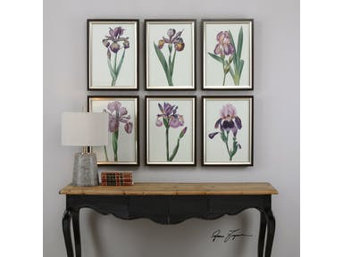
Uttermost Accessories Iris Beauties Floral Prints S/6 33636: A delightful collection of purple irises. Prints are under glass and surrounded by frames featuring a dark walnut finish accented by an inner lip with a champagne silver finish.
Now onto the dining room – if blue is believed to suppress the appetite, then can be safe with purple. It is a fusion of blue (appetite suppressant) and red (appetite stimulant) so it can balance the way you enjoy your food with your family.
All in all, Pantone Ultra Violet is a unique hue for any room in your home. Just make sure to use it in a room where ample light can get in during the morning so that the color won’t look gloomy.
It’s time to let go of millennial pink. Everyone, say hello to this year’s featured color – purple.
The Pantone Color Institute has now unveiled its choice for 2018’s Color of the Year. It picked an awesome hue that, without a doubt, conveys originality as well as ingenuity. Purple is a complex and distinctive hue that can easily fascinate because of its enigmatic presence.
Pantone Ultra Violet
What could be a more intriguing color for this year? This will also become an inevitable color that will be extensively used on the catwalk. Expect mixed reviews, of course, as purple is an intense hue, one that’s not used too often in interior design as well as decorating.
Greenery, last year’s Pantone color of the year was also a bold choice but it was quite easy to use in many homes because green is associated with Mother Nature. Green is a favorable color, more often than not, so it was regarded as a neutral addition, one that architects and interior designers readily embraced.
But what to do now with purple? Should you be limited to purple accents?
Let us understand that this annual announcement on Pantone’s favored color for the year is not an automatic call to redecorate your home. Not a lot of homeowners are willing to do this so find out how you can incorporate this year’s in color without strapping your home of its current look.
Begin by finding furnishings as well as decorative accessories that come in purple. For people who love this color but are hesitant to use it in their home are now at liberty to find pieces that they can use.
Pantone Ultra Violet offers a lot of potential for your home. If you use it properly, you would even be surprised at the great look that you can achieve.
Ultra Violet is a deeply-saturated color. It is lush and it can create impact even with just small applications. You can add a punch of purple in the living room through your purple throws. You can still have the rest of the room in a light and bright setup.
You can also have a chill vibe in the living room as you work with splashes of purple in a contemporary setting. A purple living room is as relaxing as it could get after a stressful day at the office.
Purple can also be added inside the bathroom for increased elegance. Believe it or not, this is a soothing color, one that can calm your nerves more specifically, which is why it is great to use inside the bathroom.
You can have a standalone bathtub in purple. This will surely become the effortless focal point inside that room. If you’re feeling up to make a statement this year, then have your bathroom walls bathed in purple tiles. You will surely be chic this year with your choice. Just make sure that you truly want this color since you’ll be living with it for years to come.
Since purple is recognized as a calming color, naturally, it is an obvious choice for the bedroom. Use a more intense color for the headboard wall while the rest of the walls come at a lighter shade of the same color.
Now onto the dining room – if blue is believed to suppress the appetite, then can be safe with purple. It is a fusion of blue (appetite suppressant) and red (appetite stimulant) so it can balance the way you enjoy your food with your family.
All in all, Pantone Ultra Violet is a unique hue for any room in your home. Just make sure to use it in a room where ample light can get in during the morning so that the color won’t look gloomy.
Tags: 2018 Color of the Year, McCreerys, McCreerys Home Furnishings, Pantone color of the year, Pantone Ultra Violet
Posted in 2018 Trends, Color Schemes, Interior Design 101, Interior Design Elements, Interior Design Themes | Comments Off on Celebrating Purple: Pantone’s 2018 Color of the Year
Tuesday, September 5th, 2017
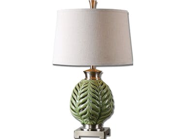
Uttermost Lamps and Lighting Flowing Fern Green Table Lamp 26285
Pantone, the color-management company, announced on the advent of 2017 that the Color of the Year was Greenery. This is a refreshing shade, one that revitalizes the homeowner’s senses without difficulty. It is a color that symbolizes beginnings.
Pantone Greenery can also be a striking shade. If you don’t look carefully, you might mistake it for lime green. It can strike a punch especially when you compare it to the colors of the year in 2016 – Serenity and Rose Quartz.
Pantone Green and Mother Nature
This year’s chief color practically begs everyone to notice the beauty of nature once more. People can reconnect with Mother Nature and should even begin to look at nobler purposes in life.
Pantone Greenery should also be relevant in the sense that the world is now slowly embracing green living.
Green living, also known as sustainable living, is a lifestyle wherein the people who sign up to do it bring balance to Earth’s natural habitats, resources, and biodiversity. Sustainable living points out that humans are very much a part of their surroundings, thus, they are affected by the Earth’s movements and environments.
More and more people are enamored by the practices that have little to zero impact on the environment. These people agree to the reduction of consumption and waste and they carry over these practices to their living arrangements.
A nature-centered lifestyle also means finding sustainable means to redo or redesign your space. This means using low to non-VOC paint and green flooring. You see, your home is where you socialize, cook, relax, and where you raise your kids. Of course, you would want it to be inviting and nurturing.
Remaking your space means changing the colors as well. You can begin by using Pantone Greenery. This is a culturally-significant hue that you can use in small doses throughout your home. If you choose a larger palette for this hue, then Pantone Greenery is also perfect.
Green, after all, is the fusion of yellow and blue; yellow which is the color of the sun and blue which is the color of the skies and the waters of the Earth. You could never go wrong with green as it is the visual anchor that represents rainforests, jungles, grasses, and trees.
Decorating your bathroom and kitchen with Pantone Greenery is a wonderful way to make these rooms come to life. Imagine having the walls of your bathroom splashed with this refreshing color. If this is too bold for you, then you can just have the bathtub and the sink come in this color. If these, too, don’t work, then you can have just a few accent pieces brought in.
Psychology in Greenery
Apart from beginnings and freshness, green is the color of safety, harmony, and fertility. It can affect you and your family mentally and physically. It is youthful and relaxing so it can easily alleviate depression, anxiety, and nervousness.
Green has the same amazing coolness that blue offers. It is directly related to energy and nature which is why it is chiefly used to advertise or promote medical products.
Pantone Greenery on Greeneries
The greenery effect can be carried a notch higher as you bring in potted plants or greens in vases. This is an effortless way to bring joy into your home without visually overwhelming anyone.
Plants can be placed on table tops or shelves, even on bedside tables. It is an effective way to break the boring color palette that is usually seen in homes. A stark white home can also look less unadorned if you bring in those potted greeneries.
Tags: greenery, Greenery for 2017, McCreerys, McCreerys Home Furnishings, Pantone color of the year, Pantone Greenery
Posted in 2017 Trends, Color Schemes, Interior Design 101, Interior Design Themes | Comments Off on Greenery for 2017: Making Sense of Pantone’s Color of the Year
Wednesday, January 18th, 2017
FFDM Fusion: The pop of green is a refreshing sight in this bedroom photograph.
It is always crucial that you stay up-to-date when it comes to interior design trends. An effective way to do this is to find out which colors are in and which are no longer popular. This is the first month of the year and so it is also the perfect time to begin updating the colors of your home. This is now the right time to switch to the more popular hues.
What’s Greenery?
Pantone highlights the color for this year. This is a symbolic selection of colors based on culture as well as a collective expression of people’s attitudes and moods.
Pantone blended two shades in the past year which were serenity and rose quartz. This year, it has chosen a brighter color that’s in line with what’s hip.
Greenery means a more cheerful version of yellow green. Pantone describes it as the symbol of new beginnings. It is a refreshing shade to begin with so it is the right color to alter the look of your home.
Greenery also blends well with other colors like blue and pink. This can also serve as the accent to white or black color scheme.
Greenery Painting
Refresh your home with a new coat of paint. This can beautifully add a burst of color to any room. If you’re adventurous enough, you can use it on your accent wall.
Infuse this color with stripes since it also looks great with white. You can make this accent wall the next DIY project for your family.
Greenery Backsplash
If you want your bathrooms to look trendier this year, then use greenery as the color for your bathroom or kitchen backsplash. If you currently have a natural-looking bathroom, use glass greenery tiles for the backsplash.
The average cost for every finished square foot is about $9.13 to $17.89.
Cynthia Rowley for Hooker Furniture Rivington 3 Over 3 Sofa: The colors that you find in this photograph blend beautifully, with yellow green being the central hue.
Greenery in the Bedroom
Using this color inside the bedroom is a non-traditional way to set up your sleeping space. This could possibly improve your mood inside this room based on the psychology of color.
A green bedroom is a room that shows passion and vitality. This is the shade that you would want to use if you want to have a life-affirming color to represent your goals for this year.
Let your bedroom become a versatile place this 2017. Consider changing the window treatments as well as the bedding to match this beautiful color. Use small accessories like candles and pillows. If you love this shade enough, consider painting the trim or walls with a more permanent coat.
If you’re not that brave to venture into a blast of this color just yet, then just subtly incorporate it on your accessories. In the kitchen, for instance, use greenery vases, chair cushions and decorative bowls.
Matching Greenery
The Pantone color for this year is all about the beauty of nature and how you can bring it inside your home. If you’re ready to work with this color, be sure to accompany it with other natural elements like wood.
Use bamboo, rattan or wicker to highlight this wonderful color.
With a bolder attitude, you can match greenery with bright pinks, hot blues or metallics. Don’t overdo it, though, or you could end up with a room that has a lot of clashing hues.
A Final Reminder
Your home should be a retreat so use the Pantone color of the year to create a place of tranquility. Use it in different areas of your home to evoke relaxation and a beautiful appeal at the same time.
Embrace this global culture that’s taking the world by storm. Let greenery become the new you.
Tags: color of the year, greenery, McCreerys, McCreerys Home Furnishings, Pantone color of the year
Posted in 2017 Trends, Color Schemes, Interior Design 101, Interior Design Elements | Comments Off on Greenery Is In This 2017
Follow us on our social media
© McCreery's Home Furnishings | All Rights Reserved | Privacy Policy