- Follow us:


Friday, June 22nd, 2018
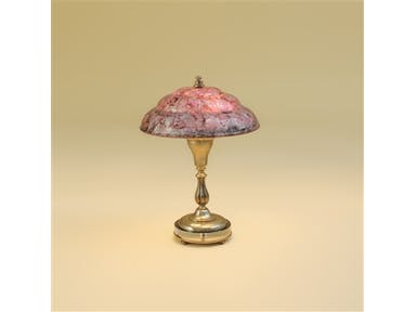
Maitland-Smith Lamps and Lighting Antique Nickel Finished Aluminum Desk Lamp, Violet Hammer Inlaid Shell Shade 1751-680
The color violet or purple is a very deep color in terms of color psychology. It is often linked to the spirituality and imagination. It stimulates higher ideals and spurs deeper imaginations. Those who want to introspect would do well to be bathed in this color as it stimulates deeper thoughts.
If you want to differentiate purple from violet, it is as easy as seeing one on the color spectrum and the other as merely a mixture of blue and red. Violet offers the highest vibration on the visible spectrum.
Violet may not be as intense as its cousin (purple) but it is closely and even interchangeably used with this hue. Both also have the energy needed to strengthen red hues and intensify blues.
This royal color is also linked to the world of fantasy so it is used when you need to escape the realities or practicalities of everyday life. Daydreamers are in love with this color.
Violet and purple both promote a balance of the emotions and the mind. They are known to contribute to mental stability and peace of mind. Violet is a good color to use when practicing meditation. But how would you use violet in designing your home?
Violet Interiors
Since violet is the color creativity and royalty, it is so easy to add an exotic flair to your home when you use this hue.
Use violet to add drama to your home. Surprisingly, you can also use this to create a wave of calm in the same room. Violet can also be lavender or solid plum. It can also be used as the chief color or the interesting accent.
If you want to create a stunning entryway, then use violet. You can then have the walls painted in light lavender grayish softness. A formal living room, on the other hand, can be set up with violet pastels fused with modern art.
Creating a statement means you’re ready to use a more jolting violet. This can be neon purple which you could use together with stripes of gray. This should easily give the room an edgy kind of look. Pair the mid-tone sort of purple with mustard for a livelier, hipper vibe.
Those who want a more sophisticated or lush room should use the UltraViolet Pantone Color of the Year. Pair this with white trim to complete the elite surroundings. You can also combine this color with greens and blues in softer shades to create more serene surroundings.
The UltraViolet Bedroom
Why not? UltraViolet is a delicious color that would be correct to use inside a young girl’s bedroom. Sure it’s not the usual pink but it offers the same amount of girly with a dash of maturity. If you used a mainly neutral color scheme, then UltraViolet can serve as the accent color that would add depth to your design.
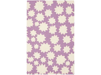
Capel Incorporated Floor Coverings Stars Rug 6066RS Violet
UltraViolet Exteriors
Again, why not? UltraViolet is such an interesting color. Use this with a dash of black and you would think back to the bygone Victorian era. Imagine having UltraViolet shutters, window boxes, or doors. These will instantly become cute and your home would surely never be considered as mundane.
The Eclectic UltraViolet Dining Room
Recreate the look of Midcentury when you use chartreuse chairs together with UltraViolet walls. The striking backdrop serves as the perfect frame to the colorful chairs that you invest in and the rich, wood dining table at the very center of all the action.
UltraViolet and White
This hue looks stunning with pristine white because, together, they can create a calming effect. The walls in violet and the ceramic bathroom essentials all create the perfect look for a spa-like ambience.
Tags: McCreerys, McCreerys Home Furnishings, Pantone Ultra Violet, purple interior design, purple interiors, UltraViolet, UltraViolet in interior design, violet
Posted in 2018 Trends, Color Schemes, Interior Design 101, Interior Design Elements, Interior Design Themes | Comments Off on Your UltraViolet 2018 Home
Wednesday, March 7th, 2018

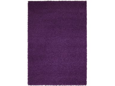
Capel Incorporated Floor Coverings Jazzy Shag Rug 5820RS Purple
There is very little doubt that many people would consider purple to be a unique, quirky color. First of all, it is not always that easy to get it right. It is not a color that you can wear with anything, in fact, you need to carefully think it through before you pair it with anything.
Purple got its name from the Latin word purpura meaning a Tyrian dye made with the mucus of a sea snail from the Mediterranean coasts. This dye was not affordable insomuch that only kings are able to buy it.
Purple is also not an easy color to work with when you want it to become the dominant color in your home. You are certain to get questioning looks if you suddenly announce that purple is going to be your chosen color palette for the year.
Yet this year, 2018, purple does take center stage in so many industries. First, in fashion, it is the hottest color to be used for wardrobes and accessories. The interior design industry, as always, follows closely behind.
Purple is either repellent or a magnetic color for you. Some are scared of its boldness but this does not mean that you have to belong to this group of purple-scared individuals.
Purple Equals Sophistication
Purple is the fusion of two remarkable hues – the passionate color of red and the active color that is blue.
Purple may be the union of these two exciting colors but it is not one to sit in between. It is a bold color and one that is often selected when there is a feature that needs to be highlighted or a room that needs to stand out.
Purple is so beautiful that it is often associated with royalty, spirituality, and wisdom. There is a reason why the Roman emperors loved this color so much as do the Catholic bishops of today. Purple looks amazing on statement pieces, especially on velvet.
It is especially amazing with Mediterranean design where lots of blue are acceptable and hints of red are encouraged.
Vincent Van Gogh loved purple and he used it often in his paintings. His famous painting Starry Night is chiefly purple with touches of yellow and blue. Leonardo da Vinci even believed in meditation being 10 times more powerful when done under a purple light.
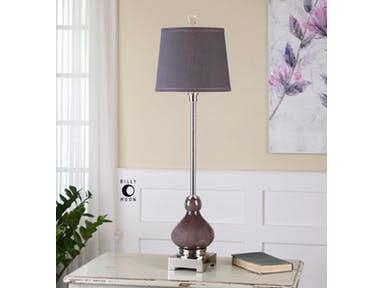
Uttermost Lamps and Lighting Charoite Deep Purple Buffet Lamp
Purple is Stylish
Where purple is featured, you are sure to find a strong, striking presence of the color. It can be a featured artwork or a piece of furniture. It can also be a lovely rug that anchors furniture sets.
The aubergine type of purple can also be a relaxing color, especially when used in the bedroom or the bathroom. Combine this with green or white and you will have a spa-like ambiance to relax in.
Working with Purple
While it is easy to just default to the plum shade of purple, this color offers so many varieties that could better express who you are. Purple is so versatile that you just need to find the right shade to work with or choose the best color to pair it with.
First, let’s have plum with chartreuse. This fusion looks amazing throughout the year. It does not choose a proper season as it is forever connected to Mother Nature. This color fusion blends well with natural materials such as leather, wood, woven items, silk and wool rugs.
Purple also goes well with warm metals. Let’s emphasize on that once more – you need to work with warm metals so stay away from silver. Instead, find copper, gold, brass or bronze pieces that will warm up your interiors.
Other colors that also work well with purple are lime green, light cobalt blue, olive green, pale gold, winter white, dusty turquoise, pomegranate red, charcoal, and teal.
Tags: McCreerys, McCreerys Home Furnishings, Pantone color of the year, Pantone Ultra Violet, purple, Ultra Violet, violet
Posted in 2018 Trends, Color Schemes, Interior Design 101, Interior Design Elements, Interior Design Themes | Comments Off on Reasons to Love the Quirkiness of Purple
Tuesday, January 23rd, 2018

Uttermost Accessories Iris Beauties Floral Prints in Sets of 6.
What color do you get when you mix red and blue? You get a most interesting hue called purple or violet. This year, this awesome color takes center stage as it becomes the Pantone Color of the Year. Ultra Violet takes the limelight with its luxurious, powerful, and magical beauty.
Purple in Color Psychology
As many people already know, colors have a way of affecting people’s psyche. As for purple, it is a color that’s known to calm the nerves. It is also known to trigger a person’s creativity as well as spur calmness over the mind.
Bright purple, in particular, is seen as the color of royalty and having a vast amount of riches. Dark purple, on the other hand, is the color of sadness and even frustration.
Compared to primary colors, purple is not used as often in decorating or designing homes. Yet when used, this color is no less than the symbol of quality and royalty. In fact, many businesses who want to be recognized as luxurious brands tend to consider purple as their company or logo color. Examples of these are the Hallmark logo, Cadbury, Yahoo, and the LA Lakers.
The Capel Incorporated Floor Coverings Jazzy Shag Rug in purple is the epitome of comfort and luxury.
Purple Interiors
If you want a unique color to design with, then Pantone’s 2018 color choice should be your first option. This is a wonderful color to decorate with. Think of using lavender, lilac or other shades of this royal color. Don’t just stick with Ultra Violet even though this is touted as the color to paint your walls or to upholster your furnishings with this year.
There is so much to embrace in purple that is awesome. It is not a color that’s to be used on an accent wall alone. It can be as vast as the theme of a winter or spring wedding or it can be the accent to add visual interest in a mainly neutral home.
So, if purple is such an amazing color, why did it take this long for it to become the color of the year? Also, why are a lot of people afraid to decorate with it?
Purple can be a hue that is so powerful that it can easily overpower a space. You have to learn to handle this color with such confidence so that you won’t create chaos. Instead, you should be able to create a home with purple blended professionally and infused with care with all the other design elements.
Whether you love or hate this color, the truth remains that it is the star hue this year and you’ve got to learn how to decorate carefully with it. Of course, it would be unwise to paint an entire bedroom with glossy purple.
For anyone who is looking into using purple, you might want to begin with lighter shades first. The lighter the shades, the less overwhelming they can be. Begin with accents in purple. If you’re feeling more confident, then you can go ahead and paint an entire wall purple or have the couch upholstered in purple.
Your wall’s decorative elements will also play a huge role this year. These can also become more interesting if purple were to become the contrasting color. Contrasting hues of purple are gold or lime green, even yellow. You can also do the ombre effect by using lighter or darker shades of purple for your chairs and other furnishings. Wall décor, side lamps, frames, and artworks can also come in bold purple hues this year. Just make sure to blend them properly with the rest of your design elements.
There is no denying it – purple is trendy this year. When you are looking forward to having a spectacular and fashionable interior design this 2018, then this is your jaw-dropping, go-to color. In a nutshell, here are some suggestions where you can use purple –
Tags: McCreerys, McCreerys Home Furnishings, Pantone color of the year, Pantone Ultra Violet, purple, purple color scheme, purple interiors, Ultra Violet, violet
Posted in 2018 Trends, Accents, Color Schemes, Interior Design 101, Interior Design Elements, Interior Design Themes | Comments Off on It’s a Purple 2018
Wednesday, January 3rd, 2018

Uttermost Lamps and Lighting Charoite Deep Purple Buffet Lamp 29346: Thick, deep purple, seeded glass accented with polished nickel plated details and a crystal finial. The tapered round hardback shade is a charcoal linen fabric with natural slubbing and purple double trim.
It’s time to let go of millennial pink. Everyone, say hello to this year’s featured color – purple.
The Pantone Color Institute has now unveiled its choice for 2018’s Color of the Year. It picked an awesome hue that, without a doubt, conveys originality as well as ingenuity. Purple is a complex and distinctive hue that can easily fascinate because of its enigmatic presence.
Pantone Ultra Violet
What could be a more intriguing color for this year? This will also become an inevitable color that will be extensively used on the catwalk. Expect mixed reviews, of course, as purple is an intense hue, one that’s not used too often in interior design as well as decorating.
Greenery, last year’s Pantone color of the year was also a bold choice but it was quite easy to use in many homes because green is associated with Mother Nature. Green is a favorable color, more often than not, so it was regarded as a neutral addition, one that architects and interior designers readily embraced.
But what to do now with purple? Should you be limited to purple accents?
Let us understand that this annual announcement on Pantone’s favored color for the year is not an automatic call to redecorate your home. Not a lot of homeowners are willing to do this so find out how you can incorporate this year’s in color without strapping your home of its current look.
Begin by finding furnishings as well as decorative accessories that come in purple. For people who love this color but are hesitant to use it in their home are now at liberty to find pieces that they can use.
Pantone Ultra Violet offers a lot of potential for your home. If you use it properly, you would even be surprised at the great look that you can achieve.
Ultra Violet is a deeply-saturated color. It is lush and it can create impact even with just small applications. You can add a punch of purple in the living room through your purple throws. You can still have the rest of the room in a light and bright setup.
You can also have a chill vibe in the living room as you work with splashes of purple in a contemporary setting. A purple living room is as relaxing as it could get after a stressful day at the office.
Purple can also be added to the bathroom for increased elegance. Believe it or not, this is a soothing color, one that can calm your nerves more specifically, which is why it is great to use in the bathroom.
You can have a standalone bathtub in purple. This will surely become the effortless focal point inside that room. If you’re feeling up to make a statement this year, then have your bathroom walls bathed in purple tiles. You will surely be chic this year with your choice. Just make sure that you truly want this color since you’ll be living with it for years to come.
Since purple is recognized as a calming color, naturally, it is an obvious choice for the bedroom. Use a more intense color for the headboard wall while the rest of the walls come at a lighter shade of the same color.
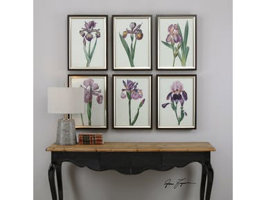
Uttermost Accessories Iris Beauties Floral Prints S/6 33636: A delightful collection of purple irises. Prints are under glass and surrounded by frames featuring a dark walnut finish accented by an inner lip with a champagne silver finish.
Now onto the dining room – if blue is believed to suppress the appetite, then can be safe with purple. It is a fusion of blue (appetite suppressant) and red (appetite stimulant) so it can balance the way you enjoy your food with your family.
All in all, Pantone Ultra Violet is a unique hue for any room in your home. Just make sure to use it in a room where ample light can get in during the morning so that the color won’t look gloomy.
It’s time to let go of millennial pink. Everyone, say hello to this year’s featured color – purple.
The Pantone Color Institute has now unveiled its choice for 2018’s Color of the Year. It picked an awesome hue that, without a doubt, conveys originality as well as ingenuity. Purple is a complex and distinctive hue that can easily fascinate because of its enigmatic presence.
Pantone Ultra Violet
What could be a more intriguing color for this year? This will also become an inevitable color that will be extensively used on the catwalk. Expect mixed reviews, of course, as purple is an intense hue, one that’s not used too often in interior design as well as decorating.
Greenery, last year’s Pantone color of the year was also a bold choice but it was quite easy to use in many homes because green is associated with Mother Nature. Green is a favorable color, more often than not, so it was regarded as a neutral addition, one that architects and interior designers readily embraced.
But what to do now with purple? Should you be limited to purple accents?
Let us understand that this annual announcement on Pantone’s favored color for the year is not an automatic call to redecorate your home. Not a lot of homeowners are willing to do this so find out how you can incorporate this year’s in color without strapping your home of its current look.
Begin by finding furnishings as well as decorative accessories that come in purple. For people who love this color but are hesitant to use it in their home are now at liberty to find pieces that they can use.
Pantone Ultra Violet offers a lot of potential for your home. If you use it properly, you would even be surprised at the great look that you can achieve.
Ultra Violet is a deeply-saturated color. It is lush and it can create impact even with just small applications. You can add a punch of purple in the living room through your purple throws. You can still have the rest of the room in a light and bright setup.
You can also have a chill vibe in the living room as you work with splashes of purple in a contemporary setting. A purple living room is as relaxing as it could get after a stressful day at the office.
Purple can also be added inside the bathroom for increased elegance. Believe it or not, this is a soothing color, one that can calm your nerves more specifically, which is why it is great to use inside the bathroom.
You can have a standalone bathtub in purple. This will surely become the effortless focal point inside that room. If you’re feeling up to make a statement this year, then have your bathroom walls bathed in purple tiles. You will surely be chic this year with your choice. Just make sure that you truly want this color since you’ll be living with it for years to come.
Since purple is recognized as a calming color, naturally, it is an obvious choice for the bedroom. Use a more intense color for the headboard wall while the rest of the walls come at a lighter shade of the same color.
Now onto the dining room – if blue is believed to suppress the appetite, then can be safe with purple. It is a fusion of blue (appetite suppressant) and red (appetite stimulant) so it can balance the way you enjoy your food with your family.
All in all, Pantone Ultra Violet is a unique hue for any room in your home. Just make sure to use it in a room where ample light can get in during the morning so that the color won’t look gloomy.
Tags: 2018 Color of the Year, McCreerys, McCreerys Home Furnishings, Pantone color of the year, Pantone Ultra Violet
Posted in 2018 Trends, Color Schemes, Interior Design 101, Interior Design Elements, Interior Design Themes | Comments Off on Celebrating Purple: Pantone’s 2018 Color of the Year
Follow us on our social media
© McCreery's Home Furnishings | All Rights Reserved | Privacy Policy