- Follow us:


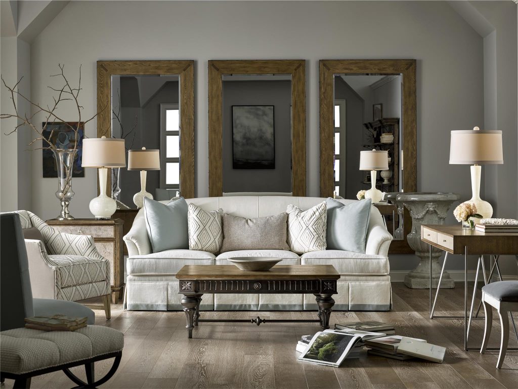
Brentwood Collection offers this Kent Cocktail Table made more beautiful by pastel throws and lampshades.
If you’re still categorizing pastel colors as hues only for girls’ bedrooms or nurseries, then you’re hugely mistaken. There is so much more to these awesome colors that can freshen up and uplift the natural beauty of homes. Gone are those days when they are just paired with equally neutral colors. These days, they can go with pretty much any color that you can think of including black.
Here are many other pastel pairings that will surely amaze you –
Pastels + White Elements
Pastels are growing to be more and more stylish each year. These wonderful soft colors can be infused in a bedroom that’s chiefly white. When you do so, more often than not, the result is a wonderful modern yet sophisticated room.
Just imagine the delicious ambiance that pastel green walls can provide to white furniture pieces. Or if you prefer it the other way around, place pastel furniture inside a mainly white room.
Pastels together with white walls can make even the smallest rooms appear spacious. This is also one of the reasons why pastels are becoming more popular. While they are light-colored, they are far from boring unlike the usual neutrals that dominate many homes. Just picture a unique mint green or sunny yellow bedroom – ain’t it awesome?
Pastels + Traditional Prints
How about filling a sunny room with fresh pastels and traditional elements? The former is quite cheerful and so they are the perfect elements that would balance the rest of the old-fashioned elements.
Classic prints such as lattice, checks, and seersucker blend pretty well with any pastel color. They can also help make the place appear more laidback.
Unique Pastels
When talking about pastels, don’t automatically go for pastel pink or blue, or their cousins green and yellow. There are so many other tints of pastels that you can experiment with. Don’t be bound by just the classics. When you’re feeling up to it, you can also use purple or the incredibly chic pale mustard yellow.
Pastels + Earthy Pieces
You just gotta love pastels because they pair up with just about any style and color that you can think of. If you love rustic, earthy pieces, then pastels are just as wonderful with them. Try pairing a leather chair with some pastel elements, say, some pastel throws or a pastel area rug. Even a unique sculptural lamp with pastel shade would look great with wood furniture.
Dirty Pastels
‘Ever heard of dirty pastels?
Pastel colors are supposed to be soothing, washed out or soft. But when you choose to be unique by combining pastels of different tints and shades, you could come across something more interesting – dirty pastels.
Some of known dirty pastels include #c3a3a3 (which has a red value of 195, green value of 163, and a blue value of 163), #baa0a8 (RGB of 186, 160, 168); #aa97ab (RGB 170, 151, 171); #9492b0 (RGB 148, 146, 176); and #929fb0 (RGB 146, 159, 176).
Pastels with a tinge of brown or gray also work well with the serenity of pastels. If you want to achieve a seamless look, paint the trim with the same color family as the walls. Don’t always go for standard-issue neutrals.
The Pastel In-betweens
Another strategy to make good use of pastel colors is to surround them with white and then to use an accent that is saturated with the same hue. An example is when you use pale pastel pink with deep coral for a romantic yet not-too-feminine look.
Pastel Contrasts
Periwinkle. This is an interesting color that will make red accessories stand out. If you want to follow this same pattern throughout your home, then pick a pastel color for your walls and then finish with a stronger, bolder color right across the color wheel (e.g. pastel pink walls go well with turquoise accents).
Follow us on our social media
© McCreery's Home Furnishings | All Rights Reserved | Privacy Policy