- Follow us:


Thursday, January 3rd, 2019
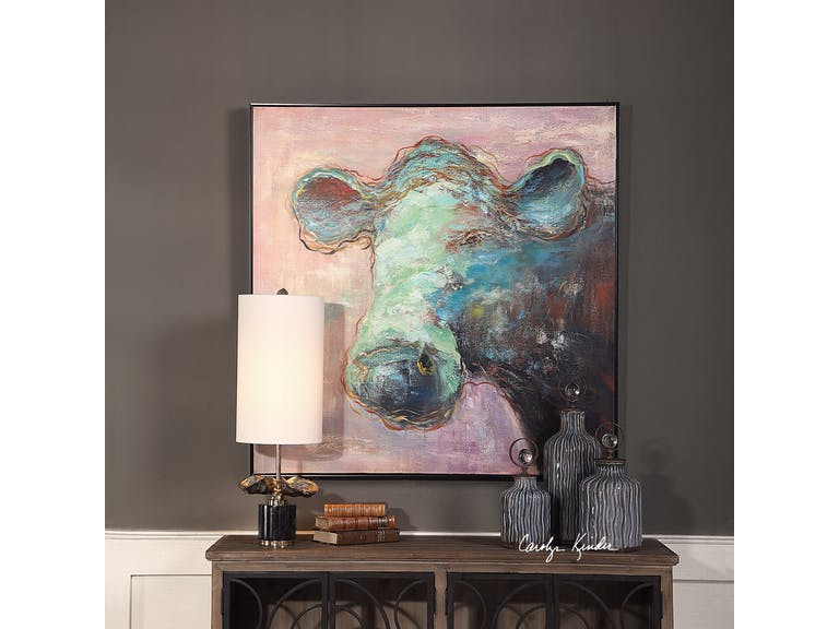
The Uttermost Accessories Matty The Cow Animal Art 41917 makes it easier to embrace this year’s Pantone Color – Living Coral. It is a more subdued version of the hue so it’s easier on the eye while still visually delicious.
The Pantone Color of the Year is both vividly bold and soft; it can be warm and comforting while, at the same time, beautifully buoyant. Get ready to welcome – Living Coral.
Also known as Pantone 16-1546, Living Coral is a spirited and appealing. Those who have a playful attitude and spirit will surely love this delicious color.
Living Coral, according to Pantone, represents the harmony between modern life and nature. It is also the color of the liveliness of social media.
Pantone Color of the Year: The Beginning
For 20 years now, Pantone has been influencing product improvement and has affected many purchasing decisions in varying industries including the world of fashion, industrial design, and furnishings.
The selection of the color is a thorough process that includes many thoughtful decisions and analyses of trends. This trends analyses could include looking at films, travels, works of new artists, artworks, and many other areas of design.
Other influences include textures, new technology, and social media platforms.
Pantone Color Institute is the unit in charge of emphasizing trending runway hues and color forecasts. This Color Institute works together with global brands to sway the psychology and color emotion in design strategies.
Let’s Use Living Coral
There are five color palettes that could fuse well with Living Coral. Use these and you will surely bring out the flexible nature of this beautiful shade.
The first on the list is Pantone 15-4003 or Storm Gray. Gray is a subdued color that will tone down the bright nature of Living Coral. Gray is there to create balance.
Pantone 19-5230 or Forest Biome. Forest biome is actually a term used to generally describe coniferous forests, mixed leaf forest and deciduous forests. The three types that are classified according to latitude are temperate, tropical, and taiga or Boreal forests.
This delicious green will further excite the vibrant Living Coral so it is awesome for rooms that are in need of energy and activity.
The next set of hues that you can partner with Living Coral is Martini Olive or Pantone 18-0625, Mauvewood (which looks relatively close to this year’s Pantone Color), Twill, and Beluga.
Now, don’t be afraid of this mellow color. This orange peace shade is perfect for people who are optimistic. It is a hue that promotes happiness, integrity, self-respect, longevity, to name a few.
Stress reduction is also a known benefit.
Living Coral is vibrantly fresh so you can use it in rooms that need to be energized. This can be used on bathroom tiles so that the room looks more refreshing. If used as a focal point, it can be painted on a wall to draw attention. This feature wall will surely become a classic so use it when you want the room to become an instant hit.
How about a Living Coral rug? Any dreary space is sure to come to life if this is the color that you’d choose.
It can also be the color of a major piece of furniture. Now picture this – a room with pink walls that is perfectly balanced by the furnishings that come in the darker shade of Living Coral.
Since this shade can also be playful, you can use it in the hallway or in kids’ playrooms. Pair it with nude hues to create the perfect welcoming work. In the living room, Living Coral is the right accent that is the perfect companion to indigo and deep teals. It becomes a warm shade as it is paired with cooler blue shades.
If Living Coral is too vibrant for your taste, then try finding a lighter shade of peach. This should still help you embrace the trend.
Tags: 2019 Pantone Color of the Year, Living Coral, McCreerys, McCreerys Home Furnishings, Pantone 16-1546, Pantone Color of 2019, Pantone color of the year
Posted in 2019 Trends, Color Schemes, Interior Design 101, Interior Design Elements, Interior Design Themes | Comments Off on Living Coral: The Hub of Color Schemes This 2019
Follow us on our social media
© McCreery's Home Furnishings | All Rights Reserved | Privacy Policy