- Follow us:


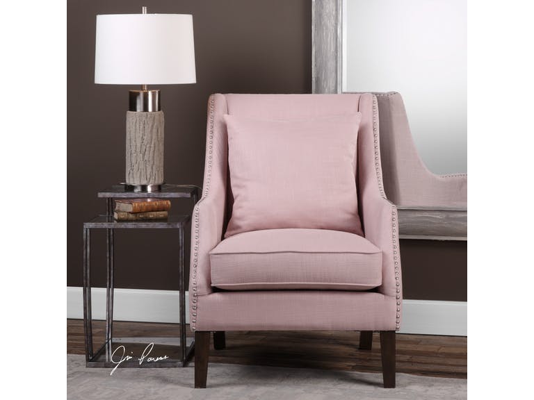
Uttermost Living Room Arieat Pink Armchair 23370: This pop of pink is just the needed visual interest in this neutral room.
Pantone is a company that prides itself in being the global authority when it comes to color. For many years now, it’s been unveiling its versions of Color of the Year and it seems that the fashion and interior design industries are following the trends.
In 2017, the Color of the Year was Greenery and just last year, it was more eye-catching with UltraViolet taking center stage.
Did you ever wonder how Pantone chooses the colors that they highlight each year? They have been at it since the year 2000. It all began with the discussion among 20 people and it eventually evolved into a team which became the Pantone Color Institute.
The process of choosing the subsequent year’s central color takes almost nine months. The chosen color is actually a global expression of people’s moods and attitudes.
Following the color trends isn’t new. Homeowners want to stay up-to-date with the current styles that they could use in their own habitats. And two months into this new year, you have ample time to understand this year’s color and how you can apply it in your interior design.
Living Coral in Your Home
So Pantone has finally proclaimed this year’s color to guide the decorators, designers, and homeowners with their color schemes. Current events pointed towards Living Coral, an exciting yet subdued pink that would be great to incorporate in any design.
UltraViolet, last year, promised that it would point to what’s about to come. Many people did not know how to use this eccentric color. It became a trial and error of sorts for some.
Pantone stated that Living Coral is meant to energize and it is familiar because it is a hue that’s commonly found in nature. More specifically, this color is displayed beautifully underneath the seas so very few have enjoyed its actual beauty. A lot of designers are excited to use this rare hue in their homes.
Living Coral is vibrant and charming so it could bring just these beautiful adjectives to your home. You can either use it as a bold statement or it can also take the backseat to become the light accent.
Allow Living Coral to participate in the whole design harmony that you’re trying to set up in your home. And allow yourself to be playful, too, as you experiment on how you can better use this lovely hue.
So, Living Coral is, somehow, a shade of pink. What’s great with this hue is that you can match it with many different colors. Even when it’s categorized as a shade of pink, it’s a mellow version so it is nearer the neutral plate more than any other color scheme.
Living Coral does not have to be used in a totally pink home. Match it with whites, grays, creams, greens or blues. These complimentary colors can help neutralize the pinkness.
Add a partial or full accent wall then pair the color with pure white and natural wood. This simple ensemble will give you a contemporary vibe. If you’re not afraid to play with colors, then go bold with the Living Coral being the anchor color for metallic accents.
Living Coral can be so beautiful inside the bedroom. It can be used as the color for the bedding or the furniture. This hue would surely bring restful sleeps in the nights to come.
If you want to add Living Coral in the kitchen, then add it to an all white space. The pop of color will add the fun vibe to what is an otherwise neutral room. Imagine a Living Coral colored set of coffee mugs and kitchen towels.
They’re a thing of beauty, aren’t they?
Follow us on our social media
© McCreery's Home Furnishings | All Rights Reserved | Privacy Policy