- Follow us:


Friday, April 19th, 2019
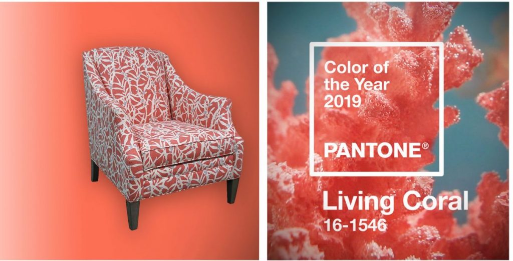
Living Coral on Sam Moore Furniture.
What a wonderful year 2019 is, and what an amazing Color of the Year Living Coral is. Pantone’s chosen Color of the Year for the Year of the Earth Pig is the vivaciously delicious Living Coral.
Living Coral is fearless and upbeat but, looking at it, it is now a classic since it offers a Renaissance vibe. If you’re feeling up for a remodel so you could use this color for this year, then you’re not alone. A lot of homeowners are concocting ways to use this hue in their habitats.
Go ahead and liven up your home with this exciting color. Imagine different ways that you can pair it, fuse it or make it the center of all attention.
Living Coral + Gray
You can wake up to the awesome coolness of a neutral color palette as you set up a pearl gray loveseat. With light woods and off white walls all throughout, the welcoming freshness of Living Coral is something to look forward to in this setup.
Living Coral + Rich Blues
Living Coral will also blend well with royal blue. These are complementing colors that can make your space look regal. If you have dark woods and some gold accents, then what you’ll have is a dramatically sophisticated living room – or is it a bedroom that you wanted for this display of colors?
Pairing Living Coral with teal or aqua is also an alluring way to set up a beach vibe in your home. Use this color palette to make the living room or dining room more exciting.
Living Coral Going Solo
Living Coral, by itself, is already a vibrant color. So, it can manage to become a classic or modern element in any home. It can be the accent hue in a shabby chic environment or it can be the stylize a modern habitat.
You can even achieve an Asian flair with the right elements matching this lovely color. Living Coral can be used in bigger swaths throughout the room so that it stages an inviting and friendly environment.
Living Coral as Accent
Small accent pieces may be tiny but the can contribute – a lot – to the overall harmony inside a home.
Use Living Coral inside the bathroom to give it a different level of freshness. Use it in the bedroom to give a dash of bloom into that restful space. If you use Living Coral in the dining room or the living room, then you have sprinkled those rooms with tasteful art.
Color dispersion is the key to successfully using this lovely color as an accent hue. With the Pantone Color of the Year used in small amounts, you are keeping your spaces from looking too busy or confusing.
Pops of Living Coral will also provide an uninterrupted flow to the different rooms, thus, maximizing the impact of your design.
Living Coral Is Fun
What could be more fun to use in a home this year? Celebrate the beauty of interior design by choosing Living Coral as one of the stylish elements in your home. This bright color fuses the masculine and feminine energies.
In essence, you are decorating with Yin and Yang in mind or the ultimate balance. This will then become the oasis that you so badly need especially this season and the upcoming warm summer.
The Living Coral Overall Effect
Living Coral is fun. It can be the star or the relief from the overall color scheme. It can be bold, it can be the calming hue, it can be so many things for as long as you know how to use, fuse, and appreciate it.
Tags: 2019 Color of the Year, Living Coral, McCreerys, McCreerys Home Furnishings, Pantone Color of the Year 2019
Posted in 2019 Trends, Accents, Accessories, Color Schemes, Decorative Elements, Interior Design 101, Interior Design Elements, Interior Design Themes | Comments Off on Living with Living Coral
Monday, March 4th, 2019
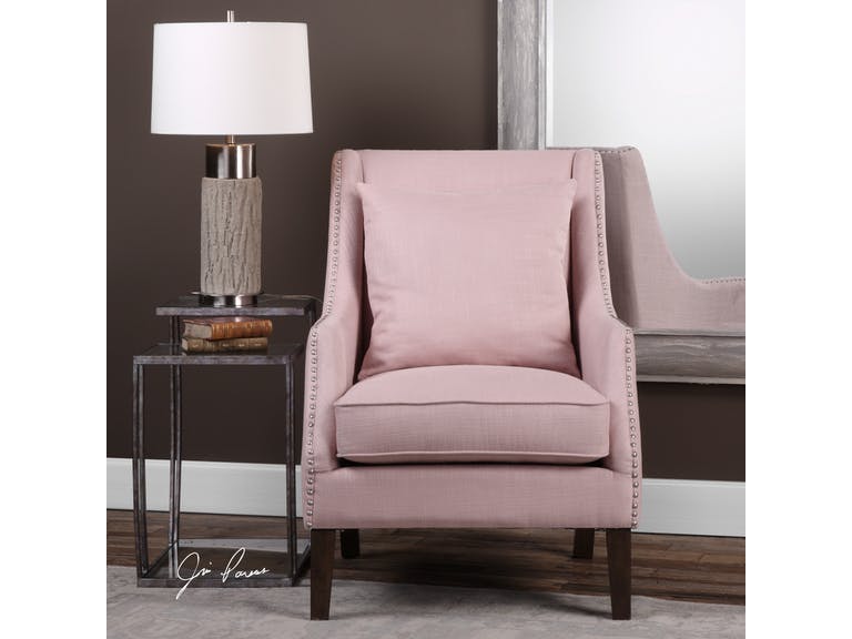
Uttermost Living Room Arieat Pink Armchair 23370: This pop of pink is just the needed visual interest in this neutral room.
Pantone is a company that prides itself in being the global authority when it comes to color. For many years now, it’s been unveiling its versions of Color of the Year and it seems that the fashion and interior design industries are following the trends.
In 2017, the Color of the Year was Greenery and just last year, it was more eye-catching with UltraViolet taking center stage.
Did you ever wonder how Pantone chooses the colors that they highlight each year? They have been at it since the year 2000. It all began with the discussion among 20 people and it eventually evolved into a team which became the Pantone Color Institute.
The process of choosing the subsequent year’s central color takes almost nine months. The chosen color is actually a global expression of people’s moods and attitudes.
Following the color trends isn’t new. Homeowners want to stay up-to-date with the current styles that they could use in their own habitats. And two months into this new year, you have ample time to understand this year’s color and how you can apply it in your interior design.
Living Coral in Your Home
So Pantone has finally proclaimed this year’s color to guide the decorators, designers, and homeowners with their color schemes. Current events pointed towards Living Coral, an exciting yet subdued pink that would be great to incorporate in any design.
UltraViolet, last year, promised that it would point to what’s about to come. Many people did not know how to use this eccentric color. It became a trial and error of sorts for some.
Pantone stated that Living Coral is meant to energize and it is familiar because it is a hue that’s commonly found in nature. More specifically, this color is displayed beautifully underneath the seas so very few have enjoyed its actual beauty. A lot of designers are excited to use this rare hue in their homes.
Living Coral is vibrant and charming so it could bring just these beautiful adjectives to your home. You can either use it as a bold statement or it can also take the backseat to become the light accent.
Allow Living Coral to participate in the whole design harmony that you’re trying to set up in your home. And allow yourself to be playful, too, as you experiment on how you can better use this lovely hue.
So, Living Coral is, somehow, a shade of pink. What’s great with this hue is that you can match it with many different colors. Even when it’s categorized as a shade of pink, it’s a mellow version so it is nearer the neutral plate more than any other color scheme.
Living Coral does not have to be used in a totally pink home. Match it with whites, grays, creams, greens or blues. These complimentary colors can help neutralize the pinkness.
Add a partial or full accent wall then pair the color with pure white and natural wood. This simple ensemble will give you a contemporary vibe. If you’re not afraid to play with colors, then go bold with the Living Coral being the anchor color for metallic accents.
Living Coral can be so beautiful inside the bedroom. It can be used as the color for the bedding or the furniture. This hue would surely bring restful sleeps in the nights to come.
If you want to add Living Coral in the kitchen, then add it to an all white space. The pop of color will add the fun vibe to what is an otherwise neutral room. Imagine a Living Coral colored set of coffee mugs and kitchen towels.
They’re a thing of beauty, aren’t they?
Tags: 2019 Pantone Color of the Year, Living Coral, McCreerys, McCreerys Home Furnishings, Pantone color of the year
Posted in 2019 Trends, Accents, Color Schemes, Decorative Elements, Interior Design 101, Interior Design Elements, Interior Design Themes | Comments Off on Making Living Coral the Focal Element of Your Home
Thursday, January 3rd, 2019
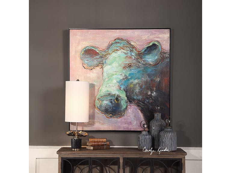
The Uttermost Accessories Matty The Cow Animal Art 41917 makes it easier to embrace this year’s Pantone Color – Living Coral. It is a more subdued version of the hue so it’s easier on the eye while still visually delicious.
The Pantone Color of the Year is both vividly bold and soft; it can be warm and comforting while, at the same time, beautifully buoyant. Get ready to welcome – Living Coral.
Also known as Pantone 16-1546, Living Coral is a spirited and appealing. Those who have a playful attitude and spirit will surely love this delicious color.
Living Coral, according to Pantone, represents the harmony between modern life and nature. It is also the color of the liveliness of social media.
Pantone Color of the Year: The Beginning
For 20 years now, Pantone has been influencing product improvement and has affected many purchasing decisions in varying industries including the world of fashion, industrial design, and furnishings.
The selection of the color is a thorough process that includes many thoughtful decisions and analyses of trends. This trends analyses could include looking at films, travels, works of new artists, artworks, and many other areas of design.
Other influences include textures, new technology, and social media platforms.
Pantone Color Institute is the unit in charge of emphasizing trending runway hues and color forecasts. This Color Institute works together with global brands to sway the psychology and color emotion in design strategies.
Let’s Use Living Coral
There are five color palettes that could fuse well with Living Coral. Use these and you will surely bring out the flexible nature of this beautiful shade.
The first on the list is Pantone 15-4003 or Storm Gray. Gray is a subdued color that will tone down the bright nature of Living Coral. Gray is there to create balance.
Pantone 19-5230 or Forest Biome. Forest biome is actually a term used to generally describe coniferous forests, mixed leaf forest and deciduous forests. The three types that are classified according to latitude are temperate, tropical, and taiga or Boreal forests.
This delicious green will further excite the vibrant Living Coral so it is awesome for rooms that are in need of energy and activity.
The next set of hues that you can partner with Living Coral is Martini Olive or Pantone 18-0625, Mauvewood (which looks relatively close to this year’s Pantone Color), Twill, and Beluga.
Now, don’t be afraid of this mellow color. This orange peace shade is perfect for people who are optimistic. It is a hue that promotes happiness, integrity, self-respect, longevity, to name a few.
Stress reduction is also a known benefit.
Living Coral is vibrantly fresh so you can use it in rooms that need to be energized. This can be used on bathroom tiles so that the room looks more refreshing. If used as a focal point, it can be painted on a wall to draw attention. This feature wall will surely become a classic so use it when you want the room to become an instant hit.
How about a Living Coral rug? Any dreary space is sure to come to life if this is the color that you’d choose.
It can also be the color of a major piece of furniture. Now picture this – a room with pink walls that is perfectly balanced by the furnishings that come in the darker shade of Living Coral.
Since this shade can also be playful, you can use it in the hallway or in kids’ playrooms. Pair it with nude hues to create the perfect welcoming work. In the living room, Living Coral is the right accent that is the perfect companion to indigo and deep teals. It becomes a warm shade as it is paired with cooler blue shades.
If Living Coral is too vibrant for your taste, then try finding a lighter shade of peach. This should still help you embrace the trend.
Tags: 2019 Pantone Color of the Year, Living Coral, McCreerys, McCreerys Home Furnishings, Pantone 16-1546, Pantone Color of 2019, Pantone color of the year
Posted in 2019 Trends, Color Schemes, Interior Design 101, Interior Design Elements, Interior Design Themes | Comments Off on Living Coral: The Hub of Color Schemes This 2019
Follow us on our social media
© McCreery's Home Furnishings | All Rights Reserved | Privacy Policy