- Follow us:


Saturday, December 23rd, 2017
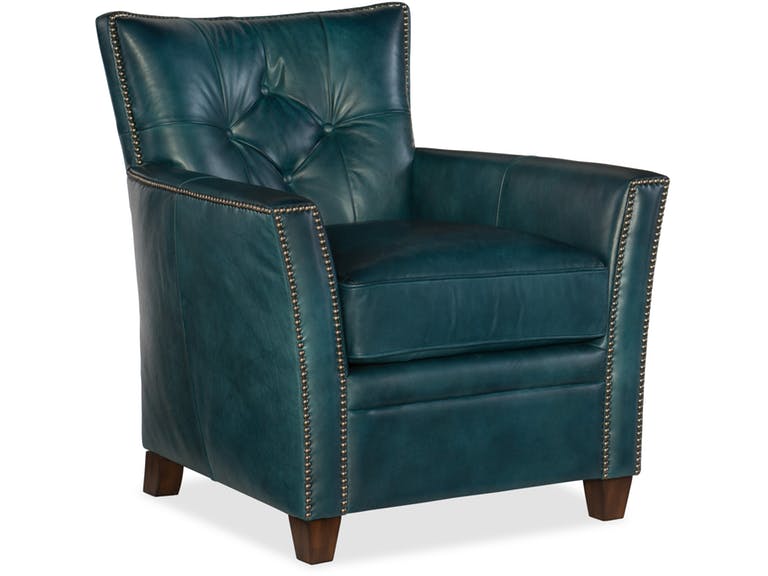
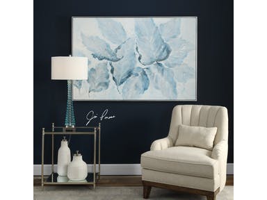
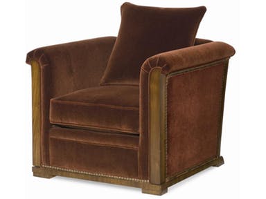
Hooker Furniture Living Room Conner Club Chair
Bold colors aren’t for everyone. So if you’re particularly enamored by the boldest and brightest colors, then you’re one of the few. Being drawn to a bold-colored couch, for instance, might just be what you need to set up a lovely, attention-grabbing, yet enjoyable space.
When you’re adamant about infusing a bright hue into your design, then you can always begin with the sofa. This one piece of furniture can immediately transform the look as well as the general mood in a room. When you’re done infusing bright colors to your main seating unit, then you can spread your gaze towards other pieces that just might add a little more oomph to your design.
Begin with Blue
Cobalt blue is as bold as blue could get. When designers talk about making rooms a lot brighter and airier, then all they often need is a can of the right blue paint. Adding drama is also easy with blue.
Be bold enough to set up an East Coast preppiness or a traditional white and blue fusion. Sea-foam-colored blue is also a saturated kind of blue. This also has East Coast origins. This union of white and blue should easily remind you of colonial hues.
Add velvet to this color and you instantly have a luxurious living space for everyone to enjoy.
Proudly Pink
If you are, on the other hand, looking to create a happier atmosphere then pink is your go-to bold hue. You can always begin with subtle and pretty or you can go gaga over the more energized versions of this color.
Peony is a more intense color of pink. Raspberry undertones work best on entryways and in dining rooms because they reflect warm light.
Pink can also be beautifully paired with many other colors such as black, chocolate brown, mint, metallic gold, green, and silver. Even white and grays look good with it.
Don’t go for sweet and cloying pink straightaway. This hue has a strong potential to create just the right pop of color to make people notice so use it to your advantage.
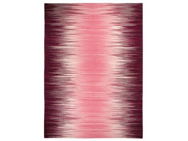
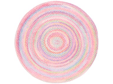
Capel Incorporated Floor Coverings Flash Rug 3634RS Pink
Go Gaga with Green
Green, without a doubt, is a rich color. If you have to use a bold shade of this color, then go for emerald green. It is a color that restores, rejuvenates, and provides a feeling of instant connection with Mother Nature.
Emerald green is also the color of an elegant and luxurious jewel so it communicates just those two things about your home, too.
If this particular tone resonates with you, then use it as a trendy color to surround yourself with. Combine it with equally exciting colors such as red or some pink tones.
Remember to use emerald green with purpose. Consider the atmosphere and mood that you would want to evoke in the room. Decide on the right proportion, combination, and placement of your chosen colors. Keep in mind that every tone has its set of psychological effects.
Perfect in Purple
If you have to use this color in a home, then make sure to use it with care. Make sure that you can tolerate the boldness and drama that this color can bring.
The rich and dark kind of purple is the very color of royalty. You can add this hue to different rooms, depending on the quietness or drama that you would want to set up.
Use the deeper shade of purple for a stunning entryway. A living room with darker purple upholstered chairs can be made light by light lavender walls.
If you want to do just the opposite and make a statement, you might want to try neon purple for your walls. This is the edgiest color that you can use for your dining room.
Tags: bold color palette, bold colors, bold hues, dramatic color palette, dramatic colors, McCreerys, McCreerys Home Furnishings
Posted in Color Schemes, Interior Design 101, Interior Design Elements, Interior Design Themes | Comments Off on 4 Bold, Daring Colors to Invigorate Any Space
Friday, December 22nd, 2017
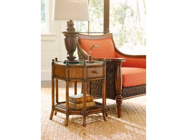
Imagine drinking eggnog while seated in this colorful chair right beside the Tommy Bahama Home Living Room Flamingo Octagonal End Table.
When you are prompted to use a color combination that is found in nature, it is almost always a huge success. Especially in the right hands, using the shades of green and brown is like saying yes to the very beauties of trees and Mother Nature herself.
Color will always be a crucial aspect of every interior design. You also know by now that every well-planned space is enhanced by the use of correct colors. The right color for any space is relative and cannot be prescribed.
If you want to successfully use green and brown together, you will need to plan in advance. Careful planning ups the confidence in your use of the hues plus you will understand how each hue works.
Ask the Right Questions
There are important questions to ask when you are about to work with colors that you haven’t used in the past. First, ask what, then who, and then where.
What is the function or the purpose of the room wherein you’re going to use the green and brown color fusion? Residential interiors should be personalized. This means the colors and all other design elements that you use there need to be based on your preference and choices.
In contrast, you can also experiment with bright and trendy colors. So brown doesn’t have to be tree-trunk-brown or green doesn’t have to be tree-leaf-green.
The function of the space as well as the intended ambiance and homeowner preference, will all dictate the shade of brown and green that will eventually be used.
The next question is this – who will use the space? What adjectives would best describe you? Prior to deriving the shade of brown and green that you would use, be able to define the age group of the persons that will use the room. You also need to specify their special needs. Defining these things will allow you to make your decisions about visual resolutions and such.
The third question is – where is the color combination going to be used?
Color schemes differ for every space. Spaces with hot and bright climates need to have cooler colors while those with colder weathers might have a desperate need for darker shades (or vice versa depending on the style that you’re trying to project).
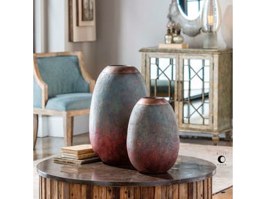
Uttermost Accessories Pavak Etruscan Sky Vases S/2 18862
Possible Brown and Green Color Combos
Celery and taupe will look great with oatmeal-colored walls. Just imagine these color combinations inside your bedroom. What could be more soothing?
You can also have fun with green shades as you anchor the color with a dark brown couch. Another wonderful thing about the brown couch is that it is kid and pet-friendly. You won’t have to worry about stains because the dark-colored seating unit is beautifully dark.
If you want to be surprised by the sex of you about-to-be-born baby, then you can set up a nursery in green and brown. Don’t use too dark of a brown shade, instead, find brown checks and fuse them with green ones.
Brown and green is a fusion that is vibrant, gender-neutral, and kid-friendly.
You can also use sky blue together with this lovely marriage of nature’s colors. Just imagine the color of the skies joining the beauty of the color of the earth and the lush greeneries – it is an amazing sight to behold.
Green is also the right accent color for brown. There is a reason that God paired green leaves with the earthy brown tree trunk. Since this is so, you can also stick with the simple palette of evergreen and chocolate brown. Throw in the dependability of crisp white and you’ve got a visual appetizer that’s hard to resist.
Tags: McCreerys, McCreerys Home Furnishings
Posted in Color Schemes, Interior Design 101, Interior Design Elements, Interior Design Themes, Winter Season | Comments Off on A Brown and Green Holiday
Thursday, December 21st, 2017
Just how beautiful is the Uttermost Accessories Blue Belle Floral Art 36112 against a dark backdrop? It’s just breathtaking.
Who says pastels are just for spring?
Pastels are popping almost everywhere and every season. The interior design industry is brimming with these amazingly refreshing colors. While they are pretty, in the wrong hands, they can turn a tad too girly.
A Single Pastel
If you want just a simple update this holiday season, then all you need to do is to pick just a single piece for your home. An example is when you choose a pastel sofa, say, a soft, blue tone. This is neutral enough for any room and it can easily last through the years.
Going monochromatic with your pastel is a great idea because it means – you mean business. If you are obsessed with the beauty of gray-green, then find a way to incorporate it into every piece that you would pick for a particular room in your home.
Pastel Pairing
Or you can make a statement by using multiple pastels. To play with pastels, use a tone that you particularly like then bring it the room that you like most. Find two or more of this same seating unit to complete the pairing.
Dependably Pink
What could be more pastel and candy-like than pastel pink?
A room can be pretty in pink without being saccharine. Pick modern pastel pinks in florals and soft solids. Find textiles with these hues for the ultimate fusion.
It is always best to try smaller pieces at first. A few pastel pink accents should be enough to jump-start your pastel adventure.
If you have a chiefly gray or any neutral-colored room, then it would be easier for you to slink into your pastel mode. Pastel pink is naturally at home with shades of gray.
Pastel Cabinets
Pastels are a great way to soften or freshen up a room. But more than just pastel cushions or throws, you can make better and bolder use of these colors by painting your cabinets with them. When you do this, you are introducing an interesting amount of texture and depth into a room.
Pastels have been dominant in the past years and for a good reason. Dusted heathers, as well as blues, work amazingly well on cabinetry and architecture. Praline hues have a calming effect because they have a gentle sense of simplicity in them.
Your pastel-painted cabinet could be your one hero piece.
Welcome your guests with pastel with this Capel Incorporated Floor Coverings Cutting Garden Rug 0450CS Tea Rose.
Sugary Shades on Homeware
Pastels are always on the interior design menu. Don’t think that they are limited to spring. If you want a pastel holiday this year, then, by all means, go for it.
Frosted hues are going to look great with your Christmas decorative elements. Just imagine how beautiful your pastel blue would be with your silver bells, frost, and hollies.
Use pastel tableware. This is the easiest way to add pastel to your kitchen and the dining room. There are many decorating stores and shops that sell these colorful wares. When running out of ideas, just go for pastel accessories such as planters and throws.
Pastel Mix
Pastels are whimsical hues. They may have been used more in spring but they can also become popular this holiday season. Find pastel accessories that you can pair with your bigger furniture pieces. A light blue decorative bowl will look perfect with a traditional lamp with green shade.
Pillows in different pastel colors add a wonderful touch to a chair, couch or a bed. Consider the hues that your room currently has. Pick colors that jive well with these current colors.
Light yellow and purple are amazing hues to work with when you want to create a comfy and serene environment.
Tags: McCreerys, McCreerys Home Furnishings, pastel, pastel color palette, pastel color scheme, pastel palette, pastels
Posted in 2017 Trends, Accents, Color Schemes, Interior Design 101, Interior Design Elements, Interior Design Themes, Winter Season | Comments Off on A Pastel Holiday
Wednesday, December 20th, 2017
Brentwood Collection offers this Kent Cocktail Table made more beautiful by pastel throws and lampshades.
If you’re still categorizing pastel colors as hues only for girls’ bedrooms or nurseries, then you’re hugely mistaken. There is so much more to these awesome colors that can freshen up and uplift the natural beauty of homes. Gone are those days when they are just paired with equally neutral colors. These days, they can go with pretty much any color that you can think of including black.
Here are many other pastel pairings that will surely amaze you –
Pastels + White Elements
Pastels are growing to be more and more stylish each year. These wonderful soft colors can be infused in a bedroom that’s chiefly white. When you do so, more often than not, the result is a wonderful modern yet sophisticated room.
Just imagine the delicious ambiance that pastel green walls can provide to white furniture pieces. Or if you prefer it the other way around, place pastel furniture inside a mainly white room.
Pastels together with white walls can make even the smallest rooms appear spacious. This is also one of the reasons why pastels are becoming more popular. While they are light-colored, they are far from boring unlike the usual neutrals that dominate many homes. Just picture a unique mint green or sunny yellow bedroom – ain’t it awesome?
Pastels + Traditional Prints
How about filling a sunny room with fresh pastels and traditional elements? The former is quite cheerful and so they are the perfect elements that would balance the rest of the old-fashioned elements.
Classic prints such as lattice, checks, and seersucker blend pretty well with any pastel color. They can also help make the place appear more laidback.
Unique Pastels
When talking about pastels, don’t automatically go for pastel pink or blue, or their cousins green and yellow. There are so many other tints of pastels that you can experiment with. Don’t be bound by just the classics. When you’re feeling up to it, you can also use purple or the incredibly chic pale mustard yellow.
Pastels + Earthy Pieces
You just gotta love pastels because they pair up with just about any style and color that you can think of. If you love rustic, earthy pieces, then pastels are just as wonderful with them. Try pairing a leather chair with some pastel elements, say, some pastel throws or a pastel area rug. Even a unique sculptural lamp with pastel shade would look great with wood furniture.
Dirty Pastels
‘Ever heard of dirty pastels?
Pastel colors are supposed to be soothing, washed out or soft. But when you choose to be unique by combining pastels of different tints and shades, you could come across something more interesting – dirty pastels.
Some of known dirty pastels include #c3a3a3 (which has a red value of 195, green value of 163, and a blue value of 163), #baa0a8 (RGB of 186, 160, 168); #aa97ab (RGB 170, 151, 171); #9492b0 (RGB 148, 146, 176); and #929fb0 (RGB 146, 159, 176).
Pastels with a tinge of brown or gray also work well with the serenity of pastels. If you want to achieve a seamless look, paint the trim with the same color family as the walls. Don’t always go for standard-issue neutrals.
The Pastel In-betweens
Another strategy to make good use of pastel colors is to surround them with white and then to use an accent that is saturated with the same hue. An example is when you use pale pastel pink with deep coral for a romantic yet not-too-feminine look.
Pastel Contrasts
Periwinkle. This is an interesting color that will make red accessories stand out. If you want to follow this same pattern throughout your home, then pick a pastel color for your walls and then finish with a stronger, bolder color right across the color wheel (e.g. pastel pink walls go well with turquoise accents).
Tags: McCreerys, McCreerys Home Furnishings, pastel, pastel color palette, pastel color scheme, pastel interior design, pastels
Posted in 2017 Trends, Accents, Color Schemes, Interior Design 101, Interior Design Elements | Comments Off on Modestly Pastel
Tuesday, December 19th, 2017
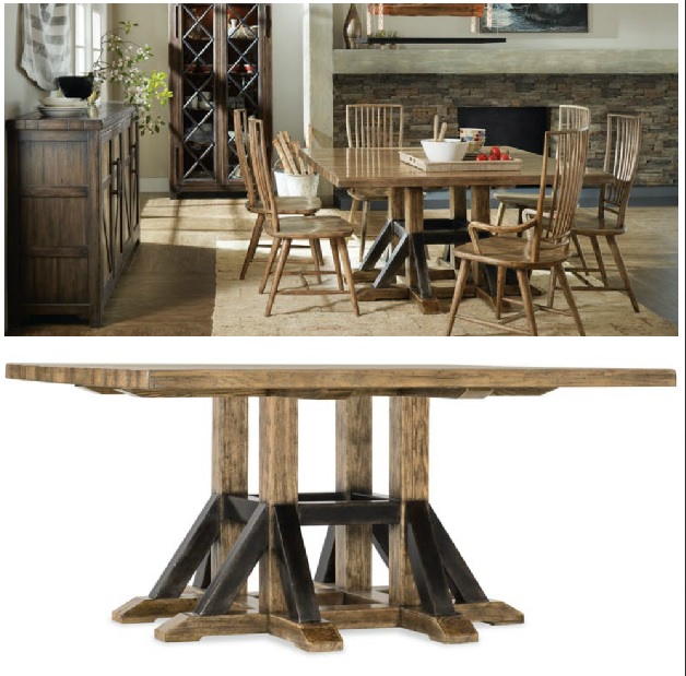
Featured furniture piece is the Hooker Furniture Roslyn County Square Dining Table 1618-75205-MWD.
Okay, so it’s the Holidays and now you’ve decided to redecorate. More often than not, you would require a few hands to help you with your project. If you have decided to hire a decorator are you anxious about your first meetup?
Consider interior designers as psychiatrists of sorts. They are there to analyze some personal matters concerning you such as your needs, what you like and what you particularly dislike, and what your current lifestyle is.
When you are searching for the perfect candidate, know that these professionals are also screening you. They, too, have a set of questions that they need to ask. Would you like to know what the most common redecorating questions are that interior designers ask?
What do you like in this particular room?
This is probably one of the first questions that will pop up once you meet up with your shortlisted interior designers. There is logic to this simple question and how it is actually one of the most important questions that your candidates could ever ask.
This question will provide them with the answer as to your taste. They will then determine how they can better serve such preference.
What don’t you like in this particular room?
Just as important, this question gauges the things that you don’t want to be included in your design. The designer will then have a better understanding of your tastes and, once again, your preferences. And if he’s a good designer, then he will not try to convince you to try something that you’re not comfortable with.
What colors tickle your fancy?
This third question is the designer’s way of picking your brain for the colors that he will use in your redecoration project. This can be any color that you like for as long as it won’t hinder with the functions of the room. For instance, the color red or orange is such an energetic hue. If you put this in a room where you are supposed to relax, say, inside the bedroom, then it defeats the very purpose or function of the room.
Ask if the colors you prefer can be used in a different tint or shade depending on what’s pleasant in a particular room where it is supposed to be used.
Do you already have a style in mind?
If you answer yes to this question, then you would make your interior designer’s job a lot easier. There won’t be any guessing games or butting of heads needed since specific interior design styles come with specific features and characteristics. As a team, you can then work together to achieve a wonderful balance between the style’s elements.
If you’re still not aware of your style preference, then take the time to search through some interior design websites. You can also buy some interior design magazines.
Begin cutting some pictures of homes or rooms that catch your attention. Pretty soon, you will see similarities among your cutouts. Only then can you and your designer point out your preferred style.
How will the room be used?
While it is obvious that the bedroom is for rest and relaxation, there are some folks that actually prefer to do other activities there such as some office work. If you’re one of the few who wants to set up their home office inside the bedroom, then you would need other furniture aside from the bed and nightstands.
Many living rooms today also double as entertainment and socialization zones so having just a couch and a center table also won’t be enough.
What special needs do you require?
Expect this question from a competent interior designer. The most common special needs include firm furniture pieces and proper furniture placement for the elderly. The next special need is the safety features for homes with kids and pets.
Tags: interior design questions, McCreerys, McCreerys Home Furnishings, questions by interior designers
Posted in Interior Design 101, Interior Design Elements, Interior Design Themes, The Interior Designer | Comments Off on Prepare for These 6 Interior Design Questions
Friday, December 15th, 2017
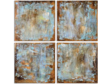
Uttermost Accessories Accent Tiles Modern Art, S/4 35310: Hang paintings like an expert above the mantel this holiday season.
You must be scratching your head while wondering where to best put up the Christmas wreath. Of course, you wouldn’t want the look to become permanent so you don’t want to destroy the façade of your beautiful home. When hanging a few Christmas decorative elements seems a burden every year, well, here now are the solutions –
Drilling into Concrete or Brick
Drilling a hole through brick or concrete is a difficult task. Even the best of contractors know this since brick is durable – sometimes, too durable for comfort.
You will need screws that are specifically manufactured for masonry. You must also know where to drill and how you can repair the holes once the holidays are done.
When you need to anchor something on a brick or concrete wall, use a drill bit with your steady hands. Drive the screws into the mortar joint only. These are those white lines between the bricks. Drilling directly into the brick will destroy its beauty.
In removing the screw after the holidays, be sure to purchase mortar repair and squirt a little into the holes. Another option is to use 100% silicone also in squeezable or caulking tubes.
Adding Hooks to Sheetrock
There are now many versions of picture hangers that you can use for sheetrock. These hold a tremendous weight amount. Just be sure to check their rating before you purchase. Each is rated according to the weight that they can carry.
To use, install two nails that come with the package – no need to use a stud – and you’re done.
If you are going to use screws for the sheetrock, be sure to not over tighten. Turning too tightly can result in a broken sheetrock. Also, the screw will create a hold that is actually bigger than its diameter. Just screw in your depth requirement.
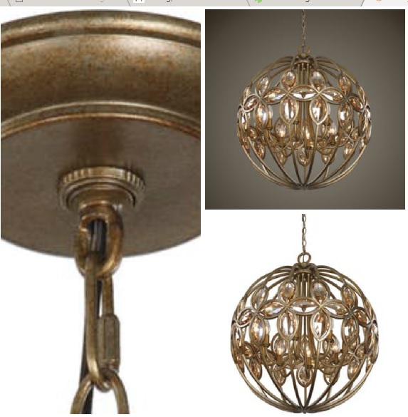
Uttermost Lamps and Lighting Ambre 8 Light Gold Sphere Chandelier 21269: Drilling holes on ceilings and walls may be a necessity this holiday season. It’s time to learn how.
Using Wood
A trim nail may be simple in the sight of many people but they are your go-to solution for your wood tapping needs. This nail can also hold substantial weights and they are quite easy to remove.
Once you need to remove the nails from a wooden wall or rail, just fill the nail hole with the right putty. Always check for the correct color of putty that would match your painted wood surfaces.
If you want to drill through first instead of driving a nail straightaway (this is called the pilot hole), your basic tools include wood screws, nails, hammer drill, and drill bits.
Boring through Natural Rock
In drilling natural rock, you will need a hammer drill, at least 5/8 bit, and a steady hand. Practice first before you do the actual drilling. Once you get the hang of it, you can drill through sandstone, limestone, and even granite.
Other contractors use a rotary hammer with diamond bits. These, according to them, can make the cleanest holes.
Always use force when drilling so that the screw won’t fly off. And never go to work without the proper safety gears such as goggles and thick gloves.
If you’re drilling just this one time, then there is no need to purchase a rotary hammer or a hammer drill. There are many rental shops where you can go to. Just supply the needed manual labor and you should be good.
Preparing your home for the holidays doesn’t just involve cleaning the microwave, oven, inspecting the refrigerator, prepping the vacuum cleaners, wiping the drip coffeemakers, inspecting the dishwasher, sharpening knives or having the toilet checked.
There are decorative elements that need to be set up so you will need a few equipment and hardware tools to do the tasks.
Tags: Christmas projects, drilling, drilling holes, McCreerys, McCreerys Home Furnishings
Posted in Interior Design 101, Interior Design Elements, Outdoors Style, Winter Season | Comments Off on Hang Holiday Décor with Ease This 2017
Thursday, December 14th, 2017
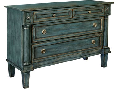
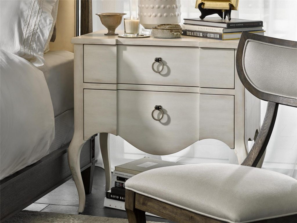
Use the Thomasville Bedroom Neo Classic Chest 85034-760 as a Christmas element or keep throughout the year, it’s all up to you.
Christmas decoration does not have to default to the red and green theme. This is the holiday season so you have to unleash the inner child and play with colors that you can use in your home. Now let’s find out how pinks, blues, and golds can all give the same (if not an increased) amount of joy that the red and green theme can offer.
Let’s be Blue
At least just with your color theme for this season.
Use the color of the beautiful seas to decorate your home. A nautical holiday look is the perfect look when you use blue ribbons and decorate your Christmas tree with seashells, mermaid ornaments, and little boats. It’s time to deviate from the usual red and green Christmas balls with blinking fairy lights.
This time, redesign with teal blue, especially if you have a young, exciting family. Distribute the hue with green and blue ornaments which overflow on your mantel. Add blue and green chairs to balance the unique look.
Cap the look by hanging a festive artwork right above your living room’s fireplace.
The Inspirational Wallpaper
What is your current wallpaper color? Again, your Christmas home doesn’t always have to be green-or-red-inspired. Now, you can take whatever color your wallpaper has (if there are many, then find the dominant hue). Use this as the anchor color to decorate the rest of your home.
Glamorize with Gold
Even in an already glitzy room, gold is still a welcome sight. This is the color of Nordstrom and Donna Karan, and Calvin Klein, practically every fashionable place or brand that you can find.
But don’t automatically go for the stunning gold. Use a different tint such as rose gold. Think of the holidays as your chance to decorate with subdued enthusiasm (now that’s an exciting oxymoron there). This hue is pretty and is aesthetically easy on the eye.
Use rose gold on your vignette of neutral tones, and a linen table runner.
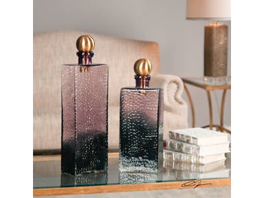
Uttermost Accessories Benedetto Glass Bottles, S/2 20075 have metallic and purple elements to make your home more exciting this Christmas.
Regally Purple
Purple may not be the first color that comes to anyone’s mind when they are decorating for Christmas but you shouldn’t limit your imagination to just the bright, energetic colors.
Purple is a very regal color and when you decide to use it on your sofa, Christmas balls, bulbs, and your accent pieces this holiday, then you’re in for a wonderful, fashionable surprise.
How about being different this year by donning a purple Christmas tree? And how about displaying silver bells with purple pinecones? This is an amazing replacement for the usual red and green wreath. And if you’re still feeling up to it, add some sugar plum and silver toy soldiers by the corner.
Purple poinsettias? They are truly amazing!
Or Just be Black and White
Who says that black and white is for any other season ‘cept Christmas? Continue your simple home design during the holidays as you set up pared-down rooms. Most of the time, the festive banner says it all while the rest of the decorative elements remain simple and subdued.
Metallic Christmas
Amp up the usual winter wonderland theme by adding metallic elements. Glittering reindeers and elves are elements that you can use on the mantel. The Christmas tree could be white but the rest of the décor can come in silver, rose gold, and chrome. Use fairy lights to emphasize the shimmering décor.
Try these elements against a white backdrop and you would surely marvel at how your home has become so pleasantly different.
Don’t end the metallic theme with your Christmas tree, metallic balls, and fairy lights. Continue the visually festive scene at your dining table. Use metal-inspired placemats, table runner, napkin rings, and goblets.
Tags: Christmas decor, Christmas interior design, Christmas style, decorating for Christmas, McCreerys, McCreerys Home Furnishings
Posted in 2017 Trends, Accents, Color Schemes, Interior Design 101, Interior Design Elements, Interior Design Themes, Winter Season | Comments Off on Deck the Halls with Various Colors (Fa la la la la…)
Wednesday, December 13th, 2017
The Century Furniture Living Room Fox Tuxedo Chair AE-11-1068 is made with sturdy Scandinavian leather.
Scandinavian or Nordic style remains to be one of the most sought-after looks by interior designers, critics, and homeowners. It is especially popular this last quarter of the year because of the Christmas season. All things hygge seems to fascinate people globally. But what features totally describe the Nordic look?
Believe it or not, there are some popular myths about this look. If you’re not careful, you could fall into the same trap and end up making your home look like it’s the land of the frost giants.
Myth #1: Scandinavian Style Means All White
While Nordic nations do love white interiors because of its light-giving properties (remember how dark it could get during those long wintry months?), it could also cause depression when not used with care.
You still can use colors, in fact, you have a rainbow of tints and shades to choose from. The safest way to do it is to find the most gorgeous pastel colors. Imagine ice cream flavors and you have pretty much captured what a stylish Scandinavian interior should look like.
Myth #2: Scandinavian Style Is Always Minimalist
Have you seen those Nordic-style homes in interior design magazines? While almost all of them are simple and pared-down, with their unadorned rooms and shades of black and gray, the Swedes, Danes, Icelanders, Finns, and Norwegians are far from unexciting.
In fact, they also have a more exciting side to them. Adding simple potted green changes the monochrome setting in an instant. You can delight your guests with patterns and popping hues taking inspiration from Nordic arts and products.
If you have seen Josef Frank’s patterns, you will surely feel warmer and more welcome as he tries to soften neutral homes.
Myth #3: Scandinavian Style Is All Wood and Organic
Oops, wrong again.
No less than three of the Scandinavian nations are covered with lush forests so it is not a surprise that they are default resources for many furniture and housing needs. While this is true and while organic stuff is welcome, there are many creative works out there that also spell Danish or Icelandic.
Colorful, bright patterns such as flamingos are always welcome.
Brentwood Collection features the Sadie Night Table which offers the light-colored wood requirement for your home’s Nordic look.
Myth #4: Scandinavian Style Is All About Living Close to Nature
Nordic countries are always pictured as idyllic countryside villages with gentle breezes. While there is plenty of woods and the locals do love nature and everything organic, they do not limit themselves to the stunning beauty of nature alone.
A bigger percentage of Scandinavians actually live in cities, metropolitan spaces, and towns. These are urban areas though they may not have as dense a population as New York City but, you do get the picture.
Since they, too, live in an urbanized location, it is pretty common to find the most interesting architectural features.
Myth #5: You Can Shop for Hygge
Hygge has become a catch-phrase of sorts as this has become synonymous with warmth and coziness. While tea, sheepskins, slippers, and open furnaces are the coziest things that you can have in your home, there are other ways to create hygge in your home.
Spending time with your loved ones inside your well-lit home is hygge. This is the Nordic statement for contentment inside one’s own home.
Myth #6: Scandinavian Is All Function
While Nordic style does put its emphasis on functionality, you must never forget about style. Just think of their global designers such as Arne Jacobsen, Poul Henningsen, and Lisa Larson and you would understand that Nordic interiors are far from static.
Now that we’ve busted these six myths, are you ready to redesign your home into a more exciting Nordic theme?
Tags: hygge, McCreerys, McCreerys Home Furnishings, Nordic interior design, Nordic interiors, Nordic style, Scandinavian interior design, Scandinavian interiors, Scandinavian style, shabby chic
Posted in Color Schemes, Interior Design 101, Interior Design Elements, Interior Design Themes | Comments Off on 6 Scandinavian Design Myths Busted
Tuesday, December 12th, 2017
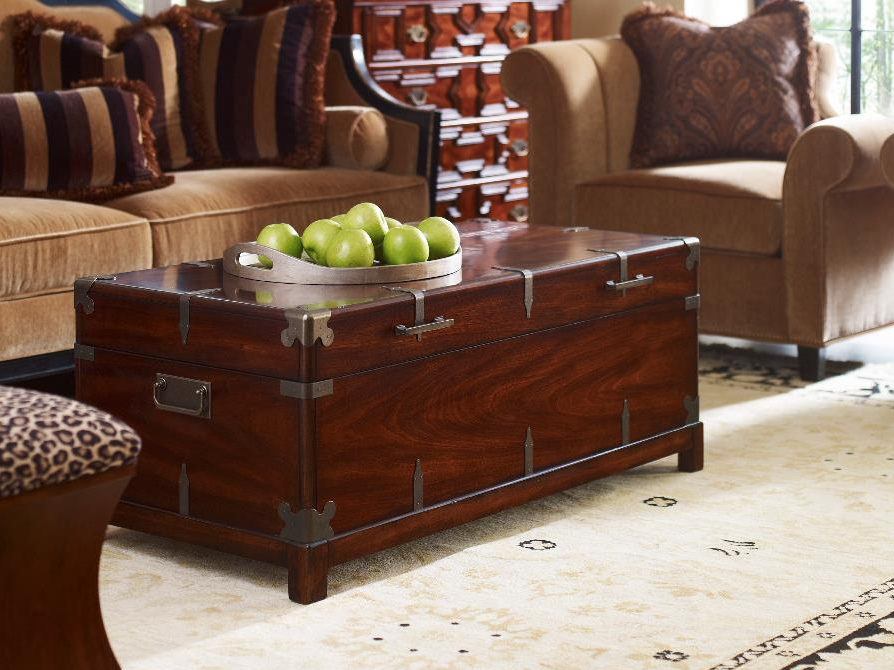
The Cachet Trunk Cocktail is beautifully emphasized with the pop of green offered by these few pieces of apples.
The center table, whether located in the grand foyer or just tucked in a cozy corner, can double as a reading nook and a place to set your most beautiful decorative elements. If you are thinking of ways to deviate from the classic look that most houses set up, then here are some ideas that will surely captivate your imagination –
Vase Cluster
This is an easy enough decorative theme for your center table. It is quick to set up plus it doesn’t look like every center table centerpiece on the planet.
Be unique as you create an informal balance of 3-5 vases. The more varied the heights, the better. The vases also don’t need to be similar. You can experiment with the fusion of different materials, for example, glass with metal or blue flowers with cut branches.
Here’s a styling tip: always place the tallest vase at the center of your decorative theme and let the smaller ones cluster around it.
Mound of Books
If books are a major part of your life, then it would be best to show them off to everyone. But don’t fill just your shelves with these books. Instead, diversify by making a lovely stack on your center table. Place your prized possessions for everyone to see as they enter your living room.
If you’re particular about your books and you don’t want uncaring hands to touch them, then have these valuable pieces encased in a shelf with a sliding glass cover and lock. Just make sure to display the ones that you are willing to share with other people.
Old books look great when placed right next to a vintage-looking candelabrum.
Find out also if you would like to decorate according to book color. Classify according to the color of the spine, their sizes or according to topic. The variations are almost limitless.
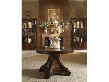
The Fine Furniture Design Living Room Round Center Table Base 1110-930 is the perfect frame for this winged cherub sculpture.
Bust and Sculptures
Find a sculpture or any object that has about half the diameter of your beautiful center table. You can then arrange a small pile of coffee-table-size books beside the artwork.
An Empty Vase
Who says that the rule is to fill a vase with flowers, twigs or whatnot each and every time? There is no need to fuss over cutting some fresh blooms just to decorate your center table. Just find a lovely vase – one that catches attention even without trying – and it becomes the sole decorative element for your center table.
If you don’t want that vase to look too alone, then find some more coffee table books and have them surround this lovely piece.
Asymmetry Is Key
If you have a round center table and you are planning to tuck it into a corner, then be sure to decorate it with a vase, an interesting sculpture, and some beautiful books. This is an ensemble of decorative elements that could work together to beautify an otherwise bland-looking corner in your home.
Asymmetry is also an arrangement that is less formal. A large vase placed off-center and surrounded with books is one of the best yet simplest asymmetrical arrangement that you can concoct for your center table.
A Huge Planter
Pick a planter that fills up 75% of the center table. Be sure to measure your center table before buying the planter. Be sure to plant it with the most gorgeous plants like bonsai and flowery plants like orchids and roses.
Floor-length Table Cover and More Books
Nope, we still haven’t stopped using those books. You can now create a more elegant look for your center table as you dress it up with a floor-length tablecloth. You can then place some more books together with a vase or sculpture as the focal piece.
You can even use the space underneath as a space for those winter mittens and scarves.
Tags: center table, centerpiece, centerpiece ideas, centerpiece setup, McCreerys, McCreerys Home Furnishings, setting up centerpieces
Posted in Furniture, Interior Design 101, Interior Design Elements | Comments Off on 7 Center Table Decorative Ideas
Monday, December 11th, 2017
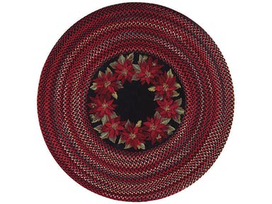
Welcome your guests with this colorful Capel Incorporated Floor Coverings Botanical Rug 0609CS Poinsettia.
Christmas.
Oh, the very word brings excitement to your very core. Yet there are messes that come with the holidays. Just imagine the state of your kitchen and dining room during these days and you’d probably have a migraine. The scenario becomes doubly dizzying if you have to take into consideration all the decorative elements that need to be set up.
This year, why don’t you take a simpler, more hassle-free approach?
Foliage Does It
Who says you have to set up the most elaborate decoration this Christmas? If you have vacant walls, then it’s time to utilize them this holiday.
Plant leaves, the ones that are visually pleasing for architectural ornamentation can be used to don your walls this coming Christmas. The best ones are those that come with artsy branches and colorful leaves. These should give your home an artistic balance as it is flooded with greens and reds which are the staple hues for this season.
Yes to Faux Fur
This fur may be an imitation of the real deal but it is still originally beautiful. Visit your local fabric store and measure the faux fur that you need. This is one of the best ways to cozy up your space this holiday season.
Faux fur is also best for rooms that need an extra oomph in terms of texture.
Faux fur is tidy, neat, homey – all the things that you would want your home to be this Christmas.
Scandinavian It Is
Scandinavian design is also referred to as Nordic or even shabby chic by some people. This is as pared down as it could get in terms of winter design.
Scandinavian interiors are basically homes with wood flooring softened with sheepskins or rugs. These are rooms that have muted colors yet, somehow, the design elements are still beautifully cohesive.
Wood is a fairly common element in many Scandinavian-styled homes. Just remember to keep the light theme going by using woods like ash, beech, and pine.
Cynthia Rowley for Hooker Furniture Living Room Sheridan Two-Door Chest is Christmas.
Be Crafty
Just visit sites like Pinterest and you will see a lot of ideas for Christmas crafts. Here are just some of such amazing ideas –
Bluer Than Blue
It is 2018 soon so make the most of this wintry season. Adorn your tables with blue plates and dark blue napkins with gold rings. Get some more branches and leaves from your yard and lay them out together with some scented candles as a centerpiece.
Instead of using your usual Christmas tablecloth, go bare this time then just place a white table runner to emphasize the green, yellow, blues, and golds on the table.
Amp Up the Bar
It’s Christmas! So you will surely be welcoming exuberant guests. Welcome them to a fully-stocked bar especially when you want to get fancy. You have also prepped for the New Year as you fill the bar with spirits.
Tags: Christmas decor, Christmas interior design, Christmas style, McCreerys, McCreerys Home Furnishings
Posted in Interior Design 101, Interior Design Elements, Winter Season | Comments Off on The Minimalist Holiday Décor
Follow us on our social media
© McCreery's Home Furnishings | All Rights Reserved | Privacy Policy