- Follow us:


Wednesday, May 3rd, 2017
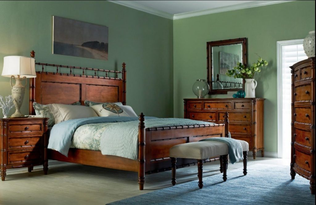
FFDM Summer Home: Panel Queen Bed sits beautifully in this ‘green’ bedroom.
Green is one of those hues that strike the eyes in a way that there isn’t a need to adjust. This is a restful color, since it is balanced, it is right in the middle of the color spectrum. Not a lot of people know this yet those who realize this aspect of green appreciate this well-adjusted color.
Back in 2013, a shade of green became the color of the year. Emerald green was quite huge back then, it was successful in succeeding the slot that Tangerine Tango filled the previous year. Because of the vigor that that tinge of orange offered for an entire year, the world wanted to have a sense of serenity the year after. The restoration of harmony and balance was gallantly offered by emerald green.
Healing You with Green
The chief psychological properties that green offers are harmony, balance and peace. This hue can restore and rejuvenate. It can easily give the feeling of a connection with Mother Nature. The right shade of green can also offer a greater sense of luxury and elegance.
The Resonance of Green
Before you decide on using green all over your place, try to ask yourself this important question – does this hue really resonate with you? Using it all because the rest of the interior design industry is going gaga over it at the moment is not the way to go.
Make sure that you pick green because you love this color and you can actually live with it. Begin by surrounding yourself with green at a shade that truly resonates to you.
You can also use classic green combinations such as complementary colors. Red, pink tones, orange and purple are wonderful hues to pair green with. Be sure to veer away from colors that would make green a jarring hue (e.g. yellow and blue).
This does not necessarily mean that you can no longer use blue with green. This all depends on the tone of blue and green that you end up using. Be ready to experiment if you are adamant in using both these colors.
Teaming up green with red also means you are ready to make the green a lot greener and red a lot redder.
Uttermost Lamps and Lighting Cayucos Pistachio Green Lamp 29204-1
The Green Habitat
Using color is all about having a purpose. Define the mood as well as the atmosphere that you would want to create. Decide whether green is perfect for your home. Decide on the proportion, combination, and placement for the colors that you pick.
Keep in mind that every tone has its own psychological property that can be altered depending on the hue that you team it up with. Be careful, though, as there are also negative results when clashing colors are paired.
Now you may be wondering which rooms would marry beautifully with green. Just decide which room needs more refinement, luxury or elegance and that’s the room that could use a bit of green. The foyer, the formal dining area, a reading nook – these are all rooms that should feel more secure, safe and serene with the use of green.
Green could also be an interesting accent wall. The easiest way, after all, to infuse color in a home is through paint. The safest, of course, is to just paint one wall. This is a dramatic choice that will clearly show how much you love green.
Bedding could also use green as an accent color. Say no to lime green in this room, though, as they tend to create a lot of energy.
Green furniture will also pop from a neutral background. Have this piece become the mother green as other pieces become the accessories that will complement.
Tags: green, green color palette, green interior design, green interiors, green palette, McCreerys, McCreerys Home Furnishings
Posted in 2017 Trends, Color Schemes, Interior Design 101, Interior Design Elements, Interior Design Themes | Comments Off on Green: The Energizing Interior Design
Sunday, July 3rd, 2016

Cynthia Rowley 1120CR Kit Club Chair is green, lively and aesthetically awesome.
It is a known scientific fact that there are certain colors which evoke a happy feeling. Summary colors like light blues, sunny yellow, and citrus greens are known to bring a light-hearted vibe which bring to mind tropical living, exotic plants and lime drinks.
Understanding Green
Green is the color of harmony and balance. This color can also mean growth, rebirth, spring, or renewal. This is the color used when depleted energy needs to be revived. It is also the sanctuary to people who feel stressed with their modern living. Logic would tell that this is why there is so much green on earth – it’s as if God wanted his people to feel relaxed and feel positive.
Green is the marriage of blue and yellow so it also exudes the clarity offered by yellow and the calmness of blue.
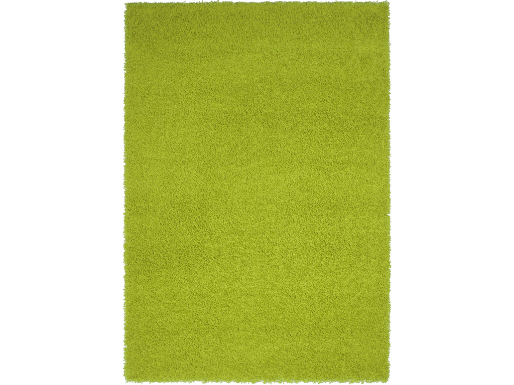
Capel Incorporated Floor Coverings Jazzy Shag Rug 5820RS05030708200: Step onto freshness!
Lime Green Elements
By adding lime green elements into your home, it is easier to feel the summer vibe all-year-round. Even when there are constant weather changes, you would soon feel that your home tends to have a lighter, airier feel compared when other hues were used primarily.
Citrus green hues are not always lime green in color. Those that have a tad more yellow can be used in moderate amounts when you want to grab a little attention and vibrancy.
Remember that colors that you see on your computer monitor often do not match what comes out in paint cans. So get some samples as well as test colors to use on your intended space. This is so you would know how they would actually look like when used on the walls.
Creating a focal point is easy when you have lime green on your side. Just use this as a statement wall and you’re done. This particular color will also fuse well with yellows and blues which are its adjacent colors on the color wheel.
Lime green can also be an effective color to use in the kitchen. It can add vitality and life to this space. It is also easy to pull off this bold color on your kitchen wall because this is an area which tends to be well-lit day or night. .
One rule to remember when using a vibrant color in your home is to use less. As the saying goes – less is more. If you’re not a huge fan of feature walls, then add just a few touches of lime green on the trim, on baseboards, or on accent pieces.
It is also wrong to default to lime green being a modern or contemporary color. It can also be used as an accent color in traditional rooms. Lime hues effectively break up warmer wood tones and could make a room more inviting.
A quick way to upgrade any unfinished concrete flooring is to have it painted. Lime green paint can be used to dress up a studio floor. This floor can mirror a beautiful landscaping outside which makes the indoor-outdoor transition easier.
Lime green walls should not be used in bedrooms, though. It’s a wrong hue there because you would want the place to be restful instead of one that invites activity. Bold colors tend to draw attention and quicken the blood so limit their use inside areas where you usually rest.
Lime green adds the right dash of color to an almost white bathroom. Rather than have a stark bathroom, add interest and flair by having lime green accents.
Another fun way to bring life into a space is to put a colorful piece of furniture there. So, would you consider investing in a lime green sofa or chair? Why not?
Tags: green, green color palette, green color scheme, green home, green interiors, lime green, lime green interior design, lime green interiors, McCreerys, McCreerys Home Furnishings
Posted in Color Schemes, Interior Design 101, Interior Design Elements | No Comments »
Monday, May 2nd, 2016
The Hooker Furniture Living Room Sanctuary Console Table’s lively green can make any room leap to life.
Many designers like working with the color green because it is a versatile hue. You can go neutral with it, you can go soft, or you can be bold. Green is an in color these days as more and more interior designers are using it as the dominant hue on their theme, some use it to complement another color used.
The hottest green shades are now used with other vibrant colors such as yellow and blue. Green brings in a fresh vibe and you have the power to increase or decrease the dose of this color depending on your mood or the theme that you have chosen.
Green Means Life
Green is quite a lovely hue which is why it is used to symbolize growth, renewal, and life. Depiction of natural environment is easy where there is a color of green somewhere.
Green is also the color of spring, that season when everything is coming to life. It also represents a phase when every little thing shows its natural process of growth.
Seeing green means there is some form of life somewhere, right? It also spells serenity, balance and harmony which is why it is a great color to use when you want to rejuvenate.
In chromatic or color therapy, green is always used to soothe the mind and soul. It can loosen one’s senses from mental or physical exhaustion. This is an excellent remedy for nervousness and anxiety.
If you want to bring this natural state of calm and harmony to your home, then you have to learn how to effectively use this wonderful color in your interior design.
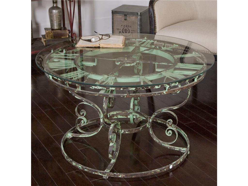
The Living Room Uttermost Gilbertine Clock Table 24349 makes green appear rustic.
Lovin’ Green
Spring green is the fusion of green and yellow. Just stick with light to medium shades for a dash of color that does not overwhelm. Be careful in using green as the eyes have a tendency to veer towards this color. You wouldn’t want to use it in a spot or design element that you do not actually want to highlight. For instance, putting a lot of green in a living room with a great picturesque view outside would be pointless. You are, in essence, defeating the purpose of the window where the view is supposed to be sublime.
Green is an amazing backdrop wherein you could add punches of more vibrant greens. Blue, yellow and green are analogous colors which means they are neighbors on the color wheel. This means that these three colors are always in harmony with each other. Combining these three colors is a great way to bring in some color without clashing or going overboard.
Are you a fan of painted ceilings? Pick spring green for your bedroom as this gives the room a cheerful glow especially during the morning. The walls can be kept white so that the ceiling color (painted spring green) would pop. Add small accents of the same color but of a different shade throughout the room. Green could go cooler with blues and grays while it could become warmer if you add wood tones.
If you want to use green on the stairway, hallways and other areas with constant foot traffic, then do so. These areas are often painted with boring white or neutral colors. Let these areas leap to life as you use spring green on the walls and framed photos.
‘Color shy? Don’t be. Green is a clever way to infuse a vibrant color without hurting anyone’s eyes. Your biggest cue is the lushness of your landscaping outside. Greeneries are eternally there to visually please.
There are so many ways to use green in your home. You could install green wall tiles, use green on your throw pillows and other accent pieces, or you could simply paint the walls green. Always think beyond paint, though, when using this color as it has so much to offer in terms of beauty and harmony.
Tags: green, green color palette, green color scheme, green interior design, green interiors, McCreerys, McCreerys Home Furnishings
Posted in Color Schemes, Interior Design 101, Interior Design Elements, Interior Design Themes | No Comments »
Sunday, January 17th, 2016
Just add sea foam and some bubbles and this setup is ready to impress anyone. The lovely credenza comes from FFDM’s Palm Island Collection.
Imagine constantly seeing the colors of sea life – greens, blues and a tinge of purple. Put these colors to your home’s walls and you have provided a stark contrast to your unique accessories, bed linen and fixtures. A color palette that could work inside the bedroom is anything aquatic such as sea foam green, blue and amethyst. Throw in some flamboyant patterns and you can almost see Sebastian singing Under the Sea.
If mixing these aquatic colors is not your cup of tea, then you can also go with one strong marine color such as royal blue. For instance, use this color on your bathroom walls and floors. To make the color pop, add a shower partition complete with cute sea creatures or flowers with the shades of yellow, blue, green and lavender.
The Sea-Inspired Bedroom
Using aquatic colors does not mean that you have to immediately resort to block colors. One way to make the palette more interesting is to throw in some colorful quilt on your bed while the pillowcases and the bed sheets still come in earth tones. This colorful addition will create the needed balance inside the now bohemian fresh bedroom.
Now imagine that you are designing the room of a young man or a bachelor. Primarily blue walls instantly indicate that the bedroom belongs to a male member of the family. You can tone down the blue color of the walls to make room for some plum-upholstered seats or any such interesting pieces. Add a pop to the room by installing a royal blue light bulb.
The Fresh Kitchen and Dining Area
Timeless marine looks can provide a laidback feeling to any home. Add greeneries to maintain the fresh air inside, or place pictures of flowers and the usual seashore palm trees on your kitchen walls. Adding these fresh concepts in your kitchen will make your cooking more enjoyable.
As for the dining room, you may use retro fabrics to achieve that blasé look. Add a modern touch by having custom tables. You may also set up a beachy desk area right by the corner of your bedroom.
The Tommy-Bahama-Home-Living-Room-Golden-Isle-Sofa-1604-33 is perfect for any beach home.
The Beach-Like Living Room
Putting a series of loveseats or a sectional sofa can easily provide room for a crowd. Use rattan or any woven pieces to add a hip ‘60s look to your beach theme. Island living requires simple yet versatile pieces of furniture and a collection of accessories such as clam shells, coral reef parts, and other seashell decor.
Use bold greens together with oranges inside your living room. These will work well with opalescent stripes on your walls or some bird prints on blank walls. Welcome your guests to this lovely room filled with colors that literally pop.
As to the living area’s furnishings, let them be awash in blues. Wingback chairs and upholstered sofas would blend well with an oak coffee table and a collage of your family photos or some sort of vintage artwork.
To make this room more appealing, use a lamp atop a side table. You can also replace the lamp with a model sailboat especially when you have a good view of the ocean from where your living room is situated. Add Roman shades, jute rug, and an upholstered chair with white framework to make the green walls stand out.
What is a marine-themed home without a touch of green? Uttermost-Accessories-Costa-Del-Sol-Potted-Greenery-Botanicals-60090-at-McCreerys-Home-Furnishings
Of course, going aquatic also means letting in a lot of sunlight. White can also be a cool color for marine-inspired living rooms so long as they are blended with blues and greens. White reflects light better so use it lavishly.
The aquatic or beach theme is one of the freshest styles that any homeowner can set up in his dwelling place. What could be airier and fresher than this concept?
Tags: 1960s, beach colors, beach design, beach furnishing, beach furniture, beach interiors, bohemian, bohemian interiors, bohemian style, green color palette, green color scheme, green design, green home, green interiors, marine colors, marine decor, marine hues, marine living, McCreerys, McCreerys Home Furnishings, natural colors, natural hues, natural light, nature's colors, sea colors, tips
Posted in Color Schemes, Interior Design 101, Interior Design Elements, Interior Design Themes | No Comments »
Follow us on our social media
© McCreery's Home Furnishings | All Rights Reserved | Privacy Policy